Table of Contents for
Mastering Responsive Web Design
 Mastering Responsive Web Design
Published by
Packt Publishing, 2015
Mastering Responsive Web Design
Published by
Packt Publishing, 2015
- Cover
- Table of Contents
- Mastering Responsive Web Design
- Mastering Responsive Web Design
- Credits
- About the Author
- Acknowledgment
- About the Reviewers
- www.PacktPub.com
- Preface
- What you need for this book
- Who this book is for
- Conventions
- Reader feedback
- Customer support
- 1. Harness the Power of Sass for Responsive Web Design
- The basic concepts of Sass for RWD
- Summary
- 2. Marking Our Content with HTML5
- The
element - The
element - The
- The
element - The
- The
- Using WAI-ARIA landmark roles to increase accessibility
- A full HTML5 example page with ARIA roles and meta tags
- Output screenshots for desktop and mobile
- Summary
- 3. Mobile-first or Desktop-first?
- Sass mixins for the mobile-first and desktop-first media queries
- Dealing with legacy browsers
- How to deal with high-density screens
- Sometimes RWD is not necessarily the right solution
- Retrofitting an old website with RWD
- Retrofitting with AWD
- Retrofitting with RWD
- Summary
- 4. CSS Grids, CSS Frameworks, UI Kits, and Flexbox for RWD
- CSS grids
- CSS frameworks
- UI kits
- The pros and cons of CSS frameworks for RWD
- Creating a custom CSS grid
- Building a sample page with the custom CSS grid
- Stop using CSS grids, use Flexbox!
- Summary
- 5. Designing Small UIs Driven by Large Finger
- The posture patterns and the touch zones
- The nav icon – basic guidelines to consider for RWD
- The navigation patterns for RWD
- Summary
- 6. Working with Images and Videos in Responsive Web Design
- Third-party image resizing services
- The
element and the srcset and sizes attributes - Replacing 1x images with 2x images on the fly with Retina.js
- Making videos responsive
- The Vector Formats
- Summary
- 7. Meaningful Typography for Responsive Web Design
- Calculating relative font sizes
- Creating a Modular Scale for a harmonious typography
- Using the Modular Scale for typography
- Web fonts and how they affect RWD
- Sass mixin for implementing web fonts
- Using FlowType.js for increased legibility
- Summary
- 8. Responsive E-mails
- Don't overlook your analytics
- Recommendations for building better responsive e-mails
- Responsive e-mail build
- Third-party services
- Summary
- Index
If and when the moment comes, we need to be prepared to make a nonresponsive or fixed-width site/app responsive.
There are two ways of retrofitting a nonresponsive or fixed-width site/app. One way is using the Adaptive Web Design (AWD) technique that uses absolute units (that is, pixels). The other way is using RWD and transforming all pixel values to percentages with a very simple formula.
Regardless of which techniques we use, we are going to have to use a desktop-first approach since the site we're dealing with was built for wide screens only. This means that we're going to use the max-width property in our media queries.
Before we look at both retrofitting techniques, we need a base page to start with.
The graphic you see here is proportional to a 12-column 980GS layout. The browser window is 1024px wide and the page is 980px wide:
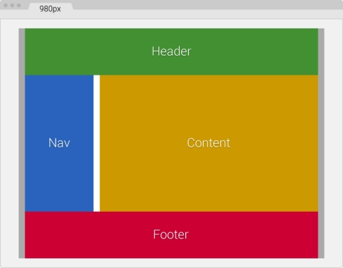
The following are the container's components:
- The main container in gray is 980px wide with 10px padding on the left and right.
- The Header in green and Footer in red are 960px or 12-column wide each: 940px with a 10px margin on the left and right.
- The Nav section in blue is 240px or 3-column wide: 220px with 10px left margin and right margins.
- The Content section in yellow is 710px or 9-column wide: 700px with 10px right margin.
- The gutter in white is 20px wide, that is, a 10px right margin from Nav and a 10px left margin from Content.
- So, 220px Nav + 710px Content + 20px gutter + 10px margins = 960px.
Here's the markup that represents our base page:
<!DOCTYPE html>
<html>
<head>
    <meta charset="utf-8">
    <title>Retrofitting with Adaptive Web Design</title>
    <link href="css/styles.css" rel="stylesheet">
</head>
<body>
    <main class="container_12 clear">
      <header class="grid_12">Header</header>
      <nav class="grid_3">Nav</nav>
      <section class="grid_9">Content</section>
      <footer class="grid_12">Footer</footer>
    </main>
</body>
</html>Regarding our CSS/SCSS, we are only going to need to create one partial, the _980gs.scss file that contains the fixed-width grid.
Then, we're going to create a styles.scss file with which we are going to perform the following operations:
- Import the
_980gs.scssfile. - Include our simple desktop-first Sass mixin to handle the media queries.
- Create all the necessary media queries using the
max-widthproperty. - Compile it to
styles.cssand use it in our page.
The _980gs.scss file contains the basic grid and looks like this:
//Globals
*, *:before, *:after {
    box-sizing: border-box;
}

//Container
.container_12 {
    width: 980px;
    padding: 0 10px;
    margin: auto;
}

//Grid >> Global
.grid {
    &_1, &_2, &_3, &_4, &_5, &_6, &_7, &_8, &_9, &_10, &_11, &_12 {
      float: left;
      margin: 0 10px;
    }
}

//Grid >> 12 Columns
.container_12 {
    .grid_1  { width: 60px; }
    .grid_2  { width: 140px; }
    .grid_3  { width: 220px; }
    .grid_4  { width: 300px; }
    .grid_5  { width: 380px; }
    .grid_6  { width: 460px; }
    .grid_7  { width: 540px; }
    .grid_8  { width: 620px; }
    .grid_9  { width: 700px; }
    .grid_10 { width: 780px; }
    .grid_11 { width: 860px; }
    .grid_12 { width: 940px; }
}

//Clear Floated Elements - http://davidwalsh.name/css-clear-fix
.clear, .row {
    &:before,
    &:after { content: ''; display: table; }
    &:after { clear: both; }
}

//Use rows to nest containers
.row { margin-bottom: 10px;
    &:last-of-type { margin-bottom: 0; }
}
//Legacy IE
.clear { zoom: 1; }