Table of Contents for
Mastering Responsive Web Design
 Mastering Responsive Web Design
Published by
Packt Publishing, 2015
Mastering Responsive Web Design
Published by
Packt Publishing, 2015
- Cover
- Table of Contents
- Mastering Responsive Web Design
- Mastering Responsive Web Design
- Credits
- About the Author
- Acknowledgment
- About the Reviewers
- www.PacktPub.com
- Preface
- What you need for this book
- Who this book is for
- Conventions
- Reader feedback
- Customer support
- 1. Harness the Power of Sass for Responsive Web Design
- The basic concepts of Sass for RWD
- Summary
- 2. Marking Our Content with HTML5
- The
element - The
element - The
- The
element - The
- The
- Using WAI-ARIA landmark roles to increase accessibility
- A full HTML5 example page with ARIA roles and meta tags
- Output screenshots for desktop and mobile
- Summary
- 3. Mobile-first or Desktop-first?
- Sass mixins for the mobile-first and desktop-first media queries
- Dealing with legacy browsers
- How to deal with high-density screens
- Sometimes RWD is not necessarily the right solution
- Retrofitting an old website with RWD
- Retrofitting with AWD
- Retrofitting with RWD
- Summary
- 4. CSS Grids, CSS Frameworks, UI Kits, and Flexbox for RWD
- CSS grids
- CSS frameworks
- UI kits
- The pros and cons of CSS frameworks for RWD
- Creating a custom CSS grid
- Building a sample page with the custom CSS grid
- Stop using CSS grids, use Flexbox!
- Summary
- 5. Designing Small UIs Driven by Large Finger
- The posture patterns and the touch zones
- The nav icon – basic guidelines to consider for RWD
- The navigation patterns for RWD
- Summary
- 6. Working with Images and Videos in Responsive Web Design
- Third-party image resizing services
- The
element and the srcset and sizes attributes - Replacing 1x images with 2x images on the fly with Retina.js
- Making videos responsive
- The Vector Formats
- Summary
- 7. Meaningful Typography for Responsive Web Design
- Calculating relative font sizes
- Creating a Modular Scale for a harmonious typography
- Using the Modular Scale for typography
- Web fonts and how they affect RWD
- Sass mixin for implementing web fonts
- Using FlowType.js for increased legibility
- Summary
- 8. Responsive E-mails
- Don't overlook your analytics
- Recommendations for building better responsive e-mails
- Responsive e-mail build
- Third-party services
- Summary
- Index
Since we're mastering RWD, we have the luxury of creating our own CSS grid. However, we need to work smart, not hard. So what we're going to do is leverage the Variable Grid System app and combine its result with our own approach, making a mobile-first, fluid, custom build, and solid CSS grid from which we can create robust responsive designs.
Let's lay out our CSS grid requirements:
- It should have 12 columns.
- It should be 1200px wide to account for 1280px screens.
- It should be fluid, with relative units (percentages) for the columns and gutters.
- It should use the mobile-first approach.
- It should use the SCSS syntax.
- It should be reusable for other projects.
- It should be simple to use and understand.
- It should be easily scalable.
Here's what our 1200 pixel wide and 12-column width 20px grid looks like:
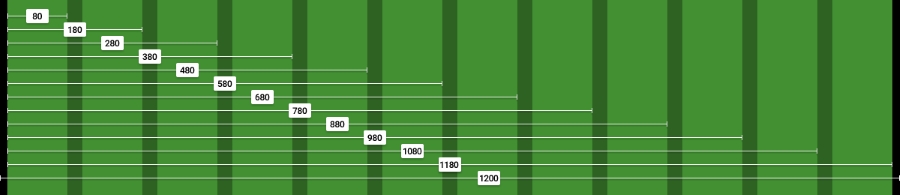
The left and right padding in black are 10px each. We'll convert those 10px into percentages at the end of this process.
We're going to use the RWD magic formula: (target ÷ context) x 100 = result %.
Our context is going to be 1200px. So let's convert one column: 80 ÷ 1200 x 100 = 6.67%.
For two columns, we have to account for the gutter that is 20px. In other words, we can't say that two columns are exactly 160px. That's not entirely correct.
Two columns are: 80px + 20px + 80px = 180px.
Let's now convert two columns: 180 ÷ 1200 x 100 = 15%.
For three columns, we now have to account for two gutters: 80px + 20px + 80px + 20px + 80px = 280px.
Let's now convert three columns: 280 ÷ 1200 x 100 = 23.33%.
Can you see the pattern now? Every time we add a column, all that we need to do is add 100 to the value. This value accounts for the gutters too!
Check the screenshot of the grid we saw moments ago, you can see the values of the columns increment by 100.
So, all the equations are as follows:
1   column:    80 ÷ 1200 x 100 = 6.67%
2   columns:  180 ÷ 1200 x 100 = 15%
3   columns:  280 ÷ 1200 x 100 = 23.33%
4   columns:  380 ÷ 1200 x 100 = 31.67%
5   columns:  480 ÷ 1200 x 100 = 40%
6   columns:  580 ÷ 1200 x 100 = 48.33%
7   columns:  680 ÷ 1200 x 100 = 56.67%
8   columns:  780 ÷ 1200 x 100 = 65%
9   columns:  880 ÷ 1200 x 100 = 73.33%
10  columns:  980 ÷ 1200 x 100 = 81.67%
11  columns: 1080 ÷ 1200 x 100 = 90%
12  columns: 1180 ÷ 1200 x 100 = 98.33%
Let's create the SCSS for the 12-column grid:
//Grid 12 Columns
.grid {
    &-1  { width:6.67%; }
    &-2  { width:15%; }
    &-3  { width:23.33%; }
    &-4  { width:31.67%; }
    &-5  { width:40%; }
    &-6  { width:48.33%; }
    &-7  { width:56.67%; }
    &-8  { width:65%; }
    &-9  { width:73.33%; }
    &-10 { width:81.67%; }
    &-11 { width:90%; }
    &-12 { width:98.33%; }
}Don't forget to include the UTF-8 encoding directive at the top of the file to let browsers know the character set we're using. Let's spruce up our code by adding a Credits section at the top. The code is as follows:
@charset "UTF-8";

/*
    Custom Fluid & Responsive Grid System
    Structure: Mobile-first (min-width)
    Syntax: SCSS
    Grid: Float-based
    Created by: Your Name
    Date: MM/DD/YY
*/

//Grid 12 Columns
.grid {
    &-1  { width:6.67%; }
    &-2  { width:15%; }
    &-3  { width:23.33%; }
    &-4  { width:31.67%; }
    &-5  { width:40%; }
    &-6  { width:48.33%; }
    &-7  { width:56.67%; }
    &-8  { width:65%; }
    &-9  { width:73.33%; }
    &-10 { width:81.67%; }
    &-11 { width:90%; }
    &-12 { width:98.33%; }
}
Tip
Notice the Credits are commented with CSS style comments: /* */. These types of comments, depending on the way we compile our SCSS files, don't get stripped out. This way, the Credits are always visible so that others know who authored the file. This may or may not work for teams. Also, the impact on file size of having the Credits display is imperceptible, if any.
Including the box-sizing property allows the browser's box model to account for the padding inside the containers; this means the padding gets subtracted rather than added, thus maintaining the defined width(s).
Since the structure of our custom CSS grid is going to be mobile-first, we need to include the mixin that will handle this aspect:
@charset "UTF-8";

/*
    Custom Fluid & Responsive Grid System
    Structure: Mobile-first (min-width)
    Syntax: SCSS
    Grid: Float-based
    Created by: Your Name
    Date: MM/DD/YY
*/

*, *:before, *:after {
    box-sizing: border-box;
}

//Moble-first Media Queries Mixin
@mixin forLargeScreens($width) {
    @media (min-width: $width/16+em) { @content }
}

//Grid 12 Columns
.grid {
    &-1  { width:6.67%; }
    &-2  { width:15%; }
    &-3  { width:23.33%; }
    &-4  { width:31.67%; }
    &-5  { width:40%; }
    &-6  { width:48.33%; }
    &-7  { width:56.67%; }
    &-8  { width:65%; }
    &-9  { width:73.33%; }
    &-10 { width:81.67%; }
    &-11 { width:90%; }
    &-12 { width:98.33%; }
}Since we're using the mobile-first approach, our main container is going to be 100% wide by default; but we're also going to give it a maximum width of 1200px since the requirement is to create a grid of that size.
We're also going to convert 10px into a percentage value, so using the RWD magic formula: 10 ÷ 1200 x 100 = 0.83%.
However, as we've seen before, 10px, or in this case 0.83%, is not enough padding and makes the content appear too close to the edge of the main container. So we're going to increase the padding to 20px: 20 ÷ 1200 x 100 = 1.67%.
We're also going to horizontally center the main container with margin: auto;.
Let's include these values now:
@charset "UTF-8";

/*
    Custom Fluid & Responsive Grid System
    Structure: Mobile-first (min-width)
    Syntax: SCSS
    Grid: Float-based
    Created by: Your Name
    Date: MM/DD/YY
*/

*, *:before, *:after {
    box-sizing: border-box;
}

//Moble-first Media Queries Mixin
@mixin forLargeScreens($width) {
    @media (min-width: $width/16+em) { @content }
}

//Main Container
.container-12 {
    width: 100%;
    //Change this value to ANYTHING you want, no need to edit anything else.
    max-width: 1200px;
    padding: 0 1.67%;
    margin: auto;
}

//Grid 12 Columns
.grid {
    &-1  { width:6.67%; }
    &-2  { width:15%; }
    &-3  { width:23.33%; }
    &-4  { width:31.67%; }
    &-5  { width:40%; }
    &-6  { width:48.33%; }
    &-7  { width:56.67%; }
    &-8  { width:65%; }
    &-9  { width:73.33%; }
    &-10 { width:81.67%; }
    &-11 { width:90%; }
    &-12 { width:98.33%; }
}On small screens, all the columns are going to be 100% wide. Since we're working with a single column layout, we don't use gutters; this means we don't have to declare margins, at least yet.
At 640px, the grid will kick in and assign corresponding percentages to each column, so we're going to include the columns in a 40em (640px) media query and float them to the left. At this point, we need gutters. Thus, we declare the margin with .83% to the left and right padding.
The code is as follows:
@charset "UTF-8";

/*
    Custom Fluid & Responsive Grid System
    Structure: Mobile-first (min-width)
    Syntax: SCSS
    Grid: Float-based
    Created by: Your Name
    Date: MM/DD/YY
*/

*, *:before, *:after {
    box-sizing: border-box;
}

//Moble-first Media Queries Mixin
@mixin forLargeScreens($width) {
    @media (min-width: $width/16+em) { @content }
}

//Main Container
.container-12 {
    width: 100%;
    //Change this value to ANYTHING you want, no need to edit anything else.
    max-width: 1200px;
    padding: 0 1.67%;
    margin: auto;
}

//Grid
.grid {
    //Global Properties - Mobile-first
    &-1, &-2, &-3, &-4, &-5, &-6, &-7, &-8, &-9, &-10, &-11, &-12 {
        width: 100%;
    }
    @include forLargeScreens(640) { //Totally arbitrary width, it's only a starting point.
    //Global Properties - Large screens
    &-1, &-2, &-3, &-4, &-5, &-6, &-7, &-8, &-9, &-10, &-11, &-12 {
        float: left;
        margin: 0 .83%;
    }
    //Grid 12 Columns
    .grid {
        &-1  { width:6.67%; }
        &-2  { width:15%; }
        &-3  { width:23.33%; }
        &-4  { width:31.67%; }
        &-5  { width:40%; }
        &-6  { width:48.33%; }
        &-7  { width:56.67%; }
        &-8  { width:65%; }
        &-9  { width:73.33%; }
        &-10 { width:81.67%; }
        &-11 { width:90%; }
        &-12 { width:98.33%; }
    }
}
If we use rows in our HTML structure or add the class .clear to a tag, we can declare all the float clearing values in a single nested rule with the :before and :after pseudo-elements.
Tip
It's the same thing to use single or double colons when declaring pseudo-elements. The double colon is a CSS3 syntax and the single colon is a CSS2.1 syntax. The idea was to be able to differentiate them at a glance so a developer could tell which CSS version they were written on. However, IE8 and below do not support the double-colon syntax.
The float clearing technique is an adaptation of David Walsh's CSS snippet (http://davidwalsh.name/css-clear-fix).
We're also adding a rule for the rows with a bottom margin of 10px to separate them from each other, while removing that margin from the last row to avoid creating unwanted extra spacing at the bottom. Finally, we add the clearing rule for legacy IEs.
Let's include these rules now:
@charset "UTF-8";

/*
    Custom Fluid & Responsive Grid System
    Structure: Mobile-first (min-width)
    Syntax: SCSS
    Grid: Float-based
    Created by: Your Name
    Date: MM/DD/YY
*/

*, *:before, *:after {
    box-sizing: border-box;
}

//Moble-first Media Queries Mixin
@mixin forLargeScreens($width) {
    @media (min-width: $width/16+em) { @content }
}

//Main Container
.container-12 {
    width: 100%;
    //Change this value to ANYTHING you want, no need to edit anything else.
    max-width: 1200px;
    padding: 0 1.67%;
    margin: auto;
}

//Grid
.grid {
    //Global Properties - Mobile-first
    &-1, &-2, &-3, &-4, &-5, &-6, &-7, &-8, &-9, &-10, &-11, &-12 {
        width: 100%;
    }
    @include forLargeScreens(640) { //Totally arbitrary width, it's only a starting point.
    //Global Properties - Large screens
    &-1, &-2, &-3, &-4, &-5, &-6, &-7, &-8, &-9, &-10, &-11, &-12 {
        float: left;
        margin: 0 .83%;
    }
    //Grid 12 Columns
    .grid {
        &-1  { width:6.67%; }
        &-2  { width:15%; }
        &-3  { width:23.33%; }
        &-4  { width:31.67%; }
        &-5  { width:40%; }
        &-6  { width:48.33%; }
        &-7  { width:56.67%; }
        &-8  { width:65%; }
        &-9  { width:73.33%; }
        &-10 { width:81.67%; }
        &-11 { width:90%; }
        &-12 { width:98.33%; }
    }
}

//Clear Floated Elements - http://davidwalsh.name/css-clear-fix
.clear, .row {
    &:before,
    &:after { content: ''; display: table; }
    &:after { clear: both; }
}

//Use rows to nest containers
.row { margin-bottom: 10px;
    &:last-of-type { margin-bottom: 0; }
}

//Legacy IE
.clear { zoom: 1; }
Let's recap our CSS grid requirements:
- 12 columns: Starting from
.grid-1to.grid-12. - 1200px wide to account for 1280px screens: The
.container-12container hasmax-width: 1200px; - Fluid and relative units (percentages) for the columns and gutters: The percentages go from 6.67% to 98.33%.
- Mobile-first: We added the mobile-first mixin (using
min-width) and nested the grid inside of it. - The SCSS syntax: The whole file is Sass-based.
- Reusable: As long as we're using 12 columns and we're using the mobile-first approach, we can use this CSS grid multiple times.
- Simple to use and understand: The class names are very straightforward. The
.grid-6grid is used for an element that spans 6 columns,.grid-7is used for an element that spans 7 columns, and so on. - Easily scalable: If we want to use 980px instead of 1200px, all we need to do is change the value in the
.container-12 max-widthproperty. Since all the elements are using relative units (percentages), everything will adapt proportionally to the new width—to any width for that matter. Pretty sweet if you ask me.