Table of Contents for
Mastering Responsive Web Design
 Mastering Responsive Web Design
Published by
Packt Publishing, 2015
Mastering Responsive Web Design
Published by
Packt Publishing, 2015
- Cover
- Table of Contents
- Mastering Responsive Web Design
- Mastering Responsive Web Design
- Credits
- About the Author
- Acknowledgment
- About the Reviewers
- www.PacktPub.com
- Preface
- What you need for this book
- Who this book is for
- Conventions
- Reader feedback
- Customer support
- 1. Harness the Power of Sass for Responsive Web Design
- The basic concepts of Sass for RWD
- Summary
- 2. Marking Our Content with HTML5
- The
element - The
element - The
- The
element - The
- The
- Using WAI-ARIA landmark roles to increase accessibility
- A full HTML5 example page with ARIA roles and meta tags
- Output screenshots for desktop and mobile
- Summary
- 3. Mobile-first or Desktop-first?
- Sass mixins for the mobile-first and desktop-first media queries
- Dealing with legacy browsers
- How to deal with high-density screens
- Sometimes RWD is not necessarily the right solution
- Retrofitting an old website with RWD
- Retrofitting with AWD
- Retrofitting with RWD
- Summary
- 4. CSS Grids, CSS Frameworks, UI Kits, and Flexbox for RWD
- CSS grids
- CSS frameworks
- UI kits
- The pros and cons of CSS frameworks for RWD
- Creating a custom CSS grid
- Building a sample page with the custom CSS grid
- Stop using CSS grids, use Flexbox!
- Summary
- 5. Designing Small UIs Driven by Large Finger
- The posture patterns and the touch zones
- The nav icon – basic guidelines to consider for RWD
- The navigation patterns for RWD
- Summary
- 6. Working with Images and Videos in Responsive Web Design
- Third-party image resizing services
- The
element and the srcset and sizes attributes - Replacing 1x images with 2x images on the fly with Retina.js
- Making videos responsive
- The Vector Formats
- Summary
- 7. Meaningful Typography for Responsive Web Design
- Calculating relative font sizes
- Creating a Modular Scale for a harmonious typography
- Using the Modular Scale for typography
- Web fonts and how they affect RWD
- Sass mixin for implementing web fonts
- Using FlowType.js for increased legibility
- Summary
- 8. Responsive E-mails
- Don't overlook your analytics
- Recommendations for building better responsive e-mails
- Responsive e-mail build
- Third-party services
- Summary
- Index
Let me start by saying that there is no 100 percent optimal solution to the image issues in RWD. This is because of the current lack of support for the recommended properties, or because there's a double download of assets. Granted, Dave Newton's article in http://ww1.smashingmagzine.com/, How To Avoid Duplicate Downloads In Responsive Images, tries to address this issue (http://www.smashingmagazine.com/2013/05/10/how-to-avoid-duplicate-downloads-in-responsive-images/).
However, that solution is very verbose. If you have to work with many images, this solution may not be the best option and allowing a double download starts making more sense. Every project is different, so trying to make the most informed decisions possible is incredibly important.
As soon as browser vendors decide to fully support any of the solutions mentioned here, there won't be a need to worry about double downloads or polyfills of any kind.
The <picture> element and the srcset and sizes attributes are maintained by the Responsive Images Community Group (RICG) and are now part of the HTML specification. In other words, we can use them without any type of polyfill and have the confidence that modern browsers will support them. Well, to some degree at least.
The only reason we would need to use a polyfill is to support those browsers (legacy and modern) that haven't yet implemented support for them.
Tip
Both the <picture> element and the srcset attribute have a fallback feature for those browsers that don't support them. You can opt to use a polyfill, but you are not required to do so. If you think using a polyfill enhances the user experience, by all means, go for it. Read this article about it from the creator of the Picturefill polyfill, Scott Jehl (http://www.filamentgroup.com/lab/to-picturefill.html).
There are many polyfills out there, here's a short list of the ones we can use today:
- Picturefill by Scott Jehl (recommended by the RICG: http://scottjehl.github.io/picturefill/)
- PicturePolyfill by Andrea Verlicchi (http://verlok.github.io/picturePolyfill/)
- respimage by Alexander Farkas (https://github.com/aFarkas/respimage)
Some people in the web design and web development communities feel strongly about considering that a new HTML element (<picture>) isn't the solution to the issues we are experiencing with images in RWD. They feel that the solution should come from within an already existing tag, the <img> tag.
Good for us, that the solutions come in both flavors. It doesn't matter which method you use to serve your images in a responsible way, what matters is that you should be using one of these methods. If you already are, that's awesome. If not, don't sweat it. The following explanations will help clear up any questions you have about this matter.
When to use <picture> and when to use srcset? This is a very legit question that I myself couldn't wrap my head around when first heard these terms. So I decided to ask Brad Frost at a workshop he conducted in Dayton, OH.
The recommended approach boils down to this concept: art direction. In responsive images, art direction basically means that you have different images that are cropped a certain way so that less important parts of the image are left out in order to focus on the important ones.
This is different from just resizing the same image. Granted, you can use whatever method you want, but to keep things simple, you can use the <picture> element when you want to serve art directed images and the srcset attribute when you just want to serve resized versions of the same image.
Before we dive into the markup, let's see a visual example of an art directed image versus a resized image using the photo of the Kung Fu grandmasters:
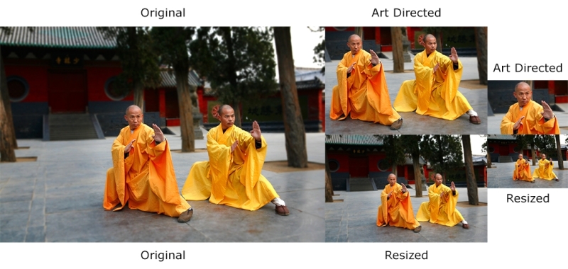
Let's see what happened here. The original image has a lot of space around the Kung Fu grandmasters: we can see the trees and the buildings in the back. The resized versions maintain all aspects and proportions 1:1 of the original image.
However, the art directed images have a lot of differences. The first art directed image is cropped to show both grandmasters in a close up; the second art directed image has been cropped even more to accentuate the focus on Shi DeRu only (the grandmaster on the left). We could've cropped the image to focus on Shi DeYang (the grandmaster on the right), but this was the "art direction" I wanted to give the image. This is a subjective decision but based on a solid intent.
Now, let's see the Picturefill polyfill/script in action.
The first thing we need to do is download the JavaScript file, which can be downloaded from https://github.com/scottjehl/picturefill/blob/2.3.0/dist/picturefill.min.js
Then, all we need to do is include it in the <head> section of our document:
<!DOCTYPE html>
<!--[if IE 8]> <html class="no-js ie8" lang="en"> <![endif]-->
<!--[if IE 9]> <html class="no-js ie9" lang="en"> <![endif]-->
<!--[if gt IE 9]><!--><html class="no-js" lang="en"><!--<![endif]-->
<head>
    <meta charset="utf-8">
    <meta name="viewport" content="width=device-width, initial-scale=1">
    <meta http-equiv="X-UA-Compatible" content="IE=edge">
    <script src="js/picturefill.min.js"></script>
    <title>Picturefill polyfill</title>
</head>When using the <picture> element, you (the author) tell the browser which image to use at which breakpoint. The good thing about this is that we can define exactly when a certain image should be displayed by using media queries. The media queries work exactly the same as the media queries used in CSS, and they even look exactly the same.
This is what a basic <picture> snippet looks like:
<picture>
    <source srcset="images/grandmasters-small.jpg" media="(max-width: 40em)">
    <source srcset="images/grandmasters-medium.jpg" media="(max-width: 64em)">
    <source srcset="images/grandmasters-default.jpg">
    <img src="images/grandmasters-default.jpg" alt="Fallback image">
</picture>
Now, even with a polyfill, IE9 has issues with the <picture> element. As weird as it sounds, we need to inject a <video> tag within conditional comments for IE9 to work correctly.
This is what the markup looks like after amending it for IE9:
<picture>
    <!--[if IE 9]><video style="display: none;"><![endif]-->
    <source srcset="images/grandmasters-small-ad.jpg" media="(max-width: 40em)">
    <source srcset="images/grandmasters-medium-ad.jpg" media="(max-width: 64em)">
    <source srcset="images/grandmasters-default.jpg">
    <!--[if IE 9]></video><![endif]-->
    <img src="images/grandmasters-default.jpg" alt="Fallback image">
</picture>
As you can see, I also highlighted the <img src="grandmasters-default.jpg" alt="Fallback image"> tag. This is the fallback image for those browsers that do not support the <picture> element.
One thing to keep in mind is that not so long ago, this fallback image caused double download in some modern browsers. My last tests showed that this was not the case in Chrome and Firefox, which do support the <picture> element. So make sure you run all necessary tests to see where you stand and then think of a solution if you need to support those legacy browsers.
Here's a demo I created for this in CodePen: http://codepen.io/ricardozea/pen/cf6c0965785d552bad5e200acb761ffe
The srcset and sizes attributes actually come from the <picture> specification, but are implemented in the <img> element. When using the srcset and sizes attributes, the browser does all the work of deciding which image to use for each specific circumstance. You can also use media queries if you want, although, not required. The word vw means viewport width and it's used to let the browser know that it should display an image at a certain percentage in relation to the width of the viewport. If you see something like 80vw, it means that the image should be 80 percent of the width of the current viewport.
The w descriptor means the width of the image. If you see something like 255w, it means the browser will understand that specific image is 255px wide.
Let's take a look at an <img> tag with the srcset and sizes attributes:
<img src="images/grandmasters-default.jpg"
     srcset="images/grandmasters-small-rsz.jpg 255w,
             images/grandmasters-medium-rsz.jpg 511w"
     sizes="(min-width: 30em) 80vw, 100vw"
     alt="Mastering RWD with HTML5 and CSS3">
The letters rsz are an abbreviation of the word resize. That's because for images that are just going to be resized in RWD, the srcset attribute keeps things a bit simpler.
The following markup is truncated in order to focus on the specific explanations easily.
The first thing we see is the already known src attribute which acts as the fallback image:
<img src="images/grandmasters-default.jpg"…
Keep in mind that the image grandmasters-default.jpg will not be used by browsers that do understand srcset. In other words, the default image in browsers that support srcset is going to be first image in the list. In our case, it is grandmasters-small-rsz.jpg. Then, we see the srcset attribute.
This is where the magic starts happening:
srcset="images/grandmasters-small-rsz.jpg 255w,images/grandmasters-medium-rsz.jpg 511w"
In this example, our plan is to show two different image files in browsers that support srcset. This is accomplished by listing the images separated by commas. Also, the value defined after each image is the width of the image:
images/grandmasters-small-rsz.jpg 255w
Giving the size of the image to the browser will allow it to make a more informed decision about what image to use based on the media query in the sizes snippet:
sizes="(min-width: 30em) 80vw, 100vw"Remember, 30em is the same as 480px. With the media query min-width: 30em, the browser goes through the following process:
- If my viewport is 30em (480px) or less, I should show the image that's 255px wide. There's no need to show the image that's 511px in a viewport that's only 480px. That's a waste of bandwidth!
- But if my viewport is more than 30em (480px), then I should show the image that's 511px wide.
The last part of the sizes attribute is the viewport widths: 80vw, 100vw.
sizes="(min-width: 30em) 80vw, 100vw"This means that if the viewport is 30em (480px) or less, the browser will show the image at 80 percent width. If it's more than 30em (480px), it will show the image at 100 percent width.
Finally, we have the alt attribute:
alt="Mastering RWD with HTML5 and CSS3">
Adding an alt attribute is always a good accessibility practice for users with assistive technology. Also, in case the images aren't loaded, browsers can display this text instead.
High-density screens will always be something in the RWD world that we'll never get away from. So if you can't defeat them, join them.
Here's a snippet that addresses normal and high-density screens:
<img src="images/grandmasters-default.jpg"
     srcset="images/grandmasters-small-rsz.jpg 1x,images/grandmasters-medium-rsz.jpg 2x">
As you can see, this is a much shorter and concise markup. It's really self-explanatory: use a fallback image in case there's no srcset support. If there is support, then use the 1x image if the device has a normal density display. You will have to use the 2x image if the device has a high-density display up to two times the density. If we are supporting even higher than 2x density devices, a 3x suffix should be added.
The sizes attribute is not required. If your design or conditions merit the use of the sizes attribute, you're free to use it.
Here's a demo I created for this in CodePen: http://codepen.io/ricardozea/pen/a13993f05a4cdc5f714a311a94f48a69
Some web designers and developers say that using media queries inside HTML like we saw with <picture> and srcset goes against the principle of separation of concerns: styling and markup should always remain as separated, independent assets.
Others, as I mentioned before, think that a new HTML element is unnecessary and that any solutions should be based on enhancing and extending already existing elements like the <img> tag.
All I can say is that at the end, none of that matters. What matters is that as web designers and developers, we should be using anything we have at our disposal to make users happy and create memorable experiences, while adhering to the best practices for long lasting implementations.