Table of Contents for
Mastering Responsive Web Design
 Mastering Responsive Web Design
Published by
Packt Publishing, 2015
Mastering Responsive Web Design
Published by
Packt Publishing, 2015
- Cover
- Table of Contents
- Mastering Responsive Web Design
- Mastering Responsive Web Design
- Credits
- About the Author
- Acknowledgment
- About the Reviewers
- www.PacktPub.com
- Preface
- What you need for this book
- Who this book is for
- Conventions
- Reader feedback
- Customer support
- 1. Harness the Power of Sass for Responsive Web Design
- The basic concepts of Sass for RWD
- Summary
- 2. Marking Our Content with HTML5
- The
element - The
element - The
- The
element - The
- The
- Using WAI-ARIA landmark roles to increase accessibility
- A full HTML5 example page with ARIA roles and meta tags
- Output screenshots for desktop and mobile
- Summary
- 3. Mobile-first or Desktop-first?
- Sass mixins for the mobile-first and desktop-first media queries
- Dealing with legacy browsers
- How to deal with high-density screens
- Sometimes RWD is not necessarily the right solution
- Retrofitting an old website with RWD
- Retrofitting with AWD
- Retrofitting with RWD
- Summary
- 4. CSS Grids, CSS Frameworks, UI Kits, and Flexbox for RWD
- CSS grids
- CSS frameworks
- UI kits
- The pros and cons of CSS frameworks for RWD
- Creating a custom CSS grid
- Building a sample page with the custom CSS grid
- Stop using CSS grids, use Flexbox!
- Summary
- 5. Designing Small UIs Driven by Large Finger
- The posture patterns and the touch zones
- The nav icon – basic guidelines to consider for RWD
- The navigation patterns for RWD
- Summary
- 6. Working with Images and Videos in Responsive Web Design
- Third-party image resizing services
- The
element and the srcset and sizes attributes - Replacing 1x images with 2x images on the fly with Retina.js
- Making videos responsive
- The Vector Formats
- Summary
- 7. Meaningful Typography for Responsive Web Design
- Calculating relative font sizes
- Creating a Modular Scale for a harmonious typography
- Using the Modular Scale for typography
- Web fonts and how they affect RWD
- Sass mixin for implementing web fonts
- Using FlowType.js for increased legibility
- Summary
- 8. Responsive E-mails
- Don't overlook your analytics
- Recommendations for building better responsive e-mails
- Responsive e-mail build
- Third-party services
- Summary
- Index
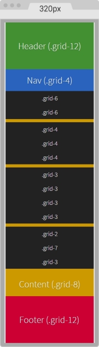
Here's the HTML we're going to use in this example:
<!DOCTYPE html>
<html>
<head>
<meta charset="utf-8">
<meta http-equiv="X-UA-Compatible" content="IE=edge">
<meta name="viewport" content="width=device-width, initial-scale=1">
<title>Mastering RWD with HTML5 & CSS3</title>
<link rel="stylesheet" href="css/site-styles.css">
<!--[if lt IE 9]>
<script src="//html5shiv.googlecode.com/svn/trunk/html5.js">
</script>
<![endif]-->
</head>
<body>
<h1>Basic Layout Using a Custom CSS Grid</h1>
<main class="container-12 clear" role="main">
<header class="grid-12" role="banner">Header (.grid-12)</header>
<nav class="grid-4" role="navigation">Nav (.grid-4)</nav>
<section class="grid-8">
<div class="row">
<div class="grid-6 black">.grid-6</div>
<div class="grid-6 black">.grid-6</div>
</div>
<div class="row">
<div class="grid-4 black">.grid-4</div>
<div class="grid-4 black">.grid-4</div>
<div class="grid-4 black">.grid-4</div>
</div>
<div class="row">
<div class="grid-3 black">.grid-3</div>
<div class="grid-3 black">.grid-3</div>
<div class="grid-3 black">.grid-3</div>
<div class="grid-3 black">.grid-3</div>
</div>
<div class="row">
<div class="grid-2 black">.grid-2</div>
<div class="grid-7 black">.grid-7</div>
<div class="grid-3 black">.grid-3</div>
</div>
<p>Content (.grid-8)</p>
</section>
<footer class="grid-12" role="contentinfo">Footer (.grid-12)</footer>
</main>
</body>Notice that there are several nested containers inside their own row (black background). The idea here is to highlight the nested content sections that add up to 12 columns.
Nesting columns are a major advantage of any grid system. In this book, we are harnessing this power so we don't limit the design in any way.
On small screens (320px wide), this is what the container looks like:
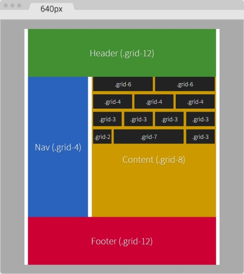
On large screens starting at 40em (640px) wide, this is what the layout looks like:
You can see the demo I created on CodePen at http://codepen.io/ricardozea/pen/d6ab6e0293be9b6bac2e16ad37942ed5.