Table of Contents for
Mastering Responsive Web Design
 Mastering Responsive Web Design
Published by
Packt Publishing, 2015
Mastering Responsive Web Design
Published by
Packt Publishing, 2015
- Cover
- Table of Contents
- Mastering Responsive Web Design
- Mastering Responsive Web Design
- Credits
- About the Author
- Acknowledgment
- About the Reviewers
- www.PacktPub.com
- Preface
- What you need for this book
- Who this book is for
- Conventions
- Reader feedback
- Customer support
- 1. Harness the Power of Sass for Responsive Web Design
- The basic concepts of Sass for RWD
- Summary
- 2. Marking Our Content with HTML5
- The
element - The
element - The
- The
element - The
- The
- Using WAI-ARIA landmark roles to increase accessibility
- A full HTML5 example page with ARIA roles and meta tags
- Output screenshots for desktop and mobile
- Summary
- 3. Mobile-first or Desktop-first?
- Sass mixins for the mobile-first and desktop-first media queries
- Dealing with legacy browsers
- How to deal with high-density screens
- Sometimes RWD is not necessarily the right solution
- Retrofitting an old website with RWD
- Retrofitting with AWD
- Retrofitting with RWD
- Summary
- 4. CSS Grids, CSS Frameworks, UI Kits, and Flexbox for RWD
- CSS grids
- CSS frameworks
- UI kits
- The pros and cons of CSS frameworks for RWD
- Creating a custom CSS grid
- Building a sample page with the custom CSS grid
- Stop using CSS grids, use Flexbox!
- Summary
- 5. Designing Small UIs Driven by Large Finger
- The posture patterns and the touch zones
- The nav icon – basic guidelines to consider for RWD
- The navigation patterns for RWD
- Summary
- 6. Working with Images and Videos in Responsive Web Design
- Third-party image resizing services
- The
element and the srcset and sizes attributes - Replacing 1x images with 2x images on the fly with Retina.js
- Making videos responsive
- The Vector Formats
- Summary
- 7. Meaningful Typography for Responsive Web Design
- Calculating relative font sizes
- Creating a Modular Scale for a harmonious typography
- Using the Modular Scale for typography
- Web fonts and how they affect RWD
- Sass mixin for implementing web fonts
- Using FlowType.js for increased legibility
- Summary
- 8. Responsive E-mails
- Don't overlook your analytics
- Recommendations for building better responsive e-mails
- Responsive e-mail build
- Third-party services
- Summary
- Index
I've always called images the "ugly child" of RWD. Why? Until the last minute, I always tried to avoid having to deal with them. Do I use image sprites? If so, do I export my transparent PNG as an 8 bit or 24 bit, or 32 bit? Some legacy IEs don't support PNG with alpha channel, so I have to export a GIF sprite. I can use SVG instead, but IE8 and below don't support SVG. I can use icon fonts, but what happens if the icon font doesn't load? I'm going to have to look up some analytics then. There's a new iDevice with a new type of high-density screen? Now I have to export two (or more) images every single time. Great! But I can't serve a high-quality image that's more than double the size of the regular size image to small-screen devices! Yeah, it may look good but it'll take forever to download, they just might as well leave the site even before the first H1 loads.
You get the picture. That's barely scratching the surface of working with media in RWD.
Some of these thoughts are still very alive today, but I've learned through the years that with a bit of common sense and staying on top of the technologies that address all these issues, having a straightforward system to deal with images (and video) can go a long way.
As in the other chapters, we are going to keep things simple but meaningful. There is no silver bullet when it comes to images, specifically in RWD, we can stay here all day long and that's certainly something we don't want with this book. I want you to go build awesome responsive sites as soon as possible. But I do encourage you to spend some time researching a bit more about images for RWD; it is truly a memorable topic among the web design and developer communities.
In this chapter, we're going to address the following topics:
- Tips for exporting images and considerably reducing their final file size while maintaining the image quality.
- How and when to use the
srcsetandsizesattributes, and the<picture>element. - Using
Retina.js. - Making videos responsive.
- Using
FitVids.js. - Using vector formats: Icon Fonts and SVGs.
- Using the right CSS image replacement technique.
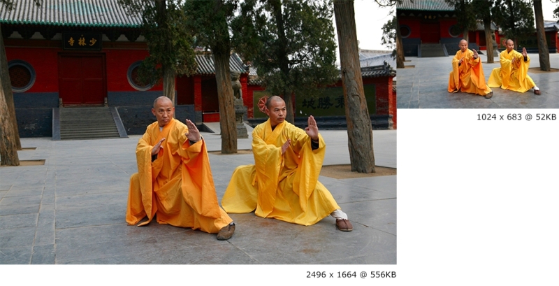
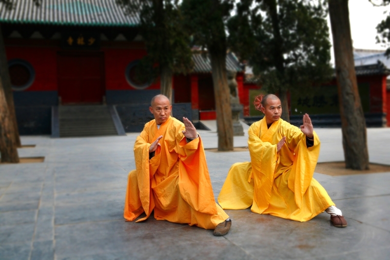
Now, here's the image we're going to use in our examples:
These awesome individuals are two Kung Fu grandmasters from the Shaolin Temple in China. Their names are Shi DeRu and Shi DeYang.
Note
Shi DeRu and Shi DeYang by Shi Deru (Shawn Xiangyang Liu), who is the sole owner and copyright-holder of the authenticity of the picture taken at the Shaolin Temple's front gate. It is licensed under CC BY-SA 3.0 via Wikipedia. It can be found at http://en.wikipedia.org/wiki/Shaolin_Kung_Fu#/media/File:Shi_DeRu_and_Shi_DeYang.jpg.
Since we are also mastering RWD with HTML5 and CSS3, I thought this photo fit right in with our mission.
The properties of the original image of the Kung Fu grandmasters I'm going to describe will help set a baseline to understand the before/after effect when optimizing images for RWD.
Here are the original image's properties:
- It is a 24-bit JPG image.
- The file size is 556KB, but it is compressed thanks to the magic of the JPG algorithm (about 12 MB decompressed).
- The dimensions are 2496 x 1664 pixels, which is about 4.15 megapixels. To put it in perspective, this image has more resolution than my 55" LED TV in my living room.
By the end of book, I assure you two things. One, you'll be absolutely ready to build responsive sites and apps. Two, when it's time to start a new project, you're going to get up from your seat and strike the same pose these grandmasters are doing.
Image editing is out of scope of this book and the following steps will require image manipulation of some sort. At this point, you can use your favorite image editor of choice. I personally use Adobe Fireworks (indeed I do), but the vast majority uses Photoshop.
If you don't use any of those, you can always use GNU Image Manipulation Software (GIMP) or Paint.NET—both are free. You can download them from here:
- GIMP: http://www.gimp.org/
- Paint.NET: http://www.getpaint.net/
You can also use an online image editing tool. However, I have to admit though that I've never used any of them, so I can't recommend one. At this point what I can say is try some of them out and choose the one that best fits your needs.
Let's get started.
In design, the rule of thumb when creating copies of an image is to go from large to small—never the other way around. In other words, the larger the image, the better its subsequent copies will be.
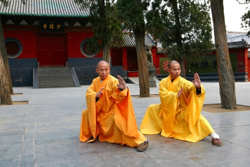
Just by resizing the image from 2496 x 1664 pixels to 1024 x 683 pixels, the file size is now 331 KB. This is nearly a 40 percent reduction in file size from 556 KB. A huge improvement, but we're not there yet.
Blurring the background is actually quite effective in itself, but it also has another benefit from the art direction point of view: It helps draw attention to the important part(s) of the image.
After blurring the background, the file now weighs 185 KB. That's about a 67 percent reduction in file size from 556 KB. We're starting to get somewhere.
Here's the new image with the blurred background:

A huge win for optimization!
Darkening or lightening the less important areas is very subjective and many may not necessarily agree with it. Under special circumstances, this process—just like the background blurring technique—can help reduce the file size and bring the important parts of the image out.
What we're basically trying to accomplish by darkening or lightening an image is to reduce the amount of colors by creating solid color areas, or at least as solid as possible. In other words, we're reducing the contrast. Use this trick with discretion.
In the case of our Kung Fu grandmasters, after darkening the less important parts of the image in the background, the image now weighs 178 KB. Admittedly, that's not much different from the former process (only 7 KB difference), but any kilobyte we can extract from the image without affecting the quality is always a good thing, and 178 KB is about a 68 percent reduction in file size.
This is how the image looks after darkening the background a little:
Every kilobyte counts.
This is the last step in the process. This step can actually be divided in two smaller steps.
Save a JPG that balances quality versus file size well. There are no determined values that can always be applied to every single image. It all happens on the fly. When doing this step, you don't want to save the image with too much low quality since the image is going to go through another optimization step.
I'm actually going to use a software that Adobe stopped developing back in May 2013: Fireworks.
Fireworks has been known to have a superior image optimization engine than Photoshop, I've run tests myself and Fireworks compression versus. quality always showed the best results. Fireworks is as relevant to today's web design processes and workflows as any other image editing software out there today. So don't be afraid to use it.
After exporting the image from Fireworks at 80 percent quality, the image of the Kung Fu grandmasters weighs now only 71 KB. That's about an 87 percent reduction in file size from the original 556 KB.
Run the image through another image optimization tool, either a standalone application such as ImageOptim for Mac or Radical Image Optimization Tool (RIOT) for Windows, or through an online service such as https://tinypng.com/ or http://www.jpegmini.com/.
We're going to use the https://tinypng.com/ online image compression service. After running the image exported from Fireworks through https://tinypng.com/, the file size is now about 52 KB, that's about a 91 percent reduction in file size from the original 556 KB. This is a massive win for image optimization.
Here's the before (left) and after (right) comparison between the 556 KB image and the final 52 KB image: