Table of Contents for
Mastering Responsive Web Design
 Mastering Responsive Web Design
Published by
Packt Publishing, 2015
Mastering Responsive Web Design
Published by
Packt Publishing, 2015
- Cover
- Table of Contents
- Mastering Responsive Web Design
- Mastering Responsive Web Design
- Credits
- About the Author
- Acknowledgment
- About the Reviewers
- www.PacktPub.com
- Preface
- What you need for this book
- Who this book is for
- Conventions
- Reader feedback
- Customer support
- 1. Harness the Power of Sass for Responsive Web Design
- The basic concepts of Sass for RWD
- Summary
- 2. Marking Our Content with HTML5
- The
element - The
element - The
- The
element - The
- The
- Using WAI-ARIA landmark roles to increase accessibility
- A full HTML5 example page with ARIA roles and meta tags
- Output screenshots for desktop and mobile
- Summary
- 3. Mobile-first or Desktop-first?
- Sass mixins for the mobile-first and desktop-first media queries
- Dealing with legacy browsers
- How to deal with high-density screens
- Sometimes RWD is not necessarily the right solution
- Retrofitting an old website with RWD
- Retrofitting with AWD
- Retrofitting with RWD
- Summary
- 4. CSS Grids, CSS Frameworks, UI Kits, and Flexbox for RWD
- CSS grids
- CSS frameworks
- UI kits
- The pros and cons of CSS frameworks for RWD
- Creating a custom CSS grid
- Building a sample page with the custom CSS grid
- Stop using CSS grids, use Flexbox!
- Summary
- 5. Designing Small UIs Driven by Large Finger
- The posture patterns and the touch zones
- The nav icon – basic guidelines to consider for RWD
- The navigation patterns for RWD
- Summary
- 6. Working with Images and Videos in Responsive Web Design
- Third-party image resizing services
- The
element and the srcset and sizes attributes - Replacing 1x images with 2x images on the fly with Retina.js
- Making videos responsive
- The Vector Formats
- Summary
- 7. Meaningful Typography for Responsive Web Design
- Calculating relative font sizes
- Creating a Modular Scale for a harmonious typography
- Using the Modular Scale for typography
- Web fonts and how they affect RWD
- Sass mixin for implementing web fonts
- Using FlowType.js for increased legibility
- Summary
- 8. Responsive E-mails
- Don't overlook your analytics
- Recommendations for building better responsive e-mails
- Responsive e-mail build
- Third-party services
- Summary
- Index
No matter how usable the sizes of our touch targets are, if they are not placed in the right location, all our efforts are pretty much worthless.
We can't talk about small UIs and large fingers without mentioning the extensive work of Luke Wroblewski in his article Responsive Navigation: Optimizing for Touch Across Devices (http://www.lukew.com/ff/entry.asp?1649).
In his article, Luke talks about the patterns of posture most users have when holding their smartphones, tablets, and touch-enabled laptops:
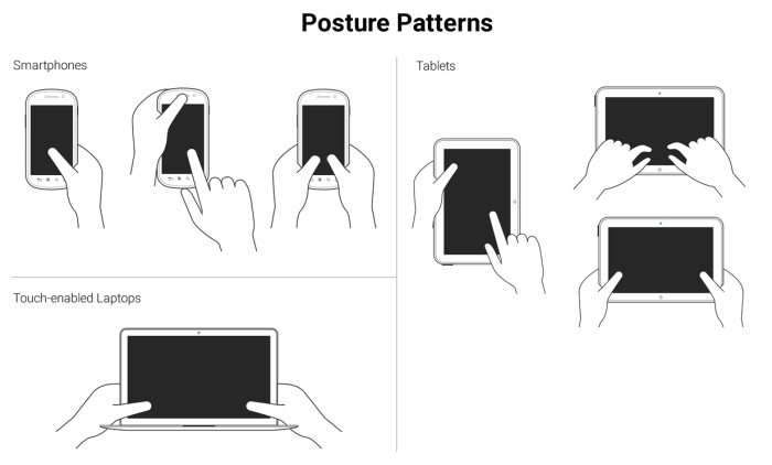
These patterns allow us to define the best way to lay out our content in order to be easily usable and accessible.
Understanding the posture patterns of our users will allow us to understand when our targets can be the right size or even a bit smaller if there isn't enough screen real estate, or a bit larger if precision is needed, since it's different when someone uses their thumbs as opposed to their index fingers.
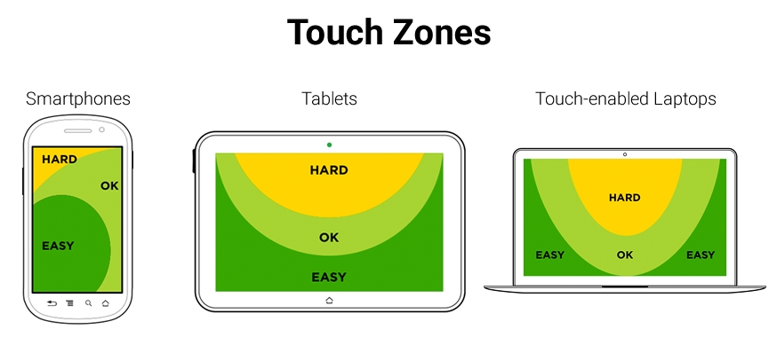
Luke also talks about touch zones, which are basically the areas of a device that are either easy or hard to reach, depending on the posture.
In all major styles of devices, smartphones, tablets and touch-enabled laptops, the ideal touch zones are in dark green, the ok touch zones are in lighter green, and the hard-to-reach zones are in yellow:
In RWD, it's a bit hard to drastically change the layout of a single page, let alone many pages (at least yet) like a standalone app, without an exorbitant amount of work. Also, there is a very high probability of negatively impacting the user experience and maintaining the content hierarchy.
RWD is strongly coupled with content strategy, so the content hierarchy needs to be preserved regardless of the device our site/app is being viewed on. We need to make sure the elements themselves are big enough for someone with large fingers to use properly. These elements are, to name a few, links, buttons, form fields, navigation items, controls of any sort like paginations, open/collapse controls in accordions, tab systems, and so on.
Now, there is one website/app element that is quite versatile in RWD: the menu button.
In order to trigger the navigation, there is a very particular element that the UX communities have very strong opinions about: The hamburger icon (≡). For now, we're going to call it something more generic: the nav icon. I'm calling it the nav icon because it doesn't necessarily have to be a hamburger icon/graphic, it can be another type of icon or a word.
The location, behavior, and design of the navigation icon and the navigation items themselves have as many variations as there are designers. What works for others may not necessarily work for us, and vice versa. So, testing becomes the go-to methodology to decide what our users feel comfortable with.
Nonetheless, there are a few UX guidelines for the nav icon that are worth mentioning and that we're going to see next.