Table of Contents for
Mastering Responsive Web Design
 Mastering Responsive Web Design
Published by
Packt Publishing, 2015
Mastering Responsive Web Design
Published by
Packt Publishing, 2015
- Cover
- Table of Contents
- Mastering Responsive Web Design
- Mastering Responsive Web Design
- Credits
- About the Author
- Acknowledgment
- About the Reviewers
- www.PacktPub.com
- Preface
- What you need for this book
- Who this book is for
- Conventions
- Reader feedback
- Customer support
- 1. Harness the Power of Sass for Responsive Web Design
- The basic concepts of Sass for RWD
- Summary
- 2. Marking Our Content with HTML5
- The
element - The
element - The
- The
element - The
- The
- Using WAI-ARIA landmark roles to increase accessibility
- A full HTML5 example page with ARIA roles and meta tags
- Output screenshots for desktop and mobile
- Summary
- 3. Mobile-first or Desktop-first?
- Sass mixins for the mobile-first and desktop-first media queries
- Dealing with legacy browsers
- How to deal with high-density screens
- Sometimes RWD is not necessarily the right solution
- Retrofitting an old website with RWD
- Retrofitting with AWD
- Retrofitting with RWD
- Summary
- 4. CSS Grids, CSS Frameworks, UI Kits, and Flexbox for RWD
- CSS grids
- CSS frameworks
- UI kits
- The pros and cons of CSS frameworks for RWD
- Creating a custom CSS grid
- Building a sample page with the custom CSS grid
- Stop using CSS grids, use Flexbox!
- Summary
- 5. Designing Small UIs Driven by Large Finger
- The posture patterns and the touch zones
- The nav icon – basic guidelines to consider for RWD
- The navigation patterns for RWD
- Summary
- 6. Working with Images and Videos in Responsive Web Design
- Third-party image resizing services
- The
element and the srcset and sizes attributes - Replacing 1x images with 2x images on the fly with Retina.js
- Making videos responsive
- The Vector Formats
- Summary
- 7. Meaningful Typography for Responsive Web Design
- Calculating relative font sizes
- Creating a Modular Scale for a harmonious typography
- Using the Modular Scale for typography
- Web fonts and how they affect RWD
- Sass mixin for implementing web fonts
- Using FlowType.js for increased legibility
- Summary
- 8. Responsive E-mails
- Don't overlook your analytics
- Recommendations for building better responsive e-mails
- Responsive e-mail build
- Third-party services
- Summary
- Index
One of the most mystifying features of RWD is the navigation. It can be as simple or as complex as we want it to be.
In this section, I'm going to show you how to build three commonly used navigation patterns:
- Toggle navigation: This is based on Brad Frost's Toggle Menu demo (http://codepen.io/bradfrost/pen/sHvaz/).
- Off-Canvas or Off-Screen navigation: This is based on Austin Wulf's SitePoint Pure CSS Off-Screen Navigation Menu demo (http://codepen.io/SitePoint/pen/uIemr/).
- Flexbox-based navigation: This is our custom solution.
Before we look at the details of each, let's clarify a few features about the mentioned patterns:
On small screens, all navigation patterns use the hamburger icon as a trigger except the Flexbox-based navigation. On large screens, the navigation bar on all examples is a horizontal group of links with centered links.
To improve usability in both the Toggle and the Off-Canvas navigations, the hamburger icon gets the class .active added/removed to offer a visual cue showing that the item has been tapped. This is done with a bit of jQuery.
Including jQuery is part of these demos, so it's necessary to call it for them to work.
The markup shown is only for the menu itself, elements and directives such as the <html> tag and HTML5 Doctype have been purposely left out.
The examples work in all major browsers that have support for relatively advanced CSS3 properties. They don't use the FastClick script to remove the 300 ms delay that mobile devices have by default.
Vendor prefixes have been left out; after all, we should be using Autoprefixer to handle this for us.
Since there's no need to reinvent the wheel, the following examples are based on other authors' demos, such as the ones by Brad Frost and Austin Wulf.
However, all original demos have been forked and extensively scaled, enhanced, cleaned up, optimized, restyled, and ported to Sass in order to fit the scope and style of this book. In other words, the markup and code you'll see has been heavily customized exclusively for you.
Let's begin.
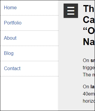
This is by far the most commonly used pattern for navigation both in RWD and mobile apps. It uses the hamburger icon as the trigger for the menu when tapped/clicked. When this happens, the main container slides to the right to reveal the menu on the left and slides back again to the left to hide it.
This example does not depend on JavaScript to work. However, it uses a few unsemantic elements to make it work: the <input> and <label> elements. In defense of this method, it uses the :checked pseudo-class, which has perfect support across the board.
Here's our HTML:
<!DOCTYPE html>
<html>
<head>
<meta charset="UTF-8">
<meta name="viewport" content="width=device-width, initial-scale=1">
<script src="https://ajax.googleapis.com/ajax/libs/jquery/2.1.3/jquery.min.js"></script>
</head>
<body>
<!-- Checkbox whose checked/unchecked states trigger the navigation -->
<input type="checkbox" id="nav-trigger" class="nav-trigger">
<!-- Hamburger icon -->
<label for="nav-trigger" class="label-trigger"><span>Menu</span></label>
<!-- Navigation -->
<nav role="navigation">
<ul class="menu">
<li><a href="#">Link 1</a></li>
<li><a href="#">Link 2</a></li>
<li><a href="#">Link 3</a></li>
<li><a href="#">Link 4</a></li>
<li><a href="#">Link 5</a></li>
</ul>
</nav>
<!-- Main container -->
<main class="main-container" role="main">
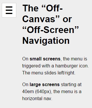
<h1>The "Off-Canvas" or "Off-Screen" Navigation</h1>
<p>On <strong>small screens</strong>, the menu is triggered with a hamburger icon. The menu slides left/right.</p>
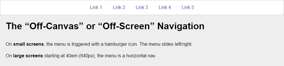
<p>On <strong>large screens</strong> starting at 40em (640px), the menu is a horizontal nav.</p>
</main>
</body>
</html>*, *:before, *:after { box-sizing: border-box; }
//Globals
html, body {
height: 100%;
width: 100%;
margin: 0;
}
//Mobile-first Media Query Mixin
@mixin forLargeScreens($media) {
@media (min-width: $media/16+em) { @content; }
}
//Mixin for animating the hamburger icon
@mixin animation-nav-icon ( $direction: left, $duration: .2s) {
transition: $direction $duration;
}
//Menu itself
.menu {
width: 100%;
height: 100%;
margin: 0;
padding: 0;
position: fixed;
top: 0;
right: 0;
bottom: 0;
left: 0;
z-index: 0;
list-style: none;
@include forLargeScreens(640) {
max-width: 980px;
min-height: 50%;
margin: 10px auto 0;
position: relative;
text-align: center;
border: #999 1px dotted;
}
//List items
li {
width: 100%;
border-bottom: 1px dotted #999;
@include forLargeScreens(640) {
display: inline;
border: none;
}
//Links themselves
a {
display: block;
padding: 1em;
color: #2963BD;
text-decoration: none;
@include forLargeScreens(640) {
display: inline-block;
}
}
}
}
//Main Container
.main-container {
max-width: 980px;
min-height: 100%;
margin: auto;
padding: 20px 0 20px 80px;
position: relative;
top: 0;
bottom: 100%;
left: 0;
z-index: 1;
background: #eee;
@include forLargeScreens(640) {
padding: 20px;
}
}
//Navigation Trigger - Hide the checkbox
.nav-trigger {
position: absolute;
clip: rect(0, 0, 0, 0);
}
//Label that triggers the checkbox
.label-trigger {
position: fixed;
left: 10px;
top: 10px;
z-index: 2;
height: 50px;
width: 50px;
cursor: pointer;
background: #fff;
border-radius: 2px;
border: 1px solid #ccc;
//Hamburger icon
&:before {
display: block;
padding-top: 25px;
text-align: center;
content: '≡';
font-size: 3em;
line-height: 0;
}
//Active hamburger icon
&.active {
background: #333;
color: #fff;
}
//Hide the term 'Menu' from displaying without sacrificing accessibility
span {
display: inline-block;
text-indent: -100%;
overflow: hidden;
white-space: nowrap;
}
}
//Animate the menu
.nav-trigger {
& + label {
@include animation-nav-icon;
//Hide the checkbox and label in large screens
@include forLargeScreens(640) {
display: none;
}
}
//Animate the label when checkbox is checked
&:checked + label {
left: 215px;
}
//Animate the main container when checkbox is checked
&:checked ~ .main-container {
left: 200px;
box-shadow: 0 0 5px 1px rgba(black, .15);
}
}
//Animate the main container
.main-container {
@include animation-nav-icon;
}
//Avoid horizontal scrollbars due to repositioning of elements
body, html { overflow-x: hidden; }
//Styling stuff not needed for demo
html, body { font-family: Arial, "Helvetica Neue", Helvetica, sans-serif; }
h1, p { margin: 0 auto 1em; }
p { line-height: 1.5; }$(function() {
//Set up the click behavior
$(".label-trigger").click(function() {
//Toggle the class .active on the hamburger icon
$(this).toggleClass("active");
});
});Let's take a look at the screenshots.
Here is what it looks like on small screens in the collapsed state:
Here is what it looks like in the expanded state:
This is what it looks like on large screens:
You can see a demo I created in CodePen at http://codepen.io/ricardozea/pen/fd504cbcf362069320d15a4ea8a88b27.
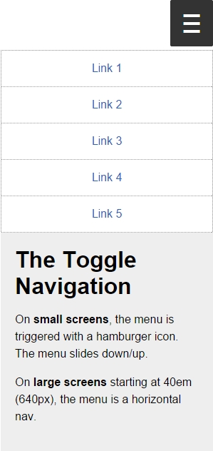
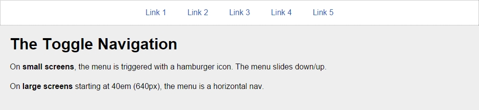
In the Toggle pattern, when the hamburger icon is tapped or clicked, the navigation bar slides down and the links are stacked. The navigation bar collapses when the hamburger icon is tapped again.
The HTML is as follows:
<!DOCTYPE html>
<html>
<head>
<meta charset="UTF-8">
<meta name="viewport" content="width=device-width, initial-scale=1">
<script src="https://ajax.googleapis.com/ajax/libs/jquery/2.1.3/jquery.min.js"></script>
</head>
<body>
<!-- Hamburger icon -->
<button class="menu-link"><span>Menu</span></button>
<!-- Navigation -->
<nav id="menu" class="menu" role="navigation">
<ul>
<li><a href="#">Link 1</a></li>
<li><a href="#">Link 2</a></li>
<li><a href="#">Link 3</a></li>
<li><a href="#">Link 4</a></li>
<li><a href="#">Link 5</a></li>
</ul>
</nav>
<!-- Main container -->
<main class="main-container" role="main">
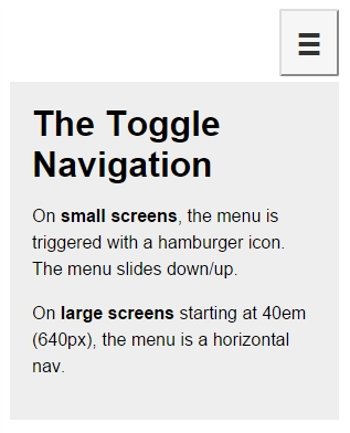
<h1>The Toggle Navigation</h1>
<p>On <strong>small screens</strong>, the menu is triggered with a hamburger icon. The menu slides down/up.</p>
<p>On <strong>large screens</strong> starting at 40em (640px), the menu is a horizontal nav.</p>
</main>
</body>
</html>*, *:before, *:after { box-sizing: border-box; }
//Mobile-first Media Query Mixin
@mixin forLargeScreens($media) {
@media (min-width: $media/16+em) { @content; }
}
//General Styling
.main-container, .menu {
width: 98%;
max-width: 980px;
margin: auto;
padding: 20px;
background: #eee;
}
//Link that triggers the menu
.menu-link {
//Change to float: left; if you want the hamburger menu on the left side
float: right;
margin: 0 1% 5px 0;
padding: 1.5em 1em 1em;
background: #f6f6f6;
line-height: 0;
text-decoration: none;
color: #333;
border-radius: 2px;
cursor: pointer;
//Hamburger icon
&:before {
display: block;
padding: 10px 0;
content: '≡';
font-size: 3em;
line-height: 0;
}
//Active hamburger icon
&.active {
background: #333;
color: #fff;
}
//Hide the term 'Menu' from displaying without sacrificing accessibility
span {
display: inline-block;
text-indent: -100%;
overflow: hidden;
white-space: nowrap;
}
//On large screens hide the menu trigger
@include forLargeScreens(640) {
display: none;
}
}
//If JavaScript is available, hide the menu.
.js .menu {
overflow: hidden;
max-height: 0;
@include forLargeScreens(640) {
max-height: inherit;
}
}
//Menu itself
.menu {
padding: 0;
clear: both;
transition: all .3s ease-out;
//Define height of the menu
&.active {
max-height: 17em;
}
//Normalize the unordered list and add a bit of styling
ul {
margin: 0;
padding: 0;
list-style-type: none;
border: 1px #999 dotted;
border-bottom: none;
text-align: center;
//In large screens remove the border
@include forLargeScreens(640) {
background: #fff;
}
}
//List items
li {
//Links themselves
a {
display: block;
padding: 1em;
border-bottom: 1px #999 dotted;
text-decoration: none;
color: #2963BD;
background: #fff;
@include forLargeScreens(640) {
border: 0;
background: none;
}
}
//On large screens make links horizontal
@include forLargeScreens(640) {
display: inline-block;
margin: 0 .20em;
}
}
}
//Styling stuff not needed for demo
body { font-family: Arial, "Helvetica Neue", Helvetica, sans-serif; }
p { line-height: 1.5; }
h1 { margin: 0; }The jQuery is as follows:
$(function() {
    //Add class .js to the body if JS is enabled
    $("body").addClass("js");
    //Set up the click behavior
    $(".menu-link").click(function() {
        //Toggle the class .active on the hamburger icon
        $(this).toggleClass("active");
       //Toggle the class .active on the menu to make it slide down/up
        $(".menu").toggleClass("active");
    });
});
Let's take a look at the screenshots.
Here is what it looks like on small screens in the collapsed state:
And here is the expanded state:
Here is what it looks like on large screens:
You can see a demo I created in CodePen at http://codepen.io/ricardozea/pen/e91a5e6ea456d41f4128d9bd405ccaa0.
You can also visit http://responsive-nav.com/ for a nice Toggle navigation functionality.
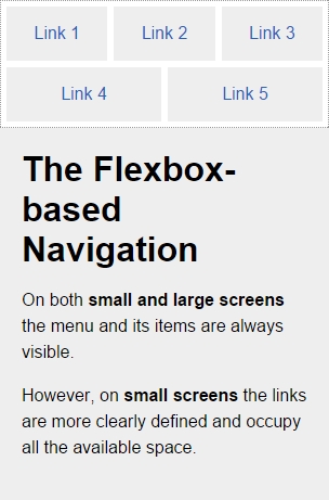
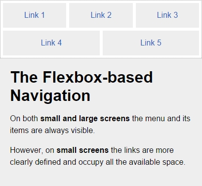
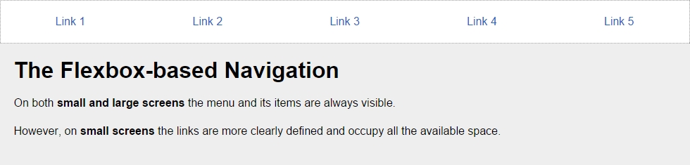
This custom solution using Flexbox is incredibly versatile and it doesn't necessarily require the use of media queries. The other two menu solutions (Toggle navigation and Off-Canvas navigation) do require media queries.
With this solution, the menu items adapt to the available space, making the target zones as large as possible, automatically enhancing the usability of the menu. Another major plus of this Flexbox-based solution is that it's not JavaScript dependent.
This is the HTML:
<!DOCTYPE html>
<html>
<head>
    <meta charset="UTF-8">
    <meta name="viewport" content="width=device-width, initial-scale=1">
</head>
<body>
    <nav role="navigation">
        <ul class="menu">
            <li><a href="#">Link 1</a></li>
            <li><a href="#">Link 2</a></li>
            <li><a href="#">Link 3</a></li>
            <li><a href="#">Link 4</a></li>
            <li><a href="#">Link 5</a></li>
        </ul>
    </nav>
    <!-- Main container -->
    <main class="main-container" role="main">
        <h1>The Flexbox-based Navigation</h1>
        <p>On both <strong>small and large screens</strong> the menu and its items are always visible.</p>
        <p>However, on <strong>small screens</strong> the links are more clearly defined and occupy all the available space.</p>
   </main>
</body>
</html>*, *:before, *:after { box-sizing: border-box; }
//Mobile-first Media Query Mixin
@mixin forLargeScreens($media) {
@media (min-width: $media/16+em) { @content; }
}
//Menu itself
.menu {
display: flex;
flex-wrap: wrap;
justify-content: space-around;
max-width: 980px;
margin: auto;
padding: 2px;
list-style: none;
border: #999 1px dotted;
//List items
li {
//Expand to use any available space
flex-grow: 1;
margin: 3px;
text-align: center;
flex-basis: 100%;
@include forLargeScreens(320) {
flex-basis: 30%;
}
@include forLargeScreens(426) {
flex-basis: 0;
}
//Links themselves
a {
display: block;
padding: 1em;
color: #2963bd;
text-decoration: none;
background: #eee;
@include forLargeScreens(426) {
background: none;
}
}
}
}
//Main Container
.main-container {
max-width: 980px;
margin: auto;
padding: 20px;
background: #eee;
}
//Styling stuff not needed for demo
body { margin: 8px; font-family: Arial, "Helvetica Neue", Helvetica, sans-serif; }
p { line-height: 1.5; }
h1 { margin: 0; }Let's take a look at the screenshots.
Here is what it looks like on small screens (320px):
Here is what it looks like on small screens (426px):
Here is what it looks like on a large screens (980px):
You can see a demo I created in CodePen at http://codepen.io/ricardozea/pen/022b38c6c395368ec4befbf43737e398.