Table of Contents for
Mastering Responsive Web Design
 Mastering Responsive Web Design
Published by
Packt Publishing, 2015
Mastering Responsive Web Design
Published by
Packt Publishing, 2015
- Cover
- Table of Contents
- Mastering Responsive Web Design
- Mastering Responsive Web Design
- Credits
- About the Author
- Acknowledgment
- About the Reviewers
- www.PacktPub.com
- Preface
- What you need for this book
- Who this book is for
- Conventions
- Reader feedback
- Customer support
- 1. Harness the Power of Sass for Responsive Web Design
- The basic concepts of Sass for RWD
- Summary
- 2. Marking Our Content with HTML5
- The
element - The
element - The
- The
element - The
- The
- Using WAI-ARIA landmark roles to increase accessibility
- A full HTML5 example page with ARIA roles and meta tags
- Output screenshots for desktop and mobile
- Summary
- 3. Mobile-first or Desktop-first?
- Sass mixins for the mobile-first and desktop-first media queries
- Dealing with legacy browsers
- How to deal with high-density screens
- Sometimes RWD is not necessarily the right solution
- Retrofitting an old website with RWD
- Retrofitting with AWD
- Retrofitting with RWD
- Summary
- 4. CSS Grids, CSS Frameworks, UI Kits, and Flexbox for RWD
- CSS grids
- CSS frameworks
- UI kits
- The pros and cons of CSS frameworks for RWD
- Creating a custom CSS grid
- Building a sample page with the custom CSS grid
- Stop using CSS grids, use Flexbox!
- Summary
- 5. Designing Small UIs Driven by Large Finger
- The posture patterns and the touch zones
- The nav icon – basic guidelines to consider for RWD
- The navigation patterns for RWD
- Summary
- 6. Working with Images and Videos in Responsive Web Design
- Third-party image resizing services
- The
element and the srcset and sizes attributes - Replacing 1x images with 2x images on the fly with Retina.js
- Making videos responsive
- The Vector Formats
- Summary
- 7. Meaningful Typography for Responsive Web Design
- Calculating relative font sizes
- Creating a Modular Scale for a harmonious typography
- Using the Modular Scale for typography
- Web fonts and how they affect RWD
- Sass mixin for implementing web fonts
- Using FlowType.js for increased legibility
- Summary
- 8. Responsive E-mails
- Don't overlook your analytics
- Recommendations for building better responsive e-mails
- Responsive e-mail build
- Third-party services
- Summary
- Index
Defining the features of the e-mail is also part of the build, so let's define those:
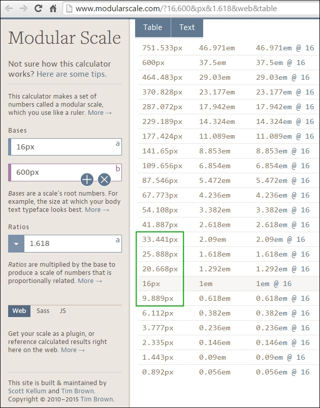
To build our Modular Scale, we're going to use the following values:
- Base one (16px): Which is our base font size.
- Base two (600px): Which is the maximum width of our e-mail.
- Ratio (1.618): The Golden ratio.
This Modular Scale can be found at http://www.modularscale.com/?16,600&px&1.618&web&table.
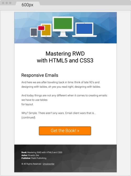
The following designs will help get a better picture of the e-mail on large and small screens. This is how it looks at 600px wide:
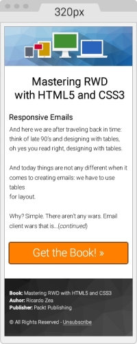
This is how the e-mail looks at its smallest size, 320px wide:
Let's get right down to business and build a responsive e-mail.
Let's start with the most basic template. Then, we're going to add to it the different things we need to have a sound template.
Here's the first take on the HTML with a few initial elements in the <head> section:
- Define the language of our document with the
langattribute, English in our case. - Since our design has a colored background, we need to give the
<html>and<body>elements a height of 100 percent. This makes both elements stretch to the full height of the viewport. Otherwise, the background will end where the bottom of the e-mail is and then the page will show a white background. - Add a
<title>tag. - Add the following meta tags:
- Character set UTF-8
- Viewport
- Make Internet Explorer use the latest rendering engine possible
- Remove the autostyling of phone numbers in OSX/iOS
- Who says we can't use the web fonts? Only a handful of e-mail clients support them, those that don't will just fallback to a system font in our font stack, very likely Arial or Helvetica. Let's use Roboto.
Here's the HTML:
<!DOCTYPE html>
<html lang="en" style="height: 100%;">
<head>
    <title>Mastering RWD with HTML5 and CSS3</title>
    <meta charset="utf-8">
    <!-- Responsive: Tell browsers that this template is optimized for small screens -->
    <meta name="viewport" content="width=device-width, initial-scale=1.0">
    <!-- IE: Make IE use its best rendering engine rather than Compatibility View mode -->
    <meta http-equiv="X-UA-Compatible" content="IE=edge">
    <!-- OSX/iOS: Remove auto styling of phone numbers -->
    <meta name="format-detection" content="telephone=no">
    <!-- Webfont from Google Fonts -->
    <link href='http://fonts.googleapis.com/css?family=Roboto:300,500' rel='stylesheet'>
</head>
<body style="height: 100%;">

</body>
</html>
Let's add the necessary CSS reset styles that will help keep a relatively uniform display across as many e-mail clients as possible.
The following list outlines what exactly we'll reset (also called normalizing) across several e-mail clients:
- Outlook (all versions):
- Force it to provide a View in browser link.
- Make it maintain any custom line heights defined.
- Remove spaces on left- and right-hand side of
<table>elements. - Fix the padding issues.
- OSX/iOS/Windows Mobile:
- Fix automatic increase of font size to 13px when fonts are small.
- Yahoo:
- Fix the paragraph issues.
- IE:
- Fix the resized images issue.
- Hotmail/Outlook.com:
- Make it display e-mails at full width.
- Force it to display normal line spacing.
- All e-mail clients:
- Remove the border around linked images.
Here's the embedded CSS:
<!DOCTYPE html>
<html lang="en" style="height: 100%;">
<head>
    <title>Mastering RWD with HTML5 and CSS3</title>
    <meta charset="utf-8">
    <!-- Responsive: Tell browsers that this template is optimized for small screens -->
    <meta name="viewport" content="width=device-width, initial-scale=1.0">
    <!-- IE: Make IE use its best rendering engine rather than Compatibility View mode -->
    <meta http-equiv="X-UA-Compatible" content="IE=edge">
    <!-- OSX/iOS: Remove auto styling of phone numbers -->
    <meta name="format-detection" content="telephone=no">
    <!-- Webfont from Google Fonts -->
    <link href='http://fonts.googleapis.com/css?family=Roboto:300,500' rel='stylesheet'>
    <style>
        /*Force Outlook to provide a "View in Browser" link.*/
        #outlook a { padding: 0; }
        body {
            width: 100% !important;
            margin: 0;
            padding: 0;
            /*Outlook: Make Outlook maintain any custom line heights defined.*/
            mso-line-height-rule: exactly;
            /*OSX/iOS/Windows Mobile: Fix automatic increasing of font size to 13px when fonts are small.*/
            -webkit-text-size-adjust: 100%;
            -ms-text-size-adjust: 100%;
        }
        /*Yahoo: Fix paragraph issue*/
        p { margin: 1em 0; }
        /*Outlook: Remove spaces on left and right side of a table elements.*/
        table {
            mso-table-lspace:0pt;
            mso-table-rspace:0pt;
        }
        /*Outlook 07, 10: Fix padding issue.*/
        table td { border-collapse: collapse; }
        img {
            outline: none;
            text-decoration: none;
            /*IE: Make resized images look fine.*/
            -ms-interpolation-mode: bicubic;
        }
        /*Remove border around linked images.*/
        a img { border: none; }
        /*Prevent Webkit and Windows Mobile platforms from changing default font sizes, while not breaking desktop design.*/
        /*Force Hotmail to display e-mails at full width.*/
        .ExternalClass{ width:100%; }
        /*Force Hotmail to display normal line spacing.*/
        .ExternalClass,
        .ExternalClass p,
        .ExternalClass span,
        .ExternalClass font,
        .ExternalClass td,
        .ExternalClass div {
            line-height: 100%;
        }
    </style>
</head>
<body style="height: 100%;">

</body>
</html>
With this basic template in place, let's start adding the content.
Building e-mails is pretty much a you gotta do what you gotta do! mentality. In other words, we do whatever we have to do to make things display as we want them to. Sometimes, we have to use nonbreaking spaces ( ) to separate things out, use the <br> tags to make things go to the next line, even use several <br> tags to create spaces between elements.
However, this does not mean that we're just going to throw all the good things we've learned out the window, no way.
Let's keep things as clean and lean as possible, nesting where necessary, and adding the necessary styles where required.
This is our outermost table container and it's always a good practice to have one. This table will allow us to handle any padding we want or need in our design, because adding padding on the <body> tag may not be a reliable approach.
We can also use this outer table to add a background color if our design has one. We're going to give this outer table a width and height of 100 percent.
We're also adding 20px padding in the cells; this will give the whole e-mail a bit of room to breathe, because it won't be touching the top and bottom edges of the viewport/panel it's going to be seen in. The code is as follows:
<body style="height: 100%;">
    <table width="100%" height="100%" cellpadding="20" cellspacing="0" border="0" bgcolor="#efefef" class="outer-container-table">
        <tr>
            <td align="center"> </td>
        </tr>
    </table>
</body>
We're declaring the width of this inner table with the HTML attribute width, rather than a width within an inline style. We're also adding a white background to this table so that our content sits over it and blocks the light gray background from the wide container.
The 1px border can be added using the border shorthand. Some say don't use CSS shorthands in e-mails! However, after testing several e-mail clients, the shorthand works just fine.
Adding a 10px margin at the top will help give the e-mail a bit more room. The code is as follows:
<body style="height: 100%;">
    <table width="100%" height="100%" cellpadding="20" cellspacing="0" border="0" bgcolor="#efefef" class="outer-container-table">
        <tr>
            <td align="center">
                <table width="600" cellpadding="0" cellspacing="0" border="0" bgcolor="white" align="center" class="inner-container-table" style="margin-top: 10px; border: #999999 1px solid;">
                    <tr>
                        <td></td>
                    </tr>
                </table>
            </td>
        </tr>
    </table>
</body>
Notice how I used the term white for the background color on the .inner-container-table? That's because I want to show you that you can also use HTML color names instead of hexadecimal values. All e-mail clients support this feature. It's also more descriptive.
There are plenty of resources out in the open Web listing all the HTML color names, but I like this one in particular because it groups the color names by categories. So, it is easier to use in a design: http://html-color-codes.info/color-names/.
Inside the empty <td> element all we need to do is add the <img> tag that calls the header image.
Images are inline-block elements by default. In order to avoid unwanted behavior, make sure the image has display: block; and width: 100%; elements as shown here:
<body style="height: 100%;">
   <table width="100%" cellpadding="0" cellspacing="20" border="0" bgcolor="#efefef" style="height: 100%;" class="outer-container-table">
      <tr>
         <td align="center">
            <table width="580" cellpadding="0" cellspacing="0" border="0" bgcolor="white" align="center" class="inner-container-table" style="margin-top: 10px; border: #999999 1px solid;">
               <tr>
                  <td>
                     <img src="https://s3-us-west-2.amazonaws.com/s.cdpn.io/9988/header-email-devices.png" alt="Mastering RWD with HTML and CSS3" style="display: block; width: 100%;">
                  </td>
               </tr>
            </table>
         </td>
      </tr>
   </table>
</body>This is where most of the magic happens because we are now creating the body of the e-mail, including the footer. A few things to note:
- The width of the first table is 88 percent. I did this to show you that you can be arbitrary if you want to. Moreover, you don't have to use pixels every time and you can also use other values different than 100 percent when using percentages.
- In some parts, I'm liberally using the
<br>tags. This is because the spacing between some elements is where I wanted them to be. Under other circumstances, this would be a pretty bad practice; in e-mail, doing this is quite useful and very common. - We're going to use three rows: one for the main header, one for the body, and one for the Call to Action (CTA) button. Doing this will allow us to handle each section independently, without having to worry about affecting the other two when debugging or styling.
- The footer will be separated from the main content structure, so we can handle the background image easily.
The markup is as follows:
<body style="height: 100%;">
<table width="100%" height="100%" cellpadding="20" cellspacing="0" border="0" bgcolor="#efefef" class="outer-container-table">
<tr>
<td align="center">
<table width="600" cellpadding="0" cellspacing="0" border="0" bgcolor=" white" align="center" class="inner-container-table" style="margin-top: 10px; border: #999999 1px solid;">
<tr>
<td>
<img src="https://s3-us-west-2.amazonaws.com/s.cdpn.io/9988/header-email-devices.png" alt="Mastering RWD with HTML and CSS3" style="display: block; width: 100%;">
</td>
</tr>
<tr>
<td align="center">
<table width="88%" cellpadding="0" cellspacing="0" border="0" align="center" class="content-table">
<tr>
<td align="center">
<table width="100%" cellpadding="10" cellspacing="0" border="0" align="center">
<tr>
<td style="font-family: Roboto, Arial, Helvetica, san-serif; font-weight: 500; font-size: 33.441px; text-align: center;"><br>Mastering RWD<br>with HTML5 and CSS3</td>
</tr>
<tr>
<td>
<h2 style="font-family: Roboto, Arial, Helvetica, san-serif; font-weight: 500; font-size: 25.888px;">Responsive Emails</h2>
<p style="font-family: Roboto, Arial, Helvetica, san-serif; font-weight: 300; font-size: 16px; line-height: 26px">And here we sare after traveling back in time: think of late 90's and designing with tables, oh yes you read right, designing with tables.</p>
<p style="font-family: Roboto, Arial, Helvetica, san-serif; font-weight: 300; font-size: 16px; line-height: 26px"> And today things are not any different when it comes to creating e-mails: we have to use tables for layout.</p>
<p style="font-family: Roboto, Arial, Helvetica, san-serif; font-weight: 300; font-size: 16px; line-height: 26px">Why? Simple. There aren't any wars. Email client wars that is… (continued).</p>
</td>
</tr>
<tr>
<td style="font-family: Roboto, Arial, Helvetica, san-serif; font-weight:300; font-size: 25.888px; text-align:center;">
<br>
<a href="#" target="_blank" style="padding: 20px 30px; border: #663300 2px solid; border-radius: 5px; text-decoration: none; color: white; background: #ff8000;" class="main-cta">Get the Book! »</a>
<br><br><br>
</td>
</tr>
</table>
</td>
</tr>
</table>
</td>
</tr>
<tr>
<td>
<table width="100%" cellpadding="0" cellspacing="0" border="0" class="footer-table-ctnr" style="background: #666666; background: linear-gradient(#333, #666);">
<tr>
<td background="https://s3-us-west-2.amazonaws.com/s.cdpn.io/9988/trianglify-black.png">
<table width="95%" align="center" cellpadding="30" cellspacing="0" border="0">
<tr>
<td style="font-family: Roboto, Arial, Helvetica, san-serif; font-weight: 300; font-size: 12px; line-height: 20px; color: white;">
<p style="margin: 0;"><span style="font-weight: 500;">Book:</span> Mastering RWD with HTML5 and CSS3</p>
<p style="margin: 0;"><span style="font-weight: 500;">Author:</span> Ricardo Zea</p>
<p style="margin: 0;"><span style="font-weight: 500;">Publisher:</span> Packt Publishing</p>
<br>
<p>© All Rights Reserved - <a href="#" style="color: white;">Unsubscribe</a></p>
</td>
</tr>
</table>
</td>
</tr>
</table>
</td>
</tr>
</table>
</td>
</tr>
</table>
</body>At this point, this is what the e-mail looks like:
And we're done! Are we? Not yet, we still have a few things to do:
- Add the Outlook 2007/2010/2013 Conditional Comments hacks for the background in the footer and the CTA button.
- Add the media queries.
- Add the Outlook web font fallback style.
Just like IE in the times of table-based layouts, Outlook rules the landscape of e-mail clients in the desktop. So we can't ignore this client when creating e-mails.
That's all fine and dandy; the problem is that most Outlook versions have very poor HTML rendering capabilities, so HTML hacks via Conditional Comments are (unfortunately) necessary. They are not difficult to implement; you just have to know when to implement them.
Conditional Comments are most useful for background images and large CTA buttons. In our example, we have both: the black/gray triangles background pattern in the footer and the orange Get the Book » CTA that is Call To Action.
In the following markup, you'll be able to note the following points:
- The Conditional Comments wrap only the element in case. In other words, ensure that you don't wrap more elements than required, otherwise, we'll be creating more problems than solutions.
- Both the footer and the CTA buttons require us to edit things in two places: the element itself and inside the Conditional Comments.
- E-mail Conditional Comments look quite obscure; they don't adhere to any standards, since they are proprietary technology. Consider them more like a patch than part of progressive enhancement. They are a flat-out hack.
- Editing Conditional Comments isn't too difficult. The parts that are customizable are either inline CSS properties/values, or a
srcattribute for images—nothing we haven't seen before.
<td background="https://s3-us-west-2.amazonaws.com/s.cdpn.io/9988/trianglify-black.png"> <!--[if gte mso 9]> <v:rect xmlns:v="urn:schemas-microsoft-com:vml" strokecolor="none" style="width: 600px; height: 184px;"> <v:fill type="frame" src="https://s3-us-west-2.amazonaws.com/s.cdpn.io/9988/trianglify-black.png"></v:fill> </v:rect> <v:shape style="position: absolute; width: 600px; height: 184px;"> <![endif]--> <table width="95%" align="center" cellpadding="30" cellspacing="0" border="0"> <tr> <td style="font-family: Roboto, Arial, Helvetica, san-serif; font-weight: 300; font-size: 12px; line-height: 20px; color: white;"> <p style="margin: 0;"><span style="font-weight: 500;">Book:</span> Mastering RWD with HTML5 and CSS3</p> <p style="margin: 0;"><span style="font-weight: 500;">Author:</span> Ricardo Zea</p> <p style="margin: 0;"><span style="font-weight: 500;">Publisher:</span> Packt Publishing</p> <br> <p>© All Rights Reserved - <a href="#" style="color: white;">Unsubscribe</a></p> </td> </tr> </table> <!--[if gte mso 9]> </v:shape> <![endif]--> </td>
The following snippet was adapted from Eli Dickinson's post How to make HTML e-mail buttons that rock from IndustryDive.com (http://www.industrydive.com/blog/how-to-make-html-email-buttons-that-rock/).
Here's what the markup looks like:
<td style="font-family: Roboto, Arial, Helvetica, san-serif; font-weight:300; font-size: 25.888px; text-align: center;">
<br>
<!--[if mso]>
<v:roundrect xmlns:v="urn:schemas-microsoft-com:vml" xmlns:w="urn:schemas-microsoft-com:office:word" href="http:#" style="height: 60px; width: 300px; v-text-anchor: middle;" arcsize="10%" stroke="f" fillcolor="#ff8000">
<center style="color: #ffffff; font-family: Roboto, Arial, Helvetica, san-serif; font-weight:300; font-size: 25.888px;">
Get the Book! »
</center>
</v:roundrect>
<![endif]-->
<![if !mso]>
<a href="#" target="_blank" style="padding: 20px 30px; border: #663300 2px solid; border-radius: 5px; text-decoration: none; color: white; background: #ff8000;" class="main-cta">Get the Book! »</a>
<![endif]-->
<br><br><br>
</td>The amount of code used in the media queries for this e-mail is minimal. This is the result of having a solid foundation of features before any HTML or CSS was created.
The things that made this e-mail a solid build are listed as follows:
- Setting a typographic Modular Scale.
- Keeping the layout to a single column.
- Building for the most problematic e-mail client first.
- Using progressive enhancement.
- Knowing where to apply Conditional Comments.
The media queries are simply as shown here:
/*Responsive Styles*/
@media (max-width: 380px) {
    .main-cta { padding:10px 30px !important; white-space: nowrap !important; }
}
@media (max-width: 600px) {
    .inner-container-table { width: 95% !important; }
    .footer-table-ctnr td { padding: 10px 0 10px 5px !important; }
}Here's what we see in the media queries:
- Since we are using the desktop-first approach, we use the
max-widthproperty. - We see a media query at 380px, because the orange CTA looks a bit thick in small screens at this width. So, we reduce the top and bottom padding from 20px to 10px.
- We also add a
white-space: nowrap !important;element for good measure and avoid having the button wrap to a second line. - Once the viewport hits 600px, we're going to make the
inner-container-table95 percent wide. This will give the e-mail a bit of padding on the sides, allowing it to breathe and not feel boxed in such a small space. - Then, we're going to reduce the padding on the table in the footer. This helps use a bit more of the available space while keeping the credits in a single line each.
Outlook won't use any of the fallback fonts in the font stack. It will just use Times New Roman and sometimes this is not what we intend.
So using a specific style within Conditional Comments to target Outlook is the way to solve this problem. This style should go after the closing the </style> tag of the main embedded style sheet.
Here's what it looks like:
<!--[if mso]>
    <style>
    /* Make Outlook fallback to Arial rather than Times New Roman */
    h1, h2, p { font-family: Arial, sans-serif; }
    </style>
<![endif]-->
And that's it! Really, it is. Here's a demo I created in CodePen: http://codepen.io/ricardozea/pen/d11a14e6f5eace07d93beb559b771263
This e-mail was tested on the following e-mail clients and platforms:
- Desktop:
- Outlook 2010
- Gmail
- Yahoo! Mail
- Outlook.com
- Mobile (iPhone):
- Mail App
- Gmail App (mobile-friendly view)
- Gmail App (original view)
- Yahoo Mail App
- Mobile (Android):
- Gmail App
Here's an image of the e-mail on various desktop and mobile clients:
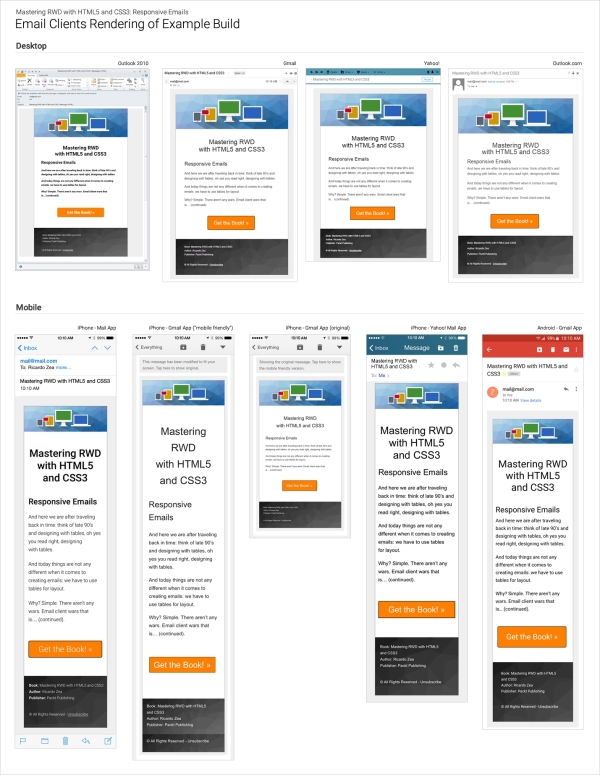
Here, a few of the e-mail clients, both desktop and mobile, were actually able to pick up Roboto, the web font we used. The rest of them used Arial from the font stack, which was our plan anyway.
On desktop, surprisingly, Outlook 2010 was the only one able to render Roboto—albeit the font looks bolder than it really is—yet it still was the only one.
On mobile, iPhone's mail app and Gmail on Android were the ones that were capable of using Roboto.