Table of Contents for
Mastering Responsive Web Design
 Mastering Responsive Web Design
Published by
Packt Publishing, 2015
Mastering Responsive Web Design
Published by
Packt Publishing, 2015
- Cover
- Table of Contents
- Mastering Responsive Web Design
- Mastering Responsive Web Design
- Credits
- About the Author
- Acknowledgment
- About the Reviewers
- www.PacktPub.com
- Preface
- What you need for this book
- Who this book is for
- Conventions
- Reader feedback
- Customer support
- 1. Harness the Power of Sass for Responsive Web Design
- The basic concepts of Sass for RWD
- Summary
- 2. Marking Our Content with HTML5
- The
element - The
element - The
- The
element - The
- The
- Using WAI-ARIA landmark roles to increase accessibility
- A full HTML5 example page with ARIA roles and meta tags
- Output screenshots for desktop and mobile
- Summary
- 3. Mobile-first or Desktop-first?
- Sass mixins for the mobile-first and desktop-first media queries
- Dealing with legacy browsers
- How to deal with high-density screens
- Sometimes RWD is not necessarily the right solution
- Retrofitting an old website with RWD
- Retrofitting with AWD
- Retrofitting with RWD
- Summary
- 4. CSS Grids, CSS Frameworks, UI Kits, and Flexbox for RWD
- CSS grids
- CSS frameworks
- UI kits
- The pros and cons of CSS frameworks for RWD
- Creating a custom CSS grid
- Building a sample page with the custom CSS grid
- Stop using CSS grids, use Flexbox!
- Summary
- 5. Designing Small UIs Driven by Large Finger
- The posture patterns and the touch zones
- The nav icon – basic guidelines to consider for RWD
- The navigation patterns for RWD
- Summary
- 6. Working with Images and Videos in Responsive Web Design
- Third-party image resizing services
- The
element and the srcset and sizes attributes - Replacing 1x images with 2x images on the fly with Retina.js
- Making videos responsive
- The Vector Formats
- Summary
- 7. Meaningful Typography for Responsive Web Design
- Calculating relative font sizes
- Creating a Modular Scale for a harmonious typography
- Using the Modular Scale for typography
- Web fonts and how they affect RWD
- Sass mixin for implementing web fonts
- Using FlowType.js for increased legibility
- Summary
- 8. Responsive E-mails
- Don't overlook your analytics
- Recommendations for building better responsive e-mails
- Responsive e-mail build
- Third-party services
- Summary
- Index
We just saw how using AWD is accomplished, using pixels. With RWD and a very simple equation, we can retrofit a site using relative units, in our case percentages. Not to mention it will be a lot easier than using AWD.
Discovered/created by Ethan Marcotte, who coined the term Responsive Web Design, the RWD magic formula is a very simple equation:
(target ÷ context) x 100 = result %
Before we start turning pixels into percentages, we need to see which width our context is going to be.
Our context is going to be the main container of the page .container_12, which has a maximum width of 980px. However, there's a catch involving the main container and the columns that will turn this 980px context into 960px. Notice the 10px left-right padding on the .container_12 section and the 10px left-right margin in the .grid rules:
.container_12 {
    width: 980px;
    padding: 0 10px;
    margin: auto;
}
.grid {
    &_1, &_2, &_3, &_4, &_5, &_6, &_7, &_8, &_9, &_10, &_11, &_12 {
      float: left;
      margin: 0 10px;
    }
}
The 10px left-right margin in the .grid rule means that the widths of all the columns have an additional 20px. So, for example, the header and footer that are 940px wide are really 960px wide. The box-sizing: border-box; property only accounts for subtracting what's inside the box model (padding), not what's outside (margin).
One solution would be to remove the 10px left-right padding on .container_12 and increase the left-right margin in the .grid rule to 20px in order to keep the gutters; otherwise, the columns would touch.
Now, the gutters become wider and this may not be intended for design purposes, and—believe it or not—somehow an extra 1px is added to the widest containers. In our case, it is added to the header and footer.
As a designer, I know I do not want to deal with any of those issues if I don't have to.
The second solution is simpler: make the context 960px. This way, we can remove the 10 extra pixels globally without affecting the integrity of the main container and the columns, and the resulting values are almost the same since we're getting percentages.
In other words: (960px ÷ 980px) x 100 = 97.95918367346939% (97.95%)
It's practically the same as: (940px ÷ 960px) x 100 = 97.91666666666667% (97.91%)
In the second solution, the 1px issue does happen, but happens at random widths when resizing the browser. However, the 1px issue is permanent with the first solution, regardless of the browser's width.
With this part clear, we are then going to turn all pixel-based widths into percentages using 960px as their context.
Both the Header and Footer sections have the same width, 940px. Knowing that their context is 960px, let's go ahead and find their widths in percentages using the magic formula: (940px ÷ 960px) x 100 = 97.91666666666667%.
You might be asking yourselves, "are that many decimals necessary?" Not all of them, but at least two are recommended.
So we end up with the Header and Footer sections of 97.91 percent.
Some developers recommend using all the decimals and letting the browser decide how many it wants to use. In the past, I decided to challenge this recommendation and use only two decimals to see what happened. Since I started using two decimals, I haven't experienced any unwanted behavior or width issues whatsoever in any browser.
Firefox and IE11 trim the excess decimals to two. Chrome, on the other hand, leaves all the decimals. I recommend using no less than two decimals, which is what we're going to use in the book to keep things simple and short. However, if you prefer to use all the decimals, by all means, go for it! At this point, it is a matter of personal preference.
To find the width of the Nav section in percentages, we use 960px as its context as well: (220px ÷ 960px) x 100 = 22.91666666666667%.
Using two decimals, we end up with a Nav section of 22.91 percent.
To find out the width of the Content section in percentages, our formula looks almost identical. The only difference is that we are changing the first value which corresponds to the width of the Content section in pixels: (700px ÷ 960px) x 100 = 72.91666666666667%.
Using only two decimals, our final value is a Content section of 72.91 percent.
This is what our initial retrofitting RWD SCSS file starts to look like:
.container_12 {
    .grid_12 { //Header and Footer sections
      width: 97.91%;
    }
    .grid_3 { //Nav section
      width: 22.91%;
    }
    .grid_9 { //Content section
       width: 72.91%;
    }
}
Now, let's take a step back and address a few other pixel-based widths before we continue. Remember the 10px padding to the left and the right of the main container .container_12? We need to turn those 10px into percentages as well.
With our magic formula, we do it like this:
(10px ÷ 960px) x 100 = 1.041666666666667%.
Using only two decimals, our final value is a left and right padding of 1.04 percent.
Let's add this value to our SCSS:
.container_12 {
    width: 980px;
    padding: 0 1.04%;
    margin: auto;
}
.container_12 {
    .grid_12 { //Header and Footer sections
      width: 97.91%;
    }
    .grid_3 { //Nav section
      width: 22.91%;
    }
    .grid_9 { //Content section
       width: 72.91%;
    }
}
Also, all our columns have a 10px margin to the left and right. Since we already know that 10px is 1.04 percent, let's add this value to all our columns in our SCSS:
.container_12 {
    width: 980px;
    padding: 0 1.04%;
    margin: auto;
}
.grid {
    &_1, &_2, &_3, &_4, &_5, &_6, &_7, &_8, &_9, &_10, &_11, &_12 {
      float: left;
      margin: 0 1.04%;
    }
}
.container_12 {

    .grid_12 { //Header and Footer sections
      width: 97.91%;
    }
    .grid_3 { //Nav section
      width: 22.91%;
    }
    .grid_9 { //Content section
       width: 72.91%;
    }
}
Now, we have a browser window 1024px wide, a layout 980px wide, and all the columns at their corresponding percentage values. In reality, this is practically impossible without looking at the code to visually tell the differences between the fixed width and the percentage-based layouts.
We're doing good here!
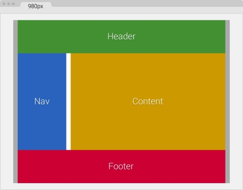
Let the fun begin. Let's add our first media query.
The following media query is aimed at 768px:
.container_12 {
width: 980px;
padding: 0 1.04%;
margin: auto;
}
.grid {
&_1, &_2, &_3, &_4, &_5, &_6, &_7, &_8, &_9, &_10, &_11, &_12 {
float: left;
margin: 0 1.04%;
}
}
.container_12 {
@include forSmallScreens(980px) {
width: 768px;
}
.grid_12 { //Header and Footer sections
width: 97.91%;
}
.grid_3 { //Nav section
width: 22.91%;
}
.grid_9 { //Content section
width: 72.91%;
}
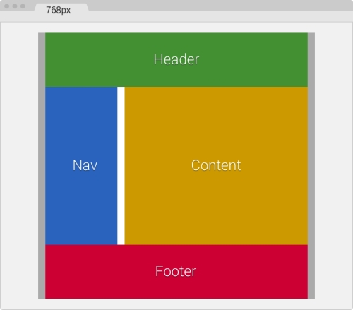
}Since the widths of the Header, Footer, Nav, and Content sections, their paddings, and their margins are set in percentages now, we don't have to declare any media queries for them—at least not yet because the layout hasn't changed.
When we resize our browser window, the Header, Footer, Nav, and Content sections automatically respond, shrink proportionally, snap properly, and fit the new width of the main container .container_12 without breaking the layout. This is shown in the following screenshot:
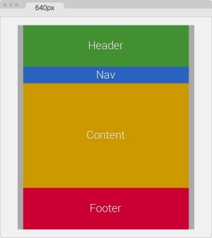
Let's add another breakpoint.
In the following breakpoint (640px), our layout is going to change to a single column. So we are going to add a new media query that will make the Nav and Content sections as wide as the Header and Footer sections, and make them stack on top of each other.
The following media query is aimed at 640px and makes the Nav and Content sections full width:
.container_12 {
    width: 980px;
    padding: 0 1.04%;
    margin: auto;
}
.grid {
    &_1, &_2, &_3, &_4, &_5, &_6, &_7, &_8, &_9, &_10, &_11, &_12 {
        float: left;
        margin: 0 1.04%;
    }
}
.container_12 {
    @include forSmallScreens(980px) {
        width: 768px;
    }
    @include forSmallScreens(768px) {
        width: 640px;
    }
    .grid_12 { //Header and Footer sections
      width: 97.91%;
    }
    .grid_3 { //Nav section
      width: 22.91%;
    }
    .grid_9 { //Content section
      width: 72.91%;
    }
    .grid_3, .grid_9 { //Nav and Content sections
        @include forSmallScreens(640px) {
            width: 97.91%;
        }
    }
}
Ok, we now have a single-column layout. Not bad, not bad!
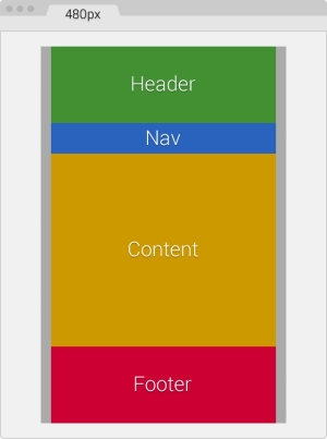
We are now going as small as 480px and the one-column layout won't change, only the widths of all the containers will change.
The following media query is aimed at 480px:
.container_12 {
  width: 980px;
  padding: 0 1.04%;
  margin: auto;
}
.grid {
    &_1, &_2, &_3, &_4, &_5, &_6, &_7, &_8, &_9, &_10, &_11, &_12 {
      float: left;
      margin: 0 1.04%;
    }
}
.container_12 {
    @include forSmallScreens(980px) {
      width: 768px;
    }
    @include forSmallScreens(768px) {
      width: 640px;
    }
    @include forSmallScreens(640px) {
      width: 480px;
    }
    .grid_12 { //Header and Footer sections
      width: 97.91%;
    }
    .grid_3 { //Nav section
      width: 22.91%;
      @include forSmallScreens(640px) {
        height: 50px; //This is only for styling
      }
    }
    .grid_9 { //Content section
       width: 72.91%;
    }
    .grid_3, .grid_9 { //Nav and Content sections
      @include forSmallScreens(640px) {
        width: 97.91%;
      }
    }
}
Our layout is getting narrower and all we needed to do was add a new media query and that was it! No need to mess around with the other containers; they all adapt perfectly to any width we define.
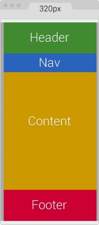
Finally, we address the 320px width without modifying the one-column layout. We remove the padding on .container_12 to make use of all the available screen real estate.
The following media query is aimed at 320px:
.container_12 {
    width: 980px;
    padding: 0 1.04%;
    margin: auto;
}
.grid {
    &_1, &_2, &_3, &_4, &_5, &_6, &_7, &_8, &_9, &_10, &_11, &_12 {
    float: left;
    margin: 0 1.04%;  }
}
.container_12 {
    @include forSmallScreens(980px) {
      width: 768px;
    }
    @include forSmallScreens(768px) {
      width: 640px;
    }
    @include forSmallScreens(640px) {
      width: 480px;
    }
    @include forSmallScreens(480px) {
      width: 320px; padding: 0;
    }
    .grid_12 { //Header and Footer sections
      width: 97.91%;
    }
    .grid_3 { //Nav section
      width: 22.91%;
      @include forSmallScreens(640px) {
        height: 50px; //This is only for styling
      }
    }
    .grid_9 { //Content section
       width: 72.91%;
    }
    .grid_3, .grid_9 {
      @include forSmallScreens(640px) {
        width: 97.91%;
      }
    }
}
Once more, we do not have to add anything to the Header, Footer, Nav, and Content sections, since all of them are now 97.91 percent wide. This makes them responsive and we don't have to worry about anything else.
The final SCSS, combining all breakpoints and widths, is as follows:
.container_12 {
    width: 980px;
    padding: 0 1.04%;
    margin: auto;
}
.grid {
    &_1, &_2, &_3, &_4, &_5, &_6, &_7, &_8, &_9, &_10, &_11, &_12 {
        float: left;
        margin: 0 1.04%;
    }
}
.container_12 {
    @include forSmallScreens(980px) {
        width: 768px;
    }
    @include forSmallScreens(768px) {
        width: 640px;
    }
    @include forSmallScreens(640px) {
        width: 480px;
    }
    @include forSmallScreens(480px) {
        width: 320px; padding: 0;
    }
    .grid_12 { //Header and Footer sections
      width: 97.91%;
    }
    .grid_3 { //Nav section
      width: 22.91%;
    }
    .grid_9 { //Content section
      width: 72.91%;
    }
    .grid_3, .grid_9 { //Nav and Content sections
        @include forSmallScreens(640px) {
            width: 97.91%;
        }
    }
}
It compiles to the following CSS:
.container_12 {
    width: 980px;
    padding: 0 1.04%;
    margin: auto;
}

.grid_1, .grid_2, .grid_3, .grid_4, .grid_5, .grid_6, .grid_7, .grid_8, .grid_9, .grid_10, .grid_11, .grid_12 {
    float: left;
    margin: 0 1.04%;
}

@media (max-width: 980px) {
    .container_12 {
      width: 768px;
    }
}
@media (max-width: 768px) {
    .container_12 {
      width: 640px;
    }
}
@media (max-width: 640px) {
    .container_12 {
      width: 480px;
    }
}
@media (max-width: 480px) {
    .container_12 {
      width: 320px;
      padding: 0;
    }
}
.container_12 .grid_12 {
    width: 97.91%;
}
.container_12 .grid_3 {
    width: 22.91%;
}
.container_12 .grid_9 {
    width: 72.91%;
}
@media (max-width: 640px) {
    .container_12 .grid_3, .container_12 .grid_9 {
      width: 97.91%;
    }
}
As you can see, it's a lot less code using RWD than AWD to retrofit a site. Granted, these examples are an extreme simplification of a site/app layout, but now you are aware of the basic concepts of each technique when the time to make the call of using AWD or RWD knocks on your door.