Table of Contents for
Mastering Responsive Web Design
 Mastering Responsive Web Design
Published by
Packt Publishing, 2015
Mastering Responsive Web Design
Published by
Packt Publishing, 2015
- Cover
- Table of Contents
- Mastering Responsive Web Design
- Mastering Responsive Web Design
- Credits
- About the Author
- Acknowledgment
- About the Reviewers
- www.PacktPub.com
- Preface
- What you need for this book
- Who this book is for
- Conventions
- Reader feedback
- Customer support
- 1. Harness the Power of Sass for Responsive Web Design
- The basic concepts of Sass for RWD
- Summary
- 2. Marking Our Content with HTML5
- The
element - The
element - The
- The
element - The
- The
- Using WAI-ARIA landmark roles to increase accessibility
- A full HTML5 example page with ARIA roles and meta tags
- Output screenshots for desktop and mobile
- Summary
- 3. Mobile-first or Desktop-first?
- Sass mixins for the mobile-first and desktop-first media queries
- Dealing with legacy browsers
- How to deal with high-density screens
- Sometimes RWD is not necessarily the right solution
- Retrofitting an old website with RWD
- Retrofitting with AWD
- Retrofitting with RWD
- Summary
- 4. CSS Grids, CSS Frameworks, UI Kits, and Flexbox for RWD
- CSS grids
- CSS frameworks
- UI kits
- The pros and cons of CSS frameworks for RWD
- Creating a custom CSS grid
- Building a sample page with the custom CSS grid
- Stop using CSS grids, use Flexbox!
- Summary
- 5. Designing Small UIs Driven by Large Finger
- The posture patterns and the touch zones
- The nav icon – basic guidelines to consider for RWD
- The navigation patterns for RWD
- Summary
- 6. Working with Images and Videos in Responsive Web Design
- Third-party image resizing services
- The
element and the srcset and sizes attributes - Replacing 1x images with 2x images on the fly with Retina.js
- Making videos responsive
- The Vector Formats
- Summary
- 7. Meaningful Typography for Responsive Web Design
- Calculating relative font sizes
- Creating a Modular Scale for a harmonious typography
- Using the Modular Scale for typography
- Web fonts and how they affect RWD
- Sass mixin for implementing web fonts
- Using FlowType.js for increased legibility
- Summary
- 8. Responsive E-mails
- Don't overlook your analytics
- Recommendations for building better responsive e-mails
- Responsive e-mail build
- Third-party services
- Summary
- Index
Unlike RWD where the widths are fluid and elastic (ems and percentages), hence the term relative units, in AWD, the widths are fixed (pixels). Hence, we use the term absolute units and elements will snap to these fixed widths when we resize our browser window.
In AWD, we use pixels for practically every width, even our media queries.
The first thing we're going to do in the styles.scss file is to import the partial _980gs.scss file:
//Retrofitting with Adaptive Web Design
@import "980gs";
Then, we're going to include our simple desktop-first mixin to handle the media queries. However, remember I mentioned before how this is mixin is scalable and we could make it compile pixel-based values if we wanted to? All we need to do is remove the value /16+em from the division $media/16+em:
//Retrofitting with Adaptive Web Design
@import "980gs";

//Desktop-first Media Query Mixin
@mixin forSmallScreens($media) {
    @media (max-width: $media) { @content; }
}
The following rules are merely for styling purposes in order to accomplish the same design we saw in the screenshot before:
//Retrofitting with Adaptive Web Design
@import "980gs";

//Desktop-first Media Query Mixin
@mixin forSmallScreens($media) {
    @media (max-width: $media) { @content; }
}

//Basic styling
.container_12 {
    background: #aaa;
    font-size: 30px;
    text-shadow: 0 1px 1px rgba(black,.5);
}
header { background: #429032; }
nav { background: #2963BD; }
section { background: #c90; }
footer { background: #c03; }

//Give heights to elements for better perception of sections
header, footer { height: 150px; }
nav, section { height: 440px; }
At this point, our page is 980px wide and it looks like the screenshot we initially saw.
Let's define the widths at which we are going to make our base page snap to:
- At 980px, we're going to snap the page to 768px.
- At 768px, we're going to snap the page to 640px.
- At 640px, we're going to snap the page to 480px.
- At 480px, we're going to snap the page to 320px.
This is where the fun begins. Let's start retrofitting this page by creating the media queries for each section.
The following media queries are aimed at 768px:
.container_12 {
  @include forSmallScreens(980px) {
      width: 768px;
  }
    .grid_12 { //Header and Footer sections
      @include forSmallScreens(980px) {
        width: 728px;
    }
  }
  .grid_3 { //Nav section
    @include forSmallScreens(980px) {
      width: 200px;
    }
  }
  .grid_9 { //Content section
    @include forSmallScreens(980px) {
      width: 508px;
    }
  }
}
Admittedly, it is a bit hard to perceive the difference in the book from 980px to 768px, but believe me, the following screenshot fully represents a browser window 980px wide and a page 768px wide:
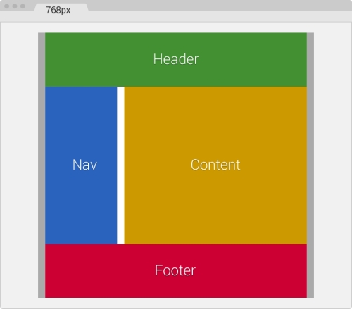
As you can see, the moment the screen is 980px, the width of our main container (.container_12) goes from 980px to 768px. Our main container has 10px padding to the left and the right, so the widths of all other sections should add up to match 748px.
Let's take a look.
Our Header and Footer that use the same class .grid_12 are now 728px wide. So if we add: 728px + 10px left margin + 10px right margin = 748px.
If we add the widths of our Nav (.grid_3) and Content (.grid_9) sections:
- 200px Nav + 508px Content = 708px
- 708px + 20px gutter = 728px
- 728px + 10px left margin on Nav + 10px right margin on Content = 748px
The following media queries are aimed at 640px:
.container_12 {
    @include forSmallScreens(980px) {
      width: 768px;
  }
    @include forSmallScreens(768px) {
      width: 640px;
    }
    .grid_12 { //Header and Footer sections
      @include forSmallScreens(980px) {
        width: 728px;
      }
      @include forSmallScreens(768px) {
        width: 600px;
      }
    }
    .grid_3 { //Nav section
      @include forSmallScreens(980px) {
        width: 200px;
      }
      @include forSmallScreens(768px) {
        width: 160px;
      }
    }
    .grid_9 { //Content section
      @include forSmallScreens(980px) {
        width: 508px;
      }
      @include forSmallScreens(768px) {
        width: 420px;
      }
    }
}
Ok, this layout is now a single column page. We're starting to see some results. Nice!
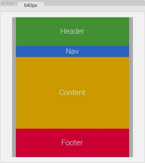
Again, remember that our main container has 10px padding to the left and the right, thus the widths of all other sections should add up to match 620px.
Let's make sure our numbers add up:
Our Header and Footer that use the same class .grid_12 are now 600px wide. So if we add: 600px + 10px left margin + 10px right margin = 620px.
If we add the widths of our Nav (.grid_3) and Content (.grid_9) sections:
- 160px Nav + 420px Content = 580px
- 580px + 20px gutter = 600px
- 600px + 10px left margin on Nav + 10px right margin on Content = 620px
Let's make this page even smaller!
The following media queries are aimed at 480px:
.container_12 {
    @include forSmallScreens(980px) {
      width: 768px;
    }
    @include forSmallScreens(768px) {
      width: 640px;
    }
    @include forSmallScreens(640px) {
      width: 480px;
    }
    .grid_12 { //Header and Footer sections
      @include forSmallScreens(980px) {
        width: 728px;
      }
      @include forSmallScreens(768px) {
        width: 600px;
      }
    }
    .grid_3 { //Nav section
      @include forSmallScreens(980px) {
        width: 200px;
      }
      @include forSmallScreens(768px) {
        width: 160px;
      }
    }
    .grid_9 { //Content section
      @include forSmallScreens(980px) {
        width: 508px;
      }
      @include forSmallScreens(768px) {
        width: 420px;
      }
    }
    .grid_3,
    .grid_9,
    .grid_12 {
      @include forSmallScreens(640px) {
        width: 440px;
      }
    }
}
We're making some well-deserved progress! Here, the browser window is 640px wide and the page is 480px wide:
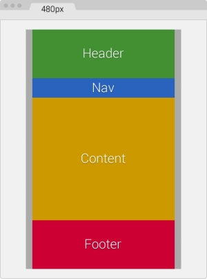
Remember that our main container has 10px padding to the left and the right, thus the widths of all other sections should add up to match 460px.
Now, we are going to change from a 2-column to a 1-column layout. This means that all sections now have the exact same width.
This also means that in our SCSS file, we can create a single media block for all three classes:
.grid_3,
.grid_9,
.grid_12 {
    @include forSmallScreens(640px) {
      width: 440px;
    }
}
Now, let's make sure our numbers add up:
Our Header, Nav, Content, and Footer sections are now 440px wide, stacked one on top of the other. So if we add: 440px of all sections + 10px left margin + 10px right margin = 460px.
Here we go, the last piece of this puzzle!
The following media queries are aimed at 320px:
.container_12 {
    @include forSmallScreens(980px) {
      width: 768px;
    }
    @include forSmallScreens(768px) {
      width: 640px;
    }
    @include forSmallScreens(640px) {
      width: 480px;
    }
    @include forSmallScreens(480px) {
      width: 320px;
      padding: 0;
    }
    .grid_12 { //Header and Footer sections
      @include forSmallScreens(980px) {
        width: 728px;
      }
      @include forSmallScreens(768px) {
        width: 600px;
      }
    }
    .grid_3 { //Nav section
      @include forSmallScreens(980px) {
        width: 200px;
      }
      @include forSmallScreens(768px) {
        width: 160px;
      }
      @include forSmallScreens(640px) {
        height: 50px; //This is only for styling
      }
    }
    .grid_9 { //Content section
      @include forSmallScreens(980px) {
        width: 508px;
      }
      @include forSmallScreens(768px) {
        width: 420px;
      }
    }
    .grid_3,.grid_9,.grid_12 {
      @include forSmallScreens(640px) {
        width: 440px;
      }
      @include forSmallScreens(480px) {
        width: 300px;
      }
    }
}
There we go! In this screenshot, the browser window is 320px wide—the content is 320px wide as well and fits very nicely:
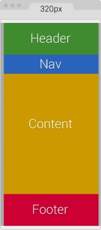
We already know that our main container has 10px padding to the left and the right. In this case, we are going to remove that padding to gain those 20 pixels, since our screen real estate is now very small:
@include forSmallScreens(480px) {
    width: 320px;
    padding: 0;
}
The 10px spacing on the left and right are now going to be created by the left and right margins from the other sections. This means that the width of each section should be 300px.
Adding the new 320px breakpoint is easy:
.grid_3,
.grid_9,
.grid_12 {
    @include forSmallScreens(640px) {
      width: 440px;
    }
    @include forSmallScreens(480px) {
       width: 300px;
    }
}
Now, let's make sure our numbers add up:
Our Header, Nav, Content, and Footer sections are now 300px wide, stacked one on top of the other. So if we add: 300px of all sections + 10px left margin + 10px right margin = 320px.
That's it. We have now retrofitted a fixed-width page to be responsive with the AWD technique.
The final SCSS is as follows:
.container_12 {
    @include forSmallScreens(980px) {
      width: 768px;
    }
    @include forSmallScreens(768px) {
      width: 640px;
    }
    @include forSmallScreens(640px) {
      width: 480px;
    }
    @include forSmallScreens(480px) {
      width: 320px; padding: 0;
    }
    .grid_12 { //Header and Footer sections
      @include forSmallScreens(980px) {
        width: 728px;
      }
      @include forSmallScreens(768px) {
        width: 600px;
      }
    }
    .grid_3 { //Nav section
      @include forSmallScreens(980px) {
        width: 200px;
      }
      @include forSmallScreens(768px) {
        width: 160px;
      }
      @include forSmallScreens(640px) {
        height: 50px; //This is only for styling
      }
    }
    .grid_9 { //Content section
      @include forSmallScreens(980px) {
        width: 508px;
      }
      @include forSmallScreens(768px) {
        width: 420px;
      }
    }
    .grid_3, .grid_9, .grid_12 {
      @include forSmallScreens(640px) {
        width: 440px;
      }
      @include forSmallScreens(480px) {
        width: 300px;
      }
    }
}
It compiles to the following CSS:
@media (max-width: 980px) {
    .container_12 {
      width: 768px;
    }
}
@media (max-width: 768px) {
    .container_12 {
      width: 640px;
    }
}
@media (max-width: 640px) {
    .container_12 {
      width: 480px;
    }
}
@media (max-width: 480px) {
    .container_12 {
      width: 320px;
      padding: 0;
  }
}
@media (max-width: 980px) {
    .container_12 .grid_12 {
      width: 728px;
    }
}
@media (max-width: 768px) {
    .container_12 .grid_12 {
      width: 600px;
    }
}
@media (max-width: 980px) {
    .container_12 .grid_3 {
      width: 200px;
    }
}
@media (max-width: 768px) {
    .container_12 .grid_3 {
      width: 160px;
    }
}
@media (max-width: 640px) {
    .container_12 .grid_3 {
      height: 50px;
    }
}
@media (max-width: 980px) {
    .container_12 .grid_9 {
      width: 508px;
    }
}
@media (max-width: 768px) {
    .container_12 .grid_9 {
      width: 420px;
    }
}
@media (max-width: 640px) {
    .container_12 .grid_3, .container_12 .grid_9,.container_12 .grid_12 {
      width: 440px;
    }
}
@media (max-width: 480px) {
    .container_12 .grid_3,.container_12 .grid_9,.container_12 .grid_12 {
      width: 300px;
  }
}
Tip
As you can see, several breakpoints are repeated in our final CSS file. This is an issue with Sass. However, it's really not an issue or something we need to worry about because when this file is gzipped by the server, it will compress it at its maximum. If we minimize the final output (which we should anyhow), we'll be compressing the file even more. The repeated @media breakpoints have very little if any impact on performance.
Now, let's see how retrofitting the same page looks when using percentages and RWD.