Table of Contents for
Mastering Responsive Web Design
 Mastering Responsive Web Design
Published by
Packt Publishing, 2015
Mastering Responsive Web Design
Published by
Packt Publishing, 2015
- Cover
- Table of Contents
- Mastering Responsive Web Design
- Mastering Responsive Web Design
- Credits
- About the Author
- Acknowledgment
- About the Reviewers
- www.PacktPub.com
- Preface
- What you need for this book
- Who this book is for
- Conventions
- Reader feedback
- Customer support
- 1. Harness the Power of Sass for Responsive Web Design
- The basic concepts of Sass for RWD
- Summary
- 2. Marking Our Content with HTML5
- The
element - The
element - The
- The
element - The
- The
- Using WAI-ARIA landmark roles to increase accessibility
- A full HTML5 example page with ARIA roles and meta tags
- Output screenshots for desktop and mobile
- Summary
- 3. Mobile-first or Desktop-first?
- Sass mixins for the mobile-first and desktop-first media queries
- Dealing with legacy browsers
- How to deal with high-density screens
- Sometimes RWD is not necessarily the right solution
- Retrofitting an old website with RWD
- Retrofitting with AWD
- Retrofitting with RWD
- Summary
- 4. CSS Grids, CSS Frameworks, UI Kits, and Flexbox for RWD
- CSS grids
- CSS frameworks
- UI kits
- The pros and cons of CSS frameworks for RWD
- Creating a custom CSS grid
- Building a sample page with the custom CSS grid
- Stop using CSS grids, use Flexbox!
- Summary
- 5. Designing Small UIs Driven by Large Finger
- The posture patterns and the touch zones
- The nav icon – basic guidelines to consider for RWD
- The navigation patterns for RWD
- Summary
- 6. Working with Images and Videos in Responsive Web Design
- Third-party image resizing services
- The
element and the srcset and sizes attributes - Replacing 1x images with 2x images on the fly with Retina.js
- Making videos responsive
- The Vector Formats
- Summary
- 7. Meaningful Typography for Responsive Web Design
- Calculating relative font sizes
- Creating a Modular Scale for a harmonious typography
- Using the Modular Scale for typography
- Web fonts and how they affect RWD
- Sass mixin for implementing web fonts
- Using FlowType.js for increased legibility
- Summary
- 8. Responsive E-mails
- Don't overlook your analytics
- Recommendations for building better responsive e-mails
- Responsive e-mail build
- Third-party services
- Summary
- Index
When building responsive e-mails, we have to complement our bag of tricks, hacks, and broad understanding of e-mail clients' quirks and mishaps, with tools that can allow us to test faster, optimize our workflow, improve our efficiency with more modern technologies, and learn from others.
There are as many tools out there as there are web designers; the ones we're going to mention are strongly related to what this book is about. Also, all these tools are free. Let's take a look.
I have to admit that the name of this tool isn't very descriptive and doesn't make any reference to how useful this tool is. With Litmus's PutsMail, we can send an e-mail to any account we want for testing and debugging. With the click of a single button, PutsMail sends an e-mail to virtually any number of e-mail accounts we want.
PutsMail allows us to do the following things:
- Add any e-mail(s) to send the tests to
- Add a subject line
- Paste our HTML
Once we have that in place, we just click on the button to send the e-mail and off we go to test on all devices. No need for logins and cumbersome interfaces in e-mail management platforms.
I used this tool to send the e-mails you saw in the image with all the e-mail clients' screenshots a few paragraphs back.
The advantages are:
- It's very easy to use, and has a very low learning curve.
- Unlike some e-mail management services, PutsMail sends the test e-mails right away.
- Adding and removing e-mails from the list is very easy.
- In addition to testing regular HTML e-mails, it also allows you to test plain text and Apple Watch versions.
- It has the option to inline the CSS if needed.
- The markup is neatly highlighted in the HTML field.
- It's free.
The disadvantages are:
- Sometimes you need to delete an e-mail and add it again to be able to receive the test.
- Each e-mail marketing service has different rules about what gets stripped out or what is left in the markup upon sending the e-mail. So PutsMail's rules may be different from other e-mail marketing provider's rules.
Litmus's PutsMail can be found at the following URL: https://putsmail.com/.
Writing inline CSS is quite a tedious task: if our paragraphs have font-family: Arial, Helvetica, san-serif; font-style: italic; font-weight: bold; font-size: 18px;, then we have to copy and paste all these attributes into each paragraph. Alternatively, we have to copy and paste the same paragraph and change the text inside of them.
Don't even think about using the font shorthand. What about a change in one of the properties? Well, we now have to make the change in every paragraph. Doing a find-and-replace can be risky, which means more time testing. Enter CSS inliners!
With CSS inliners, we can write our CSS inside a <style> tag in the <head> section of the e-mail template, just like we would do when creating a normal web page. Once we're done, we upload the e-mail template into the CSS inliner tool. The tool will inline the CSS automatically in each corresponding HTML tag.
So if we have the following paragraph:
<p class="note__important">CSS inliners are an awesome tool!</p>
Then, we write this in the <style> tag in the <head> section:
<style>
    p.note__important {
        font-family: Arial, Helvetica, san-serif;
        font-style: italic;
        font-weight: bold;
        font-size: 18px;
    }
</style><p class="note__important" style="font-family: Arial, Helvetica, san-serif;font-style: italic;font-weight: bold;font-size: 18px;" >CSS inliners are an awesome tool!</p>The advantages are as follows:
- We can include all our styles in a
<style>tag in the<head>section of the e-mail template, just like in a regular web page build. - It's simple to use CSS inliners: paste your markup, press the inline button, and you're done.
- It leads to considerable reduction in repetitive tasks, since placing a class in the
<style>tag is all we need to do—the tool does the rest. - Most CSS inliners are free.
The disadvantages are as follows:
- Testing e-mails is very time consuming, so using a CSS inliner to create test e-mails adds an extra step to the process.
An exception to this is Litmus's PutsMail, since it has the option to inline the CSS upon sending the test e-mail.
- CSS inliners have different ways of writing the styles: some add spaces after the semicolon while others don't. This may or may not concur with one's style.
Some of the most popular CSS inliners are as follows:
- MailChimp (http://templates.mailchimp.com/resources/inline-css/)
- Campaign Monitor (http://inliner.cm/)
- Dialect's Premailer (http://premailer.dialect.ca/)
- Zurb's Inliner (http://zurb.com/ink/inliner.php)
Who says we can't build e-mails with modern and more advanced technologies, such as Sass, Grunt, and Node.js?
For those who are a bit more technical and love frontend development, these e-mail frameworks can speed things up tremendously.
The advantages are as follows:
- These technologies boost the speed of the development and testing phases.
- These technologies run locally on one's machine; this means that everything executes much faster than using a third-party, web-based service.
- If you're a frontend developer who is familiar with such technologies, learning to use any e-mail framework can be much easier.
- Some e-mail frameworks allow us to reuse components, similar to using includes, like the header and footer, and so on.
- Creating plain text e-mails is an option in some e-mail frameworks.
- Any time any of us uses an open source project, we are helping a fellow web professional in their career, and any community around such projects, making a better web.
- There is support from the developer(s) and the ecosystem of contributors of the project.
- These technologies are free.
The disadvantages are as follows:
- The learning curve can be steep if one is not familiar with such frontend technologies.
- It requires knowing and understanding more than one frontend technology beforehand.
Some of the e-mail frameworks are as follows:
- Nathan Rambeck's Email Lab (https://github.com/sparkbox/email-lab) It uses the following:
- Node.js
- Grunt
- Bundler
- Sass
- Ruby
- Premailer
- Nodemailer
- Handlebars/Assemble
- Alex Ilhan's Zenith (https://github.com/Omgitsonlyalex/ZenithFramework)
You can find a tutorial in Litmus at https://litmus.com/community/learning/23-getting-started-with-sass-in-email. It uses the following:
- Sass
- Compass
- Premailer
- Lee Munroe's Grunt Email Workflow (https://github.com/leemunroe/grunt-email-workflow)
It uses the following:
- Grunt
- Ruby
- Node.js
- Sass
- Premailer
- Mailgun (optional)
- Litmus (optional)
- Rackspace Cloud (optional)
I've always believed that being hands-on is the best way to learn. However, in the world of e-mail, being hands-on means spending a lot of time working with HTML and CSS in ways that are no longer a good practice. Using tables for layout (not that using floats is any better), inlining CSS, dealing with quirky e-mail clients, and so on, takes a lot longer than necessary for testing and debugging, and all that other good stuff.
A way to speed things up is to use third-party e-mail templates because the authors have already, at least for the most part, done the dirty work for us. Let's take a look at the pros and cons of using third-party responsive e-mail templates.
- It's likely that thorough testing has already been done; this reduces our own testing time tremendously.
- If we are happy with the layout, all we need to do is replace the content with our own.
- Some e-mail template services even allow you to send the e-mail itself after editing it.
- Some services don't require the author to know any HTML or CSS in order to create a responsive e-mail.
- Downloading the e-mail template is an option provided by some e-mail template services.
- Most responsive e-mail templates for download are free.
- Some paid drag-and-drop e-mail building services offer a free account with a lot of functionalities available with their free plan.
- Although minimal, some testing of our own is still necessary.
- If we want to make changes to the layout, sometimes it's not possible. This depends on the e-mail template service.
- Although some e-mail template services allow us to send the e-mail, they don't provide any analytics or backend where we can see how the e-mail performed.
- Image optimization may or may not be ideal. There's no way to know.
- Reusing an old e-mail template is not possible with some services, so we have to edit everything again from scratch if we plan to use the same layout.
Some of the most common responsive e-mail templates for download are as follows:
- MailChimp's Email Blueprints (https://github.com/mailchimp/Email-Blueprints)
- Zurb Ink (http://zurb.com/ink/templates.php)
- Litmus's Slate (https://litmus.com/resources/free-responsive-email-templates)
- Brian Graves's Responsive Email Patterns (http://responsiveemailpatterns.com/)
The following are drag-and-drop e-mail building services:
- Stamplia Builder (https://builder.stamplia.com/)
- MailUp's BEE Free (https://beefree.io/)
This tool has got to be one of the most amazing and useful tools for e-mail development and learning. Litmus's Scope bookmarklet allows us to see, from within any webmail client, how an e-mail template was built.
Tip
A bookmarklet is a JavaScript component that you store in your bookmarks, usually your bookmarks bar. When you click on the bookmarklet, a special functionality displays. A bookmarklet is not a bookmark per se; it happens to be stored with the bookmarks, but offers a very different functionality than a regular bookmark.
The way Scope works is quite simple:
- Go to the Scope site: https://litmus.com/scope/.
- Drag the bookmarklet to your bookmarks bar in your browser.
- Open your webmail and view any e-mail.
- Click on the Scope It bookmarklet in your bookmarks bar.
- The Scope site opens with the e-mail in design mode.
- Click on code and the design panel will slide away and allow us to see all the markup of the e-mail in question.
This is incredibly useful for learning how others are pulling off such amazing things like video on e-mails, gradients, responsiveness, and so on. Here's a screenshot showing us what the responsive e-mail template we just built looks like after sending it to my Gmail account and scoping it with the bookmarklet.
On the left we see the Scope side on Litmus's website, and on the right it's the file opened in Sublime Text. They are exactly the same… even the formatting is identical. Amazing tool!
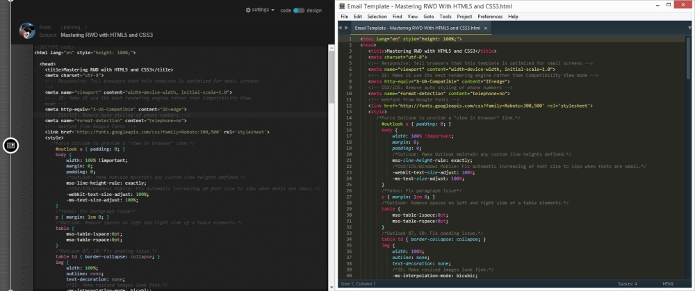
E-mail template using Litmus's Scope