
Chapter 17
The Detection of Financial Statement Fraud
This chapter reviews the use of forensic analytics to detect financial statement fraud. The general belief is that analytic and analysis methods alone cannot detect fraudulent financial reporting. With this in mind, this chapter offers some methods and insights into the detection of some highly specific financial-reporting irregularities.
The first section of this chapter reviews the detection of financial statement fraud based on an analysis of the digit and number patterns of the reported numbers. The second section reviews the use of Benford's Law and other techniques to detect biases across many financial statements. Biases are a gravitation to some section or sections of the real number line, possibly for some psychological advantage. For example, retail store prices are biased toward being slightly below whole dollar amounts while gasoline prices in the United States are biased toward having an ending digit 9. The third section reviews the published financial statements of Enron, Inc. and the review shows that several suspect patterns were evident from those numbers. The final section reviews an application of the risk-scoring method to detect controller fraud at operating divisions. The risk-scoring method follows the same format and logic as is shown in the previous two chapters.
The Digits of Financial Statement Numbers
Fraudulent financial reporting is the intentional misstatement of, or an omission from, the financial statements of a company, government agency, or other organization, made with the intent to deceive financial statement users. Most cases of financial statement fraud involve misstated revenue numbers in the financial statements. Fraud detection would be much easier if we could simply compare the patterns of a single set of financial statements to Benford's Law and then conclude that nonconformity means that the financial statements are misstated. However, fraudulent financial statements are rarely identified by analyzing the financial statements alone. Also, using Benford's Law is problematic because it is unlikely that changing only one or two numbers will cause the entire table of financial statement (FS) numbers to become nonconforming. With only a few numbers in a set of financial statements, we have to allow some extra leeway to the mean absolute deviation (MAD) when assessing conformity or nonconformity.
The combination of many financial statement numbers across many companies (known as a cross-sectional analysis) should give a close conformity to Benford's Law. Financial statements in general conform to Benford's Law, so it is reasonable to assume that a set of FS should by itself conform to Benford's Law. This is true, but because a set of FS only gives a small table of numbers, any set of FS numbers could deviate substantially from Benford's Law. The same logic would apply to income tax return numbers. If we omit those numbers that are fixed (standard deductions or exemptions), or are subject to maximums (child care allowance) then the remaining numbers, as a whole, should conform to Benford's Law. But because we only have a few numbers on any individual tax return, the return when analyzed alone could have a large departure from Benford and still be accurate and compliant.
To show how a Benford analysis might be performed on a set of financial statements, the reported numbers of a NYSE company were analyzed. The company was chosen because the financial statement numbers are presented in whole dollars making an analysis of the last-two digits meaningful. The primary business of the company is the exploration and production of oil and gas properties in Oceania. The following guidelines need to be followed when analyzing FS numbers:
Totals and subtotals should be ignored. For example, if an employee's travel claim is made up of three numbers ($545.18, $165.46, and $40.00) then the total ($750.64) should be excluded from the analysis. The total cannot be manipulated because it is an arithmetic operation applied to the three amounts.
Numbers brought forward from other schedules and pages should not be counted twice. In many places income tax returns require taxpayers to calculate certain numbers and then to carry the total (perhaps Schedule C Business Income) to the Form 1040. These numbers should not be double counted. An FS example is that the same net income number is copied from the income statement to the statement of changes in retained earnings.
Numbers that come from tables should generally be omitted in the analysis. Income tax examples are tax payable from the tax tables or the earned income credit from the earned income credit table. The table numbers cannot be manipulated. Table numbers in an employee travel claim could be the mileage allowance ($0.51 per mile) or a per diem for meals and incidental expenses ($52.00 per day).
Income and expense (or income and deduction) items need to be analyzed separately because they are manipulated in opposite ways. For income taxes, income is omitted or understated while deductions are overstated. In an FS context revenues would be overstated and expenses might be understated. An analysis of income and expense items together would give a mix of numbers that were potentially manipulated upward with others that were potentially manipulated downward.
The start of the analysis was to enter the numbers into an Excel worksheet in a common format for all years. All income numbers are shown at the top of the table and all deduction and expense items are shown at the bottom of the table. The worksheet is shown in Figure 17.1.
Figure 17.1 The Reported Income and Expenses in a Consistent Format
The income statement items are shown in Figure 17.1. The numbers are interesting because the numbers are not rounded to the nearest thousand or million. The revisions were done so that all income items are now in the top section and all deduction items are now in the bottom section. The first digits of the income items (in B2:F10) and the expense items (in B12:F26) are shown in Figure 17.2.
Figure 17.2 The First Digits of the Revenue and Expense Numbers
The first digits in the left panel of Figure 17.2 do not conform to Benford's Law using the MAD criterion. However, because there are very few records, none of the differences are statistically significant using the z-statistic in Equation 6.1. To be statistically significant the deviation must be “large” and the data set must be “large.” The right panel in Figure 17.2 also shows patterns that deviate from Benford's Law using the MAD criterion. However, again because there are very few records, none of the differences are statistically significant using the z-statistic in Equation 6.1.
If the numbers represented by the graphs on Figure 17.2 were from a data table of 1,000 records then the individual digit differences would be statistically significant. Because the first digits have no significant differences this does not mean that there are no significant differences for the first-two digits. However, for the first-two digits there were also no significant differences (z-statistics > 1.96). For the expense numbers the 31 and 88 both had counts (of three and two respectively) that deviated significantly from Benford's Law. Some significant differences should arise just due to chance alone (5 percent at the 0.05 level) and there does not seem to be anything systematic in the 31 and 88 numbers. The 31 numbers were $31,710,027, $31,227,627, and $31,998,655 and each of these numbers occurred in a different year. The digit patterns do not in and of themselves signal intentional or unintentional errors. The last-two digits are shown in Figure 17.3.
Figure 17.3 The Last-Two Digits of the Revenue and Expense Numbers
For the revenue numbers the last-two digits 34, 45, 50, 68, and 85 were significantly different from the 0.01 expectation. The last-two digits of the expense numbers had only the 90 that was significantly different from zero. The numbers with significant last-two digit combinations are highlighted in Figure 17.4.
Figure 17.4 The Income Statements with the Significant Last-Two Digit Differences Highlighted
Figure 17.4 shows that the expense numbers were relatively free of last-two digit duplications. The revenue numbers showed that 11 of the 29 numbers had last-two digits that were significantly in excess of the expectation. This is a reasonably surprising result. The chances of a duplicate or triplicate number can be calculated using the binomial distribution. The calculations are shown in Figure 17.5
Figure 17.5 The Binomial Probabilities Related to the Last-Two Digits of the Income Numbers
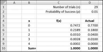
Figure 17.5 shows a binomial worksheet for the last-two digits. The binomial distribution is a discrete (dealing with whole numbers) probability distribution that can help to assess the conformity of the last-two digits. There is a good description of the binomial distribution in the Engineering Statistics Handbook (www.itl.nist.gov/div898/handbook/). That discussion focuses on the formulas as opposed to applications to detect fraud or errors. The properties of a binomial experiment in the context of the income numbers are that each number can be seen to be:
- The result of a trial in an experiment to test whether the number has last-two digits of yz.
- With the outcomes being either a success where the last-two digits are yz or a failure where that is not the case.
- Where the probability of a success, p, is constant at 0.01 from number to number.
- Where the trials are independent (the outcome of one number does not affect the outcome of another number).
The values in C5:C9 were calculated using the BINOMDIST function in Excel. The formula for cell C5 is =BINOMDIST(B5,$D$1,$D$2,FALSE).
The interpretation of cell C5 is that when there are 29 trials (numbers) and the probability of any last-two digit combination is 0.01, then we expect 0 numbers with a specific last-two digit 74.72 percent of the time. There should be no last-two digit 27 numbers 74.72 percent of the time. There should be one occurrence of (say) 27, 21.89 percent of the time, two occurrences of 27, 3.1 percent of the time, and three occurrences of 27, 0.28 percent of the time.
Column D in Figure 17.5 shows the actual probabilities. Cell D5 indicates that 77 percent of all the possible last-two digits were not used on the income statement. We expected 74.72 last-two digits not to be used, so this means that the data table contains more duplication than expected. At the extreme if 99 percent of all last-two digits were not used this would mean that one last-two digit was used 29 times, which exceeds the column C probabilities (29 is not shown) by a wide margin. The effect of the extra duplication is that four last-two digits were used twice, and one last-two digit combination was used three times. The calculated chi-square statistic of 119.28 is just below the cutoff value for a significance level of 0.05 with 99 degrees of freedom. The extent of the duplication is not enough to reject the null hypothesis that the last-two digits are uniformly distributed.
Excessive duplication by itself would not necessarily prove fraud. The numbers would then be suspicious but the duplication would simply be a red flag. The usual practice in grocery stores is to price goods so that the ending digits are 9s. This does not signal fraud but rather that some human thought has gone into setting a selling price as a part of a marketing strategy. The question with FS numbers is whether any number invention was done with the intent to deceive, and whether the level of deception was material.
A few other factors in the financial statements are noteworthy. First, the company has restated some of the prior year numbers. Interestingly, the comparative figures on the 2009 income statement are not the same numbers that were originally reported. The net income of the prior years is unchanged but some formerly combined numbers were disaggregated. Second, the “other income” (revenue from sources other than sales to customers) and other types of gains grew almost exponentially from 2005 to 2008 and then showed a decline in 2009. The changes in the rate of large one-off gains make forecasting income from operations very difficult. Third, the five annual EPS numbers of (2.15), (1.55), (0.96), (0.35), and 0.15 includes of four numbers that are neat multiples of 5. Only one in five EPS numbers should be a multiple of 5.
Unusual patterns or ratios in reported numbers might be red flags to fraud but they are not guarantees of any sort. A red flag is an indicator that is present in a significant percentage of fraud cases, but their presence in no way means that fraud is actually present in a particular case. Many fraud schemes do not require any type of number invention. For example, improper cutoff procedures may show sales for (say) 55 weeks (the current year plus three weeks into the next year) as the sales for the current year.
Detecting Biases in Accounting Numbers
The Enron bankruptcy in December 2001 set off a chain of events that resulted in the Sarbanes-Oxley Act and brought the topic of corporate fraud and accounting to the attention of the financial press and television. The value of accounting and auditing was again questioned in 2008 with the bankruptcy of Lehman Brothers and the government bailout of the financial system. In 2002 the high visibility of accounting in a negative vein gave rise to the research question as to whether the level of earnings management around this time period was more or less than “normal.” The approach taken in Nigrini (2005) was to look at the digit patterns of reported earnings for signs of biases in these reported numbers.
The Wall Street Journal (WSJ) includes a daily “Digest of Corporate Earnings Reports” that reports and summarizes the earnings releases of the previous day. The information reported includes:
- Company name, ticker symbol, and the stock exchange where the company is listed
- Reporting period (e.g., Q3/31 would indicate quarter ending 3/31)
- Revenue (in millions, with a percentage change)
- Income from continuing operations (in millions, with a percentage change)
- Net income (in millions, with a percentage change)
- Earnings per share (in dollars, with comparison to year-earlier period and percentage change)
The information is given a standard format for each company. The data studied included all the earnings reports published in the “Digest of Corporate Earnings Reports” from April 1 to May 31, 2001 (before the collapse of Enron), and from April 1 to May 31, 2002 (after the collapse of Enron). A summary of the earnings reports is shown in Table 17.1.
Table 17.1 A Summary of Quarterly Earnings Numbers.
| 2001 | 2002 | |
| Quarter ended March 31 | 5,483 | 4,869 |
| Quarter ended 12/31, 1/31, 2/28, or 4/30 | 624 | 547 |
| New York Stock Exchange listing | 1,747 | 1,633 |
| AMEX or NASDAQ listing | 4,360 | 3,783 |
| Total number of records | 6,107 | 5,416 |
Table 17.1 shows that most of the earnings reports analyzed were for the quarter ended March 31, 2001, or March 31, 2002. About 30 percent of the companies were New York Stock Exchange (NYSE) listings, with the remainder of the companies being listed on the American Stock Exchange (AMEX) or Nasdaq exchanges. Toronto and foreign listings were omitted because the original numbers were not denominated in U.S. dollars. Also omitted were companies listed on the NYSE that were foreign and that did not report an earnings per share (EPS) number.
A test of the second digits was used to detect manipulations of revenues. Companies with less than $1 million in revenues were excluded from the analysis to avoid the situation where a company reported (say) $798,000 and this number was shown in the WSJ as $0.80 million (revenue numbers were shown in millions to two decimal places). This company would have a true second digit 9 that would be analyzed as if it were a second digit 0. In 2001 there were 182 companies with revenues under $1 million and in 2002 there were 186 such companies.
The first digits of the revenue numbers were tested as a preliminary test to check that Benford's Law was a valid expectation for the second digits. The results are shown in Figure 17.6
Figure 17.6 The First Digits of the Reported Income Numbers
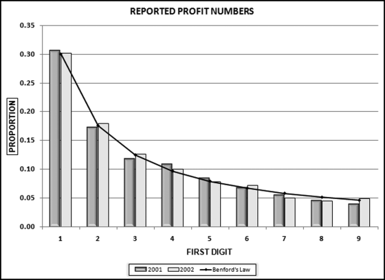
The first digits of the net income numbers in Figure 17.6 show a close conformity to Benford's Law for both 2001 and 2002. The MAD for 2001 is 0.0052, which meets the criteria for close conformity and the MAD for 2002 is 0.0036, which also meets the criteria for close conformity. The second digits of the revenue numbers are shown in Figure 17.7
Figure 17.7 The Second Digits of the Reported Income Numbers
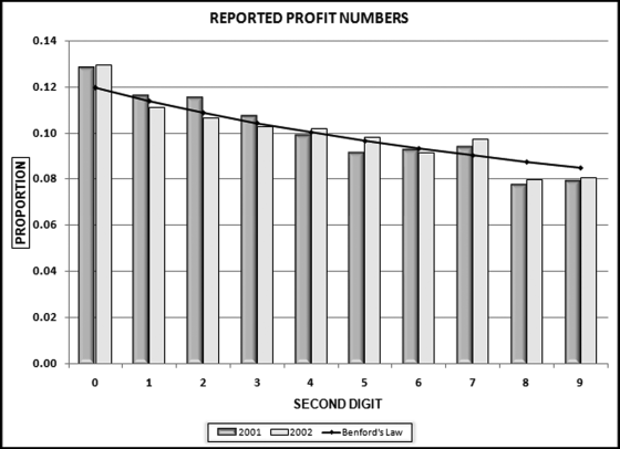
The second digits, as seen as a whole, have a close conformity to Benford's Law for each of the years in question. The calculated chi-square statistics of 14.56 and 10.58 are below the critical chi-square value (=CHIINV(0.05,9)) of 16.92. What is of interest is that for both 2001 and 2002 the digit 0 is overstated by an average of 0.9 percent while again for both 2001 and 2002, there is a shortage of 8s and 9s as compared to Benford's Law. These results are consistent with the belief that when corporate net incomes are just below psychological boundaries, managers would tend to round these numbers up. Numbers such as $798,000 and $19.97 million might be rounded up to numbers just above $800,000 and $20 million respectively, possibly because the latter numbers convey a larger measure of size despite the fact that in percentage terms they are just marginally higher. A clue that such rounding-up behavior was occurring would be an excess of second digit 0s and a shortage of second digit 9s in reported net income numbers. The direction of the deviations is consistent with an upward revision of revenue numbers where, for example, numbers with first-two digits of 79 or 19 are managed upward to have first-two digits of 80 and 20 respectively. The percentage of second digit 0s is 13.0 percent in 2002 and 12.8 percent in 2001, which suggests that rounding up behavior was more prevalent in 2002 than it was in 2001. This is puzzling given all the attention given to financial statement fraud in 2002 at the time that Arthur Andersen was in court because of the Enron saga.
An Analysis of Enron's Reported Numbers
The preceding analysis looked at whether accounting numbers might have been influenced by psychological thresholds. Here the Enron numbers are analyzed to see whether they show signs of trying to make psychological thresholds. On November 11, 2001, Enron filed a Form 8-R in which it revised its results for 1997 to 2000 (four years) inclusive. Table 17.2 shows the original numbers as reported by Enron for 1997 to 2000.
Table 17.2 The Numbers Reported by Enron for 1997 to 2000.
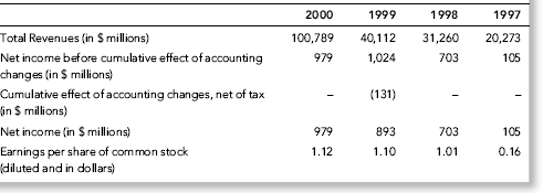
Table 17.2 shows that for three of the four years from 1997 to 2000, Enron reported revenues that just exceeded a multiple of $10 billion, giving the revenues numbers a second digit 0 for three of the four years. For three of the four years, Enron reported net income before the cumulative effect of accounting changes that just exceeded a multiple of $100 million, giving the income numbers a second digit 0 for three of the four years. Enron seemed to emphasize net income before the cumulative effect of accounting changes presumably because they wanted it to be clear that the effect of accounting changes were out of the control of management. The table shows that for the only year in which Enron's revenues did not just exceed a multiple of $10 billion, the reported EPS number is $1.01, which not only has a second digit zero, but it just makes a threshold of $1.00.
Table 17.2 shows 12 “headline” reported numbers (four each for total revenues, net income before the cumulative effect of accounting changes, and earnings per share). Of these 12 numbers, seven numbers have a second digit zero. The binomial probability distribution is used to calculate the chances of seven second digit zeroes. The BINOMDIST function (=BINOMDIST(7,12,0.11968,FALSE)) gives a result of 0.00016. The chances of seven or more second digit zeroes in 12 numbers is about 16 times in 100,000. Enron seemed to target numbers that just made psychological thresholds.
A look at the revenue numbers raises other questions. From 1999 to 2000 the revenues rose from $40 billion to $100 billion. This is dramatic for two reasons. First, at that time there were only a handful of companies with revenues over $100 billion. The common theme among those companies was that they were all international conglomerates founded more than 100 years ago (with the exception of Walmart). Second, the growth in revenues is difficult to understand. Seen in context, Enron's growth was slightly more than two times Microsoft's (Microsoft's revenues were about $25 billion per year at that time). Some reports suggested that most of this revenue increase came from the way that Enron booked its sales of derivative contracts.
An Analysis of Biased Reimbursement Numbers
A bias refers to individuals targeting, being predisposed toward, or inclined toward the numbers in one or more number ranges because of some real or perceived benefits or consequences. A plethora of minimums and maximums in the income tax code means that taxpayers are biased on a number of fronts. For example, to deduct charitable contributions of items valued at $500 or more, an additional form needs to be completed and attached to the tax return. An analysis of taxpayer gifts to charity other than by cash or check will presumably show “many” gifts in the $450 to $499 range and only a “few” gifts in the $500 to $550 range, because the $500 to $550 range would require the completion of Form 8283.
A small software company had a policy that for out-of-town travel employees need not include a receipt for breakfast costs of $10 or less. Management was considering raising the receipt amount to $15. An analysis of breakfast claims showed that the three most frequent amounts claimed for breakfast were $9.50, $9.90, and $10.00. The breakfast claims were influenced and biased by the receipt requirement for amounts over $10. However, believing that a financial threshold might create a bias, and statistically concluding that a set of numbers (perhaps financial statement numbers) are biased are two different things. This section shows how a bias might be evaluated statistically.
In April, 2010 the Wall Street Journal reported on an analysis of therapy visits and concluded that the number of therapy visits was influenced by the Medicare reimbursement formula. Medicare paid health services providers about $2,200 if a patient received from one to nine at-home therapy visits. The health services providers were paid an additional $2,100 if there were 10 or more at-home therapy visits. Medicare therefore paid an additional $2,100 for the 10th therapy visit and $0 for the 11th and subsequent visits. A hypothetical provider's therapy visit pattern is shown in Figure 17.8.
Figure 17.8 A Hypothetical Pattern of Therapy Visits
In most cases the forensic investigator would not know too much about therapy and therapy visits so we cannot really say that x percent of patients would normally have y number of visits. The assumption was made that the percentage of people having y visits should be approximately the same as the percentage having y − 1 visits and y + 1 visits. Similarly, we do not know what percentage of people have six dentist visits a year, but we can assume that the percentage must be close to the percentage of people having five or seven visits a year. There is no real reason for a spike at five unless many people have the same problem that is usually fixed in five visits. Also, the Facebook “friends” distribution is unknown, but it seems logical that the proportion of people with (say) 64 friends should be close to the proportion with 63 friends or 65 friends. The smooth pattern for y being close to y − 1 and y + 1 is the case for the 13 visits and higher section in Figure 17.8. The graph shows a consistent downward pattern to 39 visits. The proportion for 40 visits is actually the proportion for 40 and higher, hence the small upward jump. The assumption is that we should be able to fit a continuous function to the points and any discontinuities (abrupt changes) might signal biases.
Sigma Plot 11 was used to fit a curve to the points. Sigma Plot has formulas for smoothing sharp changes in two dimensional graphs. The software gives users a choice of smoothing methods that includes (a) negative exponential, (b) locally weighted scatterplot smoothing, (c) running average, (d) running median, (e) bisquare smoothing, and (f) inverse square smoothing. The results of all the smoothing methods are shown in Figure 17.9.
Figure 17.9 The Smoothing Functions Fitted to the Therapy Visit Data
The graphs in Figure 17.9 show that Sigma Plot's smoothing techniques can fit a neat curve to the line for 14 visits or more. The techniques cannot fit a close-fitting curve to the left side of the graph (1 to 13 visits). The largest deviations (fitted curve and actual proportions) are for therapy visits of 10, 11, and 12. In calculus terms the graphs seem to have a jump discontinuity. The hypothesis is that a jump discontinuity is evidence of a bias.
To determine how extreme the deviation was from the best-fitting smooth function, the chi-square statistic was calculated. Although the graphs show proportions, the chi-square statistic is calculated using the actual and the expected counts (from the fitted smooth line). The lowest two chi-square statistics and the highest chi-square statistic are shown below:
Negative exponential: 826.4
Bisquare smoothing: 1,261.7
Running median: 6,171.5
In each case the chi-square value for the 9 and 10 counts made a big impact on the chi-square statistics. In some cases the chi-square value for a count of one visit also contributed to the chi-square statistics. In all cases the fit was quite good for the counts of 14 through 40.
To determine the significance of the difference between the fitted smooth lines and the actual data, the chi-square statistics were calculated. The results using the CHIDIST function with 39 degrees of freedom were that the chances were less than 1 in 100,000,000 that the data as shown by the scatterplot points (the actual numbers) were drawn from the smooth distribution shown by the lines (the best fitting functions). There is therefore a clear bias evident in the data.
The same method was used on the 2002 accounting numbers reviewed in the previous section. The first and second digit counts, and the fitted smooth lines are shown in Figure 17.10.
Figure 17.10 The Best Fitting Line Fitted to the First and Second Digit Counts
For the first digits the smoothing technique fits a line with a slightly less dramatic difference between the low and high first digits. The first digit 6 shows up as a point above the line. For the second digits the technique manages to fit a function that starts at the overrepresented 0s and ends at the underrepresented 9s. The excess 7s and the shortage of 8s are evident from the graph.
The chi-square statistic for the first digits is 24.22 meaning that the actual data differs significantly from the fitted line. The digit 2 makes a large contribution to that value. The calculated chi-square statistic for the second digits of 6.09 means that there is not enough evidence to conclude that the actual data differs significantly from the fitted line. These results are in disagreement with what we know to be the case. It seems that the line-fitting technique did a good job (in fact too good) of fitting a line to the actual second digit counts. It seems that the technique is not too good at detecting peaks and valleys at the start or at the end of a series of numbers because it manages to fit the line close to these points.
Detecting Manipulations in Monthly Subsidiary Reports
This section describes a risk-scoring method to detect divisional fraud where the predictors are the reported monthly numbers. The behavior of interest is the overstatement of divisional profits or the creation of cookie jars for future use. The forensic unit is a division (or subsidiary or branch) of a company. The scoring system was designed to detect intentional and unintentional errors in the monthly reports. The forensic investigators wanted to proactively detect errors in the monthly reports.
It would seem that divisional controllers do commit fraudulent financial reporting. For example, on October 6, 2010, the Wall Street Journal reported that a subsidiary of Hitachi had been falsifying sales over the past five years. The subsidiary booked fictitious sales and profits between December 2005 and August 2010. The president of the unit had apparently been trying to “window dress” the division's earnings. The Wall Street Journal suggested that the company may be having difficulty in fully keeping track of the activities of its myriad units. On August 17, 2010, the Wall Street Journal reported that a division of Mercia Corporation had inflated profits by booking fictitious transactions since 2005.
The risk-scoring system was developed by a large company headquartered in the United States with most of its divisions located in the United States. There were about 500 divisions engaged in four similar types of products all requiring sophisticated manufacturing processes. The customers of the divisions were manufacturing companies that used the products in their end products. The company's fortunes were closely tied to the fortunes of the industry into which it sold. The results of the divisions were subject to large fluctuations.
The divisional controllers were required to report their prior month results by the fifth day of the following month. It took about 10 days to consolidate the results. Corporate accounting had systems and procedures in place to contact the controllers if they come across errors or questionable items. The head office review of the accounting numbers was a high-level scan using professional judgment. There was no formal systematic review of the numbers to detect intentional or unintentional errors. The company had a set of policies and procedures that were to be followed by the controllers. The divisions maintained their own accounting systems and they all had to use the same chart of accounts. The consolidation of the results was done with Oracle's Hyperion software. The uniform format of the reports and Hyperion's data retrieval capabilities meant that the team had access to archival data. The risk-scoring system had 27 predictors being scored on a 0 to 1 scale. The management reports include (a) a listing of the risk scores for all divisions, (b) the ability to call up and review the scores for all 27 variables for any single division, and (c) other high-level analyses of the reported numbers.
The risk scores were related to the following broad categories of predictors:
- Reported sales amounts
- Reported standard profits and net income
- Reported variances
- Selected expense amounts
- Reported accounts receivable, inventories, and prepaid expenses amounts
- The use of selected accounts in the general ledger
- Location
- Historical prior scores
The risk-scoring system sought to proactively and systematically evaluate the reported numbers for intentional and unintentional errors and violations of policies and procedures. The risk-scoring system had the following objectives:
- To assist in evaluating the risk of intentional and unintentional errors and biases in the reported numbers of the divisions.
- To function as an audit-planning tool for audit staff that were assigned to an audit of a specific division.
- To function as a planning tool to assist in the selection of divisions to audit in the coming year.
- As a tool for initiating contact (by phone or by letter) to alert controllers to the fact that the accounting numbers were being reviewed by corporate audit and to act as a mild deterrent to errors or biases in reported numbers.
The analysis required a systematic approach because each of the 500 divisions reported about 300 accounting numbers each period giving 150,000 data points each month. The analysis was further complicated by the fact that it could be relationships between the numbers that indicate the errors. For example, a decrease in sales might not be an abnormal event but a decrease in sales coupled with an increase in accounts receivable is suspicious. Access was used for data manipulation, calculations, and reporting. Excel was used to prepare neat graphs. A review of the predictors is given below.
P1: Erratic Sales
P1 gave a high score to divisions with erratic (volatile) sales. The belief was that large fluctuations in the sales numbers could be due to errors. The usual measure of dispersion (spread) is the variance, but the variance is not neatly bounded like correlation (from −1.00 to +1.00). Sales numbers that are all within 10 percent of $100,000 will have a larger variance than sales numbers that are all within 10 percent of $10,000, even though the percentage deviations are equal. The variance was therefore not a good measure of dispersion. The P1 formula is given in Equation (17.1).
The formula for P1 is shown in Equation (17.1). The formula uses the sales numbers for the past 12 months. If the highest sales number is zero (perhaps because the division is new) then P1 equals 0. A division with high sales of $160 and low sales of $100 will be scored as 1.00 because of the multiplication by 1.5. If the calculated P1 value is greater than 1.00 (perhaps with high sales of $180 and low sales of $100) then the P1 score was fixed at 1.00.
P2: Large Sales Change for Current Month
P2 was designed to give a high-risk score to divisions that had current month sales that were significantly different to the average for the prior 11 months. An example of this would be consistent sales of $100 per month with current month of (say) $150 or $50. The P2 formula is given in Equation (17.2).

The formula for P2 is shown in Equation (17.2). The formula uses the sales numbers for the past 12 months. The current month is the most recent month, and the average is calculated for the preceding 11 months. If the calculations were done for a calendar year then the current month would be December and the average would be calculated for January to November. If the average is zero (perhaps because the division is new) then P2 equals 0. A division with current sales of $120 and average sales of $100 will be given a P2 score of 0.80 because of the multiplication by 4. If the calculated P2 value is greater than 1.00 (perhaps with current sales of $75 and average sales of $100) then the P2 score was fixed at 1.00.
P3: Irregular Numbers Reported as Sales
P3 was designed to give a high risk score to divisions with irregular sales numbers. Irregular numbers were deemed to be zero, negative, or round numbers. P3 was based on the sales numbers for the preceding 12 months. The P3 formula is given in Equation (17.3).
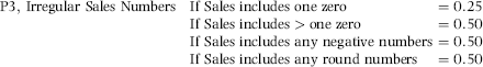
The score for the zeroes is added to the negative and round number scores. If the calculated score exceeds 1.00 then the score is capped at 1.00. Round numbers were defined to be multiples of $1,000.
P4: Increase in Sales Allowances
P4 scored increases in sales allowances. A large increase in allowances could be associated with fictitious or erroneous sales. This predictor was only based on the change in the sales allowances numbers. The P4 formula is similar to that of P2 and is given in Equation (17.4).

The formula for P4 is shown in Equation (17.4). The formula is based on the sales allowances for the past 12 months. Sales allowances are negative numbers and the calculations use the absolute values of these negative numbers. Positive allowances, if any, were set equal to zero for the P4 calculations. The current month is the most recent month, and the average is calculated over the 11 months before the latest month. If the average is zero (perhaps because the division is new), then P4 equals 0. A division with current allowance of −$120 and average allowances of −$100 will get a P4 score of 0.80 because of the multiplication by 4. If the calculated P4 value is greater than 1.00, then the P4 score is fixed at 1.00.
P5: Irregular Numbers Reported as Allowances
P5 was designed to give a high-risk score to divisions with irregular sales allowances numbers. Irregular numbers were deemed to be zero, negative, or round numbers. P5 was based on the sales allowances numbers for the preceding 12 months. The P5 formula is given in Equation (17.5).
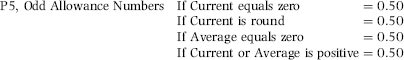
The formula for P5 is shown in Equation (17.5) with round numbers being numbers that are multiples of $1,000. Allowance numbers are negative numbers. The score for the zeroes is added to the positive and round number scores. If the calculated score exceeds 1.00, then the score is capped at 1.00.
P6: Excessive Sales Allowances
P6 was designed to score a large sales allowance percentage for the current month. The data analysis results showed that an allowance percentage above 2.5 percent was excessive. A high percentage could be due to weak sales work or even a misclassification of other expenses. This predictor used the allowances for the current month. The P6 formula is similar in form to P2 and is shown in Equation (17.6).

The P6 formula is shown in Equation (17.6). The proportion is multiplied by −0.40 because sales allowances are negative numbers. P6 equals zero if sales allowances are zero. If the sales allowance proportion exceeds 0.025, then P6 is capped at 1.00.
P7: Quarter-End Pad
P7 was an innovative predictor designed to detect higher profit numbers in March, June, September, and December. This would presumably be because the controller was pushing hard to make or beat the budget. The P7 formula is given in Equation (17.7).
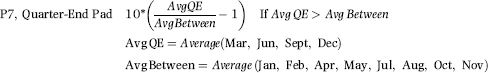
The P7 formula in Equation (17.7) is based on the profit numbers for the preceding year, which should include four quarter-end months and eight between months. If the average of the quarter-end profits was $108, and the average of the between months was $100, then the calculated P7 value would be 0.80 (10 ∗ (108/100−1)). The P7 values are bounded by the [0,1] range. If the quarter-end average was less than the average for the between months then the P7 score would be zero. The quarter-end pad was an important indicator of inflated profits.
P8: High Materials Price Variance
P8 was designed to detect a large price variance in an expense that was seen to reasonably controllable, namely the input prices for raw materials. The score for P8 used both positive (favorable) and negative (unfavorable) variances. The P8 formula is given in Equation (17.8).
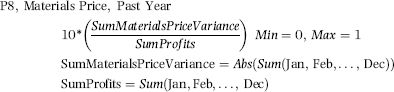
The P8 formula in Equation (17.8) is based on the materials price variance and the profit numbers for the preceding year. The months shown above are January to December. Predictor P8 is not influenced by the sign of the materials price variance (positive or negative, favorable or unfavorable). The P8 scores are bounded by the [0,1] range. Large materials price variances were an anomaly because the divisions were expected to be in control (within a few percentage points) of the prices of their inputs.
P9: High Materials Price Variance for the Current Month
P9 was essentially the same as P8 except that the calculation was made for the immediately preceding month only. The P9 formula is given in Equation (17.9).
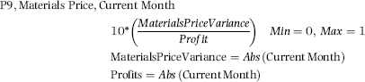
The P9 formula in Equation (17.9) is based on the materials price variance and the profit numbers for the current month. Predictor P9 is not influenced by the sign of the materials price variance (positive or negative, favorable or unfavorable). The P9 scores are bounded by the [0,1] range. This predictor highlights a large variance for the current month in an area where the divisions were expected to be in control (within a few percentage points) of the prices of their inputs.
P10: Scrap Variance Is Extreme
P10 was based on the scrap variance, which was an account that could be used to smooth profits. The score for P10 used both positive (favorable) and negative (unfavorable) variances. The P10 formula is given in Equation (17.10).
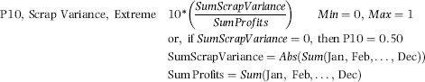
The P10 formula in Equation (17.10) is based on the scrap variance and the profit numbers for the preceding year. The months illustrated are January to December. The predictor is not influenced by the sign of the scrap variance (positive or negative, favorable or unfavorable). The P10 scores are bounded by the [0,1] range. Also, a scrap variance of zero is also extreme and P10 equals 0.50 if the sum of the scrap variances is zero. The scrap variance account was an account that the controllers might use to smooth earnings.
P11: Warranty Variance Is Large
P11 was based on the warranty variance, which was an account that could be used by the controllers to smooth profits. The score for P11 used both positive (favorable) and negative (unfavorable) variances and the current profit number. The P11 formula is shown in Equation (17.11).
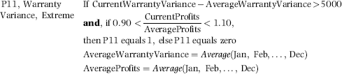
The P11 formula in Equation (17.11) is based on both the current warranty variance and the current profits. If the current warranty variance differs from the average by more than $5,000, then the first condition is met. The second condition is that the profits for the current month are within 10 percent of the average profits for the past year. If the warranty amount has changed by a large amount and the profits are normal, then P11 equals 1.00. If neither condition is met, then P11 equals zero. The results showed that about 15 percent of all divisions scored 1.00 for P11.
P12: Overhead Variance Is Erratic
P12 was based on whether the overhead variance was erratic. The usual measure of dispersion (spread) is the variance, but the variance is not neatly bounded like correlation (from −1.00 to +1.00). The range was used to measure dispersion and the P12 formula is shown in Equation (17.12).
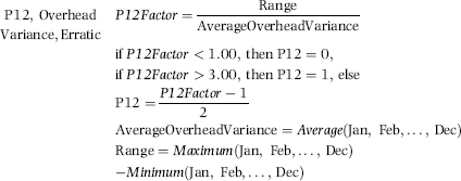
The formula for P12 in Equation (17.12) shows that the P12 score increases as the range increases and as the average decreases. The P12 result itself is restricted to the [0,1] range. Under normal circumstances the overhead variances should be quite stable. The average score for P12 was about 0.65 meaning that some two-thirds of divisions had “erratic” variances. Subsequent revisions will aim for a lower average score by the point at which the maximum is reached (when the P12Factor equals 3.00). An erratic overhead variance might be the result of smoothing or manipulating earnings.
P13: Overhead Variance Is High
P13 was based on a comparison between the current month's overhead variance and the current month's profits. The absolute value of the overhead variance was used because any high variance could signal issues with accuracy in budgeting. Issues with being able to budget expenses might be a motivation to resort to creative accounting to make up for profit shortfalls. The P13 formula is shown in Equation (17.13).
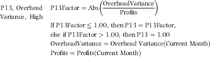
The P13 formula in Equation (17.13) increases as the overhead variance increases and it also increases as the profit amount decreases. The P13 result itself is restricted to the [0,1] range. The ability to budget expenses accurately was a key performance measure for the company. The average P13 score was 0.21, which means that not too many, and not too few, divisions were scoring on this risk indicator.
P14: Overhead Variance Moving in the Wrong Direction
P14 was based on whether the current month's overhead variance was moving in the wrong direction. The expectation was that an increase in sales would cause the overhead variance to move in a favorable direction. Predictor P14 looked at the movement of the variance. The past data was for the 11 months before the current month. The P14 formula is shown in Equation (17.14).
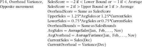
The P14 formula in Equation (17.14) shows that a large increase in sales (greater than 25 percent) would be coded as 2 and a small increase in sales would be coded as 1. A large decrease in sales would be coded as −2 and a small decrease in sales would be coded as −1. A large increase in the variance would be coded as +2 and a small increase in the variance would be coded as +1. A large decrease in the variance would be coded as −2 and a small decrease would be coded as −1. The cutoff percentage in each case is 25 percent. Changes that are larger than 25 percent are deemed large and changes that are smaller than 25 percent are small. Table 17.3 summarizes the scores for P14.
Table 17.3 The Scores for the Sales and Overhead Changes.
| Sales Score (decrease is negative) | Overhead Score (unfavorable variance is positive) | P14 |
| −1 or −2 | −1 or −2 | 1 |
| −1 or −2 | +1 or +2 | 0 |
| +1 or +2 | +1 or +2 | 1 |
| +1 or +2 | −1 or −2 | 0 |
When the sales shows a decrease (−1 or −2) and the variance becomes more favorable, then P14 is scored as 1.00. When the sales shows an increase (+1 or +2) and the overhead variance becomes more unfavorable, then P14 is scored as zero. The extent of the change (greater than 25 percent or less than 25 percent) was not used because that would have made the programming unduly complex. The Access Switch function for P14 is shown below:
V14f: Val(Switch([SDev]=−2 And [Bdev]=−2 Or [Bdev]=−1,1,[SDev]=−2 And [Bdev]=2 Or [Bdev]=1,0,[SDev]=−1 And [Bdev]=−2 Or [Bdev]=−1,1,[SDev]=−1 And [Bdev]=2 Or [Bdev]=1,0,[SDev]=2 And [Bdev]=−2 Or [Bdev]=−1,0,[SDev]=2 And [Bdev]=2 Or [Bdev]=1,1,[SDev]=1 And [Bdev]=−2 Or [Bdev]=−1,0,[SDev]=1 And [Bdev]=2 Or [Bdev]=1,1))
The result for P14 is restricted to the [0,1] range. The average P14 score was 0.50, which was too high for an average. Future refinements to the formula will only score divisions with 1.00 when the changes are more extreme. Predictor P14 is a good example of identifying amounts that were opposite to expectations.
P15: Other Income and Expenses Erratic
P15 was based on whether the other income and expenses amounts were erratic. The other income and expenses amounts could be used to dampen the effects of a very good or a very poor month. The usual metric for dispersion is the variance and in this case, the standard deviation (the square root of the variance) is used and is divided by the average amount to identify cases when the standard deviation is large relative to the norm. The P15 formula is shown in Equation (17.15).
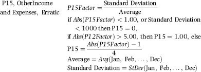
The P15 score in Equation (17.15) increases as the standard deviation increases and it also increases as the average decreases. If the standard deviation is small (less than $1,000), then P15 is set equal to zero. P15 is restricted to the usual [0,1] range. As the dispersion increases, so the P15 score would also increase. The average score for P15 was about 0.48 indicating that one-half of the divisions had erratic other income and expenses numbers. Subsequent revisions would target a lower average score by increasing the lower bounds of 1.00 and 1,000.
P16: Increase in Supplies Manufacturing
P16 was based on increases in the supplies (manufacturing) account. Supplies and consumables accounts are often the targets for fraud because there is no control through an inventory account. One way to calculate an increase over time is by using linear regression but this is a bit complex to program so a simpler approach was used. The P16 formula is given in Equation (17.16).
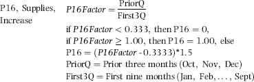
The P16 formula in Equation (17.16) compares the supplies spending for the past three months with the spending for the first nine months of the year. If the spending is equal from month to month, then the ratio of the last three months to the first nine months should be one-third because 3/9 equals one-third. Factors (or ratios) above 1/3 result in a positive P12 score. The average score for P16 was 0.11, meaning that very few divisions showed large supplies increases and that the divisions with high scores were indeed quite odd.
P17: Net Income Smooth
P17 was based on whether the net incomes were perhaps just too smooth to be true. The R-squared statistic in a linear regression would indicate whether there was a close fitting straight line to the data points. The programming would be a bit complex in Access. A simpler approach was to use the standard deviation of the profit numbers. The P17 formula is given in Equation (17.17).
The P17 formula in Equation (17.17) uses the fact that a smooth profits stream would have a small standard deviation and a low ratio of the standard deviation divided by the profits. High ratios (above 0.50) are scored as a zero. The use of the square root gives a boost to low scores. The average score for P17 was 0.21 meaning that the scoring was just about right.
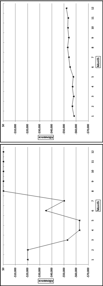
Figure 17.11 A Volatile Series of Profits and a Smooth Series of Profits
Figure 17.11 shows two sets of profit numbers. The vertical axis (the y-axis) is calibrated from −$800,000 to +$1,000,000 in each case. The numbers on the left are quite volatile and the P17Factor is 1.00 (giving a P17 score of 0.00) while the numbers on the right are quite smooth with a P17Factor of 0.15 (giving a P17 score of 0.832). The P17 formula does a good job of distinguishing between smooth and erratic profits.
P18: Accounts Receivable Increase
P18 was based on the fact that a large increase in the accounts receivable balance could be the result of overstated sales. A balance was seen to be high when it was compared to the prior norm for the division. The P18 formula is given in Equation (17.18).
The P18 formula in Equation (17.18) uses the AR (Accounts Receivable) balance for the past two months and the AR balance for the prior 10 months. The AR numbers are scaled (divided) by sales. The average score for P18 was about 0.18 indicating that large increases were not the norm.
P19: Accounts Receivable Allowances Erratic
P19 was based on whether the AR allowances were erratic (volatile). This account could be used as a cookie jar account to smooth out low and high earnings. This formula is similar to P17 except that P19 looks for erratic numbers whereas for P17 looks for smooth numbers. The P19 formula is shown in Equation (17.19).
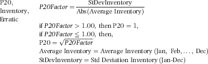
The P19 formula in Equation (17.19) is based on the standard deviation (dispersion) divided by the average AR allowance. A relatively high dispersion gives a high score for P19. The average score for P19 was about 0.31 meaning that the number of divisions with high volatility was on the high side. To illustrate the formula, two examples of AR allowances are shown in Figure 17.12.
Figure 17.12 A Volatile Series of Allowances and a Smooth Series of Allowances
The numbers should always be either negative or zero. The graphs in Figure 17.12 are calibrated from −$70,000 to $0 on the y-axis. The numbers on the left are quite volatile with the standard deviation being slightly greater than the mean giving a P19 score of 1.000. The allowance numbers in the right panel are neatly clustered in the −$58,000 to −$52,000 range. The formula can therefore distinguish between smooth and erratic allowance numbers. About one-half of the divisions had all allowance numbers equal to zero and consequently P19 scores of zero. The divisions were therefore inconsistent in their usage of the allowance account.
P20: Inventory Balance Erratic
P20 was based on erratic (volatile) inventory balances because this account could be used as a cookie jar account to smooth out low and high earnings. This formula is similar to the formula for P19. The P20 formula is shown in Equation (17.20).
The P20 formula in Equation (17.20) is based on the standard deviation (dispersion) divided by the average inventory balance. The average score for P20 was 0.40 meaning that the number of divisions with high volatilities was again on the high side. Future revisions will revise the P19 and the P20 formulas to give average scores of about 0.20.
P21: Inventory Balance Increase
P21 was based on a large increase in the inventory balance because such an increase could be the result of understating cost of goods sold. A balance was seen to be high when it was compared to the prior norm for the division. The P21 formula is shown in Equation (17.21).
The P21 formula in Equation (17.21) uses the inventory balance for the past three months and the balance for the prior nine months. The average expected score for P21 was zero because the sum of the prior three months should be one-third of the sum for the first nine months. The actual average score for P21 was 0.19, meaning that the average did show an increase for a number of divisions.
P22: Prepaid Expenses Change
P22 was based on the change in prepaid expenses because this account could be used to smooth profits in times of shortages and surpluses as compared to budget. A balance was seen to be high when it was compared to the prior norm for the division. The P22 formula is shown in Equation (17.22).
The P22 formula in Equation (17.22) gives a division a high score when the recent balances are higher than the average for the past balances. The sum of the balances for the two most recent months divided by the sum for the first ten months should be one-fifth (2/10) if the balances are consistent from one month to the next. The formula gives high scores when the ratio deviates from one-fifth. The P22Factors and the resulting P22 scores are set out in Figure 17.13.
Figure 17.13 The Scores Applied to the Prepaid Expenses Predictor
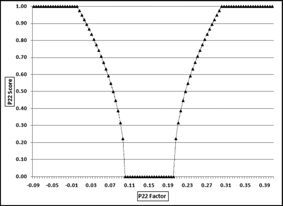
Figure 17.13 shows the P22 scores (on the y-axis) applied to the P22Factors using the formulas in Equation (17.22). The expected score is 0.20 (two months divided by 10 months) and Figure 17.13 exposes an error in the scoring in that the P22 score of zero should be centered at 0.20 and not at 0.15. Despite the flaw, the graph shows that as we move to the left or right of 0.15, the score of zero increases to 1.00. The average score for P22 was 0.59, which was very high and it seems that P22 as it stands does not do a very good job of distinguishing between erratic prepaid expenses and the normal fluctuations in a business. The average score could be reduced by increasing the interval for a zero score for P22 to perhaps 0.10 to 0.30. The square root sign could also be removed which would make the slopes a straight line instead of the convex functions shown above. This predictor was given a low weighting and so the scoring issues actually had very little impact on the final risk scores.
P23: Prepaid Expenses Other
The company had chart of accounts of about 5,000 ledger accounts and every normal business transaction could be recorded using the available ledger accounts. The next three predictors deal with the use of certain vague and rarely needed accounts. Past experience showed that controllers were inclined to use these rarely needed accounts as cookie jar reserves for lean and fat times. Predictor P23 gave a high-risk score to any division that had used the Prepaid Expenses-Other account for anything more than insignificant amounts. The P23 formula is shown in Equation (17.23).
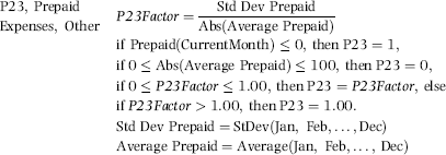
The P23 formula in Equation (17.23) uses the Prepaid amounts for the prior year and gives a high score when there are large fluctuations in the prepaid account. Several conditions can cause a score of 1.00 or a score of zero and the conditions are not always consistent. The conditions listed in Equation (17.23) are listed in the order in which they are evaluated. If the prepaid balance for the current month is negative (which is irregular because the prepaid amounts should be positive), then P23 equals 1.00 without taking the amounts or the P23Factor into account. The average score for P23 was 0.61, which means that P23 does not do a very good job of distinguishing between using the account as a possible cookie jar and using the account in the normal course of business. As a test the upper bound (of $100) was changed to $5,000 and the average dropped to 0.51. A complete reevaluation of this formula is needed.
P24: Uninvoiced Trade Payables
The logic for P24 was the same as the P23 logic. The Uninvoiced Trade Payables account was created for an accrual for an expenditure that had not yet been invoiced by the supplier. This was a rarely needed account that controllers were inclined to use as cookie jar reserves. The P24 formula is shown in Equation (17.24).
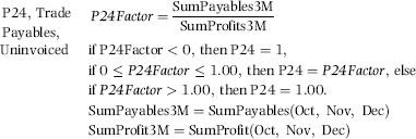
The P24 formula in Equation (17.24) uses the payables amounts for the prior three months and gives a high score when this is large in relation to the profits. P24 is scored as 1.00 if the ratio is negative. A review of the results showed that a negative P24Factor was usually due to the profits being negative. With hindsight it is not clear why a loss should generate a P24 score of 1.00. There were a few cases when the sum of the payables balances was negative, and this was a really odd situation. The average score for P24 was 0.44 and this high score again reflects a little too much zeal to score the payables predictor.
P25: Accrual Other Miscellaneous
The logic for P25 was the same as for P23 and P24. The Accrual Other Miscellaneous account was for “miscellaneous accrued liabilities awaiting final decision regarding their disposition and appropriate account classification.” This was a rarely needed account that controllers were inclined to use as cookie jar reserves. The P25 formula is shown in Equation (17.25).
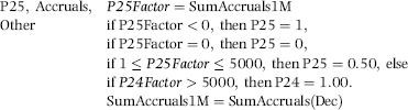
The P25 formula in Equation (17.25) uses the Accruals amounts for the preceding month and gives a high score when the accruals exceed $5,000. A score of 1.00 is awarded if the accruals amount is negative. The average score for P25 was 0.16 and this average score seems just right for a seldom-used account. It is insightful that the simplest of the three formulas gives the best average result.
P26: Outside USA and Canada
The logic for P26 was that most of the prior issues that arose in the financial reporting arena were for divisions that were outside of the USA and Canada. The Hitachi example at the start of this section also concerned a distant subsidiary. The P26 formula is given in Equation (17.26).
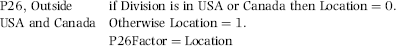
The P26 formula in Equation (17.26) could be adapted so that the “outside USA and Canada” could include more or fewer countries or regions. The formula could also be adapted to score somewhat risky countries as 0.50 and very risky countries as 1.00. The average score for this predictor was about 0.50, which reflected the fact that about one-half of all divisions were outside of the United States and Canada. A more sophisticated scoring formula would aim to reduce the average to about 0.20.
P27: Prior Scores
The logic for P27 was that the effects of a prior high score would linger for several periods. P27 formula is given in Equation (17.27).
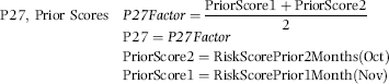
The formula for P26 is shown in Equation (17.26). This predictor keeps a prior high or low score tagging along for two more months. When the risk scoring model is first run it is not possible to have prior scores. Each forensic unit could be scored with a zero for the first run of the risk scoring model.
Each predictor was weighted according to its perceived influence on the total risk of the divisions. As with the prior applications the weights should sum to 1.00. With each predictor confined to the [0,1] range, the final scores are also bounded by the [0,1] range with high scores reflecting higher risks.
Table 17.4 The Weights Given to the 27 Predictors.
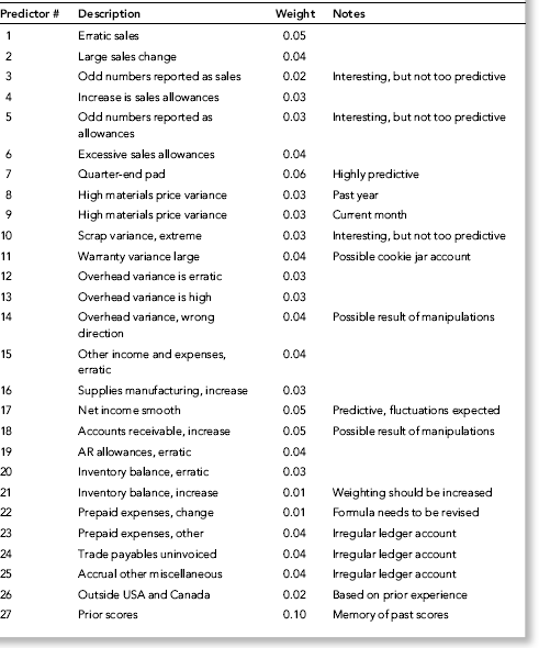
The weights of the 27 predictors are given in Table 17.4. Highly predictive predictors were given higher weights. With 27 predictors the average weight is about 0.04. The profile of the final scores is shown in Figure 17.14.
Figure 17.14 The Profile of the Financial Reporting Risk Scores
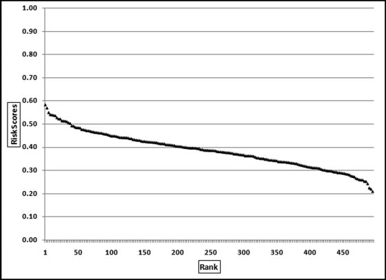
The pattern of the risk scores shows that there is a small group of divisions with relatively high scores, with high in this case meaning 0.50 and higher. These divisions (about 8 percent of the divisions) scored above 0.5, on average, across all predictors. The highest score was 0.584. This high-risk division scored perfect 1s on 13 predictors. The minimum score was 0.210, which means that the division that was seen to have the least financial reporting risk still scored perfect 1s on two predictors and positive scores on eleven variables.
The 27 financial reporting predictors were based on (a) erratic behavior, (b) changes in balances, (c) changes in a direction opposite to expected, (d) balances that are relatively high or low, (e) targeted behavior such as increased profits in the quarter-end month, and (f) the use of obscure general ledger accounts.
The risk-scoring method added several layers of rigor to the audit process. It assisted with audit planning and it helped the auditors better understand the entity and its environment before any formal audits were started. Audit management had some reservations about the risk scoring approach correctly identifying the most high-risk divisions. Their belief was that a controller could be using only three manipulation methods. The division would end up with a low risk score because scoring 1s on three predictors each weighted 0.05 would only give a score of 0.15.
Future revisions will reduce the number of predictors to 10 predictors, plus the “outside USA” and the “prior scores” predictors, neither of which is directly based on the division's financial numbers. Each predictor could then be weighted from 0.05 to 0.125. The starting point for the deletion of predictors would be those predictors that currently have low weights. Another change could be to revise the formulas so that the average score is about 0.20 and that only extreme numbers are given positive scores. It is always easier to improve and upgrade a system that is already in place than it is to create a scoring system from scratch. The system would have been very difficult to design had it not been for the consistency of reporting due to the use of an enterprise resource planning (ERP) system.
This chapter reviewed several ways to evaluate accounting numbers with a view to assessing their authenticity. The methods included (a) the analysis of the digit patterns in financial statement numbers, (b) detecting biases in accounting numbers, and (c) detecting high-risk divisional reports.
The analysis of the digit patterns in financial statement numbers started by rearranging the numbers to form a consistent set of reported numbers. Income and deduction numbers were analyzed separately. The analysis looked at the patterns of the leading and ending digits and compared these to Benford's Law. The binomial distribution was used to assess how unlikely the duplications were. The general rule is that most sets of financial numbers have too few numbers for a rigorous application of Benford's Law.
The detection of biases in accounting numbers focused on identifying an excess of second-digit zeroes that come about from inflating revenues of (say) $993 million to $1,008 million, or $798,000 to $803,000. These upward revisions were evident from an analysis of quarterly earnings reports. A review of Enron's reported numbers showed a strong bias toward reporting numbers that just exceeded psychological thresholds. This section included a method to identify biases in reported amounts. The method involved fitting the best-fitting smooth line to the data points and then assessing the magnitude of the difference between the fitted smooth line and the actual pattern. Biases are usually evident by large differences and clearly visible spikes. The technique was demonstrated on therapy visit data.
The chapter also demonstrated the risk scoring method on divisional reports. The forensic units were the divisions in an international manufacturing conglomerate and the predictors were based on the reported monthly numbers. The behavior of interest was whether the divisional controllers were reporting numbers that included intentional or unintentional errors. In general, the 27 predictors looked for (a) erratic behavior, (b) changes in balances, (c) changes in a direction opposite to expected, (d) balances that are relatively high or low, (e) targeted behavior such as increased profits in the quarter-end month, and (f) the use of obscure general ledger accounts. The final results showed that some divisions were apparently high risk. The scoring method needed to be simplified because the predictors allowed some questionable practices to remain hidden. The use of advanced detection techniques should act as a deterrent to fraudulent financial reporting.