
Chapter 14
Identifying Fraud Using Time-Series Analysis
A time-series analysis extrapolates the past into the future and compares current results to those predictions. Large deviations from the predictions signal a change in conditions, which might include fraud. A time-series is an ordered sequence of the successive values of an expense or revenue stream in units or dollars over equally spaced time intervals. Time-series is well suited to forensic analytics because accounting transactions usually include a time or date stamp. The main objectives with time-series analysis are to (a) give the investigator a better understanding of the revenues or expenditures under investigation, and, (b) to predict the revenues or expenses for future periods. These predicted values will be compared to the expected results and large differences investigated.
The comparison of actual to predicted results is closely related to a continuous monitoring setting. Time-series analysis has been made easier to use over the past few years by user-friendly software and the increased computing power of personal computers. An issue with time-series is that the diagnostic statistics are complex and this might make some forensic investigators uncomfortable in drawing conclusions that have forensic implications. For example, there are usually three measures to measure the accuracy of the fitted model and users might not know which measure is the best.
The usual forensic analytics application is forecasting the revenues for business or government forensic units, or forecasting items of an expenditure or loss nature for business or government forensic units. Forensic units are units that are being analyzed from a forensic perspective and are further discussed in Chapter 15. A forensic unit is basically the subunit used to perpetrate the fraud (a cashier, a division, a bank account number, or a frequent flyer number). For example, in an audit of the small claims paid by insurance agents in 2011, the 2011 claims would be predicted using time-series and the 2008–2010 claims. A large difference between the actual and the predicted claim payments would indicate that conditions have changed.
In a continuous monitoring environment time-series could be used to compare the actual revenues against forecasts for the current period. Time-series could be used to forecast the monthly revenues for each location for restaurant chains, stores, or parking garages. Large differences between the actual and the forecast numbers are signs of possible errors in the reported numbers. Time-series could also be used as a control of expenditure or loss accounts that have high risks for fraudulent activity. Loss accounts are costs that have no compensating benefit received and examples of these losses include (a) merchandise returns and customer refunds at store locations, (b) baggage claims at airport locations, (c) payroll expenses classified as overtime payments, (d) credits to customer accounts at utility companies, (e) warranty claims paid by auto manufacturers, or (f) insurance claims paid directly by agents.
Extrapolation (time-series) methods and econometric methods are the main statistical methods used for the analysis of time-series data. The choice of methods depends on the behavior of the series itself and whether there is additional data (besides just the revenue or expense numbers) on which to base the forecast. Time-series methods generally use only the past history of a time-series to forecast the future values. Time-series methods are most useful when the data has seasonal changes and the immediate past values of the series are a useful basis for the forecast. The original motivation for using time-series in forensic analytics was an application to see whether the divisional controllers were booking higher than usual sales at the end of each quarter. This quarter-end excess was called the quarter-end sales pad.
Time-series is a more sophisticated form of regression analysis where the forecasts include seasonal increases and decreases. In a forensic investigation setting time-series could be used by:
- A franchisor, to see which locations are showing a decrease in sales compared to past trends.
- An airline, to see which airports are showing a large increase in cases of baggage theft.
- A bank, to see which branches are showing the largest increases in loans written off.
- A school district, to see which schools are using more electricity than the amount extrapolated from past trends.
- An insurance company, to see which agents are paying claims in excess of their predicted values.
- A cruise ship or hospital, to see which ships or departments have food consumption in excess of their predicted values.
- A courier service, to see which locations are showing the largest increases in fuel expenses.
- A church district, to see which churches are showing decreasing trends in income.
This chapter reviews four time-series case studies to show how the technique works in practice. The case studies include heating oil sales, stock market returns, construction numbers, and streamflow statistics. The chapter includes a review of running the time-series tests in Excel.
To extrapolate means to extend the curve beyond the known values in a way that makes sense. These extended values would be our forecasts. Forecasting methods are usually based on (a) the simple average of past data values, or (b) a weighted average of the past data values with higher weights on more recent values, or (c) a simple or weighted average of past values together with an adjustment for seasonal patterns or cyclical patterns. A seasonal pattern is one that varies with some regularity in the past data. For example, heating oil sales are seasonal with high sales in the cold winter months and low sales in the hot summer months. A cyclical pattern is one that cycles up and down over long unequal time periods; for example, stock market bull or bear cycles, or housing boom or bust cycles.
The first step in the process is to fit a function (a line) to the series of past values. This is quite easy if the past values are close to being a straight line. The better the fit of the line to the past values, the more confidence can be shown in the predicted values. The fit between the past data and the fitted line is measured by the mean absolute percentage error (MAPE). The MAPE is a close cousin of the mean absolute deviation (MAD) discussed in Chapter 6.
Because time-series is entirely based on the past values in a series we need to consider the random variation in the past time-series. If the random variations are large then the past data values will only be a noisy basis for predicting the future. For example, in an elementary school in a remote part of the country the enrollments could be forecast with a high degree of accuracy because the population would be much the same from year to year. In other situations the future is affected by highly variable external factors. High levels of random variation would be characterized by higher MAPE measures.
An Application Using Heating Oil Sales
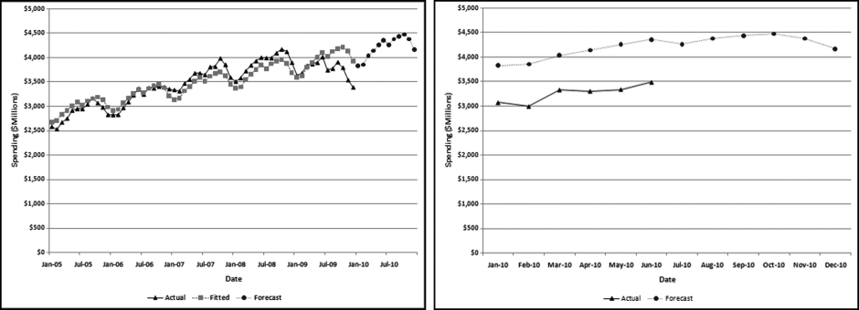
Heating oil is a low viscosity, flammable liquid petroleum product used as a heating fuel for furnaces or boilers in buildings. Heating oil use is concentrated in the northeastern United States. The demand for heating oil makes it highly seasonal. Heating oil data was obtained from the U.S. Census Bureau (Census Bureau) and the U.S. Energy Information Administration (EIA). The time-series graph in Figure 14.1 shows heating oil sales from 2005 to 2010.
Figure 14.1 U.S. Heating Oil Sales in Dollars and Gallons
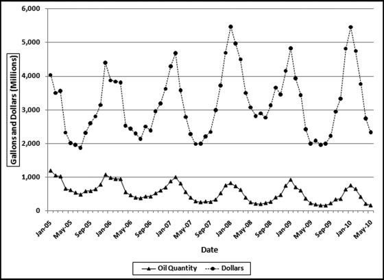
The EIA data used is the “U.S. No. 2 Fuel Oil All Sales/Deliveries by Prime Supplier.” The data is the detail supplied from the “Prime Supplier Sales Volumes” page. The EIA data has been converted from thousands of gallons per day to a monthly number. The reported number for January 2009 was 29,853.1. This number was multiplied by 31 to give a January volume of 925.4461 million gallons.
The heating oil sales data in Figure 14.1 shows that the demand is highly seasonal with a low demand in the warm summer months and a high demand in the cold winter months. The seasonal pattern repeats every 12 months. The lower line represents the sales in millions of gallons and the upper line shows the sales in millions of dollars. The two series are highly correlated since the seasonal pattern exists for both total gallons and total dollars. The peak is during the cold period and the valley is at the warmest time of the year. The correlation between the two series is 0.67. The correlation is less than 1.00 because (a) both series are subject to some measurement error, and (b) the price per gallon was not constant over the period. The price varied from a low of $1.808 per gallon at the start of the period to $2.716 at the end of the period with a high of $4.298 near the middle of the series in July 2008. Since the sales dollars series is affected by quantity and price, the sales in gallons will be used for time-series analysis. The time-series analysis is shown graphically in Figure 14.2.
Figure 14.2 The Time-Series Analysis of Heating Oil Data
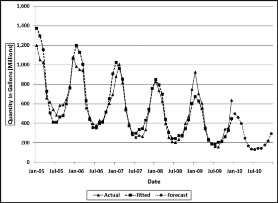
Figure 14.2 shows the actual heating oil data in millions of gallons from Figure 14.1 together with the fitted line and the 12 forecasts for 2010. The forecasting method used is based on Ittig (2004). This method is a decomposition method that also takes the trend into account. The method first calculates the effect of the seasons on the data (e.g., month 1 is 69.2 percent higher than average, and month 7 is 46.2 percent lower than average). The data is then deseasonalized, which basically removes the seasonal factors (e.g., month 1 is reduced by 40.9 percent and month 7 is increased by 85.9 percent to get back to the baseline). A regression is run on the logs of the quantities and the seasonal factor is then put back into the data. The Ittig (2004) method works well for financial data because it takes into account the seasonal factors, the trend, and also whether the seasonal pattern is becoming more or less pronounced. In the heating oil data it seems that the seasonal pattern is becoming less pronounced as the series is trending downward. The trend refers to the general upward or downward tendency over the five-year range.
There is more than one method for measuring how “good” a forecast is. One useful metric is how well the fitted values match the actual values for the past data. In the heating oil data this would be the 2005 to 2009 numbers. The closer the fitted values track the actual numbers, the easier it was for the technique to fit a function to the past data. Our assessment of the fit of the function is similar to our assessment of the fit of the actual proportions to the proportions of Benford's Law in Chapter 6. The metric for assessing the goodness-of-fit for time-series data is the MAPE and the formula is shown in Equation 14.1.
where AV denotes the actual value, FV denotes the fitted value, and K is the number of records used for the forecast. The MAPE calculation in Equation 14.1 is invalid for an AV value (or values) of zero, because division by zero is not permissible. For AV values of zero the MAPE should be reported as N/A (not applicable) or the MAD in Equation 6.4 should be used. In the case of the heating oil data we have 12 records for each year giving us a K of 48 (12 times 4).
The MAPE in Equation 14.1 is closely related to the MAD in Equation 6.4. The MAPE gives us the goodness-of-fit as a percentage. The MAPE for the heating oil data in Figure 14.2 is 12.7 percent, which means that the fitted line is, on average, 12.7 percent “away” from the actual line. This high MAPE is even more troublesome because the fit is worse for the most recent year. A simple example with only three actual and fitted values (as opposed to 48 actual and fitted values for the heating oil data) is shown in Table 14.1.
Table 14.1 A Short Example of the Goodness-of-Fit Calculations.
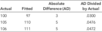
An example with only three data points and three fitted values is shown in Table 14.1. The average of the absolute differences is 0.0416 and after multiplying by 100 we get a MAPE of 4.16.
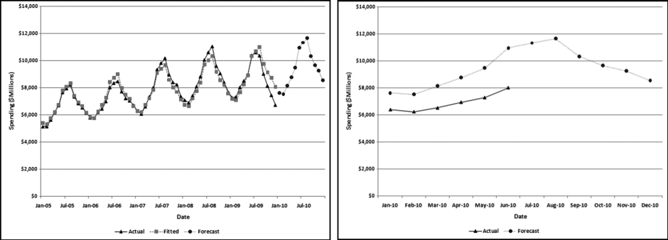
There is no benchmark for a “large” MAPE. Each application should be looked at individually. If the stakes are high and a high degree of confidence is needed in the results then we would like to see a low MAPE, which indicates that the past seasonal patterns and the past trend is stable. For forensic applications where there might be legal implications, a low MAPE would be needed before using the data in a case against an individual or entity. For marketing situations where forecasts are mingled with intuition a large MAPE might be tolerated. The heating oil forecasts and the actual numbers (as far as was known at the time of writing) are shown in Figure 14.3.
Figure 14.3 The 2010 Forecasts and the Actual Numbers for January to June
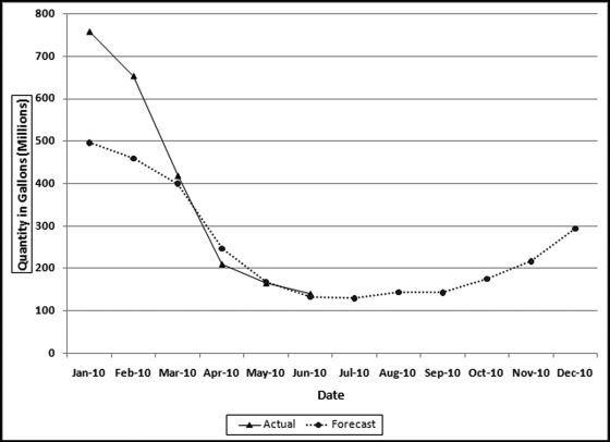
The forecast in Figure 14.3 is the dashed line that shows the strong seasonal trend with high values for the winter months and low values for the summer months. The graph in Figure 14.2 shows a downward trend over the four-year period and this trend is continued for the fifth year (the forecast year). The results show that the actual numbers for January and February exceeded the forecast while the actual numbers for March to June were on target. The June numbers were the latest available at the time of writing. A review of the actual numbers in Figure 14.2 shows that there was a surge in demand in December 2009 and this surge carried forward to the first two months of 2010. The National Oceanic and Atmospheric Administration (NOAA at www.noaa.gov) in its State of the Climate report dated March 10, 2010, noted that for the 2009–2010 winter more than one-half of the country experienced below normal temperatures. This trend was not uniform across the whole country and the areas that had a colder than usual winter contributed to the above-trend heating oil consumption in December to February. The analysis correctly indicated that conditions were different in December to February.
An Application Using Stock Market Data
A search for “best months for stock market” or “timing the market” will show a number of articles suggesting that stock returns in some months are historically better than others. This case study will use stock market data from 1988 to 2009 to calculate whether there is a seasonal effect. Data for the S&P 500 was downloaded from the Investing section of Yahoo! Finance (http://finance.yahoo.com) using the symbol ^GSPC. The monthly return was calculated as a percentage. An extract from the spreadsheet is shown in Figure 14.4.
Figure 14.4 The Monthly Data Used to Analyze S&P 500 Returns
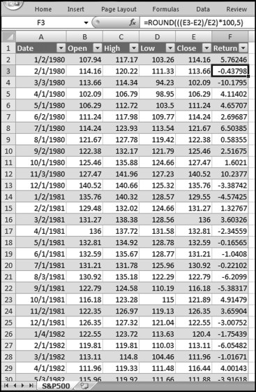
The return for each month is calculated in Figure 14.4. The formula for the monthly return is shown in Equation 14.2.
where t0 is the closing value of the index for the current month and t−1 is the closing value of the index for the prior month. The calculated return is a percentage return rounded to five decimal places to keep the spreadsheet neat. The return for the first month (January 1980) uses the closing index value from December 1979. The December 1979 values are not included on the spreadsheet. The actual returns and the fitted values of a time-series analysis are shown in Figure 14.5.
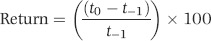
Figure 14.5 The Stock Market Returns and the Fitted Time-Series Line
Figure 14.5 shows the actual stock market returns (as the highly volatile series) and the fitted time-series values (as the stable series just above the 0 percent line). The actual returns vary widely with no noticeable pattern or trend except that there seems to be periods of high volatility (a large spread) followed by periods of low volatility. The fitted values, while difficult to see clearly, have some features that are noticeable. The fitted values are trending downward meaning that over the 30-year period the average returns were trending downward. The fitted values are not a straight line, which means that the model did detect a seasonal pattern. However, the fitted values straighten out as we move ahead in time indicating that the seasonal pattern became less pronounced as time moved forward. Finally, the MAPE was 200.2 percent, meaning that the model is not very reliable. The predicted and actual values will tell us if there is a seasonal effect and these are shown in Figure 14.6.
Figure 14.6 The Actual and the Predicted Returns for 2010
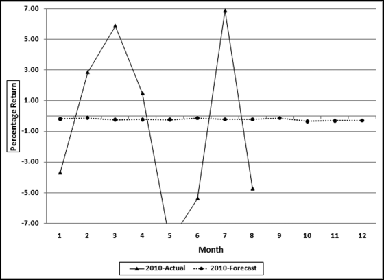
The actual and predicted returns for 2010 are shown in Figure 14.7. The predicted numbers would have been of little use to any investor. The correlation between the actual returns and the fitted values was −0.13. The time-series model is essentially predicting a straight line. Because the returns were steadily decreasing over time the model predicted negative returns for every month. The negative correlation means that the small seasonal (monthly) adjustments are more often in the wrong direction than in the right direction. In essence, these results tell us that movements in the stock market are random and there are no easily detectable patterns that can be reliably traded on. The seasonal factors are shown in Figure 14.7.
Figure 14.7 The Seasonal Pattern in the Stock Market Data
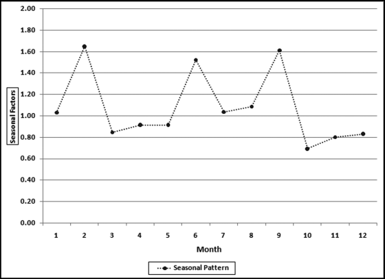
The seasonal pattern in Figure 14.7 (which is essentially Figure 14.6 without the actual values) shows that the months with the highest returns were February, June, and September. The months with the lowest returns were October, November, December, and March. The poor showing of October was due in large part to the crash of October 1987 and also a large negative return in October 2008. These results suggest that the saying “sell in May and go away” is not really true. A search of this term, or a look at the review in Wikipedia also shows that this is not one of the best market tips. Any stock market regularity (day of the week, time of the day, before or after presidential elections) that is regular and large enough to cover occasional losses and trading costs could be very valuable.
An Application Using Construction Data
Construction spending is an important part of the economy. Economists look at construction spending to gauge the overall health or optimism in the economy. The construction industry is one of the first to spiral downward in a recession and is one of the first industries to recover during the recovery phase. This section shows the application of time-series analysis to different sectors in the construction industry. It will be seen that some sectors are more amenable to time-series analysis than others. The applications will use historical data for 2005 to 2009 (60 months) for (a) residential construction, (b) highway and street, (c) healthcare, and (d) educational. The data was obtained from the U.S. Census Bureau website (www.census.gov) in the section devoted to construction spending tables. The 2010 data shown was the latest available at the time of writing. Figure 14.8 shows the results for residential construction.
Figure 14.8 A Time-Series Analysis of Residential Construction Data
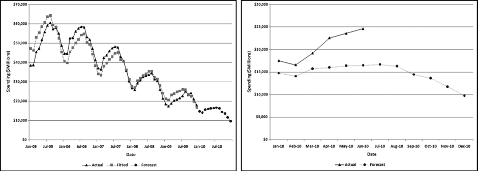
The left panel of Figure 14.8 shows total residential construction (public and private) from 2005 to 2009 (60 months) and the forecasts for 2010. The left panel shows a seasonal pattern from year to year with the annual low being in February and the annual high being in July. The graph shows a downward trend over the five-year period. This is in line with the decline in economic conditions from 2005 to 2009. The panel on the right shows the forecasts for 2010 (which is the same as the right side of the graph in the left panel) and the actual results for 2010.
The MAPE of the construction data is 8.3 percent. The 2005 and the 2006 numbers are roughly equal, and this is followed by a sharp decline. Time series analysis struggles with a change in the trend (level followed by a decline) and works best when the long-term trend is consistent. In this case, a solution could be to drop the 2005 data and to only use 2006 to 2009 for the fitted values and the forecast. An analysis of the 2005 to 2009 data (not shown) shows a MAPE of just 5 percent. The model is therefore able to create a better fit between the past data and the fitted line. Because the trend is so negative the model actually forecasts some negative values for 2011 and the entire series of forecasts for 2012 is made up of negative numbers. Time-series analysis is more of an art than a science and the results should be carefully interpreted and used. The Highway and Street construction results are shown in Figure 14.9.
Figure 14.9 A Time-Series Analysis of Highway and Street Construction Data
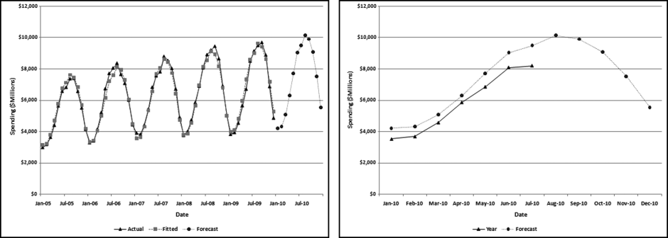
The Highway and Street (“highway”) results in Figure 14.9 have some notable features. First, the numbers are highly seasonal with the August peak being more than double the January low. The long-term trend is upward with an average monthly increase of about $31 million over the five-year period. Finally, the seasonal pattern and the trend are both regular meaning that the model can work well with this data. The MAPE is 3.4 percent, which means that the model could fit a close-fitting line.
The 2010 actual and forecast numbers are shown in the right side panel of Figure 14.9. The model captures the seasonal pattern and the seasonal trend is being closely followed in 2010. However, the trend is slightly off. The model forecasts 2010 numbers that are about 5 percent higher than the fitted 2009 numbers. However, the actual numbers are about 11 percent below the forecasts for 2010. Not only did the increase not materialize, but the trend was reversed with a decrease in 2010 as compared to 2009 (at least for the year-to-date). The most recent month shows the largest shortfall for the year-to-date. The large 11 percent difference between the actual and the forecast numbers correctly signals that conditions have changed and the long-term trend has been disrupted. These findings agree with numbers posted by the American Road and Transportation Builders Association, although it should be noted that the construction categories covered by that Association are more than just the highway category of the Census Bureau. The healthcare construction results are shown in Figure 14.10.
Figure 14.10 A Time-Series Analysis of Healthcare Construction Data
The healthcare construction (“health care”) results in Figure 14.10 have some notable features. First, the numbers are seasonal with the October peak being about 17 percent more than the January low. This seasonal pattern is less extreme than the pattern for construction spending. The long-term trend is upward with an average monthly increase of about $20 million over the five-year period. Finally, the seasonal pattern and the trend are both stable until the last six months of the period when it seems that healthcare spending falls off a cliff. The MAPE is 4.4 percent, which is usually a good fit, except for this case where most of the error is in the last six months of the last period.
The 2010 actual and forecast numbers are shown in the right side panel of Figure 14.10. The results show that the model captures the seasonal pattern and that the seasonal pattern is being reasonably closely followed in 2010. The trend is off because the forecasts are about 25 percent higher than the actual numbers. The upward trend has reversed itself to a decline in 2010 as compared to 2009 (at least for the year-to-date). The 25 percent difference between the actual and the forecast numbers correctly signals that things have changed, and for the worse. These findings echo the sentiments and numbers in the 2010 Hospital Building Report of the American Society for Healthcare Engineering. The educational construction results are shown in Figure 14.11.
Figure 14.11 A Time-Series Analysis of Educational Construction Data
The educational results in Figure 14.11 are similar to the healthcare results. The numbers are highly seasonal. The August peak is about 51 percent more than the February low. This seasonal pattern is more extreme than healthcare spending, which seems logical given that the school year starts around the end of August. The long-term trend is upward with an average monthly increase of about $45 million over the period. Finally, the seasonal pattern and the trend are both stable until the last six months of the period when it seems that educational spending falls off a cliff. The MAPE is 3.7 percent, which under normal circumstances is a good fit, except for this case where much of the error is in the last six months of the last period.
The 2010 actual and forecast numbers are shown in the right side panel of Figure 14.11. The model captures the seasonal pattern and the seasonal trend is being reasonably closely followed in 2010. Again, however, the trend is slightly off. The model forecasts 2010 numbers that are about 26 percent higher than the actual 2010 numbers. The upward trend has reversed to a decline in 2010. The large difference between the actual and the forecast numbers once again signals that conditions have changed. These findings echo the sentiments and numbers in the 2010 School Construction Report, a supplement to School Planning & Management.
The construction data shows that time-series analysis can accurately detect a seasonal pattern, when one exists. The technique falls somewhat short when the long-term trend is not consistent, as was the case with the residential construction data. Also, the technique relies on mathematics that is quite capable of predicting negative construction numbers. Negative numbers are just not possible for construction data. Time-series also struggled with an accurate forecast when the numbers showed a sharp decrease in the last six months. The results correctly signaled that the long-term trends had been disrupted, and that the past patterns in the past data were not being continued.
An Analysis of Streamflow Data
Nigrini and Miller (2007) analyze a large table of earth science data. The results showed that streamflow data conformed closely to Benford's Law and that deviations from the Benford proportions in other earth science data could be indicators of either (a) an incomplete data set, (b) the sample not being representative of the population, (c) excessive rounding of the data, (d) data errors, inconsistencies, or anomalies, or (e) conformity to a power law with a large exponent.
There are several reasons for the collection of accurate, regular, and dependable streamflow data. These are:
- Interstate and international waters. Interstate compacts, court decrees, and international treaties may require long-term, accurate, and unbiased streamflow data at key points in a river.
- Streamflow forecasts. Upstream flow data is used for flood and drought forecasting for improved estimates of risk and impacts for better hazard response and mitigation.
- Sentinel watersheds. Accurate streamflow data is needed to describe the changes in the watersheds due to changes in climate, land, and water use.
- Water quality. Streamflow data is a component of the water quality program of the USGS.
- Design of bridges and other structures. Streamflow data is required to estimate water level and discharge during flood conditions.
- Endangered species. Data is required for an assessment of survivability in times of low flows.
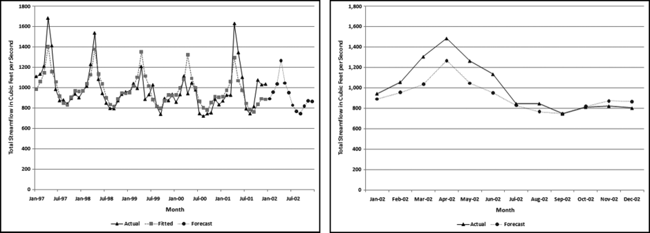
This section analyzes data prepared by Tootle, Piechota, and Singh (2005) whose study analyzes various influences on streamflow data. Their study used unimpaired streamflow data from 639 stations in the continental United States. This data set is particularly interesting because the Nigrini and Miller (2007) study showed near-perfect conformity to Benford's Law for streamflow data. The advantage of their data over the Nigrini and Miller (2007) data is that the data is in a time-series format and each station has a complete set of data for the period under study. An additional reason for studying streamflow data is because the methods used for measuring flow at most streamgages are almost identical to those used 100 years ago. Acoustic Doppler technology is available but has yet to provide accurate data over a wide range of hydrologic conditions more cost-effectively than the traditional current meter methods. For this application 60 months of data (1997 to 2001 inclusive) was used to provide a forecast for 2002. Each record is an average monthly streamflow from a station from 1997 to 2001 measured in cubic feet per second. The monthly flows ranged from 0 to 74,520 cubic feet per second. The data was highly skewed with the average monthly flow being 749 cubic feet per second. The monthly totals for the period are shown in Figure 14.12.
Figure 14.12 The Sum of the Streamflows from 1997 to 2001
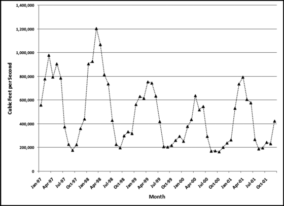
The data is highly seasonal with the annual maximum being recorded in either March or April of each year, and the annual minimum being recorded in August, September, or October of each year. The 1998 calendar year had the highest annual total streamflow and the 2000 calendar year had the lowest annual streamflow. The fact that an “early” year had the highest annual sum, and a “later” year had the lowest sum means that the time-series model will forecast a declining trend. The time-series results are shown in Figure 14.13.
Figure 14.13 A Time-Series Analysis of Streamflow Data
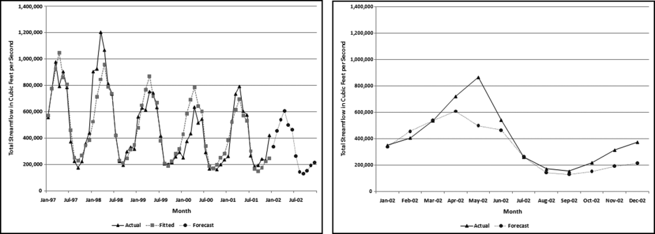
The actual and the fitted values (together with the 2002 forecasts) are shown in the left panel and the forecasts and the actual numbers are shown in the right panel. The data for 1997 to 2001 is highly seasonal. The September low is about 27 percent of the March high. Streamflows are apparently not regular and consistent from year to year. Dettinger and Diaz (2000) include an interesting discussion of streamflow seasonality. They note that seasonality varies widely from river to river and is influenced by rainfall, evaporation, the timing of snowmelt, travel times of water to the river, and human interference. Summer rainfall contributes less to streamflow. So streamflow is influenced not only by the amount of rainfall, but the timing thereof. The next step in the analysis is to compare the forecasts to the actual numbers for the 639 stations. The distribution of the MAPEs is shown in Figure 14.14.
Figure 14.14 The Ordered MAPEs for the Streamflow Stations
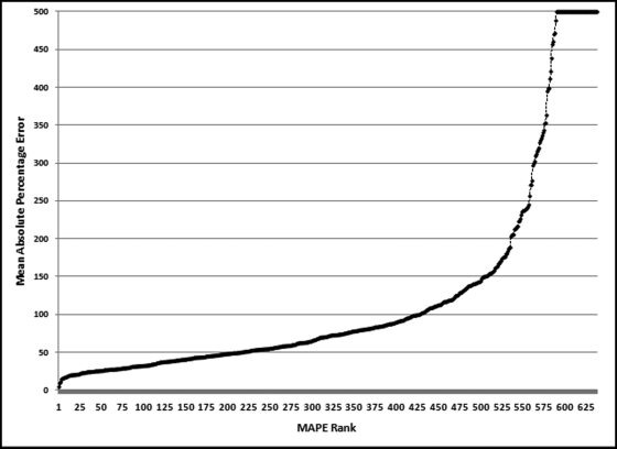
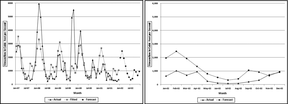
Only about one-third of the MAPEs are less than 50 percent (the left side of the graph). About one-quarter of the MAPEs exceed 100 percent. The MAPE numbers have been capped at 500. These high MAPEs indicate that the time-series model is struggling to fit a neat curve to the past data and suggests that the forecasts will not be too reliable. The results for a station with a low MAPE and a station with a high MAPE are shown next. The results for station 4124000 are shown in Figure 14.15.
Figure 14.15 A Time-Series Analysis of Streamflow Data for Station 4124000
This station is on the Manistee River, near Sherman, Michigan. This station had the second lowest MAPE (8.3 percent). The actual numbers and the fitted lines are shown in the left panel. Even though the MAPE was comparatively low, the graph shows that there was much variability in the flow from year to year. The actual numbers have a downward trend for the first four years followed by an upward jump in the last year. This gives a slope of near zero which is what we would expect in a river over a short period of time. The results for 2002 (the forecasts and the actual numbers) are shown in the right panel of Figure 14.15. Here the seasonal pattern is followed quite closely, but the forecast is too low for the first half of the year and slightly too high for the last half of the year. The MAPE of the actual to the forecast is 9.2 percent. This might be suitable for some purposes, but probably not for performance evaluation, or fraud-detection in a business setting. These results are contrasted with a station with a MAPE close to the median of 70.4 percent. The results for station 2134500 are shown in Figure 14.16.
Figure 14.16 A Time-Series Analysis of Streamflow Data for Station 2134500
This station is on the Lumber River, at Boardman, North Carolina. This station had a MAPE of 71.8 percent, which was close to the median MAPE. The actual numbers and the fitted lines are shown in the left panel. This graph shows that there was much variability in the flow from year-to-year. The actual numbers show large flows in the second and the fourth year and an abnormal peak in September and October 1999. The September and October 1999 high was a near-record crest for the river and the abnormal activity was due to hurricanes Floyd and Irene, which slammed into North Carolina almost in succession. The streamflow patterns are erratic and because of this the time-series model cannot fit a curve with a low MAPE to the actual numbers and any forecasts are similarly unreliable. The forecast values in the right panel show an abnormal peak in September and October. This is because the abnormal peak in 1999 was so extreme that it caused a bump in the forecast values. While September and October is in the hurricane season it seems illogical to include an irregular event in a forecast. The MAPE of the actual to the forecast is about 200 percent. This level of error makes the forecast unsuitable for most purposes.
The streamflow application shows that the numbers have to be somewhat stable for the time-series model to be able to make any sort of reliable forecast. If the past data is erratic then the future data is also likely to be erratic and somewhat unpredictable. If the stakes are high, as in performance evaluations or fraud detection, then forecasts with high margins of error should not be used.
Running Time-Series Analysis in Excel
Time-series analysis is more complex than linear regression. The procedure begins by deseasonalizing the data. This is followed by calculating the regression line and then reseasonalizing the data. The final steps calculate the MAPE and the forecasts. Because the number of rows changes across the calculations and because of various scaling requirements, the flexibility of Excel is preferred over Access. Some of the calculations require formulas that look up or down a specified number of rows and it is difficult to program these formulas in Access. Time-series calculations will be demonstrated using the highway and street construction data in Figure 14.9. The Excel example uses 60 months of past data with a forecast horizon of 12 months. The original data and the first stage of the calculations are shown in Figure 14.17.
Figure 14.17 The First Stage of the Time-Series Calculations
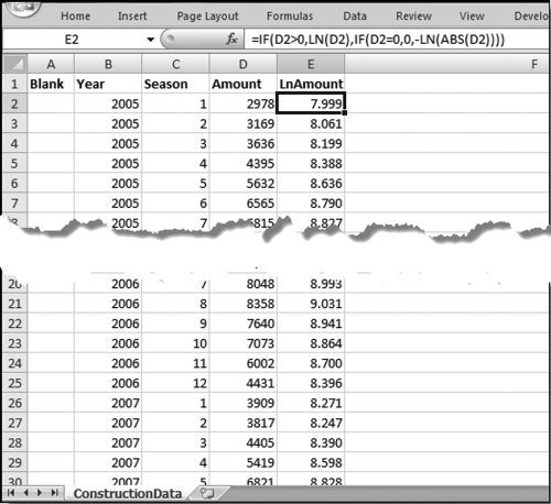
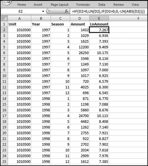
Figure 14.17 shows the first stage of time-series analysis. A description of columns A to E is given here:
A (Blank): This field is used when the analysis is performed on several forensic units such as the locations in a chain of stores, or auto dealers for a car manufacturer.
B (Year): This indicates the calendar year. The data should be organized so that the oldest year is at the top and the newest year is at the bottom. This column is not actually used in the calculations.
C (Season): This is a season indicator that goes from 1 to 12 for monthly data, or 1 to 24 for hourly data, or 1 to 7 for a weekly seasonal pattern.
D (Amount): This is the historical (past) data that will usually be denominated in dollars for financial data. Other possibilities include cubic feet per second for streamflow data, or people for passenger data.
E (LnAmount): This is the natural logarithm (base e) of the Amount field. Because the logarithm of a negative number is undefined we need to use a formula that still works with negative numbers. The formula is
E2: = IF(D2>0,LN(D2),IF(D2 = 0,0,-LN(ABS(D2))))
Calculating the Seasonal Factors
The second stage of the calculations is to calculate the seasonal factors. These factors calculate which months are higher and which are lower than average, and also the size of these differences. These formulas are not copied all the way down to the last row of the data. The completed second stage is shown in Figure 14.18.
Figure 14.18 The Calculation of the Seasonal Factors
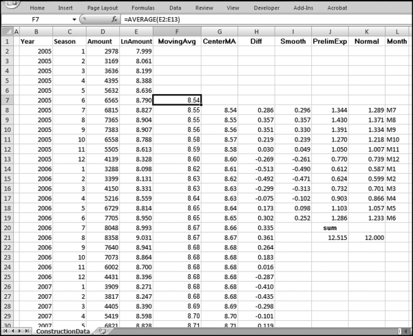
The second stage of the time-series calculations is shown in Figure 14.18 in columns F through L. This stage calculates the seasonal factors for the data. None of the formulas in columns F through L are copied down to the last row of data. The formulas and notes are
F7 (MovingAvg): = AVERAGE(E2:E13)
This formula is a part of the procedure to determine which months are higher or lower than the annual average. This formula is copied down to row 55.
G8 (CenterMA): = AVERAGE(F7:F8)
This formula is a part of the procedure to determine which months are higher or lower than the annual average. This formula is copied down to row 55.
H8 (Diff): = E8−G8
This formula is a part of the procedure to determine which months are higher or lower than the annual average. This formula is copied down to row 55.
I8 (Smooth): = AVERAGE(H8,H20,H32,H44)
This formula calculates the average monthly seasonal deviation for the four-year period. There are 12 monthly averages, one average for each month. This formula is copied down to I19.
J8 (PrelimExp): = EXP(I8)
In this Preliminary Exponent field the EXP function “undoes” the conversion to logarithms in column E by getting back to the original number. This formula is copied down to J19. We need one more step to perfect our exponents, which is to get them to average 1. This is done by getting the sum of the 12 numbers to equal 12.
J20 (sum):sum
Enter the label “sum” in J20. This is to indicate that J21 is the sum of the exponents.
J21: = SUM(J8:J19)
This formula sums the preliminary exponents. The sum of the exponents should equal 12 for monthly data.
K8 (Normal): = (J8/$J$21*12)
This formula normalizes the preliminary exponents and forces the sum to equal 12.00. This formula is copied down to K19.
K21: = SUM(K8:K19)
This formula is to check that the exponents sum to 12.00 for monthly data.
L8 to L19 (Month): These cells are given the labels M7 to M12 and M1 to M6.
The letter M stands for month and the numbers 1 to 12 are for January to December. These labels are not used in any formula.
The labels in column L complete the second stage. In the next stage, a linear regression is run on the deseasonalized data. The seasonal variations are removed and a forecast is made using linear regression.
This third stage calculates the long-term trend (upward or downward) using linear regression on the deseasonalized numbers. The seasonal factors will be used again in a later stage. The screenshot for the third stage is shown in Figure 14.19.
Figure 14.19 The Third Stage of the Time-Series Analysis
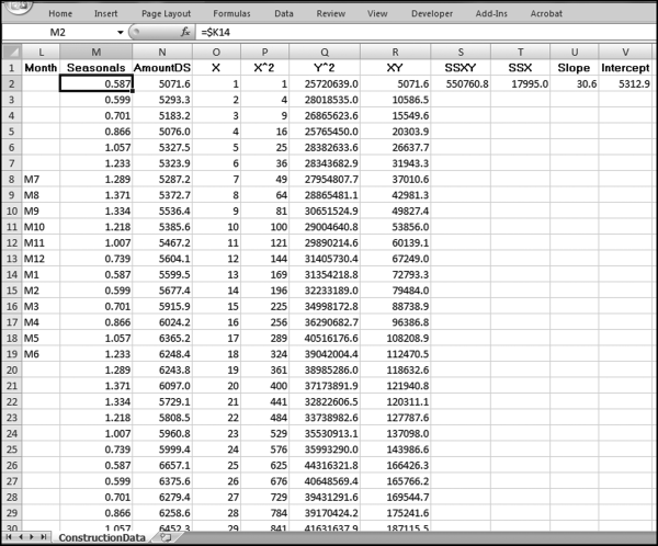
The third stage of the analysis in Figure 14.19 uses columns M through V. This stage uses the linear regression to calculate the long-term trend. The formulas and notes are

This field repeats the seasonal factors from column K. These are listed starting with M1 and continuing to M12. Thereafter the M1 to M12 values are repeated so that the 12 values are repeated a total of five times from row 2 to row 61. The use of the $ sign before the column reference means that when the formulas are copied downward, they will continue to reference K8:K19.
N2 (AmountDS): = D2/M2
This column calculates the deseasonalized amounts. This formula is copied down to N61.
O (X): This field is a counter that starts at1inO2and increases by1as the row numbers increase.
This counter starts at 1 in O2 and ends at 60 in O61, the 60th month. This counter is the x-axis in the linear regression calculations.
P2 (X^2): = O2*O2
This column calculates the x-squared values. The formula is copied down to P61.
Q2 (Y^2): = N2*N2
This column calculates the y-squared values. The formula is copied down to Q61.
R2 (XY): = O2*N2
This column calculates the xy-product values. The formula is copied down to R61.
S2 (SSXY): = SUM(R2:R61)−(SUM(O2:O61)*SUM(N2:N61)/COUNT(D2:D61))
This formula calculates the sum of the cross products. The last term divides by the number of records in the historical data, which in this case is 60.
T2 (SSX): = SUM(P2:P61)−(SUM(O2:O61)*SUM(O2:O61)/COUNT(D2:D61))
This formula calculates the sum of squares for x. The last term divides by the number of records in the historical data, which in this case is 60.
U2 (Slope): = S2/T2
This formula calculates the slope of the regression line. A positive value indicates that the long-term trend is upward.
V2 (Intercept): = SUM(N2:N61)/COUNT(D2:D61)
−(U2*SUM(O2:O61)/COUNT(D2:D61))
This formula gives the y-intercept value in the linear regression.
The third stage has now calculated the linear regression coefficients for the deseasonalized data. The fourth stage generates the fitted line and the fitted curve and calculates the MAPE.
Fitting a Curve to the Historical Data
The fourth stage of the time-series analysis is shown in Figure 14.20 and uses columns W through Z. This stage fits a straight line (giving us the trend) and the curved line (with the seasonal pattern), and also calculates the MAPE.
Figure 14.20 The Fourth Stage of the Time-Series Analysis
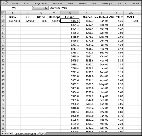
Figure 14.20 shows the fourth stage of the time-series analysis. The formulas and notes are
W2 (FitLine): = $V2+($U2*O2)
This formula applies the slope and the intercept to the x-values (the counter) in column O. This result is a straight line. This formula is copied down to W61. The formula in W3 is =$V2+($U2∗O3) and the formula in W4 is =$V2+($U2∗O4). Some manual work is needed to keep the V and U references constant and the O references relative.
X2 (FitCurve): = W2*M2
This is the fitted curve that takes into account the seasonal nature of the data. This formula is copied to X61. If there is no seasonal pattern then this line will equal the fitted line in column W.
Y2 (MonthsBack):1/1/2005
Y3 (MonthsBack):2/1/2005
This column will be used for the labels on the x-axis (the horizontal axis). The date is entered into Y2 as 1/1/2005, and into Y3 as 2/1/2005. Cells Y2 and Y3 are highlighted and the monthly increment is copied down to Y61. This field is formatted as Date using the “Mar-01” Date format in Excel.
Z2 (AbsPctErr): = IF(D2<>0,ABS((D2-X2)/D2),1)*100
This field is the Absolute Percentage Error for the row. The IF function is used to avoid division by zero. This formula is copied to Z61.
AA (MAPE): = AVERAGE(Z2:Z61)
This formula calculates the average of the absolute percentage errors in column Z. The Mean Absolute Percentage Error indicates how well time-series was able to fit a curved line to the actual past data.
This completes the fourth stage and the final stage deals with the main objective of calculating forecasts. The next stage is shown below.
The forecasts are calculated in the final stage. This stage also includes a MAPE for the forecast numbers.
Figure 14.21 The Calculation of the Forecasts and the MAPE
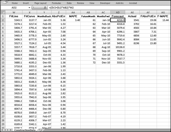
The final stage of the time-series analysis is shown in Figure 14.21 and uses columns AB through AG. The formulas for the forecasts and the MAPE are shown below:
AB2 (FutureMonth): This field is simply a counter that starts at 61 because we have 60 months of past data and the first forecast is for month “61.” The counter starts at 61 and ends at 72 in cell AB13.

This column will be used for the labels on the x-axis (the horizontal axis). The date is entered into AC2 as 1/1/2010, and into AC3 as 2/1/2010. Cells AC2 and AC3 are highlighted and the monthly increase is copied down to AC13. This field is formatted as Date using the “Mar-01” Date format in Excel.
AD2 (Forecast): = ($V2+$U$*AB2)*M2
The forecast uses the intercept and the slope times the counter in column AB. This forecast is then multiplied by the seasonal factor in column M. Because of the arithmetic gymnastics in columns J and K, the sum of the forecasts with the seasonal factor is equal to the straightline forecast (not shown). The formula for AD3 is =($V2+$U2∗AB3)∗M3 and the formula for AD4 is =($V2+$U2∗AB4)∗M4. Some manual work is needed to keep the V and U references constant and the O references relative.
AE (Actual): These are the actual numbers for the current period. In this case the source was the U.S. Census release dated September 1, 2010.
AF (FAbsPctErr): = ABS((AE2-AD2)/AE2)*100
This formula calculates the percentage error of the forecast expressed as a percentage of the actual numbers. The formula is copied down to the last row of data in column AC.
AG (F-MAPE): = AVERAGE(AF2:AF13)
This the average of the percentage errors calculated in column AF. A new column is used because we might want to sort the data according to the F-MAPEs.
Graphs of the data are shown in Figure 14.9. The left side graph of Figure 14.9 uses the data in,
D2:D61 (Actual data)
X2:X61 (Fitted numbers)
AD2:AD13 (Forecast numbers)
Y2:Y61 (x-axis labels)
The right side graph of Figure 14.9 uses the data in
AD2:AD13 (Forecast numbers)
AE2:AE8 (Actual data for 2010)
AC2:AC13 (x-axis labels)
Although it is useful to perform a time-series analysis on a single data set, the real power of the technique is when it is used on many data sets at the same time. The streamflow application used data from 639 stations for 1997 to 2001. The spreadsheet can be adapted to multiple data sets using strategically placed Copy and Paste commands. Figure 14.22 demonstrates the first step.
Figure 14.22 The Process to Run a Time-Series Analysis on Multiple Data Sets
The first step to run time-series analysis on multiple data sets is shown in Figure 14.22. Column A is now used to show the unit reference (a location number, an account number, or a person's name, etc.). The only columns with new data (as compared to Figure 14.17) is A (the unit reference), B (the year references), and D (the Amount). The time periods in columns Y and AC will need to be updated.
The first-stage calculations (with the calculated fields in columns B and E) are copied downward for all subsets. In this case we have 639 stations, each with 60 months of streamflow, and so the first stage data and calculations will extend from the labels in row 1 to row 38341. The final row is 38341 because we use one row for the labels and 639 ∗ 60 rows for our data (1 + 639∗60 = 38341). The next step is to copy the calculations starting in cell F2 (which is blank) and ending in cell AG61 (which is also actually blank) down to the last row. On a much reduced scale, this is shown in Figure 14.23.
Figure 14.23 The Copy Step in the Time-Series Worksheet
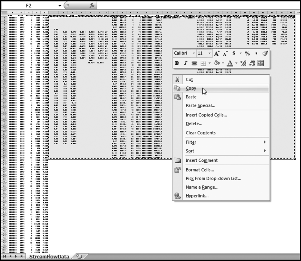
Figure 14.23 shows the first step in copying the formulas down so that the calculations are done for all units. Cells F2:AG61 are highlighted and Copy is clicked. The formulas have been written so that the calculations to the right of each data set (each set of 60 rows) will pertain to that data set. The step is completed as is shown in Figure 14.24.
Figure 14.24 The Paste Step in the Time-Series Worksheet
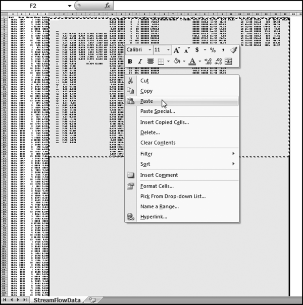
Figure 14.24 shows a portion of the spreadsheet where the formulas from F2:AG61 are copied and pasted into F2:AG38341. The formulas have been set up so that they are copied correctly. Each set of 60 rows and 28 columns will relate to one station. The final step is to insert the “Actual” numbers for 2002 (or whatever the case may be) into column AE. This might require a bit of spreadsheet gymnastics. The completed section for the first streamflow station is shown in Figure 14.25.
Figure 14.25 The Comparison of the Actual Results to the Forecasts
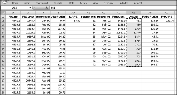
Figure 14.25 shows the comparison of the actual results to the forecast numbers. For the station 1010500 the MAPE is 141.75 percent. This shows a large difference between the past patterns and the current numbers. Care needs to be taken in this section of the worksheet (columns AE, AF, and AG) to only use the rows that are needed. If we have 12 months of actual data then we would use all 12 rows. If we only have seven months of actual data then we would only use AE2 to AF8.
A time-series is a sequence of the successive values of an expense or revenue stream in units or dollars over equally spaced time intervals. There are many time-series graphs in the Economist where interest rates or inflation numbers are plotted over a period of time. A time-series graph is one where dates or time units are plotted on the x-axis (the horizontal axis). Time-series analysis is well suited to forensic analytics because accounting transactions always include a date as a part of the details. From a forensic analytics perspective the objectives when using time-series analysis are to (a) give a better understanding of the revenues or expenditures under investigation, and, (b) to predict the values for future periods so that differences between the actual and expected results can be investigated.
In a forensic setting the investigator might forecast the revenues, or items of an expenditure or loss nature for business or government forensic units. Loss accounts are costs but have no compensating benefit received and examples include (a) merchandise returns and customer refunds at store locations, (b) baggage claims at airport locations, or (c) warranty claims paid by auto manufacturers. A large difference between the actual and the predicted numbers would tell us that conditions have changed and these changes could be due to fraud, errors, or some other anomalies. Time-series analysis is most useful for data with a seasonal component and when the immediate past values of the series is a useful basis for a forecast.
Several examples are shown in the chapter. The first study looked at heating oil sales where the numbers are highly seasonal with high usage during the cold winter months and low usage during the warm summer months. The next study looked at stock market returns for 30 years to test for seasonality and the results showed a weak seasonal pattern. The results suggested, though, that time-series analysis cannot be used to generate superior investment returns. The third study looked at construction data where it would seem that time-series would work well on aggregate U.S. data. The results showed that 2010 brought in a change in conditions. The fourth study looked at streamflow data where the results showed that streamflows are highly volatile from a seasonal and from a trend perspective.
The chapter showed how to run time-series analysis in Excel. In the first stage the data is imported (copied) to the worksheet. The seasonal factors are calculated next. These factors indicate which months are above and below the average and the extent of these deviations. The data is then deseasonalized and normal regression techniques are applied to the long-term trend. In the fourth stage a curved line is fitted to the past data and the mean absolute percentage error (MAPE) is calculated as a measure of how well the curve fits to the past data. In the fifth stage the forecast numbers are calculated and the current numbers are compared to the forecasts. The process is completed by preparing a graph of the past data with the fitted curve and the forecasts, as well as a more detailed graph of the forecasts and the actual numbers for the current period.