
Chapter 13
Identifying Fraud Using Correlation
Using correlation to detect fraud is a relatively recent event. The first application of correlation in a forensic setting was at a fast-food company where correlation was used to identify restaurants with sales patterns that deviated from the norm. These odd sales patterns played an important part in identifying sales numbers that were influenced by fraud. The next correlation application was at an electric utility where correlation was used to identify customers with electric usage patterns that differed from the seasonal norm. The usage patterns together with other red flags were successful at detecting some large-scale electricity theft. A recent correlation application was at a consumer goods manufacturer where correlation was used to identify retailers with coupon redemption patterns that differed substantially from the norm. Again, the redemption patterns together with other red flags were successful at identifying highly suspect patterns in coupon submissions.
Correlation is usually used to detect fraud on a proactive basis. According to the IIA (2004), controls may be classified as preventive, detective, or corrective:
- Preventive controls These controls are there to prevent errors, omissions, or security incidents from occurring in the first place. Examples include controls that restrict the access to systems by authorized individuals. These access-related controls include intrusion prevention systems and firewalls, and integrity constraints that are embedded within a database management system.
- Detective controls These controls are there to detect errors or incidents that have eluded the preventative controls. Examples include controls that test whether authorization limits have been exceeded, or an analysis of activity in previously dormant accounts.
- Corrective controls These controls are there to correct errors, omissions, or incidents after detection. They vary from simple correction of data-entry errors, to identifying and removing unauthorized users from systems or networks. Corrective controls are the actions taken to minimize further losses.
The most efficient route is to design systems so as to prevent errors or fraud from occurring through tight preventive controls. In some situations, tight preventive controls are difficult to achieve. For example, it is difficult to have watertight controls in situations where customer service plays a large role. These situations include airline, hotel, or rental car check-in counters. Customer service personnel need some leeway to handle unusual situations. Other low-control environments include situations where the transactions are derived from third-party reports such as sales reports from franchisees, warranty claims reported by auto dealers, baggage claims reported by passengers at airports, and reports of coupons or rebates redeemed by coupon redemption processors. In cases where preventive controls are weak, detective controls have additional value.
The use of correlation as a detective control is well suited to situations where there are, (a) a large number of forensic units (departments, divisions, franchisees, or customers, etc.), (b) a series of time-stamped revenues, expenses or loss amounts, and (c) where a valid benchmark exists against which to measure the numbers of the various forensic units. The requirements above are open to a little innovation. For example, election results are well-suited to correlation studies, but here there is no series of time-stamped transactions. An example of time-stamped revenue amounts would be sales dollars on a month-by-month basis for fiscal 2011.
Correlation tests are usually done together with other fraud detection techniques, with the correlation tests being only one part of a suite of tests used as a detective control. This chapter reviews correlation itself and includes four case studies showing its use in a forensic analytic setting. The chapter shows how to run the tests in Access and Excel.
Correlation measures how closely two sets of time-related numbers move in tandem. In statistical terms correlation measures how well two sets of data are linearly related (or associated). A high degree of correlation would occur when an x percent increase (or decrease) in one field is matched with an x percent increase (or decrease) in another field. For example, at gasoline stations there is a high level of correlation between the posted prices for low-, mid-, and high-octane gasoline. A change of (say) 10 cents in the price of one grade is almost always matched with a 10 cents change in the other two gasoline grades. Figure 13.1 shows the weekly retail pump prices of the three gasoline grades (regular, mid-, and high-octane) for 2009 for the New England region.
Figure 13.1 The Weekly Retail Pump Prices of Gasoline in 2009 in New England
Source: Department of Energy (www.eia.gov: Retail Gasoline Historical Prices)
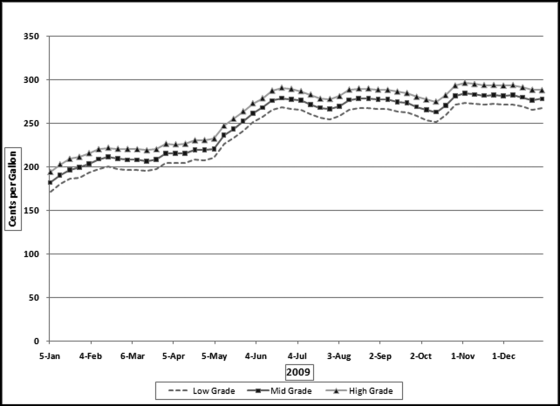
The three series of gasoline prices in Figure 13.1 track each other very closely. The middle grade is on average about 4.6 percent more expensive than the regular grade, and the high grade is on average also about 4.6 percent higher than the middle grade. The stable price differences indicate that the prices move in tandem. A change in one price is matched with an almost identical change in the other. The statistical technique used to measure how well the prices track each other is called correlation. The numerical measures of correlation range from −1.00 to +1.00.
It is important to emphasize that correlation does not imply causation. Two data fields can be highly correlated (with correlations at or near +1.00 or −1.00) without the numbers in one field necessarily causing the other field's numbers to increase or decrease. The correlation could be due purely to coincidence. For example, the winning times in one-mile races are positively correlated with the percentage of people who smoke. This does not mean that quicker one-mile races causes people to smoke less. The ranges of the correlation coefficient are discussed in the next paragraph.
When the correlation is equal to zero, there is no correlation between the two data fields. An increase in the value of one of the data series is matched with an equal chance of either an increase or a decrease in the second data series. Similarly, a decrease in the value of one of the data series is matched with a 50/50 chance of either an increase or a decrease in the second data series. A correlation of zero also occurs when the values in the series are unchanged over time and the second series shows a set of values that are either increasing or decreasing or some other pattern of changes. Examples of zero or near-zero correlations are shown in Figure 13.2.
Figure 13.2 Examples of Near-Zero Correlations
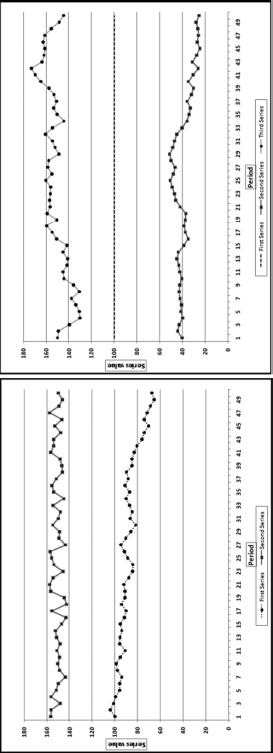
The correlations between the first and second series in the graph on the left is close to zero. The data points in the two series move in the same direction for one-half of the time and move in opposite directions for the remainder of the time. The calculated correlation is fractionally above zero. In the graph on the right, the first series (the middle set of dashes) starts at 100 and randomly ticks up by 0.0001 or down by 0.0001. The first record is 100 and all subsequent values are either 100.0001 or 99.9999. The second series (the bottom series of values) starts at 40 and randomly drifts downward to 25. The third series starts at 150 and randomly drifts downward to 145. Even though the second and third series both ultimately drift downward the calculated correlation between the first and second series is small and positive and between the first and third series is small and negative. When one series is exactly constant the correlation between it and another series cannot be calculated because the correlation formula would then include a division by zero, which is undefined. The general rule is that if one series is almost unchanged then the correlation between it and any other series will be close to zero.
A correlation of 1.00 says that there is a perfect, positive, linear relationship between the two series. The positive +1.00 does not mean that one series is always increasing. A positive correlation has little to do with a positive slope. A correlation of 1.00 happens when a percentage increase in one field is matched with exactly the same percentage increase in the other field. A correlation of 1.00 would also happen when an increase (or decrease) in the value of one field is matched with exactly the same absolute value change in the other field. A correlation of 1.00 does not imply that the change in one field causes the change in the other field. Figure 13.3 shows two examples of correlations equal to 1.00.
Figure 13.3 Some Examples of Perfect, Positive Linear Correlations
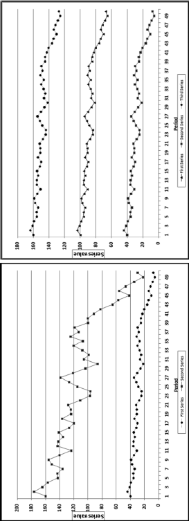
Figure 13.3 shows two examples of correlations equal to 1.00. In the graph on the left the percentage changes in both series are identical. For example, the second data point in each series is 10.125 percent greater than the first data point. Both series show an overall decrease of 81.375 percent, but the effect is most noticeable for the larger (topmost) series. In the graph on the right each series oscillates by the same absolute amount. For example, in each case the second data point in the series is 4.05 units larger than the first unit in the series. The vertical distance between all three series is constant. In the first panel the percentage changes are equal, and in the second panel the absolute changes are equal. The correlation is also equal to 1.00 with a combination of percentage and absolute value changes. The correlation is equal to 1.00 if the second series is a linear combination of the first series through multiplication by a constant, addition of a constant, or both multiplication by and addition of constants.
A correlation of −1.00 indicates that there is a perfect, negative, linear relationship between the two series. An increase in the value of one series is matched with a decrease in the second series. Figure 13.4 shows examples of correlations equal to or close to −1.00.
Figure 13.4 Examples of Negative Linear Correlations
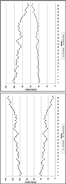
Figure 13.4 shows two examples of perfect and near-perfect negative correlations. The graph on the left shows the case where an increase in one series is matched with a decrease in the other, and a decrease in the value of one series is matched with exactly the same absolute value increase in the other. The correlation here is −1.00 because each increase or decrease is matched with an opposite change of exactly the same absolute value and this pattern continues throughout. In the graph on the right the increase of 4.05 percent in the lower series is matched with a decrease of 4.05 percent in the upper series. The absolute values of the percentages are equal but the directions are opposite. The percentages in the lower series cause much less of an upward or downward gyration because the absolute values are smaller than those of the second series. If the starting value for the lower series was (say) 5.00, then the changes would hardly be noticeable with the naked eye, but the correlation would still be a near-perfect −0.984. If one series started at 100 and the changes were easily noticeable, and a second series started at (say) 5.00 and had identical percentage changes (perhaps in the same direction and perhaps in the opposite direction) it would be impossible to tell visually whether the correlation was perfectly positive, near zero, or almost perfectly negative. The magnitude of the correlation is not visually obvious when one series plots as an almost straight line.
Correlations between 0 and 1.00 indicate that the correlation, or association, is positive and the strength of the relationship. A correlation of 0.80 says that the association is strong in that a positive increase (or decrease) in the one series is most often matched with a positive increase (or decrease) in the other. A correlation of only 0.30 means that an increase in the value of one series is matched with an increase in the other for slightly more than one-half of the data pairs. Similarly, correlations between 0 and −1.00 tell us that the correlation, or association, is negative and the strength of the relationship. Some more examples of positive and negative correlations are shown in Figure 13.5.
Figure 13.5 Examples of Positive and Negative Correlations
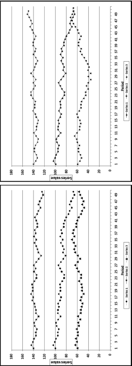
Figure 13.5 shows some examples of weak and strong positive and negative correlations. It is quite difficult to estimate correlations by just looking at them. In the graph on the left the correlation between Series 1 (the middle series) and Series 2 (the upper series) is 0.80. It is therefore strong and positive. Both series have a general downward drift and because they move in the same direction, the correlation is positive. The correlation between Series 1 and Series 3 (the lower series) is 0.30. This is a weak positive correlation. The direction changes are the same for just over one-half of the data points. In the graph on the right the correlation between Series 1 (the middle series) and Series 2 (the upper series) is −0.80. The general tendency for Series 1 is a decrease and the general tendency for Series 2 is an increase. The change is in the opposite direction for about two-thirds of the data points. The correlation between Series 1 and Series 3 (the lower series) is −0.30. This is a weak negative correlation. The general tendency for Series 1 is a decrease and for Series 2 is a very mild increase. The direction changes are the same for about one-half of the data points. It might be possible to visually distinguish between correlations of 0.80. 0.30. −0.80, and −0.30. The task is more difficult for correlations that are closer together in value and also where the changes in the series are not so easy to see as would happen if one series had values that ranged between 4.5 and 5.5 on a graph scaled from 0 to 180 on the y-axis.
The correlations calculated in Figures 13.1 to 13.5 are the Pearson product-moment correlations. The formula is shown in Equation (13.1).
where xi and yi are the records in the fields whose correlations are being calculated.
This correlation equation in Equation (13.1) includes summations, which means that the calculations will require a series of queries in Access. Excel offers three options when it comes to calculating correlations. The first two options are to use the CORREL function or the Correlation tool in the Data Analysis tools. The Correlation tool calculates the correlations between all the records in all the fields. If a data table contains 10 fields then the Correlation tool will calculate the correlations among all 10 fields, which would give a 10 by 10 matrix as a result. The CORREL function allows more control because the results can be limited to the correlations of interest. The third Excel option is to calculate the correlation using the formula in Equation (13.1).
Excel is the efficient solution when a correlation calculation is needed for one forensic unit for only two data fields. The CORREL function or the Correlation tool is impractical when many forensic units are being compared to a single benchmark. The solution is to use Access when many forensic units are being compared to a single benchmark. With many forensic units IDEA is also an excellent option because it has correlation included as a built-in function. This chapter shows how to run the Access queries.
Using Correlation to Detect Fraudulent Sales Numbers
This section describes the use of correlation by an international company with about 5,000 franchised restaurants. The franchisees are required to report their monthly sales numbers in the first three days of a month. For example, the sales numbers for November should be reported by the third day of December. Based on the reported sales numbers, the franchisor bills the franchisee for royalty and advertising fees of 7 percent of sales. The sales reports are processed by the accounts receivable department and time is needed to follow up on missing values and obvious errors. By the end of the second week of a month the sales file for the preceding month has undergone all the major internal testing procedures. By the end of the third week of a month the forensic auditors are in a position to review the sales file. There is, however, a continual revision process that occurs because of sales adjustments identified by the franchisees and the franchisor. The forensic auditors have only a short window during which to review the sales numbers before the next wave of monthly reports becomes the current month. Reporting errors by franchisees could be either intentional or unintentional.
Reporting errors (intentional or unintentional) are usually in the direction of understated sales and result in a revenue loss for the franchisor. Using the Vasarhelyi (1983) taxonomy of errors, these errors could be (a) computational errors, (b) integrity errors (unauthorized deletion of transactions), (c) timing errors (incorrect time period), (d) irregularities (deliberate fraud), or (e) legal errors (transactions that violate legal clauses) such as omitting nonfood revenues. The cost of a revenue audit on location is high, and the full cost is not only borne by the franchisor, but also partially by the franchisee in terms of the costs related to providing data and other evidence. A forensic analytics system to identify high-risk sales reports is important to minimize the costs of auditing compliant franchisees. The available auditor time should be directed at high-risk franchisees. This environment is similar to many others where audit units self-report dollar amounts and other statistics, and the recipient has to evaluate which of these might contain errors (e.g., individual tax returns, pollution reports, airline baggage claims, and insurance claims).
The sales audit system included forensic analytics that scored each restaurant based on the perceived risk of underreported sales. In the Location Audit Risk System, each restaurant was scored on 10 indicators. For each indicator a score of 0 suggested a low risk of underreported sales, while a score of 1 suggested a high risk of underreported sales. The 10 indicators included a correlation test.
The reported monthly sales number from each franchisee is the only number reported to the franchisor and is the only sales-related information that is processed, thereby precluding tests based on more explanatory variables (such as cash register reports or sales tax returns). In developing the sales expectations the assumption was made that the seasonal and cyclical patterns of the franchisee sales numbers should closely follow those of the company-owned restaurants.
The first step in the development of the analytic tests was to calculate and graph the pattern of monthly sales for the company-owned restaurants. The results are shown in Figure 13.6.
Figure 13.6 The Sales Pattern for the Average Restaurant
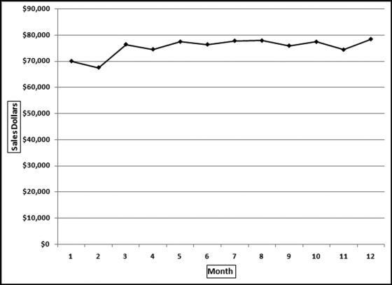
Figure 13.6 shows the monthly sales pattern. There is a seasonal pattern to the sales numbers and a general upward trend. February has low sales presumably because of the winter cold and the fact that it only has 28 days. The highest sales are in the summer vacation months of July and August, and the holiday period at the end of the year.
The assumption of this test was that the average sales pattern shown in Figure 13.6 should be the same for the franchised restaurants unless there were errors in reporting or some other unusual situation. Deviations from the benchmark (or the “norm”) signal possible reporting errors. An example of a hypothetical pattern is shown in Figure 13.7.
Figure 13.7 The Average Sales Pattern and the Sales for a Hypothetical Restaurant
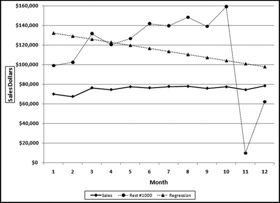
In Figure 13.7 the average sales pattern is the line with the diamond-markers and the hypothetical restaurant #1000 is the line with the circular markers. Restaurant #1000 shows an increase for February and has two abnormally low sales months (months 11 and 12). Also, the July sales number is lower than the June sales number, which differs from the average pattern. The correlation between the sales for #1000 and the average sales line is 0.279. Figure 13.7 also shows a linear regression line for restaurant #1000, which has a downward slope, whereas the regression line for the average (not shown) would have an upward slope.
The forensic analytics system was based on 10 predictors. Each predictor was seen to be a predictor of sales errors or irregularities. Each predictor was scored between 0.00 and 1.00, with 1.00 indicating a high risk of error or fraud. One predictor was based on the correlation between the sales for that particular restaurant, and the average sales pattern (in Figure 13.6). The correlation was calculated for each restaurant (their sales numbers against the average pattern) and the correlations were then ranked from smallest to largest.
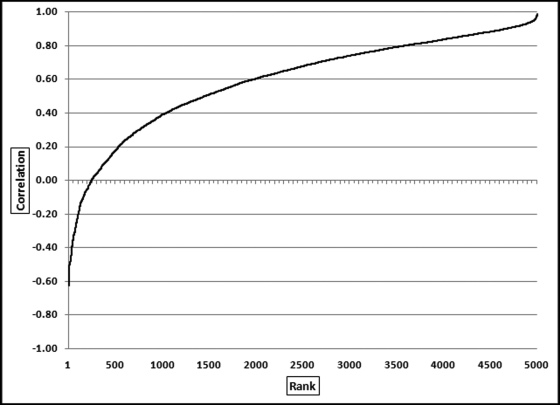
The correlations were sorted from smallest to largest and the results are shown in Figure 13.8. The lowest correlation was about −0.60 and the highest correlations were close to 1.00. It is quite remarkable that there were about 250 restaurants with negative correlations. The results showed that correlation worked well at detecting anomalies because the locations with negative correlations did have odd sales patterns. There were many cases, though, where the anomalies were caused by factors other than errors. For example, locations at university campuses had weak correlations because universities are generally empty in July (with zero or low sales) and full of hungry students in February (generating relatively high sales). Also, restaurants that were located near a big annual sporting event also had weak correlations. For example, horse racing season in Saratoga Springs is in July and August and there are a few big annual events at the Indianapolis Motor Speedway. The sharp upward spike in sales at the time of these big events impacted the correlation score. New restaurants also usually had low correlation scores. The zero sales months prior to opening, followed by a steady upward trend in sales after opening, gave rise to a weak correlation score. Weak correlation scores could be due to explainable factors other than fraud or error. The scoring of forensic units for fraud risk is further discussed in Chapter 15.
Figure 13.8 The Correlations Ranked from Smallest to Largest
Using Correlation to Detect Electricity Theft
An electric utility company in South America suspected that electricity in certain locations was being consumed and not billed. Calculations by their forensic auditors confirmed this by comparing the kilowatt hour (kWh) records for production with the kWh records for billing. The loss was large enough to merit a special forensic investigation. Access was used to calculate the average billing pattern for the average customer. The average electric usage is shown in Figure 13.9.
Figure 13.9 The Monthly Pattern of Total kWh Billed by an Electric Utility
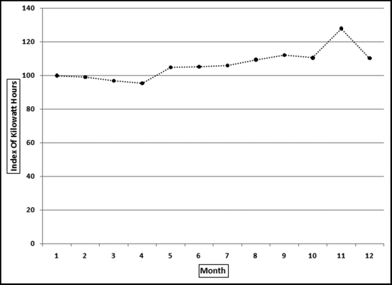
The first step in the analysis was to assess how realistic the billing pattern was. For this country the monthly average temperatures varied only slightly and so air-conditioning usage would have varied only slightly from month to month. Also, with a low average income, electric air conditioning was not going to amount to much to begin with. The first conclusion was that the seasonal pattern in Figure 13.9 was not accurate. Despite the issues with the benchmark, the correlations were calculated between each meter and the average monthly pattern. The ordered correlations are shown in Figure 13.10.
Figure 13.10 The Ordered (Ranked) Correlations of the Electric Utility
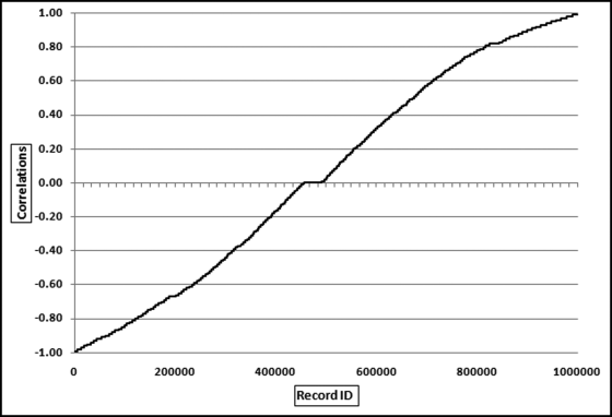
Figure 13.10 shows that the ranked correlations ranged from −0.99 to +0.99. The correlations were pretty much evenly spread over the range. The strange monthly pattern and the spread of the correlations indicated that correlation would not identify a small subset of odd meter patterns. The pattern actually indicates that one-half of the meter patterns were odd. With one million meters even a sample of 2 percent would give an audit sample of 20,000 units. Subsequent work showed that the meters were read every 28 days and so a specific meter might get read twice in one month and once in all the other months of the year.
Despite the issues with the correlations the correlations were still used to select an audit sample because the general trend in Figure 13.9 showed an increase. A negative correlation for a meter would mean that there was a declining trend for the year. A decrease in consumption is one indicator of electricity theft. An “extreme meter” test (called Extreme Medidor) was developed, which combined three predictor elements. These were (a) a large negative correlation (−0.75 or smaller), (b) a large percentage decrease from the first six months to the last six months of the year, and (c) a large decrease in absolute kWh terms. The forensic analytic test produced a sample of 1,200 highly suspect customers. The results also included a report showing customers with large credits (journal entries that simply reduced the number of kWh billed). These were red flags for internally assisted fraud by employees in the billing departments. The forensic investigation resulted in the recovery of several million dollars from customers and the prevention of further losses. Chapters 15 and 16 discuss in more detail the development of forensic risk scoring models for the detection of frauds and errors.
Using Correlation to Detect Irregularities in Election Results
In October 2003 the state of California held a special election to decide on the incumbency of the governor in office. This election was unusual in that there were 135 candidates on the ballot (plus some write-in candidates) to replace the current governor. The candidate list included several actors (including Arnold Schwarzenegger and Gary Coleman) and others from all walks of life including a comedian, a tribal chief, and a publisher (Larry Flynt). The election results can be found by clicking on the links for Election Results from the Secretary of State's page for elections (www.sos.ca.gov/elections/).
The assertion in this application is that each candidate's votes in each county should be in proportion to the total votes cast in the county. For example, 22.65 percent of the total votes cast were cast in Los Angeles County and 9.43 percent of the total votes cast were cast in San Diego County. For every candidate we would expect 22.65 percent of their total to come from Los Angeles and 9.43 percent of their total to come from San Diego. That is, we would expect the vote count for any candidate to be 2.4 times higher in Los Angeles as compared to San Diego (22.65/9.43 = 2.4). So, if a candidate received 10,000 votes then we would expect 2,265 votes (10,000 ∗ 22.65 percent) to be from Los Angeles and 943 votes (10,000 ∗ 9.43 percent) to be from San Diego. The proportion of votes cast in each county is shown in Figure 13.11.
Figure 13.11 The Proportion of Votes Cast in Each County in the 2003 Election in California
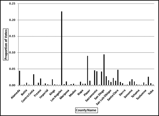
The proportion of votes cast on a county-by-county basis is shown in Figure 13.11. There are 58 counties but Figure 13.11 only shows every second county name so that the names are readable. The proportion for each county is calculated by dividing the number of votes cast in the county by the total number of votes cast in the election. In Los Angeles County there were 1,960,573 votes cast out of a total of 8,657,824 votes cast in the state giving a Los Angeles proportion of 0.2265. In San Diego County, there were 816,100 votes cast and the San Diego County proportion is therefore 0.0943. The expectation is that the votes received by each candidate follows the pattern that most of their votes were received in Los Angeles and San Diego and few votes were received in Alpine or Sierra (which had about 500 and 1,500 voters in total). The correlations were calculated for each candidate between their voting patterns and the patterns shown in Figure 13.11. The correlations were then sorted from smallest to largest and the results are shown in Figure 13.12.
Figure 13.12 The Correlations for the Election Candidates
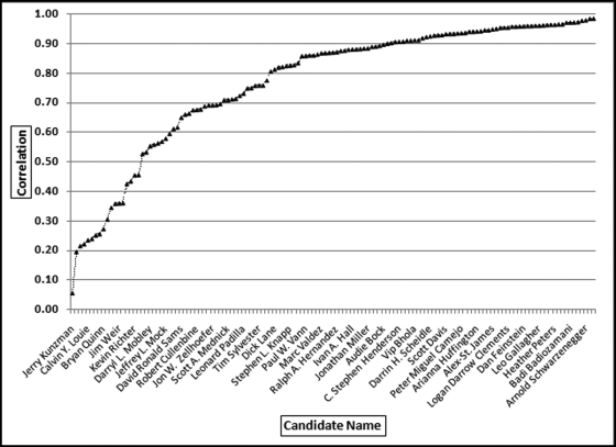
Figure 13.12 shows that the correlations ranged from 0.06 to 0.99. The lowest correlation was for candidate Jerry Kunzman and the highest correlation was for candidate Tom McClintock. The correlation for the winner, Arnold Schwarzenegger, was 0.98. In Figure 13.12 it seems that Arnold Schwarzenegger has the highest correlation but that is simply because the labels on the x-axis only show every fourth label to keep the labels readable. Even though the correlation for Jerry Kunzman is 0.06 this does not automatically signal fraud or error. The low correlation signals that this candidate's pattern differs significantly from the average pattern. The voter patterns for the two lowest correlations (Jerry Kunzman at 0.06 and Gregory Pawlik at 0.20) and another candidate, Calvin Louie, are reviewed in Figure 13.13.
Figure 13.13 The Voter Patterns for Three Candidates with Low Correlations
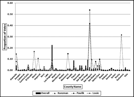
The voting patterns in Figure 13.13 show that the low correlations come about when a candidate gets a high proportion of their votes in a single county and very few votes in the counties that, on average, gave many votes to other candidates. For example, Kunzman got 32 percent of his votes in small Tulare County where the average percentage for this county was generally very low. It is a coincidence that Pawlik and Louie both got very high percentages in San Francisco.
The two lowest correlations were 0.056 and 0.196 for Kunzman and Pawlik. Pawlik only received 349 votes in total (about 6 votes per county). Pawlik received zero votes in 29 counties and any string of equal numbers will contribute to a low correlation. Pawlik received 188 votes in one county, and the string of zeroes together with one county providing about one-half of the total Pawlik votes caused a very weak correlation. In an investigative setting, the count of 188 votes in that single county would be reviewed.
Kunzman is a more interesting candidate with a near-zero correlation of 0.056. Kunzman received single digit counts for 42 counties giving a near-zero correlation for those 42 counties. He then received 736 votes in Tulare, a county with about 73,000 votes cast in total. Most of Kunzman's votes came from one small county. The correlation of near-zero is a true reflection of the voting pattern. In an investigative setting, the 736 votes in Tulare would be reviewed.
It is interesting that the correlation for the winner, Arnold Schwarzenegger, was 0.98. With such a high correlation his vote pattern should closely follow the overall pattern in Figure 13.13 (the bars). This is indeed the case and these results are shown in Figure 13.14.
Figure 13.14 The County-by-County Results for the Winner, Arnold Schwarzenegger
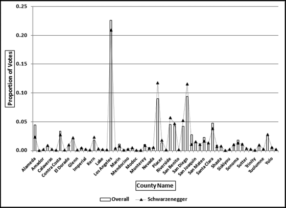
Figure 13.14 shows that the overall proportions and Schwarzenegger's proportions track each other quite closely to give a correlation of 0.98. The high correlation indicates that he was almost equally well liked across all counties. He did score low percentages in some counties but the overall picture was one of equal popularity throughout California. The graph shows that, for example, 22.6 percent of all votes cast were cast in Los Angeles, and 20.9 percent (slightly less) of Schwarzenegger's votes came from Los Angeles. Also, 9 percent of the total votes came from Orange County (the bar approximately in the middle of the x-axis) and 11.7 percent of Schwarzenegger's votes came from Orange County. For a correlation of 0.98 high percentages are needed in one series (total votes in California) and these should be matched with high percentages in the second series (votes for the candidate).
There were no candidates with negative correlations. Negative correlations would mean that a candidate would receive high counts in counties with low totals and low counts in counties with high totals. This would be very odd in election results. Correlation should provide similarly interesting results for other elections.
Detecting Irregularities in Pollution Statistics
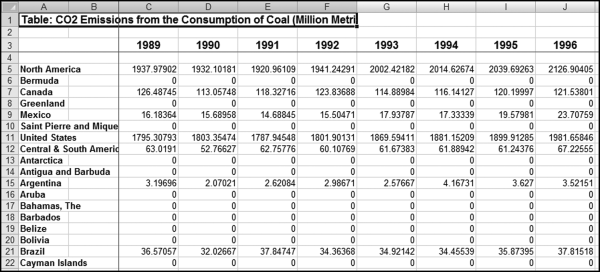
In this section carbon dioxide emissions are analyzed for signs of errors or fraud. With global warming, countries have incentives to understate their emissions, and scientists, in general, have incentives to want accurate data with which to assess the issues and propose solutions. Data for the past 20 years are analyzed for signs of errors and fraud and also to assess what useful information is provided by the correlation calculations. The data was obtained from the U.S. Energy Information Administration's website and an image of the website with some of the data is shown in Figure 13.15.
Figure 13.15 An Extract of Carbon Dioxide Emissions Data
Source: U.S. Energy Information Administration, www.eia.doe.gov.
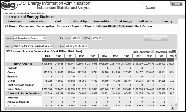
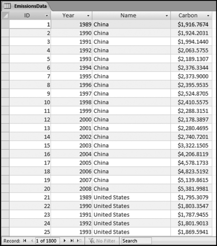
The U.S. Energy Information Administration (EIA) is the statistical and analytical agency within the U.S. Department of Energy. The agency collects, analyzes, and disseminates independent and impartial energy information to promote sound policy making, efficient markets, and public understanding of energy and its interaction with the economy and the environment. The carbon dioxide emissions data for 1989 to 2008 was downloaded and a partial view of the file is shown in Figure 13.16.
Figure 13.16 The File with Carbon Dioxide Emissions from Coal
Source: U.S. Energy Information Administration, www.eia.doe.gov.
Some data-cleansing steps were needed before the data could be analyzed. First, region totals (such as North America in row 5, and Central and South America in row 12 need to be removed). Second, countries with zero or very low emissions should be removed from the analysis. The inclusion of these countries in the analysis will complicate any interpretations from the data. The deletion of small countries will keep the results focused on the significant polluters. Third, some geographic changes needed to be made to the data such as adding East Germany and West Germany for 1988 and 1989 and including these numbers in the statistics for “Germany” (as in the united West and East). Fourth, the data need to be reconfigured in a table where all fields contain the same data. The statistics of 134 countries were deleted (leaving 90 countries) and the combined emissions of the deleted countries equaled about 0.05 percent of the world total. The data was imported into Access and an extract of the emissions table is shown in Figure 13.17.
Figure 13.17 The Access Table with the Pollution Statistics
The world total for each year from 1989 to 2008 was calculated from the emissions data in Figure 13.17. Thereafter the correlation for each country was calculated between the emissions for the specific country and the world total. Over the 20-year period the world total increased by 53.8 percent. The increase was, however, not uniform across the years. There were three years where the total decreased. These years corresponded to the economic slowdowns of 1991, 1992, and 1998. The results included some high positive correlations and quite a few negative correlations. Because the world trend is upward, upward-trending countries would have positive correlations while negative correlations occur because of a decreasing trend or some other anomaly. A table with the 15 highest and the 15 lowest correlations is shown in Figure 13.18.
Figure 13.18 The Results Showing the Highest and the Lowest Correlations with the World Trend
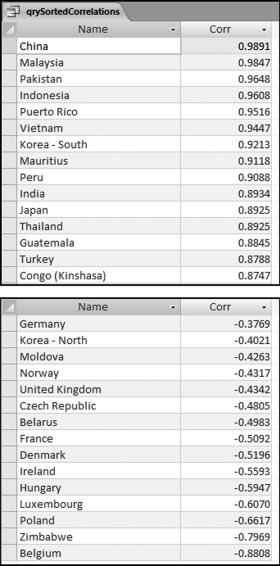
The low correlation countries generally have a downward trend. In a few cases this was because of a poor country becoming even poorer and in so doing consuming less coal in total. In three cases the low correlations were because the national boundaries were created or changed (Belarus, Czech Republic, and Moldova). In general, the low correlations were because less energy was created through the burning of coal. A negative correlation indicates a difference between the world trend and the trend for a particular country. Some of the high and low correlation patterns are shown in Figures 13.19 and 13.20. Figure 13.19 shows the world trend and the annual numbers for three high-profile high correlation countries. The emission numbers were indexed with the 1989 values set equal to 100. Without indexing the world total would be very large relative to the other values and it would be difficult to see small up and down changes.
Figure 13.19 The World Pattern and the Pattern for Three High Correlation Countries
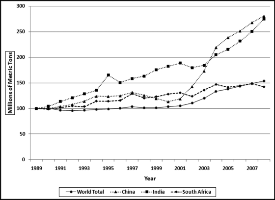
Figure 13.20 The World Pattern and the Pattern for Three Low Correlation Countries
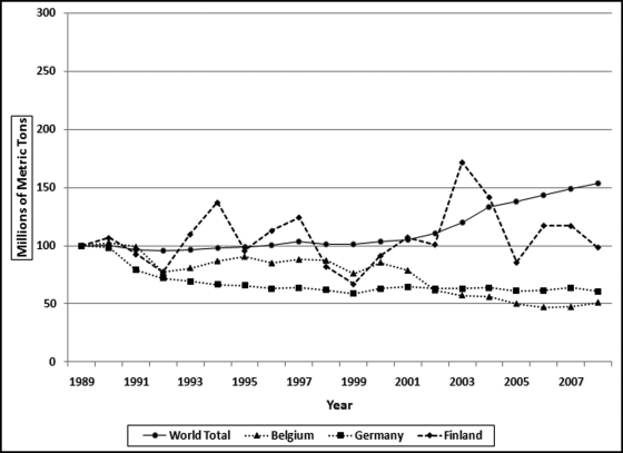
Figure 13.19 shows the world pattern and the patterns for three countries as index values starting at 100. The world pattern is the solid line generally trailing at the bottom of the graph that shows an increase of 53.8 percent over the 20 year period. The patterns for both China and India each show increases of about 180 percent over the period. The pattern for South Africa shows a slightly smaller increase of 42.3 percent over the period. The correlations of China, India, and South Africa are 0.9891, 0.8934, and 0.8492 respectively. The patterns for China and India shows that the series needs to only match each other approximately to give a high correlation. The low correlation patterns are shown in Figure 13.20.
Figure 13.20 shows the world emissions pattern as the solid line with an increasing pattern. The graph also shows three well-known countries with relatively low correlations. The emissions pattern for Finland is the dashed line that ends marginally lower than 100 at 98.8. The overall pattern showed a marginal decrease whereas the world pattern shows an increase. The pattern for Finland is choppy with jagged up and down movements. The absolute numbers are small coming in at about 0.17 percent of the world total. The sharp increase from 2002 to 2003 is suspect. The absolute numbers show an increase of about 10.5 million tons. European Union publications show an increase for Finland of only 3 million tons due to a very cold winter and declining electricity imports and increased exports. The EIA increase of 10.5 million tons might be due to an error of some sort (perhaps correcting a prior year number?). The low correlations for Belgium and Germany (−0.8808 and −0.3769) are because their emissions decreased while the world total increased. This general decline in European emissions is supported by the data on the website of the European Environment Agency. A noteworthy pattern is the sharp decline in German pollution in the early 1990s. Intuitively, this might seem to be an error. However, the sharp (but welcome) decline in pollution from the former East Germany is documented in a scientific paper published in Atmospheric Environment (1998, Volume 32, No. 20).
Given the interesting European results the correlation studies suggest several research questions. The first being an assessment of the correlation between the U.S. figures of the EIA and the European figures of the European Environment Agency. The second being an assessment of the correlations between the emission numbers of the European countries using the European totals as the benchmark.
Calculating Correlations in Access
Access is the preferred software when we need to calculate correlations for many locations or individuals. The calculations will be demonstrated on the hypothetical sales of three restaurants and a series of average sales numbers. In each case we are calculating the correlations between the sales for a single restaurant and the average. The calculations are calculated using Equation (13.1). Because of the summations and the use of x2, y2, and xy, the analytics will require a series of queries. The data for the three restaurants are in tblSalesData and the average numbers are in tblAverage. The Access table is shown in Figure 13.21.
Figure 13.21 The Sales Numbers in the Table tblSalesData
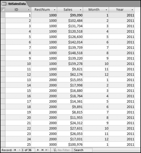
Figure 13.21 shows the sales data and the table format needed for the correlation calculations. The sales data needs to have a location identifier (RestNum) and a time period identifier (Month and Year). The calculations are much easier if the table contains only the data that will be used for the calculations with no missing (or null) values. The table tblAverageSales has only 12 rows, one row for each month, similar to the first 12 rows of tblSalesData, without the RestNum field. The sales numbers field in tblAverageSales is named AvgSales so as not to use the same field name as in the main tblSalesData table. The sales numbers are formatted as Currency because this formatting avoids some of the errors that occur with the use of floating-point arithmetic operations. The correlations use a series of four queries. The first query qryCorr1 is shown in Figure 13.22.
Figure 13.22 The First Query to Calculate the Correlations
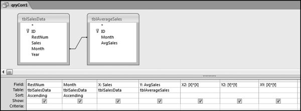
The first correlation query qryCorr1 combines the microdata and the average data in a single table, and calculates the squared and multiplied values that are needed for Equation (13.1). The use of the join matches up the sales of each restaurant against the average sales. The average sales will be pasted next to the sales numbers for each location. The sales numbers are also renamed X and Y so that these shorter names tie in with Equation (13.1) and because it is easier to use short names in formulas. The X2 stands for x-squared and similarly Y2 stands for y-squared. The calculated fields have also been formatted as Currency with zero places after the decimal point making the results a little easier to read. The next query calculates the sums required and this query is shown in Figure 13.23.
Figure 13.23 The Second Query to Calculate the Correlations
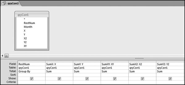
The query in Figure 13.23 uses only the data and calculations from the first query. The query qryCorr2 calculates the summations needed for the correlations. The correlation equation uses the sums of the xs and ys and the x and y-squared terms and well as the cross multiplication of x and y. The summations need to be done separately for each restaurant (or country, or candidate, or meter, as in the chapter case studies). This example has only three restaurants and so there are three rows of output. The results of qryCorr2 are shown in Figure 13.24.
Figure 13.24 The Results of the Second Query to Calculate the Correlations
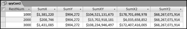
The results in Figure 13.24 show one row of sums for each location. The results for this step for the election candidates in the prior case study had one row for each candidate, giving 135 rows for that qryCorr2. The next step is to calculate how many records we have for each restaurant (or location, or candidate, or country). This will usually be known to the forensic investigator (e.g., 12 months, 58 counties, 20 years) but it is better to calculate the number with a separate query and then to use the results in the final query. The query needed to count the records in the tblAverageSales table is shown in Figure 13.25.
Figure 13.25 The Third Query to Calculate the Correlations
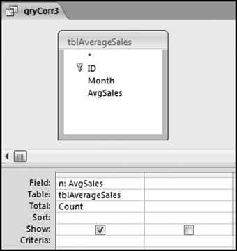
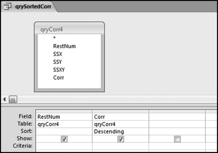
Figure 13.25 shows the query that counts the number of records for each unit. This count is named n to match up with Equation (13.1). In the final query, the correlations are calculated and qryCorr4 is shown in Figure 13.26.
Figure 13.26 The Fourth Query to Calculate the Correlations
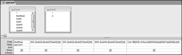
In the final query, the correlations are calculated and qryCorr4 is shown in Figure 13.26. The calculated numbers are broken down into parts known as the sum of squares. The “SS” in SSX, SSY, and SSXY refers to the sum of squares. The correlation calculation uses these sums of squares. The formulas used in qryCorr4 are:
SSX: [SumX2]-([SumX]∗[SumX]/[n])
SSY: [SumY2]-([SumY]∗[SumY]/[n])
SSXY: [SumXY]-([SumX]∗[SumY]/[n])
Corr: IIf([SSX]>0,Round([SSXY]/(Sqr([SSX])∗Sqr([SSY])),4),0)
The query qryCorr4 is algebraically equivalent to Equation (13.1). The revised formula is shown in Equation (13.1).
(13.2)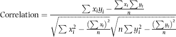
The next step is to sort the correlations. Since the calculated field Corr is based on three other calculated fields in the same query, the best option is to use another query for the sort. Also, if the calculated Corr results in an error condition for any record then this will give issues with the sort. The error message will seem to relate to the sort and not to the original Corr calculation. The query for the sort is shown in Figure 13.27.
Figure 13.27 The Query to Sort the Correlations
The query used to sort the correlations is shown in Figure 13.27. The results of the query are shown in Figure 13.28.
Figure 13.28 The Correlations Sorted from Largest to Smallest
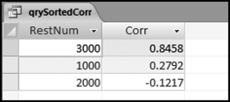
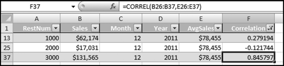
The results in Figure 13.28 show that the numbers for restaurant #3000 track the average pattern quite closely. The sales numbers for restaurant #1000 have a very weak correlation with the average. This pattern can be seen in Figure 13.7. The correlation for restaurant #2000 is weak and negative. This sales pattern was adapted from the sales numbers from a restaurant on a college campus where the sales numbers were low in July, August, and December because of the summer and winter breaks.
Calculating the Correlations in Excel
Excel has three ways of calculating correlations. The first method is to use the Data→Data Analysis→Analysis Tools→Correlation tool. The second alternative is to use the CORREL function. The third alternative is to use either Equation (13.1) or Equation (13.1). Excel is the preferred alternative if we only have to calculate one correlation between two sets of data because we can use the CORREL function. Excel becomes a bit cumbersome when we have to calculate the correlations for many locations, countries, candidates, or other unit of interest. The number of records is not usually an issue with Excel because the data tables used with correlation applications are usually well within the Excel limit. The correlation calculations will be demonstrated using the same data as in the previous section.
The preferred Excel option when there are many forensic units (locations, candidates, countries, or other units) is to use the CORREL function. To do this, each forensic unit should have exactly the same number of rows and the row count should match the Average series or whatever is being used as a benchmark. The Excel file for the sales numbers is shown in Figure 13.29.
Figure 13.29 The Layout of the Sales Numbers in Excel
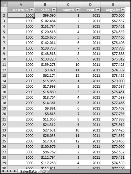
Figure 13.29 shows the data table in an Excel format. Each location has 12 records and the benchmark numbers are duplicated next to the 12 records for each restaurant. The months should match exactly. Each record should show the sales for a specified month and the benchmark for that same month. The Excel data was formatted as a table using Home→Styles→Format as Table with Table Style Medium 2. The CORREL function is shown in Figure 13.30.
Figure 13.30 The Use of the CORREL Function to Calculate Correlation
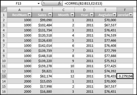
The Correlation field should be formatted to show only four digits after the decimal place. The CORREL function should also be copied down so that the calculation is run for all restaurants.
Figure 13.31 The Copy and Paste Steps to Calculate the Correlation for Each Forensic Unit
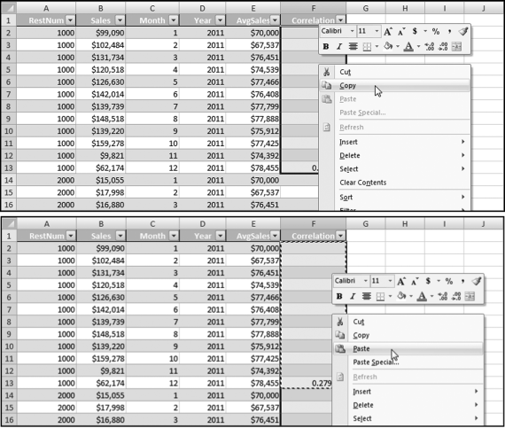
Figure 13.31 shows the Copy and Paste steps used to apply the CORREL function to every forensic unit. The first 12 rows are highlighted (even though 11 of these rows are blank) for the Copy command and all the rows are highlighted for the Paste command. The result will be one correlation at the last row of the data for every forensic unit. The last step is to apply a filter so that we only show one row for each forensic unit. This is shown in Figure 13.32.
Figure 13.32 The Filter to Extract Only the Correlations for the Forensic Units
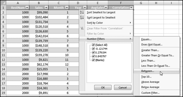
The filter used to extract only the correlations is demonstrated in Figure 13.32. After clicking Between the next step is to complete the dialog box by entering the upper and lower bounds,
“is greater than or equal to” −1.00
And,
“is less than or equal to” 1.00
The correlation results are shown in Figure 13.33. All that remains is for the correlations to be sorted. This is easily done using Home→Editing→Sort&Filter. Using Excel is probably a little quicker than Access because of the CORREL function in Excel. The upside to using Access is that the queries and the entire setup can be reused on other data.
Figure 13.33 The Correlation Results in Excel
This chapter reviewed how correlation could be used to identify errors and frauds. Correlation measures how closely two sets of time-related data move in tandem. In the United States the prices of gasoline for regular, mid-, and high-octane fuel are highly correlated. A price move for one grade is closely matched by a price move in the other grades. Correlation results range from −1.00 to +1.00. A correlation of 1.00 indicates that there is a perfect, positive, linear relationship between the two series. A change in the value of one variable is matched with an exact percentage change in the second variable, or an exact absolute value change in the second variable. When the correlation is zero there is no correlation between the two series of data. A correlation of −1.00 (which is rare) means that there is a perfect negative relationship between two sets of data.
Four case studies are reviewed and in the first application correlation was used to identify sales patterns that differed from a benchmark. These differences could be red flags for intentional or unintentional errors in sales reporting. Correlation by itself was an imperfect indicator because there were many valid reasons for having weak correlations. The correlation tests were combined with other tests to examine the trend in sales. A weak correlation matched with a strong increasing trend in sales was some assurance that sales were not being underreported. The use of correlation helps investigators to understand the entity and its environment.
The second correlation application was to identify electricity theft. A weak correlation between the patterns for a specific user and the average pattern was an indicator that the user might be stealing electricity. In this application the benchmark average pattern was questionable. However, since the average trend was increasing, a weak correlation meant that the customer had a decreasing trend. The tests combined correlation, a test for a decreasing trend, and a test for abnormally high credits for each customer.
The third application was to find anomalies in election results. The 2003 California election results were tested. The assumption was that if 23 percent of the total votes came from Los Angeles, and 10 percent of the votes came from San Diego, then each candidate should get 23 percent of their votes from Los Angeles, and 10 percent from San Diego. Low correlations would result when a candidate got an abnormally large percentage of their votes from one or two counties. The results showed some odd voting patterns. The winner, Arnold Schwarzenegger, had a correlation of 0.98, which means that his votes in each county closely tracked the totals for the counties.
The final application used carbon dioxide emission statistics for about 90 countries for 20 years. Total world emissions increased by 53.8 percent over the past 20 years. Several countries had high correlations, meaning that their emissions increased in line with the world increase. The countries with low correlations were countries with strange issues such as extreme poverty in Zimbabwe and North Korea. A negative correlation occurs when the emissions for a country show a decrease in the face of the world total showed an increase. The green drive in Europe also gave rise to negative correlations. Other negative correlations came about because of significant geographical changes (e.g., Czechoslovakia splitting into two parts). Correlation also correctly signaled the sharp decrease in emissions from East Germany after unification.
Correlations can be calculated in Access using a series of four queries. These queries can be reused in other applications provided that the table names and the field names are unchanged. The correlation graphs are prepared in Excel. The correlations can also be calculated in Excel using the CORREL function.
Correlation provides an informative signal that the data for a specific location, country, candidate, or other forensic unit differs from the average pattern or some other benchmark. The use of correlation combined with other techniques, could be useful indicators of errors or fraud.