
Chapter 4
High-Level Data Overview Tests
Chapters 1 and 2 introduced our quantitative forensic tools. Access is an effective and efficient software package that uses data tables, queries, and reports to store data, perform calculations, and neatly report the results of a series of analytic tests. Excel is an effective and efficient software package that can also store data, perform calculations, and report the results, although the lines among the three aspects of the analysis are not so clear cut. Most analytic tests can be performed using either Access or Excel. The tests that are described in the next chapters are demonstrated using both Access and Excel, unless one of these is not suitable for the task, or unless the steps in Excel are somewhat obvious. The results of the analytic tests can easily be included in a forensic report or a forensic presentation. The presentation of the forensic findings with a strong PowerPoint bias is reviewed in Chapter 3. Chapters 4 through 17 discuss various forensic analytic methods and techniques. These methods and techniques start with a high-level overview of the data.
This chapter reviews a series of three tests that form a good foundation for a data-driven forensic investigation. These three tests are the data profile, a data histogram, and a periodic graph. This chapter describes the tests and shows how these tests can be done in Access and Excel using a real-world data set of corporate invoices. There is no general rule as to whether Access or Excel is best for forensic analytics, although Access is usually preferred for large data sets, and Excel's graphing capabilities are better than those of Access.
The tests described in the chapter are there to give the forensic investigator an understanding and feel for the data. These high-level overview tests tell us how many records we have, and how the data is distributed with respect to amount and with respect to time. Chapter 9 will concentrate on how the current data compares to data from the prior period. These high-level overview tests should help the investigator to understand what it is that they are dealing with. This understanding should usually give some insights into possible processing inefficiencies, errors, questionable negative numbers, and time periods with excessive activity.
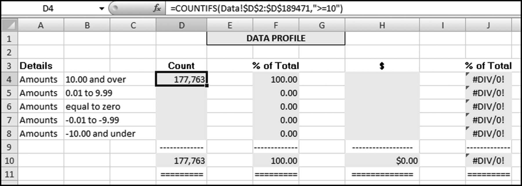
The data profile is usually the first test to be run on the data because this test might find serious issues that show that it is not a good idea to continue with the analysis. For example, we might find that a data table has exactly 16,384 records, which suggests that the original downloading procedure believed that it was exporting to Excel and there was a fixed limit of 16,384 records built into the routine. There is little point in continuing to work with incomplete data. We might also find that the data set does not contain any negative numbers and this might be an indicator that we have an accounts payable data set that is incomplete because we are lacking the credits. Again, there would be little point to continuing to work with an incomplete data table. The data profile is quite uncomplicated and the test divides the data into seven strata. For accounts payable data in U.S. dollars these strata usually are:
- Amounts equal to or larger than 10.
- Amounts from 0.01 to 9.99.
- Amounts equal to zero.
- Amounts from –0.01 to –9.99.
- Amounts equal to or smaller than –10.
The above strata or categories are described as the (1) large positive numbers, (2) small positive numbers, (3) zeroes, (4) small negative numbers, and (5) large negative numbers. Depending on the data under investigation, you might want to add extra strata or categories. A data profile of accounts payable data usually includes two extra strata as follows
- Numbers from 0.01 to 50.
- Numbers above 100,000.
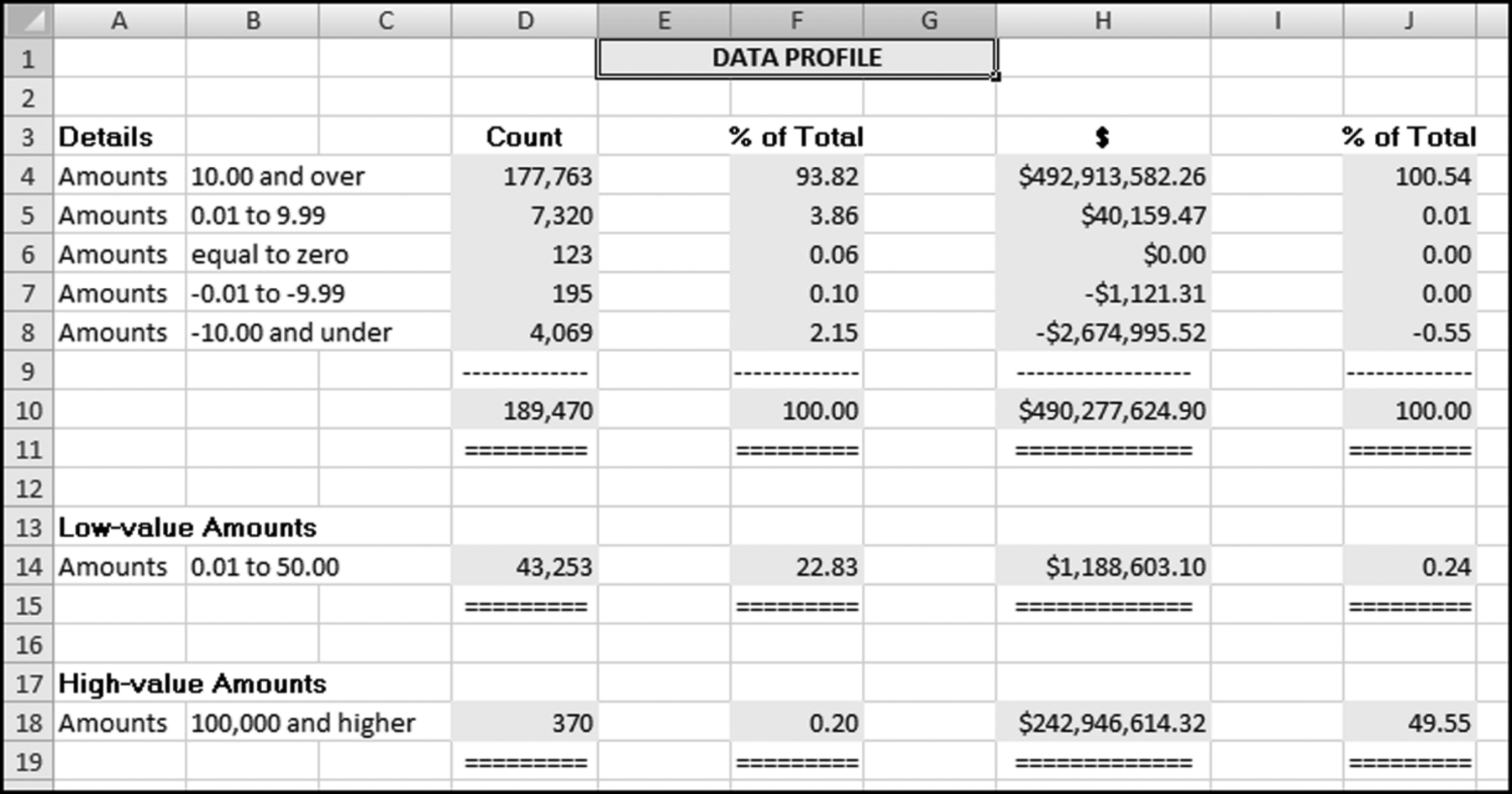
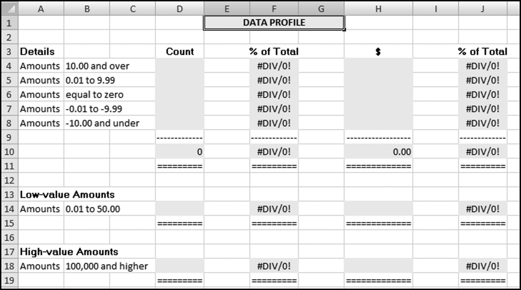
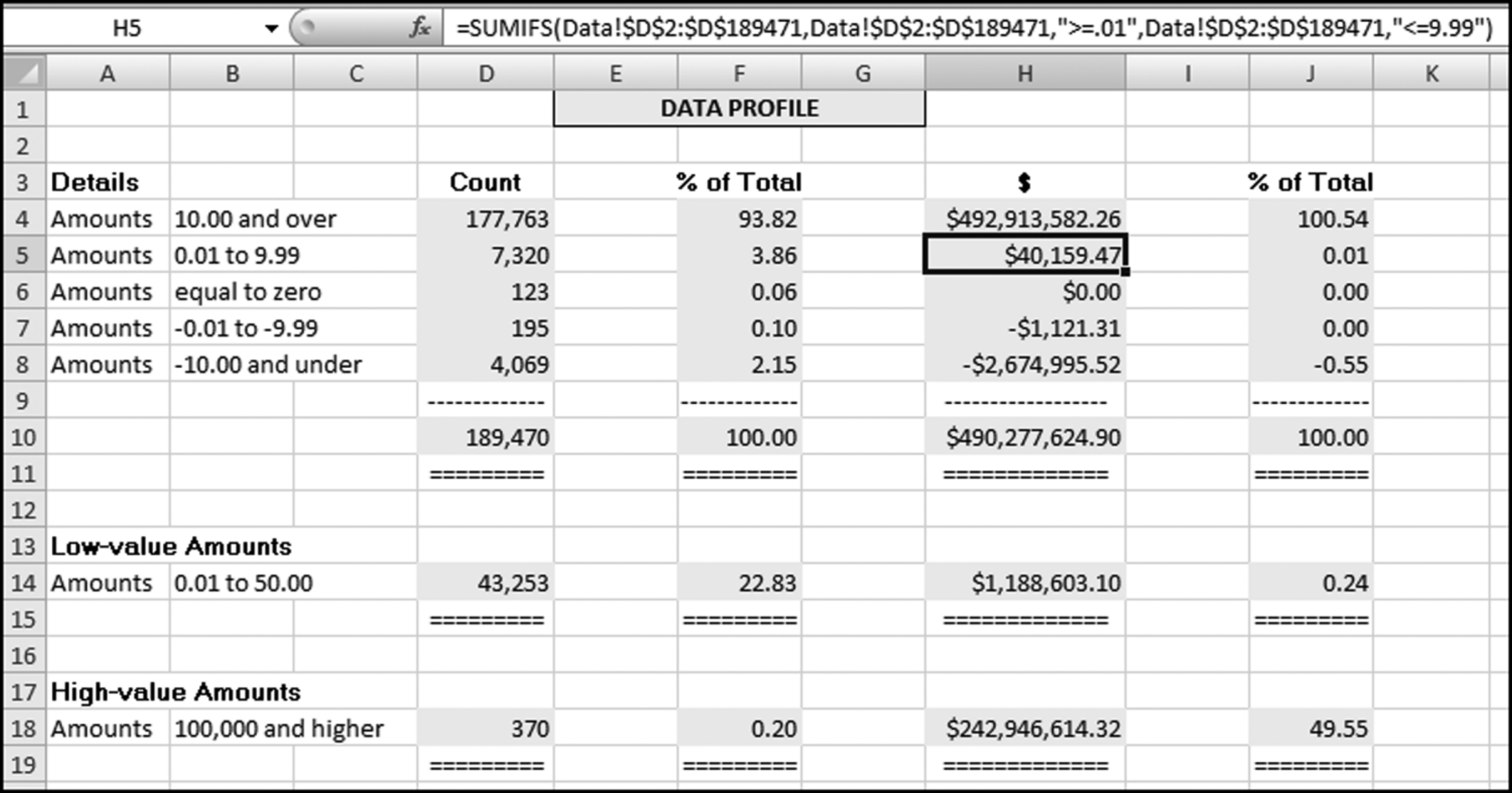
These extra strata could point internal auditors to the low-value items (that cost money to process) and to the high-value items that would usually be material. It is usually more efficient in a statistical sampling context to sample from the high-dollar strata at a higher rate than from the low-dollar strata. The data profile of the InvoicesPaid.xlsx data is shown in Figure 4.1.
Figure 4.1 The Data Profile Shows the Counts and the Total Dollars in the Various Strata
For some data sets it might be appropriate to use more strata (intervals) or to change the value of the low-value dollar range in the sixth stratum. In an analysis of the invoices paid by a major international conglomerate we used several strata for the large positive numbers (10 to 99.99, 100 to 999.99, 1,000 to 9,999.99, 10,000 to 99,999.99, and 100,000 and above). Changing the strata ranges would also be appropriate in countries where there are many units of the local currency to the U.S. dollar. Examples would include Japan, Norway, and South Africa. Different strata ranges would also be appropriate for other data sets with relatively large numbers (e.g., frequent flyer miles, hotel loyalty program points, or bank wire transfers).
Possible Findings from the Data Profile
The data profile helps us to understand the data being analyzed. Besides helping with an understanding, the data profile can provide some interesting initial results. Examples of these results in an accounts payable audit are:
- File completeness. This test helps the investigator or auditor assess whether the file is complete. This is done by reconciling the total dollars in the table (in Figure 4.1 this amounts to $490,277,624.90) to the financial records. The reconciliation would help to ensure that we are working with a complete file (i.e., we have all the transactions for the period). In an external audit one of the management assertions is the assertion of completeness. With this assertion management are asserting that all the transactions that should be included in the financial statements are in fact included. In a forensic investigation there is no such assertion, but the investigator does need to know that all the transactions for the period are included in the data being analyzed. The data profile would also help the investigator to understand which transactions are included in the data set and which transactions are excluded. For example, in an analysis of health care claims the investigator might discover that certain types of claims (e.g., dental claims or claims by retired employees) are processed by another system and that a second, or third, separate analysis is also needed. By way of another example, some firms process “immediate and urgent” checks through a system separate from the usual accounts payable system, and government agencies also process contract payments and routine purchases through separate payables systems.
- A high proportion of low-value invoices. In accounts payable data it is usual to find that there is a high proportion of low-value ($50 and under) invoices. The normal proportion for low-value invoices is about 15 percent. Some company data profiles have shown a few cases where the low-value (under $50) invoices made up more than 50 percent of the count of the invoices. In one company in California the CFO called for a monthly report showing the percentage of low-value invoices. He was keen to see a continual reduction in that percentage. Internal auditors could suggest ways to cut down on the percentage or count of low-value invoices. These ways could include the use of closely monitored purchasing cards (see Chapter 18). The example in Figure 4.1 shows that about 43,000 invoices, or a little more than one-fifth of the invoices, were for $50 or less. This means that one-fifth of the entire accounts payable infrastructure was there to process low-value invoices and the total dollars for these invoices amounted to about $1.2 million. The other 80 percent of the time the accounts payable personnel were processing the larger invoices that totaled $489 million.
- Zero invoices. Many zero-dollar invoices would also be of interest to an investigator. An analysis done in Chicago (not the Figure 4.1 example) showed that the company had about 8,000 zero invoices. The follow-up work showed that these were warranty claims that were being processed as if they were normal purchases. It was therefore true that the company was buying something (a repair or replacement part) at a zero cost. However, processing 8,000 $0 invoices was inefficient. Processing and system inefficiencies are usually found in companies that have experienced high growth. A system that might have worked well when the company was younger and smaller becomes inefficient with large transaction volumes.
- Number of credit memos. The norm for credit memos as a percentage of invoices is about 3 percent. Percentages higher than 3 percent might indicate that an excessive amount of correcting is being made to invoices that have been entered for processing. Percentages lower than 3 percent might indicate that payments personnel are not thoroughly reviewing and correcting invoices prior to payments. Across a broad spectrum of companies the credit memo percentages would range from 1 percent all the way up to 6 percent. A low percentage (such as 1 percent) is a red flag that not much correcting is being done and, all things being equal, the payments data has a higher risk of overpayments.
- Negative amounts. The data profile is also useful for finding negative amounts in data sets that should not have negative numbers. Examples of data that should always be positive are perpetual inventory balances, gross or net pay payroll numbers, census counts, car odometer readings, and stream-flow statistics.
The data profile will not tell a story to us. We need to look carefully at the numbers and together with an understanding of the data we should develop some insights. It often helps to review the data profile with someone who is closely connected to the data. In a recent analysis of purchasing card transactions (see Chapter 18), I questioned why the largest dollar category had the highest number of transactions (the usual pattern is for high dollar amounts to occur less frequently than low dollar amounts). It turned out that their data profile range of $5,000 and higher referred not to single transactions above $5,000 but to cardholders with monthly purchases in excess of $5,000. After the data profile the next two tests are the data histogram and the periodic graph.
A data histogram shows us the pattern of our data with respect to size and counts by showing us the shape of the distribution. The histogram tells us something more about the properties of our data. We get to know how many small numbers there are, how many in-between numbers there are, and how many large numbers there are. The data histogram is shown graphically, whereas the data profile is a numeric table. In statistical terms this test is called a descriptive statistic. Descriptive statistics are graphical and numerical measures that are used to summarize and interpret some of the properties of a data table.
The histogram itself is a graph made up of vertical bars constructed on a horizontal line (the x-axis) that is marked off with intervals (e.g., $0 to $50). These intervals should include all the amounts in the data set and should not overlap (e.g., $0 to $50, and $40 to $90 do overlap because $45 or $47 would fall into either interval). Each record (usually a transaction) should belong to one interval only. The height of each bar in the histogram indicates the number of records in the interval.
The number of intervals in the histogram is at the discretion of the investigator. Some books suggest 14–20 intervals if there are more than 5,000 records. It seems that 14–20 intervals will give a crowded histogram especially when current and prior year histograms are being compared side-by-side (see Chapter 9 for comparing current data to prior period data). My experience in forensic environments suggests that 10 intervals works well. Each interval should have a neat round number as the upper bound (e.g., $250, $500, or $750) and should preferably contain enough records so that at least a small bar is visible for every interval. No real insights are obtained from a histogram that has one or two intervals with many records (say 90 percent of all the records) and the remaining intervals have few records. The final (10th) interval should be for all amounts greater than the prior upper bound (for example, $450 and higher). This makes the final interval width much wider than those of the first nine intervals and this interval should therefore be clearly labeled. Statistics books generally want each histogram bar to represent an equal interval but if we do this with financial data we will get about 70 percent of the records in the first interval and about 20 percent of the records in the second interval, and bars that are barely visible in the remaining intervals. This is because financial data usually has many small numbers and only a few large numbers.
Choosing the interval breakpoints involves some thought and perhaps repeated trials. This is not usually a problem because what we are trying to do is to get some insights on the distribution of the data and by redoing the intervals a few times over we are getting a good sense of the make-up or distribution of our numbers. Selecting the ranges is an iterative process. There is not usually a right answer and a wrong answer.
Figure 4.2 The Histogram of the Payments Data
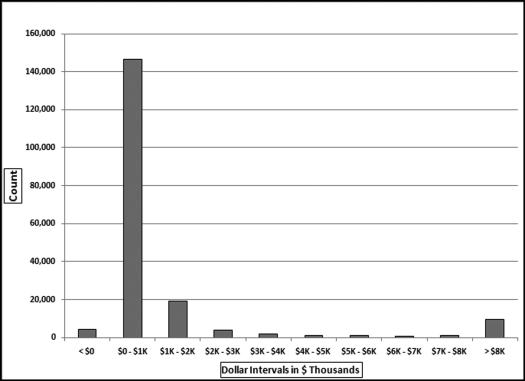
The histogram of the payments data is shown in Figure 4.2. The histogram shows that most of the invoices are in the $0 to $1,000 range. Note that the center eight ranges includes their lower limits ($1,000, $2,000, and so on) but excludes the upper limits ($2,000, $3,000, up to $8,000). The histogram shows that there are about 9,000 invoices of $8,000 and higher. The large bias toward many small numbers means that the data is positively skewed. Statisticians have a skewness measure that indicates whether the numbers are evenly distributed around the mean. Data that is positively skewed has many small amounts and fewer large amounts. This is usually the pattern found in the dollar amounts of invoices paid (expenses) as shown above and most financial and accounting data sets. In contrast, data with a negative skewness measure has many large numbers and fewer smaller numbers (as might be the case with student GPAs). The skewness of a data set with all numbers evenly distributed from (say) $0 to $8,000 is zero, which is neither positive, nor negative.
For example, a histogram over a short interval (perhaps $2,400 to $2,600) might help a forensic investigator to conclude that there are excessive purchases at or just below the limit of $2,500 for purchasing cards. This would be evidenced by a large spike in the (say) $2,475 to $2,500 interval. Chapter 18 shows several tests related to purchasing cards transactions.
The periodic graph is the last of the three high-level tests related to the distribution of the data. This test divides the data into time periods and shows the total per time period on a graph with time shown on the x-axis. This is useful for a better understanding of the data, and also to detect large anomalies. In the purchasing card example in Chapter 18 an example of such an anomaly was a single purchase for $3 million that was clear from an odd pattern on the periodic graph. In a purchasing card context this test has often showed increased card usage at the end of a fiscal year where cardholders try to spend the money in the budget. The periodic graph of the InvoicesPaid.xlsx data is shown in Figure 4.3.
Figure 4.3 The Periodic Graph of the Payments Data
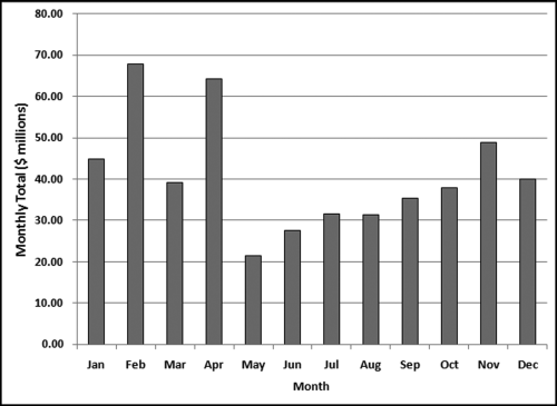
The periodic graph shows relatively high totals for February and April. A review of the data shows that February had two large invoices (for $15.8 million and $14.5 million, respectively), and April had one large invoice for $26.8 million. These three large invoices explain the spikes. A forensic investigator could remove these three large invoices from the table (just for the purposes of this test) and redo the periodic graph. Any forensic report would show two periodic graphs, one with the three large invoices and one graph without the three large invoices.
These monthly totals (or weekly, or daily if relevant) are especially useful after a three or four year history has been built up, or if a history is available. The monthly totals could be used as inputs to a time-series analysis. The time-series analysis would give a forecast for the coming year. These forecasts could be used as a part of a continuous monitoring system. Time-series analysis and continuous monitoring is further developed in Chapter 14.
Preparing the Data Profile Using Access
In Access there is sometimes more than one way to get the same result, and the software demonstrations will show the way that fits in best with how the other tests are performed, or the way that is the easiest to adapt to other situations. The data profile queries are reasonably straightforward but before any queries can be run, the data needs to be imported into Access. The data files and the Excel template are available on the companion website. The invoices data for this chapter and also for chapters 5 through 12 are from a division of an electric power company. The invoices included all invoices from vendors and all payments to vendors and other entities. Vendor accounts were sometimes opened for odd situations, including giving customers refunds for some special situations. A view of the invoices table (imported using External Data→Import→Excel) is shown in Figure 4.4.
Figure 4.4 The InvoicesPaid Table in Access
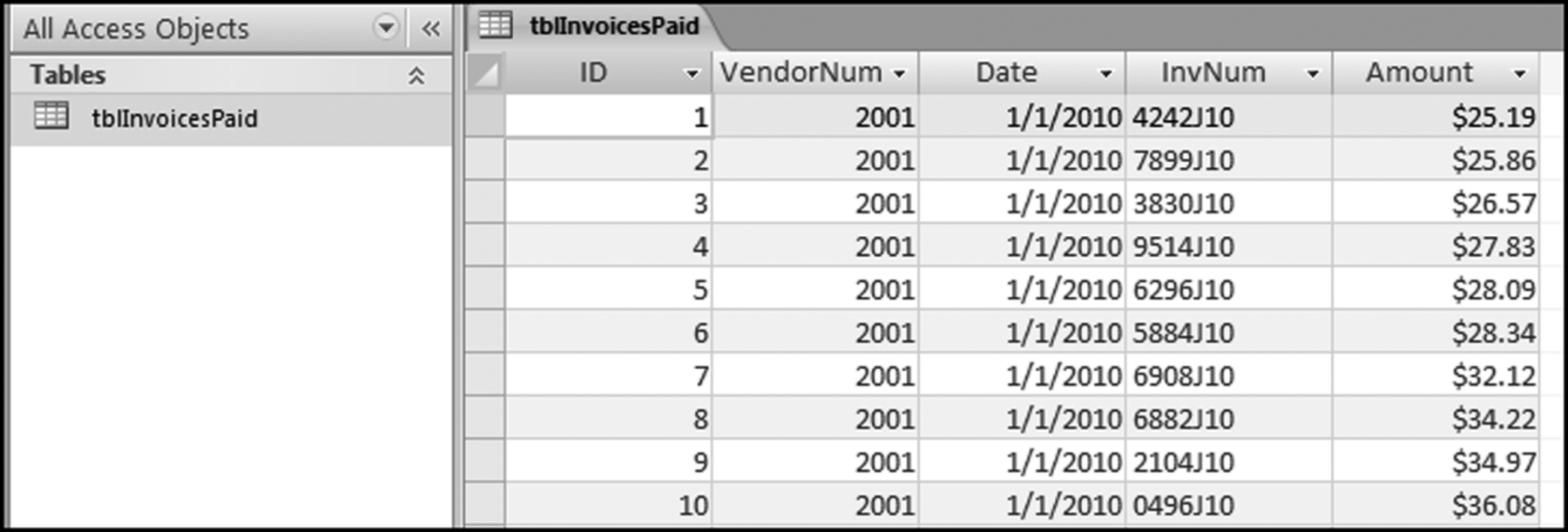
The InvoicesPaid table (tblInvoicesPaid) is shown in Figure 4.4. The data was imported using the External Data tab and then Excel to import the InvoicesPaid data. The Excel file was imported using the First row contains column headings option. The Date field was formatted as Date/Time and the Amount field was formatted as Currency. The Let Access Add Primary Key option was accepted. The result is shown in Figure 4.4. The companion site includes a data profile template. The Excel template DataProfile.xlsx is shown in Figure 4.5.
Figure 4.5 The Data Profile Excel Template
In this section we use Access to run the calculations, and Excel for the neatly formatted reporting of the results. Each of the seven strata requires one (slightly different) query. The totals in row 10 and the percentages in columns F and J will be automatically calculated by Excel once the cells in columns D and H are populated. To get Access into its query creation mode we need to click Create →Query Design to give the screen shown in Figure 4.6.
Figure 4.6 The First Dialog Box When Setting Up a Query in Access
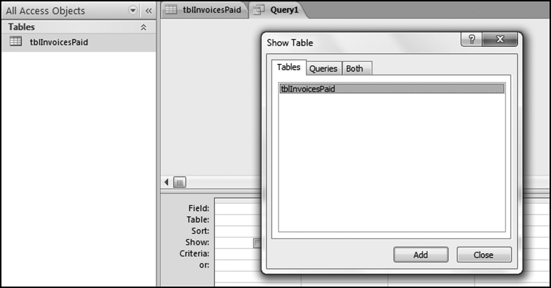
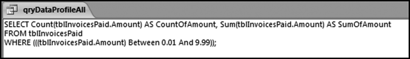
This dialog box is used to select the table or tables, and also perhaps queries that will be used in the current query. Click Add and then Close to add the tblInvoicesPaid table to the top pane of the Query window. The first data profile stratum is for the large positive numbers, being amounts greater than or equal to 10. We need the count and the sum of these amounts. The first step in the query is to drag the Amount field from the table tblInvoicesPaid in the top pane of the Query window to the grid on the bottom pane of the Query window. This is done by highlighting the Amount field and dragging it down to the lower part of the Query window.
The Amount field needs to be dragged to the Query grid three times. Amount can also be moved to the Query grid by highlighting the field in the top part of the Query window and then double-clicking on Amount. The Access functions that we need (Count, Sum, and Where) only become visible in the lower pane of the Query grid after we click the Totals button (with the Greek sigma letter) using Design→Show/Hide→Totals.
Figure 4.7 The Query Window with the Fields Selected and the Total Row Activated
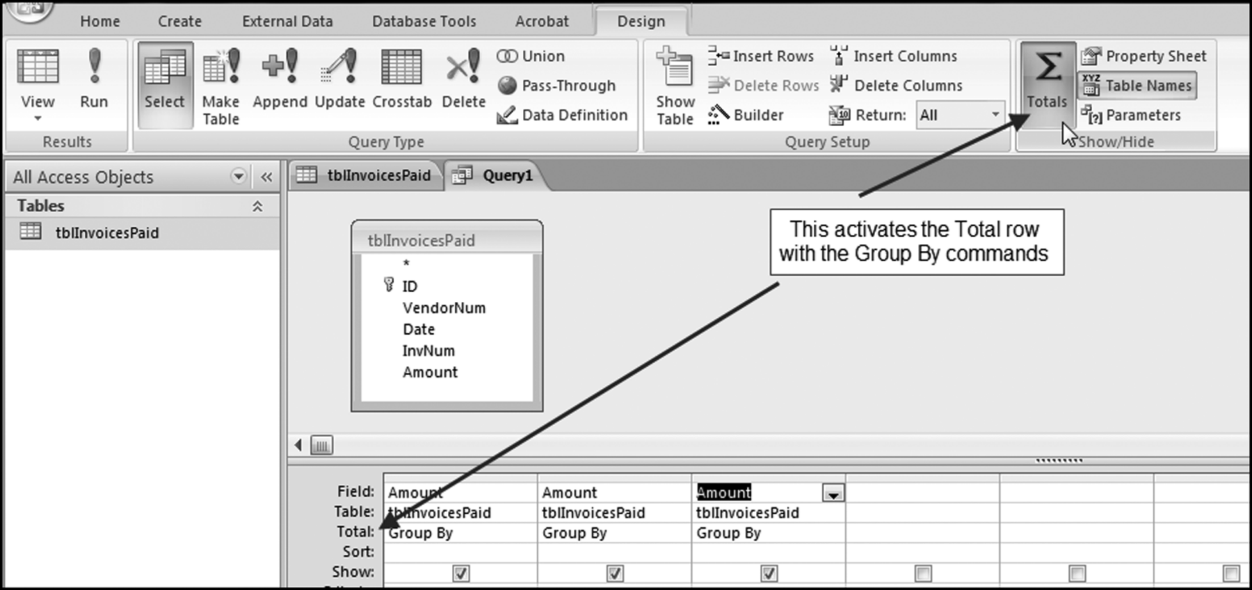
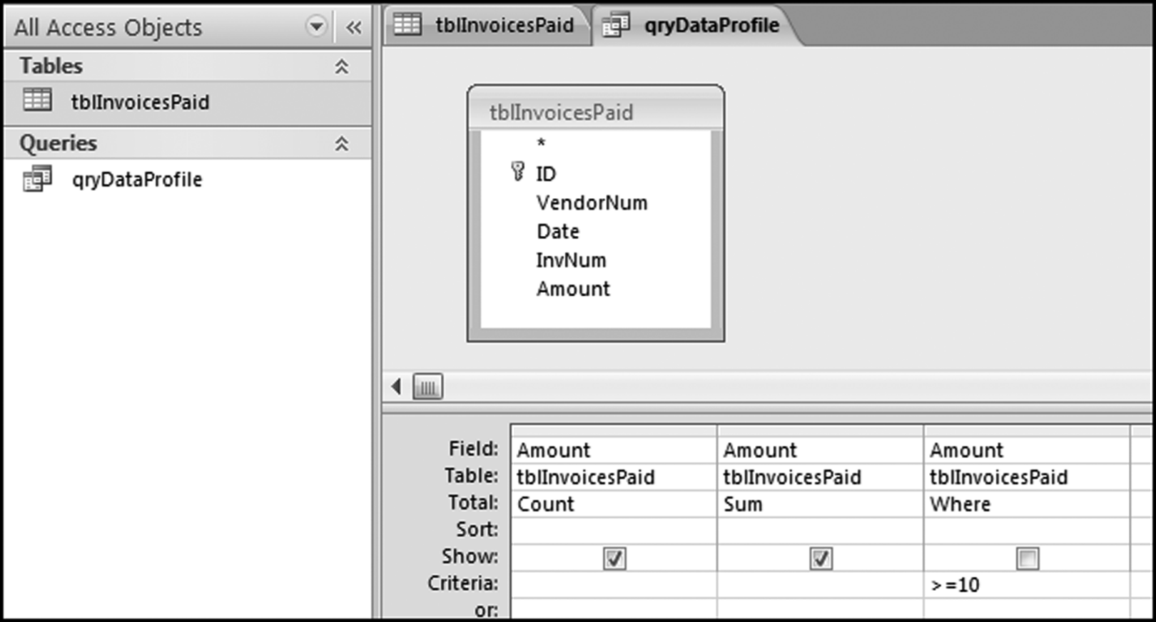
Figure 4.7 shows that the fields have been selected and the Total row has been activated. The default command for the Total row is Group By and the data profile does not require a Group By command, but rather Count, Sum, and Where. The drop-down lists in the Totals row are used to select Count, Sum, and Where. For the first stratum we also need to insert the criteria >=10. The competed query grid, after saving the query as qryDataProfile, is shown in Figure 4.8. The three-letter prefix qry tells other Access users that the object is a query. Each of the descriptive words in the query name should be capitalized. There should not be any spaces in the query name.
Figure 4.8 The Completed Query for the First Stratum of the Data Profile
The completed query grid is shown in Figure 4.8. The query is run by clicking the Run button. This button is found at Design→Results→Run. The Run button has a large red exclamation point that makes it easy to see. The query results are shown in Figure 4.9.
Figure 4.9 The Results of Running the First Data Profile Query
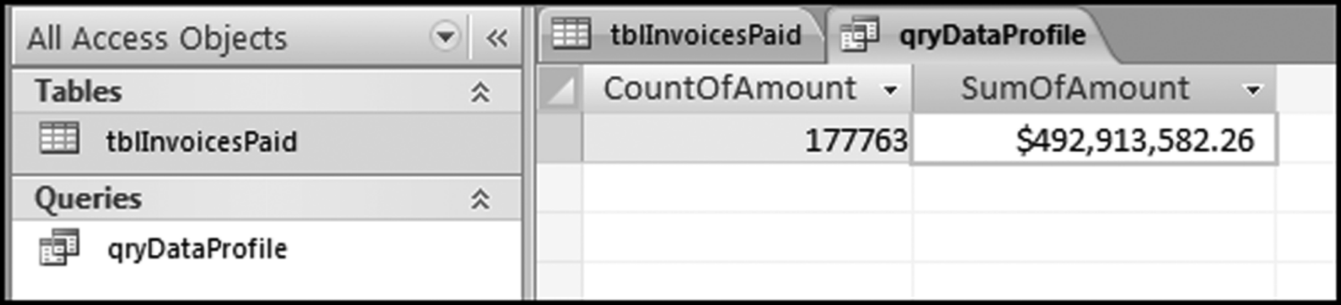
It is usually necessary to widen the default column widths to see the full field names. The results tell us that the count of the amounts greater than or equal to 10 was 177,763 records, and the sum of the amounts greater than or equal to 10 was $492,913,582.26. We cannot format the output to a neatly comma delimited number of “177,763” after the query has run. All formatting must be done in the query Design View before running the query. The next step is to copy these results to the Excel template. The easiest way to do this is to highlight each result (separately) and to right-click and to use Copy and Paste. The Paste step in the Excel template is shown in Figure 4.10.
Figure 4.10 Pasting the Access Results into the Excel Template
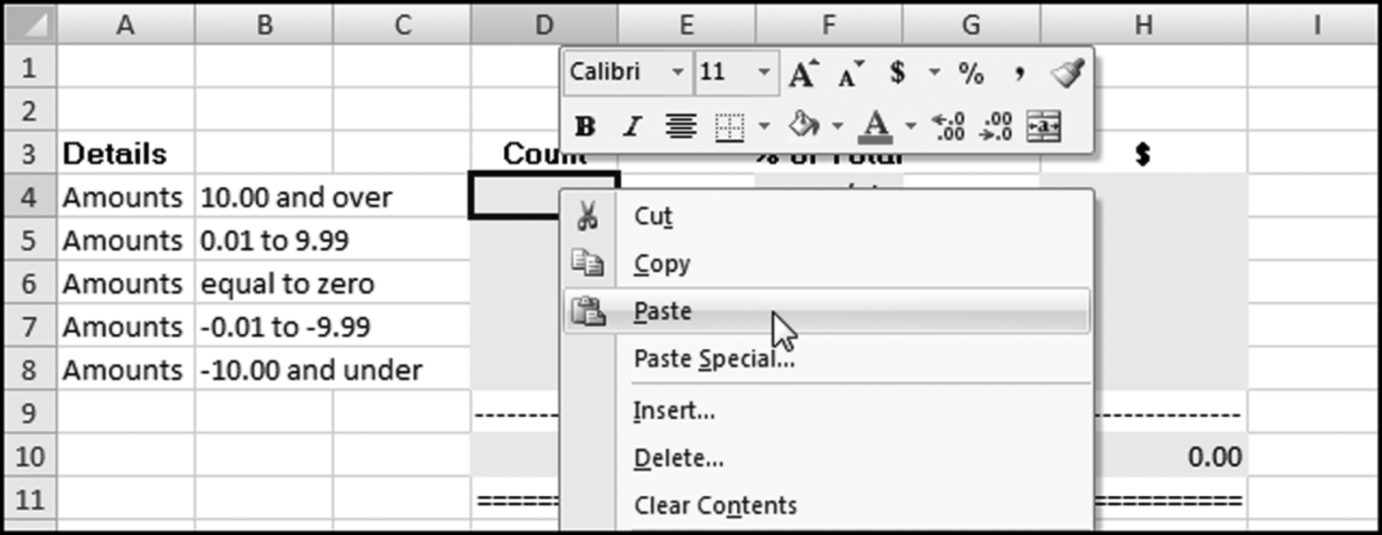
The Copy and Paste routine must be done for each of the 14 calculated values in the data profile (two calculated values per query). The other strata of the data profile have different bounds and different results and need to be calculated using a slightly different query. To get back to the Design View, right click on the qryDataProfile tab and select Design View. Once you are back in Design View, the only change that needs to be made for each strata is to change the Criteria. The Criteria for the next stratum is shown in Figure 4.11.
Figure 4.11 The Criteria for the Second Stratum in the Data Profile
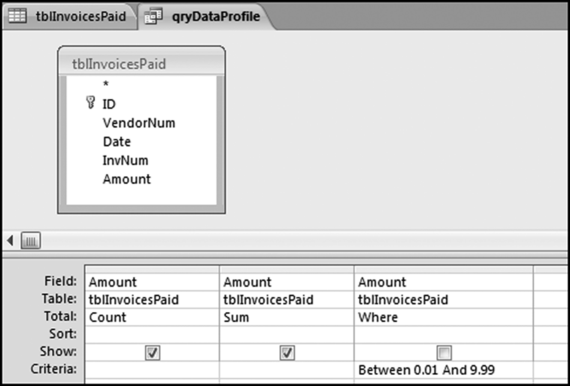
In Access “Between 0.01 And 9.99” means all numbers in the interval including 0.01 and 9.99. In everyday English we would use the words “from 0.01 to 9.99” to mean inclusive of 0.01 and 9.99. After the query in Figure 4.11 is run, the same Copy and Paste routine should be followed to copy the results to the Excel template. The query can be reused for the remaining five strata and the criteria for these strata are shown below:
= 0
Between −0.01 And −9.99
< = −10
Between 0.01 And 50
> = 100000
The “Count-Sum-Where” query can be adapted to a number of useful situations. Functions other than Count and Sum could be used. For example, we might be interested in the average (Avg), the minimum (Min), or the Maximum (Max) for various ranges. If you require these statistics for the whole data table then the Criteria row should be left blank. We could only show some of our results and the check boxes in the Show row give us some options here. This section gives some good practice in using Access to calculate statistics for various strata. A shortcut using SQL and a Union query is shown in the next section.
Preparing the Data Profile Using a Union Query
In the previous section we used a somewhat tedious approach using seven Access queries together with Copy and Paste to prepare the data profile. In this section all seven queries will be combined to form one data profile query. To start we will make a copy of qryDataProfile and call it qryDataProfileAll. This is done by right-clicking qryDataProfile and choosing Copy as is shown in Figure 4.12.
Figure 4.12 Making a Copy of an Existing and Saved Query
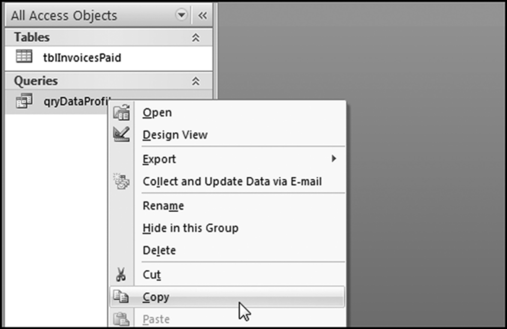
The first step in making an exact copy of the data profile query is shown in Figure 4.12. After clicking Copy you now need to click Paste. At the prompt, name the new query, qryDataProfileAll.
You now have two queries in your Queries group. Right click on qryDataProfileAll and open the query in Design View to show the familiar query grid. We are now going to enter the world of SQL (Structured Query Language) by using a right click on the query title (qryDataProfileAll) and then choosing SQL View. The SQL View screen is shown in Figure 4.13.
Figure 4.13 The SQL View of the Data Profile Query
The good news is that SQL is quite readable. By simply changing the Where statement in the third line of code we can change the criteria. For example, changing the “10” in the third line to “100000” will give us the results for the largest strata in the last line of the data profile (where we looked at the high-value amounts). A query is run from SQL View exactly the same way as from Design View by clicking on the Run button. To get back to SQL View from the query result you click on the query title (qryDataProfileAll) and select SQL View.
With a union query we will run the seven strata queries at the same time by changing the criteria for each row. For example, the criterion for the first stratum is “>=10,” and the criterion for the second stratum is “Between 0.01 and 9.99.” To stack the queries on top of one another we need to delete the semi colon and move it to the end of the query, insert the word “Union” (without the quotation marks and preferably in capital letters) between each query, and update the criteria.
The problem with the query as it stands is that the output is sorted based on the first field in ascending order. In this query it is clear which line in the results refers to which stratum. In other examples, it might not be so clear. We therefore need some way to keep the output in the same order as the strata in the data profile. To get Access to sort in the same order as the code we need to recognize that Access will sort on the first field ascending because we do not have an Order By statement in our code. We will use a little trick that leaves off any Order By statement and we will insert a new field at the left in such a way as to get the correct result. This new field will be a text field. Our new text field is created by inserting
“aLarge Positive” as Stratum,
in the first Select statement and using this pattern for all the other Select statements. The letter a before the words Large Positive is a little trick to get Access to show us this result first. The updated SQL code for the union query is shown in Figure 4.14.
Figure 4.14 The SQL Code Used to Create the Data Profile with a Union Query
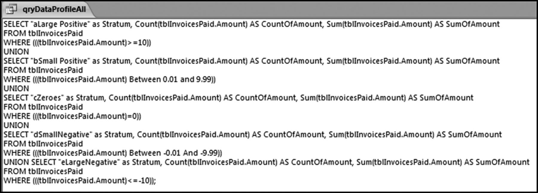
By using Copy and Paste and by typing in the extra statements to correct the sort order we now have one query that will do the data profile calculations for five strata. The code to insert to correct the sort order is
“aLarge Positive” as Stratum,
“bSmall Positive” as Stratum,
“cZeroes” as Stratum,
“dSmall Negative” as Stratum,
“eLarge Negative” as Stratum,
The results of running the qryDataProfileAll query are shown in Figure 4.15.
Figure 4.15 The Results of the Data Profile Union Query
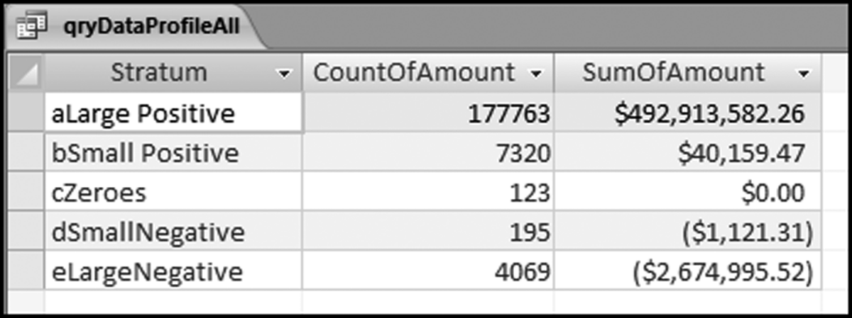
The field names can be easily changed in the SQL code. For example, Count of Amount could simply be called Count. The entire field (all five numbers in CountOfAmount or all five numbers of SumOfAmount) can now be easily copied to the data profile template DataProfile.xlsx. Note that the query qryDataProfileAll is now a Union query and it cannot be viewed in Design View any more. Once the query has been saved and closed you should see two silver rings to the left of the name qryDataProfileAll indicating that the query is a Union query.
Preparing the Data Profile Using Excel
The data profile can also be prepared in Excel. This option works well when the original data is in an Excel file and when the number of records is less than the maximum row count in Excel (1,048,576 rows). The companion site to the book includes a file called NigriniCycle.xlsx. This template can be used for a number of tests including the data profile. For this example, the invoices data has been copied into the file into the Data tab. This is the default data location and if this convention is followed then the data profile is reasonably straightforward. The demonstration, though, is with a file named NigriniCycle&InvoicesData.xlsx. The Data tab is shown in Figure 4.16.
Figure 4.16 The Data Tab of the NigriniCycle Template
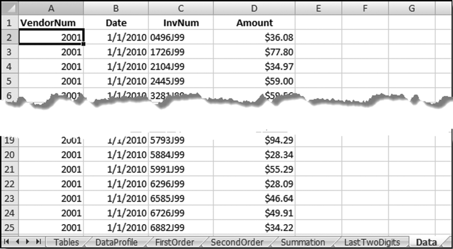
It is reasonably easy to import the data into the NigriniCycle template and the Data tab of that file is shown in Figure 4.16. The data profile is prepared in the DataProfile tab. The first COUNTIFS function can be entered into cell D4 as is shown in Figure 4.17.
Figure 4.17 The COUNTIF Function Used in the Data Profile
The first Excel formula used in the data profile is shown in Figure 4.17. The tab name in the function is followed by an exclamation point. This is followed by the range and the criteria. The criterion is entered in quotes. The COUNTIFS function is meant for two or more criteria and we only have one criterion for the >=10 strata. The COUNTIF function would have worked fine here. The COUNTIFS function is used to be consistent with the other strata. The formulas for all the cells in column D are shown below:
=COUNTIFS(Data!$D$2:$D$189471,“>=10”)
=COUNTIFS(Data!$D$2:$D$189471,”>=.01”,
Data!$D$2:$D$189471,”<=9.99”)
=COUNTIFS(Data!$D$2:$D$189471,”=0”)
=COUNTIFS(Data!$D$2:$D$189471,”>=−9.99”,
Data!$D$2:$D$189471,”<=−0.01”)
=COUNTIFS(Data!$D$2:$D$189471,”<=−10”)
=COUNTIFS(Data!$D$2:$D$189471,”>=.01”,
Data!$D$2:$D$189471,”<=50.00”)
=COUNTIFS(Data!$D$2:$D$189471,”>=100000”)
With the COUNTIFS function we state the range and a criterion, followed by a second range and another criterion, if applicable. For the second entry the first criterion was >–0.01 and the second criterion was <=9.99.
The SUMIFS function can be used for the calculations in column H. The SUMIFS function is a little bit more complex in that the range to be summed is entered first, followed by the ranges and criteria. The worksheet function for the cells in column H are shown below:
=SUMIFS(Data!$D$2:$D$189471,Data!$D$2:$D$189471,”>=10”)
= SUMIFS(Data!$D$2:$D$189471,Data!$D$2:$D$189471,”> = .01”,
Data!$D$2:$D$189471,”< = 9.99”)
=SUMIFS(Data!$D$2:$D$189471,Data!$D$2:$D$189471,”=0”)
= SUMIFS(Data!$D$2:$D$189471,Data!$D$2:$D$189471,”> = −9.99”,
Data!$D$2:$D$189471,”< = −0.01”)
The data profile prepared in Excel is shown in Figure 4.18. Note that columns F and J already have the formulas needed for the calculation of the percentages.
Figure 4.18 The Data Profile Prepared in Excel
The numbers in columns D and H have been neatly formatted. This file can be reused. As long as the amounts to be counted and summed are in column D of the Data tab then the data profile will be calculated correctly. Note, though, that the ranges (where the ending cell here is D189471) must be changed each time that the file is used.
Calculating the Inputs for the Periodic Graph in Access
The periodic graph is a reasonably straightforward columnar graph prepared in Excel. Calculating the monthly totals is a little bit tricky but this can be done quite easily in Access. The Access route is the only one demonstrated in the chapter. The query logic in Access uses two queries. The first query calculates the month from the date and the second query sums the dollars per month. We need to calculate the month because the totals are monthly totals. The query to calculate the month from the date is shown in Figure 4.19.
Figure 4.19 The Query Used to Calculate the Month from the Date
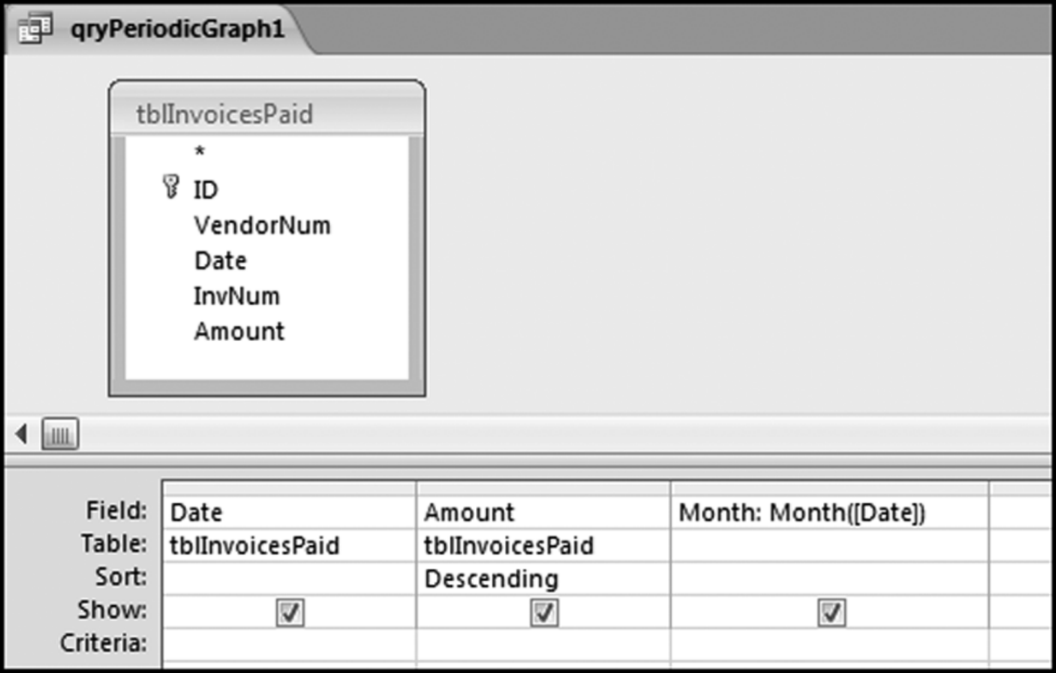
The Access function used is Month. This function assumes that the date is correctly formatted as a date. The next query calculates the monthly totals and this is shown in Figure 4.20.
Figure 4.20 The Query Used to Calculate the Monthly Statistics
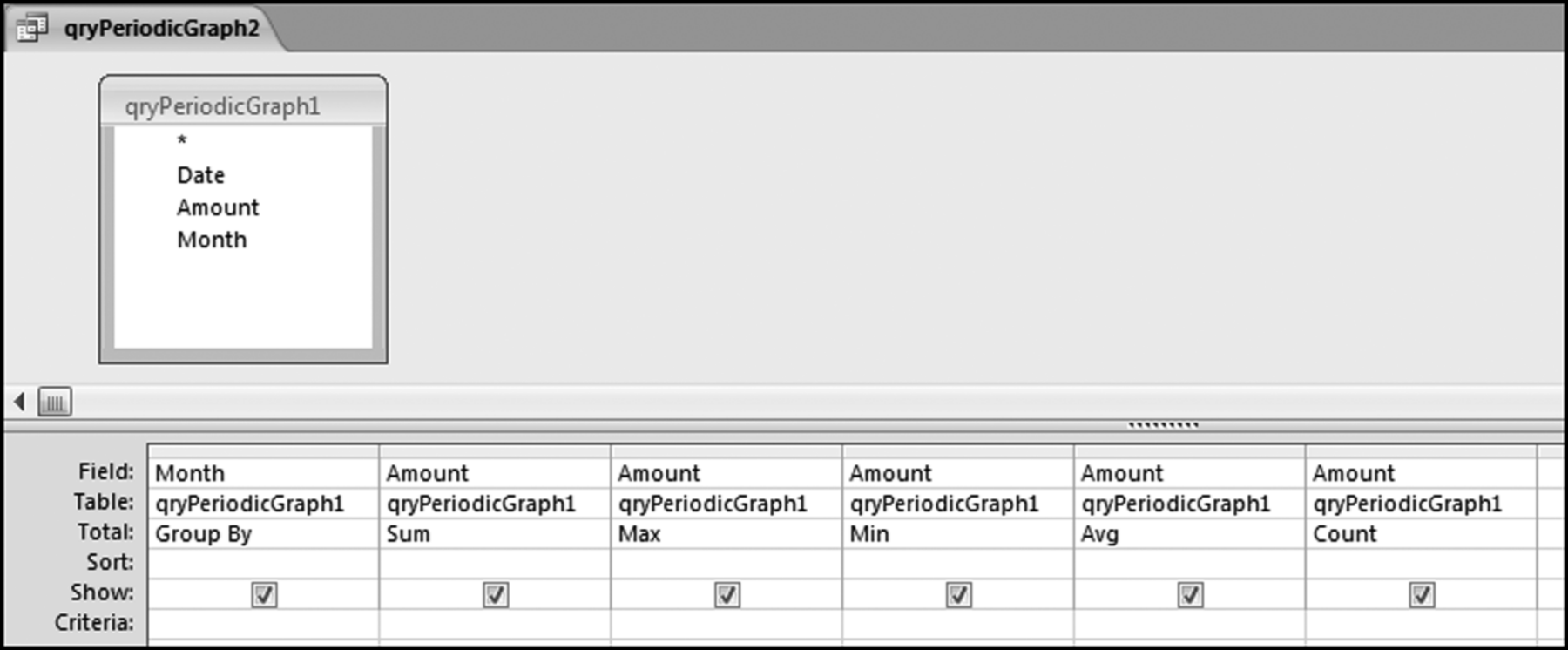
The query groups the records by month and then calculates the sum, maximum, average, and the count of the dollar amount of the records. The results are shown in Figure 4.21.
Figure 4.21 The Monthly Statistics of the Invoices Data
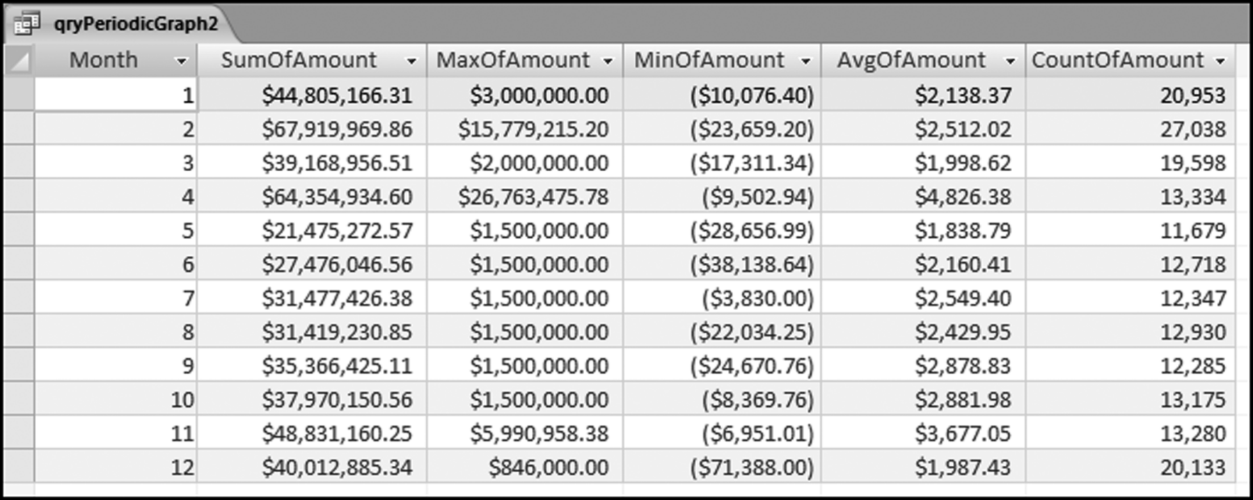
The monthly statistics are shown in Figure 4.21. It can be seen that the sums for months 2 and 4 are larger than the average monthly sum. The SumOfAmount field is the field graphed in Figure 4.3. The other calculated fields are there to gain a little more insight into the data. The next section calculates the inputs for the histogram.
Preparing a Histogram in Access Using an Interval Table
We will use Access to do the calculations and we will use Excel to prepare the graphs. A Union query would work but it would get tiring to keep changing the intervals in the SQL code. With 10 Between statements it would be easy to make an error and to double-count or to omit some records.
For the histogram we will use a table called IntervalBounds to help with the calculation of the counts for the 10 intervals. As a start we need to find out what the minimum and maximum values are for our data. This is done by looking at the MinOfAmount and MaxOfAmount fields in Figure 4.21. We need the smallest minimum and the largest maximum.
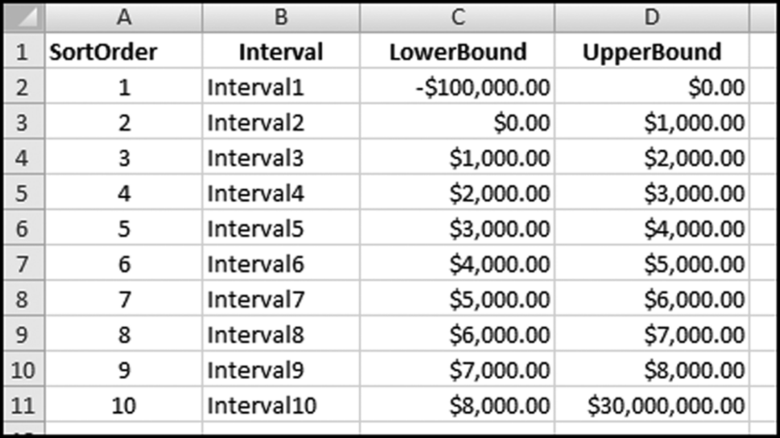
We will use our minimum of –$71,388.00 and our maximum of $26,763,475.78 to set our histogram's intervals. The next step is to create an IntervalBounds.xlsx table in Excel. This table will hold what we believe to be a good starting point for the histogram intervals. In most cases the lower bounds are equal to the upper bounds of the previous interval. To avoid double-counting we will use greater than (>) for the lower bound and less than or equal to (< =) for the upper bound so that an amount such as $2,000 will only be counted in one interval. The lower and upper bounds should be formatted as currency with two decimal places because that is the format of our Access data. The IntervalBounds.xlsx table is shown in Figure 4.22.
Figure 4.22 The Excel Table Used to Calculate the Values for the Histogram
This table should now be imported into Access using External Data→Import→Excel. Select the First Row Contains Column Headings option and let Access add a primary key. The SortOrder field is used in Access to keep the output sorted in the “correct” order. The Access table should be named tblIntervalBounds. The calculations for the histogram are done with a reasonably complex Access query that is shown in Figure 4.23.
Figure 4.23 The Query Used to Calculate the Values for the Histogram
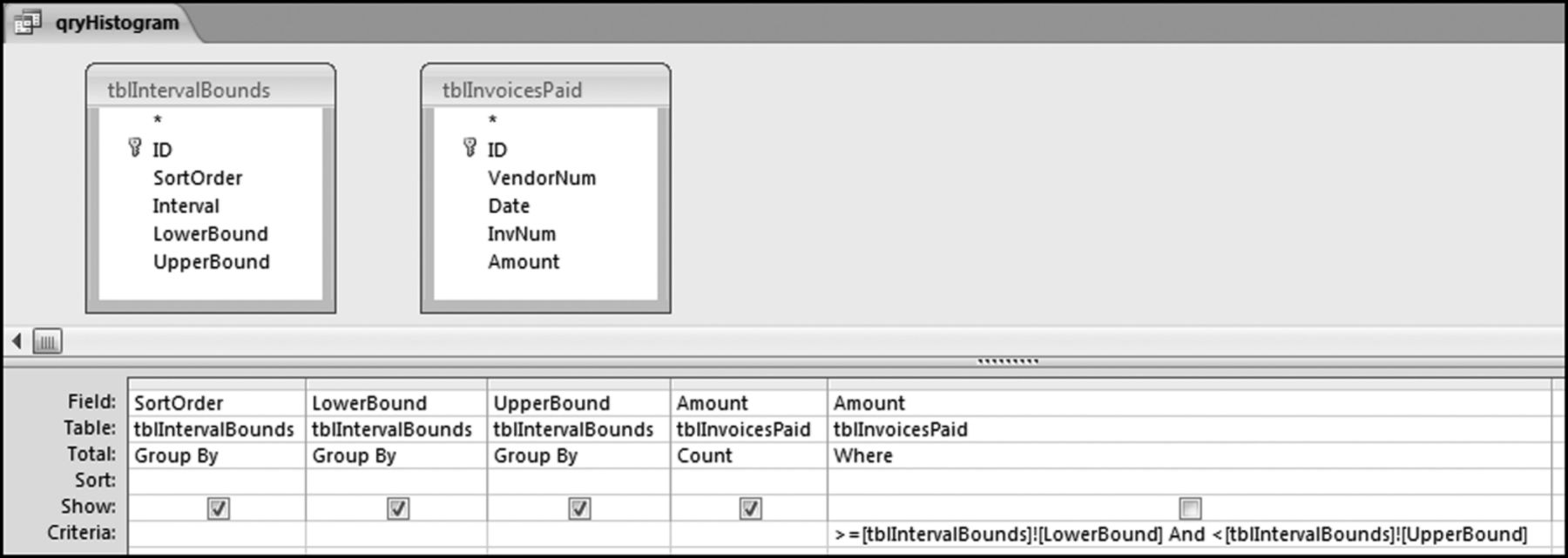
The “Criteria” in the last column is
> = [tblIntervalBounds]![LowerBound]And < [tblIntervalBounds]![UpperBound]
The Figure 4.23 query uses two tables without a solid line or an arrow joining the two tables. This is a little Access trick that works well in certain very specific situations. The usual rule for queries is that two or more tables should be joined. The results of qryHistogram are shown in Figure 4.24.
Figure 4.24 The Results of the Histogram Query
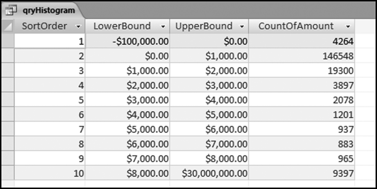
It is a good idea to sum the CountOfAmount field to see that the total number of records agrees with the total number of records in the data profile. Save the query as qryHistogram. The CountOfAmount field is used to prepare a histogram graph as is shown in Figure 4.2. The companion site for the book includes an Excel template named Histogram.xlsx. This template can be used to prepare a histogram similar to Figure 4.2. Note that qryHistogram can be rerun with different upper and lower bounds by changing the numbers in tblIntervalBounds. The query can be rerun as many times as is needed to give meaningful insights. The updated table tblIntervalBounds should be saved before qryHistogram is rerun.
This chapter introduces forensic analytic tests with three high-level tests designed to give an overview of the data. These tests are designed to be the starting line-up in a series of tests. Chapter 18 gives an example of a series of tests (starting with these high-level overview tests) applied to purchasing card data. The first high-level overview test is the data profile. The data profile gives the investigator a first look at the data. In the data profile the data is grouped into seven groups. These groups are small and large positive amounts, small and large negative amounts, and zero amounts. The data profile also includes a “somewhat small” and a “relatively large” category. The ranges for the data profile can be adapted for numbers in different ranges. For example, grocery store prices are all relatively small numbers and economic statistics are usually very large numbers. The data profile gives the count and the sum for each stratum as well as percentages for the strata. In an accounts payable setting the data profile can suggest processing inefficiencies, and in other settings the data profile could point to data errors with perhaps negative numbers in data sets that should not have negative numbers. The steps taken to create the data profile and the work done to understand its contents all help to give the investigator a better understanding of the data.
The data profile calculations can be done using Access queries. The calculations for each data profile stratum can be done one at a time, or a Union query can be used to do the calculations all at once. The Access results are then copied to an Excel template for a neat presentation format. If the data set has less than 1,048,576 records then all the calculations can be done in Excel using the new COUNTIFS and SUMIFS functions.
The second test was the periodic graph. Here we look at the month-by-month trend. Large fluctuations tell us something about the data. This test is run using Access to perform the calculations and Excel to prepare the graph. This combination often works well in a forensic setting.
The third high-level test was the preparation of a histogram. The familiar histogram is a bar chart showing the counts of the amounts in various intervals. It seems that 10 histogram intervals would work well in most financial settings. The suggested approach is to do the calculations in Access and to prepare the graph in Excel. The histogram gives the investigator another view of the shape of the distribution. Histograms tell us which numeric ranges have the highest counts. A histogram for the current period is informative, but it is even more informative to compare the histograms for the current and the prior period to see whether conditions have changed. Chapter 9 shows how a histogram can be used to look for signs that conditions have changed. These changes might be red flags for errors or fraud.
Discussions with auditors have shown that they are keen to show that their audit provides some value above and beyond the audit report. These value-added discussions usually take place after the audit in the management letter meeting with the audit committee. Auditors indicated that the results of some forensic analytic tests using descriptive statistics (including a data profile, periodic graph, and histograms) showing some anomalies, would be something that they could use at these post-audit meetings. Other auditors suggested that they might suggest selected forensic analytic tests to management as tests that management could perform on an ongoing basis on their data in a continuous monitoring environment. They, the external auditors, would then use the results in the audit as evidence that the process was being regularly monitored by management. Chapters 5 to 14 review a number of forensic analytic tests that can be carried out on a regular basis. Chapters 15 and 16 show how several tests can be combined to score forensic units for risk. The concluding Chapter 18 shows how the tests can be used in a purchasing card environment.