Table of Contents for
Responsive Web Design with Adobe Photoshop
 Responsive Web Design with Adobe Photoshop
Published by
Adobe Press, 2015
Responsive Web Design with Adobe Photoshop
Published by
Adobe Press, 2015
- Cover Page
- Title Page
- Copyright Page
- Acknowledgments
- Contents
- 1. Photoshop’s New Groove
- 2. How Did We Get Here?
- 3. The Case for Designing in the Browser
- 4. A Plea for Photoshop–Browser Harmony
- 5. Vetting Direction
- 6. Establishing Style
- 7. Establishing the System
- 8. Getting Back into Photoshop with Page Layers
- 9. Extracting Your Way Out of Photoshop
- 10. Extending Photoshop
- 11. Remembering Etiquette
- 12. Adopting a Completely New Workflow
- Index
- Responsive Web Design with Adobe Photoshop
11. Remembering Etiquette
I almost quit.
A while back, I worked at an agency where the process was generally as follows: The marketing people would meet with a client at the start of a project and then relay some information to the creative director, who would have first dibs on designing the site. He’d make a few PSD comps and hand them down to me to quality-check, more or less, to see whether everything he was doing was achievable in code. As the web designer, I was the bridge between “creative” and development.
I probably don’t need to point out that my role in the process should have started long before inheriting a PSD, but even that didn’t bother me much at the time. The role came with enough freedom to change what I saw fit that I couldn’t complain too much. Prior to learning how to design in the browser, I was lightning-quick at making edits in Photoshop (I’d like to think I still am). It was a skill I took much pride in.
That’s why it surprised everyone that my involvement derailed every project timeline.
The Problem with Inheriting PSDs
I would spend hours, and I mean hours, just getting myself up to speed when I received a batch of PSDs. Which file should I be using? Why is your Franklin Gothic different from mine, and is that OK? I can’t find any of the purchased stock photos. Why does that drop shadow look like there’s a spotlight aimed at my monitor?
Why did we bolt down the tables so I can’t flip them anymore?
That’s why I almost quit. The time I would spend making sense of a PSD was equal to the amount of time I’d spend on actual design. I venture to guess you’ve been in a similar situation, inheriting PSDs from someone and forming 25 questions before you even touch a pixel. If you haven’t, count your lucky stars.
The friction between designer and developer—or, in this case, designer and designer—is enough to produce unhealthy angst and discord. You could follow all of the workflow advice in this book to the letter, but if you work on a team that allows the distribution of messy PSDs, you won’t be getting any more efficient any time soon. If you care about such things (and you must, to have read ten chapters about it so far), a toxic and inefficient process will have you looking elsewhere for employment.
Having thought I was the only one in this kind of situation, I made a text document that outlined all of the things I’d like to have tidied up prior to inheriting artwork. It wasn’t asking much for someone to name their layers, right? Before I clicked Send on a companywide email, I realized this would die the same death just about every other piece of internal documentation does. No, this needs to be taken more seriously. It needs to look more official. This has to be a website.
And so I created one. This is the origin story of the Photoshop Etiquette Manifesto for Web Designers (see Figure 11.1).
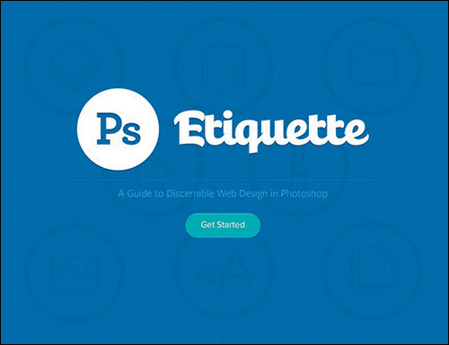
Figure 11.1 So it was, and is: www.photoshopetiquette.com
What Is Photoshop Etiquette?
To my surprise, designers from seemingly all over the world lauded having this kind of documentation. That’s when I realized these process pain points were ones everyone could relate to. Assuming we all have different workflows, etiquette must be the common ingredient that’s missing.
When we discuss etiquette, it’s typically framed around dinner table manners. Having etiquette means you’re proper, considerate, and dignified. Not having it means you’re sloppy, selfish, and, dare I say, immature. Etiquette (or the lack of it) in web design, specifically in Photoshop, has the same characteristics. You either can be mindful of the next person to inherit your file or can work with reckless abandon because you may think it’s quicker to do so.
What does having Photoshop etiquette look like? This chapter will dive deep into some examples, including best practices for file organization, layer organization, image and type considerations, using effects, and proofing your work. Don’t worry, we can all be better in this area of design, myself included. By the end of the chapter you’ll have a great reference for making some helpful adjustments and choices, and if you’re the type who’s already on top of things, you’ll have some required reading to pass around to your team.
Photoshop etiquette is critical to any team and any workflow. Here is a look at some reasons why.
Improves Efficiency
The most important benefit of employing Photoshop etiquette is to make a dent in some of the time lost transferring PSDs. Whether it’s a preemptive list of disclaimers by the transferrer or a myriad of questions by the transferee, design team members spend a considerable amount of time just getting familiar with a mock-up. The least you can do is limit these conversations to being client- or project-oriented (What was the stakeholder’s response to the blue background here?) instead of technical (Does this background need to have the Pattern Overlay turned on?).
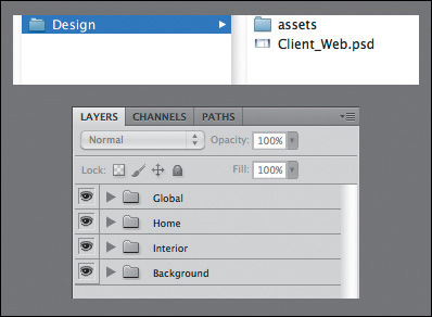
Keeps You Organized
It should be apparent that if you were to tidy up your files, layers, and assets, someone wouldn’t need to spend so much time sifting through everything (see Figure 11.2). The greater benefit is that employing better organization helps you most of all. For those times when you’re called on to create an asset or find the latest version of a PSD, you owe it to yourself to keep everything in order. Being organized in Photoshop is a gift from you to your future self.
Creates Conventions
An undervalued benefit of adhering to these guidelines is that you’re establishing common methods and conventions for the team to align to: Here’s the way we name our files. This is how we use folders in our PSDs. This is where we put stock photography. When you create standards for such things, your file and PSD structures look similar from project to project.
Increased Importance in an RWD Workflow
Think about the number of files that comprise a website. I’m not sure about you, but I use more PSDs, CSS, and images now than I did pre-RWD. Significantly more.
Now, consider all the hands that touch said files. Creative directors, art directors, interface designers, front-end developers, clients...and the list goes on. The art of building websites involves many moving pieces between breakpoint-specific CSS or Retina versions of images. It’s not that RWD is inherently messy; it just demands that we support and consider devices and views we hadn’t before. Keeping everything organized requires discipline.
It’s not easy to stay on top of everything, but clarity in Photoshop should be non-negotiable. In other words, we have enough to worry about to then have to chase one another to interpret what’s happening in a PSD. RWD has only placed greater emphasis on staying organized and increased efficiency on our teams.
Without further ado, let’s break down what it good Photoshop etiquette looks like.
Files
Before you start clarifying your layers and artwork, the least you can do is apply some discipline when you’re organizing files and folders. A well-constructed directory sets the tone for the quality of the contents inside it. If your filenames run rampant and empty folders are strewn across the project, it will affect my perception of the artwork when I eventually find it. If I don’t have confidence in your file structure, I won’t feel confident about the contents of your PSD. Don’t overlook file organization; it’s the best way to convey that you’re on top of everything.
Name Files Appropriately
Client-homepage-Final-v4.psd
Product-interior-v2-2-DO_NOT_USE_THIS_ONE.psd
We designers are pretty funny if you think about it. In an effort to aide communication, we try to convey the intent of our PSDs through the field name (see Figure 11.3). Why do we make it so hard on ourselves? Is “Final-v4” really final? Is any file meant for the ever-changing Web “final” anyway? Should we have to note which files are meant to be used and which ones not through suffixes like “DO_NOT_USE” or “OLD”?
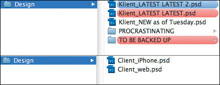
Figure 11.3 Do the red labels (top) mean “danger” like I think they do, or is Latest_Latest accurate too? Instead, let’s keep it simple (bottom).
Commit to establishing clarity in your filenames. Simplify any files that you and your collaborators need: “Project-View.psd.” That’s it.
You should also resolve to archive any artwork you don’t need instead of keeping it around with a funky file name. If Project-View.psd needs updating but you don’t want to lose the first version, create a copy and store it in a folder called “_archive” or similar. This practice will help someone inheriting a file structure find what they need quickly and have confidence that they’re opening the right PSD.
Store Assets Relative to PSD
Pretty high up on the list of web design annoyances is the endless search for the icons, stock photos, and illustrations someone’s using in a PSD. I totally see them in the artwork, but when I need the originals, where are they? Do I need to ask you to fish through the sea that is your desktop and email them to me? If so, we’re probably going to have some discord.
Similar to packaging InDesign files, you should include a folder of every asset that didn’t find its origins in the PSD. My recommendation is to store this folder in the same directory as the PSD (see Figure 11.4).
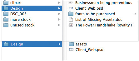
Figure 11.4 Needle-in-a-haystack asset organization (top) is a questionable practice. Tidy it up with a dedicated assets folder.
In doing so, you’ll circumvent having to stop what you’re doing to find the stock photo in your Downloads folder. Win-win.
File Accessibility
In a similar vein, it’s critical for any and all project files to find their way to a shared repository. On one project I needed a PSD on a Friday but someone had forgotten to put it on the shared file server. If this happens every now and then, that’s not so bad, but if it’s a habit, then it’s a problem.
The easiest way to ensure all your artwork is on a file share is to work directly off of one. You will run some risk of losing your work, just as you would be if your computer went down unexpectedly. At least on the file share you (typically) have greater assurance of a backup. Even more reliable is using version control, such as Git and a service like GitHub, to keep all your files up-to-date and accessible.
Working locally and remembering to upload files occasionally is hard but not impossible. It helps to set yourself an alert for the end of the day.
Layers
Layers are the core of Photoshop etiquette. The majority of the offenses I’ve endured with inherited work resulted from messy, unclear layers. Having to spend time renaming and reorganizing layers is like being a parent who has to clean up their child’s room. If you can teach them to clean it themselves, or not to make such a mess in the first place, you’ll be able to get done all the other stuff on your list.
If you’re looking to take some baby steps with etiquette, do these first. Trust me, they make a world of difference.
Name Layers and Be Accurate
Accurate layer naming is the quintessential rule of Photoshop etiquette. We need to rid the world of “Layer 0 copy copy.” That’s simply not useful.
Instead, try to be deliberate with every layer name in your document. If it’s a photo, don’t just name it “photo.” Tell your collaborators which photo. If it’s a button, “Shape 1” isn’t clear enough; there may be 25 other shapes nearby. Consider naming the foundation of an efficient collaborative workflow and build upon it by naming accurately.
Tip
If you want to get rid of the “copy” suffix Photoshop automatically puts on new layers, click the Panel Options icon in the upper right of the Layers panel. From there, deselect the Add ‘copy’ to Copied Layers and Groups check box.
Similarly, attempt to name assets for their intended use in an interface. If a background belongs to a footer, why not name the layer “footer-bg”? If you recall how Generator works to take layer names and produce files, incorporating a layer’s intended use into its name makes this a no-brainer. Name it “footer-bg.jpg” and save yourself the work of renaming extracted assets later (see Figure 11.5).
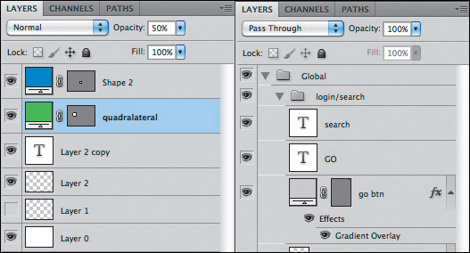
Figure 11.5 We can do better than this (left). Show some pride in your craft by naming your layers (right).
A common argument against naming layers is that it takes too much time. While there’s some truth in that, I’d argue the time it takes you, the originator of the PSD, to name your layers is but a fraction of what it takes someone else, who’s unfamiliar with your artwork, to identify and name them. Not naming them at all would be downright inefficient when you’re trying to find things later, wouldn’t it?
Use Groups and Globalize Where Possible
A well-structured layer panel is akin to a welcome mat or table of contents for the person who inherits your work. It says, “Hi there. Before we get started, here are all the categories of things I made. Have a great day.”
Groups are the best way to group and organize content, so failing to include them in a PSD makes your lack of organization apparent. Grouping by component gives someone the option to make the grouped layers visible/invisible or move them as a unit when they need to (see Figure 11.6). Ungrouped layers tend to be quite difficult to corral, especially when two layers of a component may be distant in the layer panel order.
While you’re at it, consider globalizing shared components and masks as best you can. Trying to maintain five copies of a header can be exhausting if it never changes, so keep it in a group above and away from content that shifts appearance. The same can be said for masks: There’s no reason to duplicate a common mask across ten layers. Instead, place the mask on the group and allow it to cascade down to its contents.
Delete Unnecessary Layers
Do you hold on to invisible layers and unused concepts the way you do old sweaters? If so, you might be a layer hoarder.
Unless your intent is to toggle visibility to indicate states or behaviors of a particular component, try to let go of any unused layers. All they end up doing is cluttering the Layers panel and confusing someone as to their role. You may have some very good ideas hiding behind the canvas, so document them elsewhere if you can. But by no means keep unused layers hanging around for someone else to figure out what to do with.
Still unconvinced? Do it for performance’s sake: The more layers you have, the slower Photoshop runs. A faster Photoshop should be incentive enough to trim down those layers by cutting the fat of unused ones.
Images
Even in the flat-design era, it’s hard to skirt around using photography and illustration in Photoshop. Photo manipulations have long been a key to well-crafted interfaces, so it makes sense that we might revert to some messy habits found in traditional photo editing.
Unfortunately, as a composite gets more and more layered and deep, the less we tend to consider someone else needing to make sense of it. Here are a few things we can do to change that.
Be Nondestructive
No matter how many effects you employ, you should be able to take them all away and find the original unscathed. Who knows if you’ll need to adjust the effects down the road? It’s best to keep total flexibility in the matter by being “nondestructive” to the original.
For example, if a photo has an unwanted artifact you want to remove, using the Eraser tool would cause irreparable harm to the source. The only option to undo such edits is to hang onto the original asset and include it in the PSD again. Instead, use a mask, which could be hidden or edited later and isn’t permanent (see Figure 11.7).
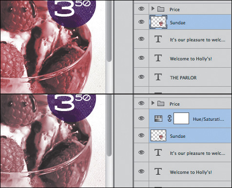
Figure 11.7 Make edits and adjustments on a mask or separate layer than the original (left) instead of directly on it (right).
Other nondestructive techniques include not rasterizing vector shapes and using adjustment layers.
Use Blend Modes with Care
While it’s true that support for blend modes via CSS is growing, be careful using them with any degree of complexity in Photoshop. It’s hard to discern how an effect is achieved from the eye of someone trying to extract assets from your PSD. If you’ve ever tried saving a layer with a Multiply blend mode with alpha transparency, you know it’s not exactly within the realm of possibilities.
Always be thinking about how your complex layering or photo manipulations are exported. If they need to be combined and flattened prior to extraction, let the next person know about it. If you do opt to use blend modes in CSS, it’s still important to be able to export an accurate fallback image to achieve the effect in browsers that lack blend mode support.
Be Aware of Resolution and Density
It’s the job of the developer and the designer to keep up-to-date with the bevy of screen resolutions and pixel densities in the wild. Pleading ignorance as to why your icons look fuzzy on a Retina screen isn’t going to fly most times. If you set your PSD up for more comprehensive output of asset sizes, you’ll have nothing to worry about.
Extract Assets proved to be a handy tool in Chapter 9, and here you see that the presets for including @2x, @3x, and beyond make for easy production. Whether you choose to upscale or downscale your work, having a complete library of assets and relative sizes has never been more important.
Type
Type is probably the trickiest element to work with in Photoshop. You’re displeased with either the rendering, selection, or performance for any number of reasons, though all three of these areas have gotten significantly better with Photoshop CC. Regardless, there’s a code of etiquette you should adhere to when using type for the Web.
Standardize Font Access
Missing font dialogs are the worst. They impede your progress before you can even open a PSD. What’s worse, it’s difficult to resolve them correctly. Sure, Typekit integration helps, but if you’re considerate about the fonts you’re using, it’s easy to grow frustrated from not having the correct one.
Often is the case that co-workers have slightly different versions of fonts (be they from different foundries or release dates), such as Franklin Gothic on my computer and Franklin Gothic ITC on someone else’s. Not only may their appearance be different, but the name is different enough to warrant Photoshop throwing a missing font dialog. In an ideal situation, a company buys the requisite amount of licenses for a font and distributes them among the design team, ensuring no conflict. However, with the amount of font scouring most of us like to do, it’s highly unrealistic to keep to synced set of fonts across all computers.
Some basic courtesy is required on the part of the PSD creator. If a font can be shared (no license restrictions), include it local to the PSD when you hand it off. If a font needs a license, consider using one that doesn’t—or, at the very least, include a note with instructions for finding it.
Don’t Stretch Type
Stretching type is more of a design practice crime than an etiquette one. I’ve yet to see a scenario where horizontally or vertically stretched or squished type made anything look better (see Figure 11.8). If you need condensed or extended type, you’re better off using a font that has one included.

From a technical standpoint, stretching type in CSS isn’t easily achieved. There’s most likely a backward, obscure way to do it. But again, would you really want to even if it were easy?
Control Your Text Boxes and Separate Them
One of the biggest frustrations of trying to select layers is when you click a canvas element and Photoshop chooses a different piece of text based on an overblown text box (see Figure 11.9.). These too-tall and too-wide text boxes are usually accidental, a product of anticipating more text than necessary. When the empty space overlaps other artwork, PSD inheritors have good reason to take issue with your lack of tidiness.
Figure 11.9 Not much can be gleaned from this joint text box (left). On the other hand, separating like elements makes the task easier (right).
The easiest remedy is to resize text boxes immediately after you’re done entering and styling text. Much like renaming layers, you could opt to do so just prior to handoff, but it’s a discipline probably best practiced in the moment.
Tip
Forget to draw a text box before you entered text? No worries: select the layer and choose Type > Convert to Paragraph Text. Need the opposite? Remove a text box by choosing Type > Convert to Point Text.
Equally important, keeping your text in separate boxes will help someone looking to extract quick style information. When you combine a headline, subheadline, and body text inside the same block, the font, size, leading (line-height), color, and other characteristics show blank in the Character panel (unless they share any of these values). It takes an extra step of selecting individual text inside the box to determine these values, and while achievable, it’s certainly not convenient. You can save someone time and clicks by keeping similar type in its own text box.
Effects
Even the best designers can overdo it when it comes to applying effects. Effect etiquette isn’t about limiting the amount you use so much as it is about establishing clarity with what the effect does. While it’s fun to guess how you made a drop shadow by using Bevel and Emboss, it’s not easy for someone to know how to show and hide the effect when exporting.
Use Overlays Appropriately
Shape thumbnails in the Layers panel used to be of bigger visual importance prior to Photoshop CC, where the original color of a shape filled the entire thumbnail.
Tip
You can achieve a similar effect by right-clicking a thumbnail and choosing Clip Thumbnails to Layer Bounds.
A white square on the canvas shows up as a white thumbnail in the Layers panel, making it easy to find. The worst thing you can do is use a Color Overlay effect to change it to a red square. The thumbnail color won’t update, and someone will be hopelessly glossing through your layers looking for something red, never to find it (Figure 11.10).
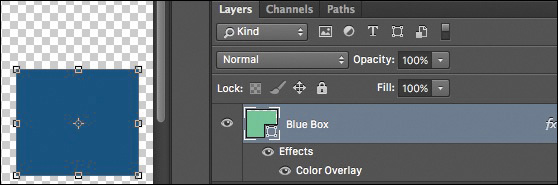
Figure 11.10 Try not to fool someone by showing them one color in the thumbnail but switching it on the canvas.
If possible, change the color fill of a shape instead of applying a filter. Changing the fill will update the thumbnail, and everyone will be happy. The idea here is to try to be as accurate as possible with thumbnail previews, whether you employ Color, Gradient, or Pattern Overlays. Those hints of color make scanning hundreds of layers that much easier.
Nail Tileable Images
Who doesn’t like a repeating background every now and then? We can pull it off with a Pattern Overlay or simply tiling images manually. Whatever method you use, be sure to make it seamless.
When a pattern is even one pixel off, the effect of a seamless background is destroyed. If the task of a developer or designer is to go in and extract such backgrounds, making them fix seams is less than considerate, don’t you think? Nail the execution of tileable images so someone else won’t have to.
Be Deliberate
The natural impulse when you’re using layer effects is to treat them like a checklist. I’ll take a Drop Shadow, Stroke, and Gradient Overlay. Check. Check. Check. By not adjusting the values, you’re depending on the Photoshop defaults, which may not be appropriate or consistent with the design of your project (see Figure 11.11).
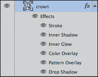
Figure 11.11 Though the Layer Effects panel has the appearance of a wish list, don’t treat it like one.
Historically, the defaults for layer effects have been incredibly gaudy, which was actually a good thing. They emphasized the effect to make its appearance unmistakable, so you knew you were using an effect. Additionally, the appearance was so exaggerated that you had no choice but to edit it to a more tasteful value.
Photoshop CC dialed back such exaggerations in favor of making the defaults fairly tasteful and subtle. While you might be tempted to use their presets, refine the settings to the precise demands of your design instead. A PSD inheritor will appreciate your eye for purpose and consistency, knowing that a 15px blur on a drop shadow was your choice instead of Photoshop’s.
QA
When you inherit a PSD from another designer, don’t you assume they’ve performed some basic quality assurance? I know I do, though that’s not usually the reality. Being “too close to a design” often means your artwork is wrought with spelling errors and potential content inaccuracies.
It’s always wise to give a your PSD one last check before sending it on its way.
Proofread
The majority of the spelling errors I’ve committed in Photoshop are on huge headlines or buttons high in contrast. Isn’t that odd, that the seemingly most apparent elements are often mislooked? It’s prudent to start your quality check by looking at the big, noticeable type and working your way down (see Figure 11.12).

Errors within the body copy are less noticeable, and while it’s usually understood that Photoshop text isn’t final, typos don’t communicate the much care for your craft.
Account for All Assets
If stock icons, photography, or illustrations are used in your comps, be sure to purchase them prior to passing around your PSD. Too often someone extracts an asset without any knowledge of its license or potential watermark (see Figure 11.13). Those for-placement-only items tend to have a longer shelf life than they should.

There are some pretty hilarious, but serious, examples out there of finished artwork with an “iStockPhoto” watermark that made it to production. Make sure this doesn’t happen to you by staying on top of purchased assets and updating your PSD.
Be Familiar with Browser Compatibility
While your PSDs usually picture a best-case scenario, the world of Internet Explorer is ignored, and while your extracted assets often accommodate the latest builds of Chrome, Firefox, and Safari, older versions can’t use them.
Tip
Visit www.caniuse.com when you’re unclear whether a feature or technique is supported in any particular browser.
It’s up to you to be familiar with browser support for the effects you display and the assets you export. Not all browsers support SVG, so you’ll need to include a fallback PNG. Not all browsers support CSS such as rounded corners and alpha transparency, so you’ll need to have a plan for those as well.
Instituting etiquette on your team should prove to be beneficial. Getting everyone on board isn’t always easy, but if you want to be master of your craft, the details of a PSD are a good place to start improving. Consistency, clarity, and intent are the elements you need to pour into Photoshop in order for your work to speak for itself.