Table of Contents for
Responsive Web Design with Adobe Photoshop
 Responsive Web Design with Adobe Photoshop
Published by
Adobe Press, 2015
Responsive Web Design with Adobe Photoshop
Published by
Adobe Press, 2015
- Cover Page
- Title Page
- Copyright Page
- Acknowledgments
- Contents
- 1. Photoshop’s New Groove
- 2. How Did We Get Here?
- 3. The Case for Designing in the Browser
- 4. A Plea for Photoshop–Browser Harmony
- 5. Vetting Direction
- 6. Establishing Style
- 7. Establishing the System
- 8. Getting Back into Photoshop with Page Layers
- 9. Extracting Your Way Out of Photoshop
- 10. Extending Photoshop
- 11. Remembering Etiquette
- 12. Adopting a Completely New Workflow
- Index
- Responsive Web Design with Adobe Photoshop
8. Getting Back into Photoshop with Page Layers
This is the first year my family is hosting Thanksgiving dinner. Although many people find it stressful to shoulder this responsibility, I love to cook, so I’m looking forward to it. I’m confident that I won’t overcook the turkey. The texture of my mashed potatoes is always spot on. The rice recipe handed down to me from my grandmother has become my go-to dish to bring, so preparing and serving it on my home turf will make it even better. The cooking is going to go great.
It’s the tablescape that has me petrified.
I know it sounds silly, but I don’t quite know how to put everything together on the table—arguably, the most important part. Sure, you can say that it’s all about how the food tastes, but if the food lacks presentation or is inaccessible, who’s going to want to eat it? There’s a lot of stuff to put out and not so much space to put it in, let alone make it look elegant.
Fortunately, my family is comfortable retrieving their own utensils should I forget to give them any, just as they’re sure to trade seats until everyone is in closest proximity to their favorite dishes.
As designers, we don’t have the convenience of knowing our users will willingly adapt to our designs. How we design the page can make or break the experience. Does the arrangement make sense? Does each element look intentional? Does this look like a cohesive page?
We have all the dishes, but the table will look like a hot mess without a game plan.
Rough Waters Ahead
In the world of RWD, the potential number of layouts we need to consider can be overwhelming at times. Screens are small, wide, tall, short, or the middle of all the above. When we throw components at a page, our expectation is that everything will just magically pop into place. I mean, everything has a consistent style and is responsively built, so what’s the worst that can happen?
The answer is, a white page with a bunch of awkwardly distributed content (see Figure 8.1).
To break it down further, there are usually four problems I find myself wrestling with after I port components into page templates.
 It’s a struggle to increase fidelity.
There’s no easy way to suggest tweaks.
The pages lack cohesion.
Some elements suffer from responsive wonkiness.
This chapter will address those challenges in detail because it’s not until we resolve these issues that we can deliver well-considered designs. The good news is that each struggle can benefit from a little bit of TLC in Photoshop. What complicates matters is that everything we have, from style guides to component libraries, is in code. How do we get the product of HTML & CSS back into Photoshop?
The solution may blow your mind.
Introducing Page Layers
Every attempt I’ve made to go from rendered web page to Photoshop has been an exercise in futility. I just end up re-creating every shape, entering each line of text, and ultimately banging my head on my desk for the time it took to do so. Thankfully, there’s a better way and it’s called Page Layers.
Created by Ralf Ebert, Page Layers (see Figure 8.2) is a Mac app that converts HTML to PSD. The presentation of the app is akin to a browser, with only a few differences. To export a page, type in the URL, and when the page loads, choose Screenshot > Save As or drag the PSD icon at the top right to your folder of choice. Page Layers will parse through the page and create a PSD with layers respective to the DOM, or structure of the HTML. The result is a perfectly captured web page that’s fully editable, layer by layer, in Photoshop.
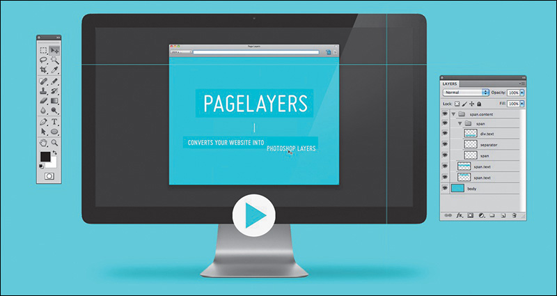
Figure 8.2 Page Layers (www.pagelayers.com) is a magical application that turns your website into a fully layered Photoshop document.
It’s magic, really. For $34.99 (on the Mac App Store), it’s also a bargain. If you’re unimpressed at this point, I’m confident I’ll convert you to Team Page Layers by demonstrating how it helps solve our four component-to-page problems.
The Struggle to Increase Fidelity
As you move toward creating a high-fidelity prototype, you’ll encounter a few scenarios where you’re likely to struggle with bringing the right amount of polish to your design. Perhaps you’re still designing components and you’re stuck on how to style a few. Maybe you’ll encounter a block of content that isn’t a repeatable pattern so much as it’s a page-specific occurrence. For many of us, the process of refining components can lead into the trap of attempting to design everything in the browser.
As mentioned in Chapter 4, designing in the browser can often yield results that align with the path of least resistance. Boxes, solid colors, and habitual styling, even unintentionally applied, can prove counterproductive in some projects. You might hit a creative wall when you’re trying to style components, such as footers, that don’t inherently lend themselves to the design inspiration captured in the visual inventory or element collage. In many a project I’ve found the gray-boxed footer staring me in the eye, challenging me to come up with something beyond my usual solid background color overlaid by white text links.
This is where Page Layers shines. Instead of trying to vet ideas in the browser, fire up Page Layers and export the component you’re struggling with back into Photoshop. It may be the most fundamental use case for Page Layers, but using it as a means to retrieve usable assets in Photoshop is undeniably essential.
With full-page comps, in cases where we needed to edit something, we always had an original we could start from. If we ditch this approach, Page Layers becomes indispensable as a tool to give us access to every page element in Photoshop. Quite simply, we now have the best starting point to begin high-fidelity ideation.
Tip
Page Layers renders elements as raster graphics, making it a little tricky to manipulate them. While a fix for vector rendering is ideally in the works, you can render text for easy editing by choosing Save As instead of dragging the PSD icon. In the dialog that appears, select the Generate Text Layers check box. It’s likely the name of the web font being used won’t map to any installed on your computer, so you’ll need to adjust it manually.
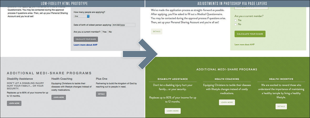
Let’s start with the example of a low-fidelity prototype. It’s strewn with gray boxes and unstyled text, by design. When it’s time to move to component styling and you’re struggling to add fidelity to the footer, there’s no need to hop into Photoshop and attempt to re-create all the links. Fire up Page Layers, generate a PSD of your lo-fi, and use the time you would have re-creating elements to build your dream footer instead (see Figure 8.3).
Pulling your rough layouts into Photoshop is a great way to start adjusting in an environment of direct manipulation, and it may increase your efficiency in homing in on the best stylistic approach.
Don’t Get Too Comfortable in Photoshop
The first few times I used Page Layers were game-changing. It was so game-changing, in fact, that I found myself spending too much time in Photoshop and not getting back into the browser to implement my ideas. It’s surprisingly easy, and addictive, to start pulling in page after page and adjust every last detail. The problem is that method isn’t much better than creating full-page comps prior to development.
Try to focus on only those components or areas that could use a quick round of ideation. If you find yourself (or your team) spending more time in Photoshop than coding, that’s not the balance we’re looking for. Our goal is to use Photoshop as a complement to the browser, not an equal or superior. Keeping this in mind should help you move between the two environments with frequency and efficiency. Continue to rely on the visual inventory and element collage where you can; where you can’t, move quickly through your ideas in Photoshop.
Leveraging Linked Smart Objects
Linked Smart Objects are one of the best features in Photoshop CC. If you’re unfamiliar with Smart Objects in general, they are layers in your document that contain nested elements. For example, you may have a component such as navigation in a Smart Object. The individual type layers or shapes that comprise it wouldn’t appear in your parent PSD; rather, they’d be isolated in a child PSD, accessed by double-clicking the layer thumbnail.
For years, to edit those Smart Objects, you would need to have the parent PSD open. With Linked Smart Objects, child PSBs can remain independent files from the parent but still update the parent when saved. It’s a feature similar to Links in InDesign, where any changes made to exterior files are reflected in the parent INDD.
So, what does this mean for component-driven design? If you’re a solo designer, Linked Smart Objects might provide a decent way to organize your ideas.
More importantly, if you’re on a team of designers, Linked Smart Objects resolve the conflict of any two designers needing to make changes to the same PSD simultaneously. In this example, components.psd is a master document comprised only of Linked Smart Objects. Kenny Loggins can be editing header.psb while Jim Messina edits carousel.psb (see Figure 8.4). This gives Loggins complete autonomy over a portion of the master PSD without needing to ask Messina for permission to edit it.
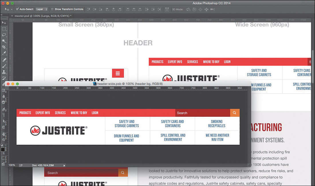
Figure 8.4 Here’s Loggins working on the header on the left. His changes are reflected in the master PSD on the right, without ever needing to touch it.
If this workflow sounds appealing to you and your team, you might consider the following workspace beneficial. In one window, you can edit a component and in another window view components.psd updating live.
Linked Smart Objects offer a powerful way to get multiple designers working on the same part of the process simultaneously, which again should help productivity and efficiency.
There’s No Easy Way to Suggest Tweaks
No matter your level of experience, I wager you can identify with this common practice:
1. You notice something in development that needs adjusting.
2. You take a screen grab and pull it into Photoshop.
3. You adjust the offending element through a mix of clone stamping, re-creating text, and other smoke-and-mirrors approaches.
The Old Screenshot
No doubt, we designers have gotten good at this practice, even when it’s just to make a suggestion to another designer instead of trying to describe it with words. Pictures do a much better and more accurate job, so why not lean on our proficiency in Photoshop to tell the story? My team at WSOL does this constantly over Slack (an instant messaging communication tool I highly recommend). As efficient as I thought I was at this method of picture making, it still takes me 10 to 20 minutes at times to produce a comp with stretched-out text and gaps in the background (see Figure 8.5).

Fellow designers can usually interpret such deformities, but it’s less than ideal to hand this to a developer. It usually takes more explaining than it should. What’s worse is attempting to modify a screen grab to illustrate a point to your clients. It’d be best to not have to disclaimer your work.
The New Screenshot
Thankfully, we don’t have to. With Page Layers, we have all the assets at the ready for transforming and editing. Because every element is on its own layer, there’s no need for filling in patches where you selected a region and moved it or stretching or squishing text to fit a new container. The ease with which we can modify these “screenshots” has significant impact on our accuracy and efficiency. Let’s take a look at three benefits.
A Proper Sandbox
For code-averse designers, suggesting adjustments in Photoshop has always been the best option. It’s a familiar environment in which we can maintain the fidelity of the browser. Even for the designer who codes but is fearful of any ripple effect their efforts may cause to development (raises hand), Photoshop provides a sterile environment in which major adjustments have no repercussions. I consider myself proficient in HTML & CSS, but I find myself making small pictures for our front-end developer, who’s at least twice as efficient as I am.
Cumulative Time Savings
You may snicker at the concept of saving time with more efficient doodling in Photoshop. A 20-minute exercise is reduced by half in Page Layers, but 10 minutes isn’t going to help us come in under budget any more than 20 might. While that may be true, consider the cumulative time savings of 10 minutes here, 10 minutes there. This practice of modifying screenshots is so commonplace for most teams that they can find themselves saving hours with this adjustment.
Maybe it’s not about budget for you. Still, imagine having a conversation with a developer about a page when you notice something that can change. If it takes you 20 minutes to communicate the necessary adjustment, that’s 20 minutes they’ve been waiting for your response or potentially have moved onto something else. Quicker adjustments through Page Layers help to sustain the momentum of the conversation and potentially help you figure out what you want to suggest a lot faster, too.
Reinforcing the Practice
Using visual aides to communicate our design recommendations seems natural, right? We continue to modify screenshots because we know the power of being able to show our intent visually, complementing our words. Sometimes I tend to lose sight of this, because the mere thought of hacking a screenshot in Photoshop seems like more trouble than it’s worth. Regretfully, this has resulted in more utterances of “that looks good enough” than I’m comfortable admitting.
For me, Page Layers has made an arduous task easier, so much so that I tend to use it more often. It’s hard to argue against anything that helps you communicate design intent more efficiently.
Our Pages Lack Cohesion
Designing a system has major advantages over page-centric design, especially in responsive contexts. I’ve hinted at some of these benefits already: increased consistency, thoroughness, and modularity. I know I need a button on the page, but instead of creating a one-off style for it, I refer to the style guide. This is a good approach; embrace it.
However, when we move to building out pages and templates, the premise that we can just plop in our components and everything should look intentional is a bit misguided. We’ve established some stylistic consistency across each component, but that doesn’t guarantee their arrangement on a page will look well considered. I believe a lot of the similarities found across responsive sites are because of a lack of page cohesion and a reliance on designing in the browser.
Framing Content and the Big Picture
In Chapter 4, I touched on a theme called responsive design sameness. Sites today are just one level of consideration shy of establishing more of a unique identity. Let’s break this down a bit further.
On a site I created for Indiana Wesleyan University, I added a few components to the middle of the homepage. At the very least, everything is where it needs to be, but like so many other sites, we have a bunch of content floating atop a white background. Is it functional? Yes. Is it legible? Yes. Is it cohesive? I’d argue that it’s not, at least not with the other content above and below it. It lacks character and presentation (see Figure 8.6).

Figure 8.6 On their own, the components make for a totally usable design, but the content isn’t framed in any meaningful way.
With Page Layers, I took this back to Photoshop to toy with some ideas I had to better frame the About Us content. In the context of a large photographic banner on top and a footer below whose background is a campus photo, introducing a third, more subtle photo seemed natural. I find it a thousand times easier to manipulate photos and effects in Photoshop than in the browser and thus have the propensity to do so more often. What resulted after a round or two was a clearly defined panel for the content and, more importantly, an opportunity to help introduce some cohesive style to a section that desperately needed it (see Figure 8.7).

It’s worth noting that one of the best techniques for repurposing Photoshop isn’t focusing on the pixel-level detail we’re accustomed to but the broad canvas of the page. If we can borrow a step from the traditional process, the ability to step back (zoom out, rather) and view the entire page was a very underrated byproduct of the granular work we were doing. Designing in the browser tends to lock us into a viewport’s height, making it harder to assess cohesiveness and flow across the entire page. Worse yet, how easy is it to design solely for the particular height of your browser window, only to realize that your design doesn’t work at a different height?
Bird’s-Eye View
Living in a house that’s barely a year old, I’ve started to become enamored with yard work. Early on, after growing an acre’s worth of grass (which was no small feat, mind you), I decided to take on some landscaping. My wife and I made our way down to a local nursery and bought nine small plants, and I spent the better part of a few weekends making some beds for them to grow in. I’m happy with the result, though it wasn’t until recently that I saw our house on Google Earth and noticed how isolated everything looks in view of our entire lot. We have a swing set here, two small apple trees there, and a bed of plants near neither.
I’m glad I had an aerial view at this point. It’s spurred tons of ideas for planting large trees, how big to make a patio, and what size pool would work (just kidding—people in Syracuse don’t have pools). While it’s not realistic that my house will be viewed from that perspective, I do know that being too close to the “component” I’m working on tends to lend itself to looking isolated in view of the big picture.
Sometimes, Photoshop is better used as Google Earth than Street View.
Where Skeuomorphism Worked
Cohesiveness is one of page design’s toughest challenges; in this regard, it trails only establishing layout and hierarchy. It would seem that our fixed-width—dare I say skeuomorphic—designs took cohesion into account more than our responsive, flat-designed sites. With the more detailed, textural designs, we had to take great consideration as to deep layering of backgrounds, transitions of content sections, and how we established clarity (see Figure 8.8). Minimal, flat-design aesthetics are convenient for responsive design since there is a fair amount of margin of error in terms of our backgrounds adapting to different widths. With that, I fear we haven’t always considered the details of stitching components together in a deliberate way.
I’m not advocating for employing a bunch of one-off section backgrounds; such faulty logic will catch up to you as you try to maintain a handful of slightly different section styles. Introducing a better way to frame content in one place should be applicable to other places on your site. Alternatively, push yourself to find more methods than employing solid background colors with hard edges; there’s plenty of that out there already. Instead, elements such as rules, padding, and even gradients may give you more distinctive solutions.
Some Elements Suffer from Responsive Wonkiness
Let’s talk about being responsively thorough for a minute. If we’re adopting the philosophy that our site should look its best at any size, that means we need to test it beyond the most popular or convenient-to-us device widths. Resizing our browser gives us a decent approximation, but if that’s the route we’re taking, I encourage you to set it to something peculiar like 734px. If you’re like me, you’ll find the 50px above or below a breakpoint are certain to produce some kind of oddities.
I like to define “oddities” as anything that looks wonky and “wonkiness” as a presentation that isn’t quite ideal. For instance, the three circles shown here are adequately filled at 900px, and though the content is abbreviated, it’s still optimal at 800px. However, the circles begin to have some undesirable empty space at 850px. Granted, you may not have a large user base viewing your site on a 850px device, but it’s certainly possible someone’s browser window is open that wide at any given time. Any way you rationalize it, I think you need to take another look at this component’s 850px presentation (see Figure 8.9).
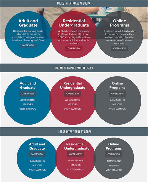
Figure 8.9 The content fills the circles well at 800px and 900px but not so much at 850px. I contend that’s worth fixing.
Seems pretty particular, no? I enjoy this take on the matter:
“Go deeper. Squander loose time on expanding your ideas, even if you’re sure they’re perfect or useless. Look closely at decisions you think are trivial. I guarantee you’ll find better solutions around the corner.”
—CENNYD BOWLES, Letter to a Junior Designer (www.alistapart.com/column/letter-to-a-junior-designer)
Examples like this provide opportunities to really nail the interface across the board. Do you need to make changes to the entire site at 850px? Not at all. You can add as many component-specific breakpoints as you need to respond to the stress, or stretch, of your designs (see Figure 8.10).

Width-Specificity in Page Layers
Identifying wonkiness is one thing. Fixing it is another matter. Again, Page Layers can help us take a screenshot back into Photoshop for some ideation (see Figure 8.11). Because it acts like a browser, the Page Layers application can be resized to the exact width of your responsive oddity; then it can capture a representative PSD. What’s more, you can find the exact dimensions on the top left of the app, which will be handy for recalling which value you need a breakpoint at.
All in all, Page Layers is an indispensable application if you want to address RWD with Photoshop. I suppose the fact that it’s a Mac-only product is a bit of a bummer. The live text capture incompatibilities and lack of vectorizing shapes are a little disheartening, but the benefits far outweigh these conveniences. I’ve saved countless hours and frustration being able to get back into an environment I can vet ideas and creativity greater than a code editor.
(If Adobe wants to someone incorporate this function into Photoshop natively or a similar companion app so it’s accessible cross-platform, I imagine a lot of people would be happy.)
Exit Strategy
Let’s briefly recap what we’ve been able to accomplish in Photoshop. We’ve added fidelity to some gray-box prototypes. Our screenshot modifications potentially have some new elements we’ve shown to our developers. We’ve added some backgrounds and frames to otherwise floating content. We’ve even suggested alternatives to those pesky in-between breakpoint oddities.
It sounds to me like we have a handful of Photoshop assets we need to implement in the browser—if only there were an easier way than the arduous Save for Web.
Would you believe the cropping, slicing, and Mac OS X beach ball-inducing workflow isn’t our only option? The efficiency train is moving full steam ahead, and exporting our assets just bought us a ticket.