Table of Contents for
Responsive Web Design with Adobe Photoshop
 Responsive Web Design with Adobe Photoshop
Published by
Adobe Press, 2015
Responsive Web Design with Adobe Photoshop
Published by
Adobe Press, 2015
- Cover Page
- Title Page
- Copyright Page
- Acknowledgments
- Contents
- 1. Photoshop’s New Groove
- 2. How Did We Get Here?
- 3. The Case for Designing in the Browser
- 4. A Plea for Photoshop–Browser Harmony
- 5. Vetting Direction
- 6. Establishing Style
- 7. Establishing the System
- 8. Getting Back into Photoshop with Page Layers
- 9. Extracting Your Way Out of Photoshop
- 10. Extending Photoshop
- 11. Remembering Etiquette
- 12. Adopting a Completely New Workflow
- Index
- Responsive Web Design with Adobe Photoshop
7. Establishing the System
Between moving from an apartment to a house and having a second child, my wife and I have been in constant upgrade mode in terms of home furnishings. It’s a funny stage—you want better furniture than you came out of college with, but with children you can’t afford to be too particular. Take it from me, yet-to-be-parents: Crayon and food stains will abound.
The best option for us continues to be IKEA. If you’ve been there, you’re familiar with the craziness that ensues while trekking the showroom. There are tons of home goods to choose from, and the enormity of the place makes it all but impossible to walk away with any fewer than five purchases. Living in Syracuse, New York, only compounds the matter: The closest IKEA is five hours in any direction.
Because of the distance, we always feel compelled to make the most of the pilgrimage. Our last trip was quite a haul. I’m fairly certain we’ve mastered the art of stuffing their iconic flat boxes into SUVs. Each item is packed in a nondescript and minimally shaped cardboard box, or series of boxes, and convenience comes at a price: Assembling IKEA furniture is a bit like building your house out of Legos. It’s achievable, but it’s going to cost you a few weekends.
Having built cribs, tables, dressers, and chairs over the years, I’d like to consider myself an aficionado of sorts when it comes to IKEA products and assembly. Probably the smartest thing about their products are the shared parts across various lines. Open any product, and you will inevitably find the same dowels, cams, and pins. Rarely do you find a part that’s a one-off and never used on a different piece of furniture.
That’s the idea we’re aiming for in component-based design: reusability and consistency. With it, your design will be cohesive across widths and pages. Without it, you’ll have a collection of limited and inflexible one-off pieces that are difficult to scale across widths and pages. It’s always a good idea to take inventory of all your pieces before you start building.
Now It’s the Browser’s Turn
As promised, we’re weaving between Photoshop and code again. Unlike waterfall processes that separate design and development, we can start development even while element collage explorations are happening. When you start overlapping design with development, you’ll find it’s a fairly wild concept that will take extra communication if you’re not the one doing both tasks.
There are three pieces of in-browser design I want to tackle. The first is creating a style guide, where you outline the foundational elements of your site. The next step is crafting a component library to house all the reusable patterns and modules you’ll be deploying. Lastly, you’ll put it all together in a high-fidelity prototype that should resemble the polished site or templates you’ve been working toward.
Defining the Style Guide
You may be familiar with the term style guide from a traditional application. In print, a style guide is a document (typically printed or PDF) containing any and all of a company’s identity guidelines. The logo should have X amount of space around it. The Pantone value for our yellow is 109. Our corporate typeface is Gotham.
Traditional style guides are often distributed by the brand police in hopes of maintaining consistency in various applications (see Figure 7.1). Naturally, it’s been common practice to include some guidelines for web contexts, though it’s here you’ll often find some misguided input. For example, a style guide established for a company in 2005 will most likely point out that the corporate typeface for web use is Arial. It might even define a “web-safe” color palette. Other times you’ll simply find rules and regulations for the Web made by someone who doesn’t have working knowledge of its freedoms and constraints. That’s when things get really fun.

Figure 7.1 Traditional style guides focus on brand do’s and don’ts, like Louisville’s logo guidelines. SOURCE: UNIVERSITY OF LOUISVILLE
You needn’t spend a moment attempting to correct inaccuracies in the little space devoted to the Web in a print manual. Instead, you can, and should, build a style guide in HTML & CSS that can be a resource not just after site launch but during the fulfillment of the design process.
Web-Specific
A web-specific style guide is a reference document that outlines any rules for elements to be used by content authors. To better illustrate what’s included, here’s a list to get you started:
 Colors
Typography
Link styles
Buttons
Tables
Image formats
Icons
The following sections give a more detailed breakdown of those elements.
Colors
An intentional, systematic color palette should sit at the foundation of your design. In the most practical sense, knowing what’s the “official” blue and the variations of it can only be a good thing for everyone to adhere to.
My general rule of thumb is to define at least three colors and their variations (see Figure 7.2). For example, our primary color here is purple, with lighter and darker shades for use in behaviors such as hover interactions. A secondary color is established, usually in the same warmness or coolness of the primary. In this case, it’s blue. A tertiary or accent color, while used sparingly, will help define areas of contrast or action. We’ve chosen orange.
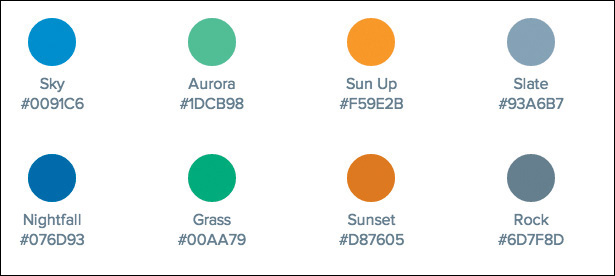
I’ve found it helpful to display a swatch (a square div with a background-color) as well as the color name, hierarchy, and hex value. Assigning each color a name helps when referencing it in casual conversation. It’s the Crayola thing to do, right? A color’s hierarchy is helpful in CSS: Classes of “primary/secondary/tertiary” give good indication of use without the pitfall of naming something “.purple,” only for it to change to red later.
The more carefully you set up color in CSS, the easier it is to change it globally. To change all the instances of purple to blue across Photoshop comps is a terribly inefficient task. This is an area where designing in the browser and setting up a system in the browser has a major advantage over traditional Photoshop page comp methods.
Lastly, the hex value is great for copy and pasting. If you want to be really thorough, RGB may prove to be an even better option for incorporating alpha transparency (RGBA). All in all, defining colors through CSS provides a reference point in the HTML style guide and should crack down on the inadvertent “close-to-but-not-quite” variations of base colors typically found in Photoshop comps.
Typography
When it comes to including type, think in terms of what styles a content author would be choosing between (see Figure 7.3). Naturally, headings, paragraph/body text, block quotes, introductory text, labels, and lists are great to include here. It’s helpful to wrangle up and audit all the typographic variations throughout a website. The beauty of this type inventory is that it reveals redundant or slightly similar styles you can combine.
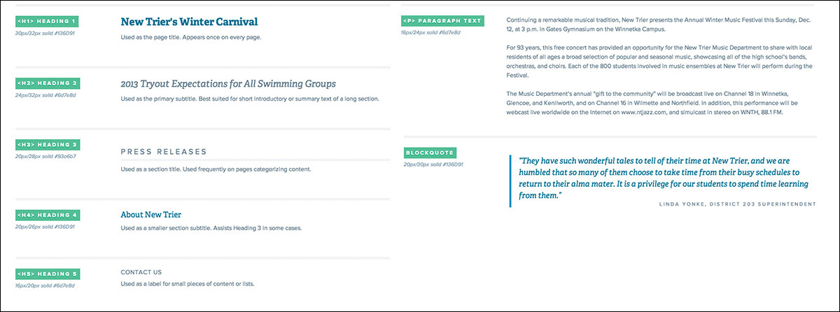
Figure 7.3 As the foundation of any website, be sure to include basic typography styles in your style guide.
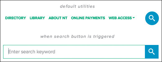
Link Styles
What might take three instances in Photoshop can be achieved in a single interactive instance in code (see Figure 7.4). Provide an example of an inline link and assign it default, active, visited, and hover state values. It’s not important to provide other link formats that rely on components such as navigation or menus, as you’ll add those elsewhere. Don’t forget to specify how headings look when linked.

Buttons
When you designed page comps, how easy was it to make 1,000 button iterations? It was incredibly easy, because each button was generally styled to the content surrounding it. By declaring a few button styles here, you’ll try to mitigate the need for hundreds of slightly different button styles, which can be confusing to your users (see Figure 7.5). Your goal in specifying button styles should be consistency: Does every button’s hover get darker or lighter?

Tables
Tables are another element native to most CMS text editors but easily overlooked by designers. Browser-default table styles are usually horrid, so make sure you show them some love in the style guide (see Figure 7.6). More importantly, tables are usually one of the most difficult elements to display legibly on narrow screens, so the effort to address them at this stage in the game is worth your while.
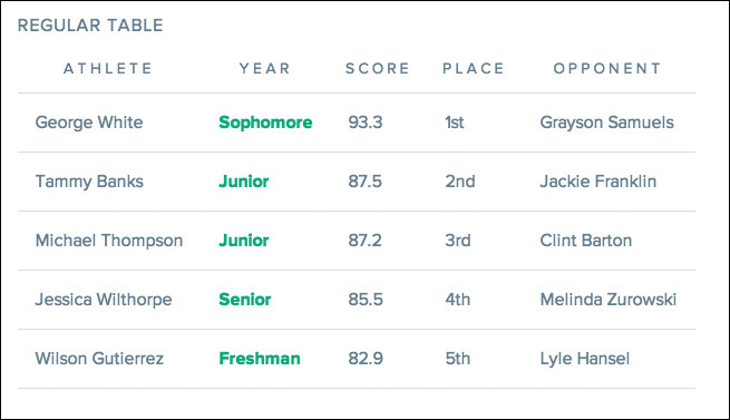
Figure 7.6 Formatting table headings, cell padding, and text alignment can go a long way to making default tables look considered.
Image Dimensions
Another common task for content authors is placing images inside page content. I’ve had countless clients send panicked emails asking what they need to do to get a photo to fit correctly. You can help make their life easier by documenting the ratios and preferred dimensions in your style guide.
Tip
Alongside all of the aforementioned elements, I’ve also found it helpful to document a respective use case. For example, “Primary buttons are used only for major actions, such as downloading our app.”
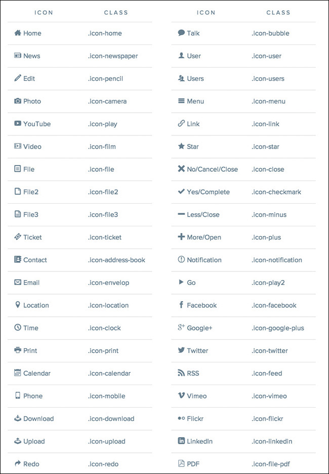
Icons
With the onset of icon fonts, it’s never been easier to place icons on the Web. This last one isn’t a necessity, but if you have icons that can be easily placed in content through a CMS, providing some syntax on your style guide is a good idea (see Figure 7.7).
Why the Style Guide Should Live in the Browser
You can create your style guide in Photoshop, and for some teams it may be easiest to do so. However, if the goal is to create a reference for content authors, a PSD or static image won’t provide an ideal level of accessibility. If your author does not have Photoshop, they won’t be able to extract text to copy to their clipboard. Code-based style guides shine in these areas.
HTML style guides also allow you to tweak values responsively. If you define text as 22px for wide views, you’ll most likely want to adjust it to 16px or so for narrower ones. Depending on screen width, buttons might need less padding, lists might need more, and tables might take a completely different format.
The style guide is a perfect example of a “deliverable” that requires a “keep going” response rather than “final approval.” As you continue to define the site design, chances are you’ll be tweaking some values here or adding a few more buttons and image formats. The occasional gut-check is more than welcome through the creation of the guide, but it’s hard to say you’re ever complete until the site launches. Even then, an argument can be made that it should be updated when needed.
To recap, here’s what you have in your design arsenal so far:
Inspiration (visual inventory)
Ideas (element collage)
Base styles (style guide)
Only two tasks separate you from completing the design. Let’s knock them out.
Building the Component Library
Comedian Jim Gaffigan has this really great bit about the questions he would have to answer as a waiter at a non-authentic Mexican restaurant:
“Hey, what’s nachos?”
“Nachos? They’re tortillas with cheese, meat, or vegetables.”
“Ah. And what’s a burrito?”
“That’s a tortilla with cheese, meat, or vegetables.”
“What’s a tostada?”
“Tortilla with cheese, meat, or vegetables.”
“What’s a taco?”
...and so on.
That may or may not be your experience with Mexican food, but regardless, it’s a shining example of using similar elements to compose (arguably) different components. This strategy has a clear parallel to interface design, in that it’s advantageous to build out the pieces of a site within the constraints of a system rather than one-off ideas. Even if a burrito is the only dish with guacamole (it’s not), the rest of the ingredients are familiar and consistent.
For responsive web design, the collection of menu items (Mexican dishes, in this example) we’re looking to prepare is commonly called a component (or pattern) library. This document picks up from what you established in the style guide and fills out the remainder of what you’ll need to start building pages.
Fair warning: This is where the bulk of your “designing” will occur.
Let’s take a look at some common components to include:
Forms and inputs
Image grids
Media blocks
Hero blocks
Figure with caption
Primary calls-to-action
Sign-up modules
Navigation
Sidebar callouts
Breadcrumbs
Pagination
Tabbed panels
Expandable panels
Comments
Alerts
Latest/recent feeds
There are certainly more, depending on your project’s needs, but I’ve found these to be a reliable representation of what it typically takes to build a page. For instance, you may be building a retail/e-commerce site and choose to include some product detail components such as the thumbnail, title, and price grouping. You may have a robust event listing module, a scoreboard, or a video block for each tutorial. Add those patterns to your document as well, and keep an eye out for any other reusable components.
Contents of a Comprehensive Component Library
Let’s look at the essential components of the component library in a bit more depth.
Forms and Inputs
Just about every site has a need for user inputs such as text fields, check boxes, and radio buttons. It’s handy to spec out the styling for just about any form element ahead of time so you’ll have them ready when needed (see Figure 7.8). I typically forget to include <select> drop-downs and various input types (email, date, and so on), only to have to go back and include them later. It’s also wise to be proactive about focus states, error states, and validation.
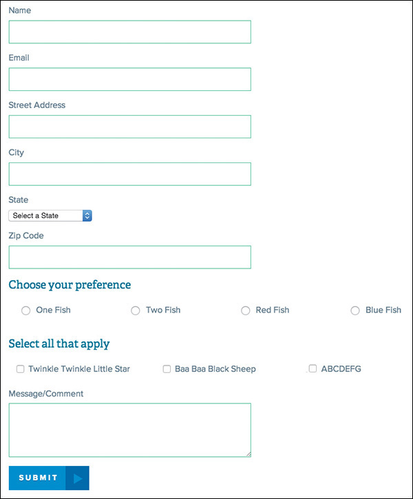
Image Grids
Does your site use images? Great, so does mine! Even if you think you won’t need a fluid grid of 20+ photos, I recommend setting up rules for one anyway. The idea here is to specify image blocks in terms of the space they require, such as two-up, three-up, four-up, and so on. This will allow easier layout options as you build pages.
Media Blocks
In this case, the term media refers to a generic left-right grouping of image and text. Common examples of this component include news items, product information, or profile details each offset by a thumbnail or avatar (see Figure 7.9). While they may be part of a bigger list, be sure to outline the details at the component level.
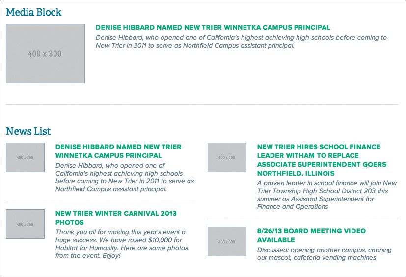
Figure 7.9 Image and text blocks like these are fairly common on most sites, so defining a consistent style for them is important.
Hero Blocks
It’s hard to think of a site that doesn’t have a large banner image or rotator sitting in the front seat of its homepage nowadays (see Figure 7.10). Even though it may appear to be a single-use component, you may end up choosing to use it on interior pages in a smaller format, making it worthy of inclusion in the component library.

Figure with Caption
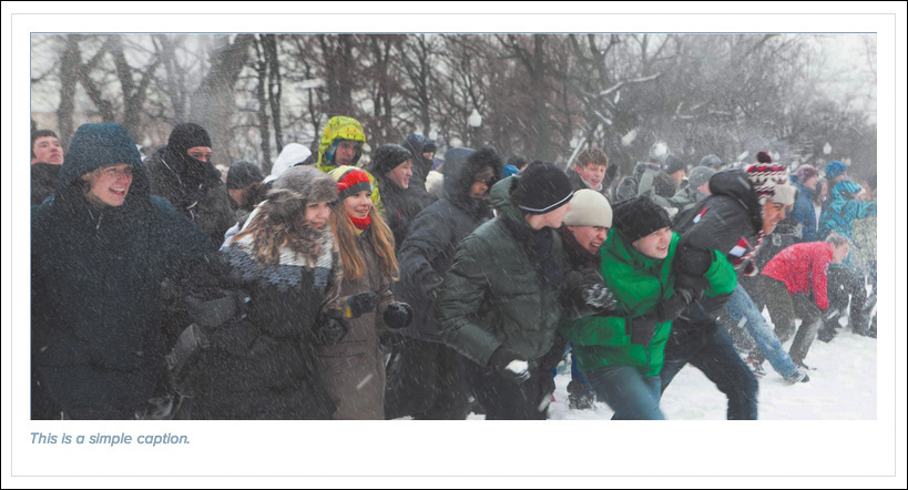
Unconsidered, an in-body-text photo with a small caption underneath is easily achieved by a content author in a what-you-see-is-what-you-get (WYSIWYG) editor (see Figure 7.11). Might you want to fancy it up a bit with a background or border containing both elements? How about overlaying the caption on top of the image with a slightly opaque background color? Considerations such as these are fruitful ones and should be documented here.
Primary Calls-to-Action
Perhaps your site has articles that end with instructions or a call-to-action button (see Figure 7.12). These typically have a different look from the default text and (occasionally) button style or size, and the component may be offset by a border or background.

Sign-up Modules
I discussed forms and inputs earlier, but there are some cases where you may want a special arrangement such as a search field and button or, for example, a newsletter sign-up that has instruction and icons (see Figure 7.13). Either pattern is great to include here because they’re typically used across all pages of a site.
Navigation
There are many types of navigation: primary, secondary, main, utility, off-canvas, overlay, drop-down, footer, section, sidebar, interior, and audience (see Figure 7.14). You may deploy one or all of the above on your site, so collect them here. Though the primary objective is to provide a good bird’s-eye view of style, it may also reveal any instances of link duplication.
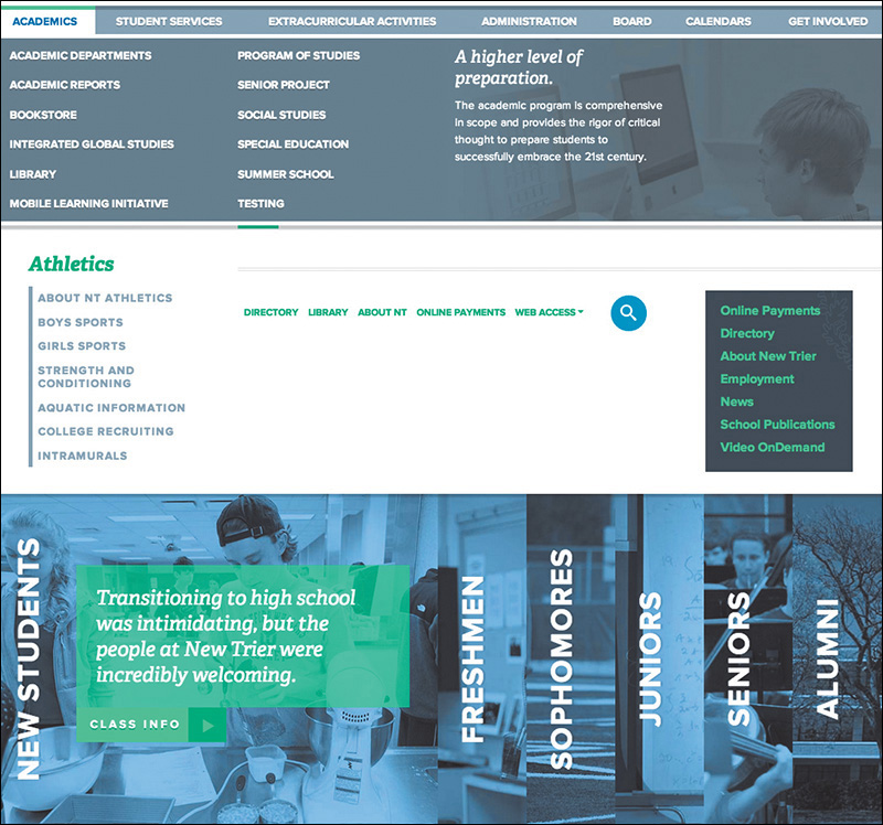
Figure 7.14 Navigation can take many shapes and forms, so it’s best to collect each one in your component library.
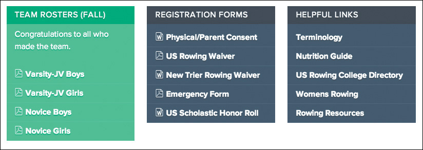
Sidebar Callouts
Sidebars are prime areas for calling out related actions to a page’s main content (see Figure 7.15). Examples of these callouts include a text, image, and button grouping or a list of links (associative navigation). By defining a system of these modules, you’ll likely mitigate the need for one-off designs for each different callout, which can start to make your site look like a circus.
Breadcrumbs
Technically another piece of navigation, breadcrumbs (crumb trail) are a horizontal list usually found near the top of a page (see Figure 7.16). Be sure to account for them here.

Pagination
Often lost in the sea of to-dos for me is styling pagination (see Figure 7.17). It’s never the sexiest component, nor one that even comes to mind until I see it unstyled in development. Don’t be like me. Give consideration ahead of time to any instances of pagination you plan on using in your project.

Figure 7.17 Often an oversight, pagination links can bear a lot of the same styles you’ve established with inline links or buttons.
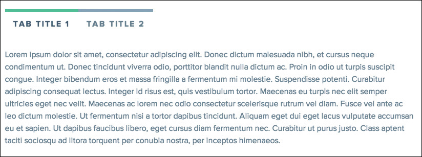
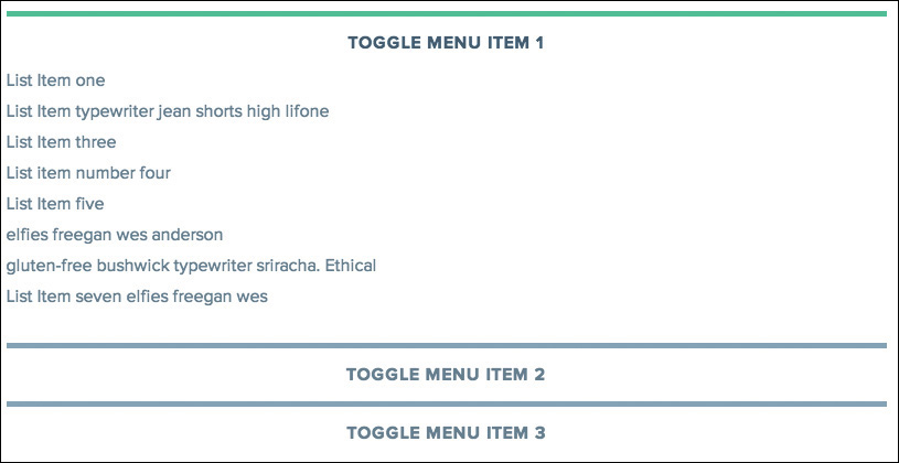
Tabbed Panels
Tabbed panels (tabs for short) are the fast food of components (see Figure 7.18). They offer convenience for authors since they tuck away a good deal of content while still making it accessible through tab navigation. However, that tab navigation isn’t always the prettiest thing to look at, especially in responsive contexts where the labels get smushed and crunched. It’s kind of like that smushed Big Mac you get when you were expecting the statuesque version from the commercials. On narrow screens, you may opt to display all the tab content instead of hiding it.
Expanding Panels
Expanding panels (typically called accordions) come in many different shapes and sizes and are often lauded for their propensity to by touch-friendly (see Figure 7.19). You may find style inspiration (and consistency) from tabs, and vice versa. This is another benefit of designing the system instead of pages.
Comments
Comments typically take a format similar to media blocks, though they certainly don’t have to do this. Depending on the amount of information you plan on showing, you may choose to float some left and right or stack everything vertically. It’s good to work this out now or simply use a plug-in like Disqus.
Alerts
A fair amount of sites I’ve done have required an alert system (see Figure 7.20). A perfect example would be educational institutions, which require a large overlay that prohibits the user from engaging with the site until they acknowledge it or a small notification that rides along the top (most times it’s both). I recommend inquiring about this component’s inclusion in your project early on.

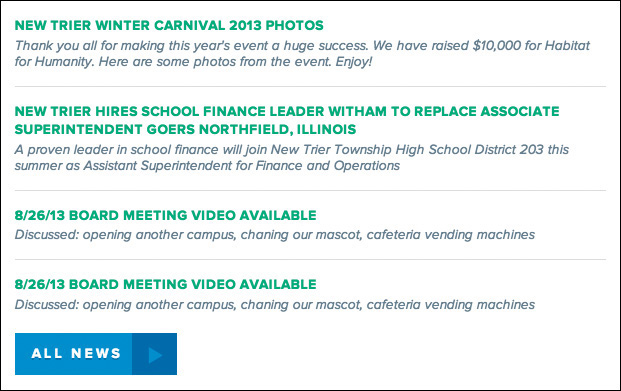
Latest/Recent Feeds
Lastly, almost every site has some type of listing component, where featured articles or latest news are pulled dynamically (see Figure 7.21). Besides feeds, you may be able to use similar styles for search results and calendar events. Defining some stylistic consistency over these components should be high priority.
Choosing the Best Environment for Your Components
Component libraries can be done in various levels of fidelity, but you’re ultimately building a reference document for page development, so you’ll want the final incarnation to be polished. Here’s a look at the two environments you can produce them in.
HTML/CSS
As previously mentioned, my belief is that the style guide and component library should be done in production-ready code because the benefits are considerable. The browser provides the most flexible environment to test how responsive-friendly the components are, which is kind of a big deal, wouldn’t you say? The browser is also the best place to assess any rendering or format issues from Safari to Internet Explorer. Above all, production-ready components are, well, ready for production and can be copied and pasted with ease, saving you time in the development of pages and templates.
Photoshop
So, why would anyone opt to build a component library in Photoshop? Depending on your code proficiency, team structure, or project, it may make sense to initially document components in Photoshop before moving them to the browser. I often find this suffers the same afflictions as page mock-ups do, in that you’re duplicating the effort. However, you may find working in Photoshop for the purpose of ideation speeds up the process of the design happening in the browser.
Element collages can tell you a lot about the styles you want to deploy, but I’ve come to realize there’s still a lot of figuring out to do at the component level. For those items I can’t derive or interpret from the element collage, I hop back into Photoshop to resolve. It’s still a bit arduous to re-create boxes and text and form fields, but Photoshop CC has made the job of consistency much easier for you, thanks to its new Libraries panel.
CC Libraries
Libraries have been one of the most requested Photoshop features over the years. You can imagine the ways being able to reuse assets would be beneficial to interface design in Photoshop; having to duplicate layers or re-create buttons is tedious. Thankfully, Creative Cloud (CC) Libraries aim to solve that pain point and many more.
While working within Photoshop, you can add any raster graphic, vector, or text to your Library (Window > Libraries) by dragging it over and dropping it on the panel. Your asset will be automatically categorized by type and ready to be reused in as many instances as you need.
Libraries are even more powerful cross-application (they’re called “CC” Libraries for a reason). Often the logo and branding assets I receive from clients are in EPS format, which takes some copying and pasting to get into Photoshop. What’s worse, those logos typically arrive in an email attachment that I rarely save locally, and when I do, it’s in the bottomless pit called my Downloads folder. It’s quite a pain when I need to use the logo again or if I’m the only one on my team with access to it.
CC Libraries can incorporate artwork from Illustrator and make it available to you in Photoshop, and vice versa. I believe this to be the original intent of the feature, though I rarely find myself going between applications, save the previous example. If you use Libraries for Photoshop only, you’ll still get a lot use out of it.
Because CC Libraries are stored within your Creative Cloud account, they are easily shared with teammates you’ve allowed access to. Think of the possibilities for a moment. You could be working on one component in a Linked Smart Object while someone else works on another, only to have your components.psd update without anyone touching it. All of your shared assets in one place, finally.
Where’s the latest version of the logo? Where can I find corporate green? Where’s the obnoxious swoosh they’re using in the print ads? All in our shared CC Library, of course. How silly of you thinking otherwise.
Lastly, I’d like to reiterate my opinion that Photoshop is super-helpful for the ideation of component styling, but the final execution should still take place in the browser, lest we lose the time we sought to gain. My hope is that you’re able to create a style guide for content authors and a component library for developers, both documents doing more efficient legwork than that of the page mock-up.
Now that the Legos are defined, it’s time to put them together.
Prototyping
Often missing in the comp-to-build process is the opportunity to test or to tweak as you collect input from the browser and your users. We get caught up in the craft of making things so precise in a static medium that they are often made to be exactly so in code.
In our effort to build a system, it’d be pretty difficult to jump to site completion from the pieces we’ve established. We have no assurance of how they’ll mesh together on the page, from a functional flow and a visual one. That’s where prototyping becomes the vehicle for page design (or for mid-to-large sites and templates).
A prototype may differ from a code-complete site in a few ways. Primarily, prototypes aren’t backed by a CMS yet, since CMSs aren’t always easy to adjust on the fly the way HTML & CSS are. We’re moving toward a more finite build, but we want to keep the environment fairly flexible so we can pivot when we need to pivot. Our prototypes are still comprised of production-ready code (which is why it’s important to use it in component-building), so we’ll be ready to transition to the real deal with little re-engineering. If production-ready code isn’t attainable, don’t be discouraged; use code that shows your design intent and gets the job done so a developer can determine what needs refining.
Roughing It in Low-Fidelity
Do you need to wait until the element collage, style guide, and component library are all completed to start prototyping? Absolutely and positively not. In fact, preliminary sketches can fuel the prototype build around the time element collages are being explored. That’s not to say you’re working in polished high fidelity, but if you’re proficient enough with HTML & CSS, you can explore some crude, gray-box mockups in the browser (see Figure 7.22). This is low-fidelity prototyping.
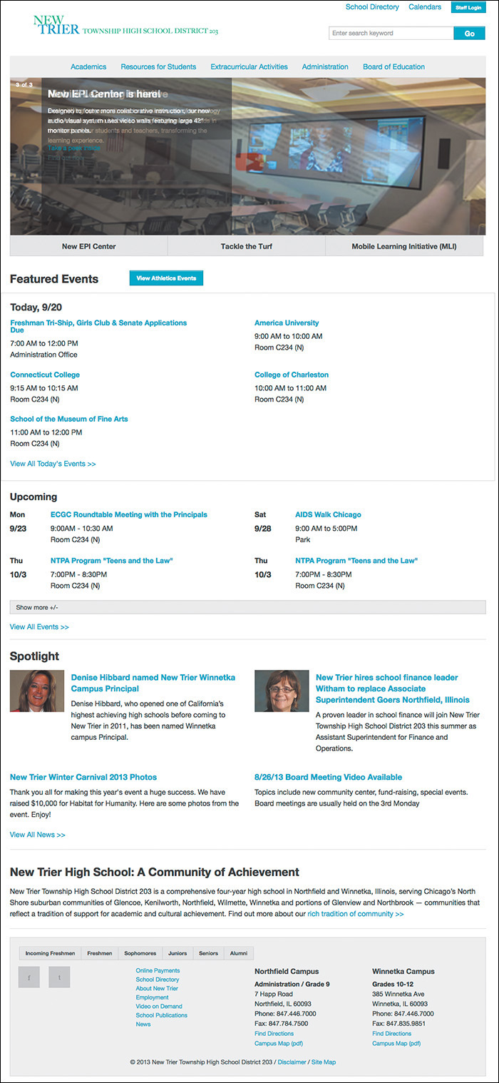
Figure 7.22 Gray boxes and blue links are a clear sign that no style choices have been made just yet, which keeps the focus on layout and content.
A rough idea of layout is a great place to start and gather inspiration for your components. I always like to pause and appreciate these moments where design and development can overlap and inform one another.
Most importantly, you want to be able to walk away from the low-fidelity prototypes feeling confident that everything works the way you intend it. Does the navigation have drop-down menus? Is there a fixed-position background? Does every element have an intentional adaptation across breakpoints? These are just some of the behaviors you want to be sure to nail, and stress test, before moving forward. You may find the ideas you toyed with in Photoshop have difficulty holding up across browser widths or with variable-length content.
Perhaps you work on a team with a developer who once inherited pixel-perfect mock-ups. If you’re not comfortable learning a framework or writing code, prototyping is a great way to foster collaboration between the two of you. Because low-fidelity prototypes lack the style considerations you’d outline in your Photoshop comps, a simple sketch or working real-time with a developer to produce gray-box templates may be the most efficient methods for you.
High-Fidelity and Beyond!
I like to imagine the high-fidelity prototype as the culmination of style, function, and layout (see Figure 7.23). You explored style in the element collage, style guide, and component library. You explored function in the low-fidelity prototype. You explored facets of layout in everything you’ve done so far. You’re ready.
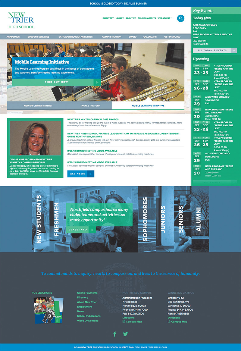
Figure 7.23 All roads lead to the high-fidelity prototype, where style, layout, function, and content considerations meet.
If the low-fidelity prototype was done with production code, you’ll have an easier time dropping in CSS from your style documents and seeing an immediate change to high-fidelity. If you used a framework as a stop-gap, a fair amount of markup edits stand between you and hi-fi glory.
Impressive. You’ve been able to use HTML & CSS for the bulk of your designing, heading back to Photoshop to toy with ideas. The best part is that you’ve created a consistent and reliable design system to build your site. Might as well close the book and call it a day, right?
Fortunately/unfortunately, establishing the system is only half the battle. Page and template design isn’t automated from here, and you’re about to see some of the ways responsive web design can throw a wrench into your work.