Table of Contents for
Responsive Web Design with Adobe Photoshop
 Responsive Web Design with Adobe Photoshop
Published by
Adobe Press, 2015
Responsive Web Design with Adobe Photoshop
Published by
Adobe Press, 2015
- Cover Page
- Title Page
- Copyright Page
- Acknowledgments
- Contents
- 1. Photoshop’s New Groove
- 2. How Did We Get Here?
- 3. The Case for Designing in the Browser
- 4. A Plea for Photoshop–Browser Harmony
- 5. Vetting Direction
- 6. Establishing Style
- 7. Establishing the System
- 8. Getting Back into Photoshop with Page Layers
- 9. Extracting Your Way Out of Photoshop
- 10. Extending Photoshop
- 11. Remembering Etiquette
- 12. Adopting a Completely New Workflow
- Index
- Responsive Web Design with Adobe Photoshop
4. A Plea for Photoshop–Browser Harmony
In Chapter 3, I presented the case for a browser-based approach to web design. In this chapter, I’ll take the browser approach down a peg, but I don’t want to diminish its importance in a responsive workflow. The browser is still the centerpiece of what we’re doing. But we need to work Photoshop back in to the fold—and not just because we’re Photoshop fanboys and fangirls. If it didn’t make sense to include Photoshop, I wouldn’t waste your time advocating its importance in the responsive web design (RWD) workflow.
The good news is that Photoshop, more so than any other tool I can think of, fills an important role missing in a browser-only design process.
Photoshop Is the New Vinyl
Have you ever had someone send you a link to a YouTube video and, before you know it, you start going down a never-ending hole watching related video after related video? That happened to me recently, and it started with the popular show “How It’s Made.” My binge-watching led me to a fascinating piece on vinyl records. (If you just had to Google vinyl records, you’re probably not the only one.)
The history of vinyl records is arguably more interesting than their manufacturing. Many of us remember their popularity in the 1970s and 1980s. Even when the cassette tape began to dominate music sales in the mid-1980s, records were still holding their own. It wasn’t until the compact disc (CD) became the preferred music medium in the 1990s that vinyl records really fell out of favor. In fact, CDs were so superior to records for most music consumers’ purposes that they pushed vinyl to the brink of extinction.
CDs offered a smaller, portable format that could fit significantly more music than records. They were even more durable, depending on how you stored them. It’s no shock that CDs were became more popular than vinyl. When the iPod ushered in the digital music revolution of the mid-2000s and began to marginalize disc media, you would assume it made vinyl go away altogether, right?
Wrong. An incredibly strange thing happened: In 2006, people started buying more records. Today, vinyl growth is steady, and while it’s by no means equal to digital in sales and mainstream consumer use, it remains relevant. Amazingly, market analysts have assigned no single concrete reason for vinyl’s uptick in popularity (see Figure 4.1).
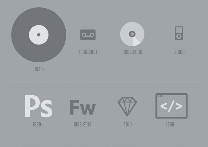
Figure 4.1 Vinyl has withstood some major innovations in music media, staying relevant even to the current day. Can Photoshop do the same in the face of new apps such as Sketch and workflow alternatives such as designing in the browser?
So, who or what gets the credit for sustaining the life of the vinyl record? Two main audiences: audiophiles, who prefer vinyl’s sound quality and treasure their massive record collections, and disc jockeys (DJs). DJs have mastered the art of combining the digital and the analog, so to speak. Digital tracks play off a computer while the DJ spins a record on a turntable for scratching, looping, and adding a host of physical effects.
Curious, I sought after some rationale from a friend of mine who is a popular Boston-area DJ. Why does he prefer to use vinyl in his work? It’s the same thing we Photoshop users enjoy but sometimes have trouble putting words to: direct manipulation.
The Power of Manipulation
At last, we find Photoshop’s first legitimate way back into a respectable design process. It’s unrealistic we’d completely abandon the visual techniques we’ve mastered for years in favor of code-abstracted design. One of the major reasons we tend to feel more “comfortable” in Photoshop is our ability to stretch, squish, shrink, and reposition elements. Sure, it’s possible to do those things with CSS somewhat easily. However, those manipulations sit behind a wall of abstraction, adjusting values and refreshing to see the results (see Figure 4.2).
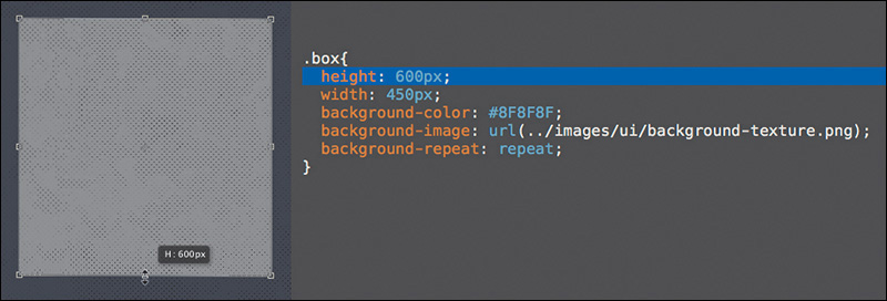
Figure 4.2 The Free Transform tool, the Move tool, and a host of others offer an ease of use that enables the exploration we desperately need—and won’t readily find in a coding-only design environment.
Designing in the browser can’t compete with the benefits of direct manipulation. Don’t underestimate the value of drawing a shape in Photoshop and seeing every step in its implementation. Your brain is processing all the sizes, colors, and positions, looking for the one that feels right.
“I move shapes around until they make sense.”
—JARED ERONDU (https://twitter.com/erondu/status/465981370930450432)
Sure, there are some disadvantages to the freedom direct manipulation provides. It engenders the “silo” effect, where we designers go solo and play in Photoshop for extended periods of time, discouraging collaboration. Direct manipulation is neither systematic nor object-oriented, meaning the process by which we transform type and shape often doesn’t adhere to a pattern or set of preset constraints.
But exploring in Photoshop sure does help get the creative juices flowing.
Creative Mode vs. Correct Mode
I am usually superior creatively in Photoshop but better at being correct in HTML & CSS. I have a propensity to try outlandish ideas on the Photoshop canvas, knowing my actions have few repercussions, whereas when I’m coding, I’m sometimes fearful of not being able to revert to a point when everything was “working.” Most designers I know operate this way, although a rare few are just as creative in code as they are in Photoshop.
As responsive web designers, we need to be “correct” in our execution of code, but we also need to be able to vet our ideas adequately. I’m just not sure we can do both in a single environment.
When I first set out to design in the browser, I assumed that because it had similar tools to Photoshop, I’d be able to explore creative ideas in the same way. I could not have been more wrong. Not only were my designs looking less distinctive and considered, but the amount of time I was spending on them increased significantly. I’d sit for hours in CSS just trying one thing, reverting, trying another approach, and never really nailing it.
This is where direct manipulation makes all the difference. Code abstracts design by a layer of syntax. Instead of choosing position, size, and color by dragging or stretching, we use letters and numbers to assign a value. By no means is the latter approach objectively wrong, but the former feels right for many of us. If you come from a print background, you most likely agree that this abstraction hinders your ability to ideate.
The more I’ve thought about this abstraction, the more I’ve been able to attribute it to one significant concern: following the path of least resistance.
The Path of Least Resistance
Even though we have the tools to pull off Photoshop-like effects in CSS, I don’t think we always approach using them the same way.
Check out the audience navigation in Figure 4.3 (on the next page). This low-fidelity prototype was built in HTML & CSS, and now it’s ready for styling. My first impulse was to apply the button styles I was already toying with elsewhere and use them accordingly.
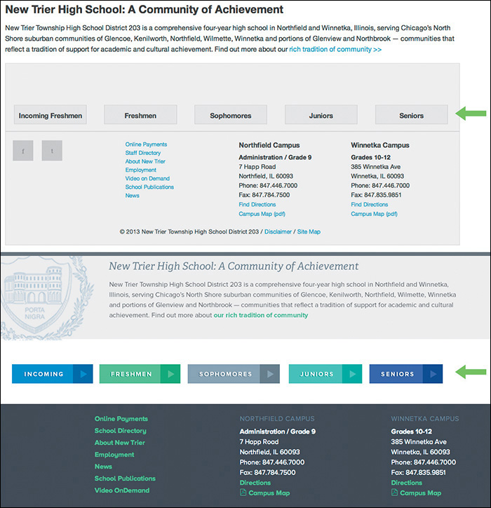
Objectively, there’s nothing wrong with this approach, and certainly it communicates that these are five areas you can visit. When I showed the client, they were quite underwhelmed. The feedback I received was that the section didn’t have adequate emphasis relative to the importance of the content.
My reaction was to fill the containing divs with the button color (see Figure 4.4 on the next page). Bigger = more important, right?
Again, the clients were underwhelmed. They expected to have buttons and appreciated the increased size, but they thought it was a missed opportunity to tell more of the story behind the content. It’s a high school, and these portals are all part of the journey.
It wasn’t until I toyed around with that section in Photoshop that I started to layer some new elements in, like screened photos and sideways text. The point isn’t that those techniques are exclusive to Photoshop (because they’re not: adding a simple background image and “transform: rotate” in an HTML & CSS editor is just as easy), but the idea came more naturally in Photoshop.
Sarah Parmenter had a similar assessment of designing in the browser.
“It’s a guilty secret I’ve been harboring for about a year: I cannot design directly into the browser. My creative brain switches at the point when I open my HTML/CSS editor (Espresso) and starts thinking in terms of structure and how to achieve the look of my design using as much native CSS as possible. If I don’t have my design to follow, the whole process breaks down for me. I’ve tried, goodness knows I’ve tried, but my designs end up suffering, looking boxy, bland, and uninspiring.”
—SARAH PARMENTER (www.sazzy.co.uk/2012/02/why-i-cant-design-in-the-browser/)
While I won’t advocate for having your entire design predetermined before HTML & CSS, the example shown in Figure 4.5 is a case where taking one small section or component into Photoshop makes a world of difference.
As unpopular as the idea may be, I think it’s easier to take the path of least resistance in the browser than in Photoshop; working in an HTML & CSS editor makes you more inclined to think in terms of boxes, containers, and the styles you usually employ than ones you don’t. Heavy layering, offsetting only a single element and not others, and breaking convention usually mean tweaking more than just a few HTML tags and CSS properties. Sometimes, that amount of trial isn’t worth the inevitable error. Suffice it to say, for whatever reason, I’m more inclined to play it safe in the design techniques I use in code than in Photoshop.
Is it possible that lack of courage in our code-exclusive designs is the reason that all RWD sites look so similar?
Responsive Design Sameness
The idea that responsive sites all look the same isn’t a new one. It’s a topic that’s been broached many times, and you’ll find some interesting perspectives on it.
“Have you ever noticed how many websites look the same? How many are just a bunch of rectangles? How many seem to copy from one another? Where’s the uniqueness and creativity?”
—STEVEN BRADLEY (The Web is a Rectangle, www.vanseodesign.com/web-design/rectangular-web/)
“I feel like responsive design has sucked the soul out of website design. Everything is boxes and grids. Where has the creativity gone?”
—NOAH STOKES (http://esbueno.noahstokes.com/post/44088237921/where-has-all-the-soul-gone)
“I wonder if #RWD looks the way it does because so many projects aren’t being run by designers but by front-end dev teams.”
—MARK BOULTON (https://twitter.com/markboulton/status/445943150247702528)
The question of “Why do all RWD sites look the same?” is a pertinent one when you consider that diversity in the pre-RWD era was fairly extraordinary. One could even argue that Flash-based sites were the most distinctive of the lot. Today, it’s commonplace to pick out the sites designed in the browser from ones designed in Photoshop et al. This notion is where we get such statements like “It looks like a Bootstrap/Foundation site” and “It’s like they just slapped their logo on a responsive WordPress theme.”
To some extent, there will undoubtedly be shared styles and components from site to site, no matter how original we think we’re being (Figures 4.6-4.8). That’s OK. I’d much rather have a Web that works than one that succeeds in diversity for diversity’s sake. Remember, the originality we established using Photoshop didn’t always translate to the browser in a way that was user-friendly, either. Karen McGrane made this witty retort to the complaint of RWD sameness as it applies to print:
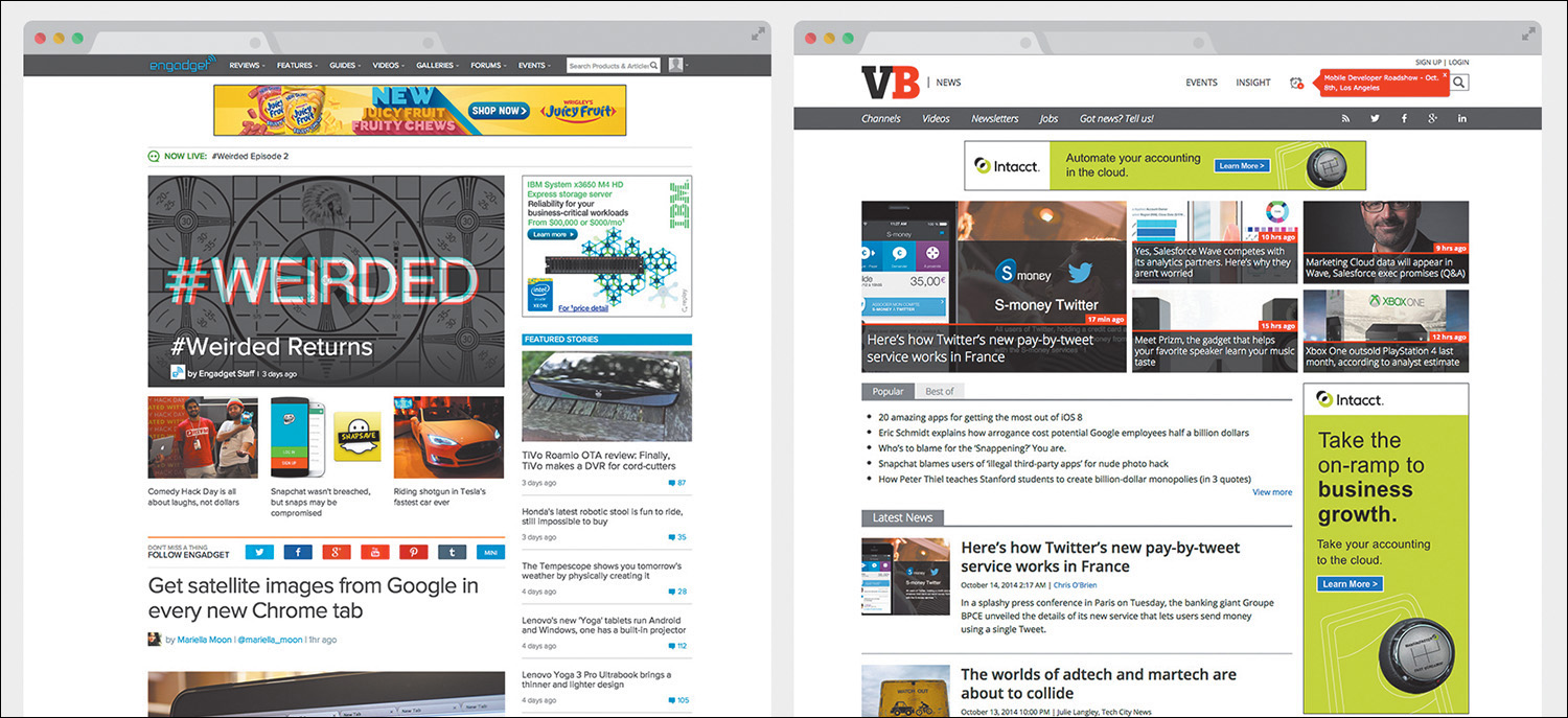
Figure 4.6 Examples of similarities in responsive site design. Common components include “boxy” layouts, white background headers, and hero images with white text overlaid.
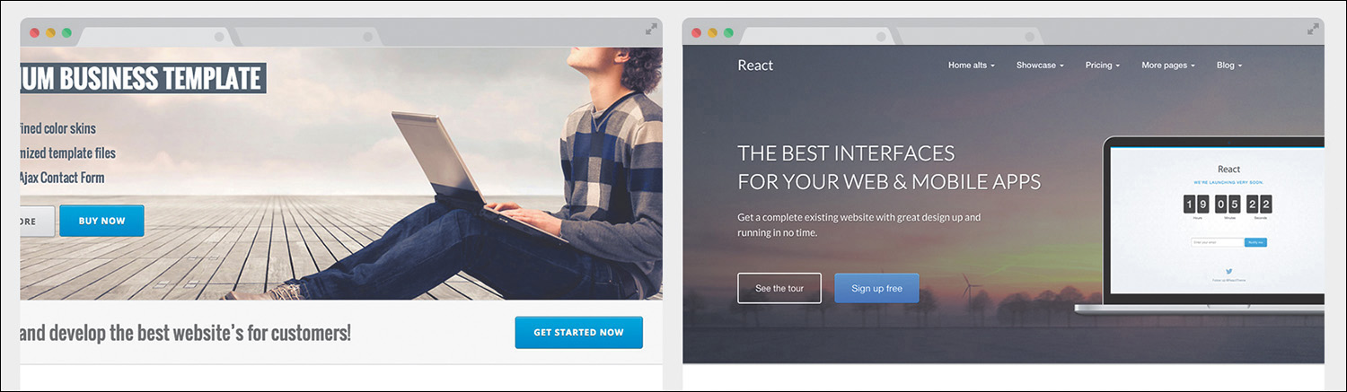
Figure 4.7 Examples of similarities in sites designed on the Bootstrap framework. Unadjusted button styles are a clear giveaway.
Figure 4.8 Examples of similarities in sites designed as WordPress themes. Similar content layout is a hallmark of blogs.
“But why do all the magazines have the binding on the left? And columnar layouts, so tired. Where’s the innovation?”
—KAREN MCGRANE (https://twitter.com/karenmcgrane/status/515162632551411712)
I’m not sure we can fault responsive design for a lack of uniqueness in sites, but certainly its introduction has added to the number of design considerations we need to make. By extension, new considerations may not always be tested across all screen sizes, so we rely on what “works” and what’s familiar. We’re still getting our feet wet designing responsively; creativity will come.
That doesn’t mean we need to stifle uniqueness or “soul” in the name of being responsively correct. We need to think creatively about being creative.
“Emulation is a part of the evolution of design. And the web, for that matter. But design sameness tends to fade when one forgets all of the existing patterns, all of the Bootstraps, all of the preconceived design solutions. Design sameness fades when designers stop focusing on which solutions for their problem are out there and start focusing on the problem at hand.”
—STEPHEN HAY (www.the-haystack.com/2014/03/21/responsive-design-sameness/)
I contend that Photoshop can greatly assist in our efforts to infuse our designs with the unconventional and unique. Where designing in the browser may introduce friction in the creative process, Photoshop can help us focus on the best approach regardless of the amount of code needed to execute it.
Using Photoshop Only When Necessary
Photoshop can ride along with designing in the browser, but we need to determine to what degree. It would be counterproductive to revert to full-page comps, but we still need Photoshop to throw down some high-fidelity ideas on. Likewise, we still need the browser to keep our designs flexible, while curtailing the amount of time and effort we exhaust trying to come up with truly unique ideas.
If a responsive workflow is your goal, I recommend adopting the following philosophy: Photoshop can’t be the workhorse we’ve made it in years past. Instead, Photoshop takes a backseat to in-browser design, but we still use it to ideate when necessary. To what extent do we keep Photoshop involved?
In his article “Responsive Web Design in the Browser Part 1: Kill Photoshop,” Josh Long makes the following statement:
“If you want to be a better designer, I’d start by killing Photoshop”
—JOSH LONG (http://blog.teamtreehouse.com/responsive-web-design-in-the-browser-part-1-kill-photoshop)
While some of this sentiment seems in line with what we’ve explored, I object to the notion that discarding any tool makes you a better designer. Becoming a better designer has more to do with knowing the limits of the tools you use and knowing when to use them for the greatest gain.
The browser can bear the majority of many layout and style decisions, which is great because it’s ultimately where our design will live. We’d be shooting ourselves in the foot if we tried to make every decision before writing a line of HTML or CSS. That puts the onus on adopting a workflow that allows the flexibility needed to refine design solutions after being in the browser (I’ll talk more about how to sell this kind of process internally and externally in Chapter 12).
The Megaman Principle
Raise your hand if you’re also a child of the 1980s and grew up playing Nintendo. No, not you, Wii whiz kids. Not you, Atari fans. I’m talking about the 8-bit Nintendo Entertainment System. Specifically, I’m talking about my favorite series of games: Megaman.
For those unfamiliar, Megaman was pretty much the best thing ever. You controlled a blue, android-like robot in a classic quest of good versus evil. Your mission was to take down an army of bad robots, each of which had a unique weapon, be it ice, fire, stones, bubbles, or the even more obscure piles of trash Junk Man used. When you defeated these bad guys, you’d inherit their weapon.
In most instances, you’d be hard-pressed to find a use for your default Mega Buster arm cannon, so the quintessential strategy for beating each boss was to use another’s weapon. Ice Man’s Ice Slasher was critically effective against Fire Man, for example. Choosing the right weapon at the right time was, essentially, a glorified game of Rock-Paper-Scissors. Mastering when to use each weapon made the game infinitely easier (see Figure 4.9).
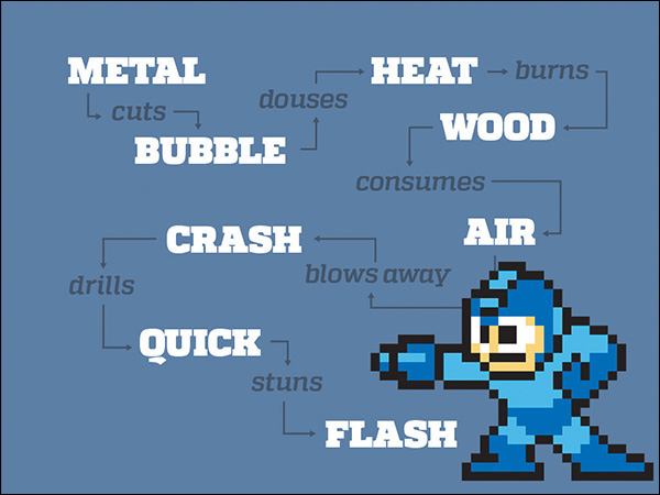
Figure 4.9 Just as Megaman leveraged timing to beat his enemies, can we do the same with Photoshop? Specifically, I mean the enemies called “boxy,” “bland,” and “uninspiring.”
Collecting weapons and knowing when to use them is not so different from the problem we face in web design. By using the right tool, at the right time, for the right purpose, we extract more out of said tool than normal. Knowing when to use Photoshop is the only thing that can logically keep it in our workflows. Using it too often, too early, or for the wrong purpose produces frustration, wasted time, and potentially wasted money.
Practical Photoshopping: An Overview
In the next few chapters, you’ll look at when, why, and how to use Photoshop alongside the browser. Because every project is different, implementations will vary, but you’ll discover a few inventive ways of getting the most out of Photoshop.
Inspiration
If our plan is to present multiple design concepts to clients, where does RWD fit in? It seems like a daunting task to show contrasting design directions through Photoshop mock-ups at a few different sizes, so what’s a more effective way to move the project forward?
The secret may be getting everyone on track toward a shared ideal far before anything is done in Photoshop. You’ll explore a few ways to hedge what would otherwise be discarded work by using inspiration from around the Web to drive your directions. Equally important, you’ll discover techniques for extracting more useful feedback from your clients.
Art Direction
The conundrum of page comps in a responsive world hasn’t been ignored. While some of the industry has turned to producing tools to make comps more quickly, a strong contingent of designers have devised better design documents altogether. You’ll take a look at this landscape in Chapter 6, including one I find to be the best suited for a responsive process: element collages.
Building Blocks
You may have created style guides in the past or be familiar with their longstanding print implementation. I’ll define what style guides mean for the Web and, more importantly, as part of a responsive process.
Similarly, component (or pattern) libraries extend what’s introduced in a style guide into functional collections of elements.
While it behooves us to develop both of these elements in code, there’s plenty of opportunity to spice them up in Photoshop, long before we run into any funky page designs.
Repair
It’s incredibly optimistic—naïve, even—to expect all the disparate elements of a responsive site design to come together seamlessly. When it’s time to build pages from components, we usually find ourselves scrambling to make everything look like the coherent page it should be.
Let’s determine to expect the wonkiness of putting components together and combat the seamless spots with Photoshop. You’ll take a look at some common examples of where page design can fall short and feel disjointed in the absence of a system and pivot swiftly into an environment to try some stitch-work.
All of this preparation will lead to the union of Photoshop and the browser and to a better responsive workflow.