Table of Contents for
Responsive Web Design with Adobe Photoshop
 Responsive Web Design with Adobe Photoshop
Published by
Adobe Press, 2015
Responsive Web Design with Adobe Photoshop
Published by
Adobe Press, 2015
- Cover Page
- Title Page
- Copyright Page
- Acknowledgments
- Contents
- 1. Photoshop’s New Groove
- 2. How Did We Get Here?
- 3. The Case for Designing in the Browser
- 4. A Plea for Photoshop–Browser Harmony
- 5. Vetting Direction
- 6. Establishing Style
- 7. Establishing the System
- 8. Getting Back into Photoshop with Page Layers
- 9. Extracting Your Way Out of Photoshop
- 10. Extending Photoshop
- 11. Remembering Etiquette
- 12. Adopting a Completely New Workflow
- Index
- Responsive Web Design with Adobe Photoshop
3. The Case for Designing in the Browser
Have no fear—the subject of this book has not changed since you turned to this page, contrary to what the title of this chapter might suggest. We’re still on track to design responsively with Photoshop. But a major component of a strong workflow is circumventing the painful full-page comp routine we just explored in Chapter 2.
There are a few options for doing this, though it seems we’re all trying to find the single magic bullet that will solve all our responsive problems lately.
You Get a Tool! And You Get a Tool! Everyone Gets a Tool!
Wait! Can’t we just throw more tools at the problem? Sure we can. When it comes to RWD apps, there are plenty to choose from, but three of the strongest are Macaw, Adobe Edge Reflow, and Webflow (see Figure 3.1 on the next page). I highly encourage you to check out all three of them for yourself. Equally suitable is blindly subscribing to the following assessment.
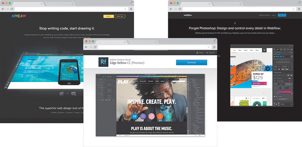
Figure 3.1 While RWD apps such as Macaw, Reflow, and Webflow offer great alternatives to full-page static comps, are they the only option? SOURCE: MACAW.COM, CREATIVE.ADOBE.COM, WEBFLOW.COM
Amid tons of revolutionary features, what makes these tools different from the Photoshops, Sketches, and Fireworks of the world is a fluid canvas. Imagine being able to resize a Photoshop document by dragging the corner of the canvas and seeing the contents respond. Picture yourself adding breakpoints to a comp so you can adjust presentation. Wouldn’t it be great if Photoshop exported HTML & CSS? It does all of that and then some.
There’s really no catch here. Macaw, Reflow, and Webflow are all great manifestations of the wish list that web designers have had for years. Recently, I flirted with the prospect of making them a core piece of my RWD workflow, but ultimately I decided against it. Though all of these applications are completely capable of rendering the level of design I want, I found myself wanting total control, beyond the interface options. I want to write HTML & CSS just as much as I want to toy with layering backgrounds and tweaking type settings.
It’s all about control. With so many moving parts, responsive design demands we take greater control of that which we can. There’s so much we can’t control: what screen someone pulls up our site on, the speed of the data connection they have, or the browser version they’re using. What we can, and should, do is make sure our techniques are airtight. It’s hard to trust anything except for code you’ve edited yourself to provide that level of granularity when it comes to realizing your design vision, regardless of the end user’s platform.
Designing in the Browser 101
Truth be told, it took me a while to figure out what “designing in the browser” actually meant. I had the wacky idea that someone was actually drawing objects with Photoshop-like tools in Firefox or something. Simply put, designing in the browser means exclusively using HTML & CSS to render design. The technique takes advantage of CSS’s capabilities to render Photoshop essentially obsolete.
Photoshop Styles Translated to CSS
Here’s a quick rundown of common Photoshop effects that can be achieved solely using CSS:
 Transparency: opacity: 0.5; color: rgba(255,255,255,0.5);
Drop shadows: box-shadow: 10px 10px 10px #000; text-shadow: 10px 10px 10px #000;
Inner shadows: box-shadow: inset 10px 10px 10px #000;
Rounded rectangles: border-radius: 5px 0px 0px 5px;
Image borders: border-image: url(border.png) 30 30 round;
Gradient backgrounds: background: linear-gradient(red, blue); background: radial-gradient(red, blue);
Fonts: @font-face {font-family: myFont; src: url(fontyfont.otf);}
Blend modes: background-blend-mode: multiply; mix-blend-mode: multiply;
Note that, for blend modes, you can also use screen, overlay, darken, lighten, color-dodge, color-burn, hard-light, soft-light, difference, exclusion, hue, saturation, color, and luminosity.
Also note that this list omits browser prefixes that may or may not be necessary, based on ongoing browser support.
This is by no means a new method, though its popularity as an alternative to Photoshop has grown in recent years. At its foundation, designing in the browser is commonly done by editing code and previewing live or by altering generated code by inspecting elements in the browser.
Text Editor and Live Preview
It doesn’t get more straightforward than this: Fire up your text editor of choice (mine is Coda by Panic, but others use Sublime Text, Dreamweaver, and so on), write some code, save it, and preview it in the browser of your choice (see Figure 3.2 on the next page). See something you want to change? Head back to your text editor and change it. Refresh your browser. Look, Ma! I’m designing in the browser!
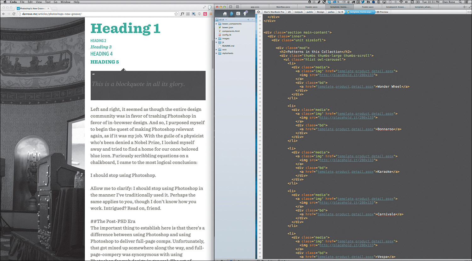
Figure 3.2 Depending on your workspace, editing code and live previewing could be a side-by-side view.
I imagine this do-si-do between your text editor and browser is familiar to most of you. There’s no magic. The difference is that you’re developing without the detailed script Photoshop comps provided. I’ll get into the advantages of this method shortly, though it should be evident that cutting out the entire mock-up phase is a radical change from traditional workflows.
Tip
If you find the Edit > Save > Refresh workflow a bit tedious, Emmet (http://emmet.io) is a great way to cut out the middle man. One of its features includes a live update when you make a change in code, eliminating the need to refresh the browser.
Not sure where to start “designing”? My best recommendation is to start with text—or, more specifically, all the “real” content. Assign each piece of text a tag corresponding to its hierarchical designation: <h1> for the page title, <p> for body copy, and so forth. Start playing with styles and layout from there. Sometimes it helps to take this approach and build your interface from the most fundamental element (type) outward.
“Content precedes design. Design in the absence of content is not design; it’s decoration.”
—JEFFREY ZELDMAN (https://twitter.com/zeldman/statuses/804159148)
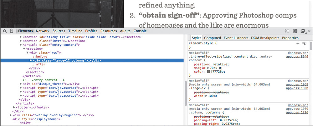
Inspect Element
In addition to working out of a text editor, your browser’s developer tools allow for real-time tweaks. If you’re using Chrome, Firefox, or Safari, right-click the element in question and select Inspect Element (see Figure 3.3) to bring up the respective HTML & CSS (you can access the equivalent in Internet Explorer by pressing F12 or selecting F12 Tools under the gear icon). Being able to try something and immediately see the impact is a huge benefit and helps take the sting away from the experimentation we’re used to in Photoshop (not completely, but it’s a step in the right direction).
I’ve found it advantageous to stay within the developer tools and completely style an element before moving back to my text editor. At times, changing only a single setting in the browser makes sense, but often I prefer to establish a chunk of CSS (or HTML) I can copy and paste back into my production files. The key is to try to cut down on any inefficiencies in your workflow, such as switching back and forth between the editor and the browser with little payoff each time.
Fluid by Nature: The Inherent Benefits of the Browser
Fluid width in in-browser design means one thing: At last, we’re freed from the shackles of fixed-width canvases. For me, there was this strange feeling when I first adopted the design-in-browser approach. I felt as though every block I put on the page was simultaneously more permanent and less permanent than when I did the same within Photoshop. Although elements felt a bit more “published” because they were sitting on a web page, they also seemed to be hiding some hidden potential. Will it squish? Will it stack? Will it go away? I found the answer by simply resizing the browser, a valuable option missing from static design apps.
Do you find yourself going to a site and immediately grabbing the lower-right corner of your browser and then furiously pulling and pushing to see whether it’s responsive? I feel as though this is an unspoken (probably even subconscious) behavior among designers. Whether it’s a finished site or one you’re just starting on, being able to resize your browser has become a natural behavior when evaluating design.
Speaking of evaluating design, just think of all the devices out there for a moment. We build device labs to try to get a good sense for how our sites render across the board, but inevitably we miss some screens of peculiar sizes owned by some of our audience. I’ve had some fairly significant layout issues to fix at uncommon devices widths such as 769px and 1025px.
Resizing the browser is the only way I would have found them before they reached the wild. Though it’s not always 100 percent accurate, being able to adjust your browser to every screen width (and height!) goes a long way in thoroughly testing your design.
Interactivity
As I discussed in Chapter 2, Photoshop comes up incredibly short in terms of “showing” interactivity. I’d wager that this deficiency fuels the popular statement “Photoshop is not a web design tool.” The Web is interactive, and designing for it shouldn’t have to include faux-hovers and the like. We want the real thing.
Consider the case of toggling content. You might decide to use a convention such as revealing hidden text by pressing a trigger button. The markup is potentially similar, whether it takes the form of an accordion or otherwise. I find it much easier to experiment with ideas for interaction, including how fast the reveal appears, in the browser. Heck, it’s nearly impossible to predict the speed at which something will animate in Photoshop. All the while, adjusting style for such content isn’t all that difficult when the HTML doesn’t need to change much.
Consequently, nailing aspects of interactivity and presenting them in the browser are fantastic for communication. No imagining required, except how the presentation might go with your clients. Here’s the hover state for submit buttons; give it a whirl. What do you think about that fixed background when you scroll? Check out the speed of the drawer that slides in from the right. This is easily spoken to in the browser, but not so much (if at all) in Photoshop.
Global Changes
Have you ever taken on a project only to find out that something as crucial as the logo could be changing at any moment? No worries! We’ll just swap it in there when you’re ready. Sure you will. Given the client, you might also be signing up for changing the primary color or typeface of the UI at the same time.
Tip
While it doesn’t let you make global color changes easily, Photoshop CC did port over the popular Character & Paragraph Styles functionality from InDesign. You can find these styles under the Window menu option.
If you’re trying to make these kind of global edits in Photoshop, you have my sympathies. At least in CSS you can find and replace a specific hex value or easily change every instance of a font stack in one swoop. The mission becomes a cakewalk when you’re using variables in Sass.
Photoshop simply isn’t made for wholesale changes, no matter where or when in the design process they occur. Having to find every instance of a color, piece of text, or image across multiple PSDs is a nightmare. Conversely, when properly set up, code can be manipulated in a global fashion quite easily.
True Font Rendering
I remember one of the first projects I ever got to use web fonts on. It was for a financial institution, and I couldn’t wait to employ Calluna, one of my favorite serifs. It was one of those projects where you know the font you want to use even before getting to your computer. It was one of those even rarer projects where that first instinct ended up being the right choice in the end.
Well, almost.
Everything looked great to us, and the client was thrilled with Calluna in our Photoshop comps. So, we went ahead and developed it, sending them a first pass at a few templates. What they weren’t thrilled about was how the Calluna font ended up looking in their browser of choice: Internet Explorer. Because we were going by the PSDs, we never caught how Calluna was borderline-illegible on any Windows browser because of the poor font rendering engine (it’s gotten much better since, but credit that to the font foundry exljbris).
In fact, many web fonts still render poorly on Windows. Often, you’ll find they look chunky and decrepit in contrast to their Mac counterparts. It’s simply not something you can preview in Photoshop, but it can quickly temper your enthusiasm for your design as soon as you view it in the browser. The sooner you can test font rendering across browsers and platforms, the better (see Figure 3.4 on the next page). Choosing an alternative at the beginning of the design process is infinitely better than after the client has gone from swoon to fury after development.
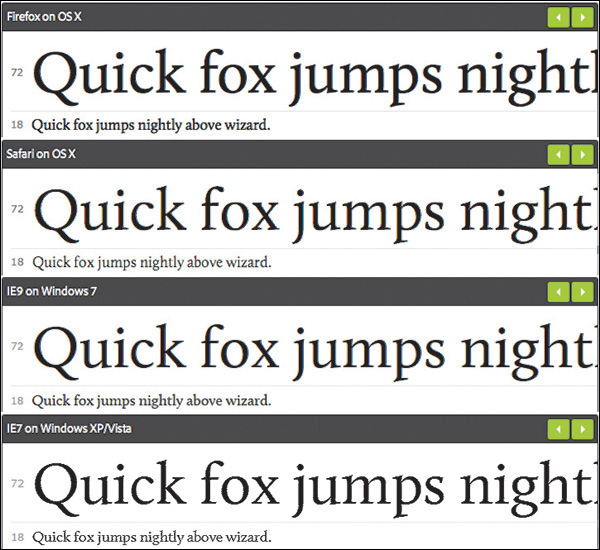
Figure 3.4 Though it can vary greatly between vendors, when it comes to font rendering, you know what you’re getting when you design in the browser. SOURCE: TYPEKIT.COM
Free
Contrary to what you may have been taught, you don’t need Photoshop, or any design software, to build a web page. Every computer comes with a basic text editor and a browser at no additional cost. For some, it’s the financial savings that make using text editors more desirable than purchasing Photoshop. Fire up TextEdit or Notepad and you’re off to the races.
There are varying levels of what a designer might be willing to pay for a tool. You can certainly spend more for fancier text-editing apps, such as Sublime Text ($70) and Coda ($75), though there are free code editors such as Aptana Studio and Brackets. You’re looking at potentially hundreds in savings compared to Photoshop, without the worry of incompatibility across versions.
1x the Effort
I recently gave the website Warby Parker a spin because my previous set of eyeglasses are covered with the typical battle wounds dads get playing with their toddlers. Besides offering the most hipster frames you’ll find this side of the Mississippi, Warby Parker has a tool on its site that lets you upload a photo and preview how frames will look on you. Let’s hear it for technology!
Seeing how the glasses will look on my face is nice and all, but I have no idea whether they’ll press on the sides of my head, fall off my face when I look down, or pinch the bridge of my nose.
Thankfully, Warby Parker is best known for its “Home Try-On” program (see Figure 3.5), where the company will ship you five frames to try at your leisure. The preview tool on the site isn’t worth the effort for me. I need to make my evaluation as “real” as possible.
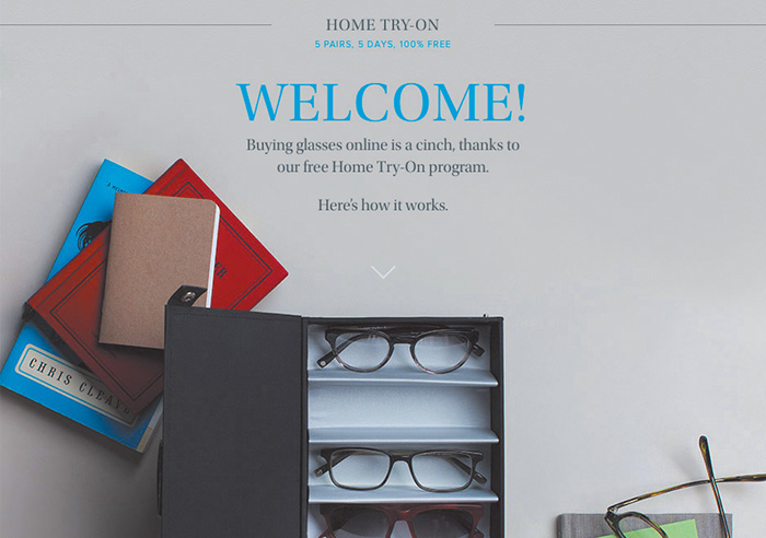
Figure 3.5 Warby Parker promotes its Home Try-On program as “5 Pairs, 5 Days, 100% Free.” We’re all attracted to quick, convenient, and painless shopping processes. Why shouldn’t it be the same with design? SOURCE: WARBYPARKER.COM
Tip
As noted earlier, always use real content. I used to be a Lorem Ipsum-er back in the day. Using placeholder text is like shoving all your messy desktop files in new folder called Desktop Files. It’s a temporary fix to a persisting problem. Eventually you’re going to have to use accurate content, and the sooner you and your client can do it, the better.
That’s how we should approach web design: one effort in the “realest” possible environment. Having to re-create a design in code seems incredibly inefficient, wouldn’t you say? Designing in the browser ensures your efforts are applied to the final home of the design, as opposed to the temporary apartment that is Photoshop.
Perception plays a major role when deciding to abandon the Photoshop phase. While it’s possible that specifying every last pixel in a comp will help give a developer a clear understanding of what to do, it also seems like an excessive effort compared to writing some code and iterating on it. The perceived amount of sheer design effort in Photoshop appears to be something we can circumvent by choosing to code instead.
“HTML/CSS is real in a way Photoshop will never be.”
—JASON FRIED (https://signalvnoise.com/posts/1061-why-we-skip-photoshop)
How important is it to work toward something “real”? Wouldn’t it seem like a bit of a waste to work on something that isn’t part of the actual site you’re designing? How can we defend it? In terms of potential time and money savings, eliminating any effort duplication is essential. This multidevice world demands that we work efficiently, and that means we need to lean on the browser much more than we have been.
Web Design’s Natural Habitat
Clearly, we’re seeing the stark contrast between a program designed to make pictures and an inherently interactive platform. For all these reasons and more, the browser is the best place to evaluate user interfaces and ultimately user experience.
The end goal of full-page mock-ups has always been completion: no detail left on the table and no pixel left unconsidered. The problem with this approach is that we do all of the evaluation within Photoshop, which lacks the credentials of fluidity and interactivity to make assessments properly. We never truly accounted for how the browser would impact the design decisions we’ve made. Better yet, we’ve never embraced said impact.
When we design in the browser, the checkpoints for evaluating user interface (UI) and user experience (UX) become more frequent, naturally. I always like to use site navigation as an example because of how many different forms it can take across screen widths. The moment you adjust your browser width, a horizontal navigation bar will either gain space or lose it. That’s your first opportunity to change course, if necessary. The moment you switch to a different kind of browser from the one you’re using, those same navigation items might render slightly more bold, therefore stressing dissimilarly to the previous browser. Again, it’s an opportunity to adjust and move forward. Likewise, what happens when JavaScript is turned off and the menu doesn’t have a signal to tuck underneath a trigger button?
If we can embrace designing for an innumerable number of screens, browsers, and sometimes settings, we can reach our audiences with accurately rendered design and without roadblocks. The only way of accounting for the diversity of the browser is to prototype directly in it. From there, we can test what works, why it works, and when it works.
If you come away with nothing else from this chapter, understand that the goal of a responsive process should be to ditch the concept of showing a single moment in time. For this purpose, the browser is superior to Photoshop because it encompasses every width, state, and behavior (moment) anyone could ever experience your design on. That’s accuracy (see Figure 3.6 on the next page).
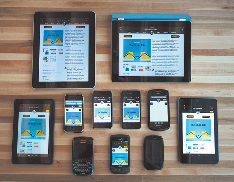
Figure 3.6 If we’re trying to be accurate, we’ll have to account for all these devices and the ones coming out in the future as best we can. SOURCE: COGNITION.HAPPYCOG.COM
Public Testing
A few years ago, I would have preferred to sing the National Anthem at the Super Bowl than show my clients in-progress Photoshop comps. In case you don’t know me, you can assume that belting out “The Star-Spangled Banner” at the big game isn’t exactly on my bucket list. I’m even skittish of showing in-progress Photoshop comps to the people I work with, never mind open myself up for critique and scrutiny on pixels that haven’t been run through the layer style gauntlet yet.
Today, I prefer showing clients in-progress looks at design in the browser. How’s that accordion work for you? Any trouble filling out the form? Does the login sequence seem a bit over-designed? While I can’t put my finger on it, the browser appears to be more conducive to conversations about “how it works,” which has just as much to do with design as “how it looks.”
PSDs for Proofreading, Browser for Evaluating Behavior
Typically, edits to full-page comps are subjective, aren’t they? Change this, change that, and so on. I’m not sure if your experience resembles mine, but the majority of client feedback on my comps was always, “Can you change the text to say ____?” All the while, I really wanted feedback on the effectiveness of interactive components. Photoshop comps almost always became a fancy exercise in proofreading.
The moment I shifted to using the browser for prototyping was the first time I started garnering the kind of feedback I truly sought. It was almost as if my clients finally understood, “It’s in a browser, so he probably wants me to try using it.” It was almost as if I finally understood how to show “design” to my clients. Too often, what gets lost in our comps is the function of design, buried beneath a sea of style choices. In the browser, the style choices still exist, but the window implores you to act.
Reaffirming Expectations That Things Look Different in Different Browsers
I’ve tried every disclaimer known to man in an effort to warn clients that what they’re seeing in a static mock-up will look different in the browser. Even if everything rendered like a mirror image in Chrome, it’s bound to look slightly different in Firefox and markedly different in Internet Explorer. It’s not until you start prototyping in the browser that the inconsistencies between browsers truly become apparent to your client (see Figure 3.7).
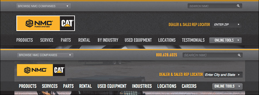
Figure 3.7 Font rendering, text positioning, subtle padding differences, and last-minute panic decisions such as adding the phone number make the PSD (top) different enough from the final site build (bottom) to reliably call the PSD an exact replica.
Why should we lead our clients to believe that the perfect comps we produce aren’t attainable across browsers? Instead, let’s expose our clients to the nitty-gritty differences of type, layout, and style from the outset in our designing. The earlier everyone can embrace these inherent differences, the better the opportunity for designers to deliver realistic expectations.
Easy to Change on the Fly
The ability to easily make global changes in the browser may open up better conversations with your team or clients. This may sound incredibly risky if you’ve always used traditional workflows, but I think you should try entertaining style changes during a meeting. Trust me, this will seem tame compared to some of the other tactics I recommend in this book.
The idea falls in line with showing in-progress design in the browser. Previously, we’d gear up for the big reveal and pull back the curtain of our pristine Photoshop comps. Let’s scratch that completely. I’m not suggesting we rely on client input over our own design ability, but inviting our clients into the process of design has profound benefits. Not only do these in-progress conversations give us opportunities to educate our clients on many aspects of web design, but they also help stakeholders feel a sense of ownership without having to send you a list of 54 edits.
To pull this off, you need to be able to make changes on the fly. Presenting comps in Photoshop, we’d be clumsily exporting JPEGs and uploading them. I’m not certain how good your Photoshop ninjutsu is, but I know mine isn’t at the level where I can pull off anything beyond a simple free transform, save, export, and upload while not skipping a beat in a meeting. Try making a change that swiftly to three different-sized comps or every other template you’ve mocked.
Tip
If your heart is set on designing on the fly in Photoshop, check out InVision (http://invisionapp.com). These brilliant folks have engineered a plug-in called Live Share, which allows you to make edits in Photoshop that will automatically update in your presentation.
Editing on the fly in the browser typically produces results that will cascade where they need to, across widths and pages. From there you can have great discussions and quick critiques about what might work better without having to go back for a few days and set up another meeting.
All in all, the ability to test your design in the browser should only instill confidence that you’re on the track of a usable, accurate design. We simply can’t have the same kind of assurances in Photoshop without knowing how our designs will translate.
Assessment as a Client Education Tool
If I’m not serving pizza or applesauce, my toddler almost always objects to what I present to her for dinner. Hey, she’s two—give her a break. And give me a break for not being down for pizza every night.
Knowing the chances of culinary acceptance aren’t high with her, I tried something different one time: I invited her to watch me cook. As she started making a connection between grilling chicken, steaming rice, and eating it soon thereafter, I could see her inclusion in the process was the missing ingredient, for lack of a better term. Yes, we need to include our clients in our design process, but that’s not where this story is going. It’s more fun than that.
You see, chicken is still pretty high on my daughter’s yucky scale, so more had to be done to bring her around.
I started explaining why we eat certain things together (think: chicken and rice), as well as why we don’t eat certain things together (think: ketchup and ice cream). In a very elementary way, I could see the explanation setting in. Knowing “why” is the primary component to every toddler musing. As adults, we sometimes forget to investigate the “why” and rely on our own biases and previous knowledge.
One of the hardest battles we designers fight is conveying all the design wisdom we have to design-averse clients. Some say educating clients on design isn’t worth striving for, and it’s true that we’re hired to be the experts in our field and they in theirs. Still, we should do our best to inform our clients on objective issues rather than debate subjective ones with them.
Fold
The fold is my arch-nemesis—all the more so because of my ongoing struggle to convince my clients that it doesn’t really apply to consuming content online. Traditionally, newspaper editors refer to the content on the top half of the front page as “above the fold.” The goal was to feature the most important information above the horizon line to entice someone to pick up the paper and buy it. Repurposed for the Web, the idea is the same: Feature important homepage content in view without having to scroll.
With so many different device heights, browser toolbars, and personal preferences, it’s impossible to target any pixel value as “the fold” to keep content above, since “the fold” falls at different places on different screens (see Figure 3.8 on the next page). Furthermore, the argument is moot: Data supports the fact that users embrace scrolling and tend to get a good sense of what’s on the page in its entirety anyway.
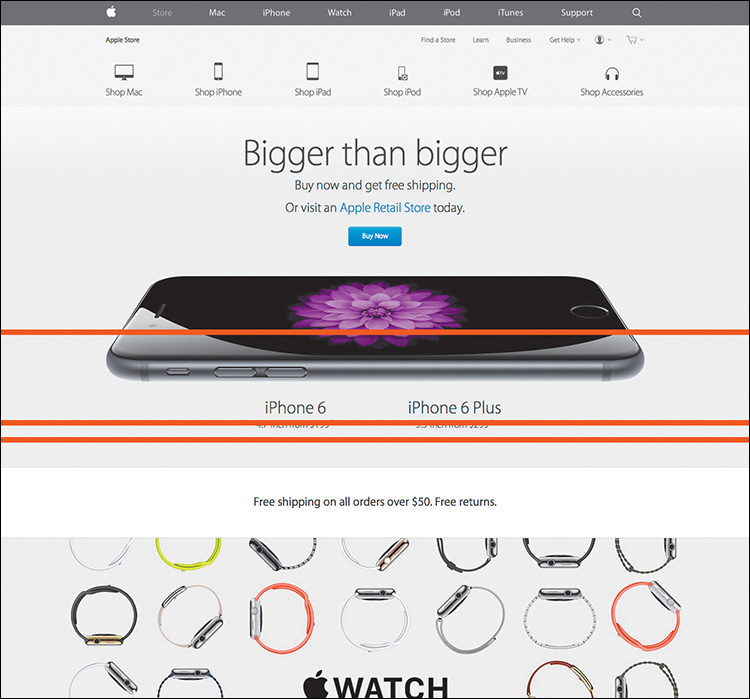
Figure 3.8 People have theorized this supposed “fold” is anywhere from 600px to 768px to 800px from the top of the page. Imagine if Apple decided to subscribe to pushing their WATCH content up to fit above 600px.
The previous reasons, told in much more detail, have become a key part of my shtick to clients. However, the conversation now comes up during early prototyping as opposed to previously when it was a topic for late development. Because I’m designing in the browser, it’s natural for clients to ask questions about the fold before I even get into high fidelity. If you don’t show static comps in the browser, this is a conversation you risk having at a very inconvenient time late in the process.
Explaining how browsers render type differently is best shown, ironically, in the browser. Conveying what’s an acceptable “tap” size is far easier on a touch-enabled device than a comp on a desktop monitor. Evaluating the usefulness of animation, transition, and interaction is incredibly effective when you can show it. These client education aspects, and so many more, tend to be a natural part of the conversation when everyone is sitting in front of an actual browser instead of a picture of one.
Designer/Developer Bonding
While the historic rift between designers and developers may have been amplified only at the onset of responsive web design, the occasion also engendered a call for reconciliation. There’s simply too much to consider between technology and technique to continue siloing both roles. Designers need a solid understanding of how browser behavior affects their work, and developers should be able to interpret a visual theme in all the overlooked nooks and crannies.
Much continues to be made about the blurred line between design and development. On the surface, a designer with some code chops and a developer with a discerning eye sound like ingredients for an unstoppable web pairing. Dig a little deeper, and you’ll find that a shared vocabulary makes this scenario ideal. The conversations these folks have aren’t happening in Photoshop on the command line.
They’re happening in the browser.
Designing in the browser removes us from Photoshop, in the most literal sense. With HTML & CSS, we’re operating on the same playing field as our developer counterparts (one of them, anyway) and can leverage their input to fully realize our design intent. We’re using terms like media queries, pseudoselectors, and progressive enhancement in ways we most likely weren’t in Photoshop. If you feel like Photoshop is your domain, and yours alone, try seeing how it feels to pair up with a developer and just start laying out a site beginning with code instead.
The browser harbors healthy designer-developer communication, and both parties need to contribute jointly and effectively to take on a myriad of moving (responsive) parts.
OK to Kill Photoshop Now?
No! Well, not entirely. As confusing as it might sound, we just need a better role for Photoshop in the aftermath of the design-in-browser movement. Clearly, we should be leveraging HTML & CSS as early as possible, but like Photoshop, code has its deficiencies too.
Those deficiencies provide the opportunity to keep Photoshop in the loop and transform our workflows into well-oiled machines. We may have killed the way we used Photoshop traditionally, but we won’t be killing it altogether anytime soon. Hooray for happy endings!
This is where the fun begins: the romantic comedy that is Photoshop and the browser.