Table of Contents for
Responsive Web Design with Adobe Photoshop
 Responsive Web Design with Adobe Photoshop
Published by
Adobe Press, 2015
Responsive Web Design with Adobe Photoshop
Published by
Adobe Press, 2015
- Cover Page
- Title Page
- Copyright Page
- Acknowledgments
- Contents
- 1. Photoshop’s New Groove
- 2. How Did We Get Here?
- 3. The Case for Designing in the Browser
- 4. A Plea for Photoshop–Browser Harmony
- 5. Vetting Direction
- 6. Establishing Style
- 7. Establishing the System
- 8. Getting Back into Photoshop with Page Layers
- 9. Extracting Your Way Out of Photoshop
- 10. Extending Photoshop
- 11. Remembering Etiquette
- 12. Adopting a Completely New Workflow
- Index
- Responsive Web Design with Adobe Photoshop
1. Photoshop’s New Groove
“We need to make this responsive.”
Whether you consider yourself a web design noob or pro, this declaration is as exciting as it is terrifying. Having some experience making responsive sites affords you only a small advantage over those who are just learning how. The way we design, even responsively, has evolved significantly in just two short years. That’s the nature of the ever-changing Web, where the best tool you can have in your box is an eagerness to stay as up-to-date as possible.
That’s why you picked up this book, isn’t it?
At this moment, odds are you find yourself in a dilemma. Responsive web design (RWD) is becoming synonymous with simply web design, yet your process hasn’t quite caught up. You’ve always used Photoshop, but its place in a responsive workflow seems a bit forced. Do I really need to make that many comps? Are any of these newfangled design apps worth trying? There’s got to be a better way!
Even if you’ve done the responsive song and dance a few times, Photoshop most likely is no longer the workhorse of your web design workflow. Designing solely in the browser continues to pillage would-be Photoshop users, and new apps such as Reflow, Webflow, and Macaw present increasingly viable alternatives. The voices calling for the demise of Adobe’s flagship app in web design are well-documented, and it’s starting to make sense. You just might be the only one you know who still uses Photoshop for web design. Perhaps it’s time to cut your losses and jump ship.
Yet there you are, still reading a book with “Photoshop” in the title. Stubborn. I like that about you.
Called Into Question
Photoshop is the one of the most polarizing topics among web designers today and has been ever since RWD came on the scene in 2011. I can remember the first time I really noticed it, back in September 2012. While scrolling through my Twitter stream I saw a link to a post on Treehouse’s blog, titled “Responsive Web Design in the Browser Part 1: Kill Photoshop” (see Figure 1.1). Mind you, up until that point, I was already designing responsively but had no idea I wasn’t supposed to be using Photoshop anymore.
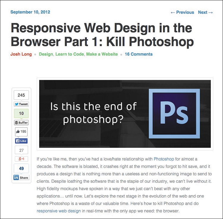
Figure 1.1 The alternatives seem to be many, but the call to action from the design community seems to be clear: Kill Photoshop!
Now, I’m not easily dissuaded by one person’s opinion, but the topic seemed to hit a fever pitch soon thereafter.
 “Has Responsive Web Design Killed Photoshop for Web Designers?” (www.boagworld.com/design/has-responsive-design-killed-photoshop-for-web-designers/)
“Is Photoshop Dead?” (www.webdesignerdepot.com/2013/02/is-photoshop-dead)
“Photoshop Users: How to Switch to Sketch” (http://blog.mengto.com/photoshop-users-how-to-switch-to-sketch)
“Khoi Vinh on Using Sketch Instead of Photoshop” (www.creativebloq.com/khoi-vinh-using-sketch-instead-photoshop-6133901)
“Photoshop Killer” (www.photoshopkiller.com)
The next thing I knew, I couldn’t find more than a handful of designer friends who said they still used Photoshop, or were willing to admit it anyway. They’d moved onto “more efficient” methods like using Sketch (www.bohemiancoding.com/sketch) or just designing with Hypertext Markup Language (HTML) and Cascading Style Sheets (CSS). It’s possible you may work somewhere that mandates you use Photoshop. But for designers like myself who have autonomy to use whatever tools and more or less processes they want, dumping a product I’ve used for my entire career wasn’t a trivial matter.
For the past few years, I’ve tried to find out as much as I can about why the switch from Photoshop is happening and who might still be using it. In my quest I’ve found a common concern shared by designers: Beyond it simply being a preference, Photoshop is intrinsically tied to their current employment. In other words, when some designers hear “They’re telling us to stop using Photoshop,” they internalize “I’m worried about my role on the team and potentially my career.” That seems pretty heavy for one tool, but don’t underestimate the impact it’s had on our industry.
Should you switch?
Stick in the Mud
Sure, you could ditch years of Photoshop familiarity, training, and cost. You could invest in a new web design app and never look back, at least until an even newer app comes out. Nobody would blame you, and they’d probably applaud you because you did it in the name of responsive web design efficiency. Everybody is doing it.
Still, I contend that jumping ship because of popularity isn’t good enough, not when the other option is simply trying harder to see the redeeming qualities of Photoshop and whether a better process is just a few tweaks away. I have a hunch you feel the same. That’s good because we’re about to take a deep dive into exploring how to get the most out of Photoshop without sacrificing workflow efficiency.
Fear of the Unknown?
I don’t think reluctance to drop Photoshop comes from being afraid to try new tools. I’ve tried a bunch of them. The appeal is there, and I encourage you to assess them for yourself. Fluid canvasses, adjustable breakpoints, and easy browser previews aren’t native to Photoshop. We can hope that these features will be baked in at some point, but that doesn’t seem likely. Adding them would require a major pivot from the iconic landscape of the product and likely frustrate users who are just fine with the current canvas.
However, the supposed “lack” of those features makes Photoshop a great environment for designing a single “moment.” Designing individual instances, in moderation, can help spur ideas to be introduced on a larger scale. Not everything about designing in a static medium is as bad as you might think. Granted, a lot of new tools have parallels to Photoshop in terms of drawing shapes and placing type. However, when handled appropriately, focusing on a single breakpoint can bring focus to a design. When I don’t have to be concerned about what shape navigation takes at a narrower or wider view, I can commit to exhausting an idea.
Can I Still Get by Without Knowing Code?
Equally important, this isn’t an “anti-design in browser” cookbook for getting around knowing how to code either. Being able to design in the browser is essential when it comes to responsive web design, and this book has a whole chapter about it. I’m a staunch advocate of designers who can craft HTML & CSS because the structure it provides creates both possibilities and constraints for your design. The benefits aren’t just individual, either. Ben Terrett of Gov.UK puts it this way:
“All of the designers can code or are learning to code. We call ourselves the design team because it’s important to belong to a group with shared skills and experiences. This helps people develop their skills, support each other, and build a strong culture with shared standards.”
—BEN TERRETT (https://gds.blog.gov.uk/2014/07/18/whats-the-design-process-at-gds)
Don’t worry, though. If you’re a bit behind on your coding skills, there are wonderful resources to help you learn, like Treehouse (www.teamtreehouse.com), Code School (www.codeschool.com), and Codeacademy (www.codeacademy.com) to name a few. I won’t be covering anything overly technical, but being able to bring your ideas to life in the browser has never been more critical (see Figure 1.2). (If not for lack of resources, what might be holding you up from learning some basic HTML & CSS?)
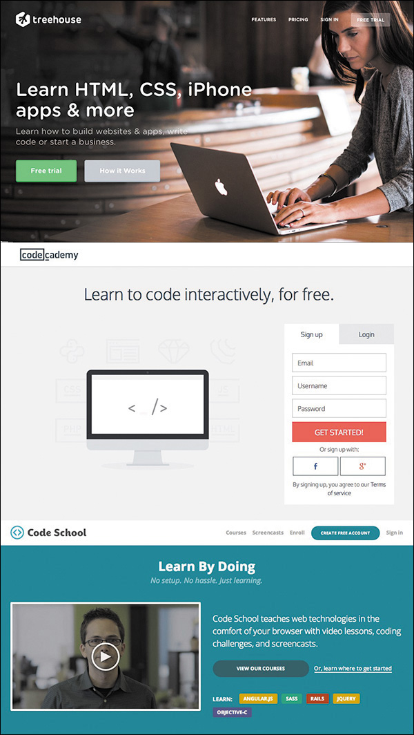
Figure 1.2 The chasm between design and coding skills has plagued web design for years and still exists for many.
So if you’re amenable to learning new tools and designing in the browser, what keeps pulling you back to Photoshop? For me, it’s a tool I’m just too proficient with to abandon at the arrival of responsive web design. Proficiency is, and always will be, valuable to web design. And before you go disqualifying your own proficiency, note that I only recently got the Save for Web keyboard shortcut down (otherwise affectionately known as Save for Web Claw...just Google it). Proficiency isn’t just about knowing your way around; it’s about being able to ideate and render your design intent to the best of your ability. So, I’m declaring that it’s OK to be a stick in the mud about this one, as long as you’re open to figuring out how Photoshop’s role is changing.
More Process Than Tool
Because there’s no Convert to Responsive button in Adobe Photoshop (see Figure 1.3), we’re going to have to talk about process a whole lot more than the new bells and whistles in Photoshop CC. (It would be pretty lame if there were such a button anyway.)
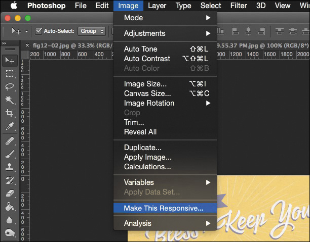
Figure 1.3 Have you found the magic button yet? It appears when you hold down every key except ~ on your keyboard. OK, I’m kidding...don’t do that.
I’ve always maintained the most enjoyable part of web design is creative investigation. Designing for myriad screen widths provides ample opportunity for exploration, and while it often seems like a lot of work, it’s work that shouldn’t be automated. Each site design presents a set of challenges and problems to solve, and you can spot “templated” solutions from unique and well-considered ones. Design thinking and design tools need to work in beautiful choreography. To make your responsive workflows successful, you need to shift your focus from “Which tool should I use?” to “Where does it make sense to use each tool in my process?”
Today’s workflows are about staying nimble. I’m confident you can stay nimble using Photoshop, but you may need to rework your traditional approaches to do so.
A Battle of Two Short Words
I almost made a horrible mistake naming this book.
I was this close to titling it Responsive Web Design in Adobe Photoshop. You just checked the cover to see what the difference is, didn’t you? But the distinction may not be clear or significant to you at the moment.
What’s the difference between Responsive Web Design in Adobe Photoshop and Responsive Web Design with Adobe Photoshop?
Distinguishing with from in is vital. For years, designers have used Photoshop as a program to do web design “in,” in its entirety. The “Photoshop phase” of a project was half of the work. Once our infamous “Home.psd, Landing.psd, Interior.psd” mock-ups were approved, we’d wipe our hands clean and move on. Months of project timelines were spent assessing work done in Photoshop.
That was when we were designing for a single screen, and even then you could argue how inefficient and inaccurate of an approach it was.
Designing for multiple screens places greater emphasis on staying nimble. You’ve probably already experienced how backlogged a project gets when you’re making three templates at three sizes each. How about more than ten templates at more than five different sizes? Overwhelming. No doubt you’re under the gun to shorten the Photoshop phase, or perhaps you’re just genuinely interested in a more efficient method. Logically, if you’re cutting down design time in Photoshop, you have to increase the time you spend in HTML & CSS. The trick, as you’ll discover, is continuing to work “with” Photoshop even after you (or a developer) start toying with code.
Responsive web design isn’t something you can do inside the silo of Photoshop. You can, however, use Photoshop alongside the browser (and a bevy of other tools) to help you design responsively.
Not on the Menu Tonight
Now is as good a time as any to discuss some of the topics I won’t be covering in depth, don’t you think?
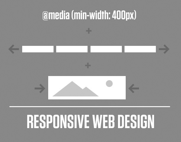
The Core Tenets of Responsive Web Design
On the RWD side, I’m assuming you’re familiar with its core tenets: media queries, flexible grids, and fluid images and video (see Figure 1.4). Therefore, we won’t be spending time defining what’s already been so brilliantly defined by the inimitable Ethan Marcotte (www.alistapart.com/article/responsive-web-design). He also published the penultimate book on the topic, Responsive Web Design (www.abookapart.com/products/responsive-web-design). If you haven’t read it, do so on my recommendation and that of every other person who owns it.
Responsive Patterns
There are a ton of responsive patterns and conventions that the fine people in our industry continue to develop, and it would be nearly impossible to detail them in the scope of this adventure. For example, the number of patterns available for navigation at different screen sizes spans from stacking items vertically to triggering an off-canvas menu like Facebook of yesteryear. I’ll touch on a little of that, but a much more comprehensive resource I often use Is This is Responsive (http://bradfrost.github.io/this-is-responsive), curated by one of the finest people on the Web (and IRL), Brad Frost.
Performance
Lastly, there’s a critical component to responsive web design that we designers tend to overlook at our own peril: performance. Some of the most gorgeous sites not only take forever to load on a standard mobile connection but also end up sending your data plan overage fees through the roof. Why is this? Among other things, uncompressed images are to blame, but there are a ton of other factors for slow performance that are a bit too technical for our discussion. Scott Jehl’s Responsible Responsive Design (www.abookapart.com/products/responsible-responsive-design) tackles the impact of the choices we make.
Photoshop Basics
On the Photoshop side, I’ll assume you’re familiar with the interface. You’ve comped websites with it, and you more or less enjoy using it. In fact, I’m banking on you loving Photoshop so much that you’re reluctant to give it up. For those reasons, I won’t be covering the basics of web design in Photoshop, such as how to create buttons by drawing rounded rectangles. That doesn’t mean I’ll always be talking in advanced terms, but I’ll focus on practical applications, rather than the basics.
The Minutiae of Version Disparity
Subsequently, your familiarity with Photoshop may be relegated to a certain version. My hope is that you’re on the latest version (CC 2014 as of this writing), but I realize there are several reasons why that might not be the case for you. I do advocate joining Adobe’s Creative Cloud. I was a bit skeptical when I heard Adobe was switching to a subscription-based model but have found the benefits considerable. Always using the latest version cuts down incompatibility, pain points, and the fear of missing out on something (or FOMO, as the millennials say). Rest assured, 90 percent of what you’ll read in this book isn’t particular to the latest version. When it is, I’ll do my best to call out CC 2014–only features.
The Merits of Comparable Tools
There’s one elephant in the room I want to address, and that concerns the Photoshop skeptics. If you have your doubts that Photoshop is as good of a tool as, say, Sketch, Fireworks (R.I.P., 2013), or Microsoft Paint, I won’t be tearing down those apps in an effort to build Photoshop up.
I don’t speak from a lack of confidence in Photoshop; Photoshop is a fantastic web design tool. You might prefer a different app, and that’s totally OK; you’ll find enough relevant parallels in the coming chapters. But let it be known that I use Photoshop because it works for me, and I in no way prescribe that all web designers need to use it. I will, however, accept the challenge of proving Photoshop as a viable choice for web design (see Figure 1.5).
Finding Photoshop’s Groove
As we set out to write Photoshop’s new story, my hope is that you’ll come away with some incredibly practical strategies for leveraging it. One of the most important things I’ve learned in repurposing Photoshop is that an approach might work for one project yet be ineffective for another. Suffice to say, this is all about you being able to discern when, how, and why to use it. That’s what I like to call finding Photoshop’s “groove.”
We were once taught to use Photoshop for a specific task: creating full-page comps. In the next chapter, I’ll shoot some holes in that process and discuss some disadvantages that you’ve heard about or experienced for yourself. While Photoshop is historically synonymous with full-page comps, it’s important to distinguish between the two. All those folks advocating for Sketch, Fireworks, and the others are still making comps, too. It’s not so much the tool that’s faulty but the workflow.
So, where does that leave Photoshop? To keep it in the fold, you’ll need to be clever about where it fits with designing in the browser. Some designers are amazing at using code to express design. I am not one of them.
Fortunately, there are a few exercises you can do in Photoshop that are much shorter in scope than full-page comps and allow you to work with the browser. That’s where I’ll spend the majority of the book and from which you can discern which ones are best suited for your workflow. You may have heard of visual inventories, style tiles, style prototypes, and element collages. I’ll dissect the best parts of those and introduce some techniques for using them after you have some components started in the browser.
In addition, I’ve compiled a list of enough plug-ins and extensions to constitute a small nation. I know it’s easy to get wrapped up in process, workflow, and deliverables without feeling like you have anything to download or install. I’ve read more “Top 100 Photoshop Plugins for Web Designers” posts than anyone should ever have to, and I’ve plucked out the most practical ones I’ve either used or plan on using. I dare you not to find one worth trying yourself.
By the time you’re done this book, you’ll be a well-mannered designer after I break down what it means to have “Photoshop etiquette.” If you’re laughing at the prospect of properly naming and organizing your layers, odds are there’s someone who inherits your PSDs and wants to cause you harm but hasn’t said anything. Yet.
Anti-full-page comping. Designing with the browser. New-age “deliverables.” A jackpot of resources. Some good ol’ fashioned etiquette. That’s our road map, so buckle up.
We Need to Make This Responsive!
It’s crunch time. It’s been crunch time for the past few years. Responsive isn’t so much an option as a necessity these days, and it’s on you to nail it. The only thing that stands between you and a more sensible workflow are the pages that follow.
But before we can get anywhere, we need to understand how our industry arrived at such an unpopular view on Photoshop. Without fully understanding the pain points in using it, we can’t be innovative in dodging them.