Table of Contents for
Responsive Web Design with Adobe Photoshop
 Responsive Web Design with Adobe Photoshop
Published by
Adobe Press, 2015
Responsive Web Design with Adobe Photoshop
Published by
Adobe Press, 2015
- Cover Page
- Title Page
- Copyright Page
- Acknowledgments
- Contents
- 1. Photoshop’s New Groove
- 2. How Did We Get Here?
- 3. The Case for Designing in the Browser
- 4. A Plea for Photoshop–Browser Harmony
- 5. Vetting Direction
- 6. Establishing Style
- 7. Establishing the System
- 8. Getting Back into Photoshop with Page Layers
- 9. Extracting Your Way Out of Photoshop
- 10. Extending Photoshop
- 11. Remembering Etiquette
- 12. Adopting a Completely New Workflow
- Index
- Responsive Web Design with Adobe Photoshop
6. Establishing Style
Think back to a time when your design process was fairly arbitrary. For you, it might be when you first started learning web design or perhaps when you went to work for yourself. In the first stages of a project, do you recall the anticipation of putting down the first pixels in Photoshop? Without the overhead of more structured processes, you’d be so excited just to start putting together the header and hero image for the homepage or start toying with how profile avatars and major call-to-action buttons would look.
Rarely does anyone get excited about designing footers, sidebar ad placement regions, or forms. But we must. In order to have accurate page designs, we need to show all the mundane details alongside the ones we’re psyched about. The minutiae of a comp is the lorem ipsum to the eagerly conceived poetry we want to dive into.
What if I told you it’s not only OK to plunge into designing only the stuff you’re most excited about but doing so might be the catalyst for transforming your entire workflow?
In this chapter, you’ll explore why.
Suitable Mock-up Replacements
While it’s true that visual inventories are well worth exploring prior to producing full-page comps, you’re much better off continuing with the idea of staying small and flexible. It’s tempting to take what you’ve learned and spend a few weeks in Photoshop committing to your findings, but it’s also risky. Not only might you be putting all your design-direction eggs in one basket, so to speak, but you’d still be susceptible to the pitfalls of the waterfall, full-page comp workflow described in previous chapters.
On Sketching
You could take a rough approach to defining style, and you can’t get much rougher in fidelity than paper-and-pencil/pen/marker sketches. As expressed earlier in a quote from Jason Dziak, sketching helps further the style conversation without committing to pixels (see Figure 6.1). The advantage here is keeping the art direction rough, which is a great strategy in the early stages of design.
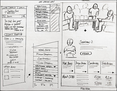
Figure 6.1 While sketching is great for exploring many ideas quickly, style-related exploration usually involves moving to higher-fidelity approaches.
Tip
If you haven’t made sketching or sharing your sketches part of your process, I highly suggest you do so. I don’t have the space in this chapter to cover an exhaustive exploration of sketching strategies, techniques, and materials, but you should pick up Sketching User Experiences: The Workbook by Saul Greenberg, Sheelagh Carpendale, Nicolai Marquardt, and Bill Buxton if you’re interested in learning more.
Rough sketches often can’t convey enough in terms of style. You can show shape, layout, and even some rudimentary type or color, but an exploration in higher fidelity is almost always necessary.
Fortunately, a number of talented folks have created approaches that reduce the scope of what we’re designing while still supplying the detail we so desperately want to dive into.
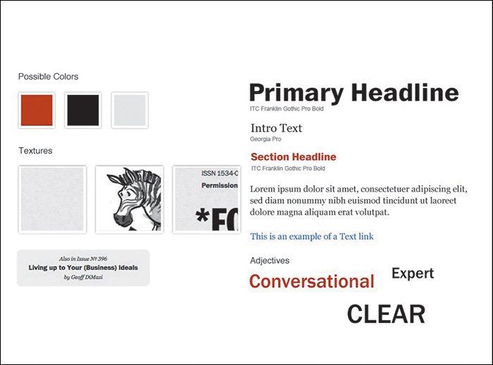
Style Tiles
A popular alternative to full-page mock-ups is style tiles (http://styletil.es/), a term and exploration coined by Samantha Warren (see Figure 6.2).
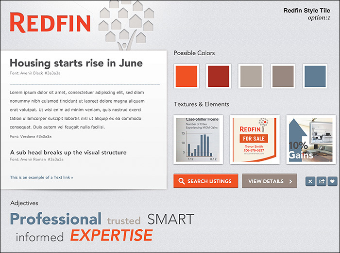
Figure 6.2 Style tiles have been widely adopted as a practical alternative to full-page comps. SOURCE: WWW.THEARTISANVISUAL.COM
“Style tiles are similar to the paint chips and fabric swatches an interior designer gets approval on before designing a room. An interior designer doesn’t design three different rooms for a client at the first kickoff meeting, so why do web designers design three different web page mock-ups?”
—SAMANTHA WARREN (http://styletil.es)
Tip
You can download a blank style tile template from http://styletil.es/downloads/Style_Tile_Template.psd.zip.
A style tile is a Photoshop document that focuses on a few foundational elements to carry the visual theme of a website. Typically, these elements include the following:
 Basic typography (headings, paragraph text)
A button or link style
Primary color palette (three to five swatches)
Possible patterns and backgrounds
A list of adjectives (from which you derive design principles)
The best approach to setting up a style tile is open to interpretation. The sample provided on http://styletil.es is 1024x768, but don’t let that discourage you from making it wider or taller. The only thing that should dissuade you from using a specific size is the device-independent focus of the practice. The goal is to define the basic visual language for a responsive site. Stacking the elements in a 320px width screen would inadvertently imply appearance in a narrow context like a smartphone.
Advantages of Style Tiles
Let’s break down style tiles a bit further, starting with the advantages of using them. Primarily, style tiles achieve the goal of considerably stripping down the work we’ve traditionally done. A small sampling of the intended styles for a site essentially does the job of many large mock-ups.
As with the majority of full-page comp alternatives, style tiles cut down the number of hours spent in Photoshop at the beginning of a project while still accomplishing the goal of establishing the visual direction of a site. The benefit is that the saved budget and time can be better used addressing the complexities of variable-width layout in the browser.
One of the best benefits of style tiles is their versatility. It’s quite easy to establish one theme, copy the file, and produce another. Little effort need be wasted as the foundational elements appear on each version, with the only changes being stylistic outside of changing adjectives. Whether you’ve started with a visual inventory or not, this is a great method of providing choice and comparison for our conversations. I’ll cover the specific benefits of choice in Chapter 12.
Lastly, style tiles do the least to imply the most. For our purposes, it doesn’t take very much for designers and developers alike to riff off the little we’ve established and create robust systems. Focusing on the building blocks of an interface gives us a great start for further implementation.
Exercise: Reverse-Engineer a Style Tile
If the idea of a style tile seems a bit wild to you, I’ve found the following exercise helpful in imagining their usefulness.
Begin by picking a website, preferably one you’re familiar with—Apple, Target, Starbucks...whatever. Next, open the blank style tile template in Photoshop. Challenge yourself to fill in the blanks in what I like to call “reverse-engineering” a style tile. It’s fascinating to see the building blocks of style in such a minimal form and how they can translate to a bigger design system. This practice should get you in the groove of what to include from the start (see Figure 6.3).
If you want to have some real fun, reverse-engineer a style tile, strip out the logo at the top, and quiz your designer friends to see whether they can guess what site you chose. It’s so much fun you can hardly stand it, right?
Style Prototypes
Do you like the style tile approach but wonder why it can’t be done in the browser instead? My friends at Sparkbox (www.seesparkbox.com) have done just that with an approach called style prototypes.
There are a few differences between the two, but style prototypes (see Figure 6.4) are used for the same purpose as style tiles: to gain consensus on a design direction very early in the process without sacrificing the time and resources traditional mock-ups take.
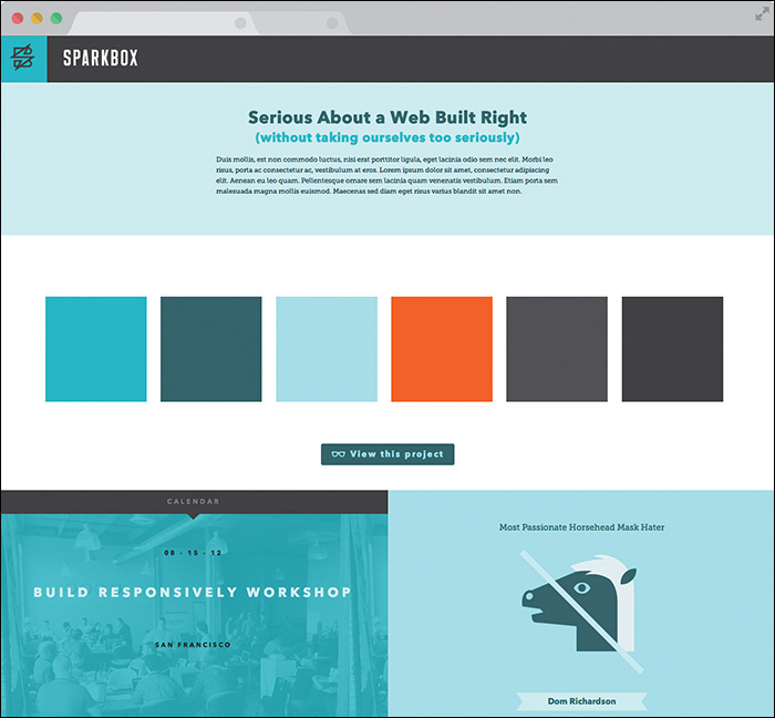
Figure 6.4 Style prototypes bring the style tile conversation to the browser from the start. SOURCE: SPARKBOX
The clear advantage of using the browser as a design medium is the ability to work in responsive behavior. While the contents of a style prototype aren’t meant to communicate a specific page layout, it might be helpful to begin to discuss how certain elements could adapt.
As relatively new as responsive web design is to us designers, it’s even newer and often completely unfamiliar to our clients, which means we need to take every opportunity to weave in the concept. Even in a project’s infancy, showing style in the browser may help familiarize your clients with this concept.
Tip
No matter the deliverable, make sure you’re showing it in the browser. If it’s code-based, it’ll naturally be there. If it’s static, make a blank Hypertext Markup Language (HTML) page for it to live in. Why? The disconnect from an operating system’s default JPEG viewer and the browser can be problematic in terms of zoom. Are you certain your design is being viewed at 100 percent? Why not have every possible discussion in the environment your design will end up living in, for consistency’s sake?
Flexibility by Design
In terms of content, the style prototype aligns well with the style tile, but it features some added flexibility by design.
“There’s really no perfect set of design elements to include in a style prototype,” says Sparkbox Creative Director Jeremy Loyd. “However, here are some basic elements to get you started:
Branded header (with logo)
Headline(s)
Subhead(s)
Paragraph style
Button style (with hovers, transitions, etc.)
Text link treatment
“I also like to include iconography, illustration, photo style, and any graphic patterns or textures,” Loyd adds. “Navigation and UI elements for e-commerce or social networking may also be appropriate.”
Including elements like a header and navigation starts to bring us closer to what we’ve traditionally done in comps, clearing up some of the abstraction of how this translates to the actual site. How can we communicate style without “committing” to the detail and minutiae? I imagine the spectrum to be something like Figure 6.5.
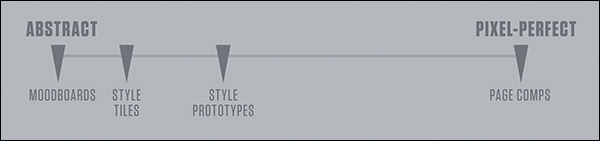
Figure 6.5 While we’ve traditionally stayed too far on the right, more liberal approaches like style tiles can be a bit abstract. Style prototypes can bring us closer to the middle.
How far to the right style prototypes appear on this spectrum depends on you, your client’s needs, and sometimes the budget for your project. At WSOL, we pushed this idea a bit further and included a few more components than normal, as shown in Figure 6.6.
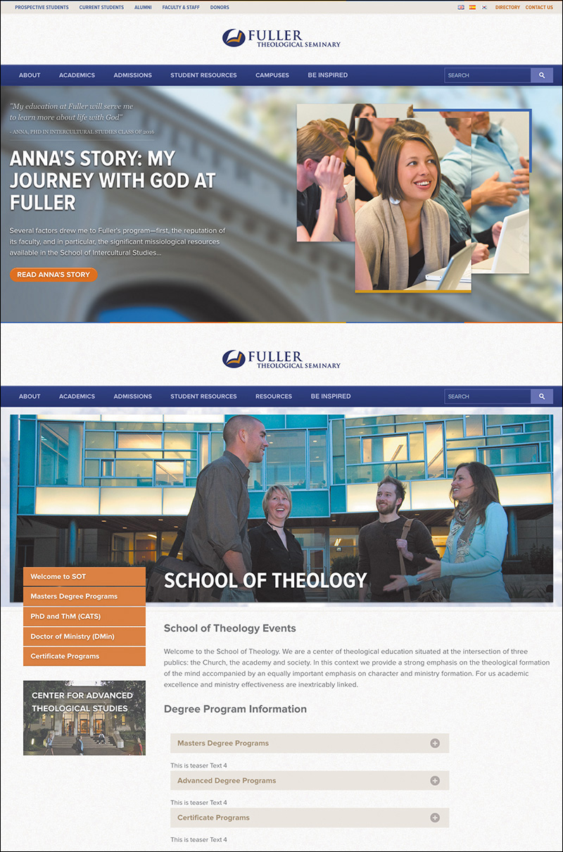
Figure 6.6 On this project for Fuller Seminary, we used more defined elements to illustrate the style direction. As not to get too far into development, we opted to show a single breakpoint (width).
The flexibility is really up for interpretation. If building in more than one breakpoint seems arduous, it’s totally acceptable to omit every intended breakpoint for the sake of discussion.
While it may appear that the style prototype approach is a browser-only exercise, I’ve found that doing some preliminary “sketches” in Photoshop helps aid in “what to show.” Traditional low-fidelity sketching on paper works fine too, but the environment of Photoshop (and my efficiency in it) helps me think in terms of color, type, and layout better. Often, these Photoshop sketches are very loose and rarely shown to anyone, but they help address the “browser block” I experience, even at the style prototype level. I’ll talk more about this in Chapter 8.
There are some things to watch out for when building style prototypes, with perhaps the most obvious being that it’s easy to continually build components in an effort to better visualize the direction. You certainly don’t want to make so many contributions to the style prototype that it could pass as the entire front end of your design.
On a similar note, using code that doesn’t adhere to your team’s production readiness isn’t a deal-breaker, but it can cause some regret as you move toward site development needing to re-create elements in slightly more efficient or accurate code.
Style prototypes are a great step in the right direction. More flexible than style tiles, they can be interpreted and tweaked to best fit your team, clients, and projects. Even though Photoshop can be used to inspire them, style prototypes are HTML & CSScentric, which may pose a stumbling block to the code-averse and the code-inefficient. In those cases, you’ll want a developer taking the lead on implementing your design vision.
Component Inventory
Continuing along the spectrum toward “detailed” approaches, we end up with what I call component inventories. These are typically Photoshop documents that detail every element from which to build a site.
What style tiles and Prototypes might lack in literal translation to actual site elements, component inventories more than make up for through their sheer thoroughness and detail. If the goal is to outline every element on a site (or at least the majority of them), there’s little chance you’ll run into the abstraction problems of adjectives and pattern snippets.
Photoshop provides a rich environment to assess the range of styles on a given project. As one of the main objectives for the designer in this approach, systematic consistency comes into greater focus than it would in page mock-ups. Do I really need 15 button styles? Can I reduce six grays down to three?
Tip
You can use multiple Photoshop CC libraries to quickly produce a few different iterations of the same elements.
Component inventories (see Figure 6.7) can take the same amount of time as full-page comps, making them dissimilar to previous, smaller-scope approaches. However, comps aren’t exhaustive in the elements included over the span of a few page mock-ups, often leaving a significant number of components unconsidered. If the goal of each is to become a specification document, the more thorough component inventories have the advantage. All components will need to be figured out eventually. At the very least, component inventories take the same amount of time but allow you to use that time more wisely.
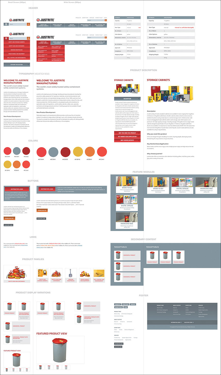
Figure 6.7 At the risk of being overly thorough (and potentially time-consuming), component inventories allow you to break down the elements of a site from within Photoshop.
If you can work efficiently, component inventories are the best way of defining a style system prior to development.
Element Collages
Dan Mall created a mock-up alternative he calls element collages (see Figure 6.8). Done entirely in Photoshop, an element collage is a collection of visual ideas that represent potential site components. Like other methods, the goal is for these components to carry the essence of an entire theme.
Perhaps it’s a collection of visual metaphors, like a social network showing a “post” with a paper-like container for the content or a sports site’s live scores using the vernacular of a scoreboard’s electronic numerals. These ideas have weight in our conversations, primarily because they don’t deal with the minutiae of design. They center more around their applicability to a brand than their accuracy to a page.
If you set the expectation that these vignettes are your take at establishing some visual themes to continue on, the conversation becomes less about approval and more about fit. Sure, you can iterate on an element collage until you land on a handful of components you will produce to the pixel, more or less. But the fundamental idea here isn’t that you need to work out every detail in Photoshop before moving to the browser. You can establish enough ideas to comprise a direction. The major advantage of element collages is that your ideas have detail, better informing the complete style direction and the choices you make in the browser.
Stripping Out the Abstraction
The main barrier the aforementioned deliverables present is abstraction. This is especially true of style tiles. Even style prototypes can require a considerable leap to “visualize” how they relate to a site. If you make verbose component inventories too early in an attempt to communicate design direction, it’s often hard for clients to put together the pieces out of context.
Element collages, on the other hand, do a great job at balancing abstraction and detail (see Figure 6.9). Because you’re designing at the component level, all of the examples shown are detailed, but they’re also contextual because you’re using “real” content. Simultaneously, element collages are still abstract in the sense that they aren’t full-page designs or builds and often feature device frames and hands to further dissuade that notion. Less of a specification document than component inventories, element collages introduce ideas rather than refined solutions.
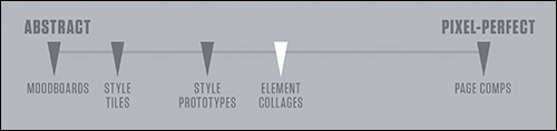
Figure 6.9 Our amended spectrum, where element collages are placed squarely between abstract and literal
All these ideas about element collages are fantastic, but I have a feeling you’re itching to talk about the details of making them. So am I.
Crafting an Element Collage
Exercise time. Crack those knuckles and fire up Photoshop, if you please.
Canvas Size
First things first: What size do you make an element collage? Great question, and I can definitively say there’s no single answer, by intention. The only difference between a 1800px wide document and a 1900px wide document is the number of ideas you can put into it. Let’s run with that and start really big—annoyingly big. I think 3200px wide by 1800px tall should suffice.
Tip
It’s possible this scale is more than just uncomfortable for you; it’s inconvenient. No sweat. You can adjust it to whatever fits your screen or current setup. The idea is that you don’t want to start at 960px or 1024x768 (or any “standard” device size). You can always add more canvas or take it away later. Ideally, a feature like Adobe Illustrator’s artboards would be great here, but a large canvas should suffice.
Now what? Blank document syndrome, right? I tend to toss in some arbitrary guides to give myself at least one constraint to start. I do this using GuideGuide, which you’ll explore in Chapter 10. What’s most important is to not predefine any of the popular device sizes, such as putting guides at 0 and 1024. You want to break out of the habit of designing for specific screens (unless your project is a native app). Users will view your designs on any number of devices, so it’s irresponsible to focus only on the ones you might have or think of.
Turning Powerful Phrases Into Visual Hooks
For me, it helps to start thinking about phrases I’ve heard in discovery and kickoff meetings. To escape the “sameness” of contemporary web style, descriptive terms unique to your clients and their industries can provide a way.
One WSOL client, Christian Care Ministry (CCM), is a community deeply rooted on the concept of sharing resources, both spiritual and physical. Their mission is to further the gospel message by harboring a “tight-knit” community. We heard this phrase throughout our initial meetings with them, and though the copy and photos of the site aim to communicate it, we thought, why not incorporate these ideas into the interface as well? Including this background pattern on the element collage was a way to kick-start a conversation about using even the most subtle of hints to portray their mission (see Figure 6.10). For the 5 to 10 percent of viewers who pick up that this woven pattern relates to the community, it’s worth it.
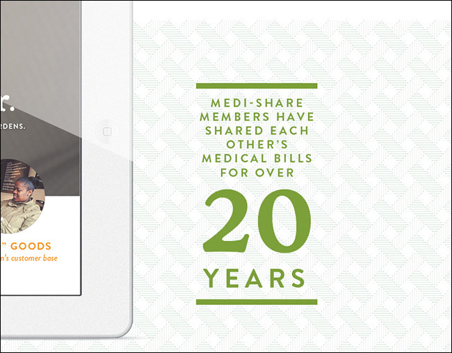
Figure 6.10 Homing in on key phrases and creating their graphic equivalent can produce some unique results.
Dan Mall refers to this technique as “turning powerful phrases into visual hooks.” Figure 6.11 shows an example he provides from a project done for Reading is Fundamental, transforming a phrase like “Turn to page 2” into an interface element.
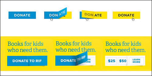
Figure 6.11 A superb example of taking the vernacular of a company or industry and translating it to UI SOURCE: SUPERFRIENDLY
Not only is this a great strategy for establishing some semblance of uniqueness, but it can also help kick-start the art direction. An approach to style should go beyond flat or skeuomorphic, shallow or deep. You can use key phrases from your clients to influence the interface in a meaningful way, creating opportunities to evaluate how their brand can be represented beyond a logo or some text.
When done tastefully and cleverly, visual metaphors are a great foundation for an element collage and web design in general.
Covering a Lot of Ground Quickly
Adjusting the scope of Photoshop comping is critical to a responsive project, where the time and budget savings can be used elsewhere. Beyond showing metaphors, it’s worth your while to explore the components whose style can best represent the direction you’re exploring. Including interface elements like buttons can inspire how other links and utilities will eventually be styled. Similarly, while you may be placing your artwork on a white canvas, crafting backgrounds for related content blocks set the expectation that your sections will have variety (see Figure 6.12).
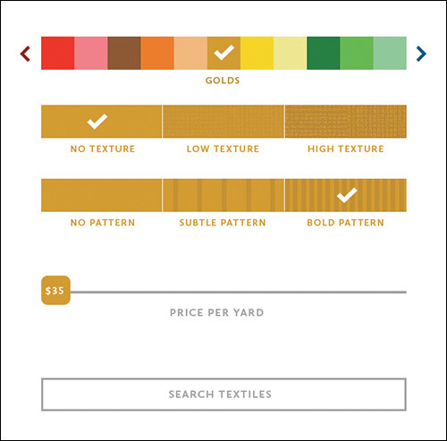
Figure 6.12 It would behoove you to mix in elements that can do the heavy lifting of conveying a theme.
Each project is different, so it’s up to you to determine which components can do the heavy lifting. It could be headlines, accordions, tabs, photo galleries, or forms. Who knows? You’re only a border, notch, or drop cap away from creating a signature pattern worth reusing throughout the design.
An important part of the shift from showing one direction to showing a few is proper setup. In the past, designers may have introduced multiple mock-ups as “options,” implying that one is better than the others and the others will be discarded. Instead, multiple directions within element collages don’t necessarily imply that all but one gets trashed. Redeeming qualities from less successful directions can still influence the end result.
With iterative design, your aim is to work toward a convergence of refining a solution. For CCM’s element collage, I described two directions for how we could execute their primary navigation: one bright but heavy and the other light but lesser in character. Although at the beginning of the conversation we collectively opted for the heavier option, CCM noted the value of the light option as something not to throw out entirely. It wasn’t until we were in the latter stages of designing a high-fidelity prototype in the browser that we recognized that the visual heaviness of the navigation outweighed its charm. Instead of defaulting to using our second exploration, we determined a way to adjust the first with the essence of the second (see Figure 6.13).
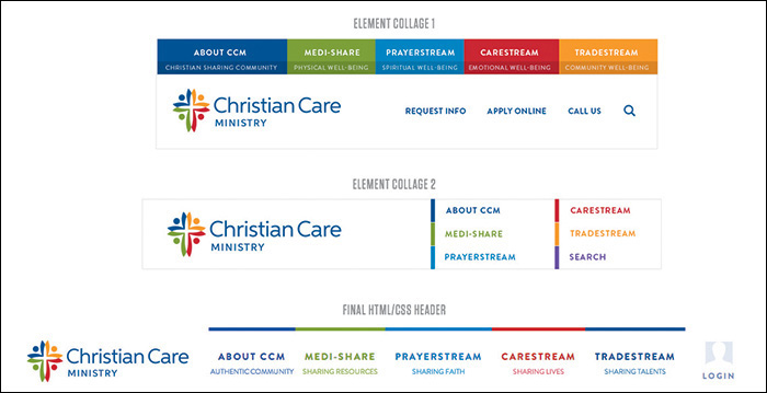
Figure 6.13 The progression of CCM’s header style, which ultimately used traits from both element collages
I mentioned that we presented two ideas for navigation style. For the components you want to show variations of, I recommend showing them in the same element collage. With the old methodology, in which each style direction had its own file, you could show two versions of an element in two files. But keep in mind that you aren’t presenting a complete direction for approval anymore. Hence, you need not isolate one version in an environment uncontaminated from another.
In fact, showing a client two versions of an element juxtaposed against each other is the most natural way to assess their value. The talented design studio Clearleft takes this approach in its impressively exhaustive element collages (see Figure 6.14). As designer Jon Aizlewood notes, including variation isn’t just about providing choice:
Figure 6.14 This is a lovely sketchbook of ideas and a much more robust element collage, wouldn’t you say? SOURCE: CLEARLEFT
“As far as its size, secretly I enjoy doing element collages more than detailed UI page design because they let you iterate through lots of different ideas quickly. You can avoid the standard constraints like screen sizes and page layouts and simply chuck things onto a canvas and see what works best.”
—JON AIZLEWOOD
Do Not Make It Look Like a Website
The risk we run in making comps like style tiles and element collages is that they can easily look like a website. But isn’t it supposed to look like a website, you ask? Aren’t we, um, making websites?
Sorta. First, allow me to explain why they might look like a website so easily. Full-page comping has trained us to work on canvases taller than they are wide. Heck, the Web is generally taller than it is wide. Naturally, when we begin stacking elements vertically, the composition begins to look like a website even if it’s not our intention. Clearleft ran into this problem when they presented the element collage shown in Figure 6.15.
Figure 6.15 Even if unintentional, it’s easy to make element collages look like page comps. SOURCE: CLEARLEFT
At a very quick glance it’s easy to mistake this collage for an actual page.
To circumvent this problem, Clearleft started laying out element collages extremely wide. Rarely would you meet someone who expects to scroll horizontally on a site, so it helped distinguish that this is a collection of ideas versus a specific page. Would you believe that sometimes that’s still not enough?
There are a few more things that can be done. We’ve started to show layouts in generic device frames right on the collage (see Figure 6.16).
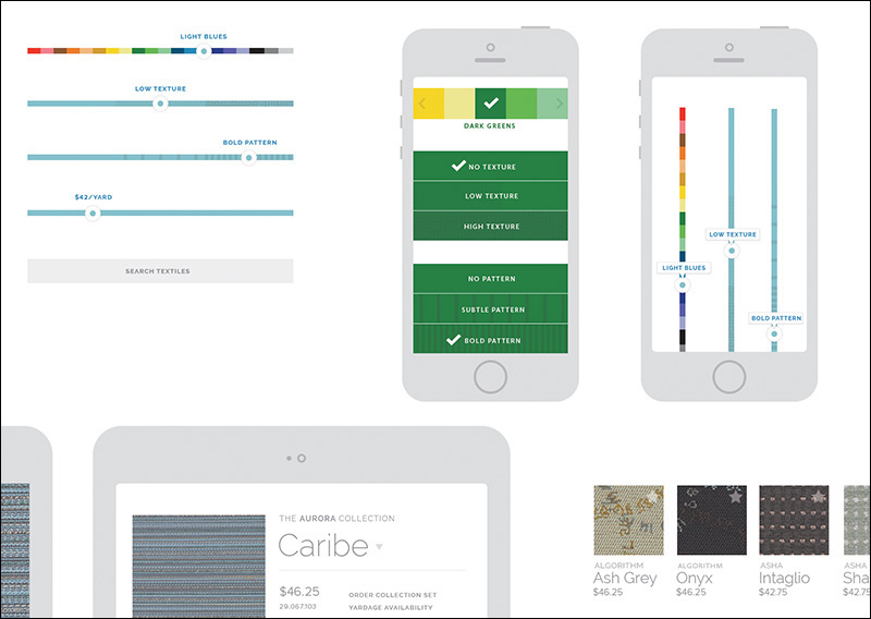
Figure 6.16 Nobody would realistically expect these devices to appear within page content, so they make great frames for our collaging.
The thought is that a client wouldn’t expect to see these kind of devices framing their content within the context of a page, unless you were pitching an app per se. Dan Mall takes this a step further and often shows actual hands holding real devices (see Figure 6.17).
It’s wise to consider any and every avenue that properly distances your collage from a page comp. Although you may still need to disclaimer your approach, avoiding confusion at this stage is critical.
Color Comparisons
A common exploration request during style ideation is to see how different color schemes would look applied to content. I’ve long contended that color is just as easy to explore in Photoshop than the browser, if not easier, given that the scope is small. Obviously, if you wanted to see how a shift in blue would affect multiple pages or elements, CSS is the way to go. If you want to shift the blue on a button or single instance, Photoshop is arguably your best bet.
Pittsburgh design shop Bearded has used element collages to assess color scheme (see Figure 6.18).
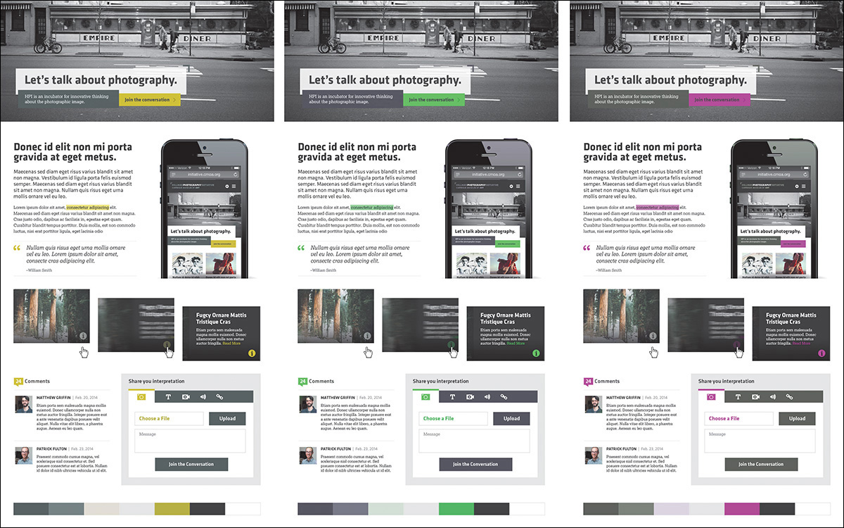
Figure 6.18 Publishing a few different color options with the same components can make for easy assessment. SOURCE: BEARDED
I hope you’re seeing how versatile element collages can be, given their smaller scope than traditional comps. You do plan on limiting the scope, right?
Scope Creep
I probably don’t have to explain how easy it is to go overboard designing element collages. They can quickly become detailed component libraries if you’re not careful. What starts out as an exploration of a few visual metaphors, navigation items, and buttons can grow into an exhaustive exercise in accounting for every interface element.
The chief reason why you want to avoid designing exhaustive systems in Photoshop is predicated on the “double effort” theory described in Chapter 2. Whatever you do in Photoshop will ultimately need to be redone in code.
Where do you draw the line? I’m not sure there’s a great answer that’s widely applicable, but I’ve always tried to imply the most by designing the least (see Figure 6.19). If you can communicate a complete design direction by presenting a few components, you’ve done your job. If you have to execute 90 percent of the components to illustrate a direction, you’re probably in the “too much effort” zone.
The inclusion of too many components can occur because of your own inclination or the request of your client. Either way, it’s a type of “scope creep” that you need to protect against. Element collages, like any other post-full-page comp strategy, need to be efficient. If it turns into another “Photoshop phase,” you’ve lost one of its main advantages.
Additionally, if there’s no cap on exploration, how can you accurately price what it will cost? You may not have to put a hard number such as 30 hours or $5,000 on element collages, but it’s irresponsible to imply that they’ll be an efficient part of the process and then turn around and spend the majority of the project budget on them. Everyone is different, so I won’t suggest a number of hours or rate you should charge for element collaging. However, it may take you a time or two to begin pricing them with accuracy.
Asking the Right Questions
As you saw with visual inventories, a major part of being successful in a responsive process is knowing how to ask the right questions. Structuring your conversations around useful feedback is the secret sauce to a successful project. If you fail to receive input from your clients, you can’t build out a design system with any more confidence than what you had prior to the exercise.
Let’s start with what not to ask: “Which one do you like better?”
“The client didn’t hire you to make something they liked, and something they like may not be the thing that leads to their success. So do not conflate the two. This point needs to be driven home from the very beginning of the project. And nowhere is this message more undermined than using language that leads them down a subjective path.”
—MIKE MONTEIRO (https://medium.com/@monteiro/13-ways-designers-screw-up-client-presentations-51aaee11e28c)
The previous question (and variations of it) does little to give you any useful input moving forward. Unless mapped to specific user objectives, clients will typically have a difficult time responding completely objectively. What’s worse, you’ll probably start down a road of refining a solution until they are fully subjectively satisfied with what they see.
That’s not what element collages, style tiles, or style prototypes are about. They’re about aligning visual ideas with a brand and its message in an effort to kick-start a direction. Said direction is further explored and implemented in the browser because that’s where you need to spend the bulk of your time in a responsive process. Refining an idea in Photoshop until it’s approved is the antithesis of what you want to accomplish.
Instead, you want to ask better questions:
How do you anticipate your end users would respond to this color/metaphor/direction?
What kind of adjectives would you use to describe what you’re seeing?
You stated you wanted your brand to align to [insert trait]. Which collage (or variation) is more successful in that regard?
The answers to these types of questions can help in the long run, well after you’re in the browser, filling out the design. The most important move you can make isn’t crafting clever questions that no one has asked your clients before but identifying the objective user and organizational goals, scenarios, and design principles before you ask anything at all. These items are critical to establish and necessary for challenging an element collage against.
Do Make It Look Like a Website
You also want to temper the expectation that any feedback received will be immediately applied to the element collage. Just as in the visual inventory, lead your client to anticipate how a direction will manifest in the final design: We’ll still be exploring, but it will be helpful to know if we’re on track with this approach. Remember, you’re looking for encouragement for the course of your design, not hard approval.
Arguably the best response will sound like this: “We understand there’s more to work out, but we’d be thrilled if our site was in this flavor.”
This response isn’t exclusive to your clients, either. It’s just as applicable to you and your team. If you can’t see how an element collage translates to a finished website, perhaps you need to include different or additional components.
Point of Reference
Responsive design can get messy. I don’t mean just in terms of components breaking from time to time; there are often situations where a lot of detail and focus gets put on one facet and not another.
For example, you may spend a good deal of time fine-tuning an off-canvas navigation function while overlooking the style of it. Perhaps it’s a component like tabs, something you bake into most projects and don’t give two thoughts about how to approach it any differently than the last time. Not only can this lead you into the trap of leaving some elements more considered than others, but it can quickly breed inconsistency in your UI.
For the record, I’m a staunch advocate of “working things” being superior to “pretty things.” Yet I’ve also found that later on in the workflow, when some facets could use a little TLC, it helps to look back to what was established in the element collage as inspiration. If you establish it as a document to truly carry the design direction, it probably makes sense to go back and look at it every now and then. I’m guiltier than most at establishing these kind of documents early and disregarding them later only to bang my head against my keyboard trying to ideate solely using CSS.
Just because you don’t have pixel-perfect mock-ups to provide a front-end development road map doesn’t mean element collages can’t be a valuable point of reference. They can and will if you continue to allow them to influence the entire design system moving forward. In fact, they also double as a great point of reference for your clients.
When questions do arise later, or differing opinions come into play, use the conversation that occurred around the element collage as a point of reference. For example, a stakeholder wants to change the hero image on the homepage to be a carousel of marketing news. This happens on every project, if you haven’t already established a carousel of marketing news as the prime element on the homepage. You could use user research, information architecture documents, and usability studies to support keeping it a static image instead of a rotating one, and you should.
You also have the element collage to point to: In the context of everything else we’ve explored here, we need the hero image to make a strong impact visually. Our concern is that we’ll only weaken its presentation by splitting its content up five times.
Where you may have created a component like this as a visual cornerstone of a direction, allow the element collage to support adhering to the spirit in which it was established. This helps communicate why breaking it up into five slides would be a departure not worth exploring.
I Still Can’t See It
You can follow everything in this chapter to the letter and produce a gorgeous element collage and still find yourself being asked to put together a page mock-up. You can communicate the disadvantages of full-page comps and still be requested to provide them. Don’t feel discouraged; this is normal! Why? Because responsive design is still new to all of us, and sometimes it’s hard to transition to a different workflow that everyone feels confident in.
So comp. Mock up any page or width that your team or clients are having trouble visualizing, as long as you have the time. I’ll even go further to say you should comp any page or part of a page you’re having trouble with yourself (see Figure 6.20). Do it for yourself.
Figure 6.20 I needed to be confident the top of this homepage would come together, so I made a comp. No big deal!
The difference here is found in the purpose. If you’re being exhaustive with full-page comping and using them to gain approval, it sets up some faulty expectations down the road. But if, instead, you use them as high-fidelity sketches to better visualize how a page, or part of a page, can come together, there’s little harm in this type of exploration.
There was a time where I had settled on firmly banishing page comps altogether. I’ve since noticed that might have been a bit rash and shortsighted. Yes, you can comp, but try to do so as efficiently and behind the scenes as you can.
Another strategy I’ve found helpful is to pair the presentation of an element collage with a gray-box, low-fidelity HTML prototype. The element collage acts as the inspiration for the style to eventually be applied to the prototype’s layout. Often what’s not being vocalized in these situations is that someone is having trouble visualizing the layout of the site if it’s not established yet. A simple prototype can supply enough layout intention without the fine-tuning of polished functionality.
What’s Missing
Now you’ve thoroughly vetted inspiration with visual inventories and ideation with element collages. Unfortunately, a responsive website you do not have. To quote the inimitable Bon Jovi, “We’re halfway there.”
Now it’s time to hop back out of Photoshop and into the browser for the nitty-gritty part of responsive web design: building the system.