Table of Contents for
Responsive Web Design with Adobe Photoshop
 Responsive Web Design with Adobe Photoshop
Published by
Adobe Press, 2015
Responsive Web Design with Adobe Photoshop
Published by
Adobe Press, 2015
- Cover Page
- Title Page
- Copyright Page
- Acknowledgments
- Contents
- 1. Photoshop’s New Groove
- 2. How Did We Get Here?
- 3. The Case for Designing in the Browser
- 4. A Plea for Photoshop–Browser Harmony
- 5. Vetting Direction
- 6. Establishing Style
- 7. Establishing the System
- 8. Getting Back into Photoshop with Page Layers
- 9. Extracting Your Way Out of Photoshop
- 10. Extending Photoshop
- 11. Remembering Etiquette
- 12. Adopting a Completely New Workflow
- Index
- Responsive Web Design with Adobe Photoshop
2. How Did We Get Here?
The year 2001 was the year I used Photoshop for the first time. I was just one of some 20-odd teens sitting in Mrs. Borges’ electronic design class in a rural Connecticut high school. I’m fairly confident my maiden Photoshop voyage was designing a CD cover for my self-titled album, Rapmasta D. Let’s just leave it at that.
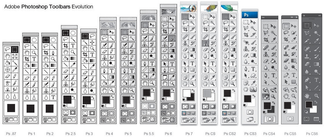
What is worth recalling is how vividly I remember the Photoshop 6 startup screen. The image was a goldish collage of a starfish, a floating eye, and some leaves. Chances are you have fond memories of the splash screen, toolbar, or application icon for the version you learned on too (see Figure 2.1). Although most of us can’t recall the first version of most software we’ve used, there’s something about Photoshop that tattoos itself on our minds. I suppose it’s always been the iconic design program, and today you’d find little argument against that claim.
How We Used to Know Photoshop
There’s a funny thing that happens when I talk about learning on Photoshop 6. It’s not very long before someone chimes in that they started with Photoshop 5. Another interjects, “4!” Then there’s the person who matter-of-factly comments, “I’ve been using Photoshop since it came out and have the floppy disk to prove it.” You know the person. Everyone knows that person. Our own version of adoption has become something of a merit badge. No doubt you’ve had similar conversations or know someone who can “trump” your Photoshop history.
Web designers exhibit an undeniable pride about how long they’ve been using Photoshop, more so than any other tool and possibly any browser. It’s this pride that’s sparked an uncanny fandom. Photoshop-related fridge magnets, pillows, mugs, and tons of other doodads have adorned workstations over the past 20 years. Heck, you know you’re a Photoshop fangirl when you get the toolbar tattooed to your forearm (see Figure 2.2).
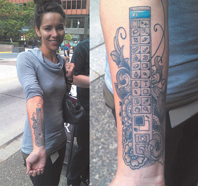
Figure 2.2 Impressive dedication (though difficult to update) SOURCE: BLOGS.ADOBE.COM
Most of us “grew up” as web designers by honing our Photoshop skills. It’s not that there weren’t alternatives; then-Macromedia Fireworks and Corel Draw had followings of their own. But by and large, the preferred software of design practitioners and educators was Photoshop. Web design curriculums were often structured around teaching its fundamentals.
Quite simply, Photoshop has historically been seen as an integral part of web design by those both inside and outside the industry.
That’s what makes the recent falling out of favor so interesting.
The Faults of Traditional Photoshop
After you start Photoshop, what’s the first thing you do? For most of us, it looks something like Figure 2.3.
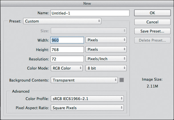
Prior to responsive web design (RWD), we made many reasonable assumptions about how our site would be viewed. Most likely, someone was viewing it on a desktop monitor with a resolution of 1024×768. They were using a mouse. Their experience wouldn’t start or continue later a smaller mobile device. And so, with that relative confidence, our new document’s width was 960px (allowing a little breathing room with 32px of padding on both sides of the screen).
Perhaps you still use 960px as a starting point. What do you do when the viewport gets smaller? Or bigger? The Web should be adaptable to any and all sizes, a concept introduced by John Allsopp in “A Dao of Web Design” (www.alistapart.com/article/dao/) in 2000 and reinforced by the mobile device explosion in recent years.
The ubiquity of the Web amplifies the absurdity of entering dimensions for a new document in Photoshop. And if we dig a little deeper, the root of the problem lies in what we set out to create in Photoshop: a brief snapshot in the continuum.
On Full-Page Comps
The most significant change in the way I’ve used Photoshop over the past few years has been to stop making full-page comps. I define a full-page comp as a mock-up of one page at one size. A prime example would be a homepage comp at 960px. It’s a practice many of us have employed for years, and surprisingly, lots of us still do. In a poorly contrived Twitter poll, I found that 72 percent of designers use full-page comps in their RWD process. That majority suggests one of two things: Mock-ups remain a completely viable exercise, or 72 percent of designers have yet to embrace a more sensible workflow.
I tend to believe the latter.
Where Full-Page Comps Made Sense
Let’s go back to why this method made sense pre-RWD. In a typical design workflow, someone (usually, but not always, a designer) would create a set of wireframes. Because wireframes often lacked any style considerations, there was a need for a deliverable that acted as a bridge to the development of the site. The next logical step would often be to create a “desktop”-width Photoshop document based on the wireframes, complete with all the intended styles. The set of PSDs would consist of just a few pages (homepage, landing, and interior) or the whole lot. I can see you nodding your head, as if you’re all too familiar with this process.
The primary goal of these full-page comps was simple: to get client approval. In doing so, the design team was authorized to continue developing what they’d mocked up while the client had reasonable confidence looking toward the finished product. The result was a complete bridge from wireframe to development, meaning the project could move forward. Mock-ups provided an answer to the all-important question of what the website would look like without ever needing to write a line of HTML & CSS. Conversely, the environment of Photoshop can be conducive to adding detail at the cost of hours, weeks, and months.
A secondary goal of design based on mock-ups is to establish design intent for the development phase. Much like blueprints outline the house plan for a contractor to follow strictly, PSDs are often regarded as equivalent to front-end developers. Did you measure the padding within that button? Are you using the right blue for the headings? Did you export the repeating background image? Developers can find all of these answers by referencing the all-encompassing PSDs done at the beginning of the project.
Where Full-Page Comps Go Horribly Wrong
Suffice it to say that the practice of design based on mock-ups enabled two things in regard to communication: the noncoding designer and the “throw it over the wall” workflow.
Let’s tackle the code-averse designer first. The Photoshop environment provides a safe haven for those not wanting to test the coding waters. Think about it: You can spend a significant amount of time detailing what a website should look like without ever needing to worry about how it actually functions, whether it breaks in older browsers, or whether renders your type poorly. Surely my sarcasm isn’t lost on you.
Fundamentally, code is the language of the browser, and the browser is the environment where your design lives. Even if we’re just assessing one screen width, how it functions, breaks, and renders should each be reason enough to become more familiar with how code works and is supported (or not). The issues are compounded only when we start to account for multiple screen widths. No longer can we blindly design sites without knowing how they’ll translate to dozens of browsers and hundreds of devices. Producing comps in Photoshop, which is neither a browser nor a device, doesn’t give us much insight into this matter.
The second egregious act of full-page comping is what’s commonly referred to as the waterfall method. This typically starts with a team member creating static wireframes and passing them along to a designer, who makes a mock-up and then sends it down the line to a developer to code. This is referred to as “throwing it over the wall,” which is sometimes literally the case in a cubicle setting. I’ve always thought that there’s an incredible collaboration opportunity missed here. Instead of the developer providing programmatic insight that might affect the design while it’s being created, the developer receives a facsimile to reproduce in code after it’s done, approved by the client, and not expected to change. The emphasis should be on the importance of a designer and developer being part of all phases of a project, especially when so many screens and devices are involved.
One Size Does Not Fit All
Having touched on internal communication, let’s shift gears to how we discuss full-page comps with our clients. To deliver a mock-up is to deliver an assumption. Dan Mall, art director and designer, puts it this way:
“By default, presenting a full comp says to your client, ‘This is how everyone will see your site.” In our multidevice world, we’re quickly moving towards, “This is how some people will see your site,’ but we’re not doing a great job of communicating that.”
—DAN MALL, “The Post-PSD Era” (http://danielmall.com/articles/the-post-psd-era/)
It’s hard to fathom any single browser rendering a design exactly like Photoshop does. Type differs based on the operating system and the browser, colors may shift depending on the screen, and then there are pixel density and resolution to consider. How bold is it, then, for designers to tell their clients, “This is how everyone will see your site”? Or how about trying to explain, “This is how some will see the site, and for some others it will be slightly narrower but not narrow enough for the navigation to break, but just imagine the tabs changing format and the footer becoming stacked vertically. Are you following me, client?”
The fact of the matter is, faulty communication is just one of the pain points full-page comps present—one of many, unfortunately.
Pain Point du Jour
Even the most unseasoned designer can attest to the parade of frustrations with every use of Photoshop. To be fair, there’s an important distinction to be made yet again. The struggles we have with the process aren’t necessarily the tool’s fault, though there are a few we can accuse Photoshop of to be certain.
Whether you’re running into these daily or every so often, you can find the following pain points on every “anti-Photoshop for RWD” manifesto.
Fixed-Width Comps
No doubt, this is the most obvious barrier to using Photoshop in an RWD workflow. The challenge becomes, “How do I generate enough fixed-width, static comps to convey a fluid layout?” The answer, quite simply, is, “You can’t.”
Let’s break down why designing multiple fixed-width comps isn’t the most efficient or accurate idea.
Three-Breakpoint Trap
A popular approach, and one I used to subscribe to, was that in order to suggest a responsive layout, I needed to make three versions of each page I was designing. I needed one at 960px for desktops, one at 768px for tablets, and one at 320px for smartphones. Sound familiar? Somehow, someway, those breakpoints were accepted as ironclad standards. Come to think of it, we know the reason: Apple.
The 960px width related to a 1024px desktop with some padding on the left and right, the 768px aligned with the original iPad in portrait mode, and 320px was the pixel width of the original iPhone (also in portrait mode). Though it has a considerable market share, Apple isn’t the only game in town when it comes to devices. If our goal is to design for inclusivity, embracing the diversity of screens our sites will be viewed on, it’s hard to justify these breakpoints being the only ones that matter.
Now, you might counter that notion with, “All smartphones will generally be around that size.” Not only are we seeing smartphones that are much larger than 320px wide, but I think we do our designs a disservice by dictating adaptation only at predetermined breakpoints. Personally, I prefer to add breakpoints where the design is becoming stressed. Figure 2.4 shows an example of main navigation at 960px wide3

As the browser gets smaller, there’s still plenty of room for the navigation to appear. In fact, it could fit at 768px just fine (see Figure 2.5).
It truly gets stressed only at 657px (see Figure 2.6).

At that point, I think it’s appropriate to add a breakpoint so we can tuck the navigation behind a trigger to expose it off-canvas. Would it have been the worst thing to add it back at 768px? Maybe not, but we’d be penalizing anyone with a device width between 680px and 767px by hiding the navigation when we didn’t have to do that. To that point, the navigation might be the only thing changing at the 680px breakpoint because it happens to be the only one under stress, so why change every nonstressed element then? Hence, we employ as many breakpoints as we need based on how individual elements react to the screen width.
Why is this important? If we’re using predetermined breakpoints to design comps, we’re not allowing the design to adjust when it needs it. In Photoshop, it’s awfully hard to know at what point design elements will get stressed in the browser and require change.
All the Comps!
The number of full-page comps can have a considerable impact on a project’s timeline. The more you wish to show prior to development, the longer you delay moving to an environment where your design can be tested. Project time needs to be spent wisely.
For example, a client of mine wanted to know exactly how long the design process would take before I could start developing. I came to the conclusion that I’d need 20 page comps to feel comfortable moving ahead with code, and that it would take over two months to design them. The client scoffed until I spelled out exactly how many templates and screen widths needed to be considered.
It’s easy to get bogged down making edits to comps, round after round. Even so, making a static representation of each page at each size does not guarantee the design won’t break somewhere. The complexities of a responsive website build demand that you spend more time testing than you did on your fixed-width sites.
A folder’s worth of page comps is also problematic to maintain. Having to make navigation edits across 20 comps is less than desirable. Being aware of the production effort is a good place to start. It’s worth your while to look at the number of comps you typically produce just to present one stylistic direction (see Figure 2.7).
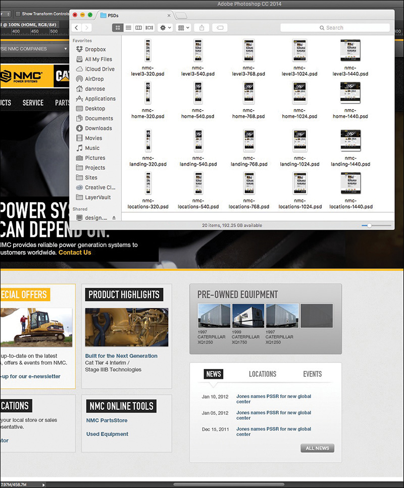
Figure 2.7 Is it me or is that a lot of comps? This still may be only a fraction of the comps created for some projects.
Whatever final number of comps you arrived at, imagine if we had to create three different directions for each. See my point?
Tip
If you’re trying to maintain shared content across multiple PSDs, Photoshop CC can help. With External Smart Objects, any changes you make will be reflected in any PSDs that reference them. While it won’t help with any width-specific layout alterations you need to make, it’s useful for things such as color and text changes.
The sheer effort involved with making fixed-width, full-page comps is significant in terms of time and money and potentially your sanity. Don’t forget to make some comps of what these pages will look like on the CEO’s “phablet!”
Lack of Interactivity
Static comps are, well, static. Without the help of the browser, there’s no interacting with flat elements. The client asks, “What does that button do?” You reply, “It goes to the product detail page,” as you shuffle through files to find product-detail.jpg. There are some ways around this that we’ll explore in Chapter 10, but for now we’re still stuck designing for an interactive medium via noninteractive deliverables.
“It’s time to stop making pictures of websites and start designing all aspects of the user experience simultaneously and in a practical way.”
—STEPHEN HAY (Responsive Design Workflow)
States
A considerable layer of design is lost when you can’t show hover, active, and focus states in proper context. Often, we make extra JPEGs, turning on and off layer comps to achieve the right series of “states.” Like everything else, the task becomes more complex the more screens we start designing for. It’s simply not natural nor is it practical to expect to be able to account for every behavior and interaction statically (see Figure 2.8). We should be able to convey basic state changes without needing to string together multiple files. We’re asking our clients to suspend reality and embrace the façade of the static instead of immersing them in the interactive.
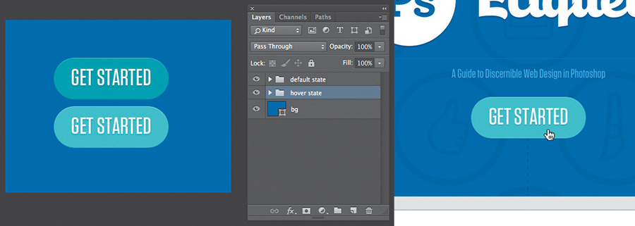
Figure 2.8 Photoshop (left) takes twice the assets, and effort, to pull off a simple hover done once in the browser (right).
Movement
Interactivity isn’t relegated to rollovers either. CSS3 and JavaScript give us the tools to transition, transform, and animate to enhance interaction. I’d argue that these facets have become just as much part of “design” as colors and type. They contribute to the feel of a site in ways that other content can’t. To put them off until the development phase seems to be leaving a lot on the table.
Every motion needn’t be figured out at the infancy of a project, but the earlier you can introduce movement conceptually, the better. Here’s an example: “You see this section? It’s going to gracefully fade in from the right when you scroll down to it, calling attention to itself.” Being able to show an idea like that might deter a request to make the hypothetical section bigger or bolder so it stands out on its own. Even the crudest of HTML prototypes can do a great job here.
I’m just not sold on the idea that we can convey movement well in Photoshop comps.
Fixed Positioning
Web designers—myself included—often abuse it, but I freely admit that I love using “background-position: fixed.” Why? It’s an easily executed technique that can add a great deal of depth. Typically it’s used on large, “hero” background images, but the effect is unmistakable: The content above and below it scrolls by while the background stays anchored to the browser. It’s a great method for layering sections and introducing some depth without necessarily needing shadows. The problem is, it’s nearly impossible to suggest in a static comp.
For that matter, fixed positioning of nonbackground elements also falls along the lines of scrolling interactivity that can be produced only in the browser. It can be mocked up to an extent, but again, it’s nearly impossible to communicate the feel it brings to a page. More importantly, fixed navigation can provide increased utility to the user, another benefit that can get lost in translation when presenting a static JPEG.
Some Fonts Are Better Than No Fonts?
The rise in support, and popularity, of web fonts in the browser has been one of the most welcome features for designers in recent years. With that came an interesting paradigm shift. We went from having all the permissible “web-safe” fonts on our desktop to a countless number stored online. Subscription services have libraries of thousands, yet because of licensing, it’s not feasible to have them all available in apps like Photoshop. It’s kind of a bummer knowing what font you want to use and being able to use it in the browser but not while you’re designing a comp.
The good news for Photoshop CC users is that it integrates the popular web font service Adobe Typekit. This is huge because experimenting with fonts is essential to the practice of creating full-page comps.
The problem remains that not every font available to you on Typekit is licensed to sync on your desktop. If you use a different service, like Cloud.typography from Hoefler & Co. (www.typography.com/cloud), you can’t use their fonts anywhere but the browser, unless you happen to own a desktop license as well. Font foundries and subscription services have made huge leaps to help Photoshop users experiment with fonts. However, because of licensing conflicts, all the fonts we can get in the browser aren’t available to us on the desktop.
Rendering
Another common pain point when working with type is how it renders. Historically, type set in Photoshop looks different from how it looks in a browser. What’s worse, if you’re working on a Mac, there’s no easy way to preview what type might look like in a Windows browser such as Internet Explorer. Why is that important? Have you ever completed the majority of front-end development, curiously checked how things looked in IE7, and realized that the font you chose was chunky and barely legible? The further you go in the process with a font, the harder it is to make a hard pivot and go with a substitute.
Photoshop CC users do have one nifty option of helping preview system rendering. In the lower right of the Character panel, you’ll find the usual anti-aliasing options. Sharp is usually selected by default, though you may have opted for Smooth at some point. You should see a new option called Mac LCD, which will mimic how the system renders fonts. I’ve found it to be comparable to WebKit browsers such as Safari and Chrome. Again, the only problem is the lack of diversity: There’s no setting close to what Firefox tends to do (it seems to make everything a bit bolder than other browsers) or any Windows options.
The Big Reveal
You’ve just completed the wireframes. Now it’s time to turn those puppies into pixel-perfect comps. Excitement abounds as you take the next month to nail every detail of every page. Then again, given that you should probably show three different options for each, you might want to allow two months. Either way, this is what being a designer is all about: putting your head down and getting creative!
Then the time to present arrives. Butterflies. Will they love it? I hope they don’t pick Option 3 since we rushed that one last week just so we’d have three to show. “OK, client, what do you think?”
“Let’s go with Option 3. I like blue!”
Our tendency is to blame our clients at this point for having poor judgment. Sure, you poured your heart into Option 1 and slaved over the color palette for Option 2. But the last thing they saw two months ago was a gray box wireframe, and now they have these incredibly detailed comps to peruse. Their initial responses might seem a bit scattershot: “Where’d the phone number go? Cool carousel! Looks like they misspelled Johnson’s alma mater. Hey, look, my favorite shade of blue!”
Full-page comps typically present our clients with a ton to digest. Content, style, and layout are all being assessed while we’re just hoping they don’t pick Option 3. The notion that we designers go behind the curtain and work our “magic” to blow everyone away with these comps is what’s referred to as the big reveal. We bombard our clients with meticulously detailed mock-ups with no natural transition from a wireframe void of fidelity. Often the result is an overwhelmed client choosing what looks the most favorable to them: complete subjectivity.
“Photoshop puts the focus on production, not productivity. Photoshop is about building something to look at, not about building something you can use.”
—JASON FRIED (www.signalvnoise.com/posts/1061-why-we-skip-photoshop)
You’ve also just spent months producing two other directions that were shot down. That’s yet another blow to the efficiency you were seeking.
What Did You Expect?
When we set out to make full-page comps, what we aim to communicate is expectation: This is what the home page will look like. This is what the fonts will look like. This is what the site will look like on a phone. I hope I’ve illustrated some reasons earlier in the chapter why these aren’t the most accurate statements you can make, but there’s one more point to be made on the topic.
We simply can’t deliver on the promise that a representation of a site done in Photoshop will render the same way in every browser. There are too many quirks to level the playing field. The easiest example is the difference between modern browsers that support CSS3 and older ones that don’t. Whenever we use a fallback method to achieve an effect in an old version of Internet Explorer, how can we guarantee it will look exactly like our PSD? How meticulous would we need to be to make sure every element has the same amount of margin and padding in Chrome that it does in IE6?
Presentation Woes
How do you typically present your design concepts? Do you email your client a ZIP file? Do you pull up JPEGs and share your screen or project on a monitor? What assurances do you have that your design is viewed at 100 percent and not zoomed in or out?
For the longest time, I would place my comps in an empty HTML page and hack together some background repeater to give the impression you were looking at a real site. You see, the browser was a natural fit because it not only ensured viewing at 100 percent but seemed like the appropriate habitat for a website comp. It worked pretty well until I needed to show narrower comps at different breakpoints. The song and dance behind pulling up specific links on specific devices just to show a comp was pretty silly and felt like more work than it was worth.
Once, I had a client print out all the JPEGs I sent so they could make notes on them (see Figure 2.9). OK, maybe that’s more like every time except once. It’s almost as if they don’t believe what I’m showing them is a real website, no matter how many disclaimers I throw at them: Obviously you can’t click anything but.... The background will continue to the full width of the browser if you can imagine it.... It’s hard to tell now, but the navigation will stick to the top of the page as you scroll down....
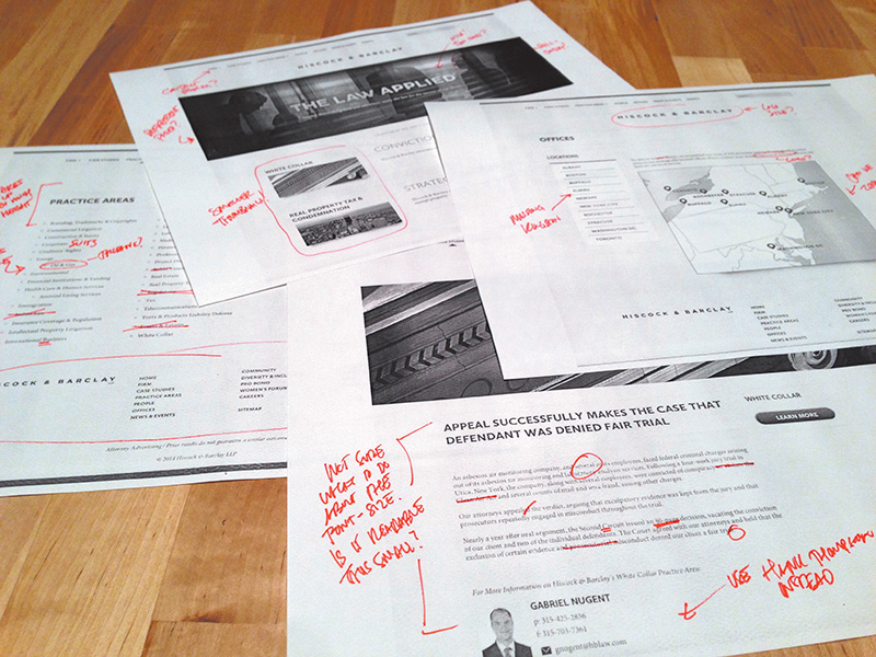
Figure 2.9 Truly an artifact from print design. There are better, more environmentally friendly options out there.
There’s clearly something missing here in terms of presentation. The goal should definitely be to show our designs in the environment in which they’ll live, but at what point do we just relent and develop the darn thing?
Tip
There’s no shortage of tools to annotate design in the browser, and RedPen (www.redpen.io) is currently my favorite. Simply upload your comp to the site, and it produces a link you can share with your team or client. You can even receive email alerts when someone has contributed a comment.
One of the major advantages to designing in the browser is the ability to make live changes on the fly. Want to try the buttons in red? It’s the difference between editing a few lines of CSS (or one in Sass) and choosing every button on the comp one by one, editing the color, and exporting. With code, the change is reflected everywhere it’s referenced. Many a designer has flipped many a table having to change a color or piece of text across ten different PSDs. Even if it’s not for the purpose of showing a client during a presentation, this kind of off-the-cuff editing is beneficial for internal critique and ideation.
Bound by Approval
How do you assess whether a design is good? If design is how it works, we can’t properly assess it without building it (see Figure 2.10). We could hack our way to suggesting functionality through a series of mock-ups, but not only would we continue to pile on the heap of comps we’re making, we wouldn’t get genuine interaction. How smooth is the drop-down when triggered? Do the in-page search results load quickly? Will the parallax be off when I scroll? (It will, by the way.)
Figure 2.10 Good design takes details such as transitions and animation into account. For example, when Apple updated its website, it updated the animation of the product bar to be more subtle, matching the tone of the UI. That’s hard to show in Photoshop.
The trap we often fall into is waiting until a client signs off on a comp only to notice in development that something significant needs to change. Sometimes it’s because of a lack of communication with those developing our designs, but it can just as easily be something nobody saw coming until you start to test it in a browser. For me recently it was designing some spiffy circular avatars for employee profiles. Everyone seemed to love the style, easily achieved with border-radius and some box-shadow settings. But it wasn’t until much later when we realized the portraits to be used weren’t square like in my example but all different heights and widths. We could get close but eventually ruled in favor of nixing the circle approach.
Good design is tested and vetted. It’s incredibly difficult to prescribe a solution without any assurances that it will hold up in the medium it’s destined for. Approved static mock-ups typically don’t allow the flexibility to explore design alternatives when you hit a snag in the development process. Rest assured, you always hit a snag in the development process. If you’re looking for an example, consider those times when you didn’t use the worst-case-scenario text length in your comp only for it to break the container in development.
Not So Stable
If I had a nickel for every time someone tweeted a complaint about Photoshop crashing....
Don’t get me wrong—complaining about a Photoshop crash is a rite of passage for web designers, and deservedly so. Forget to save? Attempting Save for Web? Any time you see that pinwheel of death pop up, odds are it’s all over but the crying. While I’ve personally seen fewer instances of Photoshop randomly crashing on me since upgrading to CC, there’s no guarantee it won’t happen at a crucial time. Does that mean you should stop trusting Photoshop? Perhaps, or maybe it means you should develop a swift Cmd-S (Mac OS)/Ctrl-S (Windows) reflex every 30 seconds just in case.
One of the main culprits of performance trouble derives from the fact that Photoshop gives web designers considerably more options and features than we would ever need. Liquify filters? 3D options? I can’t recall ever needing them to design a footer. The weight of the interface options within Photoshop make slimmer, web design–focused apps attractive by comparison, no doubt.
Computer running slow? Isn’t our first reflex to quit Photoshop? Granted, it’s a powerful tool, but, boy, does it take up the lion’s share of system resources to run.
Less-Than-Seamless Exporting
If there’s one aspect of Photoshop that causes more headaches than the others, it’s “How do I get this stuff out of my PSD?” The option Save for Web is historically the best bet, but it requires some prep such as cropping or slicing. Even when everything is ready, the patented Photoshop Color Shift option drives many of us off the deep end. You know the one: In your PSD it looks blue, but in your exported PNG it’s green (see Figure 2.11).
Figure 2.11 I’ve seen 30 solutions to the classic color-shift problem, yet none of them seems to work reliably.
In recent years, I’ve tried to circumvent the Save for Web process by using CSS3 to implement shadows, rounded corners, and more. Unfortunately, rare is the case that I can design a website without ever having to export a background image at the least. It’s inevitable that asset creation will likely remain reason enough for keeping Photoshop in the fold, but that doesn’t mean exporting is quick and easy (see Figure 2.12).
Thankfully, in Photoshop CC Adobe introduced Generator, an extension that makes exporting assets from a PSD easy-peasy. If you’re not familiar with Generator, there’s a lot it can do, so much so that I’ll spend a good chunk of Chapter 10 demonstrating it.
Empty Your Pockets
The cost of Photoshop is not insignificant. In fact, prior to Creative Cloud, a new copy of Photoshop cost about $700 if you couldn’t upgrade or cash in on an educational discount. Compare that to tools like Sketch ($79.99), Pixelmator ($29.99), or Gimp (free), and it’s apparent why the competition is attractive.
Easing the sticker shock, Creative Cloud not only provides Photoshop for a manageable monthly fee ranging from $10 to $50 but also gives you access to the entire suite of Adobe apps. Granted, if all you use is Photoshop, it will only take a little over a year to hit that $700 mark again.
Double the Effort, Double the Pain
One of the more hotly debated pain points of the PSD-to-HTML process is that you’re essentially doing the same work twice. By making a static representation of a website, you’ll inevitably be reproducing it in code. Why not start there in the first place?
For those on the pro-PSD side of the fence, the counterargument is that code is a bit abstract to manifest design. The ability to easily draw elements and shift their position and appearance without consequence isn’t just a luxury but a necessity. Furthermore, those in the “pixel-perfect” camp prefer honing in on design decisions prior to code, as you’d expect.
While some would say, “Let’s keep it rough and clean it up in the browser,” pixel perfectionists would suggest that Photoshop is the better environment for evaluating and executing detail. In the former scenario, the refining depends on good designer/developer communication, whereas the latter continues to put design in a silo. Either way, establishing a picture to be re-created in code requires an additional amount of effort.
I stand firm against full-page comps. There are too many tasks I can create in the browser just as easily as Photoshop to make the extra time investment worthwhile.
If Not Photoshop, What?
In a search to ease the pain of a Photoshop-centric process, some have tried using other design apps, abandoning design apps altogether, or ingesting a large amount of aspirin. The most important thing is to realize when your workflow isn’t making sense and seek adjustments and alternatives. Too often I talk to friends who acknowledge the conflicts I’ve described but relegate themselves to accepting them.
If you agree that producing full-page comps is problematic in an RWD workflow, you’re clearly not alone. However, all too often the blame is placed on the software when it should fall squarely on the technique. That’s like bashing in nails with a hammer and then blaming the hammer for not extracting them. All it takes is using the hammer differently to extract the nails, silly goose.
If you use Sketch, Pixelmator, Fireworks, or Microsoft Paint instead of Photoshop, I think that’s fantastic. However, if you use those programs to create full-page comps, you’ll run into the same problems. No matter how efficiently you can create them, static mock-ups still suffer the ills outlined in this chapter. In this, though, we find a new hope for the continued use of Photoshop in an RWD workflow, so long as we pledge to walk away from these detailed comps.
The anti-Photoshop brigade has little to stand on outside of preference. The people against full-page comps? Tons. That’s why we need an alternative to the technique, not the tool.
All those voices clamoring for designing in the browser might be onto something.