Table of Contents for
Responsive Web Design with Adobe Photoshop
 Responsive Web Design with Adobe Photoshop
Published by
Adobe Press, 2015
Responsive Web Design with Adobe Photoshop
Published by
Adobe Press, 2015
- Cover Page
- Title Page
- Copyright Page
- Acknowledgments
- Contents
- 1. Photoshop’s New Groove
- 2. How Did We Get Here?
- 3. The Case for Designing in the Browser
- 4. A Plea for Photoshop–Browser Harmony
- 5. Vetting Direction
- 6. Establishing Style
- 7. Establishing the System
- 8. Getting Back into Photoshop with Page Layers
- 9. Extracting Your Way Out of Photoshop
- 10. Extending Photoshop
- 11. Remembering Etiquette
- 12. Adopting a Completely New Workflow
- Index
- Responsive Web Design with Adobe Photoshop
5. Vetting Direction
Ordering takeout always provides great respite from having to cook another meal, so naturally it’s an exciting event in my household. If you’ve ever been the one responsible for organizing the occasion, I’m sure you can relate to the following exchange:
Me: “What do you want to get for dinner?”
My wife: “I don’t know.”
Me: “How about pizza?”
My wife: “Eh. We just had pizza the other night.”
Me: “Chinese?”
My wife: “We always get Chinese. I want something different.”
Me: “Mexican?”
My wife: “...”
Me: “Barbecue?”
My wife: “...”
(long pause)
Me: “Pizza?”
The point I’m trying to make isn’t that my wife is a picky eater because when the roles are reversed I find myself responding the same way. It’s natural to want to know the options before committing to ordering takeout. Chances are there’s something you can rule out immediately. Then there will be a few options you’re just not sure about. Rarely will anything sound amazing, but eventually you’ll settle on something that “feels right” at the moment. This is life.
The Contrast Conundrum
The best thing I can do as the organizer is to offer contrasting options. If pizza gets an unfavorable response, following up by naming 70 pasta dishes might be a frustrating way to find out she’s not feeling like tomato sauce tonight. Suggesting Chinese starts to broaden the landscape of possibilities.
Your clients and stakeholders appreciate being presented with contrasting options, too. With so much to do in a responsive project, you need to be efficient in presenting options while also being aware that subjective views don’t always make for the best designs, either. Up until now, I’m not sure that we, as designers, have always recognized that.
The Comp Approach
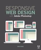
Traditionally, designers have shown options across three full-page Photoshop comps. The directive I always received prior to making three comps was to make sure each was noticeably different from the others. The elements could stay the same, but their styling needed to be unique (see Figure 5.1).
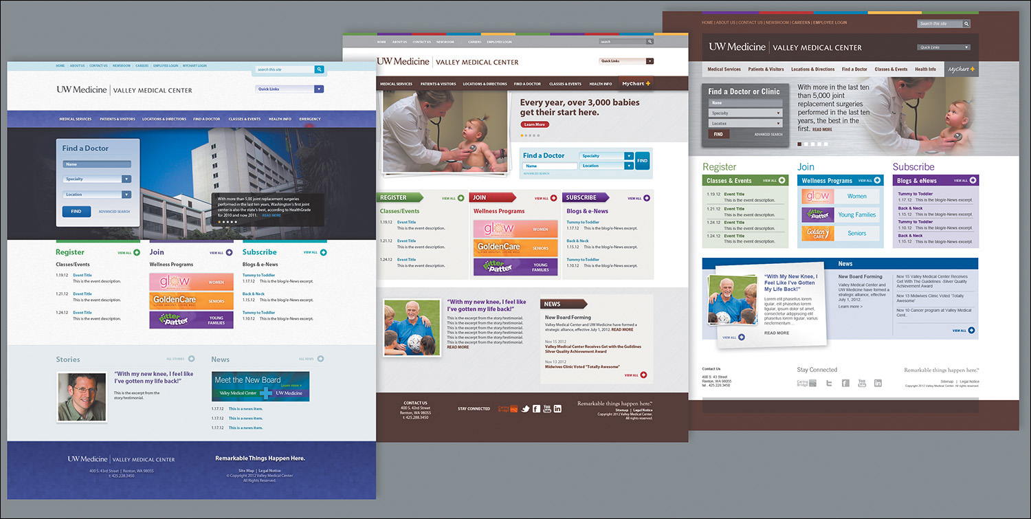
Figure 5.1 Option 1 (left) was always my favorite, Option 2 (middle) was acceptable, and Option 3 (right) the direction that took into account client requests. Much to my dismay, Option 3 always won.
For the most part, getting a client to agree to one of three directions has a high success rate, at least in my experience. On the flip side, three flavors of comps is a bit more effort than most would prefer, only to eventually have two of them trashed. In recent years, I’ve noticed the rising popularity of presenting just one direction to mitigate this expected loss. The idea here is that you can will the design direction by starting with your recommendation and revising it based on client feedback.
I adopted a one-direction approach for a few years before noticing patterns in the feedback I was receiving. I was getting significantly more style prescriptions than I expected. Can we change this to green? How about we add some depth in this background? Can you try seeing how it looks in a sans serif? I began to feel offended. My reaction to was appease their requests with a “I’ll show them how bad this looks” attitude.
They always liked seeing their suggestions. Go figure.
Within the Realm of Possibility
The root of the problem had little to do with establishing my design credibility over theirs. It’s likely your clients will defer to your decisions, but they’ll feel more confident when they can see the possibilities first. If you think about how this applies to style, it’s all about presenting contrast.
Why was it so important to establish three unique directions in the first place? In doing so, you established contrast from one to the next, essentially showcasing the spectrum of possibilities worth critiquing.
You need to use contrast in order to properly vet style direction because without it, you have only one possible solution. Consequently, exploring multiple style directions helps keep you in check. Too often, designers put their heart behind a single approach too early in the design process, without giving due diligence to other viable solutions.
It may not be your preference (or mine, for that matter), but it’s necessary to present contrasting style directions.
At the time I was debating the merits of presenting a singular style direction versus multiple approaches, my design director at WSOL, Dennis Kardys, had me watch a presentation given by Microsoft principal researcher Bill Buxton based on his book Sketching User Experiences (https://vimeo.com/5189134). Buxton puts this “exploration of alternatives” concept frankly.
“When I come in with five [ideas] and I haven’t made up my mind [about favoring one], guess what? I don’t care. You can get rid of it; there are still four left.... If I come in with one idea and you criticize my idea, you’re criticizing me.”
This comment was made in reference to the internal design process and thinking at Microsoft. The same can be apply to your own approval processes, including interactions with your clients. To be truly effective, you must have transparency in your design workflows, and that means involving your clients.
Including Your Stakeholders in the Design Process
The important lesson I’ve learned, and am still struggling to apply, is that it’s disadvantageous to take away choice from your clients and stakeholders. That’s because it’s not so much about giving choice as it is about inclusion in the design process.
In my experience, clients appreciate taking a role in the design process that’s more active than simple approval. I’ve yet to encounter a client who’s requested that I show them less work or just fully polished work. Sharing your thought process and how you develop your ideas should help your clients understand the rationale behind a design more completely than a wireframe-to-comp process would.
This transparency does come with a critical shift away from the traditional roles you and your clients may be familiar with. They are allowed to partake in the inner workings of the design process, but they are not there to approve or disapprove of your individual design choices. Rather, your client’s role is to supply more insight into their organization and industry and approve or disapprove the course you’re on as you work through the design.
No longer can you view the role of the client as an annoying but necessary gatekeeper that you involve when it’s convenient. With so many considerations in play when you’re designing responsively, you need your stakeholders to be deeply involved and make sure you’re on the right track. If you go too far before showing them anything, you’ve wasted valuable time and resources. You need your clients to be valuable contributors. As such, you’re looking for a “keep going with this” instead of an “approved—make it so.”
The primary difference between “keep going” and “approved” is expectation. The former suggests that what’s shown isn’t necessarily polished or complete, but its spirit is in line with where it needs to be. In other words, you have the green light to keep developing this direction. There may be some change down the road but not a significant departure from what you’re showing. “Approved,” by contrast, says, “You may proceed, but I’m expecting this to be the final execution.”
Approval can be poisonous to a responsive workflow for many reasons. You need the browser to influence stylistic choices such as typography (think: rendering), layout complexities and breakpoints, and performance. Locking yourself into a certain to-the-pixel execution prior to front-end development is more likely to produce problems than solve them. You need a degree of flexibility in execution—not carte blanche to change anything at any time but a realistic expectation that your style will evolve the more you develop.
It’s no wonder some designers are even being so transparent as to open their sketchbooks to clients.
“Emphasize process. We are increasingly looking less for ‘approval’ and more for permission to move forward. Sketching provides visual evidence that we are iterating and evolving to solutions. It’s easier to say ‘okay’ when no pixel is final. Sketches convey fast and temporary.”
—JASON DZIAK, Happy Cog (http://cognition.happycog.com/article/opening-my-sketchbook-to-a-client)
Inviting your clients into your ideation should help curb the need for the big reveal and having to deliver a final comp before your clients can visualize this style. Instead, you and your clients can work toward the big inclusion.
On the road to the big inclusion, there are better deliverables to vet direction than full-page comps. Let’s leave detailed design decisions for another day and instead focus on the bigger picture. Are there any directions not worth exploring? What competitor sites align to the same goals you have? What emotions do you want to evoke through the design? Answering these questions with a full-page comp is overkill.
Moodboards
Let’s face it, at the beginning of a project, the spectrum of web design possibilities is so wide that you have no choice but to start narrowing your focus. It’s often most practical and efficient to narrow focus by using examples from across the Web. If you can have constructive conversations about inspiration, you can hope to bypass a major problem of comping: assessing style and content simultaneously. It should be your goal to have separate conversations about style and content.
A great way to do this is by using moodboards. While the shape of a moodboard varies greatly, the goal is fairly common: to confirm that everyone is on the same page by hanging onto what has promise and chucking what doesn’t.
Aten Design’s Ken Woodworth explains the purpose of moodboards as follows:
“What we really want to know, after the design kick-off call, is that we have a good understanding of the design direction the client is looking for. We talk a lot with clients about sites they like and how that applies to their project.”
—KEN WOODWORTH (http://atendesigngroup.com/blog/mood-boards-evolution)
Tip
Services such as Pinterest make great vehicles for collecting and presenting moodboards. Many inspiration-gathering apps have integrated some sort of sharing function that cuts down on the work of assembly and document creation.
Often, moodboards are collections of Internet ephemera. Borrowing from their print application, type, layout, and color inspiration are arranged on a “board.” Each board can house one or more themes—or, in Aten’s case, categories.
Methods of Moodboarding
The format a moodboard takes has everything to do with juxtaposition. Let’s look at two extremes.
Traditional Collaging
Traditional collaging is the format most people think of when they hear “moodboard” (see Figure 5.2), likely because of its print application. The idea is to create an environment that conveys the aesthetic you’re presenting. For example, one moodboard for a military organization’s website might have conventional examples of stencil typography, an olive green and tan color palette, and action photography. Another board might contrast that direction with industrial typography, dark backgrounds and sharp accents, and studio portraiture.
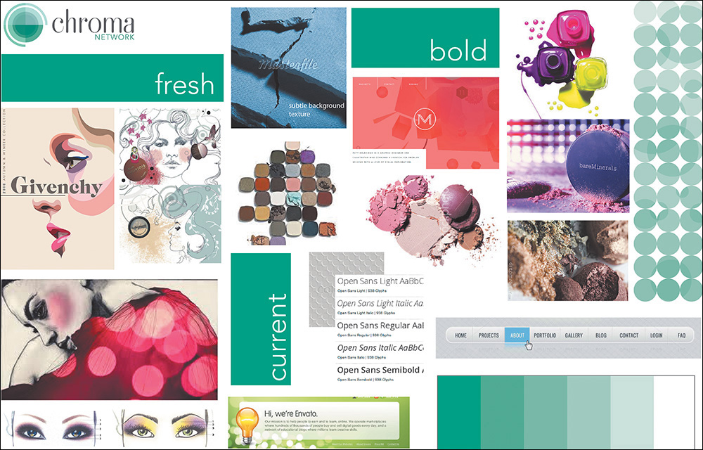
Figure 5.2 An example of a traditional moodboard with elements close to one another SOURCE: MAYA BRAGG
Having been collaged together in Photoshop, the juxtaposition of these elements attempts to communicate the feel of a direction. It’s common to name moodboards by characteristic, such as “Traditional Combat” or “Stoic Contemporary.”
Organic Inspiration
A moodboard may not be so much a deliverable as a conversation. In an organic approach, designers and clients share what web aesthetics they find appropriate for the project, and several links are compiled to visit (see Figure 5.3).
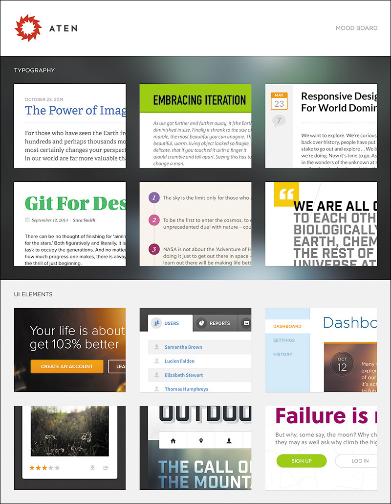
Figure 5.3 An example of documentation after a conversation about inspiration SOURCE: ATEN DESIGN GROUP
A footwear manufacturer might share competitors’ sites, while the designer might contribute contemporary examples of good design. This method should help establish a shared aesthetic, even though it’s just a conversation at its infancy. For later reference, you may choose to create a structured document from your findings. Calling it a moodboard would be appropriate since what’s captured is a collective “mood” to be explored.
In either method, the moodboard that’s deemed most appropriate gives the designer an educated starting point for further exploring style, confident that the other directions may not yield the best results.
Finding and Storing Inspiration
If you’re going to use moodboards, you’ll need two essential ingredients: a reliable source of design inspiration and a way to document it.
There’s no shortage of design inspiration galleries out there. You most likely already have a favorite or two, but if you’re in the market for one, here’s some advice for finding one.
It Has to Be Updated Weekly
Web design, style especially, seems to change daily. Rarely does a week go by without someone, somewhere launching a stellar website with a new approach. Keeping up with these contributions takes considerable time that most designers do not have. Therefore, make sure the site you choose to grab inspiration from is updated frequently so you’re always on the front end of what’s happening.
It Should Have Powerful Search Filters
Showing what’s hot in web design is all well and good, but when you’re looking for some inspiration for navigation, you’ll have to manually sift through each one to find it. A good source of inspiration has filters such as categories or tags to help you find what you’re looking for much easier. Blue, pink, header, footer, or whatever you’re trying to find, you should be able to find it quickly.
It Should Have Multiple Channels of Communication
I usually like to start my day by visiting design inspiration blogs, but some days I just need to dive into project work or I can’t find my way out of my inbox. If your favorite gallery doesn’t have a way of nudging you every so often when site examples have been added, you may be missing out on some great inspiration. A Twitter account is typically sufficient, and sometimes an email newsletter is even better.
Here are some examples of excellent design gallery sites:
 Pattern Tap (www.patterntap.com; see Figure 5.4)
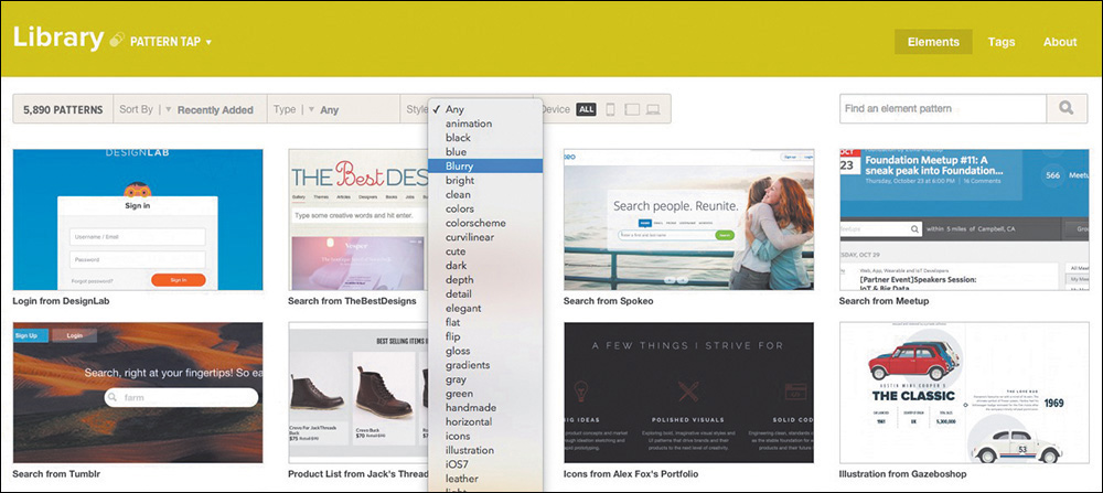
Figure 5.4 Pattern Tap by ZURB (www.patterntap.com) has a thorough list of ways to filter your search.
Niice (www.niice.co)
Media Queries (www.mediaqueri.es)
Unmatched Style (www.unmatchedstyle.com/gallery)
Site Inspire (www.siteinspire.com)
Dribbble (www.dribbble.com)
If your go-to gallery should pack up shop tomorrow, would your moodboarding be in trouble? Just because a design blog filters its content doesn’t mean you can’t too. I highly recommend creating your own notebook from which to pull examples for moodboard use. Categorize entries similarly or completely different, but having a secondhand catalog of design inspiration can be super-helpful.
Here are some examples of cataloging tools:
Evernote (www.evernote.com)
Pinterest (www.pinterest.com)
Ember (www.realmacsoftware.com/ember; see Figure 5.5)
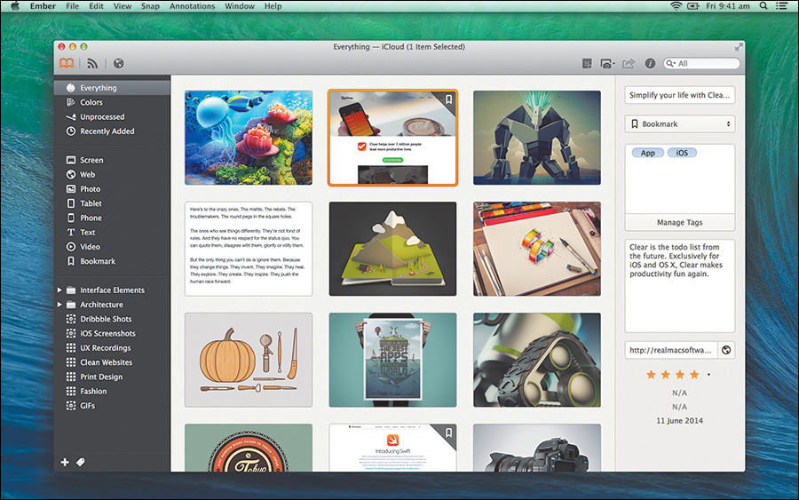
Figure 5.5 Using an app like Ember to save your inspiration is a great way to customize your archive.
Kippt (www.kippt.com)
Raindrop (www.raindrop.io)
Visual Inventories
Even before you jump into Photoshop or the browser, it’s generally good to have a plan of attack. Contrary to what we might tell our clients, we don’t “blue sky” great ideas, and they’re never 100 percent original. That doesn’t mean they’re not valuable, but our ideas usually come from consuming what’s currently appealing in our space. Simply put, we find what works well elsewhere, and that infuses our designs a little or a lot.
As you open up your design process, it’s useful to work toward a shared understanding of what an appropriate design aesthetic is. Instead of attempting to defend flat design or slab serifs at the point of a mock-up reveal, why not have an open critique before it’s applied to someone’s brand? I structure these types of conversations around a document called a visual inventory, an idea introduced by Superfriendly’s Dan Mall.
In the form of a PDF, Keynote, PowerPoint, or even a series of JPEGs crafted in Photoshop, a visual inventory is a presentation of existing conventions that comprises a conversation about art direction through the lens of industry-established approaches (see Figure 5.6). While it’s certainly possible to email such a document, I highly recommend scheduling a meeting to present it instead. The purpose isn’t to have everyone involved spend days scouring the Internet for the site they want to emulate most. Rather, it’s to receive input on which look, content, concept, and tone have significant enough value to pursue.
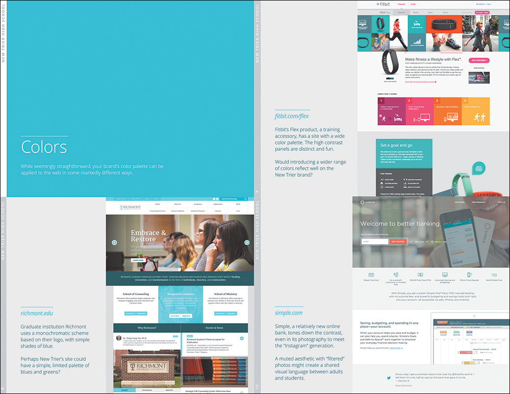
Figure 5.6 Visual inventories provide a good look at the current landscape of the Web, unearthing possibilities for your clients.
The primary difference between a moodboard and a visual inventory is format. Moodboards attempt to capture an environment or feel through collaging, while visual inventories home in on specific attributes individually and sequentially. The structure of the document is open to interpretation, but I usually roll with the following:
Introduction (explaining the purpose of the exercise)
Concept (vehicles for presenting story)
Color (schemes and applications)
Typography (specimens and combinations)
Defining Contrast
It’s critical to lead your clients to give input that’s in harmony with one direction over another. Otherwise, you’ll get feedback similar to the following: “I guess that could work for us. We’ll have to see it.”
Here are some helpful ideas for presenting concepts high in contrast. Not everything will be pertinent to the project you’re working on, but these are a good place to start.
Concept
Linear storytelling (single-page scroll)
Nonlinear storytelling (multipage exploration)
Large photography
Virtual tour
Lifestyle video
Human narrative
Device-centric narrative
Color scheme
Bright and saturated
Grayscale
Light backgrounds
Dark backgrounds
Monochromatic
One strong accent
Device-centric narrative
Typography
Humanist serif
Old-style serif
Geometric sans serif
Grotesque sans serif
Handwritten
Modern script
Blocky slab
Within each section, try to find at least three different directions to explore. Pair each one with an existing site that executes the approach well. For example, under Color, you might show a light scheme, a dark scheme, and a saturated scheme. A convincing example of a light scheme might be Apple.com, whose iconic use of whitespace and gray tones exude openness and clarity but can also be read as more stark than friendly. Those characteristics are what you’re looking for a client to align to, not subjective views on if they “like” Apple.com or not (see Figure 5.7).
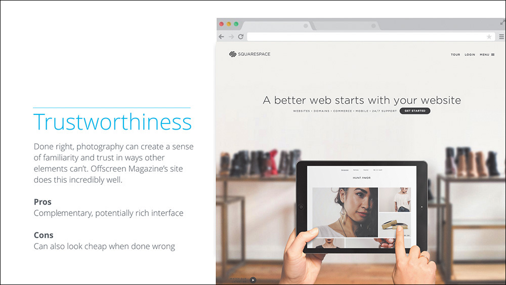
Figure 5.7 The template for a visual inventory is fairly open, but you’ll want to include some commentary on an approach and an example from the Web at the least.
The Pursuit of Efficiency
Part of the problem with presenting three full-page comps is that it requires you to produce three different, fully fleshed-out designs. Alternatively, a visual inventory allows you to vet any unworthy directions without such effort. For example, I worked on a project where I presented three type directions: humanist serif, geometric sans, and handwritten. Going into the presentation, I really thought they’d favor the handwritten because it appeared to reflect the brand’s whimsical nature. The client shot it down, informing me that they had used a handwritten font previously during a period when the company was publicly criticized. They felt that running with a handwritten font would harken back to a previously poor image and public perception.
If not for the visual inventory, I would have spent hours mocking up their site in handwritten type, only for it to get trashed (see Figure 5.8). I’m not suggesting that you shouldn’t explore unfavorable examples in subsequent exercises. If you can make a case for further exploration, by all means, do so. Just be cautious of a strong reaction, especially if it’s supported by objectivity, as was this example.
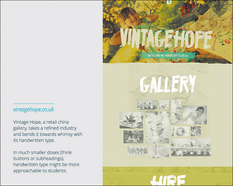
Figure 5.8 Designing this screen for a visual inventory took four minutes. A comp that used handwritten type across the UI would have taken hours.
Again, the objective of this exercise isn’t for a client to approve a monochromatic, single-page scroll with slab serifs. Rather, the objective is to start a critical conversation about how different elements of the Web can best represent their brand. Could a bright color palette infuse the sense of activity your company is seeking? Might an old-style serif best communicate “establishment” for your startup? Is showcasing detailed product photography the best approach to attracting your audience? You’d be surprised how many clients prefer this approach to the fairly subjective “Pick your favorite of these three comps.”
By removing the subjectivity, you can set the standard for rational intent early on. Not only is this helpful getting out of the gate, but it’s arguably more so later in the project. If you acquiesce to a color shift out of personal preference in the beginning, it sets the precedent that such calls are acceptable later as well. Even the smallest tweak should have rationale that maps to user or organizational goals.
Conversations, Not Deliverables
The flaw with most design practices is inherent to the term deliverable. In a responsive workflow, the goal shouldn’t be to continually deliver assets so a client can approve every phase, facsimile, and exercise. That’s neither flexible nor practical. Everything we explore is valuable to the process, but no single item should be held as sacred.
Vetting direction isn’t a deliverable. It’s a conversation around the ideas you can put style to. A moodboard or a visual inventory may take the form of a document, but neither is meant to provide a direct representation of your site. Instead, they’re meant to trigger important discussions that will influence the evolution of design throughout the entire project.
Why is this distinction important? Deliverables keep your stakeholders at a considerable distance from the inner workings of our processes. They also imply that you’re providing specification, but in early ideation phases such as moodboards and visual inventories, you’re not. Consequently, you’re also not ideating in later stages of refinement, since you’ve explored potential paths early in the design process. Though the possibilities may be expansive early, the idea is to continually refine a solution the further you go.