In this chapter, we’ll cover the following:
Colorizing a 1950s portrait (Man)
Colorizing a 1950s portrait (Boy)
Digitally repairing a faded color portrait
Colorizing a snapshot
This chapter is a glimpse into the types of colorization I do the most: old portraits and snapshots. In most cases, the client does not have a color reference photo; the image supplied is often the only known photograph of that person (or persons) or, if color photos do exist, they don’t have ready access to them.
The client will often provide you with the basic color information you’ll need for hair, eyes, and so forth. It’s important to save a layered version of the work, especially if you are colorizing as a professional service. It’s common to have to make minor adjustments, and keeping layers intact helps immensely.
Tutorial 14: Colorizing a Portrait (Man)
In the upcoming tutorial, we’ll colorize a portrait from the early 1950s.
To do this tutorial, follow these steps:
Open the Ch_6 1950s Portrait.jpg file found in the Chapter 6 Practice Images folder.
Duplicate the background layer (Layer ➤ Duplicate Layer) and rename the duplicate layer Copy, or leave it as is.
Create a new layer (Layer ➤ New Layer) and make sure Layer Fill Type is set to Transparency.
Change the blending mode to Color and reduce the layer’s opacity to 50%. Rename the new layer Background.
Change the foreground color to a beige color (R-219, G-202, B-150). Click OK.
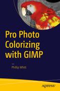
Using a brush with the 2.Hardness 025 setting and a small diameter (5–7 pixels), apply the color around the man’s hair strands (Figure 6-1). Zoom in and adjust the brush size as needed to apply the color in the small openings.
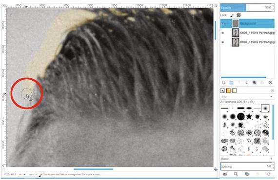
Figure 6-1. Use a small brush to apply the color around the man’s hair
Continue applying the color around the man’s right side; the color should extend about 40–50 pixels. Repeat on the other side until a complete outline of the background color is seen around the man.
We now want to quickly fill in the rest of the background with the beige color. Click inside background using the Bucket Fill tool, with these options checked (Figure 6-2):
FG color fill
Fill similar colors
Fill transparent areas
Threshold-150
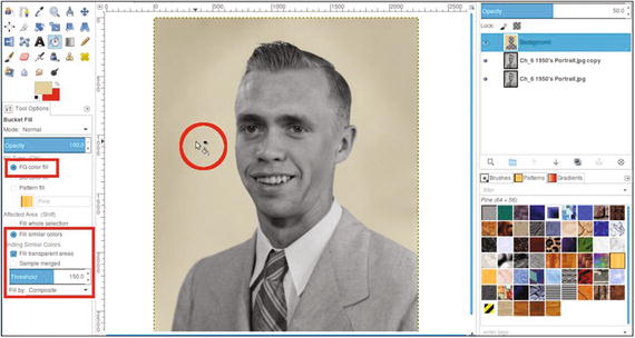
Figure 6-2. Use the Bucket Fill tool to colorize the rest of the background
Create a new layer (Layer ➤ New Layer) and make sure Layer Fill Type is set to Transparency. Change the blending mode to Color and lower the opacity to 60%. Rename the new layer Coat and Sweater.
Change the foreground color to a light blue/gray color (R-76, G-98, B-99). Click OK.
As was done with the background, we’ll create an outline for the coat and sweater and then fill it in. Using a brush with the 2.Hardness 050 setting, paint along the edge of the suit and paint in the visible part of the sweater.
Use the Bucket Fill tool (and the same fill settings used to fill the background color), click in one side of the coat, and then the other (Figure 6-3).
Figure 6-3. Apply color to the coat and sweater
Next, we’ll work on the tie. Create a new layer (Layer ➤ New Layer) and make sure Layer Fill Type is set to Transparency. Change the blending mode to Overlay and leave the opacity at 100% (I chose Overlay because it applied just the right amount of color for the effect I was aiming for). Rename the new layer Tie-Blue/Green.
Using a brush with the 2.Hardness 050 setting, apply the foreground color to the layer to colorize the entire tie.
Now, we’ll add some gold-yellow trim to the tie. Create a new layer (Layer ➤ New Layer) and make sure Layer Fill Type is set to Transparency. Change the blending mode to Color and lower the opacity to about 80%.
Change the foreground color to a gold-yellow color (R-215, G-165, B-31). Click OK.
Using a brush with the 2.Hardness 050 setting, paint the trim in the lighter lines of the tie. The brush size should be around 7–8 pixels in diameter (Figure 6-4).
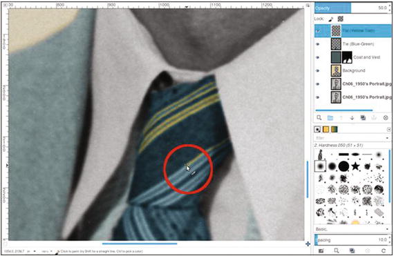
Figure 6-4. Apply the gold-yellow color for the trim
To make the edges transition better (and look less like they were painted in), we’ll need to blur the trim color a bit. Open the Gaussian Blur dialog (Filters ➤ Blur ➤ Gaussian Blur). Use the default setting of 5.0 (Vertical and Horizontal) and the RLE blur method, then click OK (Figure 6-5).
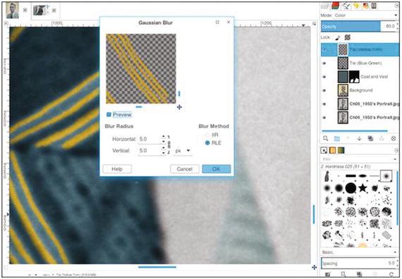
Figure 6-5. Apply a slight blur to the lines for better transition
Now, to colorize the face. Create a new layer (Layer ➤ New Layer) and make sure Layer Fill Type is set to Transparency. Change the blending mode to Color. Rename the new layer Skin and lower the opacity to 40%.
Change the foreground color to R-236, G-190, B-157 (or just use the Eyedropper tool to sample from the colors chart used in the previous chapter).
Using the Bucket Fill tool, fill the layer with the foreground color.
Add a layer mask (Layer ➤ Mask ➤ Add Layer Mask) initialized to black (the fill color will disappear until it’s revealed by painting in the layer mask). Click the layer mask to make it active.
Using a large brush (around 100 pixels in diameter) with the 2.Hardness 025 setting and white as the active color, paint along the edge where the flesh ends and hairline begins. Because the defining line isn’t very clear, it helps to use the outermost edge of the brush to blend the color into the hairline (Figure 6-6).
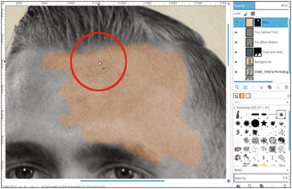
Figure 6-6. Use a large, soft-edge brush to help blend the color into the hairline
Adjust the brush size as needed to apply the color around the eyebrows (except where the hairs are very thin) and eyes (Figure 6-7). Continue applying color until the entire face is complete.
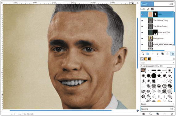
Figure 6-7. The skin color applied
Note Eyebrows can be tricky. There is only sparse hair on part of his left eyebrow (with more skin than hair), so adding the fleshtone color here will usually suffice.
To colorize the hair, create a new layer (Layer ➤ New Layer) and make sure Layer Fill Type is set to Transparency. Change the blending mode to Color. Rename the new layer Hair and lower the opacity to 40%.
Change the foreground color to R-166, G-128, B-78. Click OK.
Using the Paintbrush tool with the 2.Hardness 025 setting, apply the foreground color to the hair and eyebrows. Use a small brush to colorize the flyaway strands.
We’ll now improve the hairline transition where it borders the skin. Open the Gaussian Blur dialog (Filters ➤ Blur ➤ Gaussian Blur). Use the default setting of 5.0 (Vertical and Horizontal) and the RLE blur method, then click OK. Applying the blur helps makes the edges less sharp.
As was done in the previous chapter, we’ll add a small amount of red to vary the skin tone. Create a new layer (Layer ➤ New Layer) and make sure Layer Fill Type is set to Transparency. Change the blending mode to Color and lower the opacity to 40%. Rename the new layer Subtle Red.
Change the foreground color to red (R-255, G-0, B-0). Click OK.
Using the Paintbrush tool with the 2.Hardness 025 setting, paint some red on the cheeks, forehead, nose, ears, and chin. After red is applied, lower the layer’s opacity to 5%. Click the layer’s eyeball icon to turn the effect on and off to see the effect.
To add color to the lips, create a new layer (Layer ➤ New Layer) and make sure Layer Fill Type is set to Transparency. Change the blending mode to Color. Rename the new layer Lips and lower the opacity to 10%.
Using a brush with the 2.Hardness 025 setting, apply red to the lips and to the small exposed gum area around the teeth (Figure 6-8).
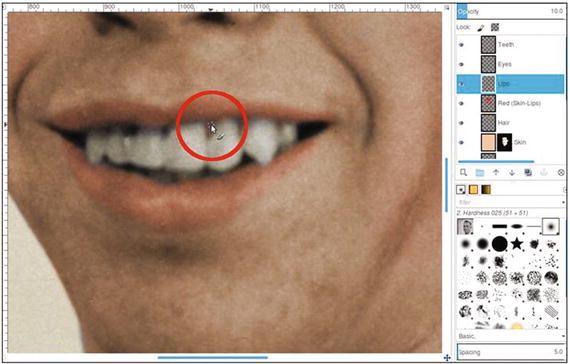
Figure 6-8. Apply color to the lips and small exposed area of gum
Create a new layer (Layer ➤ New Layer) and make sure Layer Fill Type is set to Transparency. Change the blending mode to Color and lower the opacity to 10%. Rename the new layer Teeth.
Change the foreground color to an ivory color (R-255, G-249, B-233). Apply the color to the teeth. This adds just a hint of color.
Now, we’ll colorize the eyes. Create a new layer (Layer ➤ New Layer) and make sure Layer Fill Type is set to Transparency. Change the blending mode to Color. Rename the new layer Eyes and lower the opacity to 50%.
To color the eyes, change the foreground color to blue (R-41, G-87, B-111). Apply the color to the eyes.
When finished, the end result should resemble that shown in Figure 6-9. If desired, save it as an XCF file for future reference.
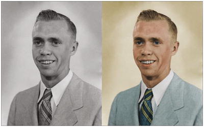
Figure 6-9. Before and after comparison
Tutorial 15: Colorizing a Portrait (Boy)
In this tutorial, we’ll colorize another old family photo from the 1950s.
You’ll notice that I go about this project somewhat differently than in previous tutorials. Even the order in which some elements are colorized is different. It’s not meant to confuse; it’s meant to demonstrate the power and flexibility of GIMP, and that it’s possible to take different approaches while achieving similar results.
To do this tutorial, follow these steps:
Open the Ch_6 1950s Portrait 2.jpg file found in the Chapter 6 Practice Images folder.
Duplicate the background layer (Layer ➤ Duplicate Layer) and rename the duplicate layer Copy, or leave it as is.
Create a new layer (Layer ➤ New Layer) and make sure Layer Fill Type is set to Transparency. Change the blending mode to Color. Rename the new layer Skin and lower the opacity to 40%.
Change the foreground color to R-236, G-190, B-157 (or just use the Eyedropper tool to sample from the colors chart used in the previous chapter).
Using a brush with the 2.Hardness 025 setting, apply the foreground color to the face, exposed areas of the legs, and arms. Zoom in and vary the brush size as needed (Figure 6-10). If you go outside the bounds, don’t worry at this point.
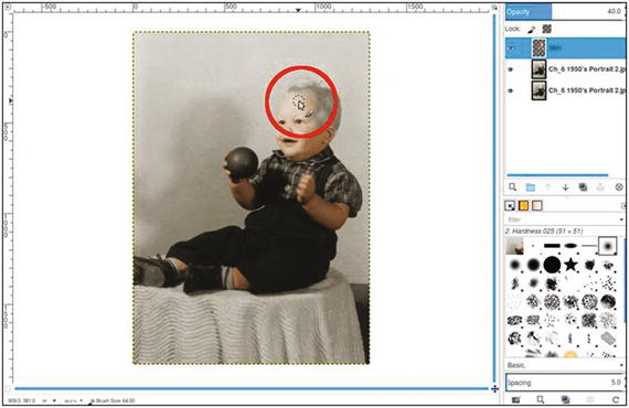
Figure 6-10. Apply color to the skin areas
Add a layer mask to the Skin layer (Layer ➤ Mask ➤ Add Layer Mask) initialized to white. Using a small, soft brush and a 50% gray as the active color, paint on the layer mask to remove some of the skin color from the eyes (Figure 6-11). Use black to clean up any excess color that went outside the bounds.
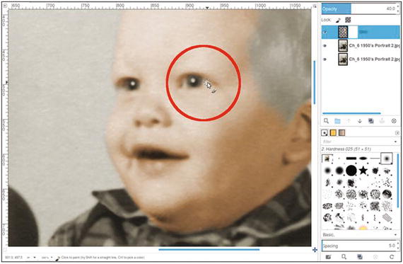
Figure 6-11. Partially remove the skin color from the whites of the eyes
Create a new layer (Layer ➤ New Layer) and make sure Layer Fill Type is set to Transparency. Change the blending mode to Color. Rename the new layer Subtle Red.
Change the foreground color to red (R-255, G-0, B-0). Click OK.
Using the Paintbrush tool with the 2.Hardness 025 setting, paint some red on the cheeks, forehead, nose, ears, and chin. After red is applied, lower the layer’s opacity to 5–8%. Click the layer’s eyeball icon to turn the red on and off to see the effect.
To add color to the lips, create a new layer (Layer ➤ New Layer) and make sure Layer Fill Type is set to Transparency. Change the blending mode to Color. Rename the new layer Lips and lower the opacity to 10%.
Using a brush with the 2.Hardness 025 setting, apply red to the lips.
Now, we’ll colorize the eyes. Create a new layer (Layer ➤ New Layer) and make sure Layer Fill Type is set to Transparency. Change the blending mode to Color. Rename the new layer Eyes and lower the opacity to 50%.
To color the eyes, change the foreground color to blue (R-41, G-87, B-111). Apply the color to the eyes.
For the remainder of this project, refer to the color guide provided in the Chapter 6 Practice Images folder, or refer to Figure 6-12. It provides the color information, blending mode to use, and layer opacity to use for each element.
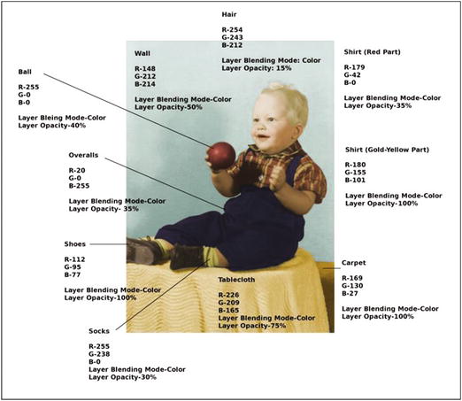
Figure 6-12. Refer to the color guide to colorize the rest of the image
When finished, the end result should resemble that shown in Figure 6-13. If desired, save it as an XCF file for future reference.
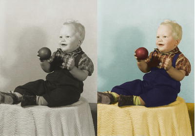
Figure 6-13. Before and after comparison
Tutorial 16: Digitally Repairing a Faded Color Portrait
Occasionally, I run across an old color image that has seen better days. Many photographs from the 1960s and 1970s didn’t hold up well over time. The dyes would either shift or fade, leaving little of the original color.
Some old portraits lose so much color information, the only way to repair them is to convert them to black and white, make tonal adjustments to restore contrast, and recolorize them.
Fortunately, they can sometimes be repaired by making a few adjustments and adding color where needed. This technique often works when there is some salvageable color information left in the image.
To do this tutorial, follow these steps:
Open the Ch_6 Damaged Portrait.jpg file found in the Chapter 6 Practice Images folder.
Duplicate the background layer (Layer ➤ Duplicate Layer) and rename the duplicate layer Copy, or leave it as is.
We’ll use the Levels dialog to rebalance the color and tonal information contained in each color channel (red, green, and blue). Open the Levels dialog (Colors ➤ Levels).
Click the triangle to the right of the Channel drop-down. Choose Red and move the black and white sliders of the input levels inward until they stop where the image data begins and ends in the histogram (Figure 6-14). Do not click OK just yet.
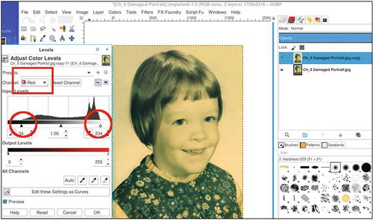
Figure 6-14. Re-balance the tonal and color information in the color channels using levels
Repeat the same steps, only making the adjustments in the green color channel this time. Do not click OK just yet.
Repeat the steps, making the adjustments on the blue color channel. By this point, you’ll notice a marked improvement (Figure 6-15). Once the adjustments have been made, click OK.
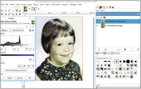
Figure 6-15. Adjusting each color channel makes a drastic improvement
Open the Hue-Saturation dialog (Colors ➤ Hue-Saturation). Boost the saturation value up to 75 (Figure 6-16). This will increase the color intensity of the image.
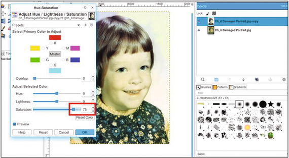
Figure 6-16. Use the Hue-Saturation dialog to boost the color
Duplicate the layer (Layer ➤ Duplicate Layer).
We’ll now make an adjustment to improve the skin color. Open the Hue-Saturation dialog (Colors ➤ Hue-Saturation). Adjust the hue slider to read -24 (Figure 6-17). This action introduces a little more red into the image, improving the skin and hair color.
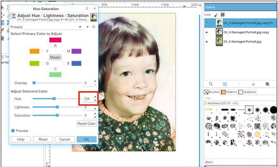
Figure 6-17. Use the Hue-Saturation dialog to improve the skin color
Add a layer mask (Layer ➤ Mask ➤ Add Layer Mask) initialized to white. Click on the layer mask to make it active.
Step 9 changed the hues in the dress, so we’ll now change them back. Using a brush with the 2.Hardness 025 setting and black as the active color, paint in the layer mask to return the dress to its original color.
Create a new layer (Layer ➤ New Layer) and make sure Layer Fill Type is set to Transparency. Change the blending mode to Color and leave the opacity at 100%. Rename the new layer Background.
Use the Eyedropper tool to sample some of the light blue color in the background with the sample “Merged” and “Set Foreground Color” options checked.
Using a large brush (around 100 pixels in diameter), apply the foreground color to provide a more uniform look to the background (Figure 6-18).
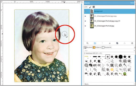
Figure 6-18. Apply a uniform color to the background
The final result should look something like the example in Figure 6-19. If desired, save it as an XCF file for future reference.
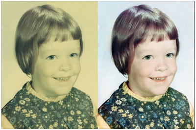
Figure 6-19. Before and after result
Tutorial 17: Colorizing a Snapshot
Colorizing snapshots can be more challenging in some respects. There are often a number of background elements that must be colorized as well as the subject(s). Another factor is that old snapshots usually don’t contain the clarity and detail that an 8” x 10” portrait does. The defining line between objects isn’t always so easy to see.
Colorizing outdoor snapshots is fairly common for me, and there is usually a lot of foliage to deal with. The next project is time intensive. It will require a lot of zooming in and using small brush diameters. However, there is a completed version in the Chapter 6 Practice Images folder that you can refer to. In fact, I suggest you open it first and look it over carefully. There are likely a few minor imperfections when viewed at close magnification, but at normal viewing distance, they probably wouldn’t be noticed by anyone.
There is a layered XCF version provided as well.
To do this tutorial, follow these steps:
Open the Ch_6 Car.jpg file found in the Chapter 6 Practice Images folder.
Duplicate the background layer (Layer ➤ Duplicate Layer) and rename the duplicate layer Copy, or leave it as is.
Create a new layer (Layer ➤ New Layer) and make sure Layer Fill Type is set to Transparency. Change the blending mode to Color. Rename the new layer Grass. The opacity range should be from 90–100%.
Change the foreground color to R-64, G-85, B-41. Click OK.
Using a brush with the 2.Hardness 025 setting, apply foreground color to the grass. You’ll need to make sure to color the grass through the car windows and work around the car’s radio antenna in the rear. Zoom in and vary the brush size as needed to work around the paving stones and visible parts of the driveways in the distance (Figure 6-20).
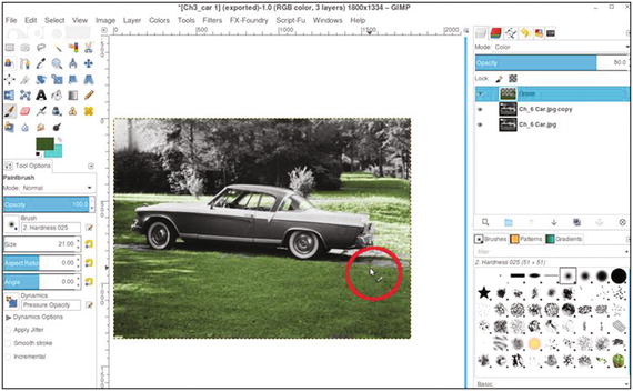
Figure 6-20. Apply the color to the grass working around the paving stones
Repeat steps 3 to 5 to apply some yellow-green color to the small trees (Figure 6-21) using these parameters:
Set the foreground color to R-176, G-188, B-37.
Set layer blending mode to Color and layer opacity to 60% (name the layer Yellow-Green Foliage).
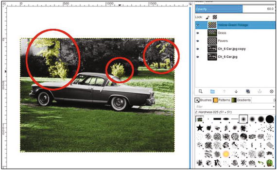
Figure 6-21. Apply color to the trees as shown
Now, repeat the same steps to apply a darker green color to the remaining trees and bushes (Figure 6-22) using these parameters:
Set the foreground color to R-39, G-58, B-6.
Set layer blending mode to Color and layer opacity to 30% (name the layer Dark Green Foliage).
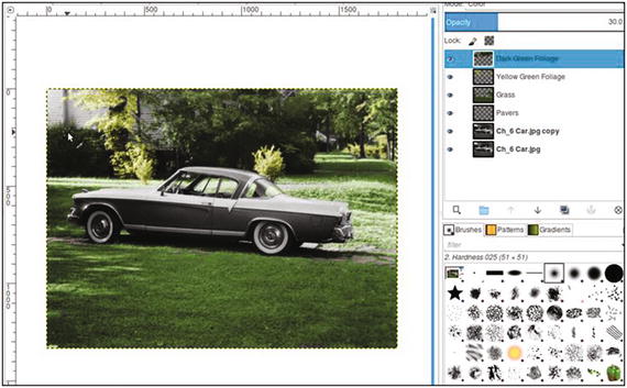
Figure 6-22. Apply color to the bushes and trees as shown
In previous tutorials, a color guide was provided for images involving several layers and colors. In this case, I don’t think that would be practical, because so many elements are small and hard to see. To colorize the rest of the image, just follow the guide below. Each bullet point goes on its own layer.
Tree trunks: foreground color R-88, G-57, B-27. Layer blending mode set to Overlay and the opacity to 40%. Name the layer Tree Trunks.
Brick and rooftops: foreground color R-131, G-52, B-17. Layer blending mode set to Color and the opacity to 25%. Name the layer Brick-Rooftops.
Aqua color (car): foreground color R-136, G-195, B-191. Layer blending mode set to Color and the opacity to 100%. Name the layer Aqua Car Color.
Tail lights: foreground color R-255, G-0, B-0. Layer blending mode set to Color and the opacity to 100%. Name the layer Tail Lights.
Pavers: foreground color R-114, G-103, B-82. Layer blending mode set to Color and the opacity to 50%. Name the layer Pavers.
Grass discolorations: foreground color R-88, G-57, B-27. Layer blending mode set to Color and the opacity to 10%. Name the layer Discolorations. Paint on random areas on the grass area the foreground.
Reflections: foreground color R-39, G-58, B-6. Layer blending mode set to Color and the opacity to 10%. Name the layer Reflections. (Paint on the hubcaps and chrome trim to simulate the color of grass reflecting off the chrome).
If needed, refer to the completed version as you work to provide some guidance. The final result should resemble the example in Figure 6-23.
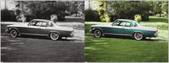
Figure 6-23. Before and after comparison
Note
When you start to colorize your own photos, having a frame of reference for choosing colors can help a great deal. Stock photography sites are a good source of reference photos. Just download a low-resolution preview of an image similar to the one you plan to colorize. This can help remove some of the guesswork from choosing colors.
Summary
In this chapter, you colorized two portraits from the 1950s. You also learned a method of restoring the color from old, faded color portraits (a method that works in many, but not all cases).
Finally, you gained some experience colorizing an old snapshot of a 1950s car. As you likely surmised, colorizing snapshots can be a bit challenging.
The first part of this book had to do with colorizing to achieve the most realism possible. In the remaining chapters, you’ll learn some fun methods of colorizing for artistic effect.