In this chapter, we’ll cover the following:
Colorizing a section of a brick wall
Colorizing a section of marble
Colorizing a piece of wall art
Colorizing foliage
Colorizing a folded quilt
Drawing from my own experience, most of the colorization projects I receive are old snapshots of people, but there are various objects and scenes in the background that must be colorized as well.
In this chapter, we’ll be tackling several colorization projects involving more complex color schemes. While it’s impossible to provide every conceivable object that may be in the background of an image, this chapter will provide (at least some) practice for colorizing assorted elements.
Some of the objects in this chapter do commonly appear in outdoor photos—those being brick walls and foliage.
Tutorial 6: Colorizing a Brick Wall
In this lesson, we’ll look at applying color to a small section of a brick wall . This one in particular has a slightly distressed, aged look.
To do this tutorial, follow these steps:
1. Open the Ch_4 Brick Wall.jpg file found in the Chapter 4 Practice Images folder.
2. Duplicate the background layer (Layer ➤ Duplicate Layer) and rename the duplicate layer Duplicate, or leave it as is.
3. Create a new layer (Layer ➤ New Layer) and make sure Layer Fill Type is set to Transparency.
4. Rename the new layer Brick Color 1. Change the blend mode from Normal to Color, and lower the opacity to about 60%.
5. Add a layer mask (Layer ➤ Mask ➤ Add Layer Mask) initialized to white.
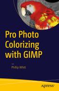
6. Click on the foreground color swatch (located in the toolbox) to open the Change Foreground Color dialog. To duplicate the exact color used in this tutorial, just enter the numeric values as follows: R-130, G-46, B-20. Click OK.
7. Making sure the layer is active, select the Bucket Fill tool and fill the layer with the foreground color (Figure 4-1).
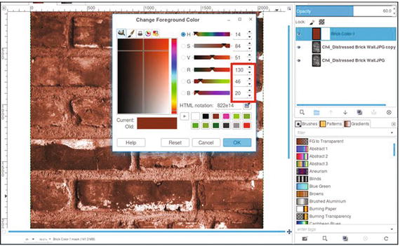
Figure 4-1. Fill the layer with the foreground color to create the brick colorization
8. Click the layer mask to make it active. Using a brush with the 2.Hardness 050 setting and black as the active color, paint between the bricks to reveal the gray of the mortar (Figure 4-2). Zoom in and adjust the brush size as needed.
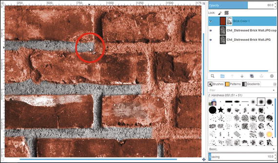
Figure 4-2. Reveal the gray mortar between the bricks
9. We’ll now add a slightly different hue to some of the bricks. Create another new layer (Layer ➤ New Layer) and make sure Layer Fill Type is set to Transparency. Rename the layer Brick Color 2.
10. Change the blending mode from Normal to Color and lower the opacity to about 30%.
11. Click on the foreground color swatch (located in the toolbox) to open the Change Foreground Color dialog. To duplicate the exact color used in this tutorial, just enter the numeric values as follows: R-104, G-23, B-13. Click OK.
12. Using a brush with the 2.Hardness 050 setting, paint in some of the bricks to apply the second brick color (Figure 4-3). This creates a subtle variation in the brick colorization.
Figure 4-3. Add a slightly different hue to some of the other bricks
13. To add a third hue, create yet another layer (Layer ➤ New Layer) and make sure Layer Fill Type is set to Transparency. Rename the layer Brick Color 3.
14. Change the blending mode from Normal to Color and lower the opacity to about 50%.
15. Click on the foreground color swatch (located in the toolbox) to open the Change Foreground Color dialog. To duplicate the exact color used in this tutorial, just enter the numeric values as follows: R-90, G-51, B-51. Click OK.
16. Paint a few random bricks (the hue will result in a subtle variation in color).
Your version should be similar to the one shown in Figure 4-4. It probably won’t be an exact reproduction. For example, the second and third brick colors probably won’t be in the exact areas shown here. The goal is a realistic look, not a verbatim copy. If desired, save the image as an XCF file for future reference.
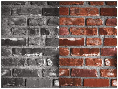
Figure 4-4. Before and after comparison
Tutorial 7: Colorizing Marble
I have on occasion colorized old black and white photos of executives (usually from the 1950s) standing in front of marble walls. In this lesson, we’ll give a pink colorization to an image of some marble. We’ll add a couple of highlight colors to enhance it and make it a little more realistic.
To do this tutorial:
1. Open the Ch_4 Pink Marble.jpg file found in the Chapter 4 Practice Images folder.
2. Duplicate the background layer (Layer ➤ Duplicate Layer) and rename the duplicate layer Base Color.
3. We’ll need to give the duplicate layer an overall pink color. Open the Colorize dialog (Colors ➤ Colorize). Set the Hue slider to 15 and the Saturation slider to 40 (Figure 4-5), then click OK.
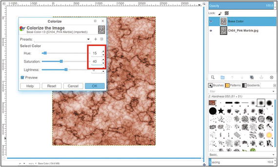
Figure 4-5. Apply a pink base color using the Colorize dialog
4. Next, we’ll apply some coral highlights. Create a new layer (Layer ➤ New Layer) and make sure Layer Fill Type is set to Transparency. Rename the new layer Highlight 1.
5. Change the layer’s blending mode from Normal to Color and lower the layer’s opacity to 20%.
6. Click on the foreground color swatch (located in the toolbox) to open the Change Foreground Color dialog. To duplicate the exact color used in this tutorial, just enter the numeric values as follows: R-255, G-133, B-107. Click OK.
7. Using a large brush (with a diameter of 100 pixels or so) and with the 2.Hardness 075 setting, dab some of the coral highlight color in several random areas using short strokes (Figure 4-6).
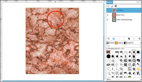
Figure 4-6. Apply subtle coral highlights
8. Now, we’ll apply some subtle yellowish highlights. Create a new layer (Layer ➤ New Layer) and make sure Layer Fill Type is set to Transparency. Rename the new layer Off White.
9. Change the layer’s blending mode from Normal to Color and lower the layer’s opacity to 25%.
10. Click on the foreground color swatch (located in the toolbox) to open the Change Foreground Color dialog. To duplicate the exact color used in this tutorial, just enter the numeric values as follows: R-237, G-222, B-183. Click OK.
11. Using a large brush (with a diameter of 100 pixels or so) and the 2.Hardness 075 setting, dab some of the second highlight color in a few other random areas (Figure 4-7).
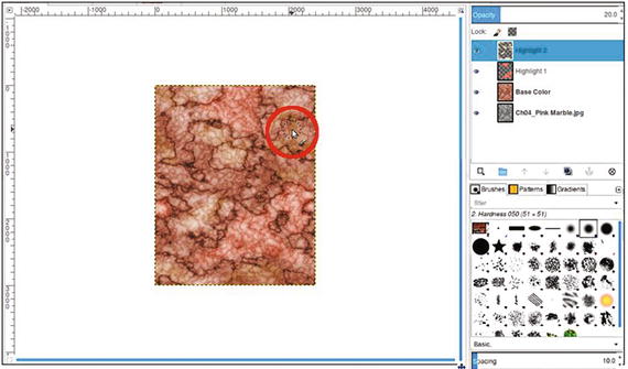
Figure 4-7. Apply subtle yellow highlights
The end result should look similar to that shown in Figure 4-8. If desired, save the image as an XCF file for future reference.
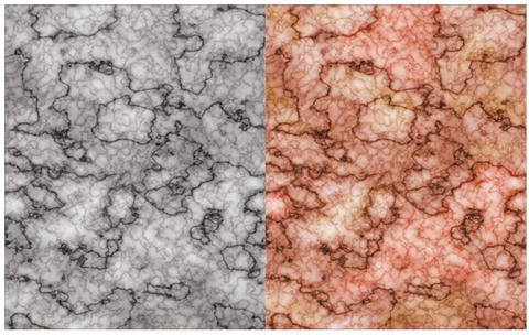
Figure 4-8. Before and after comparison
Tutorial 8: Colorizing a Piece of Wall Art
In this lesson, we’ll look at applying color to a piece of wall art with a nautical theme .
To do this tutorial, follow these steps :
1. Open the Ch_4 Wall Art.jpg file found in the Chapter 4 Practice Images folder.
2. Duplicate the background layer (Layer ➤ Duplicate Layer) and rename the duplicate layer Base Color (or leave as is).
3. We’ll need to give it a base color resembling that of burlap, the material the objects are adhered to. Open the Colorize dialog (Colors ➤ Colorize). Adjust the Hue slider to a numeric value of 40 and the Saturation slider to 20, then click OK (Figure 4-9).
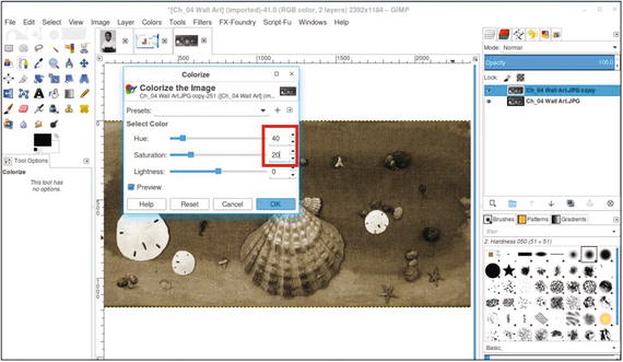
Figure 4-9. Apply a base color to the duplicate layer
4. Create a new layer (Layer ➤ New Layer). Rename the new layer Sea Green Color, making sure Layer Fill Type is set to Transparency.
5. Change the blend mode from Normal to Color and lower the opacity to 50%
6. Click on the foreground color swatch (located in the toolbox) to open the Change Foreground Color dialog. To duplicate the exact color used in this tutorial, just enter the numeric values as follows: R-31, G-157, B-99. Click OK (Figure 4-10).
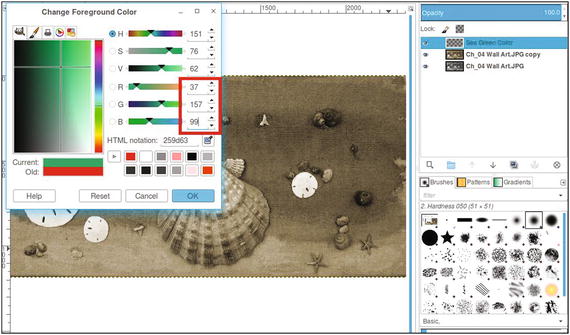
Figure 4-10. Use the Change Foreground Color dialog to create a sea green color
7. Using the Bucket Fill tool, fill the layer with the foreground color.
8. Add a layer mask to the new layer named Sea Green (Layer ➤ Mask ➤ Add Layer Mask). This time, it will be initialized to black. Click on the layer mask to activate it. If you recall, the black and white aspects of the layer mask are covered in greater detail in Chapter 1. The sea green color will disappear until it’s “painted” back in, as you’ll see shortly.
Note
It would be a good idea to refer to Figure 4-13 before proceeding to get a good sense of where to place the colors. Refer to it as needed while you’re working.
9. Use a small brush with the 2.Hardness 050 setting and black as the active color to reveal the sea green color around the various objects mounted on the wall art. Zoom in and resize the brush as needed.
10. Using a brush with the 2.Hardness 075 setting and white as the active color, paint the dark, splotchy areas to reveal the sea green. This is a soft brush setting that is useful for the soft edges of the sea green color.
11. Use 50% gray as the active color and paint in the layer mask to reveal the lighter areas of the sea green color for a paler appearance (Figure 4-11). Use a large brush for large areas, and a small brush for the edges and working around the small objects.
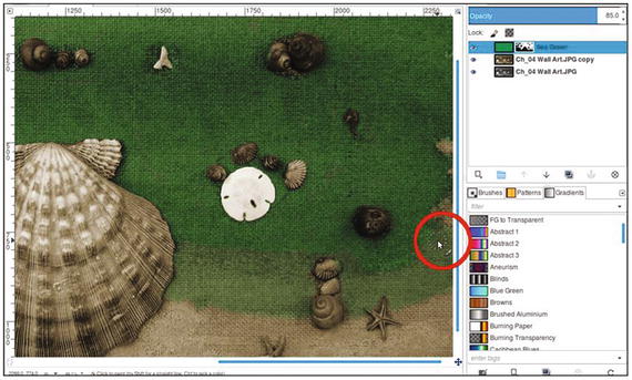
Figure 4-11. Use gray to reveal a paler sea green color in lighter areas
12. Next, we’ll add a little brownish color to the shells. Create a new layer (Layer ➤ New Layer) and make sure Layer Fill Type is set to Transparency. Rename the new layer Brown Color.
13. Change the blending mode from Normal to Overlay and lower the opacity to 50%.
14. Click on the foreground color swatch (located in the toolbox) to open the Change Foreground Color dialog. To duplicate the exact color used in this tutorial, just enter the numeric values as follows: R-135, G-65, B-19. Click OK.
15. Use a brush with the 2.Hardness 050 setting to apply some brown coloring to the bands on the large shell, as shown in Figure 4-12.
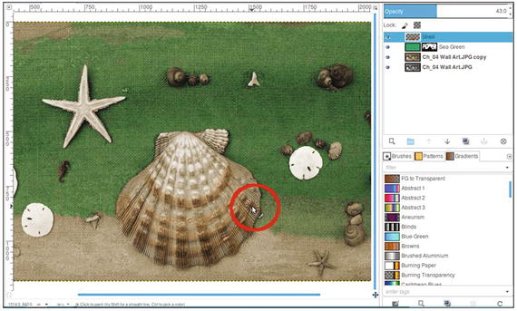
Figure 4-12. Apply some brown to the bands on the large shell
16. Paint the other shells and the two small seahorses to apply the brown coloring. The sand dollars can be left as is.
17. The last thing we’ll do is to add color to the starfish—the larger on the left and two small ones in the lower right. Create a new layer (Layer ➤ New Layer) and make sure Layer Fill Type is set to Transparency. Rename the layer Starfish Color. Change the layer blend mode to Color, and lower the opacity to 60%.
18. Click on the foreground color swatch (located in the toolbox) to open the Change Foreground Color dialog. To duplicate the exact color used in this tutorial, just enter the numeric values as follows: R-220, G-178, B-63. Click OK.
19. Use a brush with the 2.Hardness 050 setting to apply some yellow coloring to the starfish.
The end result should look similar to the one shown in Figure 4-13. If desired, save the image as an XCF file for future reference.
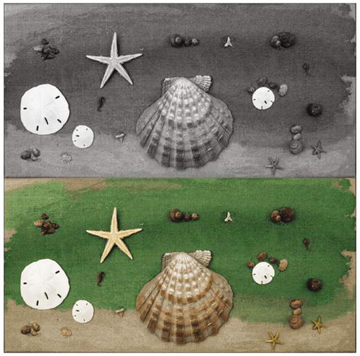
Figure 4-13. Before and after comparison
Tutorial 9: Colorizing Foliage
Over the years, I’ve colorized a fair number of old snapshot photos of people that were taken outdoors with a variety of plant life in the background. While the foliage in such pictures isn’t the focal point, it does help to make it look as natural as possible.
Note
If you’ve ever seen the old colorized black and white episodes of Gilligan’s Island (not the later episodes that were filmed in color), you’ll probably notice that all the jungle plant life is the same shade of green, and looks a bit unnatural. To be fair, these episodes were colorized at a time when the technology was still new.
In this lesson, we’ll colorize the foliage to make it look as natural as possible.
To do this tutorial, follow these steps :
1. Open the Ch_4 Foliage.jpg file found in the Chapter 4 Practice Images folder.
2. Duplicate the background layer (Layer ➤ Duplicate Layer) and rename the duplicate layer Base Color.
3. We’ll need to give the duplicate layer an overall green color. Create a new layer (Layer ➤ New Layer) and make sure Layer Fill Type is set to Transparency. Rename the new layer Green Base Color.
4. Change the layer’s blending mode from normal to Color and leave the opacity at 100%.
5. Click on the foreground color swatch (located in the toolbox) to open the Change Foreground Color dialog. To duplicate the exact color used in this tutorial, just enter the numeric values as follows: R-48, G-74, B-36. Click OK.
6. Using the Bucket Fill tool, fill the layer with the green foreground color (Figure 4-14).
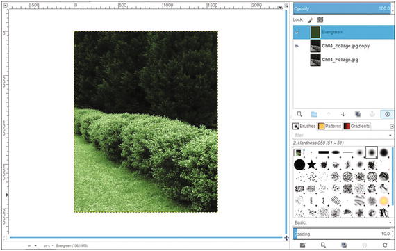
Figure 4-14. Apply a green base color using the Colorize dialog
7. The next step is to add a green hue with a bit more yellow to the hedges. Click on the foreground color swatch (located in the toolbox) to open the Change Foreground Color dialog. To duplicate the exact color used in this tutorial, just enter the numeric values as follows: R-120, G-167, B-20. Click OK.
8. Create a new layer (Layer ➤ New Layer) and make sure Layer Fill Type is set to Transparency. Rename the new layer Hedges.
9. Change the layer’s blending mode from Normal to Color and lower the layer’s opacity to 50%.
10. Using the Bucket Fill tool, fill the layer with the foreground color.
11. Add a layer mask to the new layer (Layer ➤ Mask ➤ Add Layer Mask). This time, it will be initialized to black. Click on the layer mask to activate it. The green-yellow color disappears until it is painted back in the next step.
12. Using a large brush with the 2.Hardness 075 setting and white as the active color, paint some random bright areas along the hedges (Figure 4-15). Don’t give complete coverage; the purpose here is to give the hedges highlights of the green-yellow color.
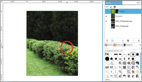
Figure 4-15. Paint a highlight color in the hedges
13. Grass usually isn’t a consistent green throughout except in lawns receiving the best professional care. To create a bit more realism, we’ll add some patches of slight discoloration in various areas. Click on the foreground color swatch (located in the toolbox) to open the Change Foreground Color dialog. To duplicate the exact color used in this tutorial, just enter the numeric values as follows: R-58, G-46, B-38. Click OK.
14. Create a new layer (Layer ➤ New Layer) and make sure Layer Fill Type is set to Transparency. Rename the new layer Patchy Spots.
15. Change the layer’s blending mode from Normal to Color and lower the layer’s opacity to 35%.
16. Using the Bucket Fill tool, fill the layer with the foreground color.
17. Add a layer mask to the new layer (Layer ➤ Mask ➤ Add Layer Mask). It should be initialized to black. Click on the layer mask to activate it.
18. Using a brush with the 2.Hardness 075 setting and white as the active color, paint several random areas around the grass to give it a few subtle patchy areas.
The end result should bear some resemblance to the example in Figure 4-16. If desired, save the image as an XCF file for future reference.
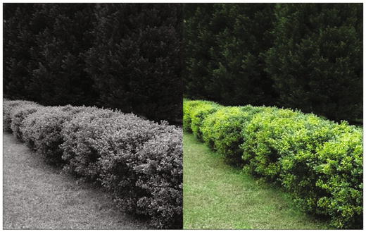
Figure 4-16. Before and after comparison
Tutorial 10: Colorizing a Folded Quilt
This project will be a bit more involved than the previous tutorials in this chapter. The quilt we’ll be colorizing has a number of patches in various colors. Steps 1-5 will get you started, and then you’ll use the quilt color guide to finish the lesson.
To do this tutorial, follow these steps:
1. Open the Ch_4 Folded Quilt.jpg file found in the Chapter 4 Practice Images folder.
2. Duplicate the background layer (Layer ➤ Duplicate Layer) and rename the duplicate layer Base Color (or leave as is).
3. Because this quilt is old, we’ll need to give the duplicate layer an aged, off-white look. Open the Colorize Dialog (Colors ➤ Colorize).
4. Adjust the Hue slider to 40 and the Saturation slider to 20 (Figure 4-17), then click OK.
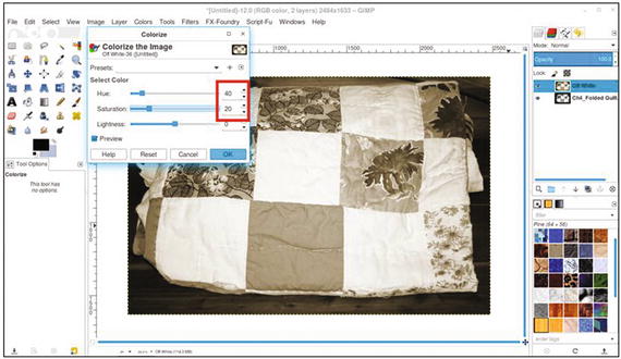
Figure 4-17. Use the Colorize dialog to give the quilt an off-white, aged look
5. As was done in Tutorial 5 in the previous chapter (colorizing the candy and dish), refer to the Quilt Colorizing Guide found in the Chapter 4 Practice Images folder, or refer to the one in Figure 4-18 for the color numeric inputs, layer blending modes, and layer opacities. A layered XCF version of this colorized project is also available in the Chapter 4 Practice Images folder.
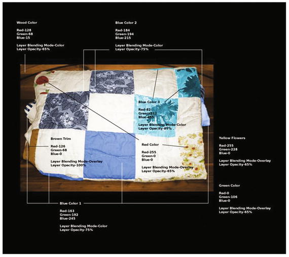
Figure 4-18. The quilt color guide
Note
In this tutorial, you’ll be creating layers and layer masks, as well as using the Paint Brush tool to paint the colors in various areas. Hopefully, you’ve had enough practice by now to do this successfully without complete step-by-step instructions. However, it would be a good idea to open the layered XCF file to “reverse engineer” it to duplicate the results.
Summary
If you’ve successfully completed the tutorials in this chapter, then congratulations again! These tutorials took things up a notch. First, we looked at colorizing a section of a brick wall and marble tile.
Next, we colorized a piece of wall art—a big job, but good practice. Then, we colorized some foliage (which is common in old black and white snapshots).
Finally, we tackled another big job by colorizing a quilt. Because there were quite a few colors involved in this lesson, a color reference guide is supplied in the Chapter 4 Practice Images folder.
In the next chapter, we’ll look at colorizing skin, hair, eyes, and teeth—useful information for colorizing portraits.