In this chapter, we’ll cover the following:
A tonally correct image
Using the histogram to assess tonality
Tracking tonality using the Color Picker tool
Using sample points
Tonal corrections using levels
Tonal corrections using curves
As a professional photo restoration artist, colorization is an oft-requested service. However, the images are almost always in need of some tonal adjustments to acquire the best overall contrast.
Since colorization is essentially applying translucent hues over various parts of the image, it’s important that the image has been tonally optimized to look its best and the most lifelike. This chapter will guide you in making basic tonal adjustments to optimize images before colorizing.
For those new to image editing, this chapter will introduce two methods of correcting dull and flat images: the Levels dialog and the Curves dialog.
A Tonally Correct Image
Black and white images (known as grayscalein the world of digital image editing) are composed of various shades of gray. These grays make up the tonal value of the image, which means lightness, darkness, and middle ranges. The tonal value is independent of chroma (color), but having the correct tonal values makes a colorized image look more realistic. Figure 2-1 shows a dull, flat image compared to one that is tonally correct.
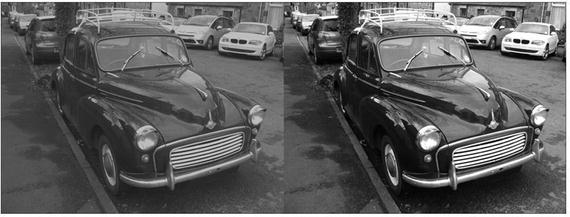
Figure 2-1. A comparison of an image that’s tonally flat and the same image with good contrast
Using the Histogram to Assess Tonality
A histogram is a graphical representation of the pixel brightness values in an image, ranging from 0 (pure black) to 255 (pure white). Factors such as image tonality and exposure determine the shape of the histogram. Tonal correction tools such as the Levels and Curves dialogs display a histogram in the window. You can also access the histogram window by itself (Colors Menu ➤ Info ➤ Histogram).
In the screenshot of the histogram in Figure 2-2, the darkest range of image data is on the left, the mid-range values are in the center, and the lightest values are on the right.
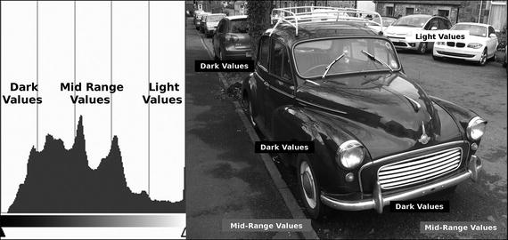
Figure 2-2. A histogram represents pixel lightness values in image data
One can usually just look at an image and tell whether it’s too bright, too dark, and so on. However, viewing the histogram is an accurate “map” of how the tonal value is distributed within the image. The shape of a histogram will reveal much about the tonal quality of an image. In the previous screenshot, the darkest and mid-range values form the tallest peaks, then slope downward as the values transition to lighter values (which there are fewer of).
The following examples demonstrate how the image tone distributes the data in a histogram, and where the image data is lacking.
Overexposed (too bright): Most of the image data is in the mid-range or light areas of the histogram (Figure 2-3).
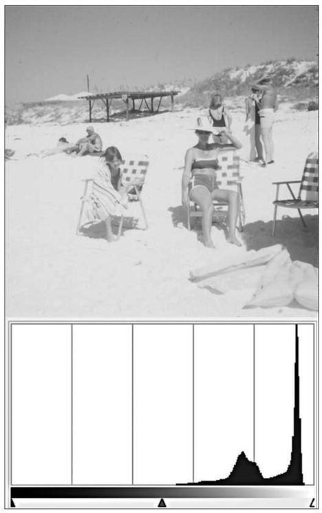
Figure 2-3. Most of the data is in the lightest range
Underexposed (too dark): Most of the image data is in the mid-range or dark areas of the histogram (Figure 2-4).
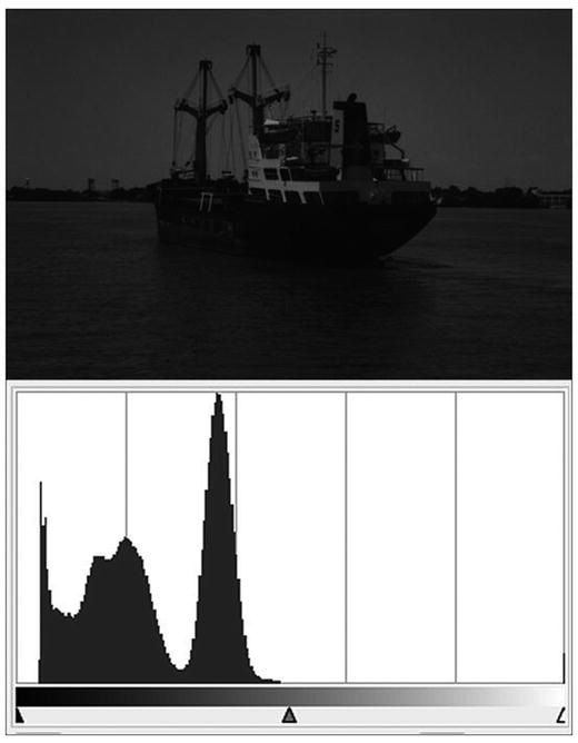
Figure 2-4. Most of the data is in the darkest range
Low contrast (dull tone): More of the image data is in the mid-range, with none in the darkest or lightest ranges (Figure 2-5).
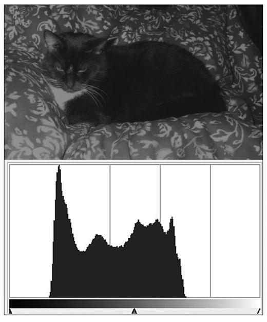
Figure 2-5. Most of the data is in the mid-range area
Balanced Tonality: The image data is spread across the full length of the histogram (Figure 2-6).
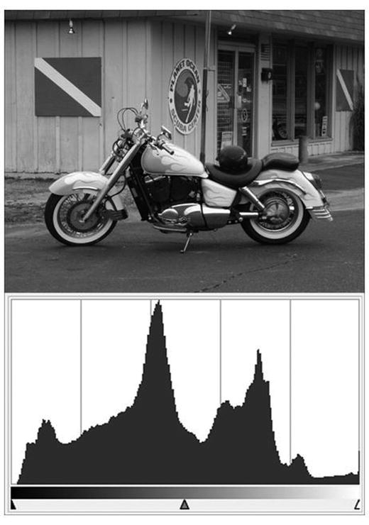
Figure 2-6. Most of the data is spread throughout the histogram
Using the Color Picker Tool to Track Tonality
As we touched on briefly in Chapter 1, the Color Picker tool is used to sample areas of your image to determine color values and tonal values. You’ll use this tool often to take color samples from reference images and to check the images you are colorizing. It can be handy for measuring gray values as well. In the black and white (grayscale, to be accurate) image shown in Figure 2-7, several areas have been sampled to determine the gray value (denoted as percentages) in various areas.
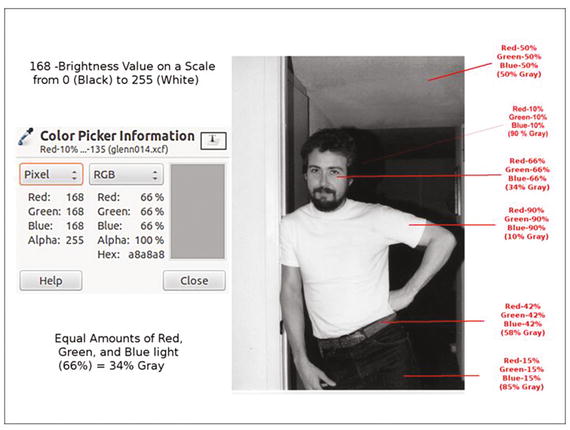
Figure 2-7. Using the Color Picker tool to track tonality
A grayscale image (as displayed on a monitor) is made up of equal amounts of red, green, and blue light. Using the eyedropper to sample pixels will display the percentages of red, green, and blue light composing any given shade of gray. You can sample a single pixel or an average of a radius of pixels you set the parameters for.
By default, the Color Picker, or Eyedropper, tool samples color data in RGB values (which will be used throughout this book). It can also display CMYK and HSV values.
Using Sample Points
Sample points are markers that can be placed on various parts of an image to help monitor specific areas as you edit. The data displayed will change in real time as you work. Sample points can be used to keep track of highlights, mid-tones, and shadows throughout the image (Figure 2-8). Although four are shown, it’s possible to create as many sample points as are needed. For the purpose of making a tonal correction, I generally place them in the darkest, mid-range, and lightest areas where I don’t want the correction to change the tone too drastically.
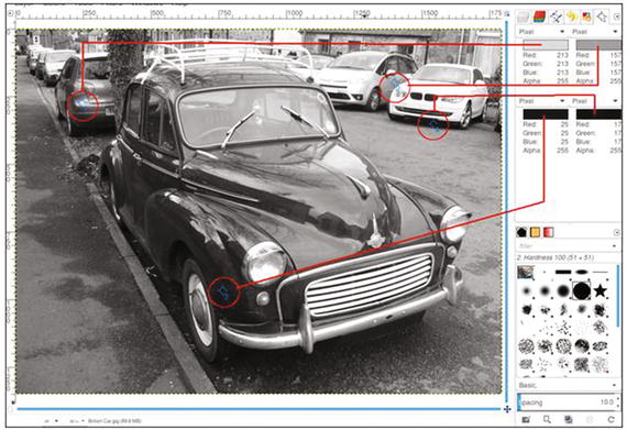
Figure 2-8. Using the Sample Points to track tonality
The Sample Points dialog can be accessed from the image menu (Windows ➤ Dockable Dialogs ➤ Sample Points). To create a sample point, press Control and click on one of the rulers in the image window, then drag with the mouse. Two perpendicular guides will appear. When you release the mouse button, the sample point will be placed where the two guides intersect (Figure 2-9). To move a sample point, click on it and drag it to where you’d like to place it. To remove a sample point, click on it and drag it off of the image workspace.
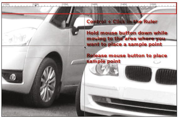
Figure 2-9. Sample Points are dragged from the Ruler
Note
It’s important to note that the brightest areas (highlights) and the darkest areas (shadows) in an image rarely contain pure white or black (the darkest shadows ideally should be around 90–95% gray, and the brightest highlights around 5–10% gray). By monitoring sample points placed in these areas, you can avoid making shadows too dark and highlights too bright when making tonal adjustments.
Tonal Correction Using Levels
The Levels dialog box (Figure 2-10) allows you to shift the brightest, mid-tone, and darkest pixels in the image you are working with. Essentially, this allows you to make an image lighter or darker, or to change the overall contrast.
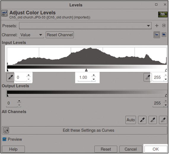
Figure 2-10. The portion of the Levels dialog that will be used in this chapter is shown in white
The Levels dialog is a complex one, and it might be overwhelming for a beginner. For the purposes of this chapter, only a couple of essential functions will be utilized. This will enable you to do the practice exercise a little later in this chapter and get a basic understanding of how to use levels. We’ll use the histogram and the Input Levels function; those features that won’t be used (shown grayed out in Figure 2-10) you don’t need to be concerned about for now.
I would, however, suggest investing some time learning about all of the features found in the Levels dialog at some point. The GIMP User Manual provides thorough coverage of this powerful dialog.
Levels Practice Exercise
For those of you who are new to image editing, this exercise will provide some hands-on experience in making a simple tonal correction using the Levels dialog.
For this exercise, follow these steps :
Open the practice image Ch2_Levels Correction.jpg, found in the Chapter 2Practice Images folder.
It’s always a good idea to work on a duplicate layer. To do this, navigate to the menu bar and go to Layers ➤ Duplicate Layer (Figure 2-11).
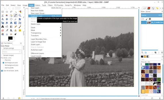
Figure 2-11. Create a duplicate of the background layer on which to make the tonal correction
Open the Levels dialog (Colors Menu ➤ Levels). Move the black slider toward the center, stopping at the base of the histogram (the numeric value will be around 55). Move the white slider toward the opposite side of the histogram’s base (the numeric value will be around 182). Finally, move the gamma slider just slightly to the left to reveal some of the detail in the darkest shadow areas (the numeric value will be around 1.10). After the sliders are moved into position, click OK. As Figure 2-12 shows, the image is improved a great deal.
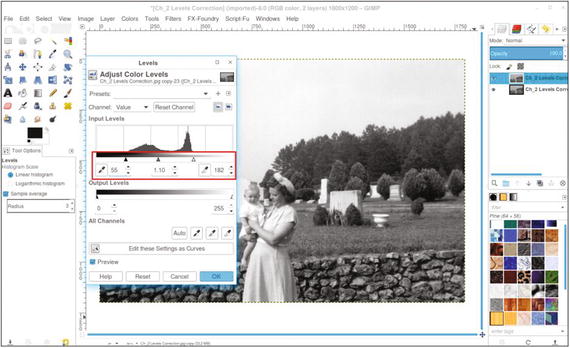
Figure 2-12. Using the Levels dialog to improve the contrast of this image
The image has gone from dull and flat to one with much better contrast—darker shadows and brighter highlights (Figure 2-13).
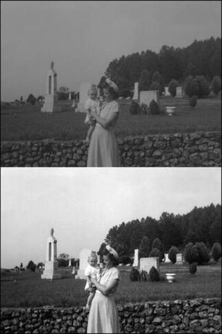
Figure 2-13. Before and after comparison
Tonal Correction Using Curves
The Curves dialog box allows you to shift the brightest, mid-tone, and darkest pixels in the image you are working with. As with levels, this allows you to control the tonality of an image.
Like the Levels dialog, it displays a histogram. A key difference in how the Curves dialog works is the ability to make tonal adjustments with greater precision. By attaching anchor points to the adjustment curve, changes can be made to pixels that are within a certain brightness range (Figure 2-14).
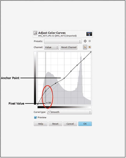
Figure 2-14. The Curves dialog box
Curves Practice Exercise
Like with levels, the Curves dialog might be a bit intimidating for beginners. In the exercise that follows, you’ll make a slight adjustment to improve the tonal quality of another image.
For this exercise, follow these steps :
Open the practice image Ch2_Curves_ Correction.jpg found in the Chapter 2 Practice Images folder.
As before, duplicate the background layer (Layers ➤ Duplicate Layer).
Open the Curves dialog (Colors Menu ➤ Curves). Click on the curve adjustment in the center of the grid to place an anchor point (Figure 2-15). To remove an anchor point, click on it and drag it off the dialog box while holding the mouse button down.
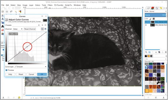
Figure 2-15. Click in the center of the grid to place an anchor point
Click on the adjustment curve (Figure 2-16) and approximate the “S” shape shown. This action brightens the highlights and darkens the shadows. Note that the new anchor points are placed where the image data begins and ends on either side of the histogram, then click OK.
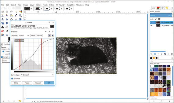
Figure 2-16. A slight “S” curve improves the contrast in this image
Note
Apply the “S” curve with a light touch. Make your adjustments gradually while monitoring the detail of the shadows and highlights.
The “S” curve is commonly used in image editing to correct contrast. With some experimentation, you’ll learn to easily improve images with flat contrast (Figure 2-17).
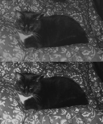
Figure 2-17. Before and after comparison
Summary
Because an image having the proper tonality is important prior to colorizing it, you were introduced to several aspects of assessing and correcting image tonality: the histogram, the Eyedropper tool, sample points, levels, and curves.
Two common features used for making tonal corrections are the Levels and Curves dialogs. The two exercises provided in this chapter teach the beginner how to correct tonality in dull, flat images.
In the next chapter, you’ll start colorizing several basic objects to get a feel for the colorizing process.