Table of Contents for
Responsive Web Design Toolkit
 Responsive Web Design Toolkit
Published by
Focal Press, 2015
Responsive Web Design Toolkit
Published by
Focal Press, 2015
- Cover
- Responsive Web Design Toolkit
- Responsive Web Design Toolkit
- Title
- Copyright
- Contents
- Dedication
- Assembling a Toolbox of Success
- Chapter 1: Responsive Web Design
- Chapter 2: Introducing the Engineering Process
- Chapter 3: Localhost, the Best Host
- Chapter 4: Apache Web Server
- Chapter 5: Connecting Devices to Your Computer
- Chapter 6: Virtual Hosts: Making Many Out of One
- Chapter 7: Get Together on GitHub
- Chapter 8: Google Chrome: Browsing a Page and Reading Its Code
- Chapter 9: Surviving CSS by Thriving With Sass
- Chapter 10: Google Analytics: Measuring Your UX With Analytics
- Chapter 11: Responsive Screen-Capture Project
- Chapter 12: Looking Around the Toolbox
- Appendix
- Index
Chapter 8
Google Chrome
Browsing a Page and Reading Its Code
When Is a Browser More Than a Browser?
The web browser has turned into something very special. It may have begun life modestly as a way for users to view webpages, but it has evolved over time into something more. It’s become a crucial tool for developing and debugging the very pages it views.
Whenever you’re reading a page, you can easily open up the developer tools and have a look at exactly how it’s made. If it’s a page from someone else, we gain inspiration, pro tips, and jumping-off points. If it’s your own page you can find out what’s not quite right, be it a JPG, HTML, CSS, or JavaScript.
We can practice the most modern technique of designing in browser. By inspecting elements and changing them, we’ll interactively add markup and style to instantly see what’s up.
All modern web browsers provide sophisticated developer tools. I’ll be covering Google Chrome because it’s the most popular cross-platform web browser.
How to Develop for Mobile Without Devices in Hand
Chapters in this book have helped you connect your phone and tablets to your development machine to better test your responsive web designs. Now this chapter is telling you that you don’t need to do that. “What’s up?” you may be asking yourself. “Has Ken lost his mind?” I assure you, I haven’t. It’s simply a matter of admitting that handhelds are sometimes hard to come by. Even without the device, you can still take some steps to test against an emulation of it without ruining a day of productive work.
Opening Chrome’s Developer Tools
Using a debugger is a great way to investigate buggy source code. The debugger’s job is to show you what source code is running. The problem for authors is that a browser executes our code fast, and based on user interactions, we never know exactly where it is. Fortunately, you can tell a debugger exactly what line it should pause on using a breakpoint.
Imagine if an auto mechanic could freeze time and roll underneath a car while it’s driving at full speed down the highway. That’s what happens when the debugger breaks on a line of code. With the engine still running, we can inspect the underlying system as it works. For us, it’s seeing the following:
- Inspecting the JavaScript as it executes and the data it holds
- Viewing HTML layout that forms the document’s page
- Listing files requested and brought across from the web server
- Identifying all styles applied to every document object model (DOM) element
A feature-rich browser like Chrome allows you to crack open a webpage and look inside to see how it’s working or find out why it isn’t working. Given those tools, you have a better chance at seeing the logic that doesn’t add up, styles that don’t look good, or missing elements that leave holes in your page.
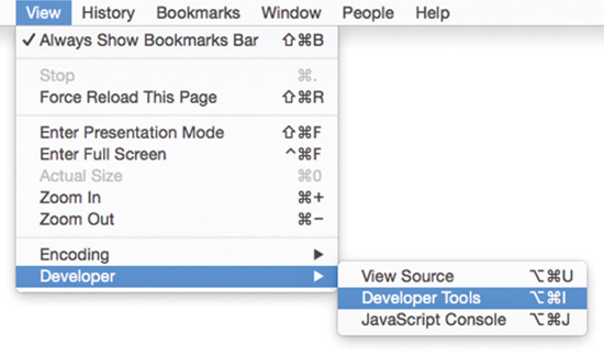
Opening the developer tools is simple enough. Take a moment to do it and look around a bit, briefly, before we dig deeply into specific features.
- Run Google Chrome web browser
- Click on the “View” drop-down menu
- Select “Developer” submenu item
- Select “Developer Tools” menu item
If this is your first introduction to the developer tools, you’ll enjoy learning about them and working them into your creative workflow. Investing time in learning this tool will serve you well in terms of more easily finding and fixing bugs and quirks in your website work. Work includes HTML layout and structure, CSS appearance and inheritance, and even JavaScript if you’re writing logic and rules. If at this point you’re only writing one or two of those languages, you may find your confidence growing as your experience builds.
Mobile Emulation Tools
Because this book is about responsive web development, we’ll have a look at the mobile emulation tool. You can clearly run this on desktop and resize your window back and forth to see how your design reacts to smaller and wider windows. It’s more interesting to see how we can emulate the mobile devices we know are in the possession of our target audience. That audience is made up of nearly everybody at this point. Unfortunately, we can’t possibly have all the phones and tablets that our collective audience will have, but yet we want and need to judge our work’s quality before it lands in their world.
Chrome’s mobile emulation toolset offers:
- Screen size—quickset by device name, but also free to resize
- User agent spoofing—lets the browser more accurately imitate the mobile device by telling the web server what it wants to know
- Bonus—not necessary but interesting for various applications: touch events, connection speed slow-down, geolocation overrides, gyroscope emulation
Touch Events
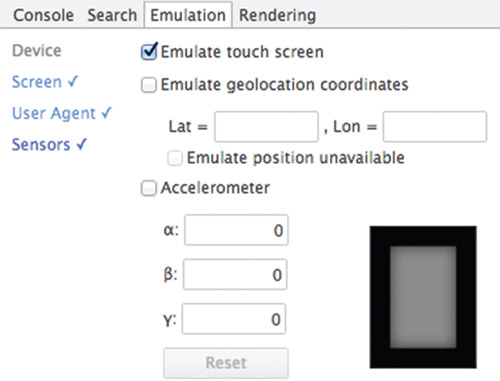
In the Chrome emulation shelf, you can turn on the “Emulate touch screen” function by ticking the associated checkbox found under the “Emulation” tab. What does this do? Immediately we notice the browser’s classic mouse pointer turns into a different shape. It’s more of a round bullet. That shape tells where the hotspot is as you touch your website. It’s round like a fingertip, and it’s the diameter of a typical touch zone a person presents each time they tap a touchscreen.
You’ll find certain touch events are now emulated by Chrome that will tickle whatever JavaScript logic you have associated with the following touch-specific events: touchstart, touchend, and touchmove.
Chrome’s touch event emulation is easily tested with the following webpage. It’s a concise demo that exercises the immediately useful touch-specific events for making interactions.
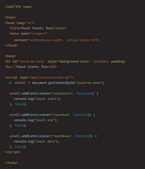
When you copy that code over to a new page in your favorite text editor, or IDE, and view it in a browser, you’ll see text printed out as you click and drop around the light-purple-colored box. You’ll see the text, through console.log(), by opening the developer tools and clicking on the “console” tab.
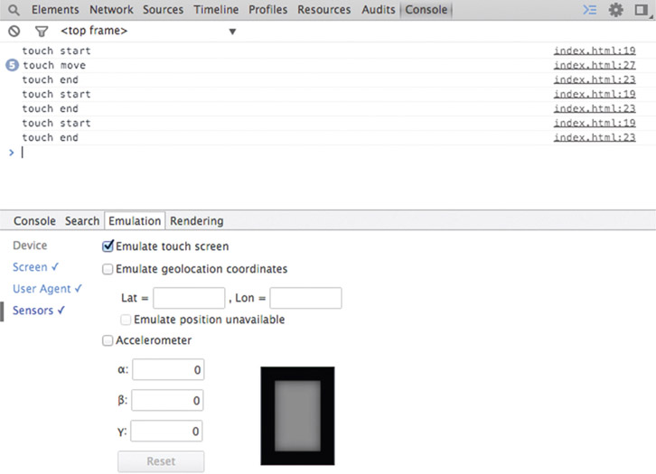
You’ll see that I choose using console.log() as a dependable debugging aid. If you’re wondering why, it’s because it comes from a technique I learned long ago when simply printing out text was the primary debugging tactic. Of course, there are many more inspection tools available in modern developer tools, and the JavaScript source-code debugger in Chrome is as good as any I’ve used in my long career. Still, I choose console.log() as a quick way to dump out information to see if some logic is triggered. It’s especially useful when events happen many times a second and I want to see real-time data flowing into place.
Working code running on real devices wins arguments. Sometimes we don’t have real hardware within reach. Mobile emulation tools let us stay productive and motivated as we design, build, and critique our work.
User Agent
In the Chrome emulation shelf, turn on the “Spoof user agent” function by ticking the associated checkbox found under the “Emulation” tab. Choose one of the predefined entries and then hit your website, either local or, more likely, an existing one on the Internet. Several dozen options are offered to you, but the most interesting ones are named after mobile devices. This is a device pretender to use while you’re developing responsive web designs.
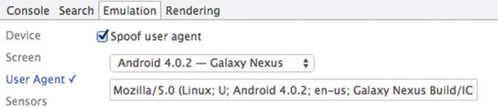
“User agent” refers to the web browser working on your (the user’s) behalf (as an agent). It’s a series of letters and numbers and a few punctuation marks strung together that tell a web server a little bit about your setup—details such as:
- CPU architecture
- Operating system and version
- Your browser’s name
- Compatibility with legacy browsers
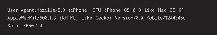
Here’s one example of a user agent string:
Why does this matter? For the most part, it matters very little between websites in these days of modern web design. Historically, servers have “sniffed” user agents and offered up customized experiences such as:
- Warn about incompatibilities with a given browser
- Serve up different files such as a stylesheet
- Offer to download various add-ins like plugins or extensions available for your browser
- Redirect you to a completely different website based on a version built especially for a mobile device
You know those websites that redirect you from a desktop site to a mobile site? Building a completely custom website based on a mobile experience is a legacy idea held over from the days when mobile devices didn’t have the power to render a well-designed website. This architectural choice already smells obsolete.
Today, we’d much rather build a single, fantastic site that’s responsive and works well for laptops, tablets, and phones. If you’re stuck with the architecture that redirects mobile devices to a specific website, at least you can use your desktop browser to test some of that when using a handheld device isn’t practical.
Network Tool—Watching What Files Go Across
Much of the slowness in a browser experience happens as files are transferred from a web server to the browser. Bigger files are slower, but sending lots of little files slows down the user experience, too. It might seem counterintuitive, but software engineers sometimes prefer a few bigger files to many smaller ones. Why is that? Lots of time is lost as the browser gains an initial connection to the web server to request the file. This is called latency.
You’ve probably judged this number-of-requests versus size-of-requests tradeoff before. Consider work you’ve done as a technically minded designer building websites in the past:
- Delivering a single sprite instead of multiple images
- Delivering a scalable icon font instead of dozens of static icon images
- Using Sass or Less to combine multiple stylesheets into a single one
- Concatenating several JavaScript files into a single one
These techniques can provide a noticeable speed boost and improve user experience. Please use more of them! It’s good stuff.
Back to the idea of how relatively slow it is for the initial connection (latency), we can map out the steps and see how much slower it is on a cell phone:
- Energize the cell radio chip
- Negotiate a connection with the local cell phone tower
- Look up the web server’s IP address from a name
- Connect to the web server and request a file
- Open a stream and bring the file across to your cell phone provider’s internal network
- Download the file from the service provider to your phone
That seems like a lot of work, and it happens relatively fast, but it’s far slower than what you see when on Wi-Fi. What’s to do here? Use your browser’s developer tool and click on the “Network” tab to see what files are pulled across the network from a web server to your local web browser.
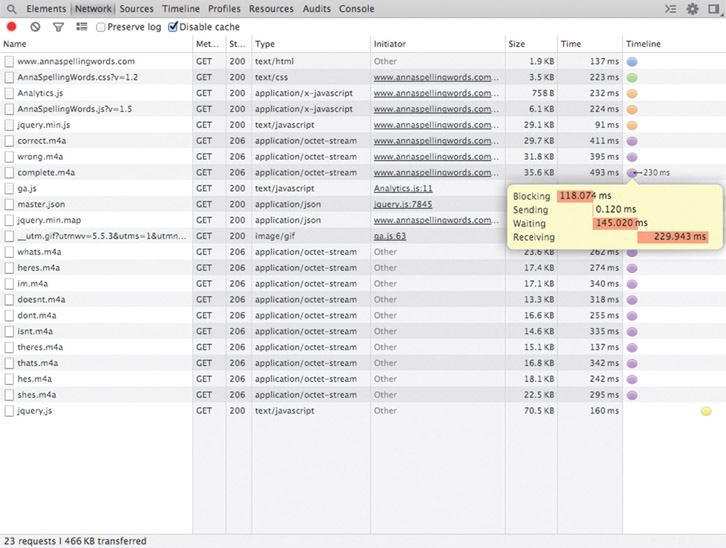
Remember that opening the developer tools is simply a matter of:
- Clicking on the “View” toolbar item
- Clicking on the “Developer” menu item
- Clicking on the “Developer Tools” submenu item
In this picture, you’ll see each of the files requested, its size, and how long it took for the request to complete. Click on the columns to see the list sorted in different ways to help you interpret it.
Sorting by name alphabetizes the list so you can better see what files are sent. Sorting by type reminds you what category of files are sent.
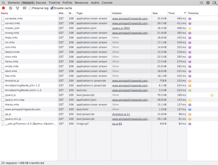
Sorting the network file list by size is interesting as you focus on the biggest files. Ensure they need to be sent, which is probably the case, or figure out if they can be sent in a smaller form. For example, you might turn a .PNG image into a compressed .JPG if the image’s transparency channel isn’t used. Open-source tools exist to shrink the size of PNG files, “crushing” them, by removing unnecessary additional data.
Sorting the network file list by time is interesting as you focus on reducing how long it takes files to download to your reader. For example, working with one of your team’s engineers, see if there are ways to store files on the user’s browser (cache control). Another way of sending files more quickly is by uploading them to high-speed content delivery networks (CDNs) such as Amazon S3. Both topics are outside the scope of this book, but I’ve mentioned them to get you thinking and talking to your team.
Looking at the network graph might evoke feelings of confusion, helplessness, and anger, but please don’t lose hope. It’s another tool that you can bring into your workflow as you build your website. Use it as a gauge for how your website is performing as your team builds it. Software engineers realize the first step of reducing how long something takes is measuring and recording that time. Later changes can be timed, recorded, and judged better depending on which direction the timings go.
Where are You Really? Latitude and Longitude
Do you have a web app or website that depends on your user’s current location? For example, letting them search around where they are right now for a thing they need most in life—like a coffee shop, movie theater, or grocery store? It’s a natural, given mobile devices have built-in tracking hardware and our ever-increasing goal of making solutions personalized. What JavaScript logic lets us ask the user’s spot in the world? There’s a function called navigator.geolocation() that returns the user’s latitude and longitude.
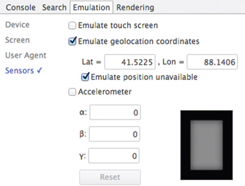
It’s fine if you’re testing this function on device in your comfy office chair, but you might be wondering: Will your code work for a customer in a far-off city? Even testing against a state nearby is interesting after a while. If you know the latitude and longitude of a city—you can easily look that up on your favorite web search site—use Google Chrome developer’s tools to test. When you open the developer tools and switch on the mobile emulation feature, you’ll see the “Sensors” option and the “Emulate geolocation coordinates” setting. Simply click on the checkbox to activate the feature and type in your test “Lat” and “Lon” values.
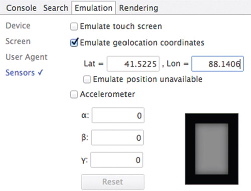
When you click through your web-site’s user experience, you ought to find that the web browser correctly substitutes the test values. Virtually move around the globe as you verify that your web apps work as expected in as many places as you can look up and test.
When looking at a model globe representing good ol’ planet Earth, we can sometimes see imaginary lines drawn from top to bottom all the way around. These vertical lines are called “longitude.” Wrapping around the globe are lines drawn horizontally called “latitude.” You can see these lines cross one another, roughly mapping out the world in a convenient array of boxes. When you’re looking up lats and lons, notice that there’s a difference between measurements in decimal degrees (want) and decimal minutes (do not want). Complex in detail but easy in theory!
If you happen to know the navigator.geolocation() function as well as I do or you think like a veteran software engineer and constantly ask, “What will go wrong?” you know there are error conditions that can pop up. Some are random hardware-related issues—like when the phone can’t talk to a nearby cell phone tower. In this case, the JavaScript function simply fails one time. A more blocking, unhappy path is when a user denies permission to find out their current position. How rude! Don’t they know our app is trying to help them? In any event, there are error conditions our JavaScript needs to handle to ensure the website doesn’t fall apart.
Writing that code isn’t too difficult, but testing can be a trial unless we take advantage of the Google mobile emulation tools and check the option “Emulator position unavailable.”
Let’s write a simple webpage with JavaScript, using the function that returns our browser’s location.
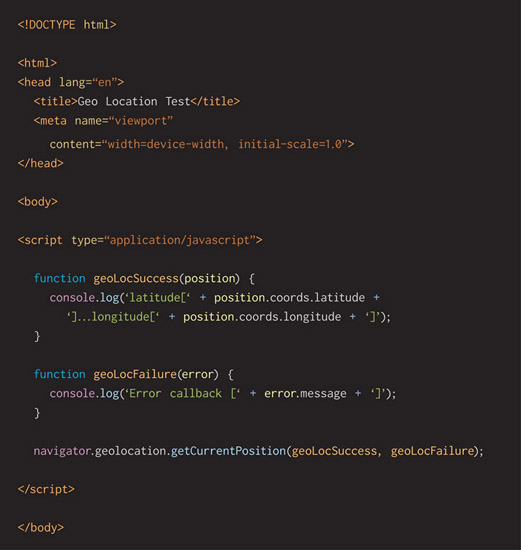
When you run this in your browser, ensure the developer tools are open, particularly the console. That’s important for showing what information comes back successfully or failing because of the printing command console.log.
If it’s a success, you’ll see something like this:

One type of error condition occurs when the user denies location services:

Another type of error condition occurs when it’s not possible for the browser to get the current location for some reason:

When you run your website and the browser is simulating a geolocation failure, you can casually test your code to ensure that it does the correct detection and reporting to your user. Sometimes it’s an accident, and they’ll be happy to have the heads-up along with direction on how to fix the problem. Either way, you’ll be happy to know your code behaves as you expect it to. Powerful developer tools that come with modern browsers will make your work easier and your development life happier.
Developer Tools for Mobile or Desktop
Developer Tools—Elements
Opening the developer tools first reveals the “Elements” tab. If you’ve never used this, pause a minute and give yourself some time to look around. It’s a lot to take in, and it looks highly technical at first, but it’s not. Use it to inspect your own website to get a feel for the tool. You’ll quickly recognize the underlying structure of your document laid out in HTML.
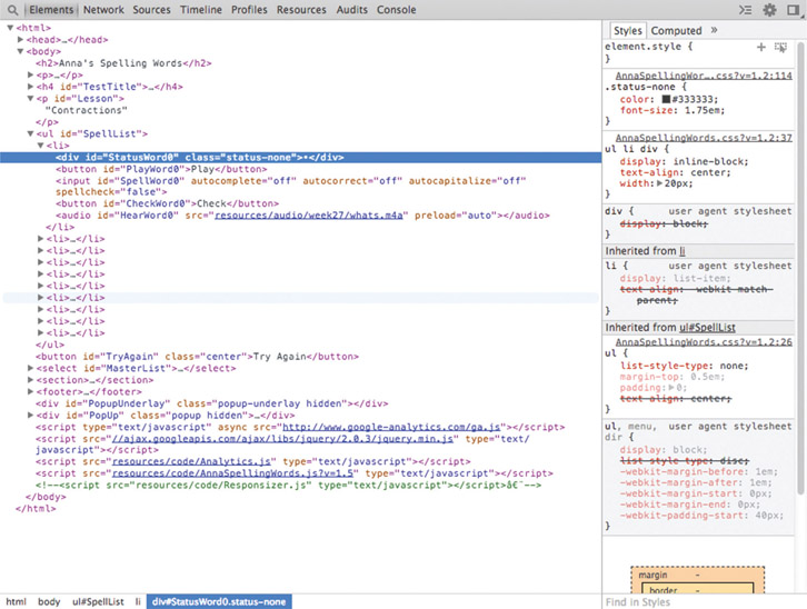
Notice that the HTML shown in the tool does not look literally like the code you wrote. Instead, this is the current representation of the DOM tree in HTML form. This represents how your browser sees your document.
Pass your mouse across the HTML layout and see the corresponding elements on your document page highlight. This quickly provides hints about what code represents what page rendering. Double-click on various parts of the HTML to edit an element in line. You can change things as you look at them. This is a fantastic way of visually inspecting your website and tweaking it to see if changes are better or worse.
Double-clicking on attributes lets you make changes like these:
- Element IDs
- Class names
- Default text values
There are editing modes in the developer tools in which you can edit an entire block of HTML wholesale, adding and removing as much detail as you desire. Change the entire section of code if you want to experiment. Pull blocks of HTML up and down the page by dragging and dropping them. This tool is powerful and worth playing around in to get a feel for how much can be done. Discover more on your own over time.
You’ll often turn to this tool just as a mechanic looks under the hood of a running car to get a feel for what’s moving regularly and what’s misfiring. It’s an incredibly useful introductory tool, and it’s something I encourage you to pick up and make your own.
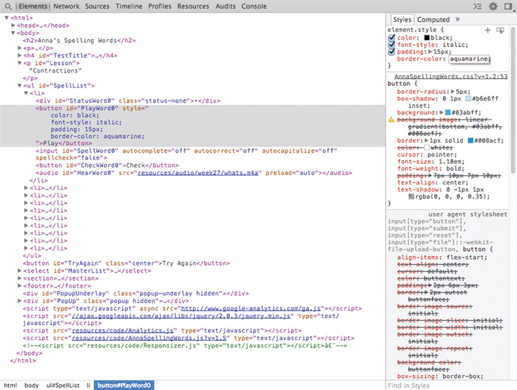
Developer Tools—Styles
Pairing nicely with the “Elements” panel is the “Styles” panel to its right. For every HTML element on your document, you’ll see its CSS rules. We’ve reviewed previously how important modifying the structural layout of a page is. We must also remember that the style is important because it declares how each element is finally rendered.
Styles come in a few categories of rules, and their order is subtly represented as a stack of boxes:
- The bottom-most boxes are default styles, built into the web browser itself. Given no custom rules, these are the basic ones the browser uses. For example, if you don’t define a text color yourself, it defaults to black. Often they’re referred to as the “user agent stylesheet.”
- The next section of boxes is explicitly declared in your .CSS files as you’ve crafted your website’s look. These are the ones you’ve written for element type, element by ID, or class names. You’ll see them stacked on top of each other as they’re layered and mixed as applied to each HTML element. Editing these applies to the basic class and ripples through each application of class or element type.
- Finally, on the very top are styles applied to the particular element. This is a fun box because it’s one where you can double-click to add and override styles, tweaking code until the display looks exactly as you want it to.
Editing and viewing styles is a great place to dive head first into developer tools, and I recommend you to take the plunge as soon as you can. Changing element styles on the fly provides amazing real-time feedback. Take the guesswork out of typing CSS in your text editor by designing in the browser. People once considered this an advanced technique, but it’s becoming commonplace because it’s so easily accomplished. Take time to poke and pull at your site until it’s to your liking.
When you’re finished changing things, don’t forget to record all of your changes in your original source code files back in the text editor. Working in the browser is seductively hands on, but that work is fleeting. Refreshing the page will wipe out all your changes in a fraction of a second.
Developer Tools—Sources
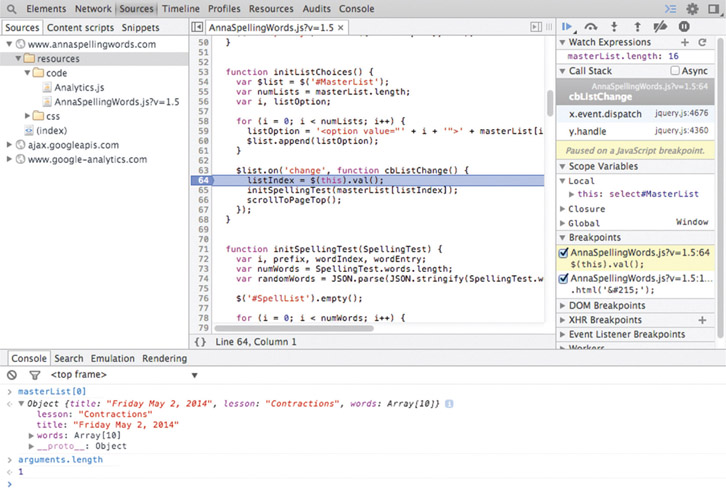
When you click on the “Sources” tab, you’ll see a panel on the left where you can sort through all of the JavaScript files loaded for your website. Double-click on any of them and the source code is shown in the middle panel. Click on any line number in the left column to set a breakpoint. Breakpoints tell the browser to stop progress if that logic is executed—usually triggered by user interaction. Why use breakpoints? Because when one hits, you can take advantage of the right-hand panel to:
- Poke around each of your variables to make sure each contains what it ought to
- See the list of functions called as a stack from bottom to top, oldest to most recent, ensuring your logic is triggered in order as you expect them
- Manage breakpoints for your JavaScript, DOM changes, and AJAX (asynchronous JavaScript and XML) requests
Source code inspection is only useful if you’ve written some of it or know the libraries that you have included. Some of the open-source libraries that you pull into your website—such as jQuery, perhaps—may have been optimized (minified) for final production work. That means all of the spaces and whitespace that humans need for properly reading it are gone because the computer and browser don’t require them, and deleting that extra information reduces the overall file size. These are hard to read, and debugging them isn’t particularly useful. When you do want to see what’s going on inside your favorite open-source library, look for versions of it that aren’t minified or compressed or that otherwise tell you they’re useful for development and debugging.
When you do write JavaScript, look to this section of the developer tools to help you gain understanding on how it’s called by your website. Use breakpoints to stop your code in its tracks so you can look around and see what has happened and what hasn’t happened. There are buttons that let you step through it a single line at a time to see how every instruction changes the world. Some let you step into a function to see all of its internal workings, but if you know for a fact it’s behaving well, step over it.
Some of these words will sound technical and peculiar because they’re from the domain of software engineers. It’s true, but the more you fearlessly approach them, the more clearly you’ll understand them over time. It’s worth it and will empower you to be a better teammate and maker. This is definitely an intermediate-level tool, so don’t put pressure on yourself to understand it all at once.
Developer Tools—Network
Monitoring which files come across the network from your website to your browser is an advanced technique. Have a look at it for sure, but don’t hassle yourself if looking at this page isn’t immediately obvious or interesting to you. In many ways, it’s a finishing-touch tool. As an artist and designer, you build out your site; when you find that it feels sluggish, you and your engineer can take some time to look in here to find which files are slow to serve.
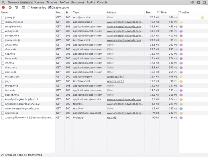
What happens when the browser records files brought across? What’s it mean? You’ll see a list of them, and you can take notice of the size for sure, but in a way, size doesn’t matter. It’s all about speed and how long it takes to drag them across. Any file that takes more than 500 ms, which is half a second, is something to notice. Small delays add up over time, and before you know it, you have a slow site on your hands.
When a website takes too much time to respond to user input, you can expect those users to leave. My sales friend Kristine reminds me that “time kills deals.” You don’t want a slow site to make your customers drift away to the competition.
Clicking on the “Time” column, you can sort the list of resources by speed in descending or ascending order. Use the one that makes the most sense to you.
What if you find files that you suspect are taking too long? What are some of the things you can do to make them more efficient?
- If it’s a .PNG image file, you can convert it to a .JPG for better compression if it’s completely opaque. If transparency is important, tools such as PNG Crush exist that will squeeze every last extraneous bit away.
- If it’s a JavaScript library, you can look for tools that minify it to squeeze it down, removing the whitespace and simplifying variable names that humans need but computers do not.
- If it’s other heavy resources such as audio and video, you might find ways to delay loading them until the user calls for their playback.
Q/A experts will enjoy getting to know this tool.
Measure your website’s transmission speeds over time. Performance monitoring is a key discipline in today’s world because quick response is coveted. Users waiting more than a few seconds will become impatient, and in a few seconds more, they may become lost as they move on to the next website.
I’ve found that optimizing doesn’t matter until I can reliably measure what I’m going to change. I need to know before, after, and the difference between to understand if my tweaks and tunes are a help or a hindrance. Make measurement as easy as possible, because easier means it’s done more often.
Finding Inspiration and Answers from Others
“This website is amazing. The animations and interaction are fantastic. How did they do that?” You probably ask yourself this question daily. I know I do.
Fortunately, Google Chrome lets you right-click on any page element to perform an “Inspect Element,” which opens Developer Tools straight to its details. Of course, you’ll find nearby the CSS “Styles” panel. Flooding your brain are all the things that make a cool-looking site tick. Finally, looking around in the “Sources” tab, you’ll see any JavaScript code supporting dynamic interactions. Use these tools to understand what other highly skilled professionals have done before you.
Hopefully creators won’t think this is underhanded, theft, or unsporting to a level of cheating. From my perspective, there’s a long tradition of copying masters to obtain one’s own education. As a student, I grew up hearing stories of amateur artists visiting museums to witness the great treasure troves of art hanging upon the walls. Displays of great work are the examples students take for understanding color, shape, and composition. Taking basic supplies to copy the paintings is a well-known convention. Practice makes perfect, and we might as well have perfection as our target.
I’ve done this many times in recent years as a diversion and escape to practice my hand skills. With a drawing book and pencil in my back pocket, I’ve roamed the many halls of my local Dallas Museum of Art, stopping long enough to quickly sketch whatever inspires me. I’ve done the same when it comes to websites. Of course, our clear warning in this regard for our professional lives comes from Pablo Picasso, who said:
Good artists copy; great artists steal.
Surely we can say that mimicry of a single site’s style is weak, but surveying many to get a sense of style and overarching themes and techniques is a better use of our time and effort. Use your browser’s inspection tool to find out what the trends of your day are. Tease out specific techniques from many websites to improve your skills. Observe everyone to see what’s most important for you at that moment.
Chrome Canary
In my opinion, one of the best-kept secrets in the web development community is Google Chrome Canary. Of course it’s not literally a secret, but it’s not a particularly common program that we hear of people installing. I can only say it’s obscure. That’s on purpose, I believe, because using it takes the right stuff in a designer, developer, and engineer. Canary is built nightly from the latest code its programmers submit. Feature changes happen nearly every day without stop, and you might be surprised what you find.
Someone could say that’s troublesome. It introduces randomness and variables that make building software difficult. Fair enough, but when I think of it more, it’s amazing. I get to see in beta form what’s going to happen several months before final release to the public. I can preview their changes to ensure my website holds up to future expectations.
Even better, the Canary browser takes on changes in the development tools. At the writing of this book, my Canary-based developer tools look a far sight different than what people see in widely used Chrome. Does Canary’s occasional updates to itself bring some glitches? Sure, but problems rarely remain for long, and the valuable benefit of seeing what’s to come is well worth the time taken to incorporate it as a powerful entry in our toolbox.
Its programmers have spent time making Canary separate from Chrome. Both browsers can be installed and open at the same time without conflict. In the unlikely event you ever see Canary do something that’s unexpected, you can simply run Chrome. Comparing the results might reveal if the bug is in fact a feature change according to design. I often keep my Chrome browser installed as my routine personal browser because it’s totally stable and reliable.
Now that you know about this, will you look for it to better test your work and receive developer tools before your competition does? You might wonder if other major browsers do the same service for the community. In fact, you can easily search to find that Mozilla does the same for Firefox, Opera offers fresh builds, WebKit serves as the foundation for Safari, and so too does Internet Explorer. Check for these in your favorite search engine using keywords such as “developer preview” and “nightly build.”
Alternatives
There are many feature-rich options for tooling in this arena. In fact, it’s almost to the point that it’s a matter of taste. If one of the major web browsers suits your needs for whatever reason, you’re going to have great success using it. If there’s some particular aspect of Internet Explorer, Firefox, Safari, or Chrome that makes your creative workflow explode, then by all means use it. Most have the basic abilities that will make you more productive in seeing, finding, and fixing bugs on webpages or web apps.
Whatever tool you choose, please take time to learn it thoroughly. Use it every day and take a chance to figure out one more thing it does. This is one of the tools that can separate you from the inexperienced masses in the industry, distance you from the competition, and help raise the game of you and your team.
Browse Sites and Debug Your Own
Browsing the web is surely a fascinating pursuit. There’s so much content contained within its boundless frontier that it’s inconceivable to wrap my brain around it. All of the human emotional reactions are stuffed inside it to a point of overflowing. Mixed alongside those are intellectual reports and data sets of factual evidence, all within reach. In the very same tool that we use to browse through these pages, flowing along links loosely coupling sites to more sites, we have the ability to stop and see how they’re constructed.
Looking at other people’s work gives us insight into their techniques and craft. Library choices, conventions, and technical trade-offs are learning lessons for us. Reflecting on what others in our industry are doing surely informs our thinking to reinforce good choices and reconsider flawed ones.
Inspecting our own sites leads to better work that’s more functional, reliable, and, whenever possible, simpler. When we decide that work is done, it ought to be bug free and good enough to go out to the customer. We can always find new bugs and fix them with updates, but at the time, we need to have put in enough testing during our creative work cycle to feel confident enough to release.
Interactively examining your HTML layout, CSS rules, and JavaScript logic is the only way to assuredly reach a conclusion that work is done enough to confidently ship out and deploy to the public with your name on it.
All of the modern web browsers are much more than page readers. This chapter brings to light many of the things that Google Chrome can do, because I find it useful enough that I want to explain what it does for me and what problems you can solve with it. When you take the time to investigate any other major modern web browser, you’ll see that it has many of the capabilities of Chrome and some that it lacks. We can admit it feels as though there’s too much to learn when it comes to front-end web development. Don’t let all of the options in the community confuse you with a constant flood of choices. I think it’s fine to specialize with a tool until you know it so well that it’s a reliable go-to. Whatever browser you choose, realize that it is a powerful tool you ought to invest in learning through constant use.