Table of Contents for
Responsive Web Design Toolkit
 Responsive Web Design Toolkit
Published by
Focal Press, 2015
Responsive Web Design Toolkit
Published by
Focal Press, 2015
- Cover
- Responsive Web Design Toolkit
- Responsive Web Design Toolkit
- Title
- Copyright
- Contents
- Dedication
- Assembling a Toolbox of Success
- Chapter 1: Responsive Web Design
- Chapter 2: Introducing the Engineering Process
- Chapter 3: Localhost, the Best Host
- Chapter 4: Apache Web Server
- Chapter 5: Connecting Devices to Your Computer
- Chapter 6: Virtual Hosts: Making Many Out of One
- Chapter 7: Get Together on GitHub
- Chapter 8: Google Chrome: Browsing a Page and Reading Its Code
- Chapter 9: Surviving CSS by Thriving With Sass
- Chapter 10: Google Analytics: Measuring Your UX With Analytics
- Chapter 11: Responsive Screen-Capture Project
- Chapter 12: Looking Around the Toolbox
- Appendix
- Index
Chapter 10
Google Analytics
Measuring Your UX With Analytics
Why Are Analytics Important?
So much about making things in the business world is that we need to solve problems for people by providing them value. In turn, we need to make some money—we need to profit, in fact. Not in a horrible greedy attitude, but in a practical way so that we can continue to solve interesting, real-world problems for people.
Analytics help us measure how people use our app—not overall but the moment-to-moment interactions that make up workflows. Analytics let us validate the little things that make up the big things like entirely new features. Big things provide value to our customers and provide return on our investment. Breaking down the big things in your app as a flow of little things makes it easier to make decisions based on facts. Fact-based decision making carries more authority when you go to convince your stakeholders and tech team that you need their time and talent. If your organization has made decisions based on gut instinct and tradition, consider analytics as a new tool to help validate your choices.
Analytics, with respect to websites, have to do with collecting and reporting user interactions with pages hosted from your web server. The goal is finding trends in measuring how your customers are using and viewing your work to better enable them to use your technology.
Getting good feedback is tough. Once you make a product design decision, how do you know you made it correctly? What if a change went wrong? How would your users tell you? Maybe they blast you on Twitter or give you a one-star rating but do not list specifically what mistakes were made. Getting out of the office and meeting random people at coffee shops is a good way to get feedback because you can hear what they say, and better yet, watch what they do.
Jeff Gothelf recommends this as a starting point for educating your team:
Collaborative discovery is an approach to research that gets the entire team out of the building—literally and figuratively—to meet with and learn from customers. It gives everyone on the team a chance to see how the hypotheses are testing and, most importantly, multiplies the number of inputs the team can use to gather customer insight.
Jeff Gothelf with Josh Seiden, Lean UX: Applying Lean Principles to Improve User Experience (Sebastopol: O’Reilly Media, Inc., 2013, p. 74)
There are lots of good reasons to be inspired by his suggestion. It’s surely worth trying to see if it becomes a part of your toolbox.
My challenge with that plan is wondering if it scales over time. Scheduling team outings into the field to accumulate user responses for frequent changes is time consuming. I’m also stuck visiting people only in my general region. I dream of one day having hundreds of thousands and possibly millions of users, and talking to a statistically significant number of them will be impossible.
Instead, I’ll be better informed if I have a system through which I can sample all my users—no matter how many there are. Then I can truly learn what they like and don’t like about my app more quickly and confidently. That’s why anonymous analytics are crucial to my plan for building remarkable user experiences.
As soon as changes are made and deployed into the field, we start seeing waves of users telling us if we made good choices. Analytics let us know if things are clicked, pushed, tapped, and swiped more often or less. Looking at the data over hours, days, and weeks lets you know if changes were well received or poorly understood or simply didn’t matter. From there, you can decide to take more actions. Engineers tasked with turning slow code into fast code know the first rule of Code Club is: Measure. If an engineer can’t measure how slow a chunk of logic is, they’re wasting their time making code changes because they won’t know if things become better (faster) or worse (slower). Learning from that, we can say that changing user interfaces, experiences, contents, layouts, and responsive design ought to be tested.
Embrace change. So much of the startup culture is based around pivoting, A/B testing, optimizing signup conversion, and seeking market acceptance. Attributes for a modern company’s new hire are surely based around these evocative, change-related subjects.
People can be skeptical of change because they’re fearful of what they think it means. People can want assurance that an investment will pay off and demand all the answers before choosing to begin. People can have an attitude that they want to finish something and be done with it. Rarely is this level of control available to us, and that level of control is an illusion.
Are your changes to a mobile site better enabling your users to use your technology? While making design changes, ask yourself:
- Are call-to-action buttons more often hit when you make changes to your CSS breaking points specially made for a phone?
- Does turning a row of buttons into a drop-down menu for tablet form factors make users touch the options more readily?
- Does making images fluid to better scale down with smaller screens help or hurt your product sales pitch?
Turn to analytics to come up with answers to your questions. This might sound more like science than art to you, and I’ll assure you there’s nothing wrong with that.
If all of this sounds like too much math or is pushing you uncomfortably toward science, I encourage you to stay strong and see how you can internalize analytics to empower your creative process. Establishing a loop in which you keenly observe, propose educated guesses about how things are used, create a test in which you put changes into public action, and then measure the outcome sounds very much like the scientific method. It is, and that’s perfectly fine. This describes the core loop of our modern scientific process, and it’s well worth taking it for your own needs. I’m worried there’s a split in our culture that pits art and science at opposite ends of a spectrum. What’s worse to me is that they are characterized as being opposed to one another. It’s a shame to me, wrong headed, and worst yet, not helpful. Scientists must dream, too, after all, and I think artists and designers will do well to postulate and evaluate.
For all creative leaders reading this book, I advise you to help your team merge some of these principles into their daily work. It will raise their level of quality by pushing their efforts past intuition and reference to what has worked in the past. These are helpful ways to start a collaborative conversation, but reality check that work with analytics. Measure how well solutions perform and either improve them or cut them, but try to remove the guesswork whenever possible.
In this chapter, I’ve chosen Google Analytics as the tool I want to show you how to use. It’s one of the most popular systems because it has a complete set of features, it works on both websites and native apps, and it has a free tier that makes it easily within your reach right now.
Analytics-Driven Design
How can analytics inform the decisions that artists and designers make? What specific numbers are the most helpful? Many are useful, but let’s focus on a few specific examples and how they can better inform your choices during parts of the creative process. Given all possible options in the universe, how can some numbers guide you to a more successful conclusion?
Screen Sizes
Find out exactly what resolution customers’ devices are presenting when they view your site. Discover the array of screen sizes and how often they happen during visits. If screen sizes are trending upward, trending downward, or holding steady, you can be more confident in the designs you’re making by looking at these numbers. Keep track of screen resolutions and create new breakpoints in your responsive design to match popular form factors.
You might be surprised at the screen sizes reported for your website. What if they’re bigger than you expected? Your audience could be made up of people viewing your website full screen on a high-end monitor. That too is something you want to know and respond to—you’re probably not taking advantage of the full width of a display that big. Centering a block of content along a web page has been a good solution in the past, but a few inches of blank space along the left and right margins might look boring and need filling.
Device Brand and Name
If you find that your website is frequently visited mostly by Apple devices, be sure to feature iPhones and iPads in your documentation and illustrations. Allow your users to feel more welcome in your supporting material by showing the devices you know they’re using. When designing advertising, drop screen shots of your website into the frames of Android devices if you see they’re more popular. Determining exactly which hardware users visit on is surprisingly easy.
Know Your Audience
As you learn about analytics and what they do to validate you work and confirm your choices, require them in your projects. Some people believe demand for measuring user performance in an app or website inevitably comes from the business development group. What if your biz-dev folks don’t know enough about analytics to appreciate them and ask for them? Then it’s up to you to demand that analytics be planned and built into your websites and apps. Once the idea is built into your culture, you won’t need to put much effort into asking for them. I predict everyone in your organization will want analytics once they see the concrete benefit.
Developer Choices Through Analytics
How can analytics inform the decisions developers make? An excellent use is finding out what operating system is most popular. If a new version of Android or iOS ships out with a hot new feature, you can track what percentage of your users have it on their mobile devices. Once you find the trend of use is moving upward and it hits some minimum threshold (say 20%) that makes it worth investing in the feature, you can be assured it is providing value to your users, and you ought to schedule time to implement it.
Along the same lines, track the versions of operating systems and watch as older ones start decreasing in appearance. Once a legacy operating system version drops below some threshold (say 5%) that makes it too expensive to maintain for the little use it gets, you can be assured it’s worth cutting support for it. Don’t bother fixing bugs in features nobody uses. Don’t bother testing on an operating system nobody wants. There are always better ways to allocate your limited time. Lean into forward-thinking technologies that you know your users will soon move to. This is easy to see as you find trends on how quickly users have adopted new versions of their preferred operating systems. What category of users upgrades to the latest versions of their OS most quickly? Is it iOS or Android customers? Use the past to inform your future decisions.
Project Decision Making With Analytics
How can analytics inform the decisions that project managers make? Management should lead a culture of analytics at their company. Setting an example for everyone on their team, a product owner will refer to analytics performance to set goals for success before project work begins and measure their effectiveness once the app is live and customer facing.
Before investing in a mobile-first redesign to an existing site, the project manager can first determine if mobile customers are already interested in visiting the website. Real-world mobile usage can inform whether this project gets prioritized.
Since managers are responsible for purchasing hardware for the team, they can check to see which devices are most often used. It doesn’t make sense to have QA staff test on a device that your audience barely owns.
Engagement numbers show the dedication of customers. A product owner can find out if new customers are arriving through acquisition channels and whether legacy ones continue to return. Keep an eye on older devices that no longer come to the site. This helps budget limited resources, such as time and money, toward the modern and emerging devices, browsers, and operating systems. If usage is dropping to 5% or below, there’s a decision to make. Take time to mindfully decide what to do with the support. Invest time and talent to grow it or invest to remove the underperforming feature.
What If You Don’t Have a Running Site With Analytics?
Much of this chapter talks about drawing reports against historical data. You might be wondering what this means if you don’t have a public site running analytics. How can you benefit? It’s never too late to start recording analytics. If you already have a website in production, add analytics immediately. Start finding out if you’re performing for your people.
If you’re building a site from scratch and want to learn from analytics before sending out into the Internet, try teaming up with someone. In the computer programming world, this tactic is called “pair programming” or “pairing.” It simply admits that an individual can’t realistically know everything, and that’s all right. It’s nothing to worry over, so let’s get past that while moving on to solving problems. I think pairing makes real the proverbial cliché that two heads are better than one. Historically we’ve called this collaborating, teaming up, and combining forces. Try looking around to find mature websites and web apps that have a profile similar to yours. Consider judging size, user persona, operating environment, production schedule, and any other characteristics that appear alike. Here are some informed sources from whom you can learn:
- If you’re in a large company, look for a sister organization with a similar project already in use.
- If you’re in a client-services group, perhaps a former customer will allow you access to their data from a site you’ve built for them.
- If you’re in a city of any size, contact your wider professional network with links established from local meetups.
There are always alternatives when you need help. There are always people needing help who might reach out to you.
Adding Google Analytics to Your Site
I will introduce you to analytics by using Google’s product. It’s easily accessed and feature rich, and signing up for even the free tier gives you access to great capabilities. Later in this chapter, you’ll read about alternative solutions, but for now, let’s work on using this one.
Visit Google’s product website and sign up:

Their website guides you through the sign-up process as well as the first steps. Initially you’ll want to:
- Create an account representing your project, or company
- Create a property representing an aspect of that account, such as a website
- Planning ahead, you should create two different properties: development and production. The development version is for your team to use while building and testing. The production version is the final one your customers will use. You don’t want your test data to get mixed with your real production data. Just remember to switch the analytics account code from development to production when you go live.
- Copy the snippet of source code from the Google Analytics property page under a menu called “.JS Tracking Code.” It’s about 10 lines of JavaScript put on each page on your website that you want Google to know about and measure with analytics. This might be on the single index.html of an incredibly simple one-page website. For a multipage site, it must be put on every.html file you’re building.
Once you’ve added this JavaScript to your web pages, they’ll start reporting analytics data to Google.
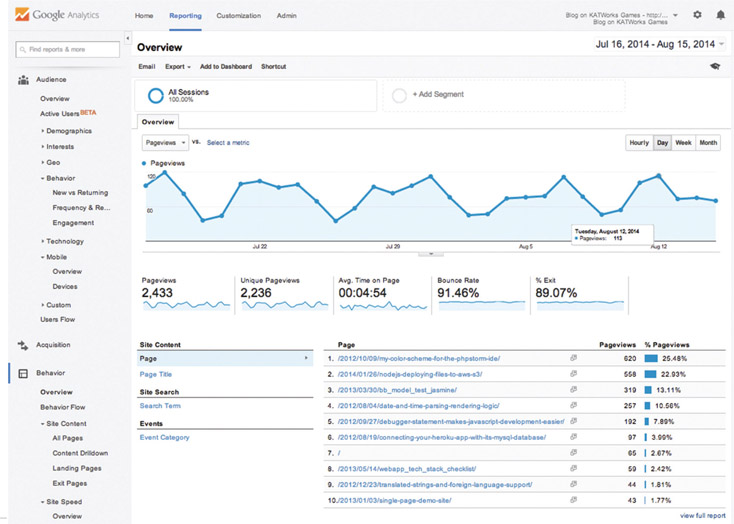
Reading the Google Analytics Default Dashboard
Once you have your website or web app reporting analytics through the Google SDK (software development kit) libraries, you’ll start seeing data. A limited amount of data is reported in real time, but the bulk of it is accumulated in temporary storage and processed once a day, reducing the burden of crunching events into numbers. All the numbers are available, and you can crack open the data and peek around. Looking into the default dashboard is intimidating for more than a few hardy souls.
When I look at the dashboard with new teammates, there’s no other way to describe the feeling. My friends and colleagues see all of the dozens of pages of reports, and they feel like a flood of big data is hosing them down. Can a person really drown in numbers? Mentally, you can. Historical collections in aggregate are reassuring, but for daily reference, we need to simplify our reporting process by dialing into what’s necessary.
Necessary to whom? Self-interest dictates one person or a team is only interested in what they’re interested in. Enjoying a highly targeted stream of analytics data is much better than trying to cope with a flood of big data.
Is there a way to limit data collections to only what we need? No, that would be a mistake, because sometime in the future, we might have new business needs and want to draw conclusions on historical data for new insights. The first rule of big data is saving our data, and if it’s not there, we’re stuck at a dead end. Instead we want filtered reporting, and Google Analytics has a fantastic way to do that. You can create a custom dashboard that dials in to the specific views you want to track and learn from. Custom dashboards are easily shared with your team-mates who have access to the same projects you do. Hard work invested in handcrafting a custom dashboard is only done once for a team, because it’s only a few clicks away from the entire group.
Crucial Data Points
We’ve already said that using the default dashboard provides access to all the analytics data our site collects, but its challenge is that it provides access to all the analytics data. I want our first exploration into analytics to be focused toward the first-class mobile-specific stats that best help you immediately.
- Total Session Visits
- Device Category
- Screen Resolution
- Mobile Screen Resolution
- Mobile Device Branding
- Mobile Device Model
- Visitor Country/Territory
- Browser Name
- Operating System
- Android Operating System Version
- iOS Version
Use these daily to get started in analytics reporting and assessment. Once you feel smart and confident using the reports from this list, take time to pull in new and interesting-looking ones. In the next section, you will see how to create a custom dashboard dedicated to mobile devices. What it reports tells you how to better build responsive designs.
Analytics have a real-time section that shows you information about your users as the usage happens. What this section reports is limited because it’s relatively complex for the system to receive these data, process them, and put them into a form that can be reported. All data are stored and processed in bulk once or twice a day. I think of it as overnight to keep it simple.
Crafting a Custom Reporting Dashboard
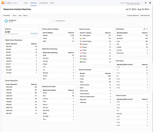
In the previous section, a list of 11 stats was highlighted as especially valuable for hammering responsive web design into shape. Let’s work through building a custom-made reporting dashboard that looks like this:
Here’s how we create a custom reporting dashboard fine-tuned for your needs:
- Log into Google Analytics
- Choose your website’s property name from your account’s list. For example, on mine, I click on my blog website, which is enabled with analytics.
- You’ll land on a default view of your site’s information that probably shows an audience overview report. Click on the “Dashboards” option on the left-hand list to open it up and show its actions.
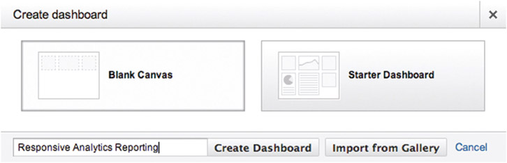
- Select the menu option called “+ New Dashboard”
- A dialog box will pop up titled “Create dashboard” with “Blank Canvas” selected by default, which is what we want. Here is a chance to name your dashboard. You might want to call it “Responsive Analytics Reporting.” Press “Create Dashboard” when you’re ready.
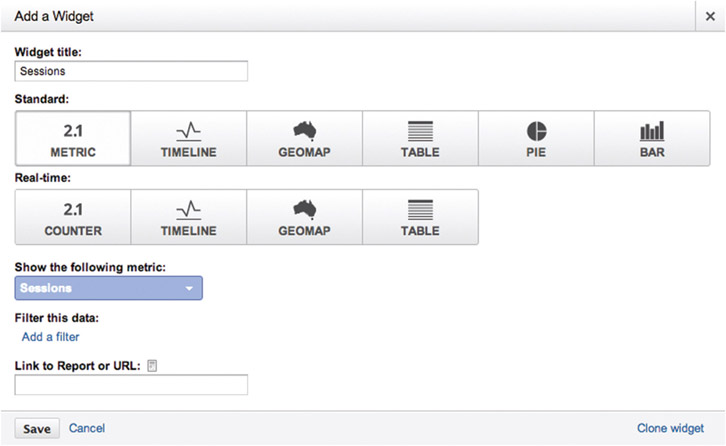
- A dialog box will pop up titled “Add a Widget,” prompting you to add the first reporting element. Let’s create the first one on our list.
- Title it “Total Session Visits”
- Select the “2.1 Metric” option under the Standard group
- Under the “show the following metric” option, click on the “Add a metric” input to search for the “Sessions” entry on the drop-down list
- Press the Save button, and you’re done with your first reporting widget
- You’ll look to it to learn how many users have viewed your site.
- Click the toolbar option called “+ Add Widget” to show the same dialog box you just used, and we’ll add another reporting widget.
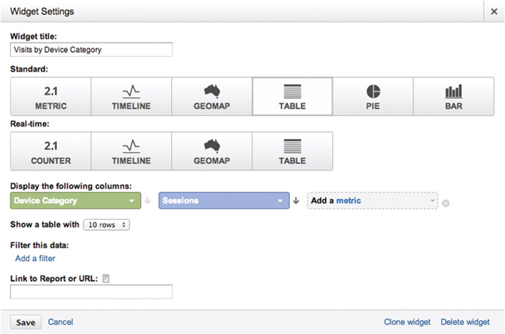
- Title it “Visits by Device Category”
- Select the “Table” option under the standard group
- Under the “Display the following columns” section, click “Add a dimension” and choose “Device Category”
- Click “Add a metric” and choose “Sessions” from the list
- Press the “Save” button and you’re done
- You’ll look to this list to see what category of device users viewed your web-site with. This includes desktop, mobile, and tablet.
- Click “Add a Widget” to show the dialog box for adding another reporting widget.
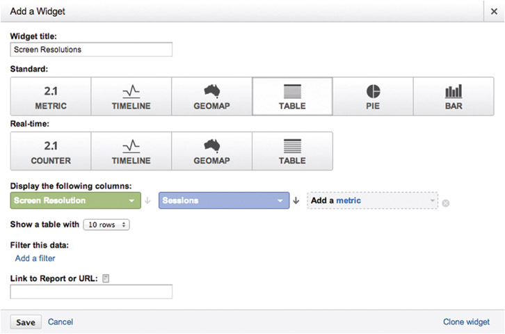
- Title it “Screen Resolutions”
- Select the “Table” option under the standard group
- Under the “Display the following columns” section, click on “Add a dimension” and choose “Screen Resolution”
- Click on “Add a metric” and choose “Sessions” from the list
- Press the Save button and you’re done
- You’ll look to this list to view the top 10 screen resolutions that view your website. Desktop and handheld are combined here.
- Click “Add a Widget” to show the dialog box for adding another reporting widget.
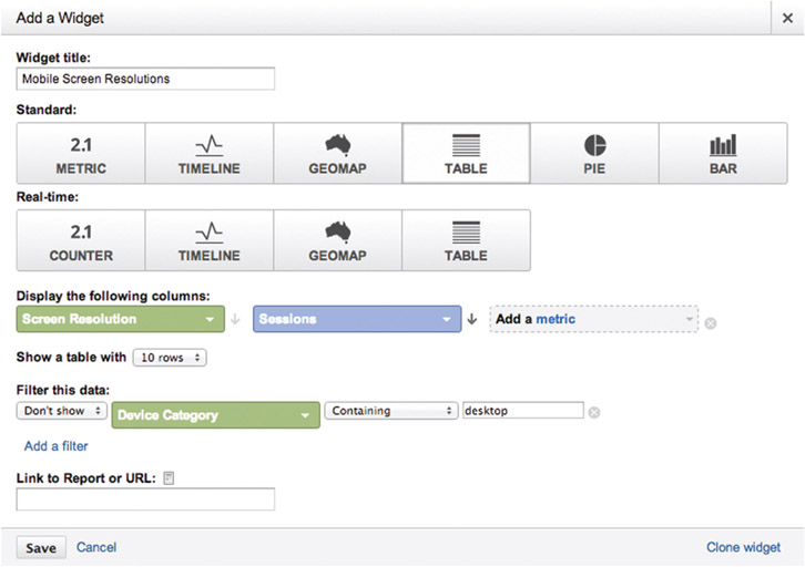
- Title it “Mobile Screen Resolutions”
- Select the “Table” option under the standard group
- Under the “Display the following columns” section, click on “Add a dimension” and choose “Screen Resolution”
- Click “Add a metric” and choose “Sessions” from the list
- Under “Filter this data,” click on “Add a filter”
- The first item defaults to “Only show”; change it to “Don’t show”
- Click on “Add a dimension” and set it to “Device Category” from the drop-down list
- The second item on this row defaults to “Containing”—leave that, but type “desktop” into the adjacent input field.
- Press the “Save” button and you’re done
- You’ll look to this list to see the top 10 screen resolutions that view your website that are only from mobile and tablet, because desktop answers are excluded
- Click on “Add a Widget” to show the dialog box for adding another reporting widget.
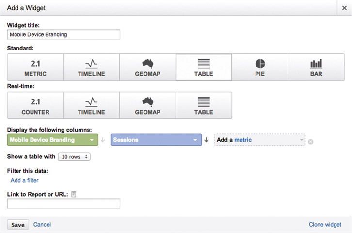
- Title it “Mobile Device Branding”
- Select the “Table” option under the standard group
- Under the “Display the following columns” section, click on “Add a dimension” and choose “Mobile Device Branding”
- Click “Add a metric” and choose “Sessions” from the list
- Under “Filter this data,”click on “Add a filter”
- The first item defaults to “Only show”; change it to “Don’t show”
- Click on “Add a dimension”and set it to “Device Category”from the dropdown list
- The second item on this row defaults to “Containing”—leave that, but type “desktop”into the adjacent input field.
- Press the “Save” button and you’re done
- You’ll look to this list to view the top company names that make mobile devices popular for viewing your website.
- Click on “Add a Widget” to show the dialog box for adding another reporting widget.
- Title it “Mobile Device Model”
- Select the “Table” option under the standard group
- Under the “Display the following columns” section, click on “Add a dimension” and choose “Mobile Device Model”
- Click on “Add a metric” and choose “Sessions” from the list
- Press the “Save” button and you’re done
- You’ll look to this list to see the top company names that make mobile devices popular for viewing your website.

- Click on “Add a Widget” to show the dialog box for adding another reporting widget.
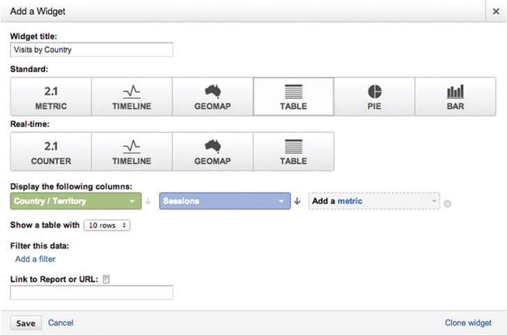
- Title it “Visits by Country”
- Select the “Table” option under the standard group
- Under the “Display the following columns” section, click on “Add a dimension” and choose “Country/Territory”
- Click on “Add a metric” and choose “Sessions” from the list
- Press the “Save” button and you’re done
- You’ll look to this list to find the top countries visiting your website.
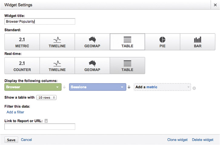
- Click on “Add a Widget” to show the dialog box for adding another reporting widget.
- Title it “Browser Popularity”
- Select the “Table” option under the standard group
- Under the “Display the following columns” section, click on “Add a dimension” and choose “Browser”
- Click “Add a metric” and choose “Sessions” from the list
- Press the “Save” button and you’re done
- You’ll look to this list to see the most popular browsers that your customers use to view your website.
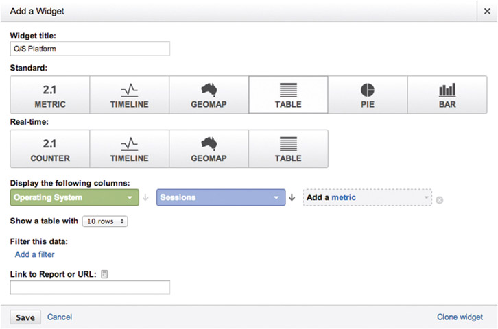
- Click on “Add a Widget” to show the dialog box for adding another reporting widget.
- Title it “O/S Platform”
- Select the “Table” option under the standard group
- Under the “Display the following columns” section, click on “Add a dimension” and choose “Operating System”
- Click “Add a metric” and choose “Sessions” from the list
- Press the “Save” button and you’re done
- You’ll look to this list to see the most popular operating systems that run devices viewing your website. Desktop and handheld are combined here.
- Click on “Add a Widget” to show the dialog box for adding another reporting widget.
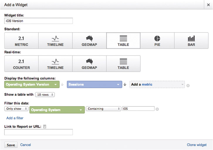
- Title it “iOS Version”
- Select the “Table” option under the standard group
- Under the “Display the following columns” section, click on “Add a dimension” and choose “Operating System Version”
- Click on “Add a metric” and choose “Sessions” from the list
- Under “Filter this data,” click on “Add a filter”
- The first item defaults to “Only show”—leave it at that
- Click on “Add a dimension” and set it to “Operating System” from the drop-down list
- The second item on this row defaults to “Containing”—leave it at that and type “iOS” in the adjacent input field
- Press the “Save” button and you’re done
- You’ll look to this list to see the specific versions of the iOS operating system running Apple-made handhelds.
- Click on “Add a Widget” to show the dialog box for adding another reporting widget.
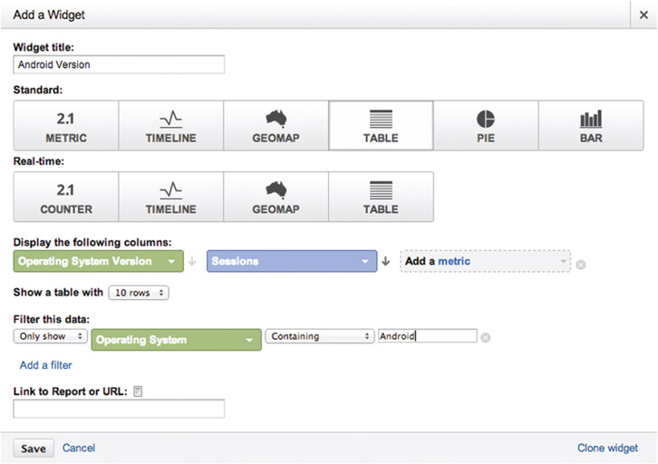
- Title it “Android Version”
- Select the “Table” option under the standard group
- Under the “Display the following columns” section, click on “Add a dimension” and choose “Operating System Version”
- Click “Add a metric” and choose “Sessions” from the list
- Under “Filter this data,” click on “Add a filter”
- The first item defaults to “Only show”—leave it at that
- Click on “Add a dimension” and set it to “Operating System” from the drop-down list
- The second item on this row defaults to “Containing”—leave it at that and type “Android” in the adjacent input field
- Press the “Save” button and you’re done
- You’ll look to this list to see the specific versions of the Android operating system running on its handhelds.
-
Now that you’ve established your reporting widgets, take a few moments to marvel at your creation. It gives a nice, high-level overview of how your website is serving your customers. Finalize a few dashboard-level settings. For example, click on the toolbar option “Customize Dashboard” and choose your preferred layout. I suggest a four-column mode to allow all of the widgets a chance to display at once. You’ll also notice that you can drag and drop reporting widgets around the dashboard space to group them in ways that make the most sense to you.
Your dashboard will look something like this.
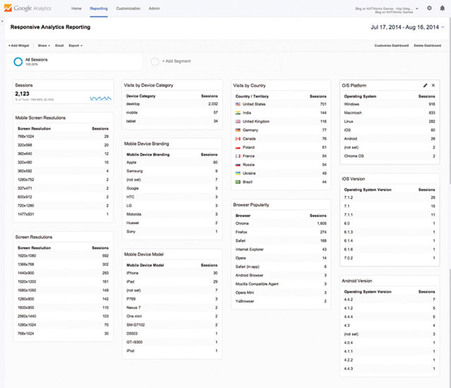
It’s time to pause and celebrate. This is next-level stuff.
Confirming and Debugging Analytics on Your Site
As a product engineer, I want my programs to work, but I don’t always get what I want. It’s nice to want things, but I’m in the business of delivering reliable, functional, simple software. Often I’m in a cycle of testing, diagnosing, fixing, and confirming my code as much as I’m writing it. Thinking about that, I offer to you two ways of testing and ensuring your analytics is working.
First, Google Analytics has a reporting section called “Real-Time,” and I devote a lot of hours to looking at it. When I suggested earlier that you create a specific project devoted to your team during development, this is the payoff. Because you’ll have a small group of people running the website during work in your office, you can look at the real-time reporting to see how your actions on the website are affecting data recording. You’ll see only a handful of analytics measurements are reported in real time. That’s on purpose.
Second, Google provides a plugin to its Chrome web browser. Search for “Google Analytics Debugger Chrome plugin” to find it in their online store. Download it and install it to your browser to reveal a switch for you to turn on for debugging insights. It reports an audit trail of what analytics are reporting from you website by printing out information in the console window of the browser’s developer tools.
Event tracking, an advanced topic covered in what follows, can be complicated for you to code and test, but this tool helps make confirmation easier. Product managers can use it to interactively probe what’s reported as they use the website.
To see the console output, start with opening the developer tools in the Chrome browser:
- Click on the “View” toolbar item
- Click on the “Developer” menu item
- Click on the “JavaScript Console” submenu item
Exploring Advanced Topics
What we have reviewed here is just an introduction to analytics. You’ll want to invest weeks understanding them. As you gain more experience and confidence using analytics to measure your mobile viewers, you’ll start wanting more advanced features. Consider adding one of these to your workflow where it makes sense.
Event Tracking
At first, it might seem that Google Analytics will only track page views, but it can also track events. A user event is any interaction with the webpage—hovering or tapping any interface elements. What if you have a web app—a single-page application continually replacing the contents of its single page? Page views aren’t really helpful here, since you only have one page. Attach an event to everything your user can tap, flip, swipe, and set. Tracking events lets you measure whether the things you design and build are actually used by people. If they’re not used, invest time to make them better or invest money to remove them.
Transactions
E-commerce transactions let you put a monetary value to all of those events and page flows. Naturally, e-commerce gives you a chance to report revenue earned from outright purchases. Then it’s an easy matter to report through a dashboard how much an event is worth based on how much it’s used and the base value you assign to it. If something on your site isn’t performing to your needs, find out about it and make it better or remove it.
Funnels
Funnel conversions are a favorite of mine. They allow you to define a series of steps a user takes from page to page. For example, a store would want to know how many steps it takes the user to browse, add, and check out. Let analytics tell you how your site performs when it comes to selling products. Sales aren’t the only reason to do this. Imagine connecting the dots along a path to change a setting. Do people start eagerly and then stop somewhere before completion? Let analytics reporting tell you where exactly the dropoff occurs as all people start at the top of a funnel and slide down it.
If there’s an obvious dropoff in the steps, put your best people on making that step easier, clearer, whatever. Then see if your changes work. If they enable more of your customers to pass through the funnel, see if they come out the exit end successfully. The funnel starts big at the entrance and progressively tightens as the steps progress. It’s accepted that not everyone will come through the end, but it’s an important goal to ensure enough do to make your investment worthwhile for running your business.
As you learn more about Google Analytics and internalize how to bring this tool to your craft, you’ll discover even more advanced techniques. The field of analytics is relatively young, but its history is already varied, full, and exciting.
Alternatives
It’s always important to constantly judge our tools. When a real-world hammer cracks or a metal chisel bends, it’s easy to loosely hold it in your hand and casually say, “It’s all busted—let’s go get a new one.” Digital tools aren’t so easily judged, are they? They’ll never break so obviously, but they will show wear and age. Then we need to make a choice. Sometimes we replace them with the newer model and upgrade. Sometimes we need to research alternatives. We must pick them up and test them out in real-world situations. Then we really know if the tool is fit for the purpose. Here is a brief list of noticeable alternatives to Google Analytics: Kissmetrics, Piwik, ChartBeat, Mint, Clicky, MixPanel, and gaug.es. This is a relatively crowded market, with many alternatives for every budget and need. Check it all out and make your final choices.
Fact-Based Decisions for Effective Design
Most people are attracted to or at least curious about the big-data phenomenon. It seems like something that’s only in the domain of different teams at other companies. Journalists writing on the subject herald big data as the next wave of computer science that will help every industry imaginable, but without concrete examples of what it means, does, or amounts to. This phrase appears weekly in the industry press in one form or another. For me, analytics strikes at the heart of big data. It’s your website being measured, collected, and reported in the context of your users viewing it and applying it to their lives. Facts about your website are accumulated daily and without pause as blocks of numbers.
When looking at analytics, I don’t simply see numbers anymore. A while back, I realized the truth—that these numbers are our users’ voices. We must listen to them as they communicate with us through analytics.
The lean startup and user experience (UX) movement proclaims that designers must get out of the office and venture out into the real world to show apps and sites to real people. Encouraging normal people to use work in progress is the only way to find out if assumptions about user interface are correctly producing positive experiences. While I surely believe this as a maker, I doubt its long-term validity as an engineer.
We engineers think of our software running on one server but then two, four, and more. As the business gains customers and success, we consider how our services can rise to meet the demand. This is “scaling.” We ask ourselves if we build software that scales up over time reliably, sometimes routinely, occasionally rapidly, without drama to meet increasing demand. Given that point of view, I think the idea of getting out of the office to meet our customers and seek their approval is a tactic that helps validate and build confidence early but does not scale over time. As our software is loaded up on the public Internet, we cannot possibly go out to meet new users across the world and cannot possibly understand who all of them are. Analytics help us do that as a proxy that meets our users where they are. No matter who they are, what devices they use, which time zones they operate in, or where they live, analytics tirelessly listen to them, record their actions, and let us graph figures from those statistics.
As you take recorded events and report on them, you’ll draw out factual understanding from your users’ raw data. Comparing reports from quarterly data ranges, weekly, even daily, you’ll see trends emerge. Although various industries warn against the volatile nature of predicting the future, the accepted practice is that past trends indicate future actions. Anticipate what your customers need and move toward them letting them better use your work.
- Are screens getting smaller or larger?
- Are operating systems fading away or growing in popularity?
- Are new geographical regions showing up?
- Are marketing and product investments paying off by acquiring new customers and adding revenue?
- Are people engaging with your content when they arrive and sticking around as long as you want them to?
- Are new users finding your site and are legacy ones returning?
- Are buttons and UI options easily understood and valuable enough to use?
Getting out of the office and directly asking some of your prospective users if new designs make sense is crucial for early critiques. Mixing in analytics will help you gain understanding of how sites in production perform at a large scale. Believe me, I’m not trying to take the fun out of the creative workflow by adding in so many numbers. Analytics are tools like any other, and they have their place. It’s a new enough field, however, that I must hold it up to the light and let you have a good look at it. Intuition is always a valid jumping-off point for creative endeavors, but if we want to support a business through making money, please take time to investigate how measuring and reporting will support your professional efforts.