Table of Contents for
Responsive Web Design Toolkit
 Responsive Web Design Toolkit
Published by
Focal Press, 2015
Responsive Web Design Toolkit
Published by
Focal Press, 2015
- Cover
- Responsive Web Design Toolkit
- Responsive Web Design Toolkit
- Title
- Copyright
- Contents
- Dedication
- Assembling a Toolbox of Success
- Chapter 1: Responsive Web Design
- Chapter 2: Introducing the Engineering Process
- Chapter 3: Localhost, the Best Host
- Chapter 4: Apache Web Server
- Chapter 5: Connecting Devices to Your Computer
- Chapter 6: Virtual Hosts: Making Many Out of One
- Chapter 7: Get Together on GitHub
- Chapter 8: Google Chrome: Browsing a Page and Reading Its Code
- Chapter 9: Surviving CSS by Thriving With Sass
- Chapter 10: Google Analytics: Measuring Your UX With Analytics
- Chapter 11: Responsive Screen-Capture Project
- Chapter 12: Looking Around the Toolbox
- Appendix
- Index
Chapter 5
Connecting Devices to Your Computer
Grab a Phone and Go
In the previous chapter, you invested a good amount of time installing Apache web server on your work computer. By now, everyone you know ought to be sick and tired of your proudly showing off localhost. This includes but is not limited to your teammates, supervisor, clients, parents, spouse, friends, and random people at the coffee shop. Each and every one of them should know how amazing it is having one’s own web server. Each of them ought to shudder when they see you walking toward them with your laptop in hand and a silly grin across your face as you look to catch their attention for another demo of what’s new.
Of course, you understand this tool is positively astounding. Because you’ve integrated the Apache web server into your workflow, you know the tool is a fantastic productivity boost. You’ll see more opportunities to polish your work to a higher quality level. You’ll discover and squish more bugs than ever before. You can use any of the popular web browsers to view your website. Because of that, you’ll generally witness your work come alive in an environment more real than ever before. How can you push your work to an even more faithful environment?
By getting your website running on your phones and tablets.
Our mobile phones have web browsers just as our work computer does. Using them to hit our localhost makes Apache serve our work in progress for critique on the exact same devices we want and need to prove function. Responsive web development is very much about handling a world of device shapes, and we must seek validation on hardware whenever possible. I’ve found I never have enough devices for testing my work. That constraint is an obvious limitation for all of us with limited budgets. Even so, judging our work on our own phones and tablets within arm’s reach is confidence building.
This chapter shows you how to connect typical phones and tablets to your work machine. It will be easier than you can imagine and more constructive than you might hope.
Testing Localhost Website on Real Mobile Devices
When I was making video games, we always had ways of emulating the physical video game system. It was often the only option we had as teams of engineers as the big console companies were finalizing their hardware designs. Software had to be ready to launch the same day the boxed systems went on sale, meaning “make it work” was our inspirational mantra. We were smart about it and never reached too far past target specifications and scheduled capacities. The worst thing that could happen was overbuilding a game world. Densely packing a terrain with overly detailed characters, loading it with inanimate objects, and mixing in visual effects always made impressive-looking demos. If final hardware couldn’t run that amount of detail, we cried. We cried and worked late making huge changes to our game worlds, chopping out stuff until it ran on final hardware.
The video game industry demands cutting-edge performance, stunning visuals, and precise user control at high frame rates. Does that challenge sound familiar to you? Loading up a website with every visual detail specified in CSS3 puts a demand on modern browsers. Rounded corners, drop shadows, text effects, transparency, and background fills are a complicated rendering mix for any modern browser. Worse yet, our phones might not have a cutting-edge browser or capable hardware.
For a long time, and still to this day with legacy Android phones, there are two web browsers available. Sadly, the wrong one is default, and that’s obvious when the choice is a generic globe icon titled “Internet.” This is generally the slower, more obsolete web browser. Its rendering algorithms are the oldest and least optimized and may not understand cell phones with hardware-accelerated graphics coprocessors. Recently made hardware is capable of doing two things at once: the “thinking” and computing that go on in the main CPU and the “drawing” that goes on in the graphics chip. It’s easy to imagine that this low-end browser is running on an equally low-end phone lacking that hardware. All of that adds up for a nasty user experience.
Cell phones can be relatively slow turning on the cell radio, making requests to web servers for assets, and dragging them over the air. They’re laughably slow compared to your Wi-Fi–connected desktop computer. Image assets may even be requested twice. That happens in the case that transmission is interrupted long enough to abandon the download. For a fun time, see if you can make this happen by walking around your office building while hitting websites. Observe how fast they come down and how long it takes for first page render. Find out if some hallways are faster than others depending on how near a window you are. How can we predict that? We can’t. We can only intelligently plan ahead to minimize the impact.
Google’s open-source mobile operating system, Android, is popular with device manufacturers because they can take and tweak it to their needs. In practice, I’ve found devices from different brands render my web pages differently. Differences even occur when comparing two devices having a different “point release” of the same major operating system number. I’ve learned to test my website on everything I can put my hands on before launch. Simply testing on a single Android device doesn’t guarantee your website will look great on all Android powered hardware.
Fingers are less precise than mouse pointers. Bigger, too. Mobile screens under sunlight look washed out compared to desktop monitors in a perfectly ambient-lit office. There’s no hover state. Breakpoints aren’t where you expect. Some tablets have aspect ratios shaped more like a theater screen than a computer monitor. It’s all kinds of crazy, and keeping it sorted out in our heads like some sage-like visionary dispensing answers to eager teammates is a sure way to insanity. Many people, including me, call on responsive web design as a way to cope with varied hardware sizes. Responsive design and development is a physical activity best put on our sketchbooks, on our text editors, and onto devices.
If you’re managing creative individuals, you understand that pouring lots of time into planning after a while doesn’t continue reducing the unknowns. Generating a perfect plan of execution appears plausible and valuable but ends up being impossible. After an appropriate amount of time, we need to find as many ways as possible that don’t work and rapidly arrive at the ways that do. Preproduction in our heads must give way to making, experimenting, failing, learning, and succeeding. Having your team running a localhost web server on their own computers and reviewing their work with handhelds delivers them more quickly to that ideal final “succeeding” step. It certainly ensures that customers never see the ugly middle parts of “experimenting” and “failing.”
These are all key reasons to test your website on a phone or tablet typical of what your target audience will use to view your website. Our work only matters once it’s seen correctly on devices.
Put all Your Devices on the Same Wi-Fi Network
Can we make connecting our phone and tablet to our machine running Apache localhost as easy as possible? Yes, and a shared network helps that greatly. What do we mean by “shared”? That the development machine and phone can “talk” to each other. The phone is normally on a cell network run by one of the big national wireless carriers. Conversely, development computers are on a home or office network typically provided by private Wi-Fi.
Getting your work computer on a cell phone network where phones dial numbers is not helpful. Is the opposite direction a better choice? Yes, your phone can get onto a Wi-Fi network through its “settings” menu. Once there, it calls the computer through its IP address. If that term seems overly technical, please push that concern away. It’s easily thought of as a number computers use to communicate to one another. We normally use a human-readable version of that such as www.focalpress.com, but in fact, that name is a synonym for a computer number called the IP address. We say the computer “resolves” that name into a number, allowing the convenient alias for human beings.
How does a computer resolve a human-readable name into an IP address? Domain Name System (DNS) servers store all known human-friendly names and the matching computer-readable addresses. As you can imagine, these are crucial parts of the Internet and must work reliably and quickly.
Once your phone is on the same Wi-Fi network as your computer, you’re ready to get started. Same thing applies to your tablet. If it’s on the Wi-Fi network, it’s ready. If your computer is plugged into the wall with a network cable, that’s fine. The cell phone can still talk to it “over the air,” but the network must eventually all be shared in common. Ask your office network expert for confirmation if you’re not 100% sure. One thing you can do is confirm that the phone’s status bar shows a Wi-Fi connection icon rather than the cell phone network symbol. Also, if its web browser can reach out to common websites, that is a good indicator success is within your grasp.
Your next move is aiming your mobile browser at your work machine. Once a connection is made, Apache serves up your website in progress, and you’ll see glorious triumph. Even so-called failures will be triumphs because they propel you one step closer to a final, workable solution.
Getting Started Connecting Phones and Tablets to Your Computer
Let’s get to the good stuff. Let’s get your phones and tablets talking to your personal Apache server. It is, after all, what we’ve been building toward. Many designers and developers will have thought this process full of complexity far beyond them and not an option for daily work. Believe me that it’s possible.
Surely these doubts cause heartache, as creators intuitively feel checking on device is an imperative part of their work. Confirming our work in real-world conditions must feel like a final line item in any professional checklist. Now believe it when I claim this can be done at any time in the workflow. Ideally, it’s so easily accomplished that you will want to do it as often as you come up with sufficiently changed HTML, CSS, and images. Reaching for devices ought to be easy, because most of us have a phone or tablet within reach.
Connecting a Phone and Tablet to an OS X Machine
We start by assuming your OS X–based machine is running Apache web server and attached to your network and that your tablet and phone are attached to the same network via Wi-Fi. Of course, we think of Wi-Fi simply because the mobile devices can’t be hardwired into your LAN as your computer might.
After that step, the most important information is the unique identifier your computer has. It’s assigned when your hardware connects to the local network and is called an IP address. Let’s find out how to get that now:
- On your OS X–driven machine, open the “System Preferences” dialog box. This is available from several places, most notably the “Apple” icon.
- Click on the “Network” icon.
-
You’ll see an entry called “Status,” which ought to report “Connected,” as well as a message specifically telling what your computer “IP address” is. Make a note of this number, because it’s exactly how your mobile devices will “call” the computer and talk to it. In turn, that tickles Apache web server to display your website files. Please realize this IP address will change from time to time as you attach to the network. It’s a “dynamic” address, so don’t be surprised when it changes.
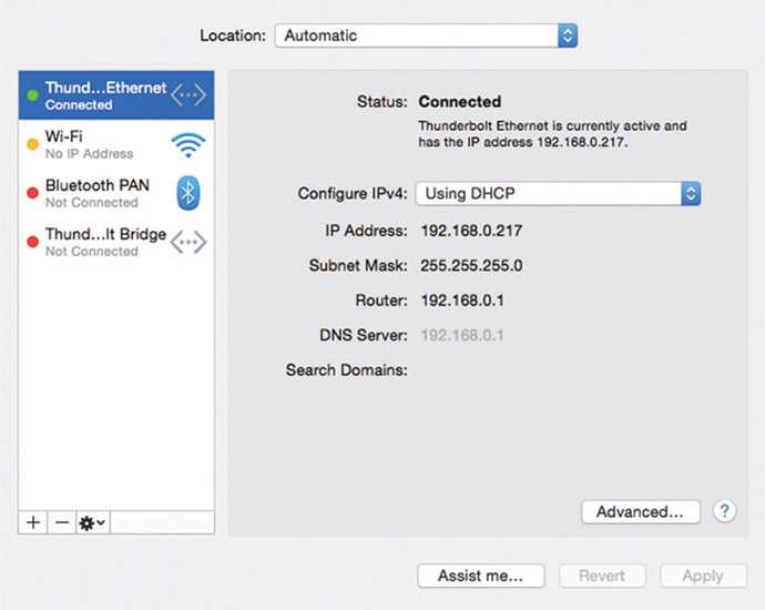
- Pull a phone or tablet from your pants pocket, purse, or messenger bag. Launch your favorite mobile browser (for example, Safari or Chrome) and input the URL shown in your OS X network tab. For example, mine looked like this at one time: http://192.168.0.217
-
As you’ve seen before on the desktop browser, your mobile browser will bring up whatever files and folders Apache finds in your working directory. If it’s a list of folders, clicking on one of them will bring up its file contents or an index.html if present.
Connecting a Phone and Tablet to a Windows Machine
We begin assuming that your Windows-based machine is running Apache web server and attached to your network and that your tablet and phone are attached to the same network via Wi-Fi. Of course, we think of Wi-Fi simply because the mobile devices can’t be hardwired into your LAN as your computer might.
After that step, the most important information is the unique identifier your development machine has. It’s assigned when your machine connects to the local network and is called an IP address. Let’s find out how to get that now:
- On your Windows-driven machine, open a Command Prompt window. Admittedly, this will look a little low level, but please have faith. There’s only a little time spent here, and it’s worth learning this specific task.
-
Type the command ipconfig and skim the lines of information the computer responds with. One line will report something like “IPv4 Address … 192.168.0.247.” Make a note of this number, because it’s exactly how your mobile devices will “call” the computer and talk to it. In turn, that tickles Apache web server to display your website files. Please realize this number will change from time to time as you attach to the network. It’s a “dynamic” address, so don’t be surprised when it changes.
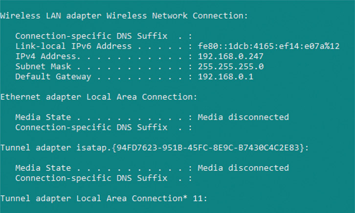
- Pull a phone or tablet from your pants pocket, purse, or messenger bag. Launch your favorite mobile browser (for example, Safari or Chrome) and input the URL you read in the command prompt. For example, mine looked like this at one time: http://192.168.0.247
-
As you’ve seen before on the desktop browser, your mobile browser will bring up whatever files and folders Apache finds in your working directory. If it’s a list of folders, clicking on one of them will bring up its file contents or an index.html if present.

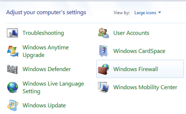
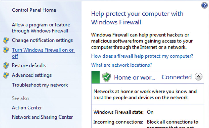
You may find your mobile devices don’t connect to your computer. When this happens, I check to see if it’s because the Windows Firewall is running. As a protective measure benefitting you, the firewall stops connections to your computer. In this case, it’s stopping connections that you actually want. Here’s how you turn off the Windows Firewall.
- Click on the Start menu and select “Control Panel”
-
The dialog box shows many configurations, and one of the last ones is called “Windows Firewall. Find it and click on it
-
On the side, look for an option called “Turn Windows Firewall on or off” and click it
-
The dialog box will show customization options. For the “Home or work network location settings,” click “Turn off Windows Firewall” and press the “OK” button
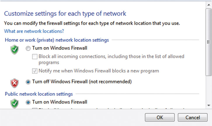
- You’ve successfully turned off the Windows Firewall on your work computer, and Apache ought to receive requests from your devices and respond as expected. Feel free to turn Firewall back on when you’re done testing.
Gaining Confidence through Testing
At this point, you ought to be experimenting with your website work in progress on your mobile device. It is served up from your work computer thanks to Apache server. Why is this important? Now you can confirm your work, on at least your own phone, anytime you want to. No need to wait on a QA to become free and read their report of your updates. No need to wait to find bugs once they’re on the production server and live for the entire world to see. This tool gives you the power to gain one of the most significant things we can achieve in modern web-based work: confidence. Confidence that:
- Your site works and appears on devices as expected
- You’ve polished your work, making it look great on device
- Bugs are found and fixed before your customers stumble across them
Connecting a Desktop Machine to a Desktop Machine
One of the goals of this book is to enable you to better test your responsive design as you develop it into action. Ideally, when you’re designing and coding, you’re constantly testing on device or emulated devices. Why continuously testing? It proves that your work is a success. If it’s not a success, then “quickly failing” means you get past the routine problems and glitches that strike all developers. We could take all the time in the world crafting the perfect plan but never know if it works while it’s only in our design journals. Without actually making something, the entire time we’re stuck in our own heads wondering as we leave out the people around us. Teammates, leaders, and clients won’t see progress and constantly ask when will our work be ready. Continuously testing lets us gain confidence in our work and reassures everyone around us when we ask them to follow our lead and believe in our vision.
I still recall the day I told my QA teammate that she could browse to my development environment and manually test our latest build running on my desktop computer. The range of emotion on her face from confusion to surprise to understanding was fantastically fun to witness. She realized that when the shared test server was occupied by another teammate, she could still carry on running our latest work on my machine. Viewing it with her desktop browser hitting my own Apache server running on my development machine meant progressing on her testing tasks. No longer blocked, she could follow up by taking out her cell phone and testing it further on her handset. Her tasks went from “blocked” to “in progress,” and her day became a lot better when I offered up this alternative option.
Testers can easily make use of connecting both devices and their desktop machines to a developer’s work computer for confirming their team’s work. Finding, documenting, and fixing bugs can happen well before work gets out to public-facing servers. All the time spent in this cycle means more polish for achieving higher-quality and more reliably functioning websites and web apps. Testing is of course not limited simply to QA experts. Anyone can participate in this activity, especially as code is submitted relatively late toward a deadline. “Code slams” happen when creative individuals push to gain as much time as possible to complete their work. Avoiding overload does mean managers, artists, and developers need to slip out of their comfort zones and slide into testing. Every annoying bug found means one less embarrassing one that customers might find.
Limitations
You might be wondering, especially if you’re a QA–minded person, how many tablets and phones can attach to your development computer before it breaks—or maybe not exactly “breaks” but fails in some way from an overload of connections. I encourage you to find out! Give it a workout like a trainer makes their client sweat at a gym session.
As far as I know, there are no practical limitations for how many phones, tablets, and computers can hit your work machine. From my experience lining up a table of half a dozen phones and a few teammates from their laptops, I’ve never encountered a problem. That’s the typical sweet spot of such a test, but your mileage may vary. Survey your site with a trusted set of handhelds representing your small, medium, and large-sized phones and tablets. Include the three most popular desktop web browsers as well. You will pull this tool into your content-creation workflow, testing legibility and presentation of your website rather than stress-testing network responses or server capacity.
Web servers are efficient due to their RESTful nature. REST is an acronym for representational state transfer, which describes a technology via which a browser requests data from a web server on behalf of a user action—for example, load the page from this URL. The browser sends over everything it can think of, giving the web server context for the request. The server listens to everything told to it as if it has never heard from that user’s browser before. It replies as quickly as possible, the connection is closed, and the two forget about each other. This keeps life simple for servers and for browsers, but the user might feel a bit forgotten and lonely in that exchange if they knew better.
Perhaps now you’re having an “ah-ha” moment because “cookies” popped into your head. You’re thinking they’re an important invention because they’re one of the few ways servers can leave clues behind on a user’s web browser. Cookies store small details servers use to remember past successful interactions for making better future ones.
No Network? No Problem!
When you’ve put into practice the tools covered in this chapter, I can guess you’re convinced how useful attaching devices to your work computer is. Constantly viewing your work-in-progress website served up by Apache localhost is a sure way to see that your project is heading in the right direction. You might already have a problem in mind with the instructions for setting up the test environment. One of the most important conditions mentioned is “all sharing the same network is easiest,” but what if you don’t have a network?
What if your work laptop, test phones, and tablets can’t share the same network because it doesn’t exist, or at least doesn’t exist as an open Wi-Fi easily accessed by your secondary laptop and mobile devices? Why would this ever happen? If your laptop was connected to a network, why wouldn’t it be over Wi-Fi that your mobile devices can use as well? I’ve seen firsthand and heard stories from colleagues that clearly demonstrate this predicament.
Scenario one is having a job in client services and working a contract on site. Imagine when you have an extended stay in the client’s office packed into a tight, sweaty corner meeting room. Making things even more challenging is that their overworked IT department only lets you have a network cable plugged into the Ethernet port cut into the wall. No login credentials for the wireless network are offered. That’s a severe lack of Wi-Fi.
Scenario two starts when someone is United States–based with a service contract from a United States-based mobile phone carrier. When traveling to Europe with work, that person might sadly discover that roaming data-plan charges across the ocean are crazy expensive. Casually attaching a mobile device suddenly becomes as expensive as a fine dining experience in a star-rated restaurant. That’s a severe lack of Wi-Fi.
Scenario three starts with employees of a top-secret government facility so paranoid that they do not allow any of their staff access to Wi-Fi. They have a dedicated hardwire from their laptop to the wall, and there’s no open Wi-Fi to speak of. That’s a severe lack of Wi-Fi.
Do you remember those stylish yellow Ethernet cables strewn along the floors that chair wheels were always bumping over? It’s time to bust those out once again. In each of the scenarios mentioned, the design-and-development staff has a clever work-around. Modern laptops can reverse the stream of their Wi-Fi hardware when physically attached to a network. How? By creating a so-called ad hoc wireless hotspot that phones and tablets can ride along when attached to the laptop. From there, it’s a matter of getting the hosting laptop’s IP address and hitting it using the mobile browser. Then the laptop’s localhost Apache will serve up the website exactly as you expect it to and exactly when you need an inventive fix.
The phrase “ad hoc” is not technical jargon but in fact comes from Latin. Its meaning refers to anything that’s spontaneously created for serving a particular need.
Creating an Ad Hoc Wireless Hotspot on OS X
Establishing an ad hoc hotspot with your OS X–based laptop begins with a wired connection to the network. More than likely, this is an Ethernet cable snapped into a port cut into the wall. Just like old times!
- Bring up the “System Preferences” dialog box, for example through the Apple pull-down menu
- Click on the “Sharing” icon
-
Click on the checkbox entitled “Internet Sharing”
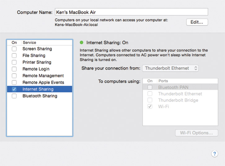
- Choose “Thunderbolt Ethernet” from the list titled “Share your connection from”
- Check the “On” checkbox for the “Port” called “Wi-Fi”
Your OS X laptop is now functioning as an ad hoc hotspot, a dedicated wireless network that shows up to mobile devices in a manner similar to that of any wireless router you’ve used before. When devices attach to the laptop’s network (more on that in the next section), the mobile browser needs to use the laptop’s IP address. You’ve looked up that number before, but as a refresher, follow these steps:
- Bring up the “System Preferences” dialog box, for example through the Apple pull-down menu
- Click on the “Network” icon
- Look for the Status: Connected message that tells what your laptop’s IP address is. For example mine, shows 192.168.0.217. Don’t forget this is dynamic, so don’t be surprised when it changes from time to time.

The laptop’s IP address is what you type in your handheld’s mobile browser to call up the Apache web server. From there, you view your pages and folders as you would normally.
Creating an Ad Hoc Wireless Hotspot on Windows
Establishing an ad hoc hotspot with your Windows-based laptop begins with a wired connection to the network. More than likely, this is an Ethernet cable snapped into a port cut into the wall. Just like old times!
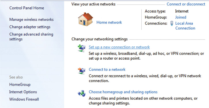
- Click on the Start menu and click on the “Control Panel” icon
-
When that dialog box shows, click on “Set up a new connection or network” under the “Change your networking settings” list
-
A new dialog box titled “Choose a connection option” shows. Click on “Set up a wireless ad hoc network”
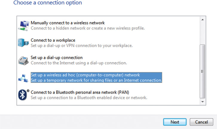
- A new panel shows that explains what it means to “Set up a wireless ad hoc network.” Read it for more details if you like. Press the “Next” button to advance to the next step.
-
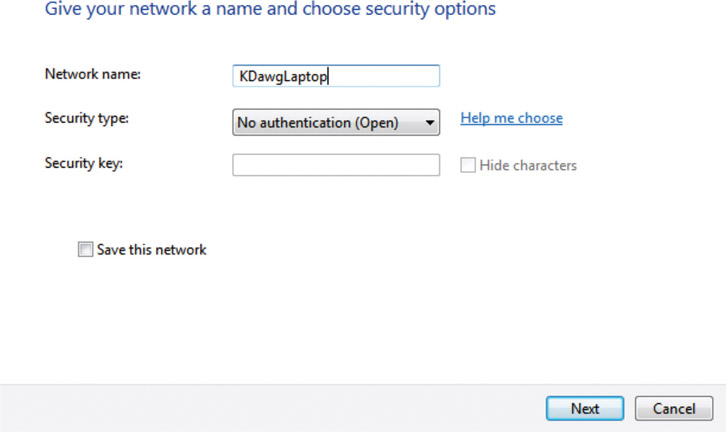
This is where you define the micro-sized, wireless, local-area network that your laptop emits. In the “Network name:” field, give it some easily remembered name such as KDawgLaptop. The easiest way to enable device connection is to choose “No authentication (Open)” from the “Security type” list, but of course anyone can connect to your laptop in that mode. Press the “Next” button when you’re done with your configuration settings.
-
You’ll see one more panel in the dialog box. It reviews what you’ve created and encouragingly reports that your newly created network is ready to use.
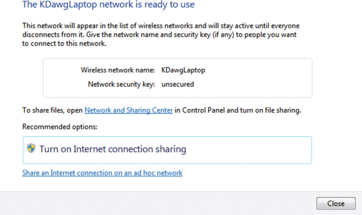
Your Windows laptop is now functioning as an ad hoc hotspot, a super-tight wireless network that shows up to mobile devices in a manner similar to that of any wireless router that you’ve used before.
Experiment with this over time and learn more about how this feature adds value to your development toolbox. Leaving the ad hoc network “Open” is the easiest way for your phone and tablet to make a connection and browse your laptop. It’s also the least secure, leaving it literally open for anyone in the surrounding area to gain access if they think to. In your office, this is probably no problem. In a coffee shop, in an airport, or on a client visit, this might be a risk you don’t want to take.
When devices attach to the laptop’s network (more on that in the next section), the mobile browser needs to use the laptop’s IP address. You have looked up that number before, but as a refresher, follow these steps:
- Click on the Start menu and click on the Command Prompt icon
- When that program runs, type the ipconfig command to find out details about your network connection, a connection no doubt via hardwire into an Ethernet port in the office wall.
-
Look for the grouped entry titled “Ethernet adapter Local Area Connection:” and scan its few lines for one reporting “IPv4 Address.”
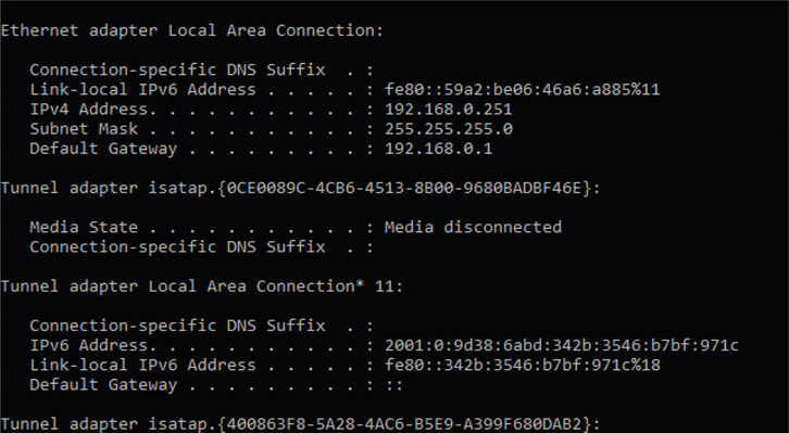
- Write down that number. For example, mine shows 192.168.0.251. Don’t forget this is a dynamic number, so don’t be surprised when it changes from time to time.
The laptop’s IP address is what you type in your handheld’s mobile browser to call up the Apache web server. From there, you view your pages and folders as you would normally.
Attaching Your iOS Device to an Ad Hoc Wireless Hotspot
Once you’ve turned your laptop into an ad hoc wireless network, you’ll want to tap into its invisible power by attaching your handheld device to it.
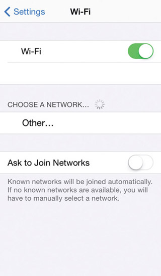
For an iOS phone and tablet, begin with:
- Opening the “Settings” app
- Click on the “Wi-Fi” option
-
Wait for the device to sniff the air around you and look for the network name you gave your laptop. Expect it to appear under the “Choose a Network” heading. There’s a chance that your laptop network may show up under the heading “Devices.”
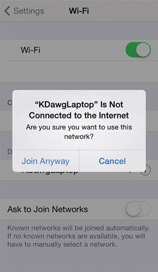
- Click the line item when it appears. You ought to attach to it automatically if it’s “Open.” If you gave it security settings, enter the password when prompted.
-
When attaching to your Windows laptop, your phone may display a pop-up telling you that your laptop “Is Not Connected to the Internet,” and you can confirm that is fine by pressing the “Join Anyway” button. It’s not a problem, as you only need to get as far as the laptop and not beyond it to the public Internet.
In the previous sections, “Creating an Ad Hoc Wireless Hotspot on OS X/Windows,” you ought to have inspected the laptop to find and record its IP address. Hitting your work laptop and viewing its Apache localhost is now simple because all your hardware is now sharing the same network. Prove that out by opening your mobile browser, for example Safari, and type in the laptop’s IP address in the top search input bar.
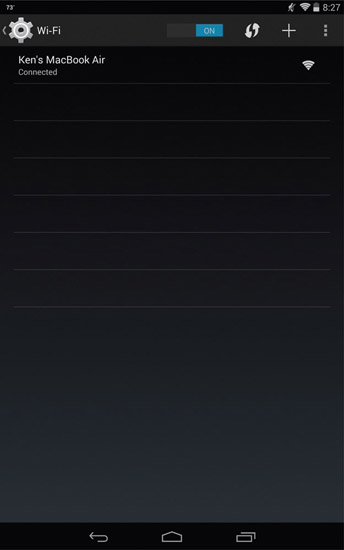
Attaching Your Android Device to an Ad Hoc Wireless Hotspot
Once your laptop is turned into an ad hoc wireless network, attaching your handheld device to it lets you tap into its invisible power.
For an Android phone and tablet, connecting to a Windows laptop appears to be unsupported at the time of writing this book.
To connect to an OS X–driven laptop, begin with:
- Open the “Settings” app
- Click on the “Wi-Fi” option
- Wait a moment while the device sniffs around and looks for the network name you gave your laptop. Once you see it listed, click on it, and you’ll see a dialog box pop up to confirm the connection. If you gave your ad hoc network security settings, this is where you enter a password.
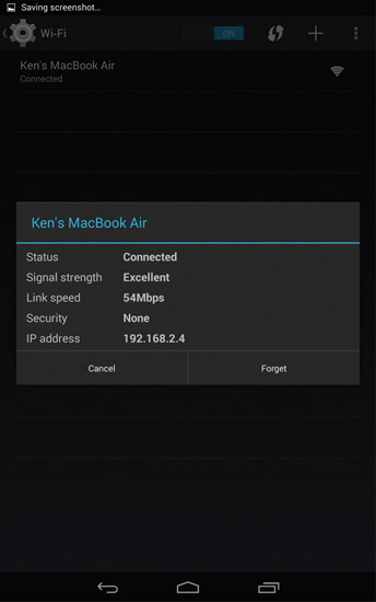
In the previous sections, “Creating an Ad Hoc Wireless Hotspot on OS X/Windows,” you ought to have inspected the laptop to find and record its IP address. Hitting your work laptop and viewing its Apache localhost is now simple because all your hardware is now sharing the same network. Prove that out by opening your mobile browser, for example Chrome, and type in the laptop’s IP address in the top search input bar.
Seeing What Your Users Will See
In my mind, the fantastic use of the Apache localhost serving up your website to your mobile device is that it represents what your customers will eventually see. You’re viewing your work on phones, tablets, and computers just as they will. You’ll see concretely if your work is going to meet their needs, at least physically. For example, are device-specific breaking points triggering as you think they will on the devices you test? Do resources such as stylesheets, JavaScript, and images get served up “over the air” without undue delay? Does the most useful information show top to bottom and left to right? Does it go another direction if your user’s countries want it that way?
You’ve already experimented with Apache localhost serving up your website project while you work on it. Now you can attach to your personal development environment with a phone and tablet while walking around your office and be mobile just as your customers eventually will be. Try to feel the site as they eventually will feel it. Are they frustrated? Confused? Is something important off screen or shrunk too small? Do they feel empowered, satisfied, delighted, or relived they can find what they need using your site?
Concrete, firsthand impressions gained from you living the experience of your users are instructional in ways a personal template cannot match. Create a checklist of how you’ll test your site, write it down in a document, and share it with your team as a testing strategy. Try using these real-world scenarios as jumping-off points for your experiments:
- On a phone walking into bright sunlight
- Distracted while surrounded by random conversations
- On an iOS phone and its browser; on an Android phone and its browser
- On a tablet held landscape then flipped around to portrait
- While walking around the office bumping into things
- Stuffed into a cramped waiting room chair, laptop teetering on crossed knees
All this work is in service of our customers. How can we have empathy for them? It’s one of the most powerful words in our language, and it’s popping up in talks and articles more often. Why? What problems are solved when we feel what our users feel? Feelings start by viewing and interacting with our websites, using customer devices in environments similar to theirs. It’ll be amazing when you begin looking at your website as your users do and seeing that your first designs aren’t what they need. Validating your assumptions through customer points of view will always synthesize another answer far better than your original. It’s better because it’s even more richly informed by the user experience.
Granted, we’re still attached to our computers in an office, and we’ll never draw a perfect picture of their lives given various physical limitations. But still, this is much better, don’t you agree? It’s more helpful that we admit we won’t have all the answers at a project’s kickoff and early design phase. Spending time to understand the challenges and problems and opportunities for a project is always crucial. Otherwise we waste time building things that don’t matter. Even so, spending too much effort designing the perfect answer takes time away from building and discovering the final true details. Testing in this manner will help surface those valuable answers for your work.
Fail Fast, Iterate Quickly, Succeed More
What are some of the key understandings our teammates want to know as part of development and debugging?
- As an engineer, I must know, is the work functional, reliable, and simple?
- As an information architect, is your content seen when and where it needs to be?
- As a designer, you must ask, where does your work need polish?
- As a team leader, you’re wondering, is my team performing to the level that they can? Do they have blockers? Do they have the toolbox necessary to help them deliver what’s promised on time?
You’ve read much about the fail-fast mantra in startup culture. It’s found throughout the Lean UX literature, and it encourages us to try building the smallest useful thing, see how real people respond when they use it, and then make little adjustments toward our original thinking to strive for a better outcome. It might seem laughable that old software projects took years to complete, but they did, and some still do. If we can iterate on a big problem by breaking it down into smaller ones, we’re going to do better because we don’t need to imagine as much before asking someone to build it.
Software—and I assert that websites are software and becoming more feature rich and app-like—are difficult to build. We ought not to impose more process and structure on a team in an attempt to reduce defects and problems. Ideally, our experienced and educated teams strive for building good work. Instead, we need to admit that bugs and errors will occur and use tools like the ones presented in this book to bounce back from mistakes with agility.
Take it from Tom DeMarco and Timothy Lister in their classic book Peopleware:
Fostering an atmosphere that doesn’t allow for error simply makes people defensive. They don’t try things that may turn out badly. You encourage this defensiveness when you try to systematize the process, when you impose rigid methodologies so that staff members are not allowed to make any of the key strategic decisions lest they make them incorrectly.
Tom DeMarco and Timothy Lister, Peopleware: Productive Projects and Teams, 2nd ed. (New York: Dorset House Publishing, 1999, p. 8)
These tools don’t necessary make solving problems easier, but they will help you discover them sooner and allow you to get to the hard part of fixing glitches and bugs well before your real users do. Self-discovery is a valuable quality, but most practitioners don’t expect to find it in their toolbox. This one amplifies that ability. Many bugs go out the door and into production because they were hidden from view. Seek them out often, and deliver higher-quality work with great professional discipline.