Table of Contents for
The Adobe Photoshop Layers Book: Harnessing Photoshop's Most Powerful Tool, covers Photoshop CS3
 The Adobe Photoshop Layers Book: Harnessing Photoshop's Most Powerful Tool, covers Photoshop CS3
Published by
Focal Press, 2007
The Adobe Photoshop Layers Book: Harnessing Photoshop's Most Powerful Tool, covers Photoshop CS3
Published by
Focal Press, 2007
- Cover
- Halftitle
- Title
- Copyright
- Dedication
- Contents
- Acknowledgements
- Introduction
- Chapter 1: The Basics of Layers: Layer Functions and Creation
- Chapter 2: Layer Management: Concepts of a Layer-Based Workflow
- Chapter 3: Object and Image Area Isolation in Layers
- Chapter 4: Masking: Enhanced Area Isolation
- Chapter 5: Applying Layer Effects
- Chapter 6: Exploring Layer Modes
- Chapter 7: Advanced Blending with Blend If
- Chapter 8: Breaking Out Components
- Chapter 9: Taking an Image through the Process
- Chapter 10: Making a Layered Collage or Composite Image
- Index
We’ve looked at multiple facets of image correction and adjustment, and now it is time to put them all together. Using a sample image supplied on the CD, we will step through the process of correction and adjustment from start to finish in order to show how the process works in practice.
The base process used for the image will follow procedures suggested earlier in this book, and it may go a step further than you would expect to embellish the image. You don’t have to agree with or even like the embellishments, but you should understand the procedures and how they fit into the process of getting to the image result. We will take a critical look at the photo before stepping through the procedures so that we can outline the goals for the image.
Earlier on we looked at various procedures for image editing, and then even ran through corrections of various types on different images, but there has not been an opportunity to put the whole process together as we were still busy exploring layers. The goal of this chapter is to bring together layer techniques that we have learned to see how the procedures apply to a real-world images and real-world editing situations. Seeing the whole process in action should help you to use the concepts and techniques to correct your own images.
The Image
The image in Figure 9.1 was taken by a long-time friend, Luke Delalio, who does a lot of head shot photography in New York City (lukedelalio.com). He gets outstanding shots of his clients, hand-held, no flash, in natural light – revealing more personality than the standard studio head shots. The image is available on the CD as Sample14.psd.
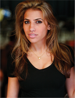
FIG 9.1 We’ll use this image from the CD to run through the correction process.
Luke had other usable shots from this session of his stunning model Carly, but he had passed this one on to me to see if I could do something with it. I could see what he liked in the image: beside the pretty model, there was some interesting lighting, an insolating depth-of-field and a flattering pose. While it is an interesting image, like any image, there are quite a few ways that it can be improved. Shot at a wide aperture at 1/30th of a second, it is almost extraordinary that it is as sharp as it is. While this might never be manipulated to be a terrifically sharp image, it might be a terrific image with a softer quality.
 The key to working with digital images day to day is usually not to envision them being something they are not already, but working with what you have to enhance what is there. Enhancement in the form of heroic measures and wild antics are secondary concerns.
Let’s review our image-processing checklist (from Chapter 2) before getting together a specific outline of changes to perform.
General Image Editing Steps: A Review
Way back at the beginning of this book we looked at the whole image editing process. By this point in this book, we are concerned more specifically with images than setup issues. The following list of steps is extracted, and somewhat modified from the list of steps suggested in Chapter 2 to target the process. We’ll follow this editing checklist in processing the Sample14.psd image:
1. Be sure that your computer system is ready for image editing. Your system is up to speed, your monitor is calibrated, you have set up your preferences and tested your output.
2. Store the original image file safely and work with a copy to do all of your image editing.
3. Have in mind a target range for the resolution and a color mode for the final image. 4. Evaluate the image.
5. Make general color and tonal corrections.
6. Make damage dust and other spot corrections.
7. Make compositional changes, including cropping, compositing and replacing image parts.
8. Make targeted color and tonal corrections to selected parts of the image.
9. Save the layered version of the image. You may want to do some simplifying and optimization at this point.
EXIF Metadata
I didn’t take the shot, but I was able to find out some things about it without asking the photographer. All I did was look into the EXIF data that came with the image. So long as you are using a modern digital camera, the camera captures EXIF data (Exchangeable Image File), storing information about the exposures you make at the time of capture. You can access and use this data to refer to exposure information.
To find the EXIF data for your images, open Photoshop, and choose File Info from the File menu (File>File Info). The following data was listed for the sample image under the Camera Data 1 category.
Camera Make/Model: Canon EOS 20D
Date and Time: 11/28/06, 3:28 PM
Shutter Speed: 1/30 second
Aperture: 2.8 ISO: 800
This information can both track what you did to capture the image, give hints as to the quality of the capture, and provide an opportunity for learning. Knowing that this image was taken with a slow shutter, a wide aperture and high ISO, suggesting the image would almost necessarily have a soft quality to it.
Note specifically that this list condenses the setup and computer-oriented issues, as well as the concerns for saving. We will assume at this point that you have taken the initiative to calibrate your monitor, build the ICC profile you need for properly viewing your images on screen, and set up your color management (checklist step 1). The concerns for image storage (checklist step 2) are taken care of by providing the file on the CD. The image on the CD cannot be overwritten, so it is safely archived. We will be processing the image using full size of the provided sample (downsized from the original), which is 9.2 × 7 inches at 200 ppi (checklist step 3). Now we are ready to evaluate the image (checklist step 4).
Applying the Image Editing Checklist
Working through the process of editing will always really start with evaluating the image. No matter what you see in an image preview or in Bridge or other viewers, there is no substitute for actually opening the image in Photoshop. So open Sample14.psd and have a good look at the image.
Working with RAW Images
While this image is already converted to JPEG and does not require dealing with Camera RAW conversions, it is worth mentioning what to do with RAW images, and why you might want to consider RAW processing if it is an option.
RAW images are images in their natural capture state – direct off the camera’s sensor without any automated in-camera processing. JPEG files, on the other hand, are images that have been processed in camera, converted from the RAW state into something standard and more globally recognized. The advantage of working with RAW images is that you get to control the image conversion from raw data rather than allowing the camera to use some generic processing that only works optimally in runof-the-mill situations. When it comes to images that are exposure extremes (over- and underexposure), in-camera processing is not an advantage. RAW images offer both more control and a higher bit count than a standard JPEG, which is especially beneficial in processing exposure extremes.
If you shoot in RAW format as a deliberate choice, you add a step to your processing, but you also add some extraordinary leeway with shots that are not exposed optimally. When opening RAW images, you are led to the intermediate Adobe Camera RAW dialog automatically, where you can make a conversion for the image. There are a lot of controls, and with that goes many opportunities for positive change. Some users see this as an opportunity, and some as an obligation. But my suggestion is to not feel too tempted to make changes unless you are positive you can make an advantageous change. If the image is a normal exposure, accept the defaults and go to work in Photoshop where you have the full range of tools and Layers to lean on. Keep in mind that you do not have to do a thing when you pass through the RAW dialog, and are best off only considering making changes when you know the image has exposure issues.
When you decide to make change and corrections in the RAW dialog, consider the histogram display and use it to help keep you from creating bad adjustments. While you may trust your screen to a great extent, the graph helps you see if you are making corrections that are too extreme and actually doing some damage to your images. If you see the graph bunching up and spiking at the right or left in the graph display in the RAW dialog histogram, chances are the image is taking a hit and you are ruining image details perhaps unwittingly. Likewise, if the graph is pulling away from the right or left or forming distinct tails, you may not be making the most of the information you captured. Use these histogram dynamics to help you make intelligent imaging choices.
Automated adjustments selected by Photoshop’s Camera RAW dialog don’t always make the best choices – they can’t see the image. Don’t just trust the RAW plug-in to make the choice for you, especially if the preview on screen seems wanting. Play with the possibilities and be careful not to blow out details by being conscious of the histograms provided on the preview. When in doubt, leave the image a little under- or overexposed to save detail so that you can work with it later rather than trying to optimize it all at once in the RAW dialog. You can still fiddle with making changes later, and there may actually be better tools in Photoshop to use when making corrections. Think of the dialog as a helper rather than an all-in-one correction tool.
To examine the image, you might want to do a few simple things, like zoom in to take a look at details (sharpness, graininess, noise), or even take a look at the RGB channels. Sometimes you will find some interesting qualities or the views may suggest specific changes or alterations. For example, you may have a noisy blue channel that suggests a little blurring the blue might help overall, or there might be tonal qualities you’d like to borrow. While you can certainly examine the channels by opening the Channels palette and reviewing the channels, do it the layers way by running the RGBL (Red, Green, Blue and Luminosity) Components action from the Separations action set (from Chapter 8) provided on the CD. After running the action, view the channels by toggling the visibility off for the layers from the top of the layers palette down (see Figure 9.2).
Something about the contrast in the blue channel seems interesting, so later in the corrections we’ll look at using the blue channel to enhance the contrast (checklist step 8). Of course we’ll want to do an initial Levels correction (checklist step 5). The initial color is fine, but might be a tinge toward yellow or red, and it can use some balance (checklist step 5). Contrast is good, but might even be stronger, playing on the quality of the light in the image. Consider ideas for cropping (checklist step 7). Do you want to get in tighter to the subject? Are there areas around the subject that might be better if removed? What will the image be used for? In this case we have a head shot. It seems the cropping can come in a bit to make the model’s head the obvious focus. We’ve already mentioned that the image is a bit soft, so we’ll work with that by playing up the quality of softness to make it more like a soft-focus glamour shot (checklist step 8).
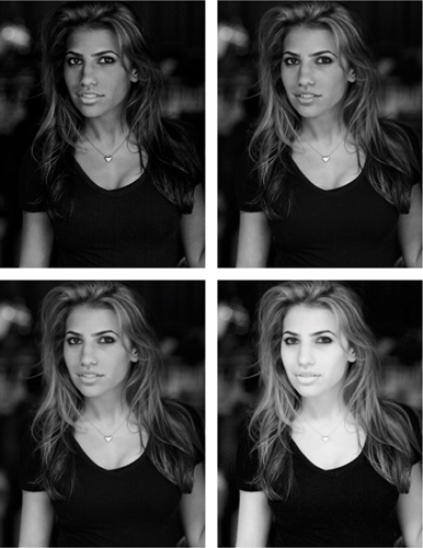
FIG 9.2 The RGBL separations show you the tone components that make up your image. From the upper left clockwise we have blue, green, red and luminosity.
Getting more specific, the midtone to shadow areas may be slightly oversaturated (checklist step 8). The model has virtually no obvious flaws (birthmarks, scars, wrinkles), however underlighting seems to be enhancing a ridge along the upper lip, which can easily be smoothed (checklist step 6). The lighting differs in color between the chest and the face, and that will become more pronounced as the correction progresses. One or the other may need some selective adjustment (checklist step 8). As the face is the focus of the shot, it may help to outline the chin. Muscle structure in the neck and cleavage can be enhanced as well to give the subject more depth (checklist step 8). The eyes and teeth are already white, and a levels correction and color balance will make them whiter still, but you’ll need to use care in correction not to blow out detail to make them look fake. We’ll look at selective adjustment to these areas to be sure they are optimized and color balanced (checklist step 8).
The final list of corrections per this evaluation is the following, attempting to work from most general to most specific:
• Levels correction
• Color Balance
• Crop
• Enhance contrast
• Add soft-focus effect(s)
• Be mindful of saturation, and adjust
• Enhance jaw line and muscle structure
• Selective balance of lighting between face and chest
• Smooth upper lip
• Hold detail and color in eyes and teeth.
This may seem like quite a lot to do in an image that is already good. Running through the steps using techniques we have already learned or which have been hinted at will make short work of the list. Be aware that as you go you may create additional issues that will require some attention, and at points the image may actually begin to look worse before it begins to get better.
Try It Now
1. Open the Sample15.psd image in Photoshop if it is not already, and make a Levels correction to the image for each channel in the Channels drop list using a Levels Adjustment layer. Name the layer 1 General Levels. See Chapter 3 for a review of the Levels correction. See Figure 9.3 for the Levels settings used.
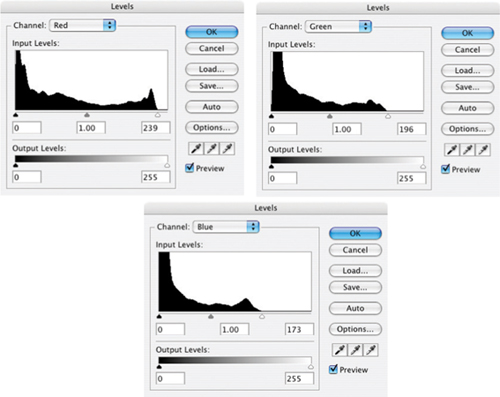
FIG 9.3 For this image there are tails to clip in highlights for each of the channels: Red, Green and Blue.
2. Adjust Color Balance using a Color Balance adjustment layer. Name the layer 2 Color Balance. See Chapter 3 for a review of making Color Balance corrections. See Figure 9.4 for the Color Balance settings used.
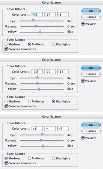
FIG 9.4 There are several different light sources to correct for here; you have to achieve the best balance. Depending on how you start the correction and the settings you begin with, your Color balance settings may be very different, but the result should be similar – balancing the color.
3. With the general color and tone corrections complete it is safe to crop the image. Use the crop tool to trim down the image and change the composition (see Figure 9.5).
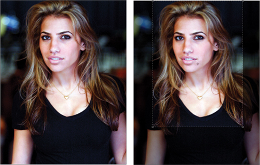
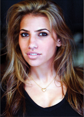
FIG 9.5 You could wait till later in the process to crop, as changes in the image may influence your decisions. I set the crop to 5 by 7 to reflect a standard image size, and cropped with the head a little to the side so the shot was not too centered
4. We will want to borrow back from the original image to get back some skin color. Open the Channels palette, hold down the Command / Ctrl key on your keyboard and click the Red channel. This will load the Red channel as a selection. Click on the Background layer in the Layers palette to activate the Background, then Copy and Paste to create a new layer. Name the layer 3 Load Red; Copy / Paste Background. Press Command+Shift+] / Ctrl+Shift+] to move the layer to the top of the layer stack. Reduce the opacity to 30% (see Figure 9.6).
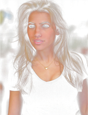
FIG 9.6 The red channel will correspond to highlights and skin in this image. Copying the background will allow you to replace original skin color based on that selection.
5. Duplicate layer 3 Load Red, and name the new layer 4 Duplicate of 3 Blur 20 pixels Opacity 20%. Use Gaussian Blur set at 20 pixels and then lower the opacity to 20%. This will begin to soften the skin and smooth it out.
6. Load the Green channel as a selection by holding down Command / Ctrl key and clicking the Green channel in the Channels palette. Click the Add Layer Mask button at the bottom of the layers palette to add a mask to the 4 Duplicate of 3 layer. This will mask off the darker parts of the layer.
Cropping in Layers
Though you can’t really crop in layers, you can create a Crop layer and use it to view the image as if it were cropped. Doing this helps you stay on a path of nondestructive editing:
1. Create a new layer at the top of the layer stack and call it Crop. Fill it with black and set the Opacity to 0%.
2. Choose the Rectangular Marquee tool, set it to 0 Feather. Choose Fixed Ratio and set the ratio according to a standard image size if you want a specific ratio.
3. Make a selection of the area that you would want to crop to. Use the Space Bar to reposition the selection as you create it.
4. Invert the selection (Command+Shift+I / Ctrl+Shift+I [Mac / PC]).
5. Click the Add Layer Mask button at the bottom of the layers palette.
At this point you have your Crop layer. You can turn the Opacity up to 100% and shut off the layer view. As you work, keep the crop layer at the top of the layer stack. You can view the crop by turning on the layer view. You can crop the image by Command+clicking / Ctrl+clicking the mask for the Crop layer, inverting the selection, and choosing Crop from the Image menu (Image>Crop). This way the crop can also actually be stored with the image as a layer.
7. Duplicate the 4 Duplicate of 3 layer and name the new layer 5 Duplicate of 4 Softlight 100%. Change the layer mode to Softlight and raise the opacity to 100%. Softlight will enhance the contrast of areas that were just softened. It will be masked as well.
8. Create a composite layer, and name it 6 Composite. To make the composite, press Command+Option+Shift+E / Ctrl+Alt+Shift+E.
As we work through here the goal will be to balance a little sharpening with a little softening so that we retain the detail and sharpness while creating the softening effect.
9. Sharpen the image with Unsharp Mask using an Amount of 70% and a Radius of 2 (Threshold 0). You can do this directly to the 6 Composite layer and change the name accordingly to save layers. For this sample, duplicate the Composite, apply the sharpening, and name the layer 7 Duplicate of Composite; Sharpen 70%, 2. Your layers should look like the layers palette in Figure 9.7 at this point.
10. Duplicate layer 7 Duplicate of Composite and name the new layer 8 Duplicate of 7 Manual Sharpening. We’ll come back to this layer in a minute to finish the manual sharpening effect for contrast enhancement.
11. Duplicate layer 8 Duplicate of 7 and name the new layer 9 Duplicate of 8 Color Hold. Change the layer mode to Color. This will lock in the color for the changes below.
12. Activate layer 8 Duplicate of 7, and apply a manual sharpening/Contrast enhancement (for a refresher see Chapter 6). The steps are invert the layer, Gaussian Blur 30 pixels, set the mode to Overlay and the Opacity to 50%. You will see this correction brings her hair out from the shadows.
13. Create a Hue/Saturation layer at the top of the layer stack (above layer 9) and push the Saturation slider for the Master to 30% to compensate for the saturation and click OK to apply the change. This will make much of the color in the midtones and darker quarter tones oversaturated. To adjust that, make sure the hue/saturation layer is active and run the Target Highlights, Half Range in the Blend If actions set provided on the CD. To run the action, click it to highlight, then click the Play button at the bottom of the Actions palette. Change the name of the Hue/Saturation layer to 10 Saturate Highlights.
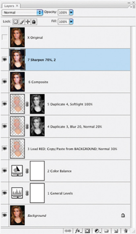
FIG 9.7 At the top of this layer stack is an extra layer. It is just a duplicate of the Background that can be used to quickly compare before and after.
14. Create a Composite layer for the image, and name it 11 Composite (see Figure 9.8).
15. Command+click / Ctrl+click on the RGB channel in the Channels palette to load the brightness of the image as a selection. With the 11 Composite layer active, Copy and Paste to extract the highlights and isolate them to their own channel. Name the layer 12 Isolate Highlights.
16. Duplicate layer 12 Isolate Highlights, and name the new layer 13 Duplicate of 12 Blur 20 Pixels. Apply a Gaussian Blur of 20 pixels and change the Opacity to 50%. Command+click / Ctrl+click the Red channel to load it as a selection and click the Add Layer Mask button at the bottom of the Layers palette. This mask will help target the softening to highlights and the skin.
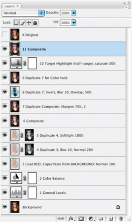
FIG 9.8 The 11 layers you have so far have made the image seem brighter, sharper, with more detail in the hair and a broader range of color than the original. Now that detail is enhanced, we can soften some without worrying as much about losing detail.
17. Duplicate layer 13 Duplicate of 12 and name the new layer 14 Duplicate of 13 Softlight 100%. Change the mode to Softlight and the Opacity to 100%. Shift+click on the layer mask to disable it, or just drag it to the trash. If you drag it to the trash you will be asked if you want to apply the mask. Click Delete (see Figure 9.9). Softlight mode will help enhance the contrast as you smooth out the skin with the blur.
18. Create a new layer and name it 15 Desaturate with Blend If. Fill the layer with black, lower the Opacity to 20%, and run the Target Midtones Full Range action. This will desaturate the midtones 20%.
19. Create a Blue component using the Blue Component action; this creates the component in a new image (a flattened copy of the working image). Play the Target RGB action, which will make the layer target all color components (RGB), turning the layer to a black-and-white representation of the Blue channel. Blur the layer with Gaussian Blur at 10 pixels, and set the Luminosity to 30%. This will add a glow of sorts to the image shadows. Name the Blue Composite layer 16 Blue Component to Grayscale Blur 10 pixels Luminosty 30%.
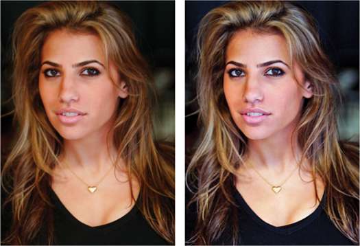
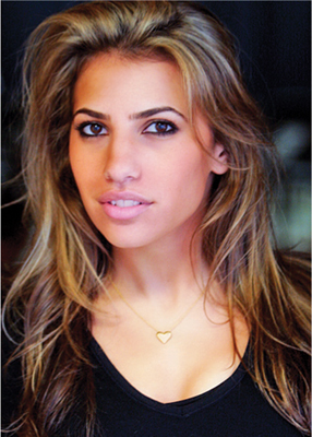
FIG 9.9 The last three steps have added three layers to significantly enhance the softness of the image. A comparison between the original (upper left), pre-softening (upper right) and post-softening (lower left) is shown here.
20. Copy the 16 Blue Component layer to the original image. There are several ways to do this from Copy and Paste to click-and-drag. To click-and-drag, for example, be sure both images are visible on screen and that the image with the Blue Component layer is active. Hold the shift key, and click-and-drag the Blue Component layer to the working image. Release the mouse button before the shift key. Close the image copy without saving. The added layer will soften the shadows.
Be sure to release the mouse button before the Shift key when doing click-and-drag to be sure the layer you are moving registers in the center of the image it is dragged to.
21. Duplicate layer 16 Blue Component and name the new layer 17 Duplicate of 16 Soft Light 30%. Change the mode to Soft Light and the Opacity to 30%. The additions of the blurred blue component in Soft Light mode will enhance contrast. See the before and after for adding the blue blur in Figure 9.10.
To this point we have done little that requires much free-hand tool skill. Many corrections have been based on understanding of previous chapters, modes, opacity, blending and the advantages offered by light components for quick selection, masking and calculations. We have also taken care of much of the preliminary part of the hit list, including Levels correction, Color Balance, Cropping, contrast enhancement, adding soft-focus effect(s) and being mindful of saturation as it wavered. From here to the end of these corrections, many more of these changes will require some dexterity and individual choice in making more selective corrections.
22. Burn in the jaw line. To do this, Create a new layer, name it 18 Burn in Jaw Line. Choose the Lasso tool and draw a selection around the jaw line, then invert the selection so the active area is off the face – targeted to the area outside the original selection. In this case we are most interested in the neck (see Figure 9.11).
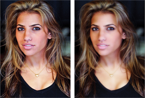
FIG 9.10 Working on blur and general enhancement of dynamic range and contrast has begun to give this image a glamour-photo look.
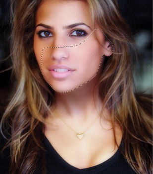
FIG 9.11 Make the selection broad to cover most of the face so that changes painted in have no chance to bleed over the wrong side of the selection. You could actually select the whole face if you wanted just to be safe.
23. Choose the Brush tool and a large, soft brush (200 pixels, 25% spacing, 100% opacity, Normal mode, all fade and other brush dynamics off), then sample a color from a shadow area of the neck. To sample the color, press Option/Alt. Paint in under the jaw line by dragging the brush along the selection line (see Figure 9.12).
24. Deselect the selection (press Command+D / Ctrl+D), then change the layer mode to Multiply, and drop the opacity to 35% or so (you may have a different preference). Apply a Gaussian Blur of 10 pixels (see Figure 9.13).
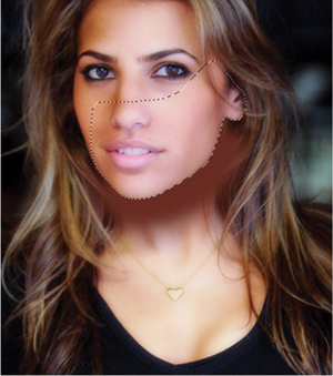
FIG 9.12 The selection will mask the painting so it falls just under the jaw. The painting under the jawline should be dark, flat and obvious, but we will adjust it.
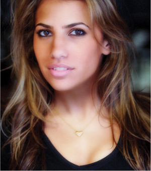
FIG 9.13 Blurring helps feather the change in around the jaw line so it isn’t terribly abrupt or overdependent on the selection.
25. To make the jaw line harder, we’ll add a second, harder accent. Create a new layer, name it 19 Refine Jaw Line. Change the size of the brush to 100 pixels and paint right over the jaw line into layer 19, following the jaw line with the center of the brush. Reduce the opacity of the layer to about 25%, and then add a layer mask. With the mask in place, choose a large (200 pixel) hard (95%) black brush (1% spacing), and paint a mask to define the jaw line. To do this, paint above the jaw line and following the jaw line with the edge of the brush. Apply a 1 pixel blur to the mask to blend it in. Click the linking icon between the mask and layer thumbnail to unlink the mask and thumbnail, click the layer thumbnail, and apply a Gaussian Blur of 20 pixels. Unlinking the mask and thumbnail will confine the blur to the layer content: you do not want the mask blurring any more than it already is (Figure 9.14).
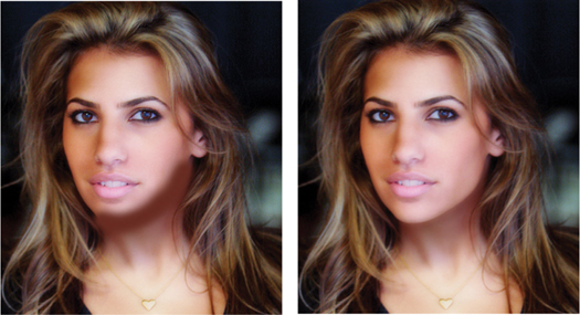
FIG 9.14 Blurring in this case helps feather the change into the previous jaw line shadow, but the blur is restricted over the face by the mask.
26. Create a new layer and name it 20 Burn In Brightspot. Choose a soft, 30 pixel brush and paint in over the bright areas on the viewer’s right at the side of the neck still using the sampled color. Blur the result 20 pixels, change the layer mode to Multiply and set the Opacity to 35% or so. This will burn in and darken the lighter area at the side of the neck.
27. Burn in contours on the neck and chest. To do this, create a new layer and name it 21 Burn In Contours and paint in accents similar to what you’ve done in the previous steps. For this area, try using a brush with a Fade dynamic (Brush: Size 50, Hardness 0%, Check: Shape Dynamics on the Brushes palette, Set the Size Jitter control to Fade and 150). Use paintbrush strokes on the neck to accentuate contours. After all the accents are in place, blur using Gaussian Blur of 20 pixels and set the mode of the layer to Multiply and Opacity to about 35% (or to your preference). See the Fade setting and brush application in Figure 9.15.
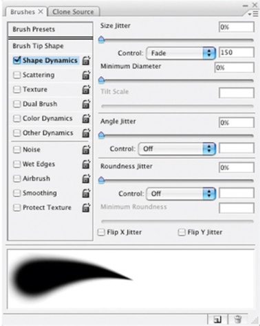
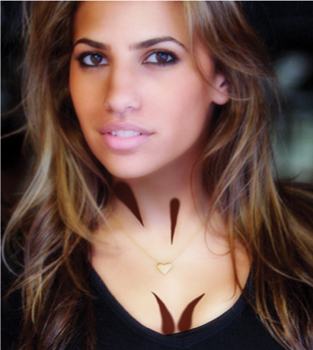
FIG 9.15 Change the brush size and fade length as appropriate to get better matching on contours. Blurring mode and Opacity will help you blend in the changes effectively.
28. Isolate the chest area for adjustment. To do this, create a new layer, name it 23 Mask Chest and composite the changes to this layer. Make a rough selection around the area to be adjusted, then click the Add Layer Mask button. This will create a mask with the selected area. Blur 30 pixels to soften the mask, then run the Target Highlights Full Range action. This will target the highlights within the masked area only.
29. Apply a color adjustment to the 23 Mask Chest layer. To do this, choose Layer>New Adjustment Layer>Hue/Saturation, and check the Use Previous Layer to Create Clipping Mask checkbox on the New layer dialog. Adjust the sliders to improve the matching to other skin tone in the image. Name the layer 24 Color Adjust 23 (Figure 9.16).
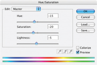
FIG 9.16 There are many other ways to make this adjustment. Hue/Saturation changes shown here reduce saturation, shift the color and slightly darken the result.
30. Retrieve the necklace from Original image to restore it. To do this, duplicate the Background layer, name the duplicate 25 Retrieve Necklace from Original, and move the layer to the top of the layer stack. Click the Add Layer Mask button, and fill the mask with black. Using small hard brushes (95% hard, 25 pixels round for the pendant and about 10 pixels for the chain), change the foreground swatch color to white and paint on the mask to reveal the necklace. Change the mode of the layer to Luminosity and reduce the Opacity as desired. Painting effectively unmasks the old layer’s luminosity, darkening the necklace which had faded due to the blurring in earlier steps.
31. Repair the upper lip. To do this, make a new layer and name it 26 Upper Lip Repair. Choose the Healing tool and a small hard brush (10 pixels). Sample from the cheek on the viewer’s right to repair the area above the right side of the lip; sample from the cheek on the viewer’s left to repair the left side of the lip. The final result should be a simple smoothing of the shadowed area above the lip. Remember to use the sample all layers setting.
32. Correct the brightness and color balance of the teeth (which have changed partially due to corrections). Isolate the teeth on their own layer by creating a new composite layer, and renaming it 27 Isolate Teeth. Make a rough selection of the teeth, and click the Add Layer Mask button, then blur slightly to feather the mask. Add a Levels layer as a clipping group, and make a Levels correction (see Figure 9.17). Rename the Levels layer 28 Levels Teeth Compensation. Adjust the opacity of the 27 Isolate Teeth layer (not the levels layer) to adjust the result (full opacity may seem too bright/white).
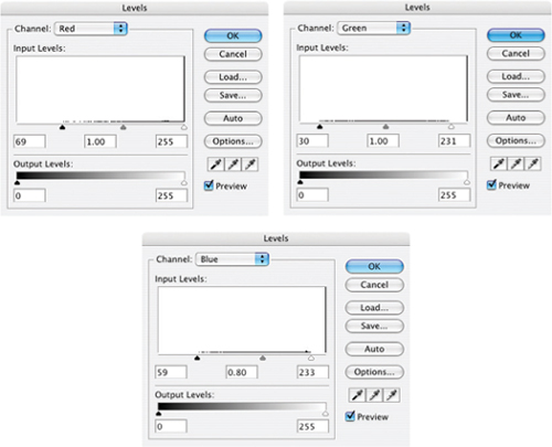
FIG 9.17 In a smaller segmented correction like this, you will be far less likely to cut off tails. Here you want to retain everything or you will blow out details.
33. Correct the brightness and color balance of the eyes. Isolate the eyes by making a new composite layer, making a selection of the eyes and adding a mask as in the previous step. Name the layer as 29 Isolate Eyes, then add a Levels layer as a clipping group and make a levels correction (see Figure 9.18). Rename the levels layer 30 Eyes Brighten and Balance. Reduce the opacity of the 29 Isolate Eyes layer to adjust the result to a pleasing look.
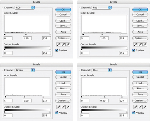
FIG 9.18 Brighten the eyes using the center RGB slider.
34. Correct the color and intensity of the lips. Isolate the lips just as you did the eyes and teeth, and name the masking layer 31 Isolate Lips. Use a Hue/Saturation adjustment layer as a clipping group to make a correction. I pushed the Saturation to +30 and adjusted the Hue −4.
35. Do a final Levels check by adding a Levels correction to the top of the stack. You may use the opportunity to brighten or darken the image slightly. Name the layer 33 Levels Check (see Figure 9.19).
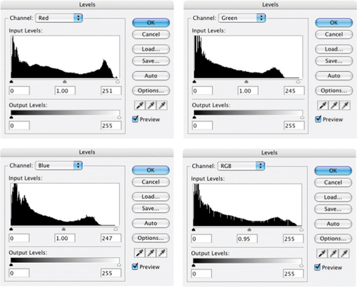
FIG 9.19 I would not cut the tails at this point as it may affect detail in the eyes and teeth.
36. Add a final Color Balance layer to the image and run through the color balance correction. There may be minimal changes at this point, but changes may also more heavily reflect preference over pure balance (Figure 9.20).
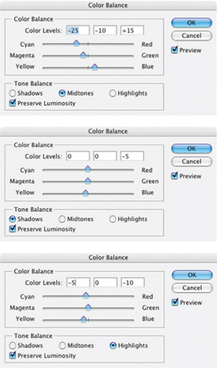
FIG 9.20 I usually like a warmer skin tone, but for this adjustment chose a bit cooler tone. Your corrections may be different.
At this point we have run the gamut of corrections on this image, and – for the purpose of this exercise and the original hit list – we have completed the image correction. We should consider the before and after comparison in Figure 9.21 as the result.
There may be additional corrections you might like to make or items that you might like to adjust at this point. Of course, you can do more with this image, and experimentation is encouraged. You can examine the sample corrections by opening the Sample14_complete.tif from the CD. This contains all the corrections as they were used for the writing of the exercise. It also contains several groupings as an example of how you might go back after corrections to group your changes to keep them organized.
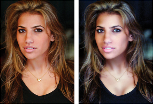
FIG 9.21 The final image has more color and tone dynamics than the original, and uses the softness to flatter the model.
Summary
In this image exercise we have used virtually every trick in this book, applying almost every layer capability for practical purposes on an image that reflects the type of day-to-day changes you may make to any image. We’ve had the opportunity to look at evaluating images, how to apply that to following a plan for corrections and how to apply layers for organizing your path to a result.
If you look at the completed sample image provided on the CD, you can turn off the spot correction layers individually to see how they play into the result. In fact, every layer from layer 12 up can be toggled on and off to view its effect in the final result because they are masked and cumulative changes.
As far as working with these techniques in the future, the ideas we have explored here in layering corrections, sharpening, soft focus and selective correction are applicable whenever you edit images. You are best off, as in this example, working from the general corrections to the more specific, and leaving as many layers intact as you need to accomplish the job. You can always go back later and clean them up, organize them, group into categories, and learn from them.
You will note in the sample image that I have noted brush sizes in the layer names, blur radius, and any number of other things that will not be apparent in looking at the content of a layer. In fact even Photoshop’s editing log will not record these details. Make smart use of layers and they can provide a wealth of information, convenience and flexibility that can be had in no other way.
In the next chapter we look briefly at an extension of correction in what it means to make collage and composite images.
If you have any questions about the techniques and procedures in this chapter, please visit the website and make your questions known! http://photoshopcs.com.