Table of Contents for
The Adobe Photoshop Layers Book: Harnessing Photoshop's Most Powerful Tool, covers Photoshop CS3
 The Adobe Photoshop Layers Book: Harnessing Photoshop's Most Powerful Tool, covers Photoshop CS3
Published by
Focal Press, 2007
The Adobe Photoshop Layers Book: Harnessing Photoshop's Most Powerful Tool, covers Photoshop CS3
Published by
Focal Press, 2007
- Cover
- Halftitle
- Title
- Copyright
- Dedication
- Contents
- Acknowledgements
- Introduction
- Chapter 1: The Basics of Layers: Layer Functions and Creation
- Chapter 2: Layer Management: Concepts of a Layer-Based Workflow
- Chapter 3: Object and Image Area Isolation in Layers
- Chapter 4: Masking: Enhanced Area Isolation
- Chapter 5: Applying Layer Effects
- Chapter 6: Exploring Layer Modes
- Chapter 7: Advanced Blending with Blend If
- Chapter 8: Breaking Out Components
- Chapter 9: Taking an Image through the Process
- Chapter 10: Making a Layered Collage or Composite Image
- Index
One of the fundamental values of working in layers is the ability to isolate image areas for change. This gives you the freedom to correct image areas independently, and revisit those changes as part of image development and workflow. Once you begin to use layers to isolate changes, you can make adjustments, and then fine-tune adjustments in ways that are impossible using selection alone.
Layers allow you to isolate changes in many different ways. In fact, the bulk of this book is dedicated to describing how different layer features enable change in images. This chapter looks at the simplest concepts behind isolating change, including the purpose and use of adjustment layers, and the idea of isolating objects and areas within images in the simplest form. As we go, we’ll look at several key concepts for image correction that apply to just about any image you will work with to form the core of your correction workflow. This includes adjusting dynamic range, color correction and color balance as initial application of layers in your images.
Isolating Correction in Adjustment Layers
Adjustment layers are based on correction functions, but instead of directly applying the adjustments to the image, adjustment settings are retained in a separate layer that you can re-adjust later, temporarily hide or even remove at any point in the processing. The point again is that the correction or change remains distinct within the layer stack and never directly changes the original image pixel information.
One of the first steps that I suggest in working with any image is making a general Levels correction. The correction helps make the most of the dynamic range (brightness from white to black) and helps establish color balance that can bring out richness in image color. The technique of Levels correction applies to the whole image, but on occasion may apply to isolated image elements as well. In this case, the Levels correction is a useful way to demonstrate a simple application of adjustment layers. This correction works on just about any image, and sometimes really works wonders.
First, let’s outline the process, and then look specifically at how to make the adjustment using the controls on the Levels dialog.
 Try It Now
Applying Levels for Color Correction
1. Open the image you want to correct.
2. Choose Layer>New Adjustment Layer>Levels. This opens the New Layer dialog box.
3. When the New Layer dialog appears, leave the defaults for now and click the OK button. This will accept the settings, creates a new Levels adjustment layer and opens the Levels dialog.
4. Select Red from the Channel drop-down list. This reveals the histogram for the red component.
5. Make a Levels correction for the component. Do this correction by evaluating the histogram and moving the sliders.
We’ll look at exactly how to make this correction by moving the sliders in a moment. See ‘Detailing the Levels Slider Changes’.
6. Repeat step 5 for the green component. Do this by selecting Green from the Channel drop-down list and making the levels change.
7. Repeat step 5 for the blue component. Do this by selecting Blue from the Channel drop-down list and making the change.
8. Make a tone adjustment to the image midtones. To do this, choose RGB from the Channels drop list and adjustment with the middle (gray) slider to brighten (left) or darken (right) the image.
9. Accept the changes in the Levels dialog by clicking OK. This closes the dialog box.
This levels correction can work wonders on an image, and it is useful in almost any image. The changes compensate for exposure and lighting conditions and improve color balance and the dynamic range of images, without a lot of complicated measurement. The results are non-destructive as the correction is made in layers. The following section outlines the details of how to make the levels change.
Detailing the Levels Slider Changes
Making the Levels slider adjustments is a fairly simple process, once you have an outline for what to do. The histogram on the Levels dialog will become your visual guide to all you need to know to make the basic adjustment. Additional changes can be made that reflect user preferences once you get used to using the tool.
The characteristic to look for in Levels histograms is shortened tonal range. Shortened tonal range is represented by a histogram that does not have information (or so little consistent information that it is more likely image noise than detail) across the entire range of the graph, with a gap at either the light end (right, highlights) or dark end (left, shadows) of the graph or both. A shortened tonal range in any of the channel components indicates that the light source was not full spectrum.
Levels is an extraordinary tool for making adjustments in this situation. All you do to correct a shortened range is move the sliders (black/shadow and white/highlight) to maximize the range of each component. The right, white slider is moved to the left to a position where the graph shows anything more than image noise; this will make whites brighter. The left, black slider, is moved to the right, again to a position where significant information is displayed in the graph; this will make shadows darker. See the examples in Figures 3.1–3.3 for the Red, Green and Blue channels.
Light’s Fingerprint
When the exposure is captured, the camera captures a fingerprint of the lighting for the scene. Natural lighting at sunset or sunrise, where lighting tends to color objects with warmer tones of yellow and red, is an example of light creating an effect in a scene. But taking that further, if your light is pure red, everything in the room will only reflect the red light, and everything (with any red in it to reflect) will appear red. Objects with no red at all will appear black.
Objects in a scene reflect the quality and color of the available light. If the light isn’t completely neutral, lacks full spectrum (full colors of the rainbow), and/or tends to favor a particular color, the scene reflects the quality of the light. As the scene can only reflect colors in the original light source(s), a capture serves as a reliable fingerprint of the general qualities of the lighting in the scene.
This fingerprint is a valuable clue to detecting the correct color for your image. If you can sample the fingerprint and correct for the deficiency of the light, you can correct image color.
Image Histograms, found by looking at the Histograms, or by looking at the Levels dialog, are exactly what you need to evaluate the quality of the light, and the fingerprint it has left on the scene. A histogram (see Figures 3.1–3.3) shows a definitive mapping of exactly how the lighting fingerprint reacts with the objects in the scene. By examining light’s fingerprint as a clue, we can easily determine how to correct image color.
The idea of light leaving a fingerprint is something I talk about to teach the idea behind the theory. If you talk with other people about ‘light’s fingerprint,’ there is a good chance they will have no idea what you are talking about.
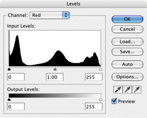
FIG 3.1 The Red histogram shows a full range from black to white, and needs no adjustment.
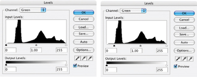
FIG 3.2 The Green channel shows a tail to the left, or shadow portion, of the green spectrum. In this case move the black (left, input) slider to the right to compensate and clip the tail as shown.
After setting the sliders, you commit your changes by clicking OK on the Levels dialog. The tails and anything outside the range of the black and white sliders are cut off, and the image information will be re-distributed over the tonal range. The new range of the graph is extended as in Figure 3.4.
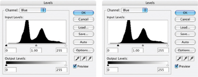
FIG 3.3 The Blue channel also shows a tail to the left, or shadow portion, of the spectrum. In this case move the black (left, input) slider to the right to compensate as shown.
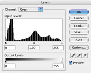
FIG 3.4 The image information is re-distributed evenly after levels changes are accepted so that the color range is broadened.
This Levels change is one you can often make almost strictly by looking at the appearance of the histogram and adjusting it accordingly – without looking at the image, just as we have done here. If you toggle the Show/Hide icon for the layer on the layers palette, the change in the image should appear to improve image dynamics, contrast and color.
A Levels adjustment will not always work well with images that have inherent color casts (sunsets) or where color filters have been used to achieve color shifting effects, as it will tend to counteract desired color shifts.
Tails on the histogram usually represent image noise rather than image detail, which is why you can generally you cut an entire tail. However, sometimes you will crop none, some, or all of a tail, depending on the image, desired color shift and the length of the tail. Usually you cut less of a very long tail. After making the levels adjustment for each of the channels, evaluate the change by eye, on screen (preferably on a calibrated monitor!). If changes seem extreme, you can mediate them using the Levels layer opacity. Lowering the Opacity will reduce the intensity of the correction – something that could not be done if the Levels were applied directly to the layer content.
Even more advanced adjustments can be made with Levels using the center, gray sliders for each channel. Moving these sliders allows you to adjust midtone color balance. However using a separate correction for Color Balance will give more control, and a better overall result. We will look at Color Balance later as we get more specific with corrections.
With all that in mind, the point of this section was to look at how isolated corrections and adjustment layers can be useful. If you open the sample1.psd image from the CD (or you can use another image that has not already been color corrected), you can run through a levels correction using an adjustment layer.
Try It Now
1. Run through a standard Levels correction described in ‘Applying Levels for Color Correction’ above, but don’t bother adjusting midtones.
2. Change the Opacity of the Levels 1 layer to 50%.
3. Duplicate the Levels 1 layer and name the duplicate Levels 2. This is a really simple example of something adjustment layers allow you to do: compare two results. Toggle the view for the Levels 1 layer off and on, and that will allow you to see the difference between applying the Levels change at 50% or 100%. But the next steps are truly unique to adjustment layers.
4. Delete the Levels 2 layer by dragging it to the Delete Layer button at the bottom of the palette.
5. Change the Opacity of the Levels 1 layer back to 100%.
6. Double-click the Levels thumbnail. The Levels dialog will open.
7. Adjust the midtone RGB slider to brighten or darken the image, then close the dialog by clicking OK.
So what happened here that is so unique? You just opened the Levels dialog a second time. You made adjustments, or at least considered them, and then accepted the changes. This is unique because if you applied the levels correction directly to the background without using an adjustment layer, you’d have had to undo the change and start over. That is the advantage of adjustment layers in a nutshell: you can make repeated changes to your adjustments without starting over. Even in this simple exercise, it saves several steps, in a more complicated correction, you can multiply the savings exponentially.
Keep that image handy; either save a version with the Levels correction or leave it open for the next exercise. Now lets look at how layering can be an advantage in isolating objects.
Isolating Image Objects
Isolating image elements is simply using layers to isolate objects or image areas into separate layers so the objects can be controlled separately. The basic idea of isolating objects in your image is as easy, conceptually, as making a selection of an image area and then copying and pasting that image area to its own layer. The ability to create the isolation and executing it in a controlled way can give you ultimate control over image composition.
To complete basic isolation of an object, you will use any one of the selection tools – or a combination of them – to create a selection. Once the selection is created, you can copy the content of your selection to the clipboard (press Command+C / Ctrl+C [Mac/PC]), then paste it back into the image (press Command+V / Ctrl+V). Photoshop will automatically make a layer and insert the content from the clipboard. Other methods, such as Command+J / Ctrl+J (New Layer Via Copy) or Command+Shift+J / Ctrl+Shift+J (New Layer Via Cut), will also work to create the new layer from the selected area. The method of getting the selected area isolated onto its own layer is less important than getting the area into a layer on its own.
With the object isolated, you will be able to more easily target changes to that area directly, using additional isolation layers, or using later techniques we will explore such as clipping groups or other masking. Isolating a single element in an image is relatively simple, and it can open the door to many other image changes. Sometimes it will be desirable to take apart an image into a variety of smaller components for the sake of correction and/or composition adjustment. While it may seem that taking apart an image object by object can be a pain, it can also sometimes lead to better corrections, and more flexibility with the end result.
For example, Figure 3.5 shows a still life of some pears shot on the spur of the moment. There were probably about 20 images in the series, and admittedly it didn’t seem any of them represented what was desired – as sometimes happens. It seemed the result could be altered by making some changes to the composition.
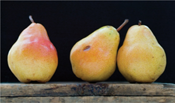
FIG 3.5 The original shot of some pears on an old crate. It seems too crowded, and begs experimentation.
To make the desired changes the image was broken down into several components to handle separately: the background, the foreground wood, the wood plateau, the two pears to the right and the pear to the left. Ultimately the pear to the left was eliminated by the change, giving the image a bit more starkness. Color was borrowed from the pear that went missing, and stems were borrowed from other images. The breakdown of steps to re-create the image and the resulting layers is shown in Figures 3.6 and 3.7.
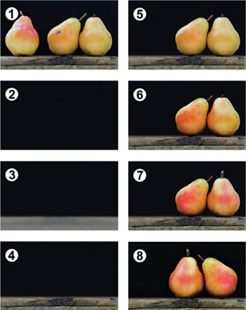
FIG 3.6 (1) The original, (2) a new background, (3) fabricated wood top, (4) copied wood face (with repairs), (5) two pairs isolated, (6) pear pair enhanced, (7) pear pair recolored and (8) two pears flipped and moved.
You will rarely go to such lengths as rebuilding an image to get the result you want, but you may see a key here in getting what you need, and an advantage provided by layers. The separation of objects goes one step further than merely selecting the object and copy/pasting to its own layer. Once the object is isolated, you put yourself in position to have ultimate control of the composition. See the result in Figure 3.8.
One key point about making such adjustments: there is a difference between photography and shooting a picture. In your photography, you can remove an object from a scene by just moving it out of the camera’s view. When you isolate an object in Photoshop layers, the layer from which you plucked the object either still contains the object, or has a hole where it was. The background doesn’t magically re-appear when the object is removed. In the case of the example, the background is mostly pretty simple, and it can be repaired by re-creating it. Making the repair to patch the hole left behind can be more difficult as the complexity of the background increases. But to build some confidence in the strategy, lets look at how it applies to the sample image continuing from the point where you left off in the last exercise.
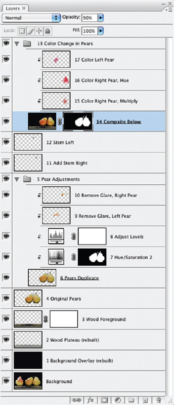
FIG 3.7 The layers show the numbered steps taken to make the adjustments – some of these being more advanced techniques with clipping and masking that we will look at in the following chapters.
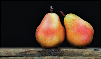
FIG 3.8 The final result is cropped, color corrected, patched and re-organized using the power of layers.
Try It Now
1. Choose the Polygon Lasso by pressing L and Shift+L to scroll the Lasso tools, or choose the Polygon Lasso from the toolbar. Change the settings on the Options bar to Feather 0 Pixels, and check Anti-alias.
Feather and Anti-alias are both means of softening the edge of the selection, and do not usually need to be used together. Softening the selection either way will tend to blend edges of selections with the surrounding area rather than making hard, noticeable edges.
2. Open the image window so you have some room around the edge of the image to apply the tool (Figure 3.9).

FIG 3.9 Use the window controller at the lower right of the window to click and drag the window larger, or zoom out from the image using the zoom tool and Option+click / Alt+click on the image.
3. Make a selection of the wood facing. To do this click outside of the image to the left, then move the cursor and click right at the top of the facing at the edge of the image. Continue moving and clicking across the top of the facing, following the contour of the wood. When you reach the right side of the image, click outside the image, then outside the lower right corner of the image, then outside the lower left corner and then on the starting point to complete the selection (see Figure 3.10).
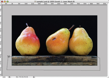
FIG 3.10 Going outside the boundaries of the image with a selection tool (as shown here) will make sure you select tightly to the edge of the image.
4. Activate the Background by clicking it in the layers palette, then Copy and Paste to create a new layer with the wood facing. Name the new layer: 2 Wood Facing.
5. Activate the Background layer again. Create a new layer and fill with black (Edit>Fill Set Content to Black). Call the new layer Black Background.
6. Shut off the view for the Black Background layer so you can see the pears.
7. Select the Polygon Lasso tool, and use it to follow the contour of the two pears to the right of the image, using short segments between clicks (see Figure 3.11). You can use other selection tools if you feel more comfortable. The goal is to isolate the pears. Technically you will not have to make an incredibly tight selection around the part of the pears that is over the black, but try to make the selection as tight as possible.
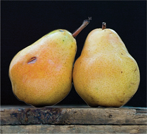
FIG 3.11 Using short segments with the Polygon Lasso can make a selection that is rather smooth, and fine for the purpose of this exercise.
8. Activate the Background layer, Copy and then Paste. This will create a new layer with the pair of pears. Name the new layer: 4 Isolated Pears.
9. Move the 4 Isolated Pears layer above the 2 Wood Facing layer in the layer stack, and turn on the view for the Black Background layer. The layer stack should look like Figure 3.12.
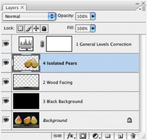
FIG 3.12 In a few quick steps the components of this image are isolated into separate layers.
This simple example isolates the pair of pears, and gives you the freedom to move them in the image and change the composition. Using the move tool, try placing the pears in a different position, or even flip the pears horizontally (Edit>Transform>Flip Horizontal). You’ll want to either keep this image open or save it to continue with the exercise in the next section.
The basics of re-creating the pear image required isolating each of the image areas and/or replacement of those areas with suitable substitutes. The additional effort of re-creating the image proves more fruitful than trying to do something like stamp out the pear on the left with the Clone Stamp. It would be painstaking to fill in the area behind the pears using the Clone Stamp and make associated repairs look right. Inevitably it would look uneven, blotchy, and repaired. Re-creating the entire black background from scratch does several things, including providing the opportunity to remove any distracting imperfections from the black background.
Of course this replacement is not perfect. We could build back in the wood platform, and add noise to the background to make it appear more like the original. In the pear example in Figures 3.6–3.8, I used quite a few different types of layers, some which will not be apparent by the screenshot of the layers palette alone. Some of the layer changes employ Modes, which we will look at later in Chapter 5, and more than one includes a mask or clipping group, which we will look at in Chapter 4. As these techniques are covered in layer chapters, it isn’t appropriate to cover them here, but we will look at similar examples in chapters to come.
Adding Layers for a Change
Layers can be added to an image that act like adjustment layers because they serve to make changes in the image, but actually are also similar to isolation layers. Objects are added to separate layers, either from scratch (using Paintbrush, Clone Stamp or Healing tools) or as image areas (copied from other images, or even cloned from elements in the same image). The objects are added to layers to give freedom in adjusting, positioning, repairing and replacing objects, as well as offering flexibility in masking and positioning in front of or behind other image elements in the layer stack.
Additions for change in the example are represented by layers such as the Remove Glare layers. For these adjustments, new layers were created, and then repairs were stamped over select areas of the pears using a combination of the Clone Stamp and Healing tools. Pear stems were borrowed from different shots in this same series of images so the stems would reflect the same or very similar lighting qualities. Color adjustments were added by sampling color from the pear that was removed and painting it back over the existing pears using different layer modes (which, again, we’ll discuss in Chapter 5).
The most obvious use for this type of ‘added change’ layer is in repairing damage, or in patching plain ol’ ugly areas of an object or area. You could do this directly to objects without adding layers, but keeping the changes separate in layers again offers opportunities that you will not have with direct, permanent application of image changes.
Simple Layer Repair Example
If you still shoot film, have tried to convert old photos to digital, or if you have ever had a dirty sensor or lens, you will be no stranger to correcting minor imperfections in your images that come in the way of dust and debris. Digital shooters may not see as much dust as they see other minor imperfections in their images like litter, crumbs, etc. You can often make quick work of dust and minor debris corrections by applying the Clone Stamp or Healing tool directly to an image background. However, applying these corrections to a blank layer offers much more flexibility. Once you are sure the correction is the way you want it, you can commit the change by merging the layers, or just leave them in separate layers. The advantage here is that if you muff up part or all of the correction, you still have the opportunity to fix it. You also have the opportunity to use tools in combination with one another such as using both the Clone Stamp and Healing tool for a correction.
The pear in this example has some obvious imperfections that needed to be taken care of. Of course, you can do this before taking the image apart into separate objects. One large dent in the middle of the three pears needed some fixing. This is taken care of with simple layered repair.
Try It Now
1. Continuing from the previous exercise, create a new layer above the 4 Isolated Pears and call it 5 Clone Stamp.
2. Create a new layer above the 5 Clone Stamp layer and call it 6 Healing.
3. Shut off the view for the 1 General Levels Correction layer, leaving the layer visible may affect cloning corrections.
4. Activate the Clone Stamp layer by clicking on it in the layers palette. Choose the Clone Stamp and set the options to Sample All Layers – if you don’t, it will not stamp to a blank layer. Apply the tool to make a correction of the damaged areas.
To apply the Clone Stamp, note the color and shape of the damage, and try to find a spot in the image that will make a good replacement. Set the brush size to just slightly larger than the width of the problem area, and use 50–80% hardness (leaving a soft edge to blend corrections). Usually I set the tool to Aligned (check the box) which keeps alignment between the brush and sample point. Sample the area you will be using to replace the damage by holding down the Option/Alt key and clicking on the area. Move the brush over the damage and apply. It is best to apply in short bursts, and it is a good idea to resample from different areas to avoid obvious patterning, and to blend in texture, contour and detail from multiple directions. Doing so will help create unique corrections of the areas.
5. Activate the Healing layer by clicking on it in the layers palette, and then choose the Healing tool. Set the brush and Options like you do for the Clone Stamp, but make the brush 100% hard – the nature of the tool blends in the application. Make a sample and apply the tool to make a second correction over areas corrected with the Clone Stamp to blend in the corrections.
The resulting layers and image can be seen in Figures 3.13 and 3.14.
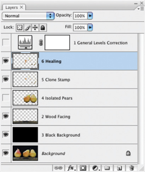
FIG 3.13 The layers palette shows the separate correction layers for Clone Stamp and Healing.
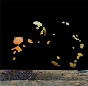
FIG 3.14 In a few quick steps the corrections for this image are isolated into separate layers.
Applying the Healing tool directly to a problem can lead to similar results, but it has been my experience that applying the Clone Stamp first to neutralize the ugliest part of the damage and then applying the Healing tool will yield better results (less noticeable edges) more consistently.
The most difficult parts of this correction will be the damage near the edges of the pears – where the pears meet the black of the background. The problem will be that the Healing tool will try to do too much: it will pull in some of the black background as part of the repair that it tries to make. There are several things you can do to eliminate this problem:
• Use only the Clone Stamp in those areas near edges.
• Make a selection around the area you want to correct to exclude the black from the background.
• Make a selection around the area you want to correct including the replacement area, then isolate that on its own layer via Copy/Paste (see Figure 3.15), and shut off other layers.
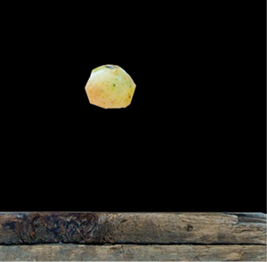
FIG 3.15 A distinct advantage of using Healing with layers is that you can limit what gets sampled for use in the correction.
Following these techniques you can make freehand corrections to this image infinite different ways, each equally as convincing. Check your handiwork by toggling the view for the correction layers. You may want to group them so you can toggle the view as a group. This will let you compare before and after, and should you want to flip the pears horizontally, you can flip the whole group (see Figure 3.16).
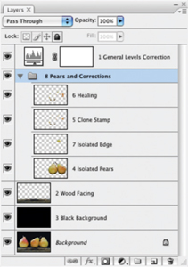
FIG 3.16 This shows the final layer set for this set of examples, including the Isolated Edge layer and grouping.
The Art of Color Balance
While levels are excellent tools for normalizing color, they may not always produce the most pleasing color if you use them only to extend the dynamic range. A tweak to color balance will often do quite a lot to enhance your image’s color.
The idea of the Color Balance function is to allow you to shift the balance between opposing colors: cyan balances against red, green against magenta and blue against yellow. These adjustments can be made using separate ranges: highlights, midtones and shadows. Working through a Color Balance correction by gaging the changes on screen can often clear up muddy appearances by balancing color casts caused by lighting conditions. The Color Balance dialog box is a friendly, easy way to make these changes. Rather than trying to calculate a result, you’ll work with Color Balance interactively. The goal is to achieve more vibrant, balanced color.
1. Open the Vanishing Point.psd on the CD. You’ll also find this image in the Samples folder in the Adobe Photoshop CS3 program folder and on the installation CD in with the Sample images.
2. Treat this as a new image and do a Levels correction as described earlier in this chapter. You won’t be able to do to much, but you’ll see a small change in the image.
3. Open Color Balance by choosing Color Balance from the Adjustment Layers sub menu (Layer>New Adjustment Layer>Color Balance).
4. Start with the Midtones (under the Tone Balance panel), and slide the Cyan/Red slider between −50 and +50, watching the effect on the image. Narrow down the range that looks best by swinging the slider in smaller ranges until the best position is achieved based on the screen preview. The ‘best’ position is where the color seems most balanced against the extremes (which you use +50 and −50 to preview).
5. Repeat step 4 for the Magenta/Green slider.
6. Repeat step 4 for the Yellow/Blue slider.
7. Click the Highlights radio button on the Color Balance dialog and repeat steps 4 through 6. This will make adjustment to Color Balance for the Highlights.
8. Click the Shadows radio button on the Color Balance dialog and repeat steps 4 through 6. This will help you make adjustment to Color Balance for the Shadows.
9. Repeat steps 4 through 8. This will allow you to review earlier adjustments in context of the changes you made to the shadow changes.
The steps here might seem an oversimplification, but this is really all you have to do with Color Balance to achieve the desired result. The critical part of this exercise is that you have to be able to trust your monitor, so it will need to be calibrated (and hopefully tested against output as well). Depending on your choices, the Vanishing Point.psd image will show a dramatic difference after Color Balance, even with small movements of the sliders. Changes will influence color, saturation, dynamics and even details in the image. You can see the effect on details usually in the highlights (the back of the dog’s head – or if you try to apply a Color Balance change to the pear image, you will see some variation in the specular highlights where the light is reflecting from the source). The color result of a correction on the Vanishing Point.psd appears in the corrections on the CD. You’ll want to toggle the view for the Color Balance 1 layer to see the difference before and after the application. Figure 3.17 shows the Color Balance settings used to make the change.
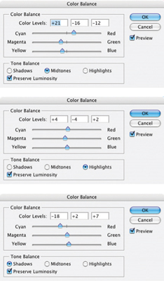
FIG 3.17 Color Balance influences many parts of the appearance of your images. When it is corrected for this image, the scene will appear to gain some depth of color.
Summary
In this chapter we have begun to use layers to actually make a difference in image appearance, first with an isolated Levels correction, then with isolating objects in the image for control of the composition, and then for making isolated corrections. The Levels correction and Cloning/Healing corrections are techniques you can use on virtually all your images. Object isolation may not be something you will do every day, but the basic concept of isolation is something you may use all the time – actually we used a variation at the very end of the section on Healing corrections by isolating the edge area.
Thinking about your images and your corrections as made up of separate, layered corrections is the key concept that should be coming across here. Layers offer opportunities for isolated correction that pose advantages while making the change and have additional advantages once the correction has been created in terms of potential adjustment.
Changes to this image need not be limited to the corrections shown in this chapter, and other corrections can certainly be considered. Think about what you would like to see in this image, and imagine how that requirement might be solved with additional layers, or those you have already created. Attempting to make some or all of those additional changes is good practice with layers.
A valuable thing to do with the information in this chapter is to begin applying the changes to your own images. Choose one or more of your images and test out selective enhancements using layers. You don’t have to do everything from this chapter to every image, but you should make an attempt to try out everything to see how the techniques might apply to your corrections:
• Start with making a Levels Adjustment Layer to correct image color.
• Attempt to isolate an image area by selection, copy and paste.
• Adjust the position of an object if you are really daring.
• Locate some image area(s) that you want to improve with simple cloning corrections, and create new layers to help you incorporate change. Then stamp out and heal problem areas.
• Fine tune with Color Balance.
Keep in mind that working with additional images can be exercises without a real goal of achieving improvement in the image: it is enough at this point to perform the techniques as exercises or practice. Do, however, make serious corrections if they are warranted in your images to exercise the true value of layers.