Table of Contents for
The Adobe Photoshop Layers Book: Harnessing Photoshop's Most Powerful Tool, covers Photoshop CS3
 The Adobe Photoshop Layers Book: Harnessing Photoshop's Most Powerful Tool, covers Photoshop CS3
Published by
Focal Press, 2007
The Adobe Photoshop Layers Book: Harnessing Photoshop's Most Powerful Tool, covers Photoshop CS3
Published by
Focal Press, 2007
- Cover
- Halftitle
- Title
- Copyright
- Dedication
- Contents
- Acknowledgements
- Introduction
- Chapter 1: The Basics of Layers: Layer Functions and Creation
- Chapter 2: Layer Management: Concepts of a Layer-Based Workflow
- Chapter 3: Object and Image Area Isolation in Layers
- Chapter 4: Masking: Enhanced Area Isolation
- Chapter 5: Applying Layer Effects
- Chapter 6: Exploring Layer Modes
- Chapter 7: Advanced Blending with Blend If
- Chapter 8: Breaking Out Components
- Chapter 9: Taking an Image through the Process
- Chapter 10: Making a Layered Collage or Composite Image
- Index
In the previous chapter we looked at layers as a means of isolating image corrections so you can target change. This covered the idea of applying corrections on separate layers, using adjustment layers, and isolating image objects. This chapter looks at some similar types of isolation using layers and masking as a means of creating flexibility with the way you handle layers.
A big deal is often made about masking and the power it provides. Masking, put simply, is blocking off areas of an image from view. This is different than erasing areas of the layers, as erasing is permanent removal; using masks is really hiding pixels rather than removing them. One of the most basic types of masking is something we did in the exercise at the end of Chapter 1. In that exercise we used a duplicate of the Background layer to hide mask the Drop Shadow layer (see Figure 4.1).
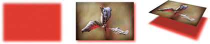
FIG 4.1 The simplest type of masking with layers is using the content of an upper layer to hide the content of the lower – the content of the lower layer is still there, but it is hidden from view.
More sophisticated means of masking are comparable to the simple masking we explored in the exercise, they just do it with more finesse. All types of masking share the same concept: masking acts to block image content from view without removing it or destroying it like erasing might.
Expanding on Process
We have advanced in the chapters from discovering where functions are, to applying functions just for the joy of seeing them work, then to seeing how they work to achieve a purpose. In this chapter, we’ll advance even further by exploring functions as part of the layers workflow working with the image in Figure 4.2.
Looking back at our outline for correction (Chapter 2), it is a good idea to start corrections by evaluating the image. A developed hit list of corrections you intend to make, roughly conforming to our previous outline, might look like this for the image in Figure 4.2:
1. Clean up pollen and dust specks.
2. Reduce the significant digital noise.
3. Enhance natural color and tone.
4. Add soft focus to go with the flow of the image.
5. Sharpen and enhance contrast.
6. Add color enhancements (paint in color).
Though the image is not a terribly good capture, when all is said and done, this image will have gone through enhancement to bring out what is lurking there. The result will be something like Figure 4.3, remarkably similar to the original capture.
The image may seem to need a lot of corrections, but the results will be worth the effort and it will offer the opportunity to learn how to apply more layer techniques. We’ll look at masking as it applies to layer transparency, layer clipping, Adjustment layers, and proper layer masks. We’ll use layer masking to paint in effects, affect image sharpness selectively, and change image color selectively. Let’s take each step in our hit list in order and explore corrections for this image fully to help you see application of layers in process.
FIG 4.2 Even though this image initially appears to be sub-standard, there is potential in the soft lighting and gentle tones, and several interesting possibilities to enhance.

FIG 4.3 Following the corrections list, this image takes a dramatic turn for the better.
Clean Up
There are some obvious detail problems in this image that can be immediately wiped out, like the obvious dust speck and several smaller areas where pollen has been scattered. You will want to clean these areas up using the Clone Stamp and Healing layer techniques discussed in the previous chapter. You can probably get everything done here with one or the other of these tools, but you can set up the two-layer technique if you want.
1. Open the Sample2.psd on the CD.
2. Create a new layer and call it 1 Spot Adjustments. Choose the Healing or Clone Stamp tool and make corrections for the obvious problems. If you use both the Clone Stamp and Healing tools, consider creating separate layers for each and name them appropriately so you can better blend the applications.
If you need more detail or to review the techniques, please see the exercise in the previous chapter. When you have finished the cloning/healing, save the image so you can come back to it as we continue working through the hit list. One of the new techniques we’ll explore thoroughly here is reducing image noise.
Reducing Image Noise
There are several ways to reduce noise in your images, few of them are probably obvious beyond the Reduce Noise filter. One of the key factors to keep in mind when addressing noise is that noise is just the opposite of blur. You can see this in a quick exercise.
 Try It Now
1. Open a new blank image (choose File>New). Be sure the image is Red, Green and Blue (RGB) and 1000 × 1000 pixels. After choosing your settings for the new file, click OK. For settings see Figure 4.4.
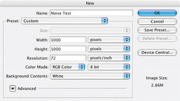
FIG 4.4 The New Image dialog settings.
2. When the image opens, fill with 50% gray. Use the Fill function (Edit>Fill), and select 50% Gray from the Use drop list. Leave the Blend Mode at Normal and the Opacity at 100% (see Figure 4.5). Click OK.
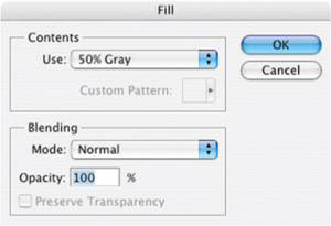
FIG 4.5 The Fill dialog settings.
3. After the fill, apply some noise to your image with the Add Noise filter (Filter>Noise>Add Noise). When the Add Noise dialog opens, make the Amount 10%, and the Distribution Uniform. Leave the Monochrome box unchecked. When you have completed the settings (see Figure 4.6), click OK on the dialog. Your image will fill with noise.
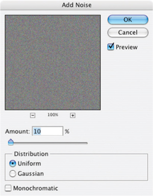
FIG 4.6 The Add Noise filter dialog settings.
4. Now open the Gaussian Blur filter (Filter>Blur>Gaussian Blur). Set the Radius for the filter to 25 pixels and click OK. This will mediate all the noise you added in step 3, and you’ll be back to flat gray, eliminating the noise (Figure 4.7).
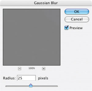
FIG 4.7 The Gaussian Blur filter dialog settings.
Hopefully you see from the quick example that you can obliterate noise with blur. However, applying blur to everything in your image will lead to a blurry image. You’ll obliterate detail as well as the noise. Often you’ll need to be selective about just what to blur. There are many ways we could go about this, and we’ll look at a method that allows us to explore noise reduction while maintaining the advantage of layers by continuing work on the sample2.psd you saved earlier in this chapter after making the initial cloning/healing corrections.
Try It Now
1. Create a new layer above the Healing/Clone Stamp layers, call it Manual Masking, and number it accordingly. This exercise assumes you have used one layer for healing/cloning, so it will be named '2 Manual Masking’. This layer will be the canvas for defining the mask you will create in the following steps.
2. Choose the Brush tool and press D to set the default colors (the foreground will be black). Be sure the brush you have selected is round, 100% hard, 100% Opaque and turn off all brush dynamics (see Figure 4.8). Try to use a larger brush 20–30 pixels in diameter. Either use the Brush Preset Picker on the Options bar when the tool is selected, or the Brush palette (Window>Brushes). This brush will be used to outline the mask you are creating.
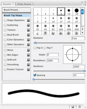
FIG 4.8 Uncheck the boxes under Brush Presets to shut off all brush dynamics.
3. Begin applying the brush to the image to outline the petals (see Figure 4.9). You want to get pretty tight to the petals to create a solid outline. Most of your movement will be freehand, but using short line segments can often be easier to control. To create line segments, hold down the shift key and click between points to draw a straight line between clicks. Complete the outline (see Figure 4.10).
Brush size can be changed with keyboard shortcuts.
Increase brush size with the ] key, and decrease brush size with the [ key.
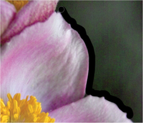
FIG 4.9 Use the larger brush to define the general outline, then come back and fill in the smaller areas using a smaller brush.
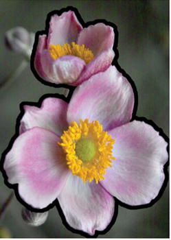
FIG 4.10 Complete the circuit around the petals.
4. Choose the Magic Wand tool, set the Tolerance to 10, check the Anti-alias box, check the contiguous box and click on the flowers. Sample All Layers should be unchecked and the 2 Manual Masking layer should be active. This will select the area inside the black outline you created.
5. Expand the selection (Select>Modify>Expand) by half the diameter of the brush selected for step 2 (e.g., 10 pixels if you used a 20 pixel brush). This will push the selection out over the outline you created.
6. Invert the selection (Command+Shift+I / Ctrl+Shift+I [Mac / PC]) then Fill with black. This will invert the selection so it is over everything but the flower petals and will fill the area around the flowers completely with black (see Figure 4.11). Deselect by pressing Command+D / Ctrl+D.
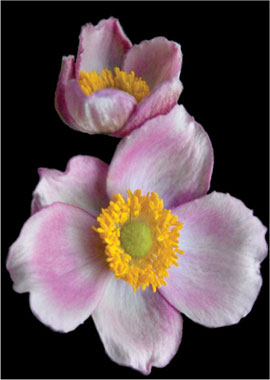
FIG 4.11 Once filled with black, the flowers are visibly isolated and we can use this as a selection and mask for additional changes.
Composite Layers
Composite layers are useful in certain circumstances to either provide a point to freeze your changes as a solid stopping point to continue working from, or to provide image information that is otherwise not available. What they do is take a freeze frame of whatever you have visible in the image at the time you capture the composite.
To capture the composite, make sure the image shows the layers you want to be in the composite (you may need to toggle layer views), then create a new layer and press Command+Option+Shift+E/ Crtl+Alt+Shift+E. Pressing these keys will stamp the visible content to the new layer. Usually you will want to rename the new layer with an appropriate name!
Sometimes you will capture the composite of the entire image with all of the layers on in order to have a point to move forward cleanly from after making a lot of changes. Other times, such as in this example, there are specific layers to take a snapshot of. Because a mode was applied to the Dupe Manual Mask layer, it only appears desaturated because of the calculation the layer performs: there is no layer that actually has the desaturated content. Making a composite allows you to re-group the image information in one place and commit it to tangible pixels. When you have gathered image information in a composite, blurring will affect the desaturated masked area directly; and in isolation from the rest of the image.
Remember this compositing technique as another means of organizing content in layers! It is frequently a handy technique.
7. Duplicate the 2 Manual Masking layer and rename it. I called it 3 Dupe Manual Masking Blurred and Desaturate. You will use this layer to make additional refinements to the mask.
8. Change the mode of the 3 Dupe Manual Masking Blurred and Desaturate layer to Color and apply a Gaussian blur to soften the edge (I used 3.5 pixels). The change in the mode will desaturate the area under the mask; blurring will soften the edges and assure the changes based on this mask will blend in at the edges of the petals.
9. Shut off the view for the 2 Manual Masking layer, be sure the 3 Dupe Manual Masking layer is active, capture the composite Command+Option+Shift+E / Ctrl+Alt+Shift+E. This will reveal the content under the 2 Manual Masking layer, and then create a new layer with the current visible saturated and desaturated content collected. Name the new layer 4 Composite.
10. Hold down the Command / Ctrl key and click on the layer thumbnail for the 3 Dupe Manual Mask layer. This will load the solid part of the layer as a selection.
11. Activate the 4 Composite layer, and duplicate the selected area to a new layer. Command+J / Ctrl+J will do the trick. Name the new layer 5 Copied Masked Area from Composite. This will isolate just the desaturated area of the image into its own layer.
12. Duplicate the 5 Copied Masked Area layer, and name it 6 Duplicate of Copied Masked Area.
13. Group the 6 Duplicate of Copied Masked Area layer with the 5 Copied Masked Area layer by pressing Command+Option+G/ Ctrl+Alt+G. This makes a clipping group from the layers. Apply a Gaussian Blur of 6 pixels to the 6 Duplicate of Copied Masked Area layer, then apply Add Noise at 2% using Gaussian distribution. Your layers should look like Figure 4.12. The blurring will soften the area around the flowers, mitigating the noise, and the Add Noise application will help rough up the texture of the area again so it is a better fit to the rest of the image.
Steps 1 through 6 create the template you will need to isolate the area to change in the later steps. Once the base mask is created, it can be adjusted and applied. Making the clipping group assures that the blur will be contained to the original masking shape, rather than allowing the blurred edges to bleed into the petals. Applying blur softens the noise, and adding noise back roughs up the blurred image area so it doesn’t seem unnaturally smooth. The result should show a slightly softer peripheral area with greatly reduced noise (see Figure 4.13).
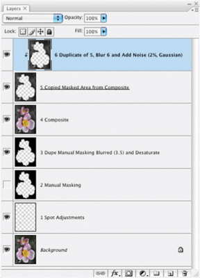
FIG 4.12 Some layers are becoming extraneous to the result at this point, but provide valuable clues as to how the result was achieved.
The main concept to keep in mind here is that Blur and Noise filters can work well together in reducing the appearance of noise in your images and maintaining a realistic appearance. A secondary concept is isolating the image area(s) that you want to affect. Here we used manual masking techniques, selection and clipping layers to achieve isolated effects.
Again, you will want to retain this image so we can continue making corrections. Now let’s look at enhancing natural color.
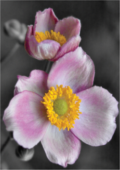
FIG 4.13 Masking and blurring helped reduce noise without compromising important detail.
Enhancing Natural Color and Tone
After taking quite a while to examine some options with noise, we’ll step back to a hopefully more familiar area of Levels corrections. You want to apply a Levels correction as an Adjustment layer masked to the flowers to be sure you are making the most of color and tone as they were captured and to do some balancing for the color and light. As you have already made the mask, applying it is easy. A second part to this color enhancement will be using Hue/Saturation to emphasize and control colors in the image.
Try It Now
1. Command+click / Ctrl+click the 3 Dupe Manual Masking layer icon to load the layer as a selection again. Invert the selection. The inverted selection targets the flower.
2. Choose Layer>New Adjustment Layer>Levels from the program menus, when the New Layer dialog appears, name the layer 7 Levels Correction for Flowers and click OK. The Levels layer will be created with a mask that targets the flowers using the selection loaded in step 1. Make your best effort in the levels correction (consulting the instructions from the previous chapter if you need to).
3. Choose the Eyedropper tool (press I), and set the Sample Size option on the Options bar to 5 by 5 Average. The settings for the Eyedropper affect samples we will be making in later steps on the Hue/Saturation dialog.
Setting the Sample Size for the Eyedropper affects the way sampling tools behave on other tool dialogs.
4. Command+click / Ctrl+click the 3 Dupe Manual Masking layer again to load the layer as a selection. Invert the selection (Select>Inverse). This selects the flowers again.
5. Choose Layer>New Adjustment Layer>Hue/Saturation. Move the Saturation slider to +10. This creates a Hue/Saturation adjustment layer targeted to the flowers and saturates the colors that already exist in the flower.
6. Choose Magenta from the Edit drop list on the Hue/Saturation dialog. We are going to work a little more with the petal color in a particular color range, and this is the first step in narrowing the range.
7. Click in the image over the pink area of the petals. Then click the Add to Sample eyedropper on the Hue/Saturation dialog. This tool will adopt settings you chose in step 3, and allow you to expand on the color range selected in step 6. Click-and-drag the sampler across one of the flower petals (see Figure 4.14). This will select the color range for the petals.
8. Drag the Saturation slider to the right until the pink area of the image is just about to burst with color. I chose +20 for Saturation and +3 for Hue. We will be softening the look a bit so making the color strong is OK as it will be mediated.
The latter Hue setting was merely a preference, but checking a range of hues by moving the Hue slider should tell you how successful your range selection was for the petal color.
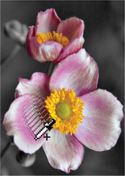
FIG 4.14 The initial click sets the standard range, the click-and-drag samples a range of color to add to the initial sample.
This Hue/Saturation technique can be used in a variety of combinations of masking and color range selections, making it a very versatile tool. You might, for example, consider making a change to the center of the flower by choosing another color to edit on the Hue/Saturation screen, creating another range using the sampling tools, and making an adjustment. You may need to combine this with additional masking to achieve the result you are looking for (Figure 4.15). For example, if you set the color range and make a hue adjustment, and it changes other parts that you don’t want it to, you can easily block the changes by adjusting the mask.
Masking in this case allows you to make a change, and then localize the change to the area you want corrected. This is just a small hint as to the enormous power of masking. Hold on to that image, there is more to come as we work on soft-focus effects.
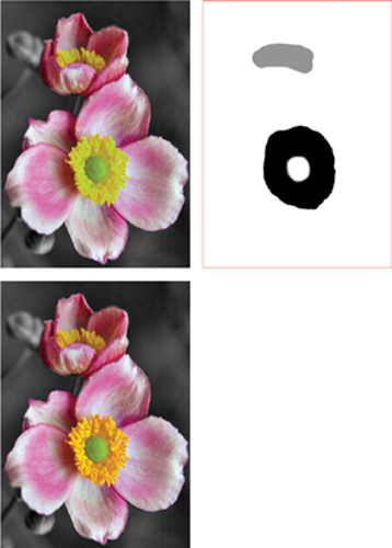
FIG 4.15 Because there is a lot of yellow in the eye of the flower, it is virtually impossible to isolate the change by a color range selection alone. Adding masking to the Hue/Saturation can easily limit the change to just the center of the flower.
Add Soft Focus
While there are certainly parts of this image that are in focus, the very shallow depth of field and lighting make the nature of this image a little soft. I find it is usually better to go with the flow, and not try to force a softer image to pretend to be tack sharp. There are ways to make this image look sharper, and we’ll look at that a bit later. Enhancing the soft focus may be the more natural and helpful in making this particular image look its best.
Soft-focus effects are achieved photographically by scattering light. You can use soft-focus filters and soft-focus lenses to achieve the effect, and a similar effect can be had by using a UV filter and smearing the outer edge with Vaseline while leaving the center of the lens clear. The latter may seem like quite a sloppy solution, but the reasoning is all the same: disburse some of the light passing into the lens and diffuse it.
To have light you have to have brightness. That is, darker parts of your image will tend to have less light to disburse, and lighter parts will have more. The logical solution for creating soft-focus effects would be to make a selection of image content based on brightness and then copy that to its own layer and blur and that is exactly right. You might follow this up using layer opacity to control the effect, and perhaps layer modes to refine the effect you want.
That is the general idea, although it may be a slight bit oversimplified (technically, you probably want to make this adjustment separately for each component of light, RGB). Following this logic, we can look at a slightly more advanced and satisfying result for this image. Remember that we have already blurred the background, and maybe we want to contain further blurring and effects. We can do that by compounding masks.
Try It Now
1. Create a composite layer at the top of the layer stack and name it 10 Composite Color Enhancements (see Figure 4.16).
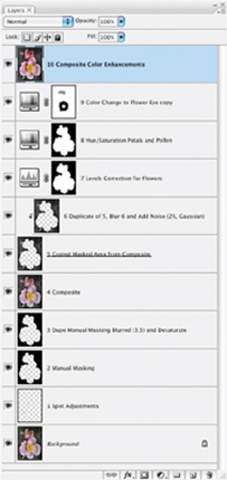
FIG 4.16 Using one layer for the spot corrections early on and adding the color change for the eye of the flower, there are currently 10 layers in this image including the new composite. You may have fewer or more layers depending on the choices you made in processing.
2. Once again, load the mask we made for the flowers as a selection. You can do this in a variety of different ways, but – as we haven’t done it quite this way – hold down the Command / Ctrl key and click on the mask for the Levels or Hue/Saturation layers created in the previous section.
3. Copy the content of the 10 Composite layer to a new layer using the selection you just loaded. Copy and Paste will work, as will Command+J / Ctrl+J. Name the new layer 11 Copied Composite Using Blurred Manual Mask, or similar name.
4. Blur the content of the 11 Copied Composite layer using Gaussian Blur and a radius of 30 pixels. This will turn the image to a horrible blurry mess – however, this is not the immediate goal.
5. Open the Channels palette (Window>Channels). This shows a display of the RGB information for the image at a glance (See Figure 4.17).
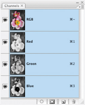
FIG 4.17 The palette controls and options for the Channels palette are very similar to the Layers palette but Channels are quite a different animal, representing the RGB light components of the current image composite.
6. Hold down the Command / Ctrl key and click the thumbnail for the Green channel in the Channels palette to load it as a selection.
Green is at the center of the visible spectrum and as such shares similarities to what we might expect to see as a luminous conversion to black and white, so that is why it is being used. Other channels could be an option as could Luminosity, which is a component of LAB mode. We’ll look at Luminosity advantages later in this book.
7. On the Layers palette (you can close the Channels palette if you want), be sure the 11 Copied Composite layer is active, and then click the Add Layer Mask button at the bottom of the Layers palette. This will create a mask for the layer using the Green component. This will block the soft-focus effect in darker portions of the image.
8. Lower the opacity of the 11 Copied Composite layer to 50%. This will allow you to see through the blurring even more.
9. Duplicate the 11 Copied Composite layer and change the mode to Softlight, then name the layer 12 Duplicated Copied Composite. This added layer will enhance the soft focus effect.
The last few steps in the procedure here both lower the effect of the blur by masking and use of opacity, then increase the contrast to compensate for some of the dynamics lost in the blur (Softlight mode). You can further control this effect by making adjustments to the layers you added using Opacity or Modes, increasing/decreasing the amount of blur, or changing the masking (e.g., for variations you could use the Red channel for the mask instead of the Green, or load the mask before making the blur).
This image has come quite a way already, but there is still a ways to go. Be sure to save it off at this point so you can continue with the corrections in the next section. Try toggling the views on and off for the 11 Copied Composite and 12 Duplicate Copied Composite layers just to see the difference before and after the soft-focus addition. You can also compare before and after for the whole process (see the Before and After sidebar).
Before and After
There are several different ways to compare before and after. Here are three different ways:
1. Toggle off the views for all other layers than the Background layer. To do this, you can click-and-drag the cursor over the Layer Visibility Indicators in the layers palette.
2. Use the History palette to toggle between the original and current state of the image by clicking the appropriate states. Click the snapshot at the top of the palette to return to the original state, and the last item in the History to return to the current state (see Figure 4.18).
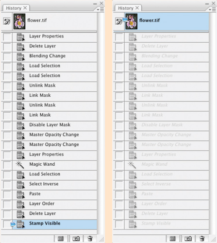
FIG 4.18 The History palette only retains as many states as you have entered in the preferences, but it does maintain the initial state of the image as well. Toggle between the initial state and the last one on the list to see before and after.
3. Duplicate the Background layer and drag the duplicate to the top of the layer stack. Name it Before, and toggle the view as needed.
Any of these methods will work, depending on how you like to work and how you use layers, some methods may prove convenient at different times.
Color Enhancements
Color enhancements for this example image come in two types: enhancement of natural color as we looked at earlier in this chapter, and enhancement by addition which we’ll look at here. In this image, adding some muted color to the additional objects in the scene like the stems and buds in the background will make them seem less distant, and more a part of the image, while giving the image a little more dynamics overall. We’ll take a look at this color adjustment and how to do it with layers by painting in color enhancements.
Try It Now
1. Create a new layer at the top of the layer stack and call it 13 Green.
2. Choose the paintbrush tool and a small soft brush, then double-click the foreground color swatch on the tool bar and choose a green (I chose RGB: 15, 120, 20). Lower the opacity of the brush to 50%. A 50% brush opacity will layer color as you apply it, yielding density changes that may prove pleasing in the final result.
3. Paint on the 13 Green layer over the areas of the image that you think should be green. I painted over the buds and stems to the left. Don’t worry about the coverage being 100% or whether it is completely even – in fact you may not want it to be (see the comments after the exercise).
4. Apply a Gaussian Blur to the layer, just a few pixels (5 or so). This will smooth out and blend in the color.
5. Set the layer to Color mode and adjust the Opacity until it seems pleasing.
6. Add a Hue/Saturation layer as a clipping layer grouped with the 13 Green layer and try variations on the color (adjusting Saturation and Hue sliders) to see if there is a shade you like better.
Add color to additional areas of the image if you wish like the petals, or consider layering color. For example, in this image I used yellow to create some highlights, blue complements may have worked as well. Add a new layer for each of these colors so you can control opacity and blur separately. In fact you may want to add color in layers, using several layers for individual colors to allow varying opacity, blur and modes.
You may also want to experiment using multiple layers, layer modes and brushes. For example, I often use the Fade control and other brush dynamics for size to taper brush strokes and apply other randomizing brush effects. While the layers themselves are acting as masks by locating color to those spots where the brushes are applied, layer masks can be added in addition to confine application areas. There is a lot of room for creative application and we can’t possibly cover it all, but we will look at it again in several other exercises as we go.
Sharpen and Enhance Contrast
Sharpening an image is sometimes understood as an action or application of filters done to magically make an image appear to be more in focus. That is not entirely the way it goes. Sharpening is meant to enhance edge contrast and detail that already exist in an image. This means enhancing the sharpness that is already in the image. If an image is utterly out of focus, soft and blurry, then there are no strong edges, nothing to sharpen, and applying some means of sharpening may actually end up making the image worse – depending on how the sharpening is applied and at what strength. The goal of sharpening is not really to snap an out-of-focus image into sharpness.
Sharpening will do several things very well. It will:
• enhance the appearance of sharpness already in an image to make it appear even sharper,
• it can enhance edges in images that are going to print to help counteract dot gain (where ink bleeds into the paper and softens images),
• enhance existing contrast.
On the negative side, sharpening can also:
• cause edges to exhibit haloing, where edge contrast is enhanced too much and appears to create a glow around edges (see Figure 4.19);
• cause image damage by blowing out highlight detail (making color run to absolute white) or blocking up shadow detail (making color run to absolute black).
The upshot is that sharpening can do just as much harm as good if you use it incorrectly. We’ll look at best practices for using the Unsharp Mask, and how to use it for both enhancing sharpness and enhancing image contrast. Later we’ll look at a much different means of sharpening by combining several techniques that we have already looked at.
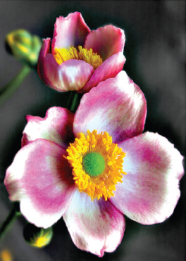
FIG 4.19 When images are oversharpened, they may display noticeable haloing on hard edges that appears as an unnatural glow. In this case, with rather extreme settings, a dark halo appears around the flower petals, the edges of the petals blow out, noise is enhanced and detail lost.
The basic application of the Unsharp Mask attempts to enhance the apparent sharpness of an image. This can work wonders in some images that are already reasonably sharp, and can work well with fine detail like fur. Continue working with the image we’ve been using throughout this chapter.
Unsharp Mask
The Unsharp Mask filter causes a lot of confusion because of its name. It seems incongruous that a filter called ‘unsharp’ is used for sharpening image.
The name unsharp comes from darkroom practice. A blurred, inverted copy of a negative was sandwiched with the original to create an edge mask. During exposure in the darkroom, that ‘unsharp mask’ was used to enhance edge separation, increasing the apparent sharpness of the results.
The Unsharp Mask filter attempts to mimic the results of this type of masking using a digital calculation.
Try It Now
1. Create a new layer at the top of the layer stack, call it 14 Unsharp Mask.
2. Copy the visible content to the layer by pressing Command+Option+Shift+E / Ctrl+Alt+Shift+E. The unsharp mask will need to be applied directly to the image content.
3. Open the Unsharp Mask filter (Filter>Sharpen>Unsharp Mask).
4. In the dialog, set the Amount to between 50% and 100%, the radius to between 1 and 3 pixels and the threshold to 0.
An Alternative to Layer Masking
There is an alternative to applying a layer mask that yields identical results, but can sometimes come in handy: using a clipping layer instead of a mask. Try using clipping groups instead of standard layer masks:
1. Activate the Unsharp Mask layer by clicking on it in the layers palette.
2. Create a new layer by clicking the Create New Layer button on the layers palette. Call it Unsharp Mask Masking.
3. Press Command+[ / Ctrl+[ to move the new layer below the sharpening layer.
4. Activate the Unsharp Mask layer again by clicking it in the layers palette and press Command+Shift+G / Ctrl+Shift+G (this was Command+G / Ctrl+G for Photoshop CS or earlier). This creates a clipping group from the Unsharp Mask and Unsharp Mask Masking layer.
5. Choose the paintbrush tool, your brush and apply it to the Unsharp Mask Masking layer to reveal the sharpened contents of the Unsharp Mask layer.
With this type of masking it is the solidity of the lower layer (rather than the tone of the mask) which controls what can be seen.
Higher amount and higher Radius will affect more pixels more intensely. The settings noted here work with most images (4–8 megapixels). Use higher Radius and Amount settings for larger images.
5. Click OK.
Depending on your settings and how you have handled the image thus far, sharpening may have given you pleasing, somewhat pleasing, or sorta ornery results. The fact is that very little of this image will need sharpening, and because of the nature of the image and added noise, you may actually experience unpleasant enhancement of noise. Sharpening does not play favorites, it enhances everything in the image.
Your choices are to use the same measures we’ve been looking at throughout this chapter to control the result: use masking or opacity. Here it may be best to mask the change to the parts of the image that benefit most: the eye of the flower.
Try It Now
1. Be sure the 14 Unsharp Mask layer is active, and click the Add Layer Mask button at the bottom of the Layers palette. This will add a mask to the layer.
2. Fill the mask with black. You can do this by using the Paint Bucket tool with black as the foreground color, or choose Fill from the Edit menu and use Black as the Content.
3. Choose the brush tool and a medium-soft brush, change the foreground to white (press D with the mask thumbnail active), and paint over areas you would like to selectively sharpen (in following the exercise that would be over the eye of the flower). Painting white into the mask reveals those areas.
Another means of applying Unsharp Mask is using a smaller Amount (10–30%) and broader Radius (50–100 pixels). This will enhance the local contrast in your image. This can often work well with images that seem a little flat, but can still be abused and may lead to trouble. There are other techniques that we will look at in later chapters using layer modes that will also enhance local contrast.
Local contrast is part of how objects and colors play against one another. Enhancing local contrast is not as radical as flatly enhancing contrast in an image as it depends on object and color proximity.
Additional Manual Sharpening
One thing you will be able to do here (for practice, fun, learning and if you have the time) is to try and sharpen up the edge of some of the petals which seem soft. Much of this is an artistic decision, but one that relies on a simple idea: lack of sharpness is apparent where edges are blurry. Fix the edges and you improve the sharpness of the image.
A manual way to enhance edges and create sharpness where it seems to be lacking is to paint in new edges using our Clone Stamp and Healing layers.
Try It Now
1. Create a new layer at the top of the layer stack and call it 15 New Edges. This will be used to hold your new adjustments.
2. Choose the Clone Stamp, and a brush that is relatively hard – relative to the image. For this image I set the brush hardness to 80% and chose a brush of 45 pixels without brush dynamics (uncheck other dynamics options in the Brushes palette).
An absolutely hard brush will make an absolutely hard new edge, a softer brush will make a softer edge; 80% seems to work well with this image because it enhances the look of the edge without seeming impossibly sharp in comparison.
3. Sample from another portion of the petal, and then use that sampled to stamp a new edge in the areas where you want the petal to be sharper (see Figure 4.20).
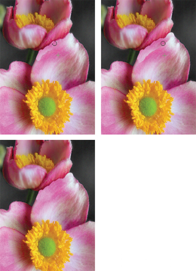
FIG 4.20 Applying the Clone Stamp allows you to make a new harder edge that seems to have more focus, and applying Healing next to that allows you to seamlessly blend in the new edge.
4. Create a new layer for the Healing tool and blend in the new edge by applying Healing to the area between the new edge and the petal. This brush can be about the same as the one chosen for the Clone Stamp but should be 100% hard.
Figure 4.20 shows the technique described in steps 3 and 4 and the immediate result of the edge creation. Continue to build and blend. You can do this right on the same Clone Stamp and Healing layers. See the before and after in Figure 4.21.
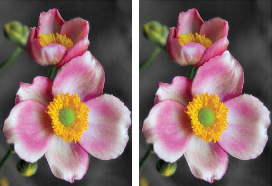
FIG 4.21 Applying the Clone Stamp allows you to make a new harder edge that seems to have more focus, and applying Healing next to that allows you to seamlessly blend in the new edge.
Summary
Throughout this rather rambling exercise you have looked at many implementations of layers and masking and the type of separation and application advantages they provide in a real world situation. Six desired adjustments have led to a plethora of changes, and 19 layers in my sample image (see Figure 4.22). The resulting layers can be perused if you open the Sample2_complete.psd image on the CD.
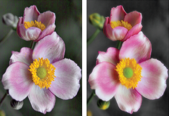
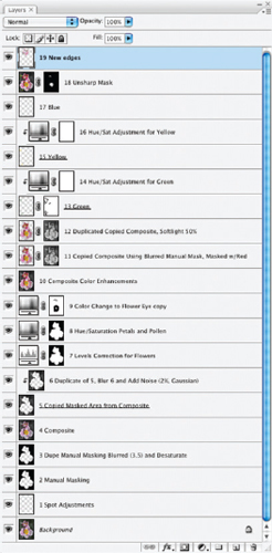
FIG 4.22 Layer stack may differ from the one shown here depending on the steps you have chosen to include throughout this chapter and how you chose to handle them, but the results should be similar. Depending on what choices you have made (e.g., how you handled cloning changes and color additions) you may have more or fewer layers than shown here.
Throughout this chapter, we have looked with some depth at a variety of ways masking is applied in images. The basic concept is indeed ‘masking hides’ but it can hide and reveal and becomes a particularly powerful tool when used in combination with layers for the purpose of corrections.
What can be a mask?
• Layer content: It masks what is below in the layer stack.
• A clipping group: It masks what is grouped above based on layer content.
• Layer Opacity: This will allow you to mask the intensity of how an upper layer supersedes content below in the layer stack.
• Layer Mode: This will allow you to vary the means by which how an upper layer combines with layers below (we’ll look at this in more depth later), effectively masking change.
• Selection: It masks changes so they are applied to the selected area only.
• Layer masks: They mask the portions of the layer they are associated with. Black hides, white reveals, gray hides as a percentage gray or as a semi-transparent mask.
• Adjustment layer settings: These can target a color or tonal range.
• Channels: These store layer masks and selections, but can become masks themselves.
And there are more advanced masking options left to dig into, like Blend If. The real challenge is to take some of what you have learned about masking in layers and apply it to your own images.
It isn’t so important to remember the various means of masking or even the terms. What is important is that masking is a layer property, and you can use it instead of erasing image details, or instead of applying changes directly. Either erasing or applying directly end up permanently obliterating, which is directly opposed to the advantages of non-destructive editing as we intend to explore it in this book. In short, use masks, not the eraser.
Keep in mind that the corrections list you develop for each photo drives your layer creation and the steps you take in making adjustments to your images. Creating the list of what to correct takes a disciplined eye. Some image needs will be obvious, and others may be found as you work through corrections. For now, if you start making those lists in your mind and on paper every time you look at an image, you will begin to see your workflow layout before you like a map. Hopefully with layers you can make all the topographical lines fit together without much trouble. Think about what you are doing with each step, and help yourself with later adjustments by letting layers define the order of changes in the image.
If you get stuck at any time and have questions, visit http://www.photoshopcs.com!