Table of Contents for
The Adobe Photoshop Layers Book: Harnessing Photoshop's Most Powerful Tool, covers Photoshop CS3
 The Adobe Photoshop Layers Book: Harnessing Photoshop's Most Powerful Tool, covers Photoshop CS3
Published by
Focal Press, 2007
The Adobe Photoshop Layers Book: Harnessing Photoshop's Most Powerful Tool, covers Photoshop CS3
Published by
Focal Press, 2007
- Cover
- Halftitle
- Title
- Copyright
- Dedication
- Contents
- Acknowledgements
- Introduction
- Chapter 1: The Basics of Layers: Layer Functions and Creation
- Chapter 2: Layer Management: Concepts of a Layer-Based Workflow
- Chapter 3: Object and Image Area Isolation in Layers
- Chapter 4: Masking: Enhanced Area Isolation
- Chapter 5: Applying Layer Effects
- Chapter 6: Exploring Layer Modes
- Chapter 7: Advanced Blending with Blend If
- Chapter 8: Breaking Out Components
- Chapter 9: Taking an Image through the Process
- Chapter 10: Making a Layered Collage or Composite Image
- Index
Layer Modes are an enigma. They are located in a drop list at the top of the layers palette in a very prominent spot, which suggests they are one of the most important tools in the layers palette. The modes have names, but few people really understand how to work with them or what they do from the name alone, unless they read about changing a mode in a tutorial.
Many times people don’t stray from the Normal mode as the rest is mostly a mystery. Other episodes of layer mode use will find people applying modes by trial and error: they experiment till they see something that they like, and either keep the result or try another mode. This kind of hit-or-miss application is fine, and can produce pleasant surprises but it will gobble up huge amounts of your imaging ‘play’ time. There is, however, a better approach to applying layer modes: actually knowing what they do and when they can be helpful.
In this chapter, we’ll look at a general overview of layer modes, what they are, how to apply them and what they can accomplish. We’ll look at ways that you can use layer modes every day for image enhancements and improvements using layer modes to target your corrections.
Layer Mode Behavior
Blending modes can be a creative or practical tool for combining and enhancing images and layer content. However, as the misunderstood half-sister of Styles and Filters, modes proffer little more to most users than a means for experimentation. Like winery visitors lining up at the tasting bar after a tour, users swish and sample anything that gets poured in a glass, hoping something will stand out to their palette. Here too, experimentation can be fun, but better understanding can turn fruitless experimentation into selective choice.
Modes, put simply, are a means of blending the content of two or more layers. It can help to start thinking of modes as a means of turning layers into image calculators. When a layer is set to a particular mode, the content of the layer acts in that mode on the content of the visible layers below it in the layer stack. The visible result is a direct correlation to a cold calculation built into the mode. Most layer modes are not really useful for everyday correction, but some are, and when they are useful, they are very powerful tools. The whole problem in making calculations work for you is deciding what to do – and what mode you’ll want to use to accomplish the result. Using modes is dependent on knowing how they act.
Though it is often what users look for, flat descriptions of the numeric calculations may be the least helpful means of really understanding what a mode accomplishes. It is often difficult even for the mathematically inclined to envision how a calculation applies as a result. Descriptions of the effect may be slightly more helpful, but not entirely intuitive. A combination of description and a simple example may be most helpful, and that is what we will look at here to start you thinking about how to employ modes.
Figure 6.1 shows two simple layers that will be used as the source images for comparing how the modes behave when applied to tone. You can find these layers in the Sample5.psd file on the CD, already stacked in layers in an image if you want to play along.
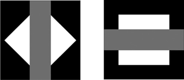
FIG 6.1 There is more to modes than evaluating how black, white and gray combine, but simplicity can be a valuable teacher. This should reveal how tone and even color channels will behave in a particular mode.
Figure 6.2 shows two layers that can be used to evaluate how modes behave when applied to color and tone. You can find these set up in the Sample6.psd file on the CD.
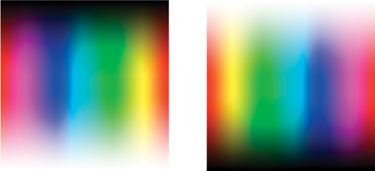
FIG 6.2 These color swatches pit one color rainbow against another to show color behavior. It is perhaps prettier as a result exploring the full harmonics, but harder to intuit.
To test the modes, all we will be doing is changing mode of the upper layer in the test file (and when applicable, opacity) to see the effect modes have on what we see on screen. Simply open one or both of the sample images, activate the Upper Layer/Calculation Layer, and choose a mode from the Mode drop list. This will apply the mode, and hopefully give you some visual sense of what happens when layers are applied with different modes, then we’ll look at some more concrete examples as to how this applies to images.
 All descriptions listed here assume the upper layer is opaque (layers set to 100% Opacity with pixel solidity), unless opacity is otherwise mentioned. The name of the mode is followed by the previews and description, which includes practical uses for the modes. This is not meant to define limitations; there may be many creative uses for any particular mode that go beyond the simple descriptions.
Normal
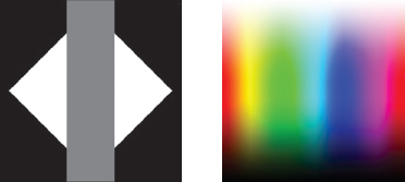
FIG 6.3 Straightforward application of layer content where the upper layer covers everything below. Used most frequently of all modes.
Normal mode is a plain overlay of content in the upper layer. The result takes on the color/tone of the pixels in the upper layer. This is the default mode of layers, and is probably by far the most often used (Figure 6.3).
Dissolve
FIG 6.4 Shown here at 50% Opacity. Creates a dithering effect. Used infrequently in corrections/enhancements.
The result is the color/tone of the pixels in either the upper layer or the lower layer, determined on a pixel by pixel basis according to the opacity of the layer. The upper layer is dithered according to the Opacity percentage and solidity of the layer content: the Opacity percentage dictates the percentage of pixels in the layer that will display. The greater the opacity, the more pixels display. At 100% opacity, 100% of the pixels in the upper layer display; at 50% opacity, 50% of the pixels in the upper layer display. Pixels are hidden in a randomized or dithered effect. May be best for specialized uses for web graphics and other dithered effects (Figure 6.4).
Darken
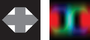
FIG 6.5 Nothing becomes darker than either of the 2 pixels occupying a space. Used occasionally in corrections/enhancements.
Chooses the darkest color value in each channel comparing the upper layer and the layer(s) (Figure 6.5). No portion of the image gets lighter. For example, in an RGB image, if the upper layer pixel is RGB 255, 170, 33, and the lower layer pixel is RGB 45, 165, 44, the result in Darken mode is the lower of any of these numbers for each channel, or RGB 45, 165, 33. The result will never get darker than existing values. Used as a means of darkening content where the application cannot exceed lightening beyond the colors being applied.
Multiply
FIG 6.6 Each pixel darkens, equal to or darker than pixels occupying the space. Used frequently in corrections/enhancements.
Darkens the result by darkening the lower layer based on the darkness of the upper layer. Any tone darker than white in the Multiply layer darkens the appearance of content (Figure 6.6). Successive applications of layers in Multiply mode will produce a continually darker result, and will get darker than existing values.
No portion of the image can get lighter. Often used with effects like drop shadows and beveling. Useful in layer-based color separation for RGB and CMYK (Chapter 8).
Color Burn
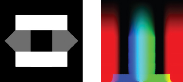
FIG 6.7 Each pixel darkens, equal to or darker than pixels occupying the space based on the difference between pixel colors. Used infrequently in corrections/enhancements.
Burns in (darkens) the color of the lower layer with the upper layer, darkening the result. Tends to burn in or enrich color density. No portion of the image gets lighter. The greater the difference between the applied pixel colors and the content (Figure 6.7), the greater the percentage of change. Used for special effects and some color enhancement.
Linear Burn
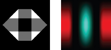
FIG 6.8 Each pixel darkens, equal to or darker than pixels occupying the space. A linear application of darkening. Used infrequently in corrections/enhancements
Similar to Multiply but more extreme and linear in application. No portion of the image can get lighter (Figure 6.8). Used in calculations, like layer-based channel mixing (see Chapter 8).
Darker Color
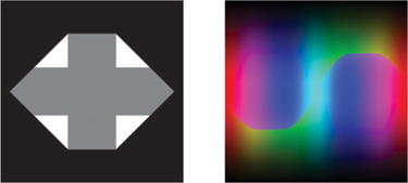
FIG 6.9 Chooses the darker of two colors for pixels occupying a space. Used infrequently in corrections/enhancements.
New in CS3. Chooses the darker of two colors in comparing pixels in the upper layer to pixels (Figure 6.9). No color in the image can get lighter.
Lighten
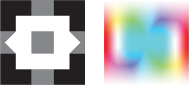
FIG 6.10 Nothing can become lighter than either of the RGB values of the two pixels occupying a space in the layer stack. Used occasionally in corrections/enhancements.
Chooses the lightest color value in each channel comparing the upper layer and the layer(s) (Figure 6.10). No portion of the image gets darker. For example, in an RGB image, if the upper layer pixel is RGB 255, 170, 33, and the lower layer pixel is RGB 45, 165, 44, the result is the greater of any of these numbers or RGB 255, 170, 44. Used as a means of lightening underlying content, where the application cannot exceed lightening beyond the colors being applied.
Screen
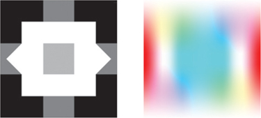
FIG 6.11 Each pixel lightens, equal to or lighter than pixels occupying the space in the layer stack. Used frequently in corrections/enhancements.
Brightens the result by lightening the lower layer based on the lightness of the upper layer. Any tone lighter than black in the upper layer lightens the appearance of the content (Figure 6.11). Successive applications of layers in Screen mode will produce a continually lighter result, and will get lighter than existing values. No portion of the image can get darker. Often used with effects like glows and beveling. Useful in layer-based color separation for RGB and CMYK (Chapter 8).
Color Dodge

FIG 6.12 Each pixel lightens, equal to or lighter than pixels occupying the space based on the difference between pixel colors. Used infrequently in corrections/enhancements.
Dodges (lightens) the color of the underlying layer with the upper layer, lightening the result. Tends to desaturate and wash out color. No portion of the image gets darker. The greater the difference between the applied pixel colors and the content (Figure 6.12), the greater the percentage of change. Used for special effects and some color enhancement.
Linear Dodge
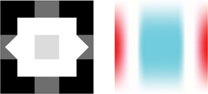
FIG 6.13 Each pixel lightens, equal to or lighter than pixels occupying the space. A linear application of brightening. Used infrequently in corrections/enhancements.
Similar to Screen but more extreme and linear in application. No portion of the image can get darker (Figure 6.13). Used in calculations, like layer-based channel mixing (see Chapter 8).
Lighter Color
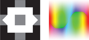
FIG 6.14 Chooses the lighter of two colors for pixels occupying a space in the layer stack. Used infrequently in corrections/enhancements.
New in CS3. Chooses the lighter of two colors in comparing pixels the upper layer to pixels (Figure 6.14). No color in the image can get darker.
Overlay
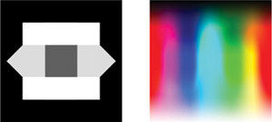
FIG 6.15 Used in many places in the book for layer-based correction/enhancement. Used frequently in corrections/enhancements.
Multiplies (darkens) the dark colors (1–49% brightness) and screens (lightens) the light colors (51–99% brightness) in the lower layer based on the content of the upper layer. This enhances contrast with like content (if you make a composite at the top of the layer stack and set to Overlay), and lowers contrast in inverted content (if you make a composite at the top of the layer stack, invert it and set to Overlay). If the applied tone is lighter than 50% gray, the result lightens; if darker than 50% gray, it darkens. Colors at the center of the light and dark range (quartertones at 75% and 25% gray) are effected more than the range extremes (0%, 100% or 50% gray). Useful for manual sharpening effects (looked at later in this chapter). Also useful for intensifying color and contrast (Figure 6.15).
Soft Light
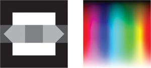
FIG 6.16 Used in some places in the book for layer-based correction/enhancement. Used occasionally in corrections/enhancements.
Multiplies (darkens) the dark colors (1–49% brightness) and screens (lightens) the light colors (51–100% brightness) in lower layers based on the content of the upper layer. Similar to Overlay but not as strong. If the applied color is light, the pixel lightens; if dark, it darkens. Useful in some special effects (soft focus) and intensifying color and contrast (Figure 6.16).
Hard Light
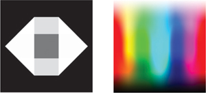
FIG 6.17 Used infrequently in corrections/enhancements.
Multiplies (darkens) the dark colors (0–49% brightness) and screens (lightens) the light colors (51–100% brightness) in the lower layers based on the content of the upper layer. Similar to Soft Light and Overlay but more linear. Useful in some special effects and intensifying color and contrast (Figure 6.17).
Vivid Light
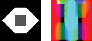
FIG 6.18 Used infrequently in corrections/enhancements.
Similar to Color Burn when the pixel in the upper layer is darker than 50% gray; similar to Color Dodge when the pixel in the upper layer is lighter than 50% gray (Figure 6.18).
Linear Light
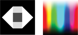
FIG 6.19 Used infrequently in corrections/enhancements.
Similar to Linear Burn when the color in the upper layer is darker than 50% gray; similar to Linear Dodge when color in the upper layer is lighter than 50% gray (Figure 6.19).
Pin Light
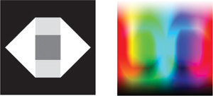
FIG 6.20 Used rarely in corrections/enhancements.
Similar to Multiply when the upper layer is darker than 50% gray; similar to Screen when the upper layer is lighter than 50% gray (Figure 6.20).
Hard Mix
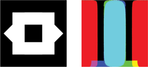
FIG 6.21 Used rarely in corrections/enhancements.
Adds a limited color palette effect to the Vivid Light effect. It will posterize the result to appear as one of eight primary colors: white, red, green, blue, cyan magenta, yellow or black (Figure 6.21).
Difference
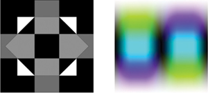
FIG 6.22 Used occasionally for comparing layer content.
Shows the result of calculating the difference between pixel values. A large difference yields a bright result; a small difference yields a dark result (no difference yields black). Useful in image evaluations to show/measure differences between corrections, and some special effects (Figure 6.22).
Exclusion
FIG 6.23 Used rarely in corrections/enhancements.
Uses the darkness of the upper layer to mask the Difference effect (see Difference). If the upper layer pixel is dark, there is little change as the result; if the upper layer pixel is black, there is no change. The lighter the pixel in the upper layer, the more intense the potential Difference effect. Mostly used for special effects (Figure 6.23).
Hue

FIG 6.24 Used occasionally in corrections/enhancements to adjust hue.
Changes the Hue of the pixels in the lower layers based on the upper layer while leaving the Saturation and Luminosity unchanged. Used for color adjustment (Figure 6.24).
Saturation
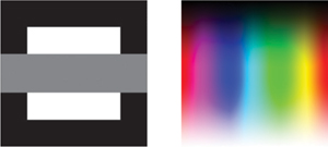
FIG 6.25 Used occasionally in corrections/enhancements to enhance saturation or desaturate.
Changes the Saturation of the pixels in the lower layers based on the upper layer while leaving the Hue and Luminosity unchanged. Used for color adjustment (Figure 6.25).
Color
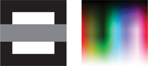
FIG 6.26 Used frequently in corrections/enhancements to adjust or apply and even remove color.
Changes the Hue and Saturation of the pixels in the lower layers based on the upper layer while leaving the Luminosity unchanged. Used for color adjustment and layer-based Luminosity and Color separations (later in this chapter) (Figure 6.26).
Luminosity
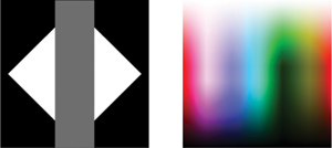
FIG 6.27 Used frequently in corrections/enhancements to adjust tone independently of color.
Changes the Luminosity of the pixels in the lower layers based on the upper layer while leaving the Saturation and Hue unchanged. Used for tone adjustment and layer-based Luminosity and Color separations (later in this chapter) (Figure 6.27).
You can use these pages as a reference. The captions suggest the modes you are likely to use most frequently and with the most success. However, just to highlight them here, these modes are:
• Normal
• Multiply
• Screen
• Overlay
• Soft light
• Color
• Luminosity
• Difference
• Darken
• Lighten.
The reason for dependence on this subset is that the other modes are most often just variations of these, and the result you get might be better controlled with Opacity or duplicating layers with these modes, rather than reaching for a less predictable or more complex mode.
Let’s take a look at some practical applications of layer modes to see how you might employ them to accomplish some useful results, starting with separating color and tone.
Separating Color and Tone
In our discussion of isolating objects, image areas and using masking, we concentrated on simple isolation based on shape. A whole different realm of isolation can be explored in isolating by color or tone. Layer modes can help make this possible.
One of the easiest results you can easily digest in working with layer modes is applying Color and Luminosity. With these two modes you can isolate the content of a layer so it affects only tone, or only color. You can also use this same functionality to isolate content based on those modes. Separation is accomplished quickly with simple layer-based calculations and application of layer modes.
Try It Now
1. Open any image. Or you can use the Sample7.psd image provided on the CD (see Figure 6.28).
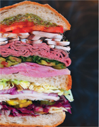
FIG 6.28 A version of the cover shot for this book will provide plenty of color and tone for exploring the Luminosity and Color separations.
2. Flatten the image if it is not flattened already (choose Flatten Image from the Layers menu). Flattened images will have a Background layer only.
3. Duplicate the Background layer and name the duplicate 1 Source.
4. Create a new layer above the 1 Source layer, and name it 2 Grayscale.
5. Fill the Grayscale layer with 50% gray (choose Edit>Fill then set the Content Use selector to 50% gray).
6. Change the 2 Grayscale layer to Color mode. Your layer palette should look like Figure 6.29, and the image will become a grayscale representation of the image as the gray ‘color’ is being applied to lower layers.
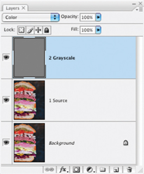
FIG 6.29 Applying gray as a color desaturates the image. The result is a display of the luminosity of the image – a representation of the image based on tone. You could possibly use this separated component to adjust the image.
7. Create a new layer at the top of the layer stack and call it 3 Luminosity.
8. Press Command+Options+Shift+E / Ctrl+Alt+Shift+E to stamp the visible image to the new layer. This commits the grayscale change to the new layer.
9. Set the layer mode to Luminosity. This completes separation of the Luminosity component. Shut off the layer view for the 3 Luminosity (see Figure 6.30 for the layer set up).
You now have the luminosity separated from the color and you can isolate tone changes by toggling on the visibility of the 3 Luminosity layer and applying changes to it. To isolate the color, continue with the steps where you left off.
10. Activate the 2 Grayscale layer by clicking it in the layers palette. Change the Mode to Normal (the image will appear to be flat gray again), then press Command+[ / Ctrl+[ to move the 2 Grayscale layer below the 1 Source layer. The image will become color again (Figure 6.31).
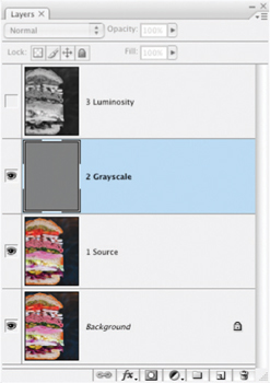
FIG 6.30 Your numbered layers mark progress through the separation. You’ll use the Source and Grayscale layers again to achieve another result.
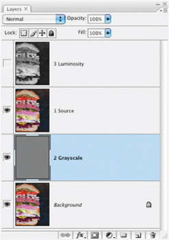
FIG 6.31 Invert the order of the source and grayscale layers to prepare for the next steps
11. Change the 1 Source layer mode to Color. What you will see is the color separated from tone (Figure 6.32).
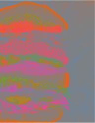
FIG 6.32 Color isolated from tone appears over a neutral tone background.
12. Create a new layer above the 1 Source layer and name it 4 Color.
13. Press Command+Options+Shift+E / Ctrl+Alt+Shift+E to stamp the visible image to the new layer.
14. Change the mode of the 4 Color layer to Color.
15. Shut off the view for the Background, 1 Source and 2 Grayscale layers, and turn on the 3 Luminosity layer. Only the 4 Color and 3 Luminosity layers will be visible (see Figure 6.33).
All that has happened here is that you are using layer Modes to allow you a different view of your image. When you isolate the view for luminosity using layer mode, you capture a snapshot of that in a composite layer – and then do the same for color. Viewing the newly isolated components alone shows that they simply represent the image in a different form. The new Color and Luminosity layers contain extracted tone and color content from the original image. Because the modes target color and tone separately, you now have control over color and tone components separately. This can be a great advantage in situations where the color is right but the tone is wrong, or vice versa. Apply color correction to the Color layer (e.g., you might apply a Hue Saturation adjustment that would be isolated to the color), and tone corrections to the Luminosity layer (you might apply a Levels correction to extend the dynamic range of the tone independent from the color).
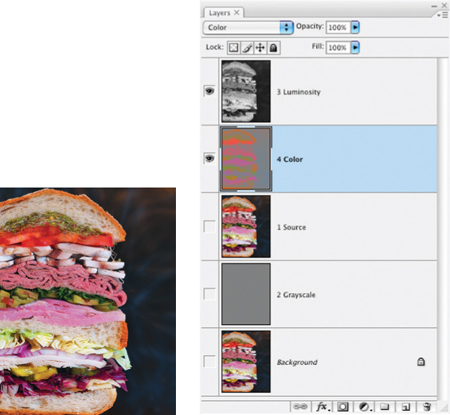
FIG 6.33 The Color and Luminosity components in the image can combine to display the original color image. Switch the visibility toggle off for either to view the companion component alone.
This calculation for separation of color and tone will work with any RGB image. Open any image and try out the steps, then apply isolated color and tone changes to see how it works.
Here we’ve used layer modes to extract separate components for color and tone. But this is just the beginning of color-based separation and isolation of image components. We’ll look at more color separation in Chapter 8, and there we will apply more modes. Now let’s look at layer modes used specifically for correction.
Sharpening Calculation
Calculations have many creative and interesting uses, most of which are not immediately obvious. One of the first really useful layer calculations I devised was creating a manual unsharp masking effect. Unsharp masking was a darkroom process before it was ever a Photoshop or Elements filter. The photographer developing in the darkroom would sandwich a blurred film negative copy of the image with the original to enhance contrast in exposure of image edges. The blur would target image edges, and the result after the application would be a sharper look to the image. It was the mask used to create the effect that was ‘unsharp’.
The layer-based application of unsharp mask that follows is a little different but it is a viable digital alternative that builds on the same concept. We’ll borrow a little of what we learned in the last exercise to isolate our corrections to the image tone.
Try It Now
1. Open a flattened image to which you’d like to apply an unsharp mask calculation, or open the image and flatten it. An interesting image to use with this technique is Sample8.psd (shown in Figure 6.34).
2. Duplicate the Background layer and name the new layer 1 Unsharp Mask.
3. Duplicate the 1 Unsharp Mask layer and name the new layer 2 Color. Change the layer mode of the 2 Color layer to Color. At this point the Background, 1 Unsharp Mask and 2 Color layers all have the same content.
The role that the 2 duplicated layers play in the image dramatically changes with their change in Mode. Changing the mode of the Color layer makes the Color layer a color lock: the positioning at the top of the layer stack with the original color information allows tone to change below without changing the original color. Though an actual separation of the color has not been completed, the change to mode effectively separates the content and effect.
4. Activate the 1 Unsharp Mask layer by clicking on its thumbnail in the layers palette. Change the Mode to Overlay, the Opacity to 50% and then Invert (press Command+I / Ctrl+I). This layer acts as the blurred negative.
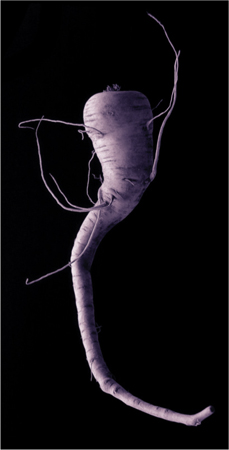
FIG 6.34 This unusual vegetable has shading that renders a strong difference when using this technique.
5. Blur the 1 Unsharp Mask layer using Gaussian Blur. The size of the blur will depend on the resolution of the image and the amount of detail. The more detailed the image, the less blur; the higher the resolution, the greater the blur. Start with 15 pixels for a 3 × 5 image at 300 ppi; use more pixels in the radius for larger images. You can view the changes as you move the slider.
The result of these steps (see Figure 6.35) is a sophisticated mask based on the content of your image. It is not a mask in the traditional sense that you have not made a visible selection with selection tools, however the technique of blurring and setting the mode (Overlay) effectively makes the content self-masking to target the effect. This is a more complicated result than what you achieved with the 2 Color layer, but that can be considered a mask as well: masking image color.
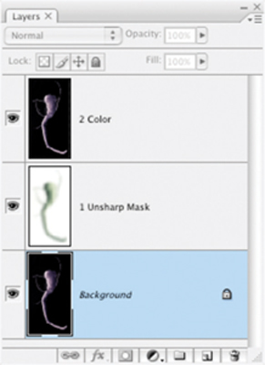
FIG 6.35 Note the changes to the brightness at the right/shadow side of the parsnip and the brightness of the tendrils. This change is because of the local contrast enhancement brought about by the application of the blurred layer in Overlay mode.
The Unsharp Mask layer you have created ends up working much like the sandwiched negative in the darkroom process, in pretty much the opposite way that the Unsharp Mask filter does: reducing image contrast in the quartertones to pull details from shadows and highlights. Unsharp Mask pushes dark areas darker and light areas lighter, sometimes leading to a loss of detail (blowing out or blocking up image areas). Because the effect of this manual unsharpening procedure is nearly the opposite of the Unsharp Mask filter, the manual unsharp effect and the Unsharp Mask filter effect can be used together. Because you can use them in tandem, you can greatly intensify image contrast changes and apply more sharpening than can be achieved with the Unsharp Mask filter alone.
One added benefit to the manual version of sharpening is that because of the nature of Overlay mode the result will not tend to blow out (move bright areas of the image to RGB: 0, 0, 0) or block up (move shadow areas of the image to RGB: 255, 255, 255) as the Unsharp Mask filter can easily do. Tones and colors at the extremes (absolute white, absolute black) and middle (50% gray) are less likely to change than the quartertones (75% and 25% gray). This can keep you from harming detail in your image, and will likely not cause the type of halo you can get with the Photoshop filter.
Summary
We have looked at the basics of layer mode as an overview and then jumped into two evolved techniques out of hundreds of variations that can be produced with layer modes. Certainly layer modes are not hard to apply, but hopefully this chapter and these exercises have shown that applying layer modes use is not necessarily best to do based on trial and error. It may take some time to develop confidence in using layer modes, but hopefully the few examples here may start you contemplating mode application rather than simply attempting to arrive at pleasant results by chance. Mode is a means of isolating effects, different than, but similar to the purpose of selection.
Sticking with the preferred list of modes outlined (and exploring the examples in the rest of the book) will help you maintain focus on the modes that will be most effective in your image corrections. Practice the exercises for separating color from tone and applying manual sharpening using your own images to see how the techniques behave. The Modes you are likely to have the most success working into your workflow at first are the simple ones: Normal (default), Multiply (darken), Screen (lighten), Color (lock color or change it) and Luminosity (lock tone or change it). These will become your workhorse tools. Overlay, Lighten and Darken will come into play as you have more experience, and Difference for comparison sake (as we use in the next chapter). Concentrate on what these do, and you add the bulk of what modes will enable for you day in, day out.
Just to reinforce the notion of focus for a moment, note that there are section dividers on the listing of modes (see Figure 6.36). These section dividers are really akin to submenus. The first section applies straight color/tone from the layer, the second section deals with darkening, the third section has modes that lighten, the fourth mixed conditional calculations, the fifth calculations based on difference between applied and base pixels and the sixth calculations based on color or tone. Understanding the behavior of one of the modes in each of the sections will really yield clues as to what the rest of the modes in that section do – even if they do it very differently. The more complex the mode the less likely you will use it often.
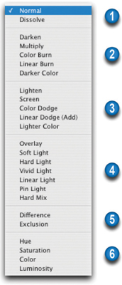
FIG 6.36 Six sections of the Mode menu reflect distinct submenus.
The visual result of applying a layer mode does not actually reside in any one layer – especially if multiple layers are combining to produce a result. You see the result of the calculation on screen. Keep in mind that to bind effects (and to apply additional modes), you may need to use the composite layer technique (create a new layer and merge visible to it with Command+Shift+Option+E / Ctrl+Shift+Alt+E).
While layer Modes are certainly a more advanced way to look at image content, the parade of extraordinary layer powers continues in the next chapter with exploration of advanced blending modes.
If you have any questions about layer modes and their use, be sure to visit the website for this book http://www.photoshopcs.com.