Table of Contents for
The Adobe Photoshop Layers Book: Harnessing Photoshop's Most Powerful Tool, covers Photoshop CS3
 The Adobe Photoshop Layers Book: Harnessing Photoshop's Most Powerful Tool, covers Photoshop CS3
Published by
Focal Press, 2007
The Adobe Photoshop Layers Book: Harnessing Photoshop's Most Powerful Tool, covers Photoshop CS3
Published by
Focal Press, 2007
- Cover
- Halftitle
- Title
- Copyright
- Dedication
- Contents
- Acknowledgements
- Introduction
- Chapter 1: The Basics of Layers: Layer Functions and Creation
- Chapter 2: Layer Management: Concepts of a Layer-Based Workflow
- Chapter 3: Object and Image Area Isolation in Layers
- Chapter 4: Masking: Enhanced Area Isolation
- Chapter 5: Applying Layer Effects
- Chapter 6: Exploring Layer Modes
- Chapter 7: Advanced Blending with Blend If
- Chapter 8: Breaking Out Components
- Chapter 9: Taking an Image through the Process
- Chapter 10: Making a Layered Collage or Composite Image
- Index
Somewhere just beyond isolating objects into their own layers and more advanced blending lies the genus of layer-based effects. Effects encompass a broad range of enhancements and adjustments from solid color fills and stroked outlines, to drop shadows and bevels, to combinations of these that create more complex layer styles. Application can be wild effects (often used with type, see Figure 5.1) to more moderate doses that add separation between image objects and subtle image enhancement.

FIG 5.1 A fairly simple application of standard styles can radically change the appearance of type.
It is useful to know what Styles and Effects are, where to find them, how to apply them and how they act. Further utility comes from methods for using and controlling these effects using multiple layers, Fill and Opacity controls, Global Settings and considering application of manual effects – which leads nicely into other topics of correction.
Styles are akin to filters in that you can waste hours and hours applying and adjusting them, then undoing and applying again. It can become addictive when doing creative projects. However, there is a practical side to styles, and we’ll look at an overview of effects in this chapter from a standpoint of practical application in image enhancement and touch on the implication for broader creative effects.
The Basics of Effects and Styles
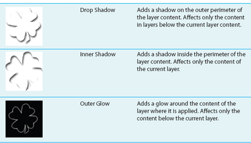
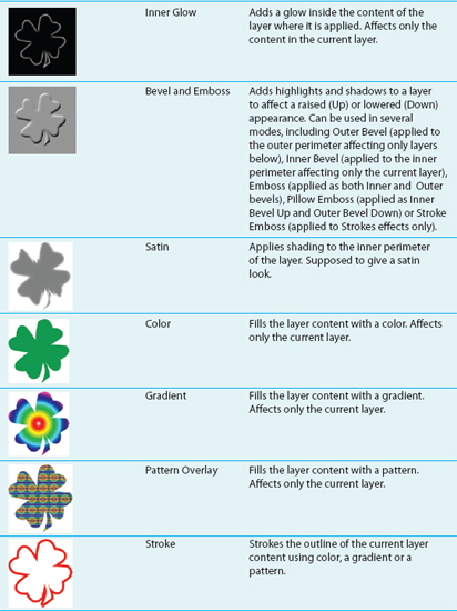
The difference between Styles and Effects is that Effects are the separate functions that can be applied to a layer, and a Style is a preset for any Effect or combination of Effects. There are 10 total effects (Table 5.1).
TABLE 5.1 The basics of Effects and Styles.
Photoshop has a set number of Effects (see the list of Effects), and comes with a few canned/prefabricated Styles that you can apply just by choosing an effect from a menu. Styles can be created and saved, or you can download them from the Internet or buy collections and load them to apply at will. These canned styles work well usually for more creative applications, and far less frequently for enhancements. The list of Styles currently loaded can be found on the Styles palette.
 Try It Now
1. Open the Sample3.psd image on the CD.
2. Click on the Wild Type Effectz layer in the layers palette if it is not already active.
3. Choose Styles from the Windows menu to open the Styles palette (see Figure 5.2).
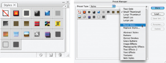
FIG 5.2 The Styles palette shown here has the default Styles. To return to the defaults, choose Preset Manager from the Styles Palette menu, and Reset Styles from the Preset Manager menu
4. Locate the Style named Chrome Satin, and apply it by clicking the thumbnail.
To find Style names, roll your cursor over the styles one-ata-time. You can also view the names of the styles in the palette by choosing Text, Small List or Large List from the Styles palette menu. Text is text only; Small List and Large List are text and thumbnail preview combinations.
Really that is all there is to applying a style: locate and click. However, there is a little more to working with the styles as we’ll see. In the following steps we’ll add another Effect to the existing Style.
5. Choose Inner Glow from the Add a Layer Style menu located either at the bottom of the Layers palette, or off the Layers menu (Layer>Layer Styles>Inner Glow). This will open the Layer Style dialog (see Figure 5.3).
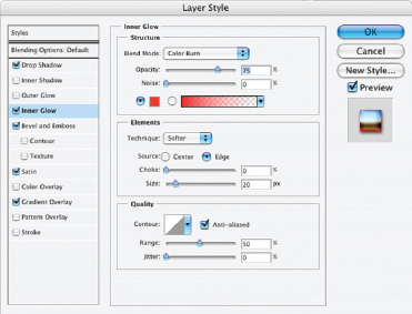
FIG 5.3 The Inner Glow Style to the left of the Layer Style dialog will be checked and highlighted. The Inner Glow options will be displayed at the center of the screen.
6. Change the Blend Mode to Color Burn, and change the color to Red (RGB: 255, 0, 0). This will intensify and burn in the red at the edge of the letters. To change the color to Red, click the Set Color of Glow swatch in the Structure panel and choose the color in the Color Picker that appears.
You can experiment with other settings, but at this point you have replicated the results from Figure 5.1. To see how each of the Effects is contributing to the result of the Style you have applied, uncheck the box next to the Effect at left to toggle the view. To adjust the settings for any of the Effects, just click the name of the Effect to reveal the options, and change them as desired. For example, if you change the Gradient Overlay from −90° to 180°, you will get a much different effect (see Figure 5.4).
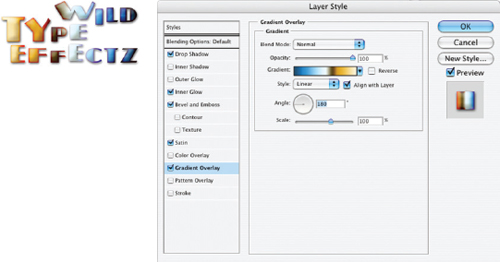
FIG 5.4 Changing the options for any of the Effects will change the result for the Style accordingly.
Separate effects within the style can be managed with a click from the Layers palette, just like they were separate layers. In the layers palette, each effect within the style applied to your layer has a visibility toggle (see Figure 5.5) that you can use to shut off the view for individual effects, or the whole grouping of effects (for the latter use the Effects visibility toggle for the layer). Shut off the Bevel and note the difference in the effect on the image. You can toggle the effect to see, but in the end, leave the visibility for that particular effect off.
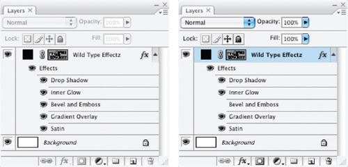
FIG 5.5 Just click the visibility toggles on individual effects to manage them from the layers palette.
This hardly scratches the surface of what styles can do, and hopefully from the fact that you made a small change in one parameter and completely remade the style suggests something about the potential for variety. Be careful with the amount of time you devote to playing around with these and experimenting and set a limit before hand, or you can lose hours of what would otherwise be productive work time correcting images.
Don’t close this file; you’ll need it in a moment.
I personally find styles most useful for storing favored settings. For example, I occasionally use a bevel effect that is sets both the Highlight and Shadow to black and multiply in combination with the Inner Shadow effect. I like the opportunity the combination gives me to tune the beveling effect. Storing that as a style allows me to apply it with a click. Likewise, you may find half a dozen or so practical settings for reuse, but Styles are more often a creative tool than a correction tool.
Saving Styles
If you hit on a Style that you want to save and perhaps use in the future, you can save the style. Not only that you can save style libraries that you create for specific purposes, or to help you manage styles that you find handy. Say, for example, you like the effect created for the type in Figure 5.4 in the previous section. You can save the effects as a style and store it for future use.
Try It Now
1. Double-click the Effect item in the layers palette under the layer for the image you were just working on (see Figure 5.6). This will open the Layer Style palette.
2. Click the New Style button at the right of the Layer Style palette. This will open the New Style dialog.
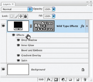
FIG 5.6 Double-click right on the item named Effect directly below the layer where the Style that you want to save is applied.
3. Name the new style by something that you will recognize, and click OK (see Figure 5.7). Options at the bottom of the New Style dialog allow you to save blending options (Opacity, Blend If, Channel targeting) as well as the effects. We’ll look more at blending options in Chapter 7.
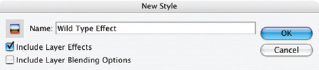
FIG 5.7 Naming the Style may be the most difficult part of this exercise. Try to make the name clarify what the effect does, and feel free to name parameters/effects used.
Now that you have stored the style, you can access it from the Styles menu any time you need to.
Try It Now
1. With the previous image still open, click directly on the Effects item and drag it to the trash at the bottom of the Layers palette. This will remove the effect from the image.
2. Open the Styles palette and click on the Effect you saved in the last segment of the exercise (you should be able to locate it by name). This click will apply the style to your image.
Take a look at the Layers palette. You will notice that if you completed the preceding exercise steps, that the view for the Bevel is included in the saved Style, but that its visibility is off. In other words, the style is stored exactly as it was when you saved it.
Managing Styles
You can download styles from the Internet and load them into Photoshop to have ready-made styles at your disposal. It is easy to build a library of thousands of freebees by downloading them from the Internet and loading them into Photoshop. But keep in mind that all styles are not created equal. Some designers with experience really know what they are doing and how to have a style render with quality, and do very useful things. Don’t just download everything in sight, or you will have a huge library that you can’t filter through for practical application.
I’ve included a styles set on the CD put together by my good friend and Photoshop Styles/Effects master, Al Ward (see his website: http://www.actionfx.com). You can use this set to practice loading styles, and to see the kind of effect that good styles can produce.
Try It Now
1. Open Photoshop and insert the CD from The Adobe Photoshop Layers book into your CD-ROM.
2. Open the Preset Manager for Styles. You can do this by choosing Preset Manager from the Edit menu and choosing Styles from the Preset Type list, or by choosing Preset Manager on the Styles palette menu. If you use the Style palette menu, the Styles will be pre-selected.
3. Click the Load button on the Preset Manager screen. This will open a Load dialog (much like a standard Open dialog).
4. Locate the CD in the Load dialog, and then click the ActionFx.com-Styles-00001.asl file in the Styles folder, and then click the Load button on the Load dialog. The styles will populate in the Preset Manager screen.
5. Close the Preset Manager by clicking Done. The styles will be loaded on the Styles palette. You can use them with a click.
Beside the Load option described, you also have the option to load by replacing the current Styles, which will remove the current styles before loading the library that you pick. To return to the default library of preset styles, choose Reset Styles.
Periodically you may want to save your Styles set as a library so you can use it with some flexibility. Depending on how you like to work, you may save several libraries to group your styles, or a single library with your most used effects. Saving will allow you to return to set should you inadvertently delete them or replace them. To save a Style library, just choose Save Styles from the Styles palette menu. When the Save dialog appears (see Figure 5.8), name the file (leave the .asl extension on the file name), and you can save it anywhere you’d like.
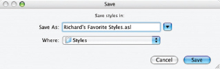
FIG 5.8 It may be best to save to a folder that gets backed up periodically, or to the Photoshop Styles folder inside the Presets folder in the program directory/folder.
Manual Effects
Although layer styles are handy for quick application of effects, there are built-in limitations to them. You are not limited to creating effects by using the layer styles. You can create effects manually so long as you understand how to create them. In fact, making your effects manually can offer a measure of flexibility that you simply can’t get from applying the canned effects, with more potential for variations.
Try It Now
1. Open the sample3.psd again from the CD. We’ll want to start from scratch here with the original image.
2. Click on the Background layer to activate it in the Layers palette if it isn’t active already.
3. Create a new layer and name it Drop Shadow.
4. Hold down the Command/Ctrl key and click on the vector mask thumbnail for the Wild Type Effectz layer. This will load the vector mask as a selection (see Figure 5.9).
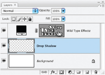
FIG 5.9 Holding down the Command/Ctrl key and clicking the vector mask will load the mask as a selection.
5. Fill the selection with Red (RGB: 255, 0, 0). You can do this by setting the foreground color and then using the Paint Bucket tool or with the Fill function (Edit>Fill) with the color set to Foreground. The selection will fill in the active Drop Shadow layer.
6. Deselect (press Command+D / Ctrl+D).
7. Apply a Gaussian Blur of 5 pixels. This will soften the edge of the color added in step 5.
8. Change the Opacity of the Drop Shadow layer to 75%. This will lighten the drop shadow.
9. Offset the content of the Drop Shadow layer down and to the right. To do this choose the Move tool (press V) hold down the Shift key and press the down arrow on the keyboard and then the right arrow. You can use the Offset function if you want (Filter>Other>Offset). The result should look something like Figure 5.10. This offset will simulate the angle between the object (in this case type) and the light source.
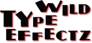
FIG 5.10 The reddish drop shadow is one of the simplest effects to create manually.
Holding the Shift key when using the arrows on your keyboard will move the content on the active layer ten pixels at a time rather than one.
All other effects can be created in a similar fashion using layers. For example, you can do inner shadows and glows by clicking the Wild Type Effectz layer in step 2, making a clipping group with the new layer created in step 3 and inverting the selection in step 4.
The real advantage to making effects manually is that the effects are actual pixels rather than virtual ones so you can treat the effects more like an editable part of the image. If you want you can apply layer styles to the layers where you have created the effects. You also have freedom of movement and adjustment without having to visit the Layer Styles dialog. We’ll look at making custom adjustment near the end of the chapter.
You can see from the nine steps above used to create a drop shadow that it probably is not worth the trouble if you can get a similar effect with a one-click layer style. However, there are ways to simplify creating manual effects, and we’ll look at those next.
Automated Manual Effects Tools
On the CD you will find a file named Layer Actions.atn, which is a set of actions that will create several layer-based effects with a click. The actions are time-savers because they will run through a series of steps that have been pre-recorded. For example, the steps above for creating the drop shadow have been recorded for the Drop Shadow/Glow action, and you can replay it with a single-click and some minimal user input. First you’ll need to load the actions.
Loading Actions
We will load actions several times throughout the book to simplify lengthy procedures and provide tools for completing repetitive tasks, like making manual drop shadows. Come back to these steps if you need a refresher on loading actions later.
a. Open the Actions palette by choosing Actions from the Window menu, or press Option+F9/Alt+F9.
b. Choose Load Actions from the Actions palette menu.
c. When the Load dialog appears, locate the CD for the book, and the Actions folder. Choose Layer_Effects.atn and then click the Load button. The actions will populate in the Actions palette. The actions should appear like Figure 5.11.
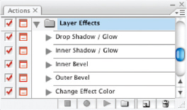
FIG 5.11 You may have other actions in your actions palette, but Layer Effects will load as an action set, containing Drop Shadow/Glow, Inner Shadow/Glow, Inner Bevel, Outer Bevel and Change Effect Color.
Try It Now
1. Start with Sample3.psd. Either open it fresh from the CD, or revert the file to the original image state by clicking the thumbnail in the image history.
2. Load the Layer_Effects.atn action into the Photoshop Actions palette. You will only have to load the actions once.
3. Set the foreground color to Red (RGB: 255, 0, 0). This color will be used by the action to define the color of the effect.
4. Activate the Wild Type Effectz layer by clicking it in the layers palette.
5. Run the Drop Shadow / Glow action. To do this, click the Drop Shadow / Glow action in the Layer Effects set on the Actions palette, then click the Play button at the bottom of the Actions palette (see Figure 5.12).
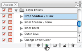
FIG 5.12 Click the Play button at the bottom of the Actions palette to play the active selection.
6. Follow the instructions as they appear on screen. Use the default Offset (+10, +10) and change the Gaussian Blur radius to 5 pixels to match the results of the previous exercise. This will create a drop shadow that falls to the lower right.
Now that the actions are loaded, the process is several steps easier. In the case of applying a bevel, it is many steps easier. But the true glory of knowing how to apply layer effects manually is not just in being able to apply a simple drop shadow or bevel to some isolated type. Benefits come in as flexibility in placement and control as well as in options you gain for applying layer styles in combination with manual effects, or even applying the styles to the effects themselves. Part of what distinguishes manual effects from layer styles, as you will have a difficult time applying compound effects if you use only Layer Styles. We’ll look at a more complicated example in the next section that combines Layer Styles, manual effects and even masking.
Close this image without saving before proceeding.
Combining Manual Effects and Styles
In keeping with the layer mentality, it is sometimes best to apply effects to separate layers rather than all at once as a single style on a single layer. However, there are times when layer Styles do everything you need them to, and times when you will want to use both manual and canned effects to orchestrate your results.
Say, for example, you want to create an effect on your type where it looks like the type is transparent. That is, the effects that appear in the background will be seen through the type. You could try reducing the opacity of the layer, but what you’ll find is that it reduces the opacity of the effect as well. Combining style and effect application in various ways will help get the desired results.
In this example we will build an effect using a combination of layer styles and draw on everything we have touched on in this chapter.
Try It Now
1. Open the Sample3.psd image from the CD.
2. Click the Wild Type Effectz layer in the layers palette to activate it.
3. Apply the type effect saved earlier in this chapter by clicking it in the Styles palette. The text shows it saved as Wild Type Effect in Figure 5.7, but you may have used another name. The result for the image and Layers palette should look like Figure 5.13.
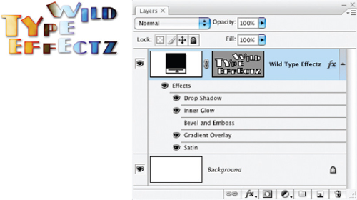
FIG 5.13 After applying the saved style, the image should display the properties inherited from the stored Style.
4. Drag Bevel and Emboss, Gradient Overlay and Drop Shadow to the trash on the layers palette. This should leave you only with Inner Glow and Satin effects, as in Figure 5.14. This removes those effects from the style as it is applied in the image.
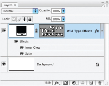
FIG 5.14 After removing the effects, the image will visibly revert to what it looked like when it was opened, but two effects are still being applied – you just can’t see them because of the black color of the layer.
5. Choose Color Overlay from the Add a Layer Style menu at the bottom of the Layers palette. This will open the Layer Styles with Color Overlay selected.
6. Double-click the Set Color of Overlay swatch to the right of the Blend Mode drop list, and set the color in the Color Overlay to RGB: 110, 170, 240 in the Color Picker when it appears (Figure 5.15).
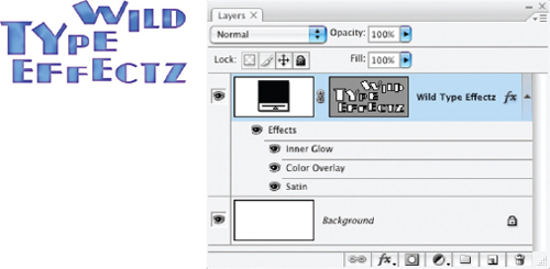
FIG 5.15 The color suggested was sampled from the ‘I’ in Wild in the image after step 3. You should now see the results of all three effects: Inner Glow, Color Overlay and Satin.
The remaining effects make specific results in the image. The Satin will leave a slight sheen on the letters. The Color Overlay provides the base color. The Inner Glow provides the reddened edges.
7. Change the Foreground color to Black (RGB: 0, 0, 0). This will be used in applying a manual drop shadow.
8. Apply a manual drop shadow using the Drop Shadow / Glow action provided with the Layer Effects action set loaded earlier in this chapter. Use an Offset of +20, +20 and a Gaussian Blur of 10 (the default blur) (Figure 5.16).
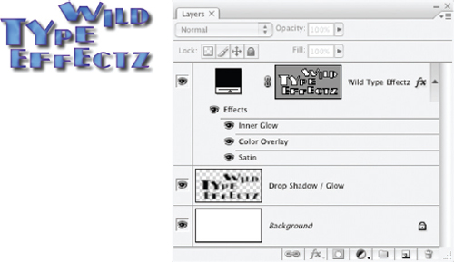
FIG 5.16 The result at this point shows a plain drop shadow in blue, as if the type object were very much opaque.
9. Copy the Layer Style applied to the Wild Type Effectz layer. To do this on PC/Windows, right-click on the Effects item under the Wild Type Effects layer and choose Copy Layer Style from the menu that appears. On Macintosh, hold down the Control key on the keyboard and click the Effects item, then choose Copy Layer Style from the menu that appears.
10. Paste the Layer Style copied in the previous step to the Drop Shadow/Glow layer. To do this, activate the Drop Shadow/Glow layer, and follow the instructions in step 9, but choose Paste Layer Style. Alternatively you can choose Paste Layer Style from the Layer menu (Layer>Layer Style>Paste Layer Style). Pasting the style applies it to the layer.
11. Shut off the visibility toggle for the Satin effect for the Drop Shadow / Glow layer, and lower the Opacity to 70%. This will remove the Satin’s sheen from the drop shadow and fade the drop shadow a bit. At this point the results should look like Figure 5.17.
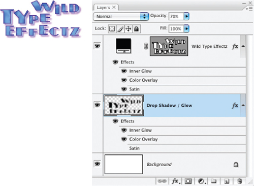
FIG 5.17 Copying the layer Style from one layer to another makes sure the settings are similar between the drop shadow and the original object. Only appropriate effects should apply, so the Satin is turned off as the drop shadow will not reflect the sheen. However, the type still is not acting translucent.
12. Duplicate the Drop Shadow/Glow layer, rename the layer Translucence and move it to the top of the layer stack. This layer will be used to make the letters seem translucent.
13. Load the Wild Type Effectz vector mask as a selection. To do this hold down the Command/Ctrl key and click on the vector mask thumbnail in the layers palette. This will be used to mask the translucent effect to the letters only.
14. With the Translucence layer still active, click the Add Layer Mask button at the bottom of the layers palette. This will use the selection you just loaded to define the mask and target the Translucence layer to the type only.
15. Lower the opacity of the Translucence layer to account for the opacity of the type object. The more you lower the opacity, the more opaque the type will appear (Figure 5.18).
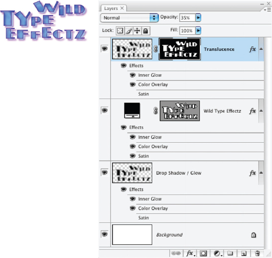
FIG 5.18 Setting the Translucence layer to 35% Opacity makes the letters about 50% transparent (half the original 70% opacity of the drop shadow).
Vector Masks
Vector masks are similar to layer masks but are controlled with vector content. Vectors are used in the Sample images in this chapter to define the content of the type layers. This is done for several reasons: the most prominent of which is that not everyone will have the type face that I used (Plug-NickelBlack). If you don’t have the type face and I left the type layer as it was, Photoshop would choose a substitute. I converted the type to vectors using Convert to Shape (Layer>Type>Convert to Shape). This command will make perfectly defined type shapes. Though the result can no longer be edited as type, it does have the advantage that it can be infinitely scaled.
Part of what makes vector components in your images distinct is that vectors are not resolution dependent. Vectors act more to corral pixels than define them absolutely. You will more often find vectors are used for logos and illustration rather than image correction (though some like to use the pen tool to help define selections). The advantage to defining illustration elements as vectors lies in the ability to infinitely scale them: if you design a vector logo, it will look its best on a business card or billboard, and won’t develop the fuzzy edges you would get with pixel-based design.
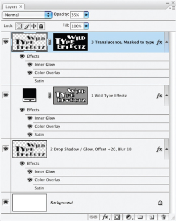
FIG 5.19 Comments and numbering help round out the layer advantage.
At this point we have successfully combined manual effects and layer styles in a way that would likely be more difficult and more time consuming using either alone. Check your results against the sample4.psd file included on the CD.
The layer styles do the bulk of the work in this example by simplifying the application and making the result more consistent, but without the help of the manual drop shadow the result becomes more difficult to achieve, as well as less flexible. As with most results in Photoshop it is not a single tool or application that provides the best results, but combinations.
To finish off the example to conform with the technique of using Layers for organization, you may want to add numbers to the layers so that you know what order they were created in. You may also want to add some notes as to settings used for the offset and blur. With these final additions, the layers palette would look like Figure 5.19.
Fill vs. Opacity
Fill and Opacity may cause some confusion if you apply them casually to layers and try to determine the difference in using one over the other. Let’s try the following to make the difference more clear. Open the Sample3.psd image one more time. Click the Wild Type Effectz to activate it, and choose Outer Glow from the Add a Layer Style menu at the bottom of the layers palette. When the layer Style dialog appears, change the Blend Mode to Normal (or perhaps Dissolve), the Size to 100 pixels, and the color to Red (RGB: 255, 0, 0), then click OK.
Go to the Opacity for the layer on the layers palette and swing the slider from 100% to 0% and back again to 100%. The whole content of the image will fade and return. Now try the same thing with Fill (leaving Opacity at 100%). Only the actual content of the layer will fade and return, the effect remains the same.
Opacity affects the entire layer, and Fill affects the content of the layer only – not the styles that have been applied.
Summary
Later Styles and Effects are layer-specific tools that carry with them a plethora of possibilities. The effects are the tools, but the real catalyst here is layers. Layers are the means by which layer effects and Styles can be assimilated and propagated in images for corrective and creative purposes. They are also the means of creating new sources to which additional effects and styles can be applied to (such as the shape for the drop shadow, and mechanism for creating translucence).
In the seemingly simple examples in this chapter, we have used vector and layer masks, manual and layer-based styles and effects, visibility toggles, opacity and modes. The results achieved are not so much an application of any one item as an orchestration of various functions and capabilities that culminate in the result. This is the modus operandi for much of Photoshop correction: results are born in the application of tools in unison. Layer styles are a powerful tool in their own right, but will likely often work best with layer modes. One of the hardest things to envision using layers may be what Layer Modes achieve. We look at them in the next chapter.
Layer Styles can help do many things, from adding a creative frame to an image in varying complexity, to creating text effects, to driving some image enhancements. Things that come to mind as practical corrections are simple exercises in separation where you add a drop shadow or glow to burn or dodge an edge around an isolated object, or where beveling or embossing may actually help enhance contour.
Creative application of styles on the other hand opens endless possibility. Though they may not technically be ‘styles’ in that they cannot be defined by the set number of layer ‘effects’, we see examples of applying ‘styles’ throughout this book in various examples, akin to the manual styles we looked at in this chapter. These effects include everything from simple dodge and burn, and application of techniques for soft focus (like those we looked at in Chapter 4), to more elaborate calculations such as manual sharpening techniques, and beyond. Many of these techniques could just as easily be relegated to standard calculations and effects (but they are just not defined as such because they are not in the standard Effects grouping).
One of the key concepts for looking at layers in this chapter is the concept of orchestrating layers to achieve a result. It is not often practical or desirable to try and achieve a result in your images all at once with one application of one tool, or even one application of one layer or one effect. Most effects and results can be achieved in more than one way. In the examples in this chapter it took only a few layers to achieve the translucence effect, but the example is steeped in the broader vision you will need to use layers effectively. As we have seen, the background and lower layers are a stage to build from. Older layers in the image can be borrowed from, reused, and generated to varying results. Envisioning the result is the key to success, and layer styles are just another building block to help form results.
Please visit http://www.photoshopcs.com for more information and resources for Photoshop styles.