Table of Contents for
The Adobe Photoshop Layers Book: Harnessing Photoshop's Most Powerful Tool, covers Photoshop CS3
 The Adobe Photoshop Layers Book: Harnessing Photoshop's Most Powerful Tool, covers Photoshop CS3
Published by
Focal Press, 2007
The Adobe Photoshop Layers Book: Harnessing Photoshop's Most Powerful Tool, covers Photoshop CS3
Published by
Focal Press, 2007
- Cover
- Halftitle
- Title
- Copyright
- Dedication
- Contents
- Acknowledgements
- Introduction
- Chapter 1: The Basics of Layers: Layer Functions and Creation
- Chapter 2: Layer Management: Concepts of a Layer-Based Workflow
- Chapter 3: Object and Image Area Isolation in Layers
- Chapter 4: Masking: Enhanced Area Isolation
- Chapter 5: Applying Layer Effects
- Chapter 6: Exploring Layer Modes
- Chapter 7: Advanced Blending with Blend If
- Chapter 8: Breaking Out Components
- Chapter 9: Taking an Image through the Process
- Chapter 10: Making a Layered Collage or Composite Image
- Index
Yet another means of combining and targeting content changes can be found lurking in the palette in the Photoshop Layer Styles. We have already looked at some of what the Layer Styles dialog can do when exploring layer styles in Chapter 5. However, Blend If is a more advanced feature on the Layer Styles dialog that offers opportunities separate from masking and clipping that we will definitely want to explore in order to round out the layer experience (Figure 7.1).
Blend If: An Overview
Blend If is very much an overlooked and even mysterious feature to almost any Photoshop user. If you ever tried looking this feature up in manuals and books, you may not have been able to find it. In fact even searching Photoshop Help will not yield a title with Blend If in it (though the feature is referenced by function in ‘Specify a blending mode for a layer or group’ and ‘Specify a tonal range for blending layers’). While the tool may not be a very popular target for tutorials and documentation, it is an enormously powerful tool that has been part of layers since the very beginning.
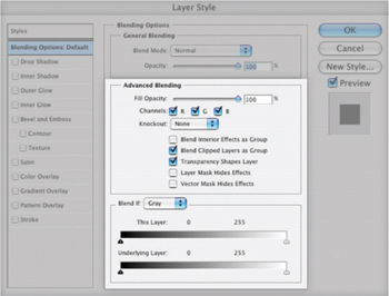
FIG 7.1 The Advanced Blending and Blend If sections of the Layer Styles screen offer additional layer advantages, not often explored by very powerful.
What Blend If can do is help you target changes and corrections based on the color or tonal content of a layer. In a way it is like an auto-mask, in that it will mask a layer without you having to actually create a mask or a selection – and these masks can be highly complicated without much work. It will target content of a layer based on a set of sliders (the Blend If sliders on the Layer Styles dialog), and those slider positions. Before we go any further, let’s take a look at the basic functionality and how you control it before we really try to look at what it can do.
 Try It Now
1. Open a new image 720 × 720 pixels with a white background (see the New Image dialog in Figure 7.2).
2. Create a new layer and call it Blend If Test.
3. Press D to set the default colors (black and white).
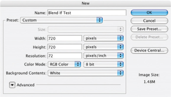
FIG 7.2 The suggested sample image should use the settings shown here.
4. Choose the Gradient tool and be sure the Options are set to Linear Gradient, Normal mode, 100% opacity, and uncheck Reverse, Dither and Transparency.
5. Click on the lower left of the image and drag the cursor to the upper right, then release the mouse. The image should fill in a gradient from black to white from the lower left to the upper right.
6. Take a snapshot of the image by clicking the snapshot button at the bottom of the History palette (Windows>History). Leave the name as the default (Snapshot 1). This will make it easy to return to the state of the image before blending is applied and without having to open the Layer Styles dialog to reset.
7. Double-click the Blend If Test layer in the layers palette (anywhere but on the thumbnail or over the name). This will open the Layer Styles dialog.
8. Click on the black This Layer slider and drag it to the center of the slider range at 128 (see Figure 7.3).
The numbers on the Blend If sliders are measured in levels 0–255. This corresponds to black (0) to white (255) in a grayscale gradient.
The change in position of the slider limits the range of what is visible in the layer (in this case the gradient) so it blends with what is below based on those slider positions. Everything to the left of the black slider and everything to the right of the white slider becomes transparent. If you shut off the visibility toggle for the Background layer you can see the transparency. Continuing from the exercise, try the following slider positions to get a better feel for the way it works:
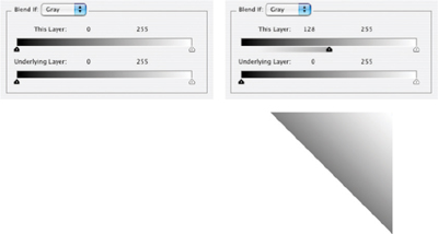
FIG 7.3 As you drag the cursor, the image on screen should appear to swipe from the lower left corner half way across the image. Notice that the layer in the layers palette retains its content.
• Move the black This Layer slider back to 0 and then move the white This Layer slider to 128 (Figure 7.4).
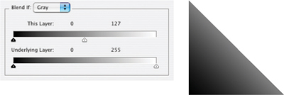
FIG 7.4 The gradient between gray and white will become transparent to see through to the background in the upper right of the image.
• Move the black This Layer slider to 192 and then move the white This Layer slider to 63 (Figure 7.5).

FIG 7.5 The area between the white slider and the black slider become transparent to see through to the background in the middle of the gradient range.
Applying layers with Blend If can occasionally be confounding when using the This Layer slider. Any changes applied directly to the layer where the Blend If sliders are set may result in unexpected changes in the image. To test this out, make a Levels adjustment to the Blend If Test layer (Image>Adjustments>Levels). When the dialog opens, swing the center gray slider left and right and watch how the image behaves. Close the Levels dialog without committing the change. Now do the same thing with an adjustment layer by choosing Levels from the Create new Fill or Adjustment Layer menu on the layers palette. This is one more clear case for using adjustment layers instead of direct application of change.
The same concepts hold true for using the Underlying Layer sliders. The main difference is that the content of the current layer will blend based on the content of the layers below, rather than the content of the layer where you apply the blend – layer transparency still effects the current layer. To see the results of using Underlying Layers, do the following:
Try It Now
1. Click Snapshot 1 in the History palette to reset the image and Blend If sliders.
2. Double-click the Background layer and rename it to White Layer.
3. Change the order of the layers in the layer stack by pressing Command+] / Ctrl+].
4. Double-click the White Layer in the layers palette to open the Layer Styles dialog.
5. Click on the black Underlying Layer slider and drag it to the center of the slider range at 128 (see Figure 7.6).
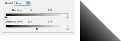
FIG 7.6 The white layer becomes transparent over the darker area of the lower layer so you can see through it to the darker half of the gradient.
6. Move the black Underlying Layer slider back to 0 and then move the white Underlying Layer slider to 128 (Figure 7.7).
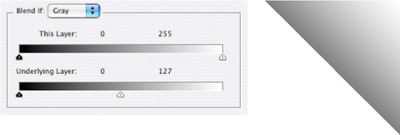
FIG 7.7 The white layer becomes transparent over the brighter area of the lower layer so you can see through it to the lighter half of the gradient.
7. Move the black Underlying Layer slider to 192 and then move the white Underlying Layer slider to 63 (Figure 7.8).
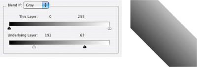
FIG 7.8 The white layer becomes transparent over the mid-tone area of the lower layer so you can see through it to the mid-tone ‘half’ of the gradient.
These examples are hard-edged application of Blend If in its simplest form. Several other features of Blend If allow partial blending and blending based on color ranges rather than just tone. Partial transparency (the real ‘blending’ form of Blend If) can be created by splitting the sliders. Color targeting can be done by choosing ranges for the Red, Green and Blue sliders found under the Blend If drop list (see Figure 7.9). Lets look at how to split sliders to have all the basic function in tow:
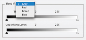
FIG 7.9 Blend If can be adjusted per channel so that blending can be targeted to specific color ranges.
Try It Now
1. Click Snapshot 1 in the History palette to reset the Blend If for the layers and the layer order.
2. Open the Layer Styles for the Blend If Test layer by doubleclicking the layer.
3. Move the black This Layer slider so it is at 128 (as in Figure 7.3).
4. Hold down the Option/Alt key [Mac/PC] and click on the left of the black slider and then drag it to 0. The slider will divide into two parts (see Figure 7.10).
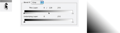
FIG 7.10 Holding the Option / Alt key allows you to split the slider, be sure to click on the side of the slider that is on the side you will be moving toward.
Splitting the slider will blend from 0% to 100% between the split halves. Splitting the sliders allows you to make a softer transition in blends, similar to blurring a mask or feathering a selection. The idea is that you gain control over how blends dissipate, rather than using them as an on/off switch for a particular range. As on/off switches the edges might end up hard and blocky, but by splitting the sliders you can offer better opportunity to control the blend.
Knockouts
Another feature under Advanced Blending in the Layer Styles palette is Knockout, another seldom-used feature with a specific ability – seldom covered or explored because it is hidden on the Layer Styles dialog. Knockout can behave much like solidity in the base layer of the clipping mask or as a mask, but it does it from the top down rather than below like a clipping layer or as a sidecar for layer masks.
To make a Knockout, try the following using the image from the previous exercise:
1. Click Snapshot 1 to restore the defaults you saved.
2. Double-click the background layer and name it White Base.
3. Choose the Type tool, and be sure you have selected a large type face like Arial Black at 300 points, and change the type color to Red (RGB: 255, 0, 0).
4. Activate the Blend If Test layer, then click on the image and type the word HOLE in all caps. Center the type vertically and horizontally on the image.
5. Shift+click on the Blend If Test layer to highlight both the HOLE layer and the Blend If Test layer.
6. Drag the layers to the Create a New Group button at the bottom of the Layers palette. Leave the default name, but toggle the arrow to expand the group.
7. Double-click the HOLE layer to open the Layer Styles dialog. Change the Fill to 0% (the type will disappear), then choose Shallow from the Knockout drop list. The type will appear in white having knocked out the base layer in the group (Blend If Test).
8. Change the Knockout to Deep. The word HOLE will knock out to the background. As there is no background in this image, it will knock out to transparent.
Shallow knockouts punch through to the bottom of their group if they are in one; Deep knockouts punch through to the background – or transparency if no background is available in the image.
Heavier Lifting with Blend If
So, what would you use Blend If for? Really, often for situations that seem otherwise hopelessly complex. For example, say you have taken a shot of a leafless tree in silhouette against a blue sky and you think it might look better with some other sky, some interesting clouds, or against a sunset, etc. It might seem to be a daunting task to make a selection between all those branches. You might try dabbling with the magic wand, but your results will be pretty sketchy. Blend If offers the opportunity to make the replacement without having to make a potentially unnerving and complex mask or selection. You can use measurements from your image to determine a range you want to replace, and then apply appropriate Blend If settings you make directly from the image.
That makes it sound like a miracle cure to use Blend If … and there are occasions where it will produce some amazing results with little effort. On the other hand, getting to do what you want may require combining it with masking or other techniques to achieve a result – like any other tool it is best to think of it as a companion to other functions rather than the lone ranger or some other hired gun. The only way to really get a feel for Blend If is to look at the reality of the way it works, and the advantages it affords first hand.
The shots in Figure 7.11 were taken on the same day, one in the morning at South Street Seaport in New York City early in the morning facing nearly east, and the other about 400 miles away near Rochester, NY facing west. They have little in common but the day they were taken. However the lighting is close enough that a merge might work – if we have the patience. These images are Sample9.psd and Sample10.psd on the CD.
In the picture of the mast, the rigging is a real problem if you are looking to replace the background. There are many cords crossing the scene, they are different weights, and somewhat different tone. The scene is lighter than the image taken at dusk, and the light wraps a little around the ropes. If it were more of a silhouette this might be easy.
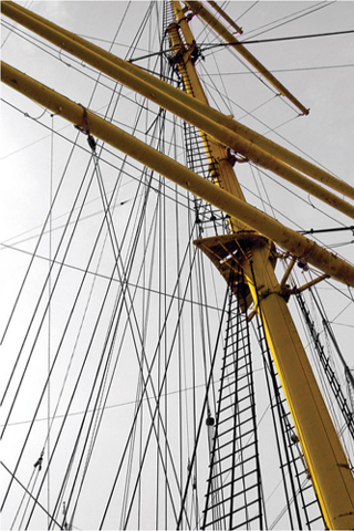
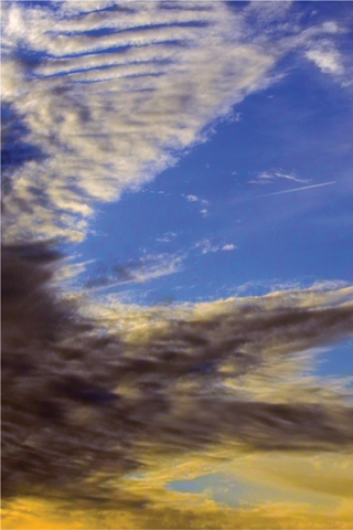
FIG 7.11 There is no accounting for weather, and you’ll often have to make due with what you get. In this case the drab sky can be replaced with the more interesting one taken later in the day.
Try It Now
1. Open the Sample9.psd image off the CD. This is the mast from Figure 7.11.
2. Double-click the Background layer and rename the layer to Original Mast in the New Layer dialog, then click OK to accept the changes.
3. Open the Sample10.psd image off the CD. This is the sky image from Figure 7.11. Place the images side by side on screen so both are in view.
4. Choose the Move tool, hold down the Shift key and click-and-drag the sky from the Sample10.psd image into the Sample9.psd. Holding the shift key will automatically center the layer you are dragging. Alternatively you can duplicate the layer from Sample10.psd to Sample9.psd using the Duplicate layer command, or even select all, copy and paste. All you are looking to do is to get the two images in the same document. Name the new layer Original Sky.
5. Close the Sample10.psd image, leaving open only the Sample9.psd which should contain the source layers from both sample images.
6. Duplicate the Original Mast layer, name the layer Blend If and move it to the top of the layer stack by pressing Command+] / Ctrl+].
7. Open the Threshold function (Image>Adjustments>Threshold). We will use this to measure the target for the blend. Swing the Threshold slider to the right and left looking for the point where the sky begins to darken in the upper right of the image. Note the number and close Threshold by clicking Cancel so the change is not saved in the image. If you push the slider left you will note the sky never completely becomes all black; if it had this would define a range for the blend and you would have to get the black slider involved (Figure 7.12).
Threshold is a tool that is useful in determining measurements of your image content, and is an unlikely candidate as a tool that you will generally use in corrections themselves – though you might occasionally use it to help create masks. Threshold turns an image into a pure bitmap where pixels are either white or black – there are no grays or colors when the tool is applied.
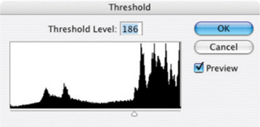
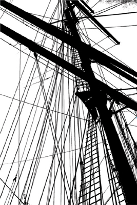
FIG 7.12 At about 186 on the threshold function, the sky at the upper right of the image begins to turn. Your threshold may be somewhat different based on color settings.
8. Double-click the Blend If layer to open the Layer Styles dialog. As you want to drop away the lighter portion of the layer to reveal what is beneath, use the white This Layer Blend If slider and move it to the left to the value you measured in step 7. Then split the sliders and give about 20 levels of blending (see Figure 7.13).
At this point the blending of the two images may not be all that you’d hoped … and likely this is where some might give up.
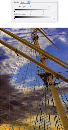
FIG 7.13 After splitting the sliders, visual evaluation suggested a broad blend to try an allow the ropes to transition smoothly, but not so far as to lose rope details.
Sometimes things will look a little worse before they start to look better, and a little more effort can go a long way – combinations of tools and techniques often win the battle. The problem here is the mismatch of the images, and you will want to do something to lighten the sky.
9. Change the opacity of the Original Sky layer to about 50. This will significantly lighten the sky and the ropes will blend better (see Figure 7.14).
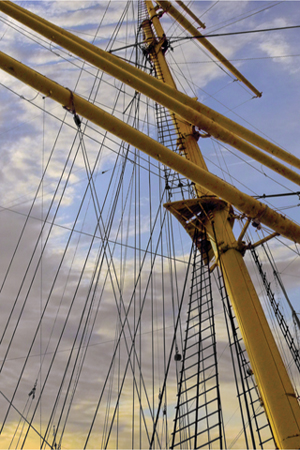
FIG 7.14 Lightening the sky brings the two parts of the image closer, but there is still more to do. The image can be color corrected, sharpened and saturated to build back some of the impact that is lost in the compromise.
10. Make a levels correction to the image using a Levels adjustment layer. It should have settings similar to Figure 7.15.
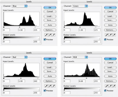
FIG 7.15 A general color correction that we did not do earlier helps bring these two blended images into sync.
11. Next using Color Balance will help you enhance color and create balance between the components that is pleasing (see Figure 7.16).
12. Make a composite at the top of the layer stack and then apply sharpening to enhance contrast (sharpening to enhance contrast uses a broad radius and small amount) (see Figure 7.17).
13. Adjust color with Hue/Saturation to enhance the sky and mast. You may need to do some selective enhancement and create custom ranges to get the best results. Figure 7.18 shows the result and a screen shot of the layers palette.
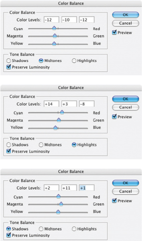
FIG 7.16 Color balance shifts between highlights and shadows, reflecting difference in the lighting and emphasis of the blended images.
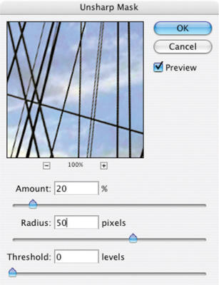
FIG 7.17 The goal with sharpening is to enhance the contrast in the image without imposing halos.
You can try this same exercise using the Sky layer as the Blend If layer without duplicating the mast layer. That is, instead of making the duplication of the Original Mast layer, just use the Original Sky layer and apply the Blend If function there. The major difference will be that you will use different settings for the blend: instead of using settings for the mast layer that will blend out the sky, you will use settings to blend into the mast image. As it turns out, the opposite settings work just fine (see Figure 7.19).
In either case we are looking to target the range of sky between the rigging in the mast layer. Blend If can accomplish the task because there is enough of a distinct difference between the sky and the rest of the layer content. Blend If will also likely be useful in situations dealing with compositing HDR (High Dynamic Range) images (images shot with different exposures to achieve HDR). But most often you will use it in tandem with masking and other techniques.
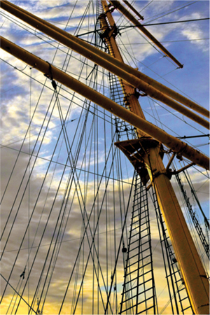

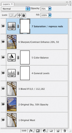
FIG 7.18 The result becomes somewhat of a mediation between the extremes rather than one image dominating the result. These layers complete the composite. The key layer using Blend If is 3 Blend If 0,0 / 112,182
Though Blend If can make precise adjustments to specific areas of an image and is handy for some types of targeting and blending, it is a little rigid when it comes to adjustment. The drawback becomes more apparent when you get into a situation where you know Blend If would be more useful if you could adjust the results like you can with a layer mask. The secret is in conversion. Let’s take a look at Color Masking and transition with Blend If.
Blend If as a Mask
Blend If is a very powerful tool for working in exacting ranges, and with the right technique it can be used for everything from coloring black-and-white images to blending layer content, to being used as a substitute for, or in conjunction with, masking. There are, however, at least two glaring problems with Blend If. First, the range is exact, which doesn’t leave any allowance for manipulation to fit shapes. If you have an area that isn’t exactly within your range, Blend If won’t target it precisely. Second Blend If is not entirely intuitive when working with tone, and it is even more difficult to work with to address color ranges. All isn’t black and white so the problem of addressing color is inevitable.
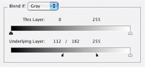
FIG 7.19 The Blend If settings would be reversed if blending the sky into the mast. You want to drop away the portions of the sky layer that correspond to the dark portion of the mast layer.
The solution is to stick to using Blend If for what it is superior at: making transparency. Because Blend If creates transparency in the current image layer, you can convert that transparency to a clipping mask, a selection or mask by manipulating the results. Once you have converted Blend if to something else, the results can be manipulated. For example, you could create a mask using Blend If sliders to target a range of tones to either keep or throw out (based on slider positions).
1. Duplicate the layer you want to make into a mask and name it Blend Mask.
2. Determine the range of tone you want to use in the layer as a mask using measurement or conceptual ranges (e.g., midtones).
3. Create a new, blank layer below the Blend Mask layer.
4. Activate the Blend Mask layer and set the This Layer range to the range determined in step 2.
5. Merge down, and change the name of the layer to Transparency Mask. This will commit the transparency of the Blend Mask layer to the Transparency Mask layer.
Steps 3 to 5 lock the transparency based on the Blend If range according to the original tone. You can now use the Transparency Mask layer as a clipping group base, shift+click it to load a selection, or load the selection and use it to create a mask. Committing the Blend Mask allows you to make it a physical element so you can make changes in it – either by changing the solidity of the Transparency Mask layer, by altering the selection, or by making adjustments to the mask.
Using this scheme, you can quickly use layer content to convert to custom masks:
• Create a highlight mask based on transparency in the current layer by splitting the black slider to 0 and 255.
• Create a shadow mask by splitting the white slider to 0 and 255.
• Create a mask that targets the lightest half of the image; split the black slider to 128 and 255.
• Create a mask that targets the darkest half of the image; split the white slider to 0 and 128.
You can probably see from this that Blend If can be very effective in targeting tone. If color is isolated as tone (like you can do with RGB, CMYK or other separation), application areas can be based on specific ranges within a color component. But Blend If can also allow you to convert specific color ranges to masks, with the help of Hue/Saturation.
Creating a Color-Based Mask
The trilobite in Figure 7.20 would prove to be a very tedious selection to make manually. The general shape along with lumps and bumps could take hours to trace in contour with one of the manual tools. The mixture of light and shadow make any kind of selection based on tone difficult or impossible.
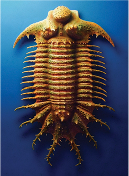
FIG 7.20 This trilobite has many ribs that protrude, making a manual selection cumbersome. Techniques for selection and isolation can be made easier using Blend If techniques.
Using the following combination of tools, it is possible to isolate an area based on color, and then convert that to a selection or mask via Blend If:
Try It Now
1. Open the Sample11.psd.
2. Duplicate the Background layer and name it Source. You need a duplicate because you will be changing the layer content rather than using non-destructive methods.
3. Open Hue/Saturation to apply it directly to the Source layer (Command+U / Ctrl+U). You want to make changes to the layer instead of using an adjustment layer.
4. Choose Blues from the Edit drop list. You choose Blues here because that seems to be the closest range to the area outside the object; had you been looking to change a green or magenta, you should select that range instead.
5. Change the Saturation slider to −100 (see Figure 7.21).
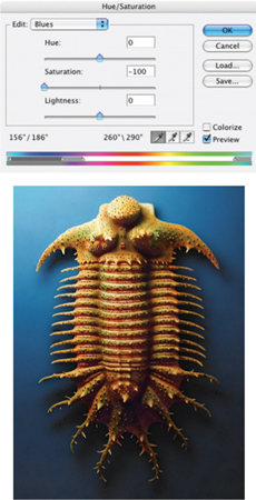
FIG 7.21 This will desaturate the areas that Photoshop considers part of the Blue range.
6. Click the Add to Sample tool on the Hue/Saturation palette. Click in areas of the image using the sampler where there is still color in the background. All areas of blue should desaturate as you click on them (change to gray). Click OK to accept the changes (Figure 7.22).
7. Activate the Background by clicking it in the Layers palette, then create a new layer (Command+Option+Shift+N/ Ctrl+Alt+Shift+N) and fill with 50% gray (Shift+F5). Name the new layer Commit 2. Duplicate Commit 2 and name it Commit 1. See Figure 7.23 for the setup. This layers will be used to commit a series of image changes that create the mask.
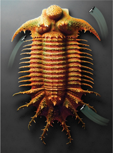
FIG 7.22 Clicking and dragging the Add to Sample tool through the background will desaturate the areas you pass over because they will be sampled into the desaturation range.
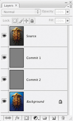
FIG 7.23 The layers should be Source, Commit 1, Commit 2, Background.
8. Change the mode of the Source layer to Color and merge down. This will isolate the color in a color separation.
9. Change the mode of the Commit 1 layer to Difference. This will show the difference between the saturated parts of Commit 1 and the unsaturated 50% gray of Commit 2. Merge down to commit the difference.
10. Change the name of the current layer to Blend Mask. The layers will look like they do in Figure 7.24.
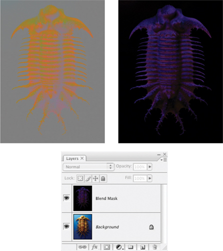
FIG 7.24 The series of mode changes between steps 9 to 11 produce these results and leave you with only the Background and Blend Mask layers.
11. Double-click the Blend Mask layer to open the Layer Style dialog.
12. Under Blend If on the dialog, click the black slider for This Layer and slide it to the right while watching the image. Slide this right only 1 or 2 levels. The black should disappear from sight in the image. Close the Layer Style dialog by clicking OK.
13. Activate the Background. Create a new, blank layer. Name it Transparency Mask.
14. Merge the Blend Mask layer down into the Transparency Mask layer to commit the transparency.
15. Clean up the Transparency mask layer. Clear debris with selection tools and the Delete button, or the Eraser tool. Fill holes in the object by just painting with a paintbrush.
16. Duplicate the Background, name the duplicate Source and move it above the Transparency Mask, then make a clipping group from those layers. Your content will be restored to the original look, but with the difference that you can alter the background without effecting the object (or vice versa). See the layer stack in Figure 7.25.
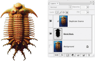
FIG 7.25 Adjust the Transparency Mask layer after committing the transparency using the Paint Brush tool or Eraser to add or remove masking, respectively.
What is happening here is that you manipulate the color to desaturate the image, isolate the desaturated areas with a calculation, and then use Blend If to re-define the visible portion of the layer. By moving the black This Layer slider to the right, the black areas of the layer are eliminated from view (though not yet deleted). Once committed, the exact range of pixels can be manually altered to account for edge blending and other differences that are not guided by strict numeric relationships.
A Color Mask action is provided in the Blend If actions included on the CD. This tool will run through the steps for the Hue/Saturation Blend If as discussed in this section. It also has tools which will do the following Blend If setups:
• Target highlights, full range (set the Underlying Layer black slider to 0 and 255)
• Target highlights, half range (set the Underlying Layer black slider to 128 and 255)
• Target shadows, full range (set the Underlying Layer white slider to 0 and 255)
• Target shadows, half range (set the Underlying Layer black slider to 0 and 128)
• Target midtones, full range (set the Underlying Layer black slider to 0 and 128; set the Underlying Layer white slider to 128 and 255)
• Target midtones, half range (set the Underlying Layer black slider to 63 and 128; set the Underlying Layer white slider to 128 and 192)
• Exclude midtones, full range (set the Underlying Layer black slider to 128 and 255; set the Underlying Layer white slider to 0 and 128)
• Exclude midtones, half range (set the Underlying Layer black slider to 192 and 255; set the Underlying Layer white slider to 0 and 63)
• Reset (set Underlying sliders to 0, 0/255, 255).
These presets can serve a variety of purposes. You may be able to guess at how these will come in handy, but we’ll look at specific examples in Chapter 9.
Summary
Blend If provides yet another opportunity to isolate objects: by creating transparency. In this way it can provide a means of blending layers that no other tool will provide, but it also provides alternatives to using other tools like the Magic Wand or color range tools for making selections, masks and creating object isolation based on tone and color.
Keys to success with Blend If lie in using it in conjunction with other tools and techniques. It won’t be the magic bullet for problems so much as it will be a masking helper, selection helper, and companion to other masking and selection techniques. Flexibility is offered by the quick Blend If actions and will keep you from having to dig into the Layer Styles every time you want to try something from the Blend If bag of tricks.
We have looked at quite a few layer-based adjustments in the past several chapters. Some are convenient for shape, others for tone, still others for color and some for general calculations. One thing to keep in mind as you move forward from this point is that it is rarely a single method that does everything you need it to if you are hoping for the best outcome. For a given image there will be occasions that I use every one of the techniques and functions mentioned in these chapters, and probably fewer times where I will use one or two. Get familiar with each of these techniques, and add them to your tool belt. If not immediately, work on them one at a time to get familiar with and master each.
One more useful feature is hidden on the Advanced panel of the Layers Styles, and that would be the deceptively simple-looking Red, Green and Blue check boxes. We’ll look at the implications these features bring to layer-based separations in the next chapter.
If you have questions about Blend If techniques, please visit: http://www.photoshopcs.com where you can ask questions about techniques in the Layers forums.