Table of Contents for
The Adobe Photoshop Layers Book: Harnessing Photoshop's Most Powerful Tool, covers Photoshop CS3
 The Adobe Photoshop Layers Book: Harnessing Photoshop's Most Powerful Tool, covers Photoshop CS3
Published by
Focal Press, 2007
The Adobe Photoshop Layers Book: Harnessing Photoshop's Most Powerful Tool, covers Photoshop CS3
Published by
Focal Press, 2007
- Cover
- Halftitle
- Title
- Copyright
- Dedication
- Contents
- Acknowledgements
- Introduction
- Chapter 1: The Basics of Layers: Layer Functions and Creation
- Chapter 2: Layer Management: Concepts of a Layer-Based Workflow
- Chapter 3: Object and Image Area Isolation in Layers
- Chapter 4: Masking: Enhanced Area Isolation
- Chapter 5: Applying Layer Effects
- Chapter 6: Exploring Layer Modes
- Chapter 7: Advanced Blending with Blend If
- Chapter 8: Breaking Out Components
- Chapter 9: Taking an Image through the Process
- Chapter 10: Making a Layered Collage or Composite Image
- Index
Image components are separations of an image into distinct color or tone parts. We looked at separating an image into brightness (luminosity) and color in Chapter 6, but there are many ways to separate images into other types of components, including color components of light (red, green and blue) and ink (cyan, yellow, magenta and black). Separating images into components can offer advantages in making corrections, creating masks, calculations and other tasks such as converting images to black and white.
Separations also provide essential understanding of how images are comprised, stored and viewed. Being able to work with color components directly as separations is nearly the exclusive reason for Channels – which Adobe has dedicated an entire palette to in Photoshop. When the Photoshop user learns to look at channels as component parts of their images in layers, they gain many times the potential flexibility of looking at channels in a separate palette. Working with components in layers leads to a better understanding of how they fit into images, and how they can be used directly in corrections.
An Historic Interlude
One of my favorite digital lessons is learned from taking a set of black-and-white images created before there was color film and making a color representation of the image. A special case are the photos of one Russian photographer, Sergei Mikhailovich Prokudin-Gorskii.
 You can find digitized images in several libraries online:
http://www.cs.cmu.edu/~dellaert/aligned/
http://www.loc.gov/exhibits/empire/
Using a special camera that he designed, Prokudin-Gorskii captured images on glass plates three at a time (it is said in rapid succession, rather than all at once). During the capture, color filters separated red, green and blue color components to different areas of the plate. The result was a single plate with black-and-white representations of the image’s core light components (see Figure 8.1).
The solution still offered only black-and-white representation of RGB channels, was a bit awkward, and required a customized projector to reproduce the color. But really this first color captures mimic what your digital camera does even today, separating color into Red, Green and Blue light components. About 100 years after they were taken, we can treat Prokudin-Gorskii’s images as components of an image and put them back together as color representations using Photoshop.
Working with separations provides some valuable background for what we’ve already been doing in correcting for different components of light with Levels. It also opens doors to additional techniques for working with color and black-and-white images.
Creating Color from Black and White
The concept of RGB and the idea that an entire world of color can be stored in combinations of three colors really doesn’t seem plausible until you see it at work. That is, the 16 million color variations in 8-bit per channel and 35 billion of 16-bit per channel are all produced from capture of red, green and blue core components.
In the following short example, we’ll look at putting together a Prokudin-Gorskii image from his original black-and-white captures.
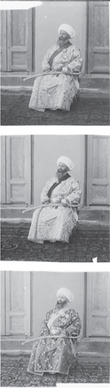
FIG 8.1 A scan of an original Prokudin-Gorskii ‘color’ plate taken between 1907 and 1915, 20 years before Kodachrome … the first color film. Stacked here from the top down are the Blue, Green and Red color components.
1. Open the three Samples12 images off the CD. They are named Sample12-red.psd, Sample12-green.psd and Sample12-blue.psd. Be sure to keep them in order, or your result will not turn out correctly (Figure 8.2).
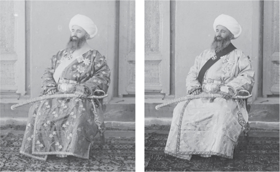
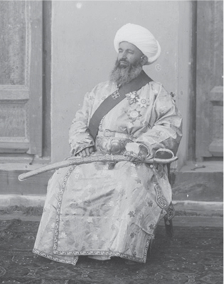
FIG 8.2 The three sample images clockwise from the upper left are the Red, Green and Blue components.
If you’d like an extra challenge, there is a Sample12-RGB.psd on the CD as well. This image has a scan of the complete glass plate. You can work from that if you’d like, but be forewarned that there are issues of alignment and distortion that have mostly been addressed in the cropped version provided.
2. Activate the Sample12-blue.psd image, then press Command+A / Ctrl+A [Mac / PC] to select the entire image, then press Command+C / Ctrl+C to copy. Doing this stores a copy of the image as well as the image dimensions, which helps automate the next step.
3. Create a new image (File>New), name the file Prokudin-Gorskii Composite, as in Figure 8.3 and be sure to change the Color Mode to RGB Color (it will initially be Grayscale). We will use this new image to assemble a color image from the components in the other three images.
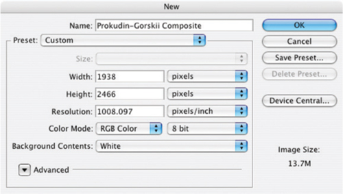
FIG 8.3 Your New screen should look very much like this when opened, as Photoshop will have automatically defined the new image size from the image information on your clipboard.
4. Create a new layer, call it Compositing Screen and fill it with black (Edit>Fill and set the Use content to Black in the drop list). This will act as a projection screen for the image components.
5. Press Command+V / Ctrl+V to paste the content of the clipboard to the image. Name the resulting layer Blue (Figure 8.4).
6. Arrange the Prokudin-Gorskii Composite image and the Sample12-green.psd so you can see both on your monitor, choose the Move tool (press V), hold the Shift key and click-and-drag the Sample12-green image into the Prokudin-Gorskii Composite file. Release the mouse button and then the shift key. Name the new layer in the Composite file Green.
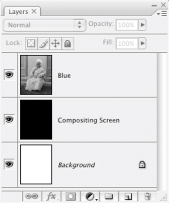
FIG 8.4 After pasting the initial component, you will have three layers: Background, Compositing Screen and Blue.
7. Arrange the Prokudin-Gorskii Composite image and the Sample12-red.psd so you can see both on screen, choose the Move tool (press V), hold the Shift key and click-and-drag the Sample12-red image into the Prokudin-Gorskii Composite file. Release the mouse button and then the shift key. Name the new layer in the Composite file Red. The result of all this clicking and dragging should look like Figure 8.5.
8. Close the Sample12-red.psd, Sample12-green.psd and Sample12-blue.psd images, leaving only the Prokudin-Gorskii Composite image open.
9. Shut off the views for the Blue and Green layers so you are viewing only the Red layer. It will appear in black and white.
10. Double-click the thumbnail for the Red layer in the layers palette. The Layer Styles palette will open.
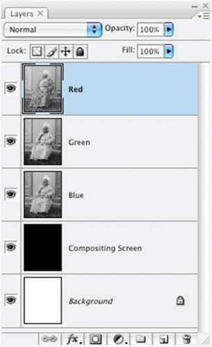
FIG 8.5 The resulting layers from the top down should be Red, Green, Blue, Compositing Screen and Background.
11. Uncheck the Green and Blue checkboxes for Channels under Advanced Blending (see Figure 8.6). The image will turn red, showing a view of how the Red light component in the image looks when isolated.
12. Shut off the visibility toggle for the Red layer and toggle the view for the Green layer so it is visible again. The image will appear as a grayscale representation of the Green channel.
13. Double-click the thumbnail for the Green layer in the layers palette for the Prokudin-Gorskii Composite image. The Layer Styles palette will appear.
14. Uncheck the Red and Blue checkboxes for Channels under Advanced Blending. The image will show the Green component channel in green (see Figure 8.7).
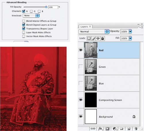
FIG 8.6 Unchecking the checkboxes for Green and Blue make this layer only act on the Red channel. The result is that you see the red light component in red.
15. Shut off the visibility toggle for the Green layer, and toggle the view for the Blue layer so it is visible again. The image will appear as a grayscale representation of the Blue channel.
16. Double-click the thumbnail for the Blue layer in the layers palette for the Prokudin-Gorskii Composite image. The Layer Styles palette will appear.
17. Uncheck the Red and Green checkboxes for Channels under Advanced Blending. As you might expect, the image will show the Blue component of the image in blue (Figure 8.8).
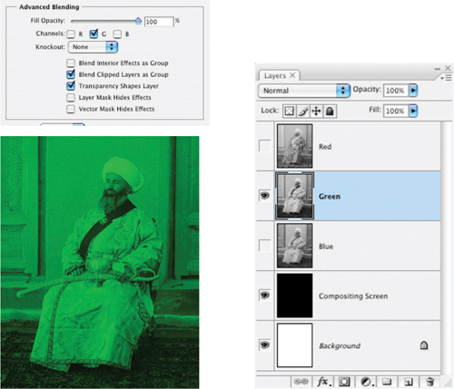
FIG 8.7 Unchecking the checkboxes for Red and Blue make this layer only act on the Green channel. The result is that you see the Green light component in Green.
18. Now turn on the visibility toggles for the Green and Red layers. You will see a full-color composite of the image, though there is no color at all in any of the layers in the layers palette (see Figure 8.9).
This is a demonstration of several things from light theory to what those little checkboxes on the Advanced Blending panel of the Layer Styles dialog do. Layer Styles targets the content of the layer to make each act like a specific light component, which projects on the dark screen. When all three of the light components are switched on, the red, green and blue components combine to re-create the color image. This is what your monitor projects, what your camera captures and what Photoshop recreates: red, green and blue components are assembled to make a color image. The example shows that colored light can really be stored by grayscale measurements, and is a sort of demonstration of what Prokudin-Gorskii needed to do to re-create the color he captured: project the filtered images onto a screen. Let’s look at this same example in a different way to mix in more light and layer theory continuing on with the same image.
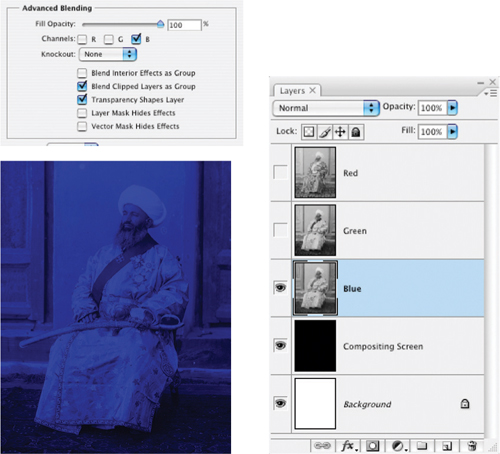
FIG 8.8 Unchecking the checkboxes for Green and Red make this layer only act on the Blue channel. The result is that you see the red light component in Blue.
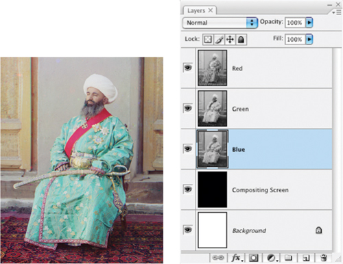
FIG 8.9 The result has some issues as far as needing color correction, dynamic range enhancement and some obvious cleanup, but the fact is that you have just created color from images taken about 100 years ago, 20 years before there was color film.
An Alternative: Creating Filtered Color
Prokudin-Gorskii couldn’t just click a checkbox to make his glass plates perform and convert to color. He had to make a more rudimentary effort to filter the red, green and blue light components during projection. Using layer modes, we can mimic filtering the components with color to reproduce color from black and white.
Try It Now
1. Double-click the Red layer in the layers palette in the Prokudin-Gorskii Composite image to open the Layer Styles dialog. Check the Green and Blue boxes, and set the layer mode to screen. This mode treats layer content like light: enhancing brightness only.
2. Double-click the Green layer in the layers palette in the Prokudin-Gorskii Composite image to open the Layer Styles dialog. Check the Red and Blue boxes, and set the layer mode to screen (Figure 8.10).
3. Double-click the Blue layer in the layers palette in the Prokudin-Gorskii Composite image to open the Layer Styles dialog. Check the Red and Green boxes, and set the layer mode to screen.
4. Shut off the visibility for the Red and Green layers. Click on the Blue layer to activate it if it is not active already.
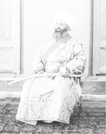
FIG 8.10 The layers palette looks no different, but the image at this point will look horribly over-exposed. Keep in mind that sometimes things look worse before they get better.
5. With the Blue layer active, create a new layer (Layer>New>Layer). When the New Layer dialog appears, name the layer Color Blue, change the layer mode to Multiply. This mode acts as a multiplier to darken content below. Check the Group With Previous checkbox. Then click OK.
6. Fill the Color Blue layer with pure Blue (RGB: 0, 0, 255). You can do this by changing the foreground color to blue and clicking in the image with the Paint Bucket tool, or by using the Fill function with the proper foreground or Custom color setting (see Figure 8.11).
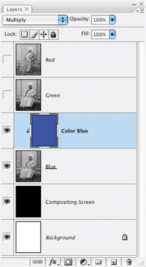
FIG 8.11 The grouped Color Blue layer acts like a filter for blue light as if you were to place a gelatin filter over the Blue content, adding color back to the component.
7. Shut off the visibility for the Blue layer and turn on visibility for the Green layer. Click the Green layer in the layers palette to activate it.
8. Create a new layer (Layer>New>Layer). When the New Layer dialog appears, name the layer Color Green, change the layer mode to Multiply and check the Group With Previous checkbox. Then click OK.
9. Fill the Color Green layer with pure Green (RGB: 0, 255, 0) (see Figure 8.12).
10. Shut off the visibility for the Green layer and turn on the visibility for the Red layer. Click the Red layer in the layers palette to activate it.
11. Create a new layer (Layer>New>Layer). When the New Layer dialog appears, name the layer Color Red, change the layer mode to Multiply and check the Group With Previous checkbox. Then click OK.
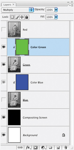
FIG 8.12 The addition of the Color Green layer will cover the green component content with green color, again as if you had applied a gelatin filter.
12. Fill the Color Red layer with pure Red (RGB: 255, 0, 0). Your layers should look like Figure 8.13.
13. Turn on the visibility for the Green and Blue layers. The image will appear in full color again.
In this scenario, the Color layers act like filters adding color to the grayscale representations using multiply layer mode. Each of the components themselves are then projected like light to the Composite layer by being set to Screen mode.
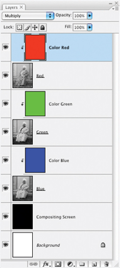
FIG 8.13 Completing the roundup of color additions with the Color Red layer, you are one step away from obtaining full color via filtered layers. When the visibility for all layers is turned on, you’ll once again have full color.
This procedure works every time you have grayscale representations of your image … but it isn’t likely that you’ll soon be out making a custom camera that will shoot separations on a glass plate. Inside every color image there is light, and because there is light, there are light components: Red, Green and Blue. Filtering works to put the color into your image, but a lesson learned from Prokudin-Gorskii is that light components can also be filtered out and separated from color images.
An interesting option at this point is to have at the Prokudin-Gorskii image with corrections. You can make a levels correction for starters and a plethora of spot/dust corrections. You might try sharpening, Color Balance, contrast enhancements, and any other technique we’ve looked at thus far. Doing so can help reinforce those techniques and their application.
Separating a Color Image into RGB Components
Just as Prokudin-Gorskii filtered the light in his scenes for red, green and blue to make his black-and-white ‘color’ plates, you can reverse the process of adding color and create separations in layers. You might say, ‘Oh, we already have channels for that’. But a huge drawback to channels is that they are in a separate palette and you can’t work with them nearly as fluidly as you could if you could work them like layers. Let’s take a look at the process and then see some of what you can do with separated components.
1. Flatten the Prokudin-Gorskii Composite image. This will commit the changes.
2. Create a new layer, name it Red Filter, and change the mode to Multiply.
3. Fill the Red Filter layer with pure Red (RGB: 255, 0, 0). This will turn the image red and will represent the red light component.
4. Create a Hue/Saturation adjustment layer. Choose Reds from the Edit drop list and push the Lightness slider all the way to the right. You will be left with a grayscale representation of the red light component.
5. Press Command+Option+Shift+E / Ctrl+Alt+Shift+E to copy the visible image to a new layer. Name the new layer Red. Your layers should look like Figure 8.14.
6. Delete the Hue/Saturation layer. Shut off the view for the Red and Red Filter layers.
7. Create a new layer above the Background layer. Name it Green Filter, and change the mode to Multiply.
8. Fill the Green Filter layer with pure Green (RGB: 0, 255, 0). This will turn the image green and will represent the green light component.
9. Create a Hue/Saturation adjustment layer. Choose Greens from the Edit drop list and push the Lightness slider all the way to the right. You will be left with a grayscale representation of the green light component.
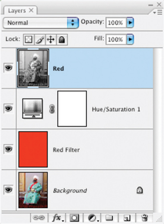
FIG 8.14 Extracting red as the first color component gives you a model for separating the green and blue components as well.
10. Press Command+Option+Shift+E / Ctrl+Alt+Shift+E to copy the visible image to a new layer. Name the new layer Green (see Figure 8.15).
11. Delete the Hue/Saturation layer. Shut off the visibility for the Green and Green Filter layers.
12. Create a new layer above the Background layer. Name it Blue Filter. Change the mode to Multiply.
13. Fill the Blue Filter layer with pure Blue (RGB: 0, 0, 255). This will turn the image blue and will represent the blue light component.
14. Create a new Hue/Saturation adjustment layer. Choose Blues from the Edit drop list and push the Lightness slider all the way to the right. You will be left with a grayscale representation of the blue light component.
15. Press Command+Option+Shift+E / Ctrl+Alt+Shift+E to copy the visible image to a new layer. Name the new layer Blue (see Figure 8.16).
16. Delete the Hue/Saturation layer.
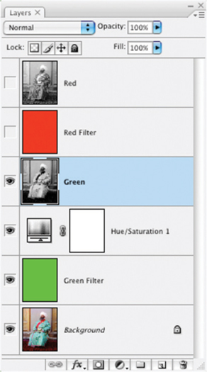
FIG 8.15 After creating the Green layer the layer stack looks like this.
After these steps you should have a Red, Green and Blue layer in your image, all representing grayscale components extracted from the image you were working on. Your next chore is to add the color back to the components to create a color representation while keeping the grayscale components separate. A big hint, look to the earlier part of this chapter where you added color to the Prokudin-Gorskii image to see how to add color back to grayscale separations. Use the Filter layers as the Color layers (that’s why I didn’t ask you delete them).
Another way to make the separations would be to use the Channel targeting in the Advanced Blending panel.
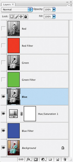
FIG 8.16 The Blue layer gets created with steps almost identical to the others, simply by applying a different color filter.
Try It Now
1. Duplicate the Background to a new image. To do this, click the Background layer to activate it, and then choose Layer>Duplicate Layer. When the Duplicate Layer dialog appears, choose New for the Destination, and name your new image Prokudin-Gorskii New (see Figure 8.17).
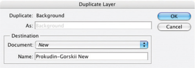
FIG 8.17 Settings for the Duplicate Layer dialog should appear as in this sample.
2. Double-click the Background layer in the new image, and when the New Layer dialog appears, rename the layer Source.
3. Double-click the Source layer and when the Layer Styles dialog appears, uncheck the Green and Blue channels.
4. Create a Hue/Saturation adjustment layer. Choose Reds from the Edit drop list and push the Lightness slider all the way to the right.
5. Press Command+Option+Shift+E / Ctrl+Alt+Shift+E to copy the visible image to a new layer. Name the new layer Red.
This will isolate the Red channel. I’ll let you figure out the rest for the Green and Blue. What either of these methods accomplishes is getting your image components on separate layers. Here we have taken apart and put back together your color images – in a fashion nearly identical to the way your images are separated into components and stored, and then reproduced as color from the grayscale channels.
You may think it is a lot of bother to go through to separate out components. That is why I have included some tools on the CD to do it for you. If you load the Separations action set, in it you will find the following tools:
• Complete RGB Separation (duplicates the current image and makes a complete RGB separation following yet another path to separations).
• Blue Component (duplicates the current image and separates out a stand-alone blue component layer).
• Green Component (duplicates the current image and separates out a stand-alone green component layer).
• Red Component (duplicates the current image and separates out a stand-alone red component layer).
• Luminosity and Color (duplicates the current image and separates out Color and Luminosity layers).
• Complete CMYK Separation (duplicates the current image and makes a complete CMYK Separation allowing custom UCR/GCR for black generation).
• *RGBL Components (duplicates the current image and separates out Red, Green, Blue and Luminosity layers).
• *Richard’s Custom Black-and-White (duplicates the current image and creates a black-and-white result that works well with many images).
• Simple Channel Mixer (duplicates the current image and sets up a layer-based channel mixing scenario).
• Target Red (targets the current layer to the red channel, unchecks boxes in the Advanced Blending for Green and Blue).
• Target Green (targets the current layer to the green channel, unchecks boxes in the Advanced Blending for Red and Blue).
• Target Blue (targets the current layer to the blue channel, unchecks boxes in the Advanced Blending for Red and Green).
• Target RGB (resets all Advanced Blending channel checkboxes to checked).
We’ll be looking at the actions marked with an asterisk in the following section.
Breaking out color components into layers is a very advanced move, and may be something you won’t do very often, but it should give you several things, including a good idea of the peripheral power of layers and a good concept of how image information is captured and stored. But what can you do with your knowledge of separations? Follow along into the next section.
Using Separations
Grayscale channels can be used for a variety of highly specialized purposes. First, you can target changes directly to any one of the RGB components by using Adjustment Layers stacked with, and therefore targeted to, specific layer color components. Components can be used for masking, selection and a plethora of alterations, with a freedom in layers that is not accessible to you with channels and channel functions.
Probably one of the most useful and practical applications of separated components is making custom black-and-white conversions. Many people will suggest turning to Channel Mixer, the Black & White function, or perhaps Calculations. The thing each of these functions has in common is that they use separated components to create the image results. However, because these features are pre-defined, there are inherent limitations to the ways they can be combined. You can’t, for example, use any of these functions to create a calculation with three components of your choosing in different modes simultaneously. Layer-based calculations and channel mixing allow you complete freedom to use the power of layers however you’d like.
Try It Now
1. Open the Sample13.psd image on the CD (see Figure 8.18).
2. Run the RGBL Components action in the Separations action set. This creates the red, green, blue and luminosity components for the image (Figure 8.19).
3. Shut off the view for the Luminosity, Red Component and Blue Component. This leaves the view for the Green Component. The flower petals are dark, but they can easily be lightened using the Red Component, as we will do in the next step.
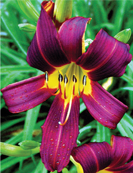
FIG 8.18 A colorful combination leaves some interesting and stark differences between image components after this separation.
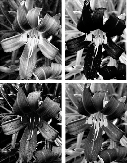
FIG 8.19 The range of looks in this separation shows a marked difference that will need to be changed to make a good black-and-white conversion. Clockwise from the upper left we have: red, green, luminosity and blue.
4. Move the Red Component above the Green Component layer in the layer stack. If you view the Red Component by itself (turn off the visibility toggle for the Green Component, turn the visibility toggle for the Red Component on), you will see that it is light in the petal areas but dark in the surrounding greenery. Turn on the visibility toggle for the Green Component, change the mode of the Red Component layer to Lighten and lower the opacity to 60%. This will lighten the flower petal area without a significant impact on the surrounding area.
5. To add back in some of the unique dynamics of the Blue Component, turn on the visibility toggle for the Blue Component layer, change the mode to Overlay and reduce the opacity to 16%.
6. Duplicate the Green Component layer, name the resulting layer Green Component Screen, change the opacity to 70% and be sure the Mode is Screen. This will lighten the area around the petals to create greater contrast.
7. Turn on the Luminosity layer, and change the opacity to 33%. This will mediate some of the extremes that may have been caused by other calculations (see the result in Figure 8.20).
Steps 6 and 7 add some calculations that experience has shown will render a better general conversion for almost any image from RGB to grayscale. You can repeat this whole series by using Richard’s Custom Black-and-White action from the Separations action set.
You can make adjustments to this result by playing around with the opacity and modes of the component layers. This particular adjustment is one developed after fooling with various possibilities and considering light and color theory. As a conversion, it works fairly consistently over a wide variety of images to produce a pretty good black-and-white image. Give it a try on any color RGB image. This is only one of the infinite possibilities for combining tone. You can fine tune or completely change the result using layer opacity, additional component layers and different layer-blending modes.
The previous example was a result derived from experimentation with the Green Component layer because it is similar to how we perceive brightness. If you start with a component other than the Green Component layer, your goals for changing the image and the calculations you make may be very different than those we used above. For example, if you make the separations and start with the Red Component layer, you could go in an entirely different direction and attempt to make the petals lighter than the background.
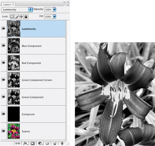
FIG 8.20 This combination of layers, components and modes cannot be achieved with Photoshop’s native functions, and yet it generally renders a favorable black-and-white result with any image. You need the power of Layers to achieve this.
Try It Now
1. Open the Sample13.psd image on the CD.
2. Run the RGBL Components action.
3. Shut off the view for the Luminosity, Green Component and Blue Component layers. This leaves the view for the Red Component layer. The flower petals are dark but brighter and more contrasty than the background. The background can be darkened, the petals lightened and the contrast enhanced using the following steps.
4. Activate the Green Component layer, and turn on the view. Invert the layer content (Command+I / Ctrl+I), change the mode to Overlay, and reduce the opacity to 24%. This should darken the background and lighten the petals. Inverting the layer changes the content to a negative of the original, in this case making the petals light and the background dark in the Green Component layer.
5. Activate the Blue Component layer, and turn on the view. Apply a Gaussian Blur of 10 pixels, change the mode to Soft Light and change the opacity to 60%. This will serve to smooth out the roughness of the blue component and allow it to be applied to enhance the contrast and soften the image, both at the same time (see the result in Figure 8.21).
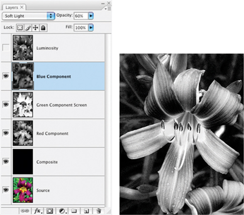
FIG 8.21 Using the same components as from the original procedure with different mode and opacity creates a much different result.
This calculation will actually not be likely to produce a good black-and-white conversion on many images. The point is that depending on where you start, how you see an image and how you use the content to make calculations, you can come to very different ends. If you are up to it, try an experiment: start with the Blue Component layer, and see where that leads. See if you can envision the result you want to get and attain it using what you know about layers.
Summary
Separations are the core of another powerful element of Photoshop: Channels. Channels are a powerful tool in their own right; however, when layers are used correctly to their capability, they can virtually make Channels and channel functions unnecessary. Using separated components as described in this chapter gives you tremendous flexibility with the application of components in a more straightforward model than using channels or channel functions. Layering components can help you break away from not only from the limitations of channels, but also of other tools such as Channel Mixer and Calculations.
There is a lot to explore in standard separations of RGB, CMYK, luminosity and color, and perhaps even more to explore with custom separations. That doesn’t merely mean that you have an opportunity to explore separations of CMYK where you fiddle with the GCR settings, but that you can create completely custom separations for unique colors. Clever use of custom separations may help you define selections and masks, or create unique black-and-white results. Creating black-and-white images via separations and calculations is not necessarily an endpoint. Black-and-white images offer opportunity for hand-colored effects and redefining the color that makes the image.
At this point we have looked at the power of layers and a variety of applications. We’ve taken a tour of the process of image editing, defined an approach and process, examined most of the more powerful layer functions, and applied each in turn. As we turn the corner into the final two chapters, we will re-focus on process by taking images through corrective steps from beginning to end with layers as our guide to the result.
For more helpful actions for image adjustments in Photoshop, visit the website for this book at http://www.photoshopcs.com