Table of Contents for
Responsive Web Design with HTML5 and CSS3 Essentials
 Responsive Web Design with HTML5 and CSS3 Essentials
Published by
Packt Publishing, 2016
Responsive Web Design with HTML5 and CSS3 Essentials
Published by
Packt Publishing, 2016
- Cover
- Table of Contents
- Responsive Web Design with HTML5 and CSS3 Essentials
- Responsive Web Design with HTML5 and CSS3 Essentials
- Credits
- About the Authors
- About the Reviewer
- www.PacktPub.com
- Preface
- What you need for this book
- Who this book is for
- Conventions
- Reader feedback
- Customer support
- 1. Introducing Responsive Web Design
- Exploring how RWD works
- Understanding the elements of RWD
- Appreciating the importance of RWD
- Comparing RWD to adaptive design
- Preparing our development environment
- Considering a suitable strategy
- Exploring best practices
- Setting up a development workflow
- Exploring mistakes
- Summary
- 2. Creating Fluid Layouts
- Understanding the different layout types
- Setting the available viewport for use
- Exploring the benefits of flexible grid layouts
- Understanding the mechanics of grid layouts
- Implementing a prebuilt grid layout
- Exploring the use of flexbox
- Visiting the future
- Taking it further
- Summary
- 3. Adding Responsive Media
- Making video responsive
- Making text fit on screen
- Summary
- 4. Exploring Media Queries
- Understanding media queries
- Identifying common breakpoints
- Putting our theory into practice
- Creating some practical examples
- Examining some common mistakes
- Exploring best practices
- Taking things further
- Summary
- 5. Testing and Optimizing for Performance
- Understanding why pages load slowly
- Optimizing the performance
- Testing the performance of our site
- Best practices
- Providing support for older browsers
- Considering cross-browser compatibility
- Testing site compatibility
- Following best practices
- Summary
A question that must always be at the back of the minds of any developer is how to retain maximum browser compatibility when constructing sites; it does not matter if the UI is stunning, if it doesn't work on enough browsers!
Any site that does not support its target browser market (that is, those browsers most used by the site's audience), risks losing business and reputation. This makes it even more important that we not only test our site, but test it across multiple browsers if we're making it responsive. This testing is a key step to retaining customer satisfaction and market share. There are a number of techniques we can use to help reduce issues related to cross-browser compatibility, before we consider some of the solutions available, let's look at some of the challenges we face in more detail.
The utopia for any designer is to have a 100% bug-free site; the reality though is that while this will always be at the back of the developer's mind, it is impossible to achieve!
Why? One key consideration is the use of CSS3 (and those elements of CSS4 that now exist); although support is constantly improving, there is still a way to go before every browser offers consistent support for all CSS3 attributes. In the same vein, support for responsive media and media queries are not supported by older browsers, so we must consider how much support we can afford to offer for these browsers.
Considering possible solutions, we've touched on three elements which are key considerations for responsive sites, to work around them, there are a number of options open to us.
We can (and should) consider constructing our site using the base content that will work on any browser; we can then progressively enhance the experience, by adding extra features that may only work for some browsers, but are not key to the overall user experience. In comparison, we could take the view that we build our site around the latest technologies and browsers, but then add in support to allow content to degrade gracefully, when used on older browsers.
Can we work around these issues? Absolutely, there are a number of different options on offer. There is one point we should consider though, using a JavaScript solution isn't necessarily the best solution; there are a number of tips and tricks we can use to help retain compatibility. Before we touch on these, let's take a moment to consider some of the options available when using JavaScript as a solution:
- Adapt.js: This script doesn't use media queries; instead, it works out which CSS file to load, based on values such as the browser's window size. This script can be downloaded from http://adapt.960.gs/.
- Modernizr.js: This library allows us to pick and choose elements we want to support, such as HTML5
<video>elements; when chosen elements are detected as being in use, Modernizr provides us with an option to gracefully degrade content, and not let our site simply fall into a heap! The library is available from https://modernizr.com/download. - Respond.js: This solution uses JavaScript to provide breakpoint support for older browsers (such as IE6-8), based on the sizes we specify when configuring our pages. We can use it in a similar way to standard CSS-based breakpoints, such as setting device-width to 414px, to cater for an iPhone 6 Plus in portrait mode. More details and downloads of the library are available from http://responsejs.com/.
Although these solutions will work perfectly well, they all suffer from one inherent drawback—JavaScript! In this modern age, most browsers are likely to have this switched on by default, but there will be instances where this is not the case; let's explore why using JavaScript isn't always the right solution.
During the construction phase of any responsive site, we will naturally need to work out which breakpoints we want to support. This will be based on statistics such as Google Analytics. The normal route would then be to use media queries in our CSS style sheet to load elements when needed. This works fine for recent browsers (anything within the last year to eighteen months), but with older browsers this will prove an issue.
We can support them using JavaScript-based solutions:
- All of the solutions we've touched on need JavaScript – if it's switched off, then they clearly won't work!
- Some of the solutions use AJAX to fetch content (such as Adapt.js). This can show a brief flash when getting the content. The developers have tried to reduce this to the absolute minimum, but no matter how much they try, it will be impossible to get rid of it; it will look odd when used on a site.
- Some of the solutions won't work on older devices, Adapt.js being a good example.
- We can use a default style sheet if JavaScript is switched off, using
<no script>tags; the question is, what screen size do we support? - Using JavaScript will require the server to load additional resources, which places additional demand on the server; JavaScript was always designed to provide additional functionality, and shouldn't be used when that functionality is key to the successful operation of a site.
Clearly these drawbacks make for a less attractive option when using JavaScript! Two key questions we should ask though are: do we really need to support older browsers, such as IE8, and use JavaScript to support them?
The question of which browsers to support is one that will divide both developers and designers; on one hand, we will have creatives that want to take advantage of the latest functionality, while others will state that we must support as wide a browser population as possible.
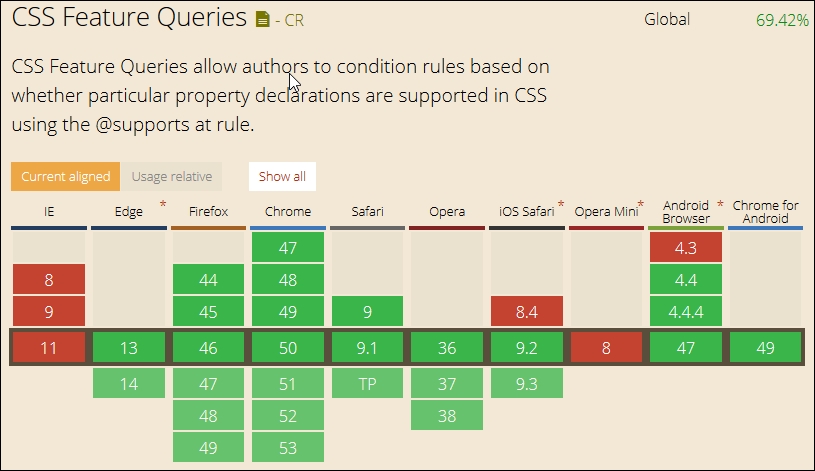
The latter might normally require the use of JavaScript for older browsers; given that this requires extra resources that we must call from the server, it makes sense to use CSS where possible. To this end, we can consider using the relatively new @supports feature, (or feature queries, to give it its technical name). This works in a similar way to media queries and allows us to style elements based on whether the chosen style is supported in the browser. This has gained great support in most recent browsers (except of course IE, which always likes to be different!):
We can then create code such as this in the main markup:
<article class="artwork">
  <img src="myimg.jpg" alt="cityscape">
</article>
And style it using code such as this, when it is supported:
@supports (mix-blend-mode: overlay) {
  .artwork img {
    mix-blend-mode: overlay;
  }
}
However if it isn't supported, then we simply add a feature query to allow it to gracefully degrade:
@supports not(mix-blend-mode: overlay) {
  .artwork img {
    opacity: 0.5;
  }
}
The beauty of this is that we're not reliant on any external libraries to help support what might be core functionality; we can use this to support new CSS3 styles and existing properties. Granted, it means that our style code base will increase, but this is tempered as the increase is in an existing file that is already cached, than having to call an additional new resource from the server!