Table of Contents for
Responsive Web Design with HTML5 and CSS3 Essentials
 Responsive Web Design with HTML5 and CSS3 Essentials
Published by
Packt Publishing, 2016
Responsive Web Design with HTML5 and CSS3 Essentials
Published by
Packt Publishing, 2016
- Cover
- Table of Contents
- Responsive Web Design with HTML5 and CSS3 Essentials
- Responsive Web Design with HTML5 and CSS3 Essentials
- Credits
- About the Authors
- About the Reviewer
- www.PacktPub.com
- Preface
- What you need for this book
- Who this book is for
- Conventions
- Reader feedback
- Customer support
- 1. Introducing Responsive Web Design
- Exploring how RWD works
- Understanding the elements of RWD
- Appreciating the importance of RWD
- Comparing RWD to adaptive design
- Preparing our development environment
- Considering a suitable strategy
- Exploring best practices
- Setting up a development workflow
- Exploring mistakes
- Summary
- 2. Creating Fluid Layouts
- Understanding the different layout types
- Setting the available viewport for use
- Exploring the benefits of flexible grid layouts
- Understanding the mechanics of grid layouts
- Implementing a prebuilt grid layout
- Exploring the use of flexbox
- Visiting the future
- Taking it further
- Summary
- 3. Adding Responsive Media
- Making video responsive
- Making text fit on screen
- Summary
- 4. Exploring Media Queries
- Understanding media queries
- Identifying common breakpoints
- Putting our theory into practice
- Creating some practical examples
- Examining some common mistakes
- Exploring best practices
- Taking things further
- Summary
- 5. Testing and Optimizing for Performance
- Understanding why pages load slowly
- Optimizing the performance
- Testing the performance of our site
- Best practices
- Providing support for older browsers
- Considering cross-browser compatibility
- Testing site compatibility
- Following best practices
- Summary
Throughout the course of this chapter, we've covered the different parts that make up media queries as I am sure someone once said, it is time.
Yes, it's time to put this into practice. Before we start creating some real-world examples, let's create something we can use to explore the effects of adding a media query to code. We'll start by resizing some simple boxes on screen:
- From the code download, go ahead and extract a copy of
queryexample.htmland save it to our project area. - In a text editor, go ahead and add the following styles; we'll start with some basic styles for our boxes:
body { background-color: #F3ECDD; text-align: center; font-family: Arial, sans-serif; color: #ffffff; min-width: 33%; } .box { width: 100%; background: #905f20; border-radius: 0.625em; margin: 0; } .box2{ min-width: 100%; background: #6b8e6f; border-radius: 0.625rem; float: left; } h3:after{ content: ' is less than 30rem'; } - We then need to add our media query; go ahead and add this below the closing bracket of the previous style rule:
@media screen and (min-width: 30rem) { body { background-color: #C7B47C; } .box { width: 49.5%; float: left; } .box + .box { margin-left: 1%; margin-bottom: 0.625em;} h3:after{ content: ' is greater than 30rem'; } } - Save the file as
queryexample.csswithin thecsssubfolder in our project area.
If we try previewing the results of our work by running queryexample.css, we should see something akin to this screenshot:
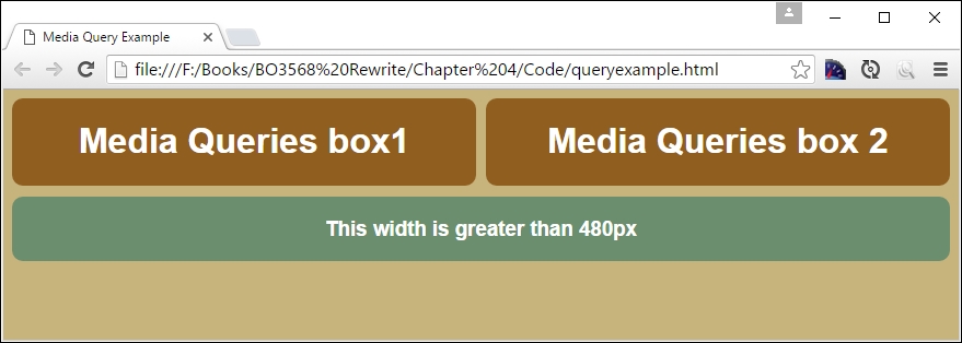
Let's understand what happened here. In the core CSS (in step 3), we added three <div> elements to our markup. Since we gave them 100% width and height is set to auto by default, they'll be stacked as a series of boxes.
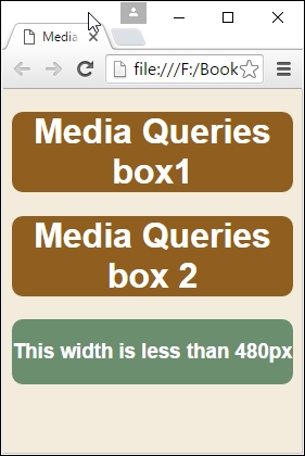
If we use Chrome and activate the device mode as we did before, then we can begin to see the effect of resizing the browser window. If we resize it to below 30rem in width as our breakpoint (or 480px), we can see the boxes realign and resize at the same time; the background also changes to a light brown color:
Now that we've seen the basics of setting up queries, let's take this a step further and create some practical examples. We'll begin with setting up a simple web page to which we will apply some simple media queries.