Table of Contents for
Responsive Web Design with HTML5 and CSS3 Essentials
 Responsive Web Design with HTML5 and CSS3 Essentials
Published by
Packt Publishing, 2016
Responsive Web Design with HTML5 and CSS3 Essentials
Published by
Packt Publishing, 2016
- Cover
- Table of Contents
- Responsive Web Design with HTML5 and CSS3 Essentials
- Responsive Web Design with HTML5 and CSS3 Essentials
- Credits
- About the Authors
- About the Reviewer
- www.PacktPub.com
- Preface
- What you need for this book
- Who this book is for
- Conventions
- Reader feedback
- Customer support
- 1. Introducing Responsive Web Design
- Exploring how RWD works
- Understanding the elements of RWD
- Appreciating the importance of RWD
- Comparing RWD to adaptive design
- Preparing our development environment
- Considering a suitable strategy
- Exploring best practices
- Setting up a development workflow
- Exploring mistakes
- Summary
- 2. Creating Fluid Layouts
- Understanding the different layout types
- Setting the available viewport for use
- Exploring the benefits of flexible grid layouts
- Understanding the mechanics of grid layouts
- Implementing a prebuilt grid layout
- Exploring the use of flexbox
- Visiting the future
- Taking it further
- Summary
- 3. Adding Responsive Media
- Making video responsive
- Making text fit on screen
- Summary
- 4. Exploring Media Queries
- Understanding media queries
- Identifying common breakpoints
- Putting our theory into practice
- Creating some practical examples
- Examining some common mistakes
- Exploring best practices
- Taking things further
- Summary
- 5. Testing and Optimizing for Performance
- Understanding why pages load slowly
- Optimizing the performance
- Testing the performance of our site
- Best practices
- Providing support for older browsers
- Considering cross-browser compatibility
- Testing site compatibility
- Following best practices
- Summary
Mobile to overtake fixed Internet access by 2014.
This bold prediction from Mary Meeker, an analyst from KPCB, back in 2008 came true in 2013-14, when mobile Internet usage rose to 51% in the USA, overtaking desktop for the first time. Part of this can be attributed to the use of media queries, the basic principles of which haven't changed since their official introduction in 2000.
Today, queries exist to support anything from high-resolution images to monochrome screens and handheld devices; throughout the course of this chapter, we'll continue with the theme of discovering what is possible with just a browser and text editor, and show you that it isn't always necessary to download anything to create media queries when building responsive sites.
In this chapter, we will cover the following topics:
- Understanding the basics of media queries
- Creating breakpoints and removing the need for them
- Exploring best practice and common mistakes
- Taking things further
Curious? Let's get cracking.
Open a browser; let's go and visit some sites.
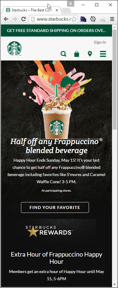
Now, you may think I've lost my marbles, but stay with me. I want to show you a few examples. Let's take a look at a couple of example sites at different screen widths. How about this example from my favorite coffee company, Starbucks:

Try resizing the browser window; if you get small enough, you will see something akin to this:
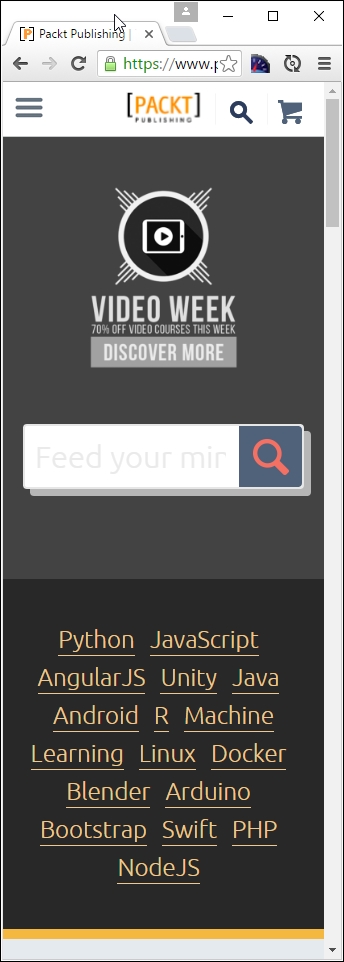
Here's another example—we cannot forget the site for the publisher of this book, Packt:
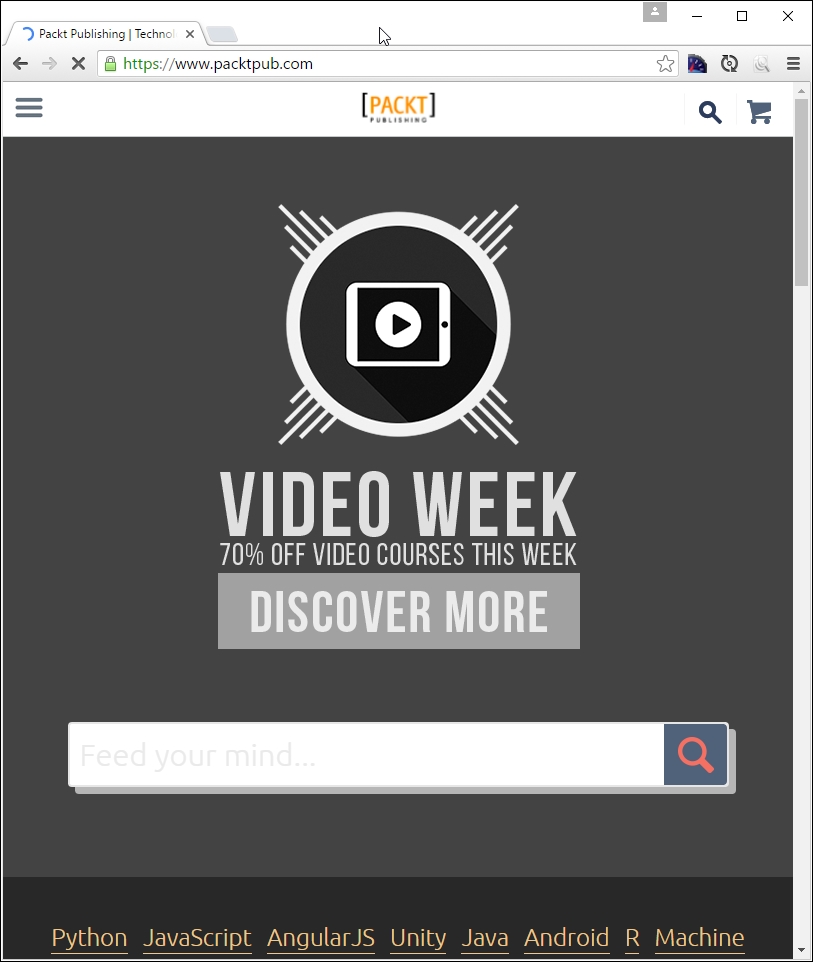
Try changing the size of your browser window. If we resize it enough, it will show this:
For our third and final example, let's go visit CSS Tricks, the site created by Chris Coyier, at http://www.css-tricks.com:
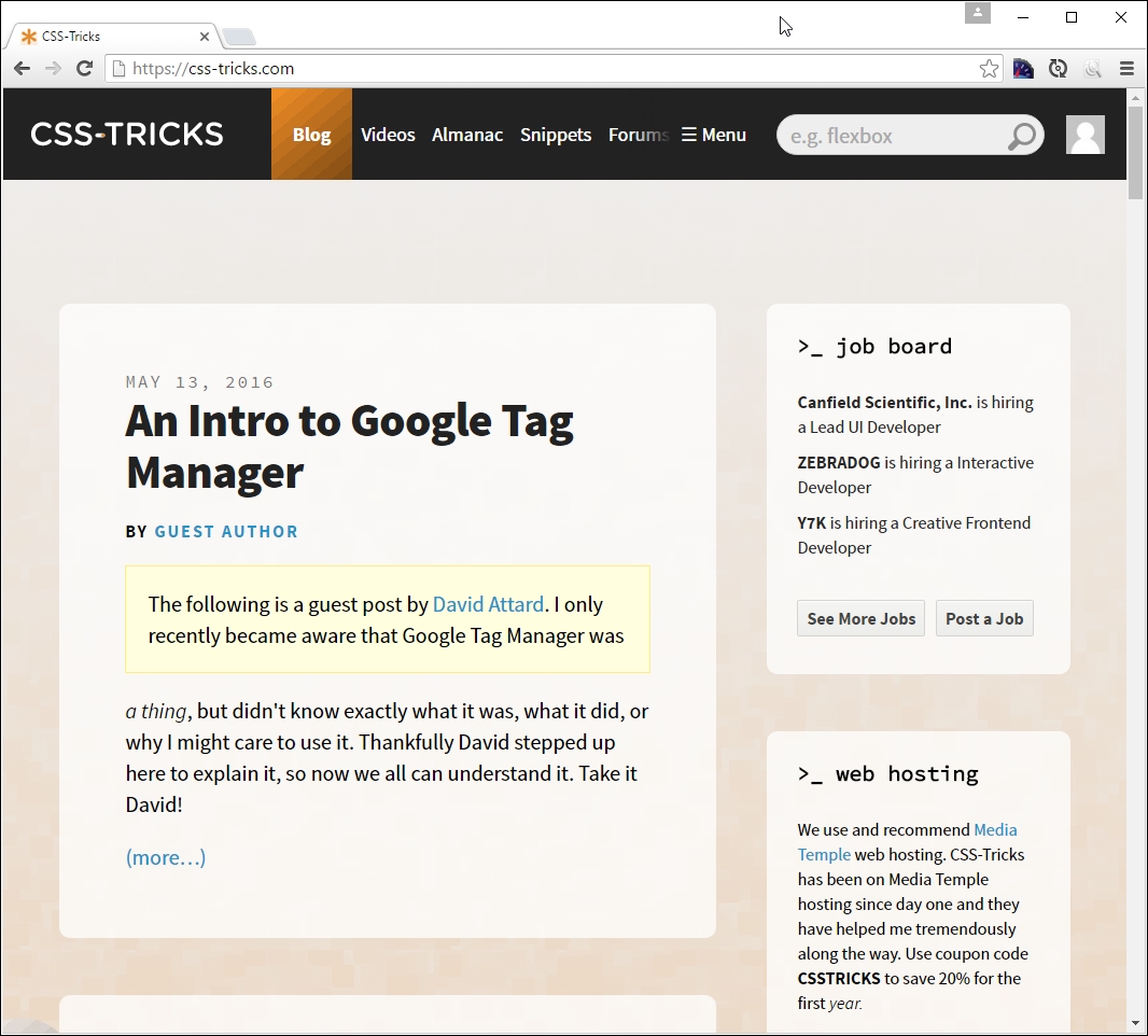
If we resize this to a smaller width, this is what we will get:
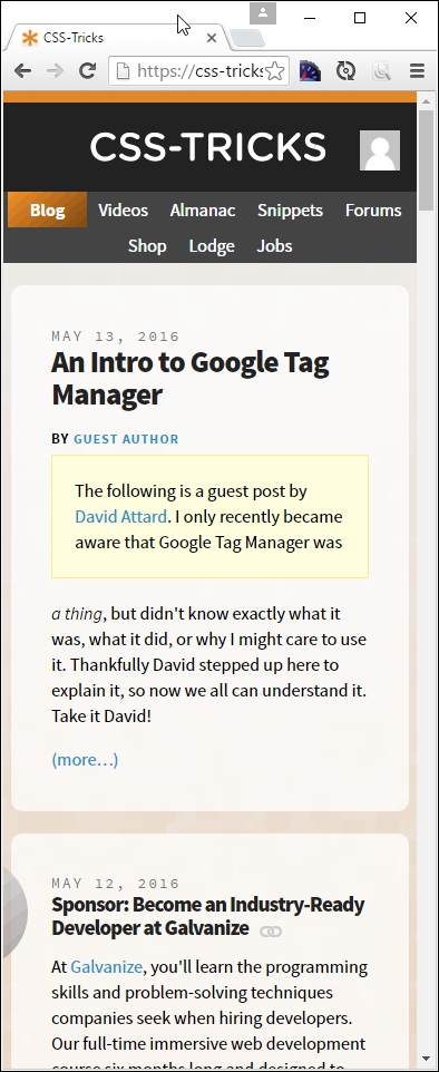
Now, what was the point of all that, I hear you ask? Well, it's simple. All of them use media queries in some form or other; CSS Tricks uses the queries built into WordPress, Packt's site is hosted using Drupal, and Starbucks' site is based around the Handlebars template system.
The key here is that all use media queries to determine what should be displayed; throughout the course of this chapter, we'll explore using them in more detail, and see how we can use them to better manage content in responsive sites. Let's make a start with exploring their make up in more detail.