Table of Contents for
Responsive Web Design with HTML5 and CSS3 Essentials
 Responsive Web Design with HTML5 and CSS3 Essentials
Published by
Packt Publishing, 2016
Responsive Web Design with HTML5 and CSS3 Essentials
Published by
Packt Publishing, 2016
- Cover
- Table of Contents
- Responsive Web Design with HTML5 and CSS3 Essentials
- Responsive Web Design with HTML5 and CSS3 Essentials
- Credits
- About the Authors
- About the Reviewer
- www.PacktPub.com
- Preface
- What you need for this book
- Who this book is for
- Conventions
- Reader feedback
- Customer support
- 1. Introducing Responsive Web Design
- Exploring how RWD works
- Understanding the elements of RWD
- Appreciating the importance of RWD
- Comparing RWD to adaptive design
- Preparing our development environment
- Considering a suitable strategy
- Exploring best practices
- Setting up a development workflow
- Exploring mistakes
- Summary
- 2. Creating Fluid Layouts
- Understanding the different layout types
- Setting the available viewport for use
- Exploring the benefits of flexible grid layouts
- Understanding the mechanics of grid layouts
- Implementing a prebuilt grid layout
- Exploring the use of flexbox
- Visiting the future
- Taking it further
- Summary
- 3. Adding Responsive Media
- Making video responsive
- Making text fit on screen
- Summary
- 4. Exploring Media Queries
- Understanding media queries
- Identifying common breakpoints
- Putting our theory into practice
- Creating some practical examples
- Examining some common mistakes
- Exploring best practices
- Taking things further
- Summary
- 5. Testing and Optimizing for Performance
- Understanding why pages load slowly
- Optimizing the performance
- Testing the performance of our site
- Best practices
- Providing support for older browsers
- Considering cross-browser compatibility
- Testing site compatibility
- Following best practices
- Summary
The concept of web design used to be simple—designers would develop content for a popular desktop screen, using a layout which works for most devices to produce well laid-out and cohesive pages.
With changes in technologies and the introduction of mobile devices, the whole experience changed—gone are the days when a static layout would suffice. In its place came a need for content that responded to the available screen real estate, with elements automatically resized or hidden, according to the device being used. This forms the basis for a technique popularized by Ethan Marcotte, which we now know as responsive web design (RWD). Throughout the course of this chapter, we will begin to explore what this means, and understand some of the principles that are key to this concept.
In this chapter, we will cover the following topics:
- Getting started with RWD
- Understanding the elements of RWD
- Understanding the importance of RWD
- Exploring how RWD works
- Setting up a development workflow
- Exploring best practice and common errors
Curious? Let's get started!
If one had to describe RWD in a sentence, then responsive design describes how the content is displayed across various screens and devices such as mobiles, tablets, phablets, or desktops. To understand what this means, let's use water as an example. The property of water is that it takes the shape of the container in which it is poured. It is an approach in which a website or a webpage adjusts its layout according to the size or resolution of the screen dynamically. This ensures that users get the best experience while using the website.
We develop a single website that uses a single code base. This will contain fluid, flexible images, proportion-based grids, fluid images, or videos and CSS3 media queries to work across multiple devices and device resolutions. The key to making them work is the use of percentage values, in place of fixed units such as pixels or ems-based sizes.
The best part of this is that we can use this technique without the knowledge or need of server based/backend solutions; to see it in action, we can use Packt's website as an example. Go ahead and browse https://www.packtpub.com/web-development/mastering-html5-forms; this is what we will see as a desktop view:

The mobile view for the same website shows this, if viewed on a smaller device:
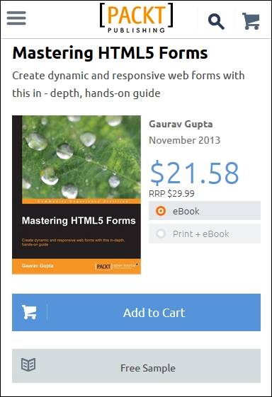
We can clearly see the same core content is being displayed (that is, an image of the book, the buy button, pricing details, and information about the book), but elements such as the menu have been transformed into a single drop-down located in the top-left corner. This is what RWD is all about—producing a flexible design that adapts according to which device we choose to use, in a format that suits the device being used.
Let's try it with another technology site; I am sure some of you are familiar with the A List Apart site (hosted at http://alistapart.com and founded by the well-known Jeffery Zeldman):
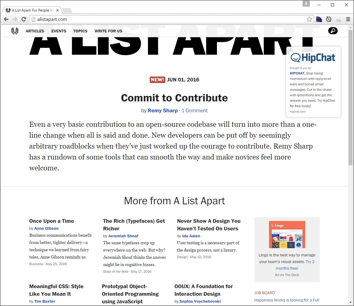
Try resizing your browser window. This is a perfect example of how a simple text site can reflow content with minimal changes; in place of the text menu, we now have the hamburger icon (which we will cover later in this chapter):

While the text in this site realigns with minimal difficulty, it seems that the top image doesn't work so well—it hasn't resized as part of the change, so will appear cut off on smaller devices.
Although this may seem a complex task to achieve, in reality it boils down to following some simple principles; how these are implemented will ultimately determine the success of our site. We've seen some in use as part of viewing Packt's and A List Apart's sites at various sizes—let's take a moment to explore the principles of how responsive design works, and why it is an important part of creating a site for the modern Internet.