Table of Contents for
Responsive Web Design with HTML5 and CSS3 Essentials
 Responsive Web Design with HTML5 and CSS3 Essentials
Published by
Packt Publishing, 2016
Responsive Web Design with HTML5 and CSS3 Essentials
Published by
Packt Publishing, 2016
- Cover
- Table of Contents
- Responsive Web Design with HTML5 and CSS3 Essentials
- Responsive Web Design with HTML5 and CSS3 Essentials
- Credits
- About the Authors
- About the Reviewer
- www.PacktPub.com
- Preface
- What you need for this book
- Who this book is for
- Conventions
- Reader feedback
- Customer support
- 1. Introducing Responsive Web Design
- Exploring how RWD works
- Understanding the elements of RWD
- Appreciating the importance of RWD
- Comparing RWD to adaptive design
- Preparing our development environment
- Considering a suitable strategy
- Exploring best practices
- Setting up a development workflow
- Exploring mistakes
- Summary
- 2. Creating Fluid Layouts
- Understanding the different layout types
- Setting the available viewport for use
- Exploring the benefits of flexible grid layouts
- Understanding the mechanics of grid layouts
- Implementing a prebuilt grid layout
- Exploring the use of flexbox
- Visiting the future
- Taking it further
- Summary
- 3. Adding Responsive Media
- Making video responsive
- Making text fit on screen
- Summary
- 4. Exploring Media Queries
- Understanding media queries
- Identifying common breakpoints
- Putting our theory into practice
- Creating some practical examples
- Examining some common mistakes
- Exploring best practices
- Taking things further
- Summary
- 5. Testing and Optimizing for Performance
- Understanding why pages load slowly
- Optimizing the performance
- Testing the performance of our site
- Best practices
- Providing support for older browsers
- Considering cross-browser compatibility
- Testing site compatibility
- Following best practices
- Summary
Best practices...ugh...what a phrase!
This is a phrase that is used and abused to death; the irony is that when it is used, it isn't always used correctly either! This said, there are some pointers we can use to help with designing our responsive sites; let's take a look at a few:
- Use a minimalistic approach: This is very popular at the moment and perfect for responsive design. It reduces the number of elements we have to realign when screen dimensions change; it also makes editing content and elements easier, if our page content is at a minimum.
- Always go for a mobile-first strategy: It is essential to consider what the user experience will be like on a mobile device. The proportion of those who own a mobile device or phone is higher than those who own their own PC; we must make sure that content is both viewable and legible on a smaller screen. Once we've nailed this, we can then extend our design for larger screens.
- Understand the need for speed: A slow site is a real turn off for customers; a good guideline to aim for when measuring load times is for around 4–5 seconds. There can be many reasons why a site is slow to load, from slow site feeds to poorly optimized hardware, but one of the easier to rectify is large images. Make sure that you've been through all of the media that is loaded, and checked to ensure it has been fully optimized for your site.
- Try to keep the site design as clean as possible: Eliminate anything that is not needed to convey your message. It goes without saying, but why use 20 words, when we can get our message across in 10?
- Make use of the hamburger icon: No, I'm not referring to food, irrespective of what size it is (sorry, bad joke!). Instead, make use of it as a consistent point of access to your site. Be mindful though that users may not want to have to keep tapping on it to access everything, so if you have menu items that are frequently used more often, then consider exposing these in your site, and hide anything less important under the hamburger icon.
- Don't use small button sizes for anything: Bear in mind that many users will use fingers to tap on icons, so any clickable icons should be large enough to allow accurate tapping and reduce any frustration with accidentally tapping the wrong link.
- Familiarize yourself with media queries: As we'll see later in Chapter 4, Exploring Media Queries, we can use media queries to control how content is displayed under certain conditions on different devices. These play a key role in responsive design; it's up to us to get the right mix of queries based on what we need to support!
There are plenty more best practices we can follow, but we shouldn't simply follow them blindly; apart from the risk of our sites losing any stand-out appeal (that is, all being the same), not all best practice necessarily applies or is even accurate.
Instead, it is worth researching what others have done online; over time, you will begin to see common threads—these are the threads that should form the basis for any discussions you may have with regards to the design of your site.
There are some practices we should follow, not necessarily because they are best practices, but borne more out of common sense; a great example is touch. When we are designing for touch, there are some pointers which we should use that will influence our design, so let's take a look at these in more detail.
Although there are lots of tips and pointers we can use to help improve our responsive development, there is one subject that is worth exploring in more detail—touch.
Why? The answer is simple—working responsively is not just about writing code; anyone can write code. The difference though, and that which separates great developers from the crowd, is the thought given to how that site looks and works. Care paid at this point will separate exceptional sites from the also-rans; to get a feel for the kind of decisions and thoughts one might go through, let's take a look at what we might have to consider when designing for touch:
- Aim to use the corners. On small screens, the lower left corner is frequently the easiest to access; for tablets, the top corners work better. We must consider putting any call to action buttons in these locations, and adapt our designs to realign automatically if different devices are used.
- Don't make the buttons too small. A good guideline for tap targets (including buttons) is usually around 44 points (or 3.68rem).
- Avoid placing items too closely together to prevent someone accessing the wrong item by mistake. A good starting point for spacing to avoid interface errors is a minimum of 23pt (or 1.92rem).
- Use natural interactions and create navigation that works well with common hand gestures, such as swiping. This screenshot shows some of the example hand gestures we can use, and that we must allow for when constructing our sites:
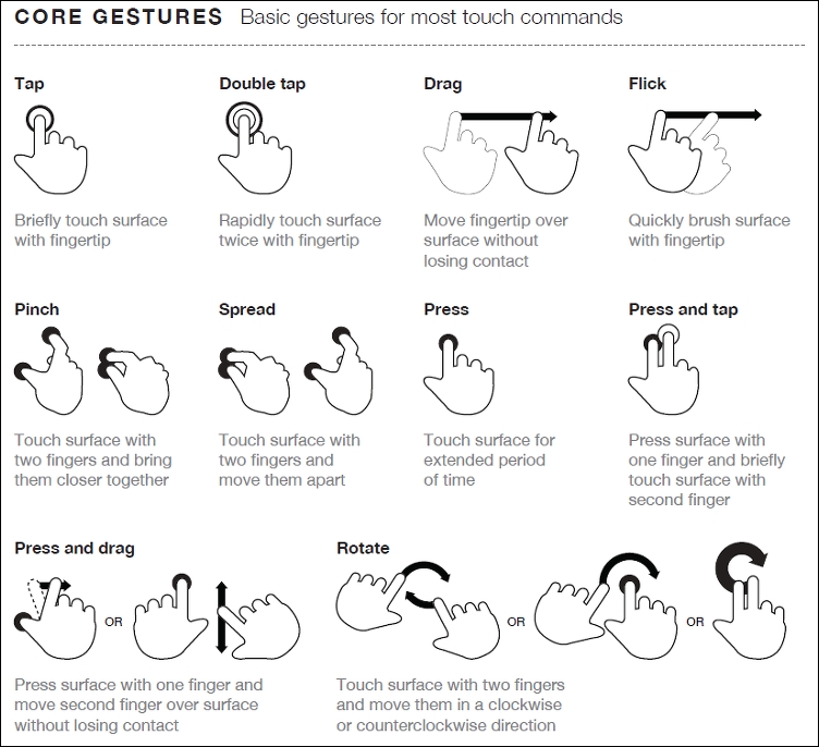
Source: The Next Web (http://www.thenextweb.com)
Hover stages are a no-no in responsive design—these do not exist. Any calls to action should be based around tapping, so make sure your design takes this factor into consideration.
Phew, there are a few things to think of there! The key thing though is that while writing code is easy, creating an effective responsive design takes time and resources, and should always be a continuous affair, so our designs can stay fresh and up to date.
It's time for us to move on to a different subject, now that we've explored some of the guidelines and tips we can use to help with responsive development, it's time for us to consider our workflow. We may already have an established one for producing standard sites, making a shift to incorporate responsive design may require us making some changes to our processes, so let's go and explore what a typical workflow could look like when working with responsive design.