Table of Contents for
Responsive Web Design with HTML5 and CSS3 Essentials

Version ebook / Retour

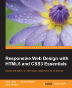
Cover image for bash Cookbook, 2nd Edition Responsive Web Design with HTML5 and CSS3 Essentials by Asoj Talesra Published by Packt Publishing, 2016
  1. Cover
  2. Table of Contents
  3. Responsive Web Design with HTML5 and CSS3 Essentials
  4. Responsive Web Design with HTML5 and CSS3 Essentials
  5. Credits
  6. About the Authors
  7. About the Reviewer
  8. www.PacktPub.com
  9. Preface
  10. What you need for this book
  11. Who this book is for
  12. Conventions
  13. Reader feedback
  14. Customer support
  15. 1. Introducing Responsive Web Design
  16. Exploring how RWD works
  17. Understanding the elements of RWD
  18. Appreciating the importance of RWD
  19. Comparing RWD to adaptive design
  20. Preparing our development environment
  21. Considering a suitable strategy
  22. Exploring best practices
  23. Setting up a development workflow
  24. Exploring mistakes
  25. Summary
  26. 2. Creating Fluid Layouts
  27. Understanding the different layout types
  28. Setting the available viewport for use
  29. Exploring the benefits of flexible grid layouts
  30. Understanding the mechanics of grid layouts
  31. Implementing a prebuilt grid layout
  32. Exploring the use of flexbox
  33. Visiting the future
  34. Taking it further
  35. Summary
  36. 3. Adding Responsive Media
  37. Making video responsive
  38. Making text fit on screen
  39. Summary
  40. 4. Exploring Media Queries
  41. Understanding media queries
  42. Identifying common breakpoints
  43. Putting our theory into practice
  44. Creating some practical examples
  45. Examining some common mistakes
  46. Exploring best practices
  47. Taking things further
  48. Summary
  49. 5. Testing and Optimizing for Performance
  50. Understanding why pages load slowly
  51. Optimizing the performance
  52. Testing the performance of our site
  53. Best practices
  54. Providing support for older browsers
  55. Considering cross-browser compatibility
  56. Testing site compatibility
  57. Following best practices
  58. Summary

Summary

Creating media queries opens up a world of possibilities; we are not forced to have to display every element of our page on each device, so we can be selective about what we show our visitors, depending on which device they use! We've covered a number of useful techniques in this chapter by just using a browser and text editor, so let's take a moment to recap what we've learned.

We kicked off with a quick interactive demo, to illustrate how some well-known sites have used media queries to realign content on screen, before exploring how media queries are constructed.

We then took a look at some of the different types. This included covering both the media types and features we can use to control how content is displayed. We then moved onto looking at some common breakpoint statements that we might use in our code, before exploring how we might need to create custom breakpoints for specific purposes. We also saw how we may even be able to reduce or remove breakpoints, if we make some simple changes to our code.

Next up came a more practical look at using media queries. We explored how we can use them to make content on a simple page display properly in a mobile device (allowing its orientation). We then covered how we can use media queries to control whether we display images of standard or higher resolution on screen.

We then rounded off the chapter with a look at fixing some common mistakes that we might make, before covering some of the options available that we can step up to using once we're more accustomed to creating media queries for our sites.

Phew, we've come to the end of the technical development; there is one more topic we should cover as part of our journey through creating responsive sites. There is no point in creating solutions if they are not efficient. Your visitors will not thank you if it takes an age to load a site! We can fix this with some simple tips and tricks, as part of optimizing our code. We'll explore this topic, and more, in the next chapter.