Table of Contents for
Responsive Web Design with HTML5 and CSS3 Essentials
 Responsive Web Design with HTML5 and CSS3 Essentials
Published by
Packt Publishing, 2016
Responsive Web Design with HTML5 and CSS3 Essentials
Published by
Packt Publishing, 2016
- Cover
- Table of Contents
- Responsive Web Design with HTML5 and CSS3 Essentials
- Responsive Web Design with HTML5 and CSS3 Essentials
- Credits
- About the Authors
- About the Reviewer
- www.PacktPub.com
- Preface
- What you need for this book
- Who this book is for
- Conventions
- Reader feedback
- Customer support
- 1. Introducing Responsive Web Design
- Exploring how RWD works
- Understanding the elements of RWD
- Appreciating the importance of RWD
- Comparing RWD to adaptive design
- Preparing our development environment
- Considering a suitable strategy
- Exploring best practices
- Setting up a development workflow
- Exploring mistakes
- Summary
- 2. Creating Fluid Layouts
- Understanding the different layout types
- Setting the available viewport for use
- Exploring the benefits of flexible grid layouts
- Understanding the mechanics of grid layouts
- Implementing a prebuilt grid layout
- Exploring the use of flexbox
- Visiting the future
- Taking it further
- Summary
- 3. Adding Responsive Media
- Making video responsive
- Making text fit on screen
- Summary
- 4. Exploring Media Queries
- Understanding media queries
- Identifying common breakpoints
- Putting our theory into practice
- Creating some practical examples
- Examining some common mistakes
- Exploring best practices
- Taking things further
- Summary
- 5. Testing and Optimizing for Performance
- Understanding why pages load slowly
- Optimizing the performance
- Testing the performance of our site
- Best practices
- Providing support for older browsers
- Considering cross-browser compatibility
- Testing site compatibility
- Following best practices
- Summary
For some, the creation of what we now know as RWD is often associated with Ethan Marcotte, although its true origins date from earlier when the site Audi.com was first created, which had an adaptive viewport area as a result of limitations within IE at the time.
If one had to describe what RWD is, then Ethan sums it up perfectly:
Rather than tailoring disconnected designs to each of an ever-increasing number of web devices, we can treat them as facets of the same experience. We can design for an optimal viewing experience, but embed standards-based technologies into our designs to make them not only more flexible, but more adaptive to the media that renders them. In short, we need to practice responsive web design.
In a nutshell, RWD is about presenting an experience for customers on different devices that allows them to interact with your business. It is important to note though that the experience does not have to use the same process; it is more important that the customer can achieve the same result, even though they may arrive using a different route. So, how does RWD work?
RWD is a set of principles we should follow, but the overriding philosophy is about making content fluid. Gone are fixed values, at least for elements on the page; in their place, we use percentage values or em/rem units. Our page layout will use a fluid grid, which resizes automatically depending on the available viewport space.
One key concept that will help determine the success of our site is not one we might automatically associate with responsive design, but nevertheless will help: divine proportion.
Divine proportion, or the Golden Ratio as it is often known, is a way of defining proportions that are aesthetically pleasing—it is perfect for setting the right proportions for a responsive layout. The trick behind it is to use this formula:
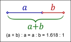
Imagine we have a layout that is 960px wide, which we want to split into two parts, called a and b. Divine proportion states that the size of a must be 1.618 times the size of b.
To arrive at our column widths, we must complete the following calculations:
- Divide the width of our site (960px) by 1.618. This gives 593px (rounded to the nearest integer).
- Subtract 593px from 960px. This gives 367px.
It's a simple formula, but one that will help improve the communication of content for your site—we're not forced to have to use it though; sites are available on the Internet that don't follow this principle. It does mean that they must ensure that the content is still equally balanced, to give that pleasing effect—this isn't so easy!
The important point here though is that we shouldn't be using fixed pixel values for a responsive site; instead, we can use rem units (which resize better) or ideally percentage values.
To translate this into something more meaningful, we can simply work out the resulting column widths as percentages of the original size. In this instance, 593px equates to 62% and 367px is 38%. That would give us something like this:
#wrapper { width: 60rem;}
#sidebar { width: 32%; }
#main { width: 68%; }
Okay, a little theoretical, but hopefully you get the idea! It's a simple formula, but a great way to ensure that we arrive at a layout which is properly balanced; using percentage values (or at the very least rem units), will help make our site responsive at the same time.