Table of Contents for
Responsive Web Design with HTML5 and CSS3 Essentials
 Responsive Web Design with HTML5 and CSS3 Essentials
Published by
Packt Publishing, 2016
Responsive Web Design with HTML5 and CSS3 Essentials
Published by
Packt Publishing, 2016
- Cover
- Table of Contents
- Responsive Web Design with HTML5 and CSS3 Essentials
- Responsive Web Design with HTML5 and CSS3 Essentials
- Credits
- About the Authors
- About the Reviewer
- www.PacktPub.com
- Preface
- What you need for this book
- Who this book is for
- Conventions
- Reader feedback
- Customer support
- 1. Introducing Responsive Web Design
- Exploring how RWD works
- Understanding the elements of RWD
- Appreciating the importance of RWD
- Comparing RWD to adaptive design
- Preparing our development environment
- Considering a suitable strategy
- Exploring best practices
- Setting up a development workflow
- Exploring mistakes
- Summary
- 2. Creating Fluid Layouts
- Understanding the different layout types
- Setting the available viewport for use
- Exploring the benefits of flexible grid layouts
- Understanding the mechanics of grid layouts
- Implementing a prebuilt grid layout
- Exploring the use of flexbox
- Visiting the future
- Taking it further
- Summary
- 3. Adding Responsive Media
- Making video responsive
- Making text fit on screen
- Summary
- 4. Exploring Media Queries
- Understanding media queries
- Identifying common breakpoints
- Putting our theory into practice
- Creating some practical examples
- Examining some common mistakes
- Exploring best practices
- Taking things further
- Summary
- 5. Testing and Optimizing for Performance
- Understanding why pages load slowly
- Optimizing the performance
- Testing the performance of our site
- Best practices
- Providing support for older browsers
- Considering cross-browser compatibility
- Testing site compatibility
- Following best practices
- Summary
Before we start on our workflow, let me ask you a question:
Does your workflow process consist of steps such as planning, creating static wireframes, building static designs, adding code then testing, and finally launching your site? Sounds familiar?
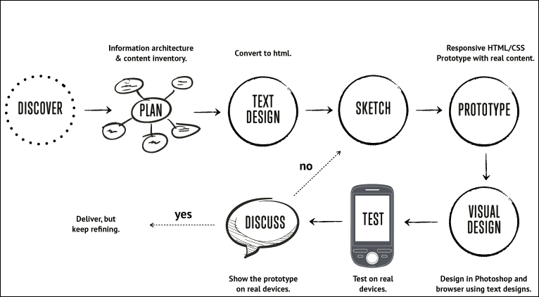
If so, then be prepared for a change; using the waterfall process (to which these steps align), doesn't work so well when creating responsive sites; working responsively is all about being agile, as illustrated by the developer Viljami Salminen from 2012:
Source: Viljami Salminen, 2012
Although his design dates from 2012, it is still perfectly valid today; before you all put your hands up in horror, let me explain why a waterfall process doesn't work for responsive design:
- We cannot hope to get support for lots of different devices built into our site in one go. We must focus on a small viewport first, before gradually enlarging it to include support for larger devices and finally desktops.
- When working responsively, our focus must be on content first, and not the layout; the reason for this is that our media queries should be built around where content breaks if we change the width of our available viewport. This removes the dependency on building for specific devices, and means that we can build queries that can serve multiple devices.
Our development process needs to be iterative, and focus chiefly on text and media before constructing the layout. Throughout the process, we should keep in constant contact with our client, as part of each iteration; gone are the days of working towards the big reveal! With all of this in mind, let's go through Viljami's illustration in more detail.
This initial stage is the same for any sites, but is particularly important for responsive design, given the different viewport sizes we have to support in our site. It's all about getting to know the client and their requirements. We must get an understanding of our client's business, their competitors, and what they are trying to achieve.
It's at this point we should be asking questions such as, "Why would people come to your site?", "What is the main goal you are trying to achieve?", and "Who are your main competitors?" The more we ask, the more we can understand and therefore better advise our clients on the best solution to fit their requirements.
When we've gathered all of the knowledge needed to construct our site, we now need to plan how it will look. We can start with the initial concept, but rather than work on the layout as we might have done before, we should concentrate on the content elements, and creating user stories and the information architecture. We can then put this together in a rudimentary HTML wireframe. At this stage, layout is less critical; it's key that we get the right view of information, before focusing on where it sits on the page.
At this point, we now need to focus on writing our content in textual form. This often under-rated step is probably the most important of the whole process; without it, people won't come to see the site, and there is no point in designing a layout if we don't know what will fill it! A useful tip is to keep styling to a minimum and to concentrate on the content; at least initially, we can see how it will display in a long, continuous format, and if it works for those who use screen readers. Don't worry though, we can always refine the text during the prototyping stage; at this point, we need something to start with, but it will be unlikely we get it right first time.
For our next step, forget using PhotoShop; it takes forever and is a real pain to make corrections quickly! The agile process is about making quick and easy changes and there is no better medium than traditional pen and paper. We can even print off the plain text content and sketch around, it if that helps, it will save us hours of development time, and can even help reduce those occasions when you hit the developer's block of...what now?
With the design sketched, it's time to create a prototype. This is when we can see how the layout will respond to different viewport sizes and allow us to highlight any potential challenges, or react to any issues that are reported by our client. It's good to be aware of the various breakpoints, but ultimately we should let our content determine where these breakpoints should be set in our design.
We might be used to prototyping our design using PhotoShop, but a better alternative is to switch to using a browser. We can use a service such as Proto.io (https://proto.io/) or Froont (http://froont.com/). This gives us extra time to get the harder elements right, such as typography; it also helps to remove any constraints that we might have with tools such as PhotoShop.
Although we may still be at a prototype stage, it's important to introduce testing early on. The number of breakpoints we may end up having in our design means that testing on multiple devices will take time! As an alternative to running a big test and reveal, we can instead perform multiple tests and reveals. This has the benefit of reducing the impact of any rollbacks (if something doesn't fit requirements), but also helps to keep the client involved with the project, as they can see progress take place during development.
The one thing we absolutely must do is to test over multiple devices. It's an expensive proposition to maintain a test suite with these devices, so it's worth asking colleagues, friends, and family to see if they can help test for you. They can at least browse the site and help pinpoint where things don't look right (to use customer parlance). It's up to us to work out where the root cause is, and implement a fix to help improve the user experience.