Table of Contents for
Responsive Web Design with HTML5 and CSS3 Essentials
 Responsive Web Design with HTML5 and CSS3 Essentials
Published by
Packt Publishing, 2016
Responsive Web Design with HTML5 and CSS3 Essentials
Published by
Packt Publishing, 2016
- Cover
- Table of Contents
- Responsive Web Design with HTML5 and CSS3 Essentials
- Responsive Web Design with HTML5 and CSS3 Essentials
- Credits
- About the Authors
- About the Reviewer
- www.PacktPub.com
- Preface
- What you need for this book
- Who this book is for
- Conventions
- Reader feedback
- Customer support
- 1. Introducing Responsive Web Design
- Exploring how RWD works
- Understanding the elements of RWD
- Appreciating the importance of RWD
- Comparing RWD to adaptive design
- Preparing our development environment
- Considering a suitable strategy
- Exploring best practices
- Setting up a development workflow
- Exploring mistakes
- Summary
- 2. Creating Fluid Layouts
- Understanding the different layout types
- Setting the available viewport for use
- Exploring the benefits of flexible grid layouts
- Understanding the mechanics of grid layouts
- Implementing a prebuilt grid layout
- Exploring the use of flexbox
- Visiting the future
- Taking it further
- Summary
- 3. Adding Responsive Media
- Making video responsive
- Making text fit on screen
- Summary
- 4. Exploring Media Queries
- Understanding media queries
- Identifying common breakpoints
- Putting our theory into practice
- Creating some practical examples
- Examining some common mistakes
- Exploring best practices
- Taking things further
- Summary
- 5. Testing and Optimizing for Performance
- Understanding why pages load slowly
- Optimizing the performance
- Testing the performance of our site
- Best practices
- Providing support for older browsers
- Considering cross-browser compatibility
- Testing site compatibility
- Following best practices
- Summary
We built our responsive pages, improved the look and feel, and also optimized the performance of our site. But before the application goes live, it is the duty of a developer (or dedicated tester) to test the performance of the website.
There is a set of tools that we can use:
- mobiReady (http://ready.mobi/): This free tool is used for testing the performance of a responsive website across different resolutions in parallel. It gives each page a score out of five, based on factors such as data sent or received and number of requests made.
- Webpagetest (http://www.webpagetest.org/): This online tool helps in testing the performance of a website with respect to specific location and browser for which we want the result. We can test a page for a number of different factors, such as caching static content, effective use of CDN, or if keep alive has been enabled.
- Google's Pagespeed InsightsTool (https://developers.google.com/speed/pagespeed/insights/): With this tool we can do the speed analysis of our responsive website for both desktop and mobile versions of the site. This tool rates the website out of 100 for the speed and user experience, providing a list of pointers we can fix, along with details on how they can be fixed.
- IntoDns.com (http://www.intodns.com/): Although this is not a performance testing tool as such, it can help determine if the performance of our site is affected, as a result of issues with our DNS. It provides a report of the website and mail servers, which we can use to fix issues and ultimately help keep performance at peak efficiency.
- YSlow (http://yslow.org/): This bookmarklet grades any chosen website into either one of three predefined rulesets or a custom one we define. It offers suggestions for where we can improve the page's performance, based on an array of different values, such as DNS lookups, making AJAX cacheable, avoiding CSS expressions, and configuring eTags.
These are some useful tools, which can help with performance and optimization of our site (with plenty more available online). However, we are missing out on an opportunity, if we focus purely on these tools. What about using what is already available in our browser?
Most (if not all) browsers have some form of DOM inspector built in to the browser or available as a standalone option. These can provide some good information that we can use as a precursor to more in-depth details from external services. To see what is possible, let's explore what we can get if we run a simple check on a website in a DOM inspector; for this example, we will use that doyenne of online retail, Amazon; it has sites available all over the world. We will perform the same test twice: the first one will be as a desktop browser and the second as an (emulated) mobile version, using Chrome's built-in DOM inspector.
For our test, we'll start with a desktop browser—we'll use Google's Chrome as it has a good set of tools; other browsers can also be used, but you may not get quite the same results. Let's make a start, using Amazon as the basis for our test:

Here's what we need to do:
- Fire up Chrome, then press Shift + Ctrl + I to display the Developer toolbar.
- Look for the red record button toward the top left of the window, then click on it.
- Revert back to Chrome's window, then browse to http://www.amazon.com. As soon as the page has finished loading, click on the red record button to stop recording.
At this point, we will have a set of results we can browse through, similar to this extract:
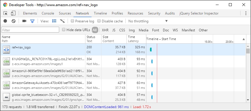
At first, these results may not make sense, but the details we want are at the foot of the window.

This shows the number of server requests made, the amount of content transferred, and the times taken to initially parse the DOM (DOMContentLoaded); then, fully download the content (indicated by Finish and the Load event being fired).
Even though Amazon's site downloads a reasonable amount of content, they've made good use of some of the tricks we've covered, to help reduce bandwidth usage and increase page rendering speed. How can we tell? Try clicking on the bottom two links shown in the screenshot (or links 4 and 5 in the asset list shown within the browser).
The first link shows a minified CSS style sheet; if we look at it in more detail, it is possible to surmise that some of the links within were generated using an automated process. The PNG filename in one example is over 70+ characters long! The use of long names will increase the file size of the file concerned; images need to be accurately named, but with sensible filename lengths!
Considering the size of the page and the number of requests, it is possible to think that this website faces performance issues. However, if we look more carefully, we can see a lot of content is being loaded in the background. This means we're still providing a good user experience, with prioritized content being loaded first, and content of lesser priority being loaded in the background.
Note
To learn more about what all of the settings mean within the Network tab of Chrome's developer toolbar, take a look at the main documentation on the Google Developer's site, at http://bit.ly/2ay9H8g.
Let's change track now, and focus on viewing the same site on a mobile device—this time the iPhone 6 Plus.
We perform the same test again, but this time set Chrome to emulate an iPhone 6 Plus, then we should see this:

The real test though is in the number of requests made, amount of data transferred, and the time taken to load the page. This time around, our browser made 103 requests, with 1.8 MB transferred from the server and completed the total download in approximately 12 seconds:

Here, we can clearly see that to provide best user experience to its customers, Amazon has cleverly reduced the page size and the number of requests.
We should constantly monitor our sites for performance; with CSS3 attributes being added or updated frequently, we can begin to update our site and start to remove dependencies on external libraries, which allows us to increase the speed of our site and ultimately provide a better user experience.