Table of Contents for
Responsive Web Design with HTML5 and CSS3 Essentials
 Responsive Web Design with HTML5 and CSS3 Essentials
Published by
Packt Publishing, 2016
Responsive Web Design with HTML5 and CSS3 Essentials
Published by
Packt Publishing, 2016
- Cover
- Table of Contents
- Responsive Web Design with HTML5 and CSS3 Essentials
- Responsive Web Design with HTML5 and CSS3 Essentials
- Credits
- About the Authors
- About the Reviewer
- www.PacktPub.com
- Preface
- What you need for this book
- Who this book is for
- Conventions
- Reader feedback
- Customer support
- 1. Introducing Responsive Web Design
- Exploring how RWD works
- Understanding the elements of RWD
- Appreciating the importance of RWD
- Comparing RWD to adaptive design
- Preparing our development environment
- Considering a suitable strategy
- Exploring best practices
- Setting up a development workflow
- Exploring mistakes
- Summary
- 2. Creating Fluid Layouts
- Understanding the different layout types
- Setting the available viewport for use
- Exploring the benefits of flexible grid layouts
- Understanding the mechanics of grid layouts
- Implementing a prebuilt grid layout
- Exploring the use of flexbox
- Visiting the future
- Taking it further
- Summary
- 3. Adding Responsive Media
- Making video responsive
- Making text fit on screen
- Summary
- 4. Exploring Media Queries
- Understanding media queries
- Identifying common breakpoints
- Putting our theory into practice
- Creating some practical examples
- Examining some common mistakes
- Exploring best practices
- Taking things further
- Summary
- 5. Testing and Optimizing for Performance
- Understanding why pages load slowly
- Optimizing the performance
- Testing the performance of our site
- Best practices
- Providing support for older browsers
- Considering cross-browser compatibility
- Testing site compatibility
- Following best practices
- Summary
So, what is flexbox?
It's a module that has been designed to provide a more efficient way to layout and distribute space around items in a container, particularly if their sizes are not yet known. We can set a number of properties to ensure that each item best uses the available space around it, even if its size changes.
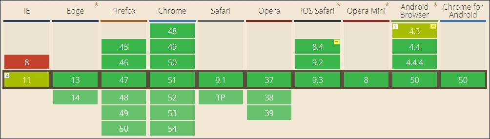
At the time of writing, this is a W3C Candidate Recommendation; this means that it is effectively on the last call before becoming a browser standard in late 2016. This should be something of a formality though, as most browsers already support it as a standard:
To fully understand how it all works is outside the scope of this book, but to help get started, we can run a quick demo, and explore some of the main features:
- From the code download that accompanies this book, go ahead and extract copies of
flexbox.htmlandflexbox.css; store the HTML markup at the root of our project area, and the CSS style sheet in thecsssubfolder of our project area. - Try previewing
flexbox.htmlin a browser. For this, we will need to enable the browser's responsive mode (or device mode, depending on browser); if all is well, we should see something akin to this screenshot:
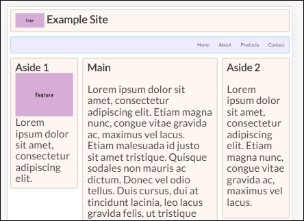
The demo is based on a pen created by Irina Kramer, which is available at https://codepen.io/irinakramer/pen/jcLlp; for the purposes of our demo, we focus on the example layout taken from that pen.
At first glance, this demo looks very straightforward. It could certainly use some help in the color department, but that's not what is of interest to us at the moment. If we dig deeper into the code, we can see that flexbox has been incorporated in various places; let's explore its use in more detail.
Taking a closer look at our code, we will find that a large part of it uses standard attributes, which we might find on any site. The code that is of interest to us starts on line 50; to understand its role, we first need to get our heads around the basic concept of flex layouts:
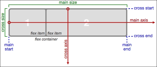
Source: W3C
In a nutshell, items are laid out following either the main axis (from main-start to main-end) or the cross axis (from cross-start to cross-end):
|
Property |
Purpose |
|
|
The primary axis along which flex items are laid out; this is dependent on the flex-direction property. |
|
|
The start and end points of flex items that are placed within the container (horizontally). |
|
|
A flex item's width or height, whichever is in the main dimension, is the item's main size. The main size property can be the item's height or width size. |
|
|
The axis perpendicular to the main axis. Its direction depends on the main axis direction. |
|
|
Start and end points for flex lines that are filled with items and placed into the container (vertically). |
|
|
This is the width or height of a flex item, whichever is in the cross dimension. |
With this in mind, let's explore some of the flexbox terms that have been used in our code; the initial few styles are standard rules that could apply to any site. The code of interest to us starts on line 29.
If we scroll down to that line, we are met with this:
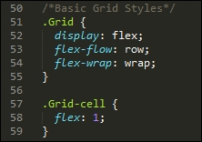
Our first attribute, display: flex, defines the container which contains the flex items; here, we're setting it to show items in rows, and to wrap from left to right. If we had a number of columns in our layout, and by this I mean more than just two or three, then we might use align-items and justify-content to ensure that each column was evenly spread throughout the row, irrespective of the width of each column.
With the .grid defined, we need to style our grid-cells, or the containers where we host our content. There are several properties we can apply; the one we've used is flex, which is shorthand for flex-grow, flex-shrink, and flex-basis. In our case, it is recommended that the shorthand version be used, as this will set the other values automatically; we've set flex-grow to 1, which indicates how much it should grow, in relation to other flexible items in the same container.
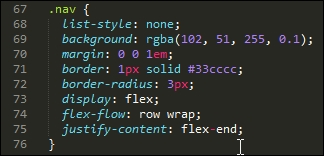
The next property of interest is in the .nav rule. Here, we've used flex-flow again, but this time we also justify-content; the latter controls how items are packed on each row (in this case, toward the end of the line):
Our last block of code of particular interest is this section, within the large screen media query:
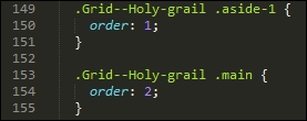
The order property simply specifies the order of each item in our flex container; in this case, we have .aside-1 and .aside-2 in position 1 and 2 respectively (not in shot), with the .main in the middle at position 2.
Note
There are a lot more properties we can set, depending on our requirements. Take a look at the source code on the original pen. There are plenty of reference sources about flexbox available online—as a start, have a look at Chris Coyier's guide, available at http://bit.ly/1xEYMhF.
Let's move on. We've explored some examples of what is possible now, but there is at least one downside with using flexbox. The technology works very well, but can add a fair amount of code and complexity when implementing in a site.
It's time to look for something simpler to use, which doesn't require quite the same effort to implement; enter CSS grid templates! This is still an early technology, with minimal browser support, but is already easier to implement. Let's dive in and take a look in more detail.