Table of Contents for
Understanding Compression
 Understanding Compression
Published by
O'Reilly Media, Inc., 2016
Understanding Compression
Published by
O'Reilly Media, Inc., 2016
- Cover
- nav
- Understanding Compression
- Understanding Compression
- section
- Foreword
- Preface
- 1. Let’s Not Be Boring
- 2. Do Not Skip This Chapter
- 3. Breaking Entropy
- 4. Variable-Length Codes
- 5. Statistical Encoding
- 6. Adaptive Statistical Encoding
- 7. Dictionary Transforms
- 8. Contextual Data Transforms
- 9. Data Modeling
- 10. Switching Gears
- 11. Evaluating Compression
- 12. Compressing Image Data Types
- 13. Serialized Data
- 14. Lossy Data Compression
- 15. Making the World a Little Smaller
- Glossary of Compression Words
- Index
- About the Authors
- Colophon
Chapter 12. Compressing Image Data Types
If you’re an application developer, chances are that the bulk of your app content is actually image data. Social media streams, shopping pages, even mapping information are all image content that must be sent down to your users, constantly.
Image compression is a really tricky subject. The individual lossy algorithms inside the compressors are gnarly (at best) and really should not be touched. But don’t lose hope. Although these compressors are mostly treated as black-box systems, there’s still a lot that your development team can do to influence the size of image content, and make it smaller.
Understanding Quality Versus File Size
Typically, image compressors provide an integer parameter that lets you define a quality metric for the image.1
As this value gets lower, so does the file size—and the image quality.
You see, this value mostly controls how aggressive the lossy algorithms are in transforming the data for better compression. So, lower quality means that more colors are discarded or more edge information is ignored, all to generate more duplicate symbols for subsequent statistical encoding stages.
Choosing the value for this quality metric should be a huge, important, time-consuming decision. Picking a value that is too low results in bad image artifacts, and users might complain about a lack of quality. Picking a value that is too high means you’re sending around larger files than you need to, and paying the cost for that as well. Figure 12-1 illustrates this progression.
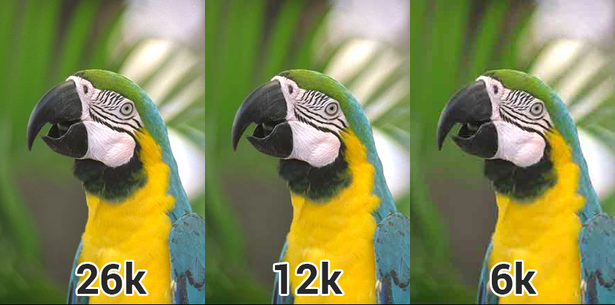
Figure 12-1. A set of images with different quality compression ratios—high, medium, and low; as the image size becomes smaller, the image quality degrades as well.
For small numbers of images, an artist or designer can pick the value of the quality metric manually. When they export the images from their tools, they can typically slide around the quality metric and find the right balance between image quality and final file size.
But this absolutely does not scale. If you have got 15 million users who upload pictures of their food creations to your backend, you can’t employ an army of artists to find that sweet spot. What’s worse: that sweet spot changes for each image. A really smooth icon or picture of a sunset will need a different quality value than a picture of a forest or someone’s face. The human brain is really tricky like that, and notices image quality errors differently in different types of situations.
So, the million-dollar question is: how do you find the right value, per image, at scale?
Sadly, most developers today don’t attempt to approach that problem and end up choosing one quality setting that they apply to all images in their service.
As the imgmin project points out, there’s generally only a small change in user-perceived quality for JPG compression between levels 75 and 100:
For an average JPEG, there is a very minor, mostly insignificant change in “apparent” quality from 100–75, but a significant file size difference for each step down. This means that many images look good to the casual viewer at quality 75, but are half as large than they would be at quality 95. As quality drops below 75, there are larger apparent visual changes and reduced savings in file size.
And imgmin further goes to show that most large websites tend to oscillate their images around this quality of 75 mark for almost all of their JPG images:
| Company image | JPG quality |
|---|---|
|
Google Images thumbnails |
74–76 |
|
Facebook full-size images |
85 |
|
Yahoo frontpage JPGs |
69–91 |
|
YouTube frontpage JPGs |
70-82 |
|
Wikipedia images |
80 |
|
Windows Live backgrounds |
82 |
|
Twitter user JPG images |
30–100 |
The issue here is that the values chosen aren’t ideal. They are usually the result of a single quality value chosen in a vacuum and then applied to all images coming through the system. In reality, some images could be compressed further with negligent quality loss, whereas other images will be compressed too much and not look good.
What Reduces Image Quality?
The human eye is pretty sensitive to a number of things when viewing images, including edges and gradients.2
Any time there’s an error with an edge between two known values, or a mismatch in what the brain thinks a smooth color should look like, it’s pretty noticeable (see Figure 12-2).

Figure 12-2. A gradient image at full smoothness (left) and compressed (right). The source image has almost 128 unique colors, whereas the compressed version has only 32. This lack of unique colors creates what is called “banding,” and it reduces the smooth quality of gradient images.
Quantization and blocking are some of the most common forms of image compression that result in visual issues. Most image compression algorithms break the data into blocks of pixels, quantized to reduce the number of unique colors involved in an image, and then make modifications based on locality of the image.
For example, JPG will group pixels into 8 x 8 blocks and attempt to find similar colors for that region. This works, because image data tends to have local regions of interest. That is, in a truly random image, there would be no correlation between two adjacent pixels; however, in a photograph, there tend to be gradients and similar colors. The result of this blocking process is that adjacent blocks might not share the same colors, and edges will be visible between the blocks, as demonstrated in Figure 12-3.
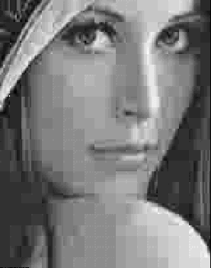
Figure 12-3. A close up of the Lena image that demonstrates the effect of blocking artifacts.
In fact, there’s an entire subset of research in understanding the types of visual artifacts that can result from compression.
Measuring Image Quality
Although the human brain can instinctively notice and define bad image quality, it doesn’t help when you’re trying to automate the process of determining whether a compressor is “good.” As such, it’s important to have a mathematical, measurable, and thus programmable concept of “image quality.”
Today, there are two competing ratios that tend to be used for evaluating image data: peak signal-to-noise ratio and structural similarity.
Peak signal-to-noise ratio (PSNR), in general terms, expresses the relationship between the maximum possible power of a signal and the power of corrupting noise that affects the fidelity of its representation (in logarithmic decibel scale). This measurement is built on the mean-square error (MSE) of the compressed image. Or rather, how much the values of the original image differ from the compressed image.
PSNR and the MSE term work in inverse relationship. When the amount of error is low, quality (and thus PSNR) will be high, and vice versa. The only catch here is that if you try to compute the MSE between two identical images, the value will be zero and hence the PSNR will be undefined (division by zero).
But there are a few problems with the PSNR measurement. Because it computes the mean-squared reconstruction error after denoising it, it is slightly biased toward over-smoothed (that is, blurry) results. In plain English, this means that if part of the texture is also removed, scores can be high (ignoring that part of the image is missing). So, PSNR is not always consistent with respect to the source image or the types of effects applied to it. In addition, the PSNR metric relies strictly on numeric comparison and does not take into account any of the biological factors of the human vision system. So what looks good from a numbers perspective might exhibit substantial quality issues when viewed by a human eye.
The structural similarity (SSIM) index was developed to address the PSNR issues and take human perception into account when comparing the compression quality of images. This is done by looking at the similarity of the edges between the source and the compressed image. SSIM might look like a better quality measurement, but it is more complicated to compute.
The value of SSIM ranges from [0,1], where 1 represents that the compressed image is identical to the source image, and 0 means that there is no viable similarity between the compressed image and the source image.
The images in Figure 12-4 show the calculated MSE (PSNR) and SSIM side by side for a series of pictures.
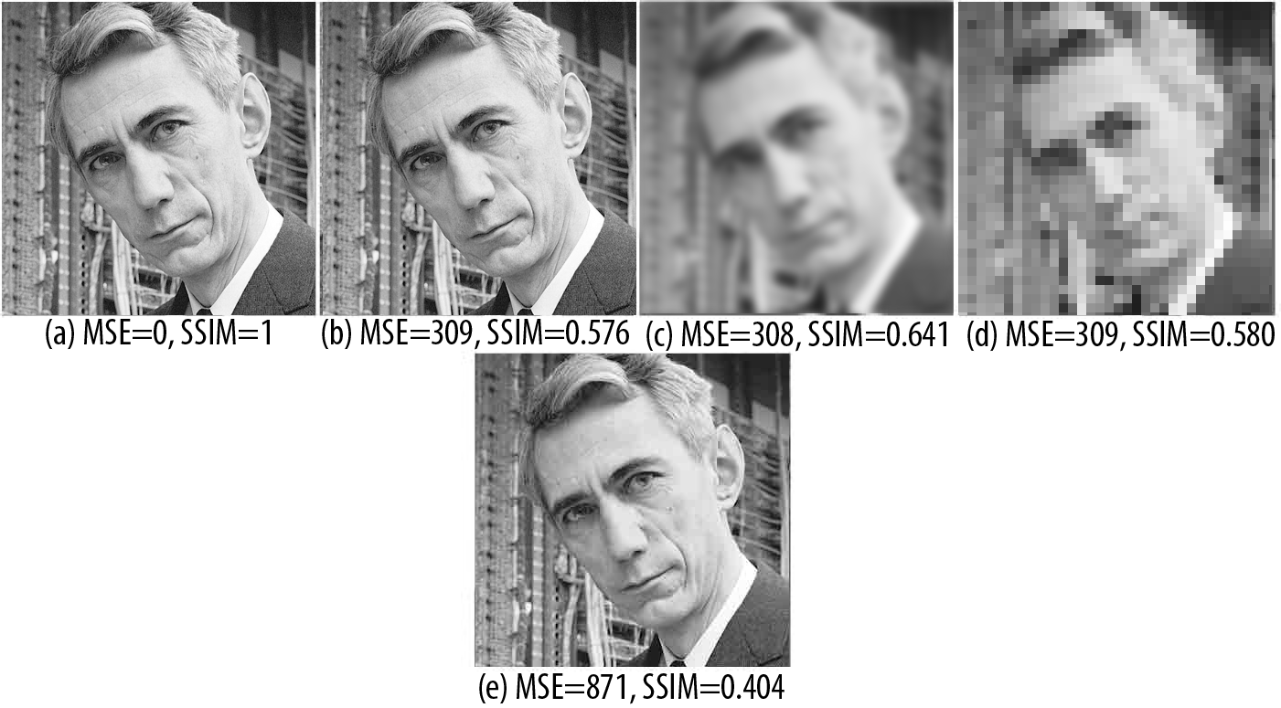
Figure 12-4. Showing off MSE (PSNR) and SSIM side by side: (a) is the original image; (b) adds white-noise to it; (c) is a blur effect; (d) is a result of low-quality JPG compression; and (e) is high-quality JPG compression. Notice how b, c, and d all have very similar MSE, despite the images being completely different from a visual perspective.
The idea here is that both PSNR and SSIM are numerical metrics that you can use to evaluate how good your image looks, post compression. This is much different than what most developers are doing, which is having an artist/designer hand-check the quality of a few samples and then choose a compression level for all of the rest of the images based on that.
Making This Work
It’s apparent, then, that different types of images will require different export settings to achieve the same level of visual quality perceived by the end user. A picture of a forest will have lots of edges and unique colors, and thus will need more bits to be able to represent it adequately, whereas a hand-drawn cartoon has lots of simple colors, and thus won’t create so many gradient problems. So, each image type should use a different set of export metrics. How you achieve this in your development environment is left to you, however.
Obviously, creating a cloud-compute resource to iteratively find the ideal quality is a straightforward path, but not all developers have access to the time and financial resources to achieve that.
Image Dimensions Are Important
In today’s mobile world, there’s a plethora of devices with many different screen sizes and varying processing power. This represents a huge problem for modern developers: What resolution should I use for my images?
Consider this: a user uploads an eight-megapixel photo from their phone.3
It makes sense that another user with the same screen resolution would want to see the image in the same size. But what about a user whose screen is only half or a quarter that size? This would be similar to the difference between viewing the image on a laptop monitor and a phone. Obviously, the smaller screen will display the image using fewer physical pixels because it has fewer of them to use, after all, but where should the resizing occur?
Sending the full-resolution image to the device and resizing it before rendering is certainly the easiest in terms of developer workload, but you are sending a lot of extra bits to a user who will never use them (or see them!). That’s basically money thrown down the drain.
A better solution is to resize the image in your cloud, or cache a resized image somewhere so that you can send a smaller image to a smaller screen. This isn’t too far-fetched a notion. Chances are, you already have the same image in multiple resolutions (Figure 12-5): a low-resolution thumbnail, a super-high one for fullscreen, and perhaps some in between for previews. You can use automation tools, locally or in the cloud, to generate all the resolutions you need with a single invocation rather than having your artists generate them by hand in an image editor.
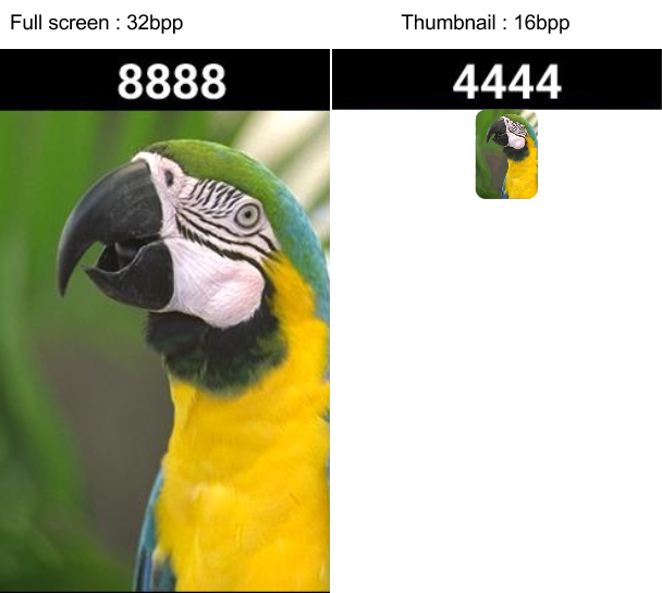
Figure 12-5. Image dimensions also open the door to being craftier with image quality. Fullscreen images have more visual real estate where users can identify quality problems. In smaller images, like thumbnails, you can accept a lot more quality format problems, because users might not notice or complain.
Sending appropriately sized images has multiple benefits:
-
You are sending less data to your users, which is faster and respects their data plans.
-
Your data takes up less space on the device, which is polite.
-
No image resizing is required. (Yes, yes, we know that the GPU could do that for you, but then you’re dealing with hacking a 4 MB image in GPU space, when it’s only being rendered as a thumbnail.)
-
Decoding is faster, loading is faster, displaying...well, you get the idea.
Choosing the Correct Image Format
As mentioned earlier, there’s an entire set of different kinds of image algorithms and formats out there today. Each one has unique trade-offs and use cases that you should be aware of when developing your image compression pipeline. Let’s talk about the big image formats that are used for mobile app and web development today: PNG, JPG, GIF, and WebP.
PNG
Portable Network Graphics (PNG) format is a lossless image format that uses a GZIP-style compressor to make its data smaller. Because the image format is lossless, the compressed image quality will be identical to your source image. This is great because you can maintain high quality while still achieving some compression, but not nearly as much compression as with lossy formats.
One of the biggest attractions of PNG is that it supports transparency. In addition to the red, green, and blue channels, it supports an alpha channel that defines which pixels to alpha-blend during rendering. This transparency support makes PNG quite attractive to the Web, and to applications where you might want an image on screen that isn’t exactly rectangular. However, you are paying to have a fourth color channel, as it increases the size of your uncompressed file.
The PNG format also allows for chunks of metadata in a file. This makes it possible for image editors (and client-side devices that create images) to attach extra data to the file. Although helpful as a format, this is a common source of bloat, and most of the time, including a data chunk that describes what program exported the image, is just irrelevant junk to a user. As such, it’s critically important that before sending these images around, you strip out this unneeded data.4
In truth, the lossless nature of the PNG file format can be a blessing and a curse. From a quality perspective, you achieve pixel-perfect results compared to your source image, but from a file-size perspective, complex images that don’t contain a lot of like-colored pixels will not compress very well. If you are required to use PNG files, for example, for Android asset bundles, or a transparent image for a web page, you can improve your image compression by applying a lossy preprocess to the image file before you save it in the PNG format.
Thankfully for you, you won’t need to write that crazy lossy preprocessing code on your own. There’s a plethora of applications that will do it on your behalf. A web search for “Lossy PNG compressor” will yield more results than you’ll know what to do with. Which preprocessor you choose depends heavily on your needs and the properties of your data set.
JPG
If you have no explicit need for transparency, the Joint Photographic Experts Group (JPEG or JPG for short) format will be a much better option. JPG is a format built for photographic images; it does not support alpha transparency. It contains a powerful lossy compressor that’s controlled by a quality metric which lets you trade off between file size and image quality.
The compression format behind JPG is built on block encoding. As illustrated in Figure 12-6, an image is broken into small 8 × 8 blocks, and various transforms are applied to each block. The transformed blocks are then combined and thrown at a statistical encoder.
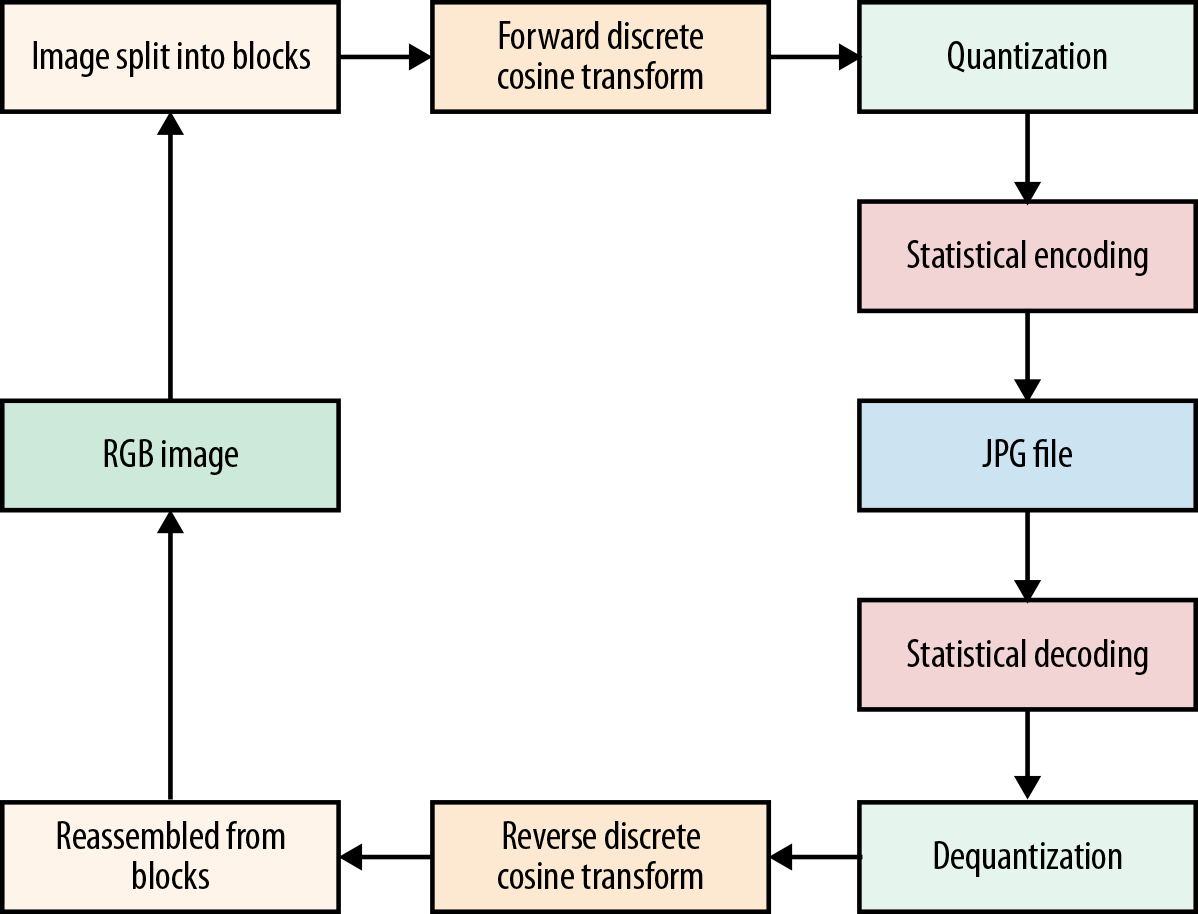
Figure 12-6. A high-level view of how the JPG algorithm works.
Blocking Is for Photos
Note that this blocking process is geared toward photographic images. If you were to compress an image with a much flatter color palette, such as a hand-drawn cartoon, the lossless compressor in PNG would perform better because it can collapse runs of similar colors into single compressed tokens.
Much like PNG, JPG files can also include metadata blocks, which means sneaky image editors or cameras can insert unneeded data into the files.5
JPG also brings the benefit that most mobile devices now come with hardware JPG encoders and decoders that the platforms take advantage of. This means that decode times for a JPG file can be significantly faster than for an equivalent PNG image.
GIF
GIF is another format that supports transparency, alongside with animation (which is the direct reason for the whole cats on the Internet thing...). The GIF format contains two stages of compression, a lossy palletization step that reduces the color pallette for the entire image to only 256 colors, followed by a lossless LZW compressor. Quantizing the colors of the image down to only 256 results in an aggressive quality reduction at the benefit of better compression sizes, which tends to produce better compression from the LZW end of things. GIF tends to be pretty well supported on the Web; however, native platforms don’t have uniform support for it.
WebP
The WebP format offers a middle ground between PNG and JPG. WebP supports a lossless mode and transparency as well as a lossy mode. Basically, you can choose between the best parts of JPG and PNG. Although that sounds like the Holy Grail of image formats, there are a few caveats with WebP; mainly, that it’s not 100% supported across all image browsers. Also, for mobile development, you typically need to include a library for it (except for Android, which supports it natively). In addition to that, the advanced nature of the lossy compression mode means that the performance of decompression on image load is a little slower than with JPG or PNG.
And Now for Choosing...
Given all these data points, there emerges a pretty clear flow diagram to decide what format to use for any given image.
-
Do you need transparency?
-
Yes → Does the client support WebP?
-
Yes → use WebP
-
No → use PNG
-
-
-
No → Does the client support WebP?
-
Yes → Use WebP (unless the performance becomes a problem)
-
No → Use JPG
-
GPU Texture Formats
Because the computer can’t draw images to the screen directly from their compressed formats, they first need to be loaded into memory and decompressed to a format that the system can use for rendering. By default, images are decompressed into 32–bits-per-pixel formats, with 8 bits going to each of the red, green, blue, and alpha channels (RGBA_8888 representations). Then the images need to be transferred to the GPU as textures, which means each bitmap you create requires CPU and GPU memory at the same time. The result of this is that regardless of the compression quality of your images on the wire, on your device these images still take up big chunks of memory.
The good news is that there exist compressed pixel formats from which the GPU can render. You take advantage of these by decompressing what comes over the wire into one of these alternate compressed formats that the GPU can render directly without a decompression step. Some of these formats are DXT, ETC, and PVR with different profiles for lossy compression (Figure 12-7).
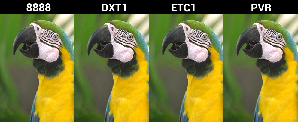
Figure 12-7. The lossy GPU formats DXT1, ETC1, and PVR are all smaller in bit-size to their RGBA_8888 counterparts, and retain high quality for many situations.
You can imagine that these compressed GPU texture formats are incredibly useful for video game developers. Not only do video games include a lot of imagery, it needs to be available in GPU memory somewhat persistently. So, any savings in memory footprint is a huge win for application smoothness and stability.
Vector Formats
Typically, images are arranged in a 2D grid of pixels, which represent the colors of the image itself. When viewed from a distance, the edging between the pixels disappears, and the human eye can see (is tricked into perceiving) smooth color gradients. This type of image is called a raster format image, and it can be rendered (relatively directly) to the screen.
But what if instead of sending around the final image, we send around a description of how that image was made? This is the concept behind vector image formats. Basically, these formats contain commands that when executed procedurally generate a final output image.
Figure 12-8 shows the same image in raster and vector format; some trade-offs are clearly evident.

Figure 12-8. An example raster image (left) compared to a vector image (right). Notice that the vector image is much simpler and contains less per-pixel detail. This is because the format type does not lend itself to producing high-quality data.
Vector formats have some interesting benefits. For example, for some types of complex images—think technical drawings that primarily consist of lines—a list of points and how to connect them is much more efficient than sending every pixel. (It’s basically a form of compression right there). Second, vector images can be scaled accurately, and that can be a huge win if you need to provide assets for thumbnails and icons and fullscreen images on a gazillion different devices.
There is a price in load time, however, because you need to create the rasterized image for the GPU by executing the commands. So, this type of format trades file size for client speed, saving bits on the wire, but incurring more client-side overhead to reconstruct the image when it’s being rendered.
One commonly used vector format is SVG. Think of SVG as a file format that makes it possible for you to store an image description at a very low memory footprint and generate a high-quality, resolution-independent image on the client, regardless of the size of the source data. One of the limitations of the SVG format is that it can represent only a certain type of image quality; that is to say that vector images tend to be simplistic, only using a set of primitive types to define how to generate colors on the screen. A field of grass in a prairie, for instance, would require too many complex shapes to yield compression savings.
Vector images are great for things like logos, technical drawings, or simple image patterns, whereas raster images are best for photos and other information-dense images.
Here is an example for your enjoyment. The following SVG produces the graphic in Figure 12-9:
<svg height="140" width="140">
  <defs>
    <filter id="f1" x="0" y="0" width="200%" height="200%">
      <feOffset result="offOut" in="SourceGraphic" dx="20" dy="20" />
      <feColorMatrix result = "matrixOut" in = "offOut"
        type = "matrix"
        values = "0.2 0 0 0 0 0 0.2 0 0 0 0 0 0.2 0 0 0 0 0 1 0"/>
      <feGaussianBlur result="blurOut" in="matrixOut"
        stdDeviation="10" />
      <feBlend in="SourceGraphic" in2="blurOut" mode="normal" />
    </filter>
  </defs>
  <rect width="90" height="90" stroke="green" stroke-width="3"
    fill="yellow" filter="url(#f1)" />
</svg>
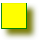
Figure 12-9. The graphic produced by the sample SVG file.
Eyes on the Prize
For modern applications, image content makes up the bulk of data that’s sent back and forth to users. Companies constantly send down thumbnails, news images, social media feeds, friend photos, and advertisements. Users, on the other hand, constantly upload pictures and content that they’ve created throughout their days. When you’re looking at decreasing the footprint of data in your applications, images are where you should begin. It’s the lowest-hanging fruit, and often small changes here can result in big wins elsewhere.
1 You might recognize this concept: when you save a JPG file out of Photoshop, it usually asks you what “quality level” you want.
2 When we look at a picture, we intuitively know whether it’s good quality. So, while “quality” is kinda fuzzy, it includes stuff such as color accuracy, sharpness, contrast, and distortion. But what we really want is to be able to measure that quality, and we’ll get to that in just a minute.
3 They took a picture of some Klingon blood pudding that they had for lunch.
4 Most photo-editing programs that export to PNG can strip out this information. There’s also a plethora of PNG-specific compressors that can do that for you.
5 This is how photos you take on your cellphone can be geo-tagged in your social media stream.
6 With that resolved, the debate has shifted to the proper pronunciation of “GIF.”