Table of Contents for
The Adobe Photoshop Lightroom Classic CC Book, Second Edition
 The Adobe Photoshop Lightroom Classic CC Book, Second Edition
Published by
Adobe Press, 2019
The Adobe Photoshop Lightroom Classic CC Book, Second Edition
Published by
Adobe Press, 2019
- Contents
- Cover Page
- Title Page
- Copyright Page
- Dedications
- Introduction
- Contents
- 1 Introducing Adobe Photoshop Lightroom
- 2 Importing photos
- 3 The Library module
- 4 Develop module image editing
- The Tone Curve Panel
- Easing the Workflow
- 5 The art of black and white
- 6 Sharpening and noise reduction
- 7 Exporting from Lightroom
- 8 Printing
- 9 Presenting your work
- 10 Managing your photos in Lightroom
- 11 Lightroom CC/mobile
- 12 Lightroom preferences and settings
- Index
8 Printing
How to get perfect prints and work efficiently in the Print module
Photograph: Trestle, Cowichan Valley Trail, BC, Canada © 2016 Martin Evening
Sony A7rII | 40mm | ISO 100 | f/14 @ 1/4
Digital printing has come a long way from the early days of Photoshop, when few photographers were convinced you could produce a digital output from a computer that would rival the quality of a photographic print. Graham Nash and Mac Holbert of Nash Editions were early pioneers of digital printing and the first people to demonstrate how inkjet technology could be used to produce print outputs onto high-quality art paper. In the intervening years, we have seen amazing breakthroughs in technology and pricing. These days, you can buy a photographic-quality printer for just a few hundred dollars. But, alas, many people still get beaten by the complexities of the operating system print dialogs and the inability to make print color management work for them.
Fortunately, the Print module in Lightroom can make your life much easier. Here, you are able to see previews of how the photographs will be laid out on the page. You can set up batches of images in a print queue to produce high-quality prints, or work in draft print mode to quickly generate sets of contact sheets. Plus, the built-in Print module sharpening means you can get nicely sharpened prints without resorting to specialist sharpening routines in Photoshop. Best of all, once you have mastered how to configure your print settings, you can save them as a template setting for more reliable and consistent print results.
The Print Module
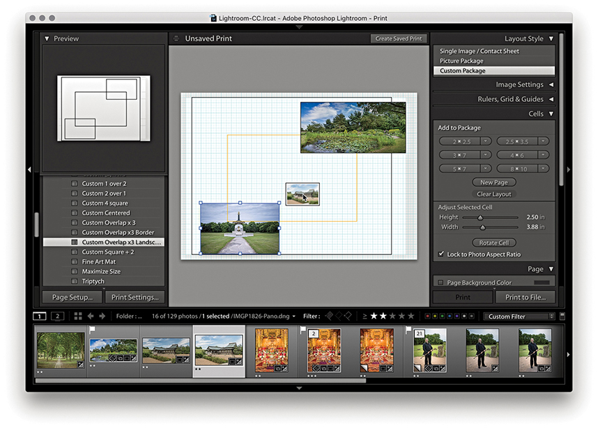
The Print module (Figure 8.1) provides you with complete control over the print page layout and provides proper-sized previews of the images that have been selected for printing. Starting from top right, the Layout Style panel offers a choice of print layouts: the Single Image/Contact Sheet layout, the Picture Package, or the Custom Package layout. The Image Settings panel can be used to apply basic rules such as how the selected image or images fill the cell areas and whether to rotate the images for the best fit, zoom and crop the photos to fit a cell, or add a stroke border.
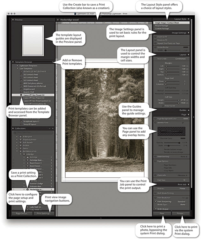
The Layout panel can then be used to define the margins, grid layout, and cell size for the images. To help you get started, you can choose from several templates in the Template Browser panel on the left, and you can preview the layout format in the Preview panel as you hover over the items in this list. The Template Browser print templates make it easy to switch print configurations and experiment with different page-layout setups. Once you have settled on a template design, you can easily apply it to other photos and then just click one of the print buttons to make a print.
The Guides panel lets you determine the visibility of various guide items, whereas the Page panel lets you add information to the print. Here, you can place your identity plate as a logo or as custom text and add a watermark plus other items, such as page numbers. You can also include additional file information below the print or individual print cells on a contact sheet and apply a custom page-background color.
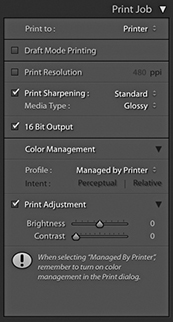
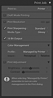
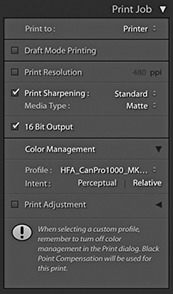
The Print Job panel then allows you to decide how the page or pages should be printed (there is no need for an Image Resize dialog in the Print module, because the Page Setup options and Print Resolution in the Print Job panel are all you need to size an image correctly for print). The Draft Mode Printing option is great for speedy print jobs, because it makes full use of the large JPEG previews that Lightroom has already rendered. Providing the previews have all been built, the print processing will be virtually instantaneous. When Draft Mode Printing is disabled, Lightroom always processes the image data from the original master file, and you can decide which level of output sharpening to apply. For easy printing, you can use the Managed by Printer setting, or you can select a custom print profile and rendering intent. You can then click the Page Setup button at the bottom to specify the page setup size and paper orientation and click the Print Settings button to specify the print output settings, such as the paper media type and print quality.
This is how things look on a Mac setup, but on Windows systems Lightroom has a single Page Setup button. This is because the Windows print drivers have the Page Setup and Print Settings options accessible from the one dialog. Both the Page Setup and Print Settings configurations can be saved as part of a print template, which can help reduce the number of opportunities for a print error at the operating system level. All you have to do then is click either of the Print buttons on the right to make a print. The Printer button opens the system print dialog, where you can make further changes to the established print settings. The Print button can be a safer option because if you are confident that the print settings are correct, it initiates the printing and bypasses the system print dialog altogether. This epitomizes the ease with which you can make prints in Lightroom. If you click the Create Saved Print button in the Print module Create bar (Figure 8.2), you can save the current print settings and image selection as a Print Collection.

Tip
Most of the time, you can ignore the Create bar and just go ahead and print. However, when creating special print jobs that involve configuring specific photo selections and specific Print module settings, it is advisable to go to the Print module and save these settings as a new Print Collection.
Layout Style Panel
The Layout Style panel determines whether you use the Single Image/Contact Sheet, Picture Package, or Custom Package layout styles (Figure 8.3). The selection you make here has a bearing on all the other panels displayed in the Print module. For example, if you select the Picture Package or Custom Package layout styles, the remaining panel options will look rather different from those shown in Figure 8.1. Seeing as the Single Image/Contact Sheet layout is the one you are likely to use most often, I will run through these panel options first.
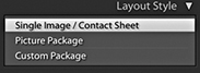
Image Settings Panel
The Image Settings panel (Figure 8.4) provides some elementary control over how the selected image or images fill the print cell areas. If the Zoom to Fill option is selected, the whole cell area is filled with the selected image so that the narrowest dimension fits within the widest grid cell dimension, and the image is cropped accordingly. Images that have been cropped in this way can be scrolled within the cells in the print layout. The Rotate to Fit option automatically rotates the images to fit the orientation of the print cells. For example, this can be useful when you are printing a contact sheet with a mixture of landscape and portrait images and you want each image on the contact sheet to print to the same size. The Repeat One Photo per Page option is applicable if the layout you are using contains more than one cell and you want an image repeated many times on the same page.
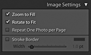
A stroke border can be added to the outer cell area and used to add a key line border to your photos. However, at lower print resolutions, the width of the stroke border may have to be adjusted to suit the print output. This is because narrow border lines may print unevenly, and you can end up with a line that is thicker on one side of the image than the other. The only way to tell if this will be the case is to make a print and see what it looks like.
Layout Panel
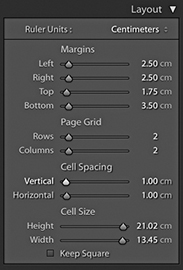
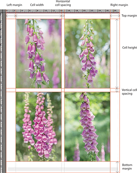
The Layout panel can be used to decide how an image (or multiple images) are positioned in a page layout, and scrolling through the Lightroom print templates in the Template Browser panel will give you a quick feel for what you can achieve using the layout controls. Notice how the Layout panel settings in Figure 8.5 relate to the page layout shown in Figure 8.6. Also notice how the Margins settings take precedence over the Cell Spacing and Cell Size settings. After you set the margins, the Cell Spacing and Cell Size adjustments adapt to fit within the margins.
Tip
A quick way to adjust the margins or, indeed, any of these guides is to click the guidelines in the content area and drag them. When you make layout adjustments using this method (or casually adjust the sliders in the Layout panel), the images often auto-adjust in size as you make refinements. If it is essential that the images be a specific size on the page, it is best to use the Layout panel method because this gives you the most precise control over the image placement and layout measurements.
Margins and Page Grid
To place an image precisely on the page, the first step is to set the widths of the margins. If you want to center a photograph, make sure the margins are set evenly and, most important of all, that the image is placed within the widest page bleed edge. Inside of the margins is the Page Grid area, which when set to print a single cell (1x1), prints a single image on the page. If you want to print multiple images on each page, you simply adjust the Rows and Columns sliders. The Cell Size sliders determine the size of the print cell area. If the Cell Size sliders are dragged all the way to the right, the cell sizes expand to the maximum size allowed within the margins. By making these smaller, you can restrict the printable area within the cell. However, the cell size adjustment is always centered within the Page Grid area set by the margins, and the margin adjustments take precedence over the Page Grid area. Any readjustments made to the margins will therefore have a secondary effect on the cell size. The Cell Spacing sliders are active only if the page grid is set to use two or more cells. If you refer back to Figure 8.5, you can see how I applied a 1 cm Vertical and Horizontal spacing to the 2x2 image layout.
Note
As you adjust the Page Setup settings to select different paper sizes, the Page Bleed area will vary and often appear asymmetrical, because some printers require a wider page bleed gap along the trailing edge of the paper. With some applications, centering the print centers the image without allowing for the offset page bleed area; therefore, prints may still print off-center. With Lightroom, turning on the Page Bleed view lets you take into account the page bleed and adjust the margin widths accordingly. This ensures that your prints are always properly centered.
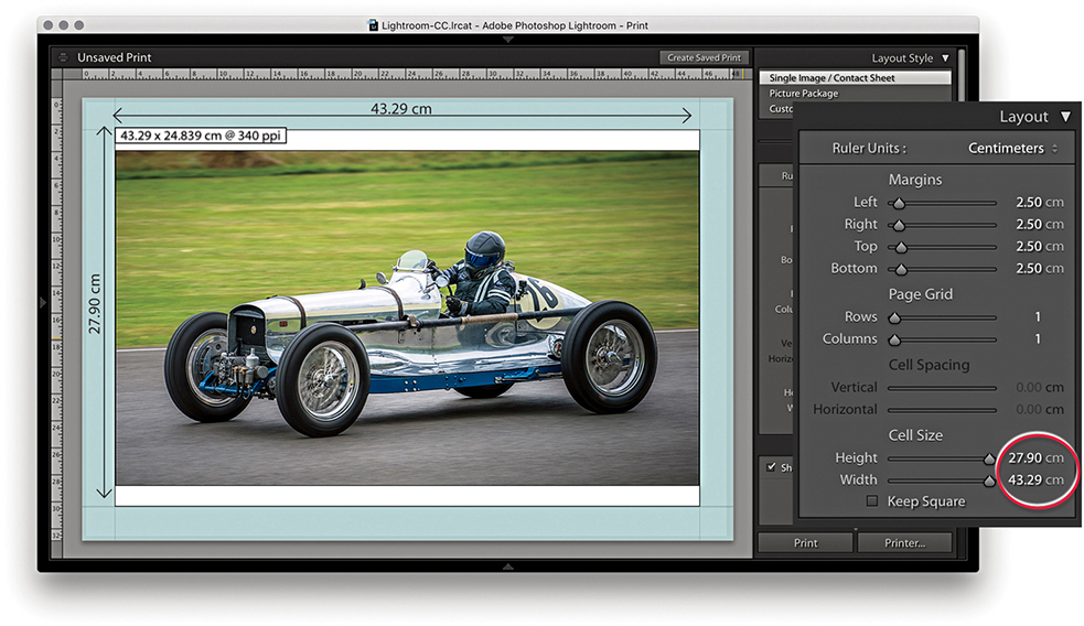
1. With this page layout, the margins (which are shaded blue) constrained the printable area by 2.5 cm left, right, top, and bottom. The cell size was set to the maximum height allowed, which was 27.90 cm. But with the image width constrained to 43.29 cm, the print image filled the width but did not fill the full height of the cell.
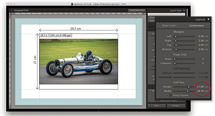
2. In this example, the margins remained the same, but the cell height and width sizes were reduced to an A4 metric size of 21 cm x 29.7 cm. Note the Dimensions box in the top-left corner of the print cell. This indicates the actual print size and resolution (see below).
Guides Panel
The Guides panel can help you plan a page layout. The rulers can be made visible by checking Rulers in the Guides panel (or use  [Mac] or
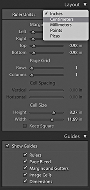
  [PC] to toggle the ruler visibility). The ruler unit measurements can be altered by clicking the Ruler Units menu in the Layout panel (Figure 8.7) or right-clicking the rulers themselves, where you can set these to inches, centimeters, millimeters, points, or picas. The Page Bleed displays a light-gray shading to represent the non-printable areas, whereas the Margins and Gutters and Image Cells check boxes allow you to independently show or hide these items. When the Dimensions box is selected, Lightroom displays the print dimensions in the top-left corner of the cell. This shows the physical unit dimensions, and if Print Resolution is deselected in the Print Job panel, it also shows the pixel resolution the file will print at. It is recommended that you deselect Print Resolution in the Print Job panel and let Lightroom automatically calculate the pixel resolution for you. Lightroom can auto-print-sharpen for any pixel resolution between 180 and 1440 pixels. If the photo’s image size exceeds these limits, a plus or minus sign appears, warning you to set an appropriate Print Resolution in the Print Job panel. Lastly, the Show Guides check box lets you show or hide all the Guides panel items.
Multiple Cell Printing
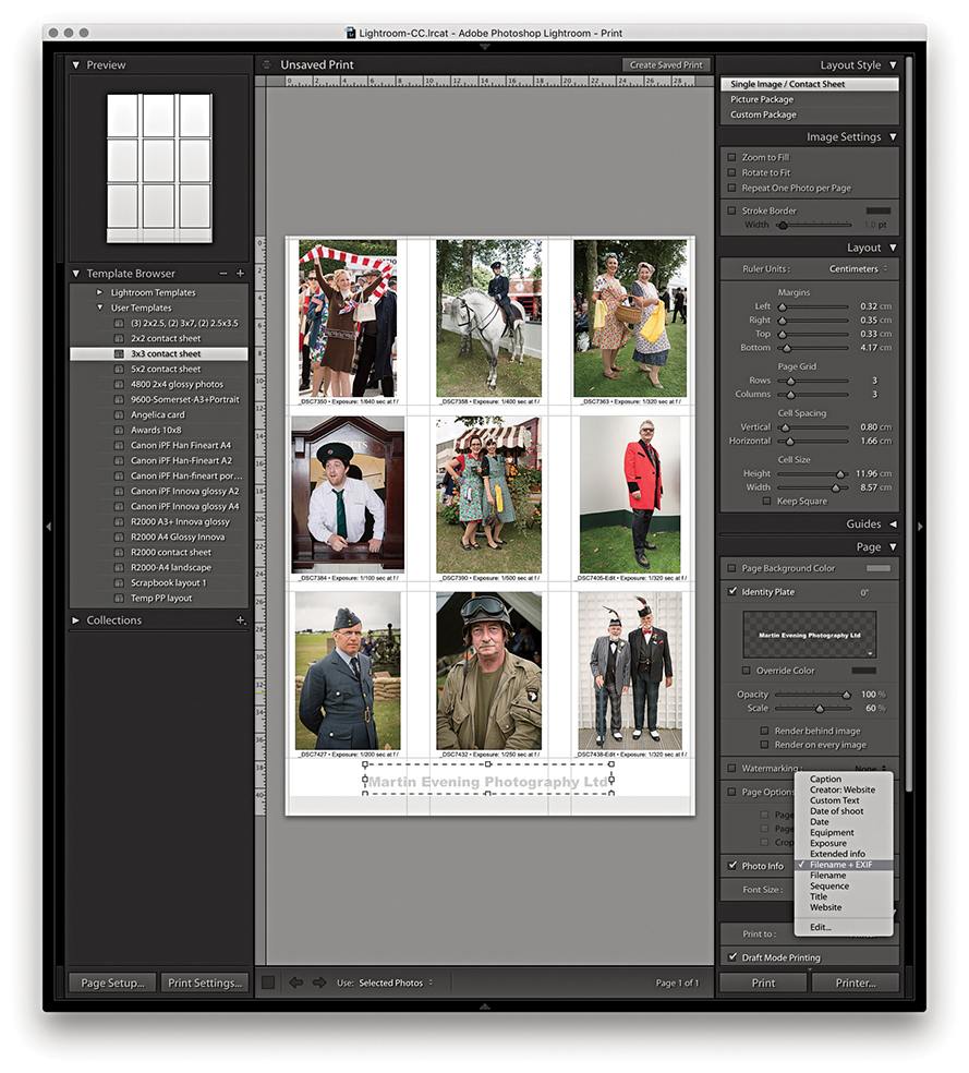
When the Single Image/Contact Sheet layout is set up to print using multiple cells, the Cell Spacing options in the Layout panel become active. These let you set the gap spacing between each cell. In Figure 8.8, I created a custom 3x3 contact sheet template in which the Cell Spacing was set to 0.8 cm for the Vertical spacing and 1.66 cm for the Horizontal spacing. The Cell Size and Cell Spacing settings are interdependent, so if you adjust one setting, the other will compensate. See how in this contact sheet layout, the Keep Square option in the Layout panel was left unselected. With some contact sheet template designs, it can be useful to have this option turned on because it ensures that both landscape and portrait images are printed at the same size on the page and are always printed upright without having to rotate the images for the best fit within the cells. In this case, it was not necessary to do so, because the photos were all oriented the same way.
Tip
Instead of printing a contact sheet from the Print module, you can always output it as a PDF document via the Print dialog. This can allow you to send a print document such as a contact sheet via email for others to open on their computers or print remotely.
Multiple cell print templates are ideal for generating contact sheet prints from selections of images. When you select more images than can be printed on a single page, Lightroom autoflows the extra images to fill more pages using the same template design and creates as many print pages as are necessary to print the entire job. However, you do need to be aware that the Print Job settings will have a major impact on how long it takes to render multiple pages of images. For fast contact sheet printing, I suggest you choose the Draft Mode Printing option in the Print Job panel. When this option is selected, Lightroom renders the contact sheet images based on the high-quality preview images that should have already been generated. I say “should have,” because this is something you may want to check before you click Print. Whenever a new batch of images is imported, Lightroom automatically generates the thumbnails followed by the Standard previews of all the images. If you have just imported a large number of photographs into Lightroom, it may take a little while for Lightroom to generate all the Standard previews. Until Lightroom has done so, choosing Draft Mode Printing may result in some of the images appearing pixelated when printed because they were rendered from the low-resolution thumbnails only. When you are in the Print module, carry out a quick preview of all the pages that are about to be printed and check if the image previews look like they have all been fully processed. If you see an ellipsis warning indicator in the top-right corner, Lightroom is still busy rendering the preview for that image. Having said this, the Lightroom catalog management is much faster than it was previously, and you are less likely to encounter this problem as the previews can be accessed in the Print module more or less right away. Overall, I find that the Draft Mode Printing option in Lightroom is invaluable in the studio because the print-rendering process can be so quick. The only limiting factor is how long it takes the printer to print all the pages.
Page Panel
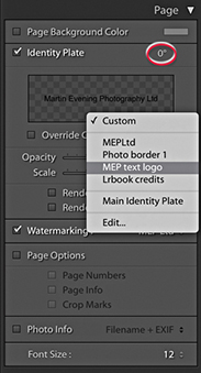
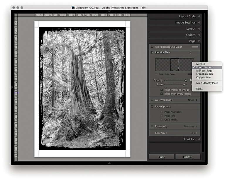
The Page panel options (Figure 8.9) determine which extra items are printed. The Page Background Color option lets you choose an alternative backdrop color to print with. For example, you might want to choose black for a contact sheet image layout. When the Identity Plate option is selected, you can click in the Identity Plate preview to reveal the list of identity plate presets and choose Edit to open the Identity Plate Editor dialog. Here, you can choose between adding a styled-text nameplate or a graphical logo. You can then use the Page panel controls to adjust the Opacity and Scale. You can set the scale by adjusting the Scale slider or by clicking and dragging the corner or side handles of the box. You can print an identity plate as big as you like, providing the identity plate image has a sufficient number of pixels to print from. (On page 482, I show how you can use a large graphical identity plate to create a photographic border.) Also, you can rotate the identity plate by going to the Rotate menu circled in Figure 8.9. If you want to repeat your logo in a multiple grid cell layout, choose the “Render on every image” option; there is also a “Render behind image” option for placing large identity plate images in the background. The Watermarking section lets you add a watermark to the printed image (refer to Chapter 7 for details on how to configure the Watermark Editor).
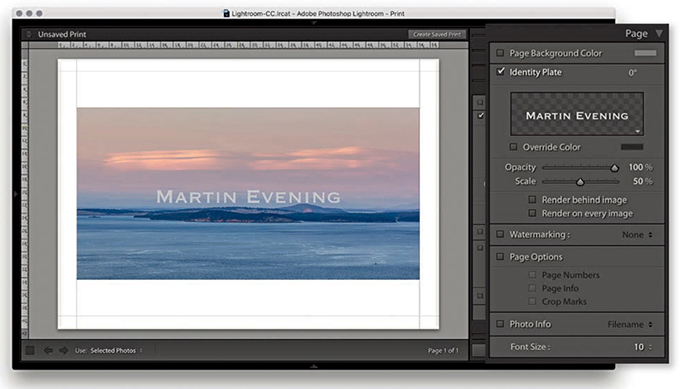
1. When the Identity Plate option is enabled, the current identity plate can be added as an overlay.
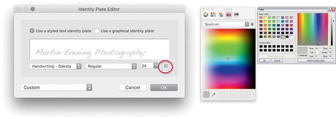
2. I wanted to change the identity plate settings, so I clicked the downward triangle in the bottom-right corner of the Identity Plate preview in the Page panel and chose Edit. This opened the Identity Plate Editor dialog, where I chose an alternative font and font size. To change the font color, I clicked the font color swatch (circled) and used the system color picker to choose a new color.
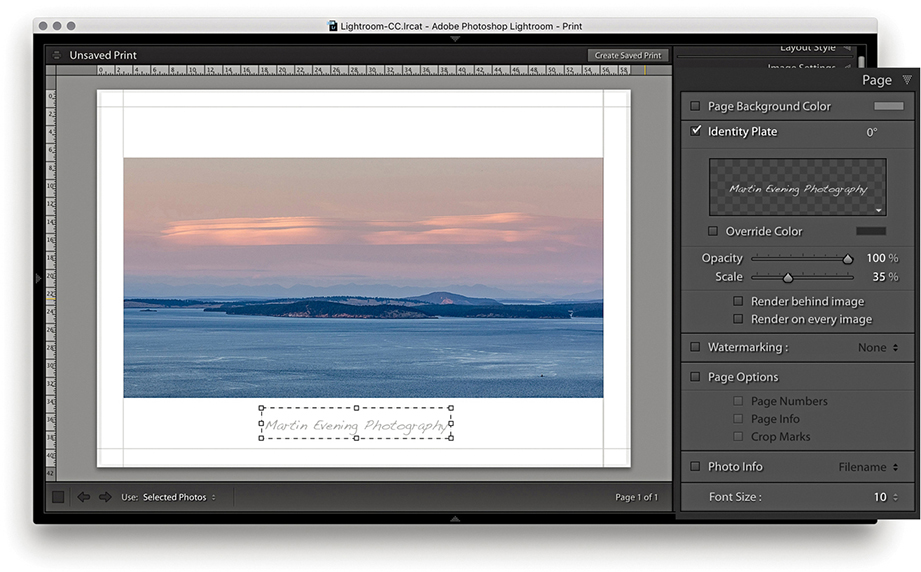
3. Now back to the Print module. I clicked the identity plate bounding box and dragged to move it downward, keeping it centered horizontally, and readjusted the scale to make the identity plate size smaller. The identity plate can also be nudged in small increments using the Arrow keys on the keyboard.
Adding a photographic border to a print
It is not immediately obvious that you can add an image of any size as a graphical identity plate, because the preview area in the Identity Plate Editor is so small. Graphical identity plates used in the Top panel should normally not exceed 57 pixels in height, and the small preview space helps you judge the correct height to use here (see the warning message in Step 2 below). For print work and other identity plate uses, there is absolutely no reason why you should be limited by this constraint. You can add a graphic, such as a scanned signature or company logo, at any size you like, as long as it has a suitable number of pixels to reproduce smoothly in print. Thanks to my colleague Sean McCormack, I was shown the following technique for adding a photographic border to Lightroom print images via the Page panel. In the example shown here, I used a scanned photographic border image, but you can easily substitute other types of borders or use the paint tools in Photoshop to create your own.
Note
You can download this PNG mask border image from the book’s website.
Downloadable Content:

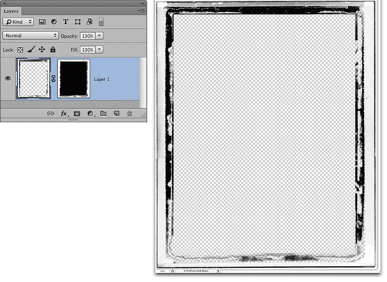
1. I first edited a photograph of a border in Photoshop. This picture is a scan of a Polaroid film border; I created a mask of the center and the semitransparent border edges and hid them with a layer mask. I then saved this image as a flattened PNG file.
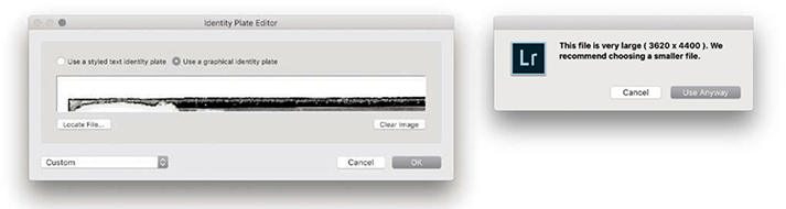
2. In the Page panel, I clicked to open the Identity Plate menu and selected Edit. This opened the Identity Plate Editor window where I switched to the “Use a graphical identity plate” option, clicked the Locate File but
3. With the new Identity Plate setting selected in the Page panel, I adjusted the scale to get the identity plate to fit the edges of the photo.
Page Options
The Page Options let you add useful extras. For example, I find the Crop Marks are handy should I need to trim prints later (although the Cut Guides described on page 489 can make this even easier). The Page Info item prints all the information relating to the print output along the bottom of the page, such as the sharpening setting (although it doesn’t tell you if the setting used was for Glossy or Matte media), profile used, rendering intent, and printer. This can be useful if you are running tests to evaluate the effectiveness of various profiles and print settings. The Page Numbers option adds a number to the bottom-right corner of the page and is therefore useful if you need to keep the print outputs in a specific page order.
In Figure 8.10, I also added a thin black border (via the Image Settings panel) to help frame the picture. You can choose a border-width setting between 1 and 20 points, but if you are using the narrowest border width, make sure the print output resolution is set to at least 300 pixels per inch.
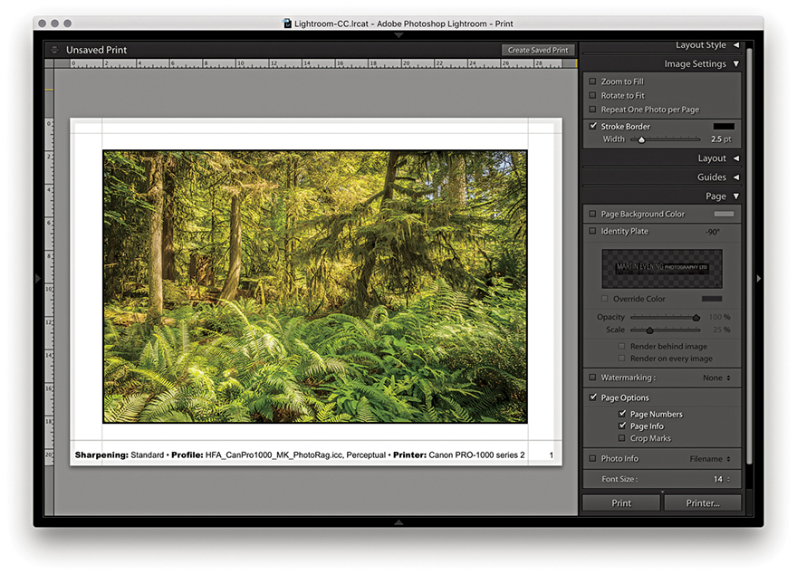
Photo Info
The Photo Info section can be used to add photographic information below each frame (Figure 8.11). Click its menu to choose from a list of basic, commonly required items such as Filename or Date. If you choose Edit, the Text Template Editor opens (Figure 8.12), where you can select tokens from the pop-up menus to insert and build a new text template. You just click the Insert button to add a selected pop-up menu token to the Photo Info template design; you also can add typed text in between the tokens as shown in Figure 8.12. When you are finished, go to the Preset menu at the top and choose Save Current Settings as New Preset; then click the Done button. Once the Photo Info settings have been configured, you can simply select the preset from the Photo Info menu and choose an appropriate font size for the Photo Info text.
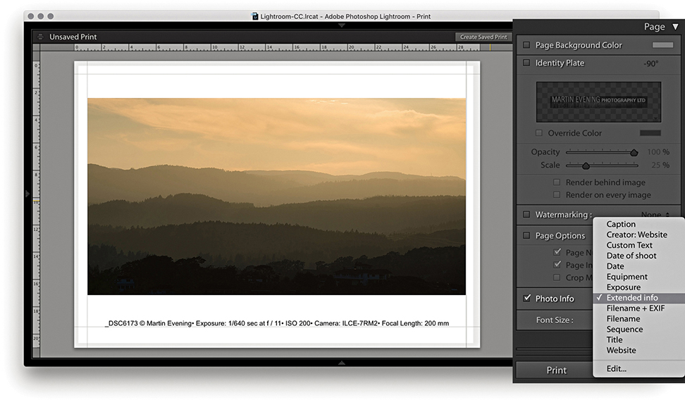
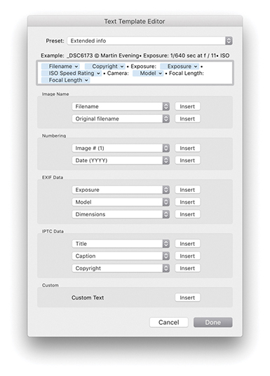
This feature has many practical uses, especially as there are many choices of photo information items that can be printed out below each picture. For example, if you are cataloging a collection of images, you may want to print out contact sheets with all the technical data included. Or, if you are sending contact sheets to a client, you may want to include the filename, caption, and copyright information.
Picture Package
So far, we have looked at the Single Image/Contact Sheet options, but there is also a Picture Package engine mode that has its own set of configuration panels (Figure 8.13), as well as a few custom templates that can be accessed from the Template Browser panel (Figure 8.14). These can be readily identified by the parenthetical numbers such as the (3) 2x2.5, (2) 3x7, (2) 2.5x3.5 template that is shown selected in Figure 8.14. The purpose of the Picture Package templates is to allow you to produce multiple-sized photographs on a single-page layout. For example, commercial portrait photographers may use this feature to produce multiple print variations on a single sheet of paper. Rather than be forced to print out two or more different print sheets that use different print sizes, you can produce all the different size prints you need on a single sheet of paper.
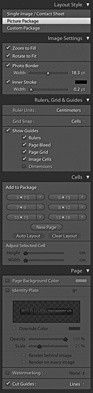
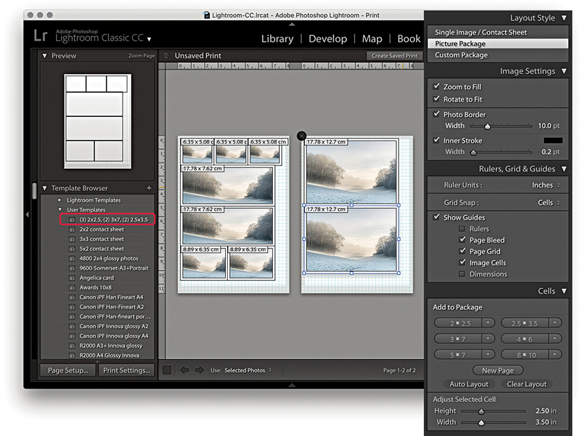
Image Settings panel
Here, you have the same Zoom to Fill and Rotate to Fit options as you have in the Single Image/Contact Sheet layout style mode. There is a Photo Border slider for setting the border padding width inside each cell and an Inner Stroke slider that can be used to set the stroke border width.
Rulers, Grid & Guides panel
The Ruler Units options are identical to those discussed earlier. Below this are the Grid Snap options. Basically, you can customize the Picture Package layouts by dragging and dropping individual cells, and the Snap options let you choose to snap to the grid lines or other cells when adjusting the placement of the cells (or turn this option off). The Show Guides options let you turn on or off various items, such as Rulers, Page Bleed, Page Grid, Image Cells, and Dimensions.
Cells panel
To create a new Picture Package layout setting, you need to select Picture Package in the Layout Style panel and click the Clear Layout button in the Cells panel. You can then add new cells to the blank Picture Package layout by clicking the Cell size buttons. These range in size from 2x2.5 inches to 8x10 inches (or 5x7.5 cm to 13x18 cm, if using centimeter units).
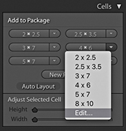
You can stick with these default size recommendations, or you can click a cell-size button’s arrow and select Edit from the pop-up menu to create and add a new custom cell size (Figure 8.15). As you click the cell buttons, new cells are added to the layout, and they are automatically placed to best fit the current Page Setup layout. To arrange the cells better, you can try clicking the Auto Layout button. This rearranges the cells to find what would be the best fit for the page layout. Lightroom does so with a view to what would be the most efficient use of space yet still allow you to trim your photos easily with a paper cutter. As you try to squeeze in more cells, at some point, Lightroom may let you place one more cell, but this will not necessarily allow you to trim the pictures that easily. Even so, the Auto Layout option can otherwise be a useful paper-saving option. The other option is to click a cell and manually drag it to a desired location on the page; this is where the Snap options can come in handy, as they can help you align the cell images. You can use the Zoom to Fill, Rotate to Fit, and Photo Border and Stroke options in the Image Settings panel to refine the layout and determine how the photos will appear within the cell frames.
As you add more cells and there is not enough room on the page, Lightroom adds new pages automatically. You can then adjust the arrangement of the cells’ layout across two or more pages. If you want to delete a page, just click the cross in the top-left corner.
Custom Package
Custom Package can be regarded as an extension of the Picture Package layout style. The main difference here is that, with Custom Package, you can create and save free-form layouts for placing selected, individual photographs on a page. Figure 8.16 shows a scrapbook-style page layout. To add frames, click the buttons in the Cells panel. Once you have done this, you can resize the cells as desired and drag photos from the Filmstrip into the layout cells. Once they’re placed, you can edit the size and proportions of each cell: Click to select it and drag one of the handles to achieve the desired size and shape. Or, you can check the Lock to Photo Aspect Ratio option to have the cells automatically resize to match the proportions of the photos you drag to them. If you click the New Page button in the Cells panel, you can add extra pages to a Custom Package layout. Custom Package layouts are limited to six pages at a time. Having said that, it is possible to exceed the six-page limit to create batches of Custom Package layouts and use the arrow keys in the Toolbar to navigate between them. There is a PDF on the book’s website with more detail about this feature.
Downloadable Content:
Picture Package/Custom Package Page panel
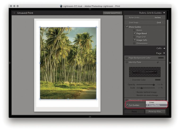
The Picture Package and Custom Package layout style Page panel is slightly different from that available when using the Single Page/Contact Sheet layout style. You do have the Page Background Color and Identity Plate options, with which you can add a custom identity plate to a Picture Package/Custom Package layout, but there are no Page Options or Photo Info options. One unique thing featured in the Picture Package and Custom Package layout modes is a Cut Guides option. When this is checked, it adds cut guides to the print that can be in the form of crop marks at the edges or crop lines that intersect on the page. Now, although this is a specific Custom Package layout feature, it also happens to be useful for single-image print layouts, such as in the Figure 8.17 example. This can make it easier to trim prints to an exact size in cases where it is not easy to see where the print edge should be, such as photographs that have say, a white background.
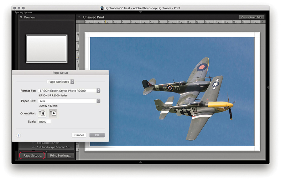
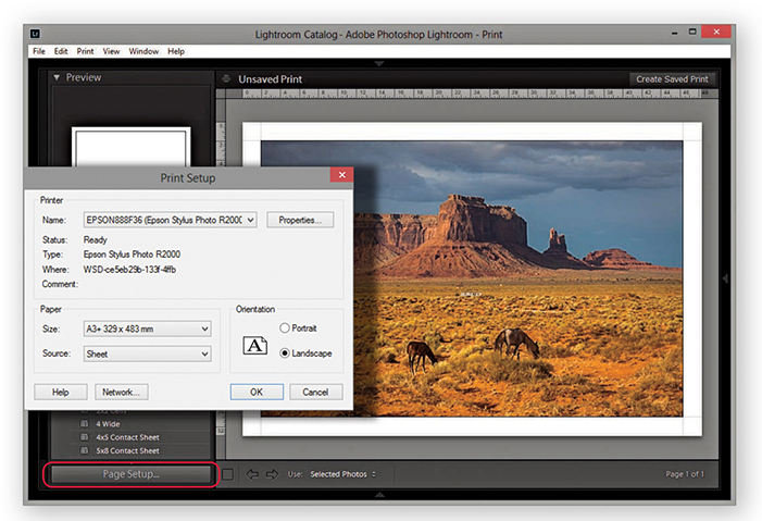
Page Setup
Before you make an actual print, you first need to click the Page Setup button at the bottom of the left panel section or use the  (Mac) or
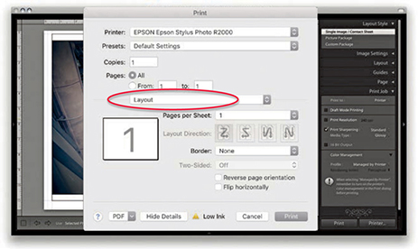
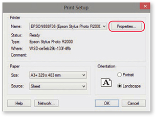
  (PC) shortcut. This takes you to the Page Setup (Mac) (Figure 8.18) or Print Setup (PC) (Figure 8.19) operating system dialog. Here, you need to establish which printer you plan to print with and enter the paper size you are about to print to, followed by the paper orientation: either portrait or landscape. The available Paper Size options will most likely vary depending on which printer model you have selected, as the subsequent options will be restricted to the various known standard paper sizes that are compatible with that particular printer. However, if the size you want to use is not listed, it is quite easy to create a new custom page size. The main difference between the PC dialog and the Mac dialog is that the PC Print Setup dialog has a Properties button that takes you directly to the Print Settings section of the system Print dialog (which is why there is only a single Page Setup button in the PC version of Lightroom). The Scale box in the Mac dialog (Figure 8.18) lets you scale the size of the print output, but I advise you to leave the Scale set to 100% and use the Print module Layout panel or Cells panel to adjust the print area size.
Print resolution
In Lightroom, there is no need to resize an image for printing. After you have configured the Page Setup settings, Lightroom will automatically sample the image up or down in size to produce a print image that has the right number of pixels to match the image dimension size that is a result of the Page Setup, Layout panel, or Cells panel settings and the Print Job panel Print Resolution setting. If you deselect the Print Resolution box in the Print Job panel (discussed in the next section), Lightroom adjusts the resolution automatically. It is only when the print resolution ends up falling outside the 180 to 1440 ppi range that it might be necessary to override the Print Resolution setting by selecting this box and manually entering a value that keeps the print resolution within the above range.
Print Job Panel
Let’s now look at the Print Job panel, which can be used to establish the printing method. Here, you can also set the print sharpening, color management, and print adjustments, if required.
Print Job panel color management
The Color Management settings provide you with simple and advanced printing options. For simple printing, leave the Profile set to Managed by Printer (Figure 8.20) and click the Print Settings button (Mac) or Page Setup button (PC) to open the system Print dialogs shown opposite. This method does, however, lock you into using the Perceptual rendering intent with the black point compensation activated. Basically, you need to choose the appropriate print settings, such as the paper/media type you are going to print with and the print quality. Most important of all, if you are using the Managed by Printer option, ColorSync must be enabled in the Color Management section (Mac) or ICM enabled in the PC Advanced Print Properties panel. These days, ColorSync is usually enabled automatically in the background, and you don’t have to do anything. After you have configured the relevant print settings, click Save to save the print settings changes.
The Lightroom printing procedure
Regardless of which print method is used, the printing procedure is essentially the same. You must first configure the Page Setup settings to tell Lightroom which printer and the size of the paper you are using. Next, you configure the Print settings to tell the printer how the print data should be interpreted. Then you can click the Printer button ( [Mac] or
  [PC]), which takes you to the final Print dialog. Or, use the Print button (
 [Mac] or
  [PC]) to bypass the system dialog completely. The following steps show the settings I would use for printing to an Epson R2000 printer. The print driver dialogs will vary from printer to printer; some offer different driver interface designs and, in some cases, more options. Unfortunately, there is no easier, universal way to describe the printing steps you should use here. The thing is, the print drivers are designed by the printer manufacturers, which, in turn, have to work within the limits imposed by the different computer operating systems. Not even Microsoft or Apple can agree on a common architecture for the print driver settings. It may be helpful to know, though, that once you have configured the page and print settings, you can permanently save these as a print template. And because you are able to save the page and print settings, you can lock the correct print settings to a template and avoid having to configure the print driver each time you make a print.
Managed by Printer print settings (Mac)
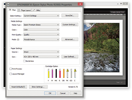
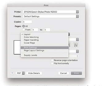
1. I clicked the Print Settings button ( )to open the Print dialog, which is shown here with the full list of options for the Epson R2000 printer. You may need to select the printer again to make sure it matches the one selected in the Page Setup dialog.
2. In the Print Settings section, I selected the media type that matched the printing paper, as well as the optimum photo color setting and print quality. I then clicked the Save button to return to the Lightroom Print module.
Managed by Printer print settings (PC)
Note
As you configure the Page Setup and Print settings, they are saved as part of the current print layout setup. If you proceed to save a print template, the Print settings will be saved along with all the other Layout settings.
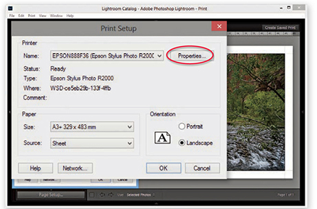
1. Here, I clicked the Page Setup button in the Print module ( ). The Print Setup dialog is similar to the one in Figure 8.19. I then needed to click the Properties button to go to the Printer Properties dialog.
2. In the Printer Properties dialog, I selected the correct print media type, the best photo print quality, and optimum photo print mode. I clicked OK to these settings and clicked OK once more to return to the Lightroom Print module.
The Managed by Printer method, outlined in the steps, works reasonably well for many photographers. Although some of the more advanced drivers provide a greater range of options, the basic print settings shown here are common to most print drivers. I generally use the Managed by Printer method for Draft Mode Printing whenever I need to generate contact sheet prints. With the Managed by Printer method, the most important thing is that ColorSync or ICM color is somehow enabled. If the driver doesn’t do this automatically, look for an ColorSync or ICM check box.
There will sometimes be a further choice of Color Settings options. If offered a choice, select whatever looks like the standard or optimum photo print output setting. Just make sure you don’t have a vivid color or “No color adjustment” setting selected.
Tip
Do not click the Printer or Print buttons in Lightroom until you have configured the Page Setup and Print settings. You should click these buttons only after you have configured the other settings first.
Printer profiles
When you buy a printer and install the print driver that comes with it, the installer should install a set of standard profiles for a select range of print media types that are designed for use with your printer. For example, if you purchase an Epson printer, the print driver installs a limited set of profiles for use with a specific range of Epson printing papers. If you want to add more custom profiles to this list, it is worth checking out the printer manufacturer’s website and other online resources to see if you can obtain printer profiles that have been built for your printer. The other alternative is to have custom printer profiles made for you by a color management expert.
There was a time when it was necessary to have custom print profiles built for each printer because of fluctuations in the hardware manufacturer process. These days, however, you can expect a much greater level of consistency. Hence, a custom profile built for one printer should work well when used with another printer of the same make. Some paper vendors have custom profiles available for download.
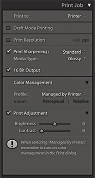
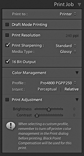
Print Adjustment controls
At the bottom of the Print Job panel are the Print Adjustment options (Figure 8.21). When Print Adjustment is selected, you have the option to modify the Brightness and Contrast of the print output independent of the actual Develop settings. Occasionally, some people reckon their print outputs from Photoshop and Lightroom are too dark. The reason for this may be that their displays were calibrated too bright or the prints are being viewed under dim lighting conditions. The Print Adjustment sliders serve as a kind of workaround to tweak the output, making the prints lighter/darker or more contrasty. It is also important to point out that these adjustments do not affect the screen display image. The adjustments are seen only in the print output when you make an actual print or save a JPEG print file.
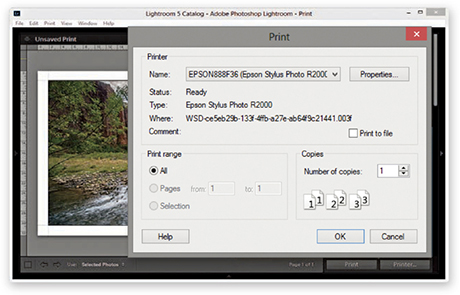
After the Page Setup and Print settings have been configured, you just need to send the print data to the printer. If you click the Print button, Lightroom conveniently bypasses the system Print dialog (see Tip). Alternatively, if you do wish to see the system print settings, you can click Printer to open the Print dialog (Figures 8.22 and 8.23). The printer model will be the same as whatever was selected previously. On the Mac, the Presets must say Default Settings, and if you select Print Settings from the menu circled below, this should confirm you have the correct preconfigured print settings selected.
Tip
The most effective way to stop the system print preset settings from interfering with the Lightroom Print settings is to click the Print module Print button. This ensures the image is output using the Print settings established in Lightroom and not affected by any others.
Printing modes
When you make a regular print output, Lightroom reads the image data from the original master file and resizes the image on the fly to match the print size specified in the page layout and ensures you get the highest print quality possible, whatever the print size is. However, if you are processing a large number of images to produce a set of contact sheet prints, it can take a long time for Lightroom to read in all the image data and resize the images. Whenever Draft Mode Printing is checked, Lightroom instead uses the image previews to generate the print files. The advantage of this approach is that the print processing time is pretty much instantaneous, and this can make a huge difference in the time it takes to generate, say, 10 contact sheet pages from a folder of 100 raw images. In Draft Mode, Lightroom uses whatever previews it has to work with. The Standard previews should be sufficient for most Draft Mode print jobs, but it is worth visiting the Library module and choosing Library ![]() Previews
Previews ![]() Render Standard-Sized Previews before making a set of Draft Mode prints. Draft Mode Printing is perfect for any print job where speed is of the essence. For everything else (especially when you want to produce the highest-quality prints), you will want to deselect this option so you can control the color management via Lightroom and apply the all-important print sharpening (Figure 8.24).
Render Standard-Sized Previews before making a set of Draft Mode prints. Draft Mode Printing is perfect for any print job where speed is of the essence. For everything else (especially when you want to produce the highest-quality prints), you will want to deselect this option so you can control the color management via Lightroom and apply the all-important print sharpening (Figure 8.24).
Print sharpening
Photographic images will inevitably appear to lose sharpness as a natural part of the printing process. To address this problem, it is always necessary to add some extra sharpening prior to making the print. You can do this by checking the Print Sharpening option in the Print Job panel. You won’t be able to preview the sharpening effect, because Lightroom applies this behind the scenes to ensure the picture looks acceptably sharp when printed. So, when you are working in the Lightroom Print module, enabling Print Sharpening is essential if you want your prints to look as sharp as they do in the screen preview. The print sharpening is all thanks to Adobe working closely with PixelGenius to bring PhotoKit SHARPENER routines to Lightroom. All you have to do is enable the Print Sharpening option, indicate whether you are printing to matte or glossy paper, and choose Standard to apply the default sharpening. You can select Low or High if you wish to modify the standard strength setting. But if you find yourself preferring High, check if you remembered to adjust the Detail capture sharpening beforehand.
Note
If you are making blow-up prints that contain high-frequency edge detail, it is worth checking the Dimensions info box (see pages 476 to 477). If the output resolution appears to fall significantly below 360 ppi, and especially if making smaller prints, it may be worth using the Print Resolution box in the Print Job panel to manually set the file’s resolution to 50% more than whatever the native resolution happens to be. When you do this, Lightroom applies an adaptive upsampling routine that combines the Bicubic and Bicubic Smoother interpolation algorithms prior to applying the print output sharpening.
Lightroom automatically resizes the image data to the print size you set in the Layout panel. Providing the print output image ends up falling within the range of 180 to 1440 ppi, there is no real need to use the Print Resolution option to interpolate the print data. Basically, Lightroom automatically applies the correct amount of sharpening on a sliding scale between 180 and 1440 ppi, and it is best to let Lightroom work out the optimum pixel resolution and sharpening. With some prints though, it may help to manually increase the resolution (see Note).
16-Bit Output
Image data is normally sent to the printer in 8-bit mode, but many inkjet printers are now enabled for 16-bit printing. You can take advantage of this providing you are using the correct plug-in for the program you are working with; in the case of Lightroom, you’ll need to make sure the 16 Bit Output box is selected (Mac only). Some people say the 16-bit printing option is overkill; others claim they can see a difference. Given that 16-bit printing technology is now commonplace, it does seem sensible to have this option available in the Lightroom Print module. In any case, selecting this option will not slow you down, so there is no harm in checking it if this is applicable. I always leave it switched on by default, even though I know it probably won’t make any difference.
Print to JPEG File
The Print to JPEG File option is available from the top of the Print Job panel, and the JPEG file options are shown in Figure 8.25. This option was introduced by popular request because a lot of Lightroom customers wanted to have a way to produce print-ready image files directly from the Print module. As you have seen already in this chapter, it is really easy to set up contact sheet layouts and do things like add signatures or add an identity plate overlay as a custom photo border. With the Print to JPEG File option, you can use the Print module to generate a JPEG image instead of sending the data to the printer.
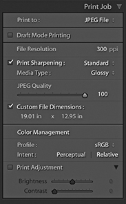
In Print to JPEG mode, you can use the Draft Mode Printing option to quickly generate sets of contact sheet print files. For example, with a JPEG output file, you can send the file to another computer for printing. This is potentially useful for a number of reasons. For example, you can free up using the main computer while you let another computer manage the printing. Also, you can generate JPEG print files for others to share and print from. Or, you could output contact sheets from a shoot via the Print module and send them as email attachments to a client or colleague so that they could run the prints off remotely. When not in Draft Mode, you have access to the same sharpening controls as were discussed earlier. The JPEG Quality slider lets you control how much JPEG compression is applied, and the File Resolution field can be edited to set a specific resolution for the output. When the Custom File Dimensions box is checked, you can also edit the dimensions of the JPEG print file page size to create a custom-sized document (using the current ruler units). In the Color Management section, you have a choice of the four main RGB output spaces—sRGB, Display P3, Adobe RGB, and ProPhoto RGB—along with any other custom print profiles that you may have loaded (see the next section on custom profile printing). You can then select the most suitable rendering intent option.
Custom Profile Printing
The Managed by Printer printing method discussed so far lets you print with color management carried out by the print driver. Therefore, if you are printing with a modern inkjet printer, you can expect to get good results using the Managed by Printer option so long as the ColorSync or ICM option is somehow enabled in the print driver settings.
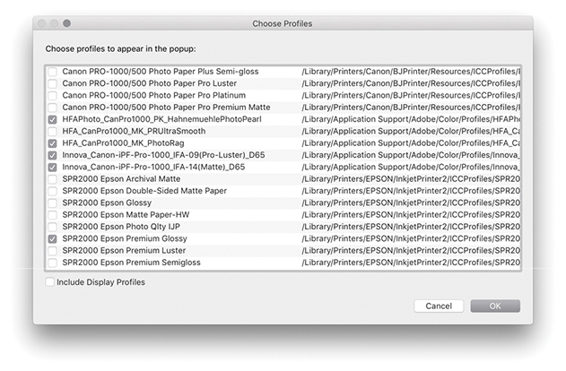
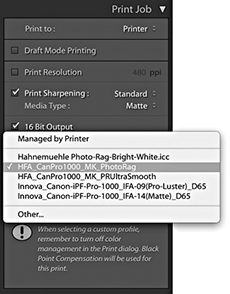
However, if you want more control over how your images are printed, you are better off getting Lightroom to handle the printer color management. To do this, go to the Profile menu and choose Other. This opens the Choose Profiles dialog shown in Figure 8.26, where you can click the check boxes to enable the printer profiles that are relevant to your print workflows. Here, you can choose canned profiles or custom profiles that have been specially made for your printer. Figure 8.27 shows how I was then able to change the Color Management Profile setting so that instead of using Managed by Printer, I could choose from a list of select printer profiles. This, in turn, offered me a choice of rendering intents for the print job (see page 502).
If you get Lightroom to handle the printer color management, you must adjust the print settings accordingly. For example, if you select a standard printer-supplied profile, the Media Type selected in the print settings must match the selected profile. If you are using a custom profile generated from a print test target, always make sure you use the exact same print settings as you used to print the target. Most important, the ColorSync/ICM settings should be set to No Color Management, because you want to avoid double-color-managing the print image data.
Managed by Lightroom print settings (Mac)
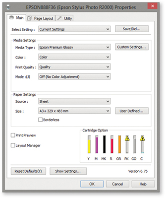
1. The steps outlined here are similar to those for the Managed by Printer procedure. I clicked the Print Settings button to open the Print dialog, which is shown here with the full list of settings options for the Epson R2000 printer.
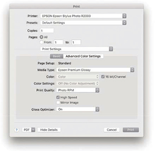
2. Once again, the most critical section is the Print Settings. I had selected the Epson R2000 Premium Glossy profile in the Print Job panel and ensured matching paper was loaded in the printer. Therefore, the selected Media Type also needed to match (because the subsequent Print Quality settings would be governed by the Media Type setting). I selected the desired print quality and speed setting. In the Mac print driver for the Epson R2000, the Color Settings are automatically set to Off. I clicked the Print dialog Save button and was then able to click the Lightroom Print button in the Print module to make a print, bypassing the system Print dialog.
Managed by Lightroom print settings (PC)
Note
If you want to have custom profiles made for your printer, your best bet is to contact a color management consultant, who will supply appropriate test targets and direct you on how to print out a target from your printer. However, you cannot use Lightroom to print out such test target images. Target images are always unprofiled, and in the absence of an embedded profile, Lightroom automatically assumes an sRGB profile for the imported images and then converts the data from this assumed space to the native Lightroom RGB space as it is processed through the (non–Draft Mode) Lightroom pipeline.
To make a custom-paper profile for your printer, you will need to use the Adobe Color Printer Utility (tinyurl.com/79sbhmg) and save the settings used to make the print (as described on these pages). When using the custom profile, make sure the exact same settings are applied as you used to generate the test target. All you really need to know is that printer targets must be printed without color managing them and remember to save the print settings so that the saved preset settings can be recalled when establishing the print settings for Lightroom to use.
1. When you click Page Setup in the PC Lightroom Print module, the main Print dialog opens. Here, I clicked the Properties button to open the Printer Properties dialog shown in Step 2.
2. Here, I was able to select the correct Media Type and Print Quality. In the Mode section, I selected the Off (No Color Adjustment) option. I clicked OK to return to the Print dialog and clicked OK to save these print settings and return to the Lightroom Print module. I then clicked the main Lightroom Print button to make a print, bypassing the system Print dialog.
Rendering intent
Whenever you deselect the Managed by Printer option and select a custom print profile in Lightroom, you have two choices of rendering intent: Perceptual or Relative (Figure 8.28). Hovering above the rendering intent displays a tooltip with a short description of how this will affect the image.
The Relative rendering intent (also referred to as Relative Colorimetric) maps all the colors in the source image to the nearest equivalent in-gamut color in the selected print profile print space, but at the same time clips those colors that fall outside the gamut of the print space. The Perceptual rendering intent maps all the colors in the source image to fit smoothly within the destination print profile space. Therefore, when Perceptual is used, all color differentiations are preserved. The brightest colors in the source image map to the brightest printable colors in the print space, and all the other colors will be evenly mapped within the gamut of the print space. The difference between these two rendering methods is most obvious when comparing an image that contains bright, saturated color detail, such as a photograph of a flower. With Relative rendering, the brighter colors may get clipped, but with Perceptual rendering, you should see better preservation of detail in the bright color areas.
Some people point out that the downside of Perceptual rendering is that it has a tendency to unnecessarily desaturate the colors in an image where there were no out-of-gamut colors in the first place. In these situations, a Relative Colorimetric rendering may produce a better result. Others argue that if the print does not look good when printed using a Perceptual rendering intent, it may be because you have not fully optimized the image in the Develop module. Personally, I find both rendering intents to be useful. If the image is fairly standard, without large areas of bright color detail, I will usually use Relative, especially if I am printing to glossy media with the wide-gamut inks found in the latest inkjet printers. However, some printers have a more limited gamut; this is especially true when printing to matte art papers using photo matte black inks. When using a Relative rendering intent, I may well see some gamut clipping in the shadow areas, but I find if I use the Perceptual rendering intent, I will get smoother tonal renditions in the shadows when printing images that contain a lot of dark colors. I also find this to be true when printing black-and-white images. In these circumstances, the Perceptual rendering intent is usually the best choice.
The simplest solution is to make use of the Soft Proofing feature in the Develop module. Just switch between Perceptual and Relative when evaluating an image to see which rendering intent you prefer best.
Soft Proofing for Print Output
The soft-proofing feature in Lightroom lets you see a preview of how a printed photo is likely to look before making a print. This is something that has to be done in the Develop module rather than the Print module. Only the Develop module can provide a truly accurate preview of how an image will look. Also, you need to have access to the Develop controls (mainly the Basic, Tone Curve, and HSL panels) to tweak the soft-proofed image and get it looking as close as possible to the master. But before we look at the soft-proof mechanism in Lightroom, let’s consider some of the limitations of color management so you can better understand what you can and cannot do when soft proofing.
Tip
The white point set for the display calibration does not really affect how cool or warm your images will appear on the display. When evaluating color, your eyes always adapt relative to whatever they perceive to be the whitest part of any scene. Therefore, it does not matter if you view an image with a warm or cool white point: Your eyes compensate automatically. Similarly, as you view a print under different lighting conditions, your eyes will, again, adapt. What is critical, though, is that when making side-by-side comparisons, such as when comparing a print lit by a calibrated color viewer, the white point of the display matches that of the viewer precisely.
Why what you see isn’t always what you get
Whenever people complain that color management is not working, it often boils down to their having unreasonable expectations as to how a color-managed system should work. The assumption is that when you photograph a scene, you can then expect to see it portrayed accurately on the computer display, as well as in print. Color management can certainly help you achieve this desirable goal, providing you understand the constraints you are working within. To begin with, you need to appreciate that although the contrast range of a daylight scene might be around, say, 10,000:1, the maximum contrast range that can be achieved in a print output is only 300:1. At the same time, the contrast range of a computer display may be just 1000:1. So, in terms of contrast, neither the computer display nor the print output can be expected to match the original scene. More important is the ability of each device in the chain to capture or reproduce accurate colors. When you take a photograph, the tone and color information you capture is determined by the spectral sensitivity of the sensor. In other words, if your sensor cannot “see” particular colors, it cannot capture them. This is crucially dependent on whether an image has been captured in JPEG or raw mode. If captured as a JPEG, the gamut of the capture file is constrained to that of the selected RGB space, as set on the camera. This will typically be sRGB or Adobe RGB, both of which are significantly smaller than the native gamut of the sensor capturing in raw mode.
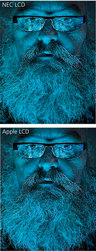
Probably the biggest limiting factor is the display itself. Most have quite small color gamuts compared to the actual gamut of the image files you are editing. Such displays are also restricted compared to the gamut of most photographic desktop printers. In fact, the gamut of a typical LCD is not far off that of the ubiquitous sRGB space. In practice, a good many photographers are capturing raw images that contain a wide gamut of colors and are using printers that are capable of reproducing quite deep colors. But they are editing their images in Photoshop or Lightroom via a display that constrains those colors to what is (by comparison) quite a small color space. This is why, for serious color editing work, you should use a display that is capable of displaying a wide color gamut. Smart displays such as those made by Eizo, NEC, and LaCie are capable of displaying nearly the entire Adobe RGB gamut, which gives you the potential to preview the entire color gamut of most CMYK output proofing devices and also allows you to preview most of the colors that a typical desktop photo printer is capable of reproducing. So, the message here is, if you have invested heavily in buying the best cameras and printers, there is no point in limiting their potential through the use of a cheap computer display. Most photographers are perhaps not even aware of this, but this is one of the main reasons why people complain that their prints do not match what they have seen on the screen. The problem is not with the printing necessarily; it is simply the limitations of the display hardware. Figure 8.29 is interesting because it attempts to show in print the difference that might be seen between a standard display and a smart display with a wider color gamut (even when soft proofing had been switched on in the Develop module). In fact, when soft proofing this photo on an NEC display, I was still unable to see an accurate preview of how the image would actually print. This was because the final print output contained deeper blues and cyans than could be shown on the NEC display. You can download variations of this file from the website and see for yourself what happens when they are printed. There is also a PDF you can download.
If we assume that we can get a reasonably accurate preview of a photograph on a display, the way those colors reproduce in print all boils down to the quality of the ICC profile used to make the profile conversion. At best, a profile conversion is a process in which colors from the source image are transformed to the color gamut of the output device. The profile does not know anything about the colors in a photo other than how to mechanically translate them to the nearest equivalent color in the destination space. An ICC profile conversion does not know which particular colors are of most importance to you; hence it is a dumb process, but one that you can adapt to suit the particular needs of each individual image (which I will be coming to shortly).
Downloadable Content:
Lastly, we have to take into account the lighting conditions under which the final print is viewed and, more particularly, how the luminance brightness of the lighting used to view the prints compares with the luminance brightness of the computer display. A frequent complaint aired on the Photoshop and Lightroom forums is “My prints look too dark,” implying that there must be something wrong with the color management system to cause this perceived discrepancy. It is important to understand that in order to evaluate a print properly, the luminance brightness of the print viewing area needs to match that of the computer display. What typically happens is that the printer is located next to the computer in a room where the lighting is quite subdued. This may be ideal when working in Lightroom or Photoshop, but not when it comes to assessing prints. In this kind of situation, anything that comes off the printer that is viewed straight away is bound to appear too dark. To judge a print properly, it should be viewed under lighting conditions where the luminance brightness closely matches that of the display. You can do this by using a calibrated print viewer. For those on a limited budget, an inexpensive option would be to buy something like the GrafiLite from ColorConfidence (tinyurl.com/7rpjwsa) or a GTI desktop viewer (colourmanagement.net/gti.html). Alternatively, you can adjust the Print Adjustment controls in the Print Job panel to compensate for perceived differences. One of the big problems these days is that a lot of LCDs are running way too bright for image-editing work. It is probably no coincidence that this is an issue that has emerged only as everyone switched from CRT to LED computer displays. A lot of LCDs, especially the cheaper ones, have the problem of being too bright. More recently, the emphasis has been on glossy-screen LCDs or LEDs that are capable of showing a high-contrast picture tailored for the optimal viewing of movies and computer games. For photo-editing work, the display you are working with should be capable of operating within the 110 to 140 cd/m2 luminance range. You will also need to properly calibrate your display of course, but as long as you have the means to get the brightness down to a sensible level, you are well on your way to having a computer setup where you can preview your images correctly relative to how they are going to print. If you want to be really precise, you might want to purchase a desktop color viewer with dimmable lights. With this type of setup, you will have the means to adjust the luminance of the display and that of the desktop viewer, so that when a print and an image on a computer display are placed side by side, they will appear to have the same brightness.
Soft proofing in practice
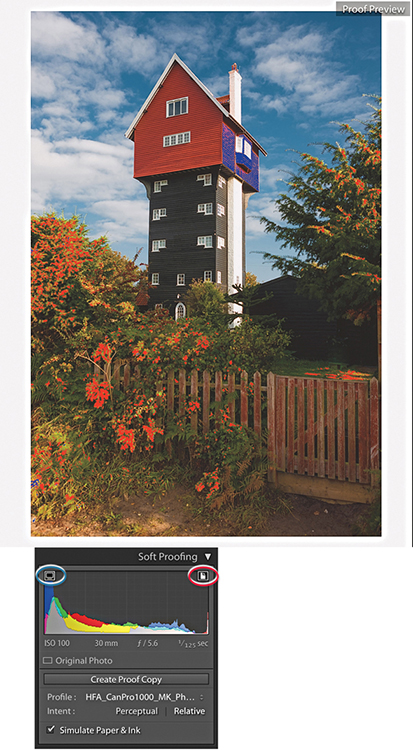
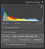
The goal of soft proofing is to simulate the print output appearance on the display. To enable soft proofing, check the Soft Proofing option in the Develop module Toolbar (Figure 8.30). When you do this, the Histogram panel changes to become the Soft Proofing panel (Figure 8.31), and you will see a number of things happen. The canvas color fades from gray to white, and the image appearance changes to reflect the current selected profile. The fading to white helps your eyes adjust to the white background color, but you can right-click the background to access the context menu and change the color if you wish. You would not normally want to do this, but there may be instances where, if you are making a print that will be displayed against anything darker than white, applying the same color at the soft-proofing stage may help you visualize the colors better. If the Simulate Paper & Ink option is turned on, the white background color will be based on the paper-white information in the current selected profile. You can choose different profiles to soft-proof with by selecting a new profile via the Profile menu. Obviously, you will want this to match the profile you will select later in the Print Job panel settings. Below this are the two rendering intent buttons: Perceptual and Relative. The clipping previews are highlighted in Figure 8.31. The one circled in blue is a display gamut warning and uses a blue overlay to highlight the colors that fall outside the color gamut of the computer display. The one circled in red is a destination gamut warning  and uses a red overlay to act as a gamut warning for the destination profile (i.e., it highlights the colors that will be clipped when outputting to the destination profile space). As you roll the pointer over the image, you will see RGB values in place of the camera data. These represent the RGB numbers (using a 0 to 255 scale) for the selected profile output space.

Note
Soft Proofing for CMYK images was removed recently from Lightroom. Therefore, you can no longer select CMYK profiles to soft proof with.
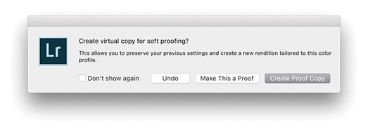
If you adjust the image in soft-proofing mode using the Develop controls, this opens the dialog shown in Figure 8.32, where you will be asked if you wish to create a proof-copy version (you can also create a new proof copy by clicking the Create Proof Copy button in the Soft Proofing panel [Figure 8.31]). If you have already clicked Create Proof Copy in the Soft Proofing panel, the dialog will not be shown. The Soft Proofing panel then changes to the view shown in Figure 8.33, where the Soft Proofing controls appear highlighted and adds the profile name inside the Copy Name field in the Metadata panel (Figure 8.34).
Before and Proof preview
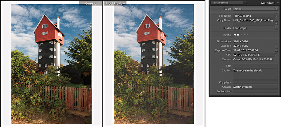
If you click the Before and After view button (circled in Figure 8.30), you can see a Before version alongside the Proof preview. The Proof preview will show a flatter preview, one that takes into account the diminished contrast range of the final print (a glossy print may have a contrast range of 300:1 and a matte print even less). The first thing you will want to do is select the most appropriate rendering intent—either Perceptual or Relative—to determine how the out-of-gamut colors are handled during the profile conversion (see page 502). As you do this, you can compare the Before and Proof previews as you apply Develop adjustments and adjust the Proof preview so it more closely resembles the Before version. Regardless of whether you are using a standard or smart display, the Proof preview at least gives you an idea of how an image might print tonally. Here, you can go to the Tone Curve panel and carefully tweak the contrast to help preserve the “contrast look” seen in the master. You might also want to use the Clarity slider in the Basic panel to boost the midtone contrast. This can be particularly helpful when preparing images to be printed on a matte paper finish. When it comes to trying to match the colors, this is where things get a little more tricky. As I explained earlier, you can make effective color corrections to a proofed image only if you are sure that the display you are working on is capable of previewing the image accurately in the first place. Assuming the display you are working on is able to do this, you can apply fine-tuned tweaks via the HSL panel to adjust the Hue, Saturation, and Luminance of specific colors. This can help you adjust the Proof preview so that it more closely resembles the Before. If there are colors in the original image that cannot be reproduced in print, you can never hope to match these, but you can fine-tune the relationship between the luminance and saturation of the colors in the Proof preview so that you come as close as possible to preserving the relationship seen in the master.
The soft-proofing process gives you the opportunity to overcome the dumbness of a standard profile conversion and finesse the color conversion process in a way that is not possible with a straightforward profile conversion. All you have to do now is make a print using the newly generated virtual copy and make sure that in the Print Job panel you select the same print profile and rendering intent as was selected in the Soft Proofing panel. This is critical, as the print output won’t match unless you remember to carry out this final step.
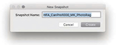
When you make a new snapshot with soft proofing enabled, it defaults to using the profile name (Figure 8.35). Therefore, when you adjust an image while soft proofing and choose to create a snapshot, the snapshot will be named appropriately using the current soft-proof profile name.
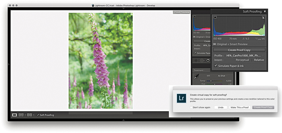
1. To soft-proof this image, I checked the Soft Proofing box in the Develop module Toolbar and selected an output profile from the Profile menu. Checking the Simulate Paper & Ink option adjusted the preview to simulate the contrast range of the media I intended to print to. As soon as I adjusted the Develop settings, this opened the dialog seen here, where I clicked Create Proof Copy.
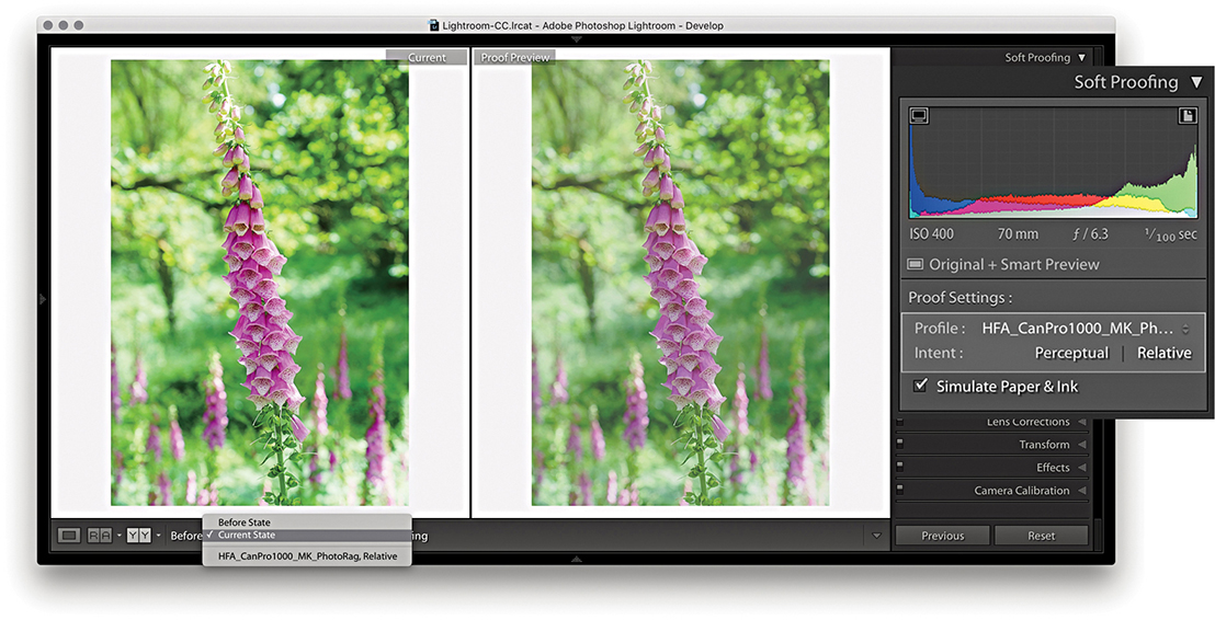
2. I then clicked the Before and After view button to see side-by-side previews (comparing with the Current State photo) and switched between the Perceptual and Relative rendering intents to see which produced the best-looking preview. In this instance, the Relative rendering intent appeared to work best.
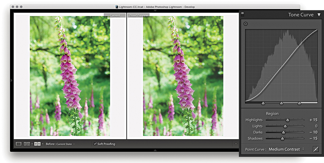
3. Next, I decided to compensate the tone contrast. This can be done by tweaking the Tone Curve sliders. When making matte prints, it may help to also adjust the Clarity slider in the Basic panel, which will boost the midtone contrast.
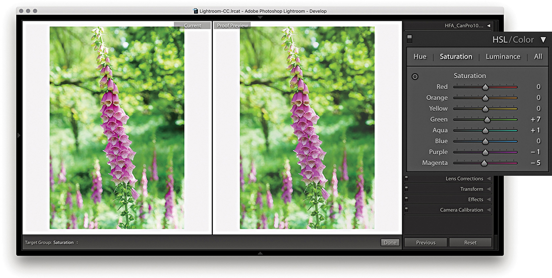
4. In the HSL panel, I tweaked the Saturation and Luminance sliders to fine-tune the color relationship. This can help preserve the color relationship and color contrast to achieve a better match with the master version. You can never hope to get an exact match, but soft proofing can get you closer.
Before state options
Let’s now look at the Before/After view options. When a master image is selected, the choice will be between the Before State and the Current State. The Before State shows an earlier version of the photo with the Soft Proofing option turned off. It defaults to displaying the last used state, but you can update it to any state you want. For example, disable Soft Proofing and update the Before State with the Current State (Figure 8.36) and then enable the Soft Proofing again. However the Before state is configured, this allows you to compare the unproofed image with a proofed version without having to create a virtual copy first. The thing is, you will be editing the master version when you do this, but you should end up with a master image that will print nicely using the selected printer profile. Essentially, the Current State option lets you see how the most recently edited version compares with the proof preview.

After returning to a regular full-screen Develop view and turning off Soft Proofing, the image preview of the soft proof-edited image will now look quite different, although you can always reselect the original image state from the History panel.
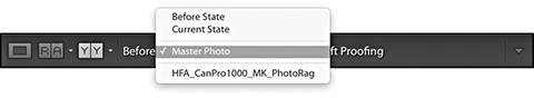
If a virtual copy photo is selected, the Before state options will be like those shown in Figure 8.37. Here, you still have the Before State and Current State, but also a Master Photo option. This lets you compare the adjustments made to the output-specified, soft-proof virtual copy with the Master Photo version. You may see other virtual copies listed in the Before pop-up menu. This allows you to compare different soft-proof previews (for different output devices) with one another. The names you see listed in the pop-up will have come from the Copy Name metadata field. If you create a virtual copy while the proof preview is enabled, this field is automatically filled in with the name of the selected profile. Otherwise, it will default to Copy 1, and so on.
The above options are there should you require this level of complexity. Personally, I find it sufficient to simply follow the steps outlined on the previous pages and click the Create Proof Copy button to create a virtual copy image that can be edited and stored independently of the master photo.
Saving a Custom Template
After you set up the page-layout design and configure the Page Setup and Print Setup settings, you can save the print setup (including all the print settings) as a custom template. In the Template Browser panel, click the + button at the top of the panel header to add the current print setup as a template and give it a name (Figure 8.38). To delete a template, select the template name in the Template Browser and click the – button.
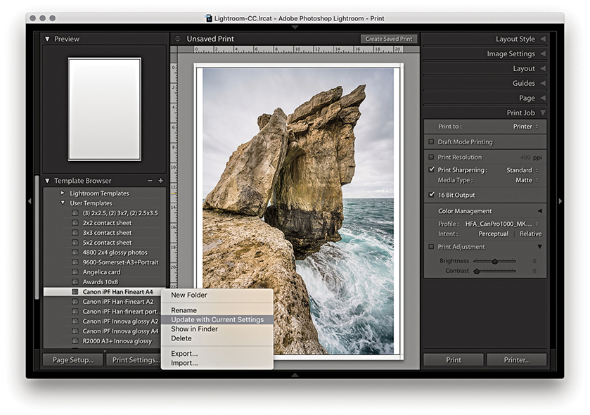
As you update the layout or print settings relating to a particular template, you can easily update the settings by right-clicking the template name to reveal the context menu and choosing Update with Current Settings.