Table of Contents for
The Adobe Photoshop Lightroom Classic CC Book, Second Edition
 The Adobe Photoshop Lightroom Classic CC Book, Second Edition
Published by
Adobe Press, 2019
The Adobe Photoshop Lightroom Classic CC Book, Second Edition
Published by
Adobe Press, 2019
- Contents
- Cover Page
- Title Page
- Copyright Page
- Dedications
- Introduction
- Contents
- 1 Introducing Adobe Photoshop Lightroom
- 2 Importing photos
- 3 The Library module
- 4 Develop module image editing
- The Tone Curve Panel
- Easing the Workflow
- 5 The art of black and white
- 6 Sharpening and noise reduction
- 7 Exporting from Lightroom
- 8 Printing
- 9 Presenting your work
- 10 Managing your photos in Lightroom
- 11 Lightroom CC/mobile
- 12 Lightroom preferences and settings
- Index
4 Develop module image editing
A definitive guide to working with the image-processing controls in the Develop module
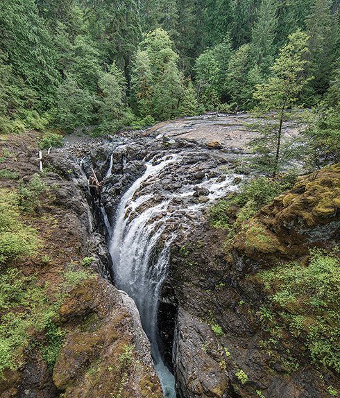
Photograph: Englishman River Falls, BC, Canada, © 2016 Martin Evening
Sony A7rII | 14mm | 200 ISO | f/8 @ 1/80th
One of the most powerful features in Lightroom is the image-processing engine, especially the way the image-adjustment processing is deferred until the time you choose to edit in Photoshop or export an image. This method of image processing actually originated in the early days of computer imaging, when deferred processing was adopted by such programs as Live Picture and xRes as a means to speed up the image editing. Computers were a lot slower back then, but it was possible to manipulate large image files in real time on relatively slow computers (with as little as 24 MB of RAM) and defer the image-rendering process to the end of a photo edit session.
Of course, these days, you can edit large images in no time at all in Photoshop. But one of the key advantages of Lightroom is that you can apply a crop, spot the image, make localized adjustments, tweak the color, do some more retouching, readjust the crop again, and so on, without ever touching the pixels in the original photograph. In a conventional pixel-editing workflow, the pixels are always modified in a consecutive sequence of steps. When you work in Lightroom, no restrictions are placed on the order in which you do things, and the edit changes you make in the Develop module are applied only when you output a photo as a rendered file, such as a PSD, TIFF, or JPEG.
Smarter Image Processing
The Lightroom image-processing engine is notable for a number of reasons. First, the Adobe engineers have made Lightroom simple to use—there are no color management settings, color space issues, or profile warnings to worry about. But just because the image processing is simpler does not mean it is inferior, as these changes have been made without compromising on quality. The Lightroom image-processing engine ultimately reduces all of its pixel calculations into a single calculation, in which any image degradation is minimized. Another advantage of the Lightroom image-processing engine is that you have full access to all of the image controls when working with JPEG, PNG, HEIF, TIFF, and PSD images, just as you have when working with raw camera files. You can use any of the image controls available in the Lightroom Develop module.
Lightroom uses a single RGB workspace to carry out all its image calculations, which is similar to the ProPhoto RGB space that was originally specified by Kodak. It uses the same coordinates as ProPhoto RGB but has a gamma of 1.0 instead of 1.8. By using a 1.0 gamma, the Lightroom RGB workspace is able to match the native 1.0 gamma of raw camera files, and its wide gamut can therefore contain all the colors that any of today’s digital cameras are capable of capturing. For these reasons, the Lightroom RGB workspace is ideally tailored to the task of processing the color data contained in the raw camera files. Concerns about banding in wide-gamut color spaces have perhaps been a little overrated, because it is really quite difficult to pull apart an image in ProPhoto RGB to the point where you see gaps appearing between the levels. Suffice it to say, the Lightroom RGB space uses a native bit depth of 16 bits per channel, which means that Lightroom is able to process up to 32,768 levels of tonal information per color channel. Because a typical digital camera will be capable of capturing only up to 4096 levels per color channel, it is probably true to say that the Lightroom RGB workspace can safely handle all of the tone and color information captured by any digital camera.
The Develop controls in Lightroom can be accessed as soon as a low-resolution preview has had a chance to load, instead of waiting for a full preview. For example, if a Smart Preview is available, Lightroom loads this first, before loading the full-sized image. When going to the Develop module, individual panels are not loaded into memory unless they are already open. This helps improve the initial launch speed of the Develop module. Lightroom Classic CC has fast switching from the Library to Develop modules. Furthermore, if you have 16 GB RAM or more, sequential navigation (using the keyboard arrows to move from one photo to the next) in Develop should be nice and fast. This is because Lightroom pre-caches upcoming photos, both before or after the direction you are navigating in. While you spend a few seconds on an image, Lightroom pre-loads the next two or three images to enable faster scrolling through these.
Steps to Get Accurate Color
The color management system in Lightroom requires no configuration, because Lightroom automatically manages the colors without your having to worry about profile mismatches, which color space the image is in, or what the default workspace is. There may be problems with missing profiles, but this applies only to imported files where a conscious decision has already been made not to color-manage an image. Apart from these rare instances, you can rely on Lightroom to manage the colors perfectly from import through to export and print. However, you do need to give special consideration to the computer display and ensure that it is properly calibrated and profiled before you can rely on it to judge the colors of your images. This is because you want the display to show as accurately as possible what you are likely to see in print. Calibrating and profiling the display is essential, but it does not have to be complicated or expensive. So if you want to get the colors right and avoid disappointments, you should regard the following pages as essential reading.
Note
You do not need to be concerned with RGB workspaces or profiles when working in Lightroom. As for raw files, Lightroom automatically applies profiles for all the currently supported cameras.
In the case of pixel images that have been imported into Lightroom, the profile recognition is handled automatically. Image files in Lightroom can be in any color space and color-managed accordingly (provided the image has an embedded profile). Whenever Lightroom encounters a file with a missing profile, it assumes the image to be sRGB.
Choosing a Display
The choice of display essentially boils down to which type of liquid crystal display (LCD) you should buy. As with all things in life, you get what you pay for. Because the display is what you will spend all your time looking at when making critical image adjustments, it is pointless to cut corners, just as it is pointless to scrimp on buying anything but the best-quality lenses for your camera. There are different classes of LCDs, starting with the budget-priced screens (such as those used on laptop computers) to large professional LCD displays that offer a high degree of color accuracy and wide color gamut, such as the Eizo ColorEdge and the NEC SpectraView. Both these displays are easy to calibrate and profile, and the large screen size means they are comfortable to work with.
Calibrating and Profiling the Display
The only truly effective way to calibrate and profile a display is to use a colorimeter or spectrophotometer. It is possible to buy a good device along with the necessary software package for under $250. You can spend up to $1000 on a good-quality display plus calibration package or spend even more on a professional calibration kit that also allows you to measure and build custom print profiles. But if all you want to do is calibrate and profile the display, these more expensive devices do not offer any significant advantages over what a basic colorimeter device can do. Having said that, some software packages can help you build better profiles using the same basic hardware-profiling kit.
There are two stages to a profiling process. The first step is to calibrate the display to optimize the screen brightness and contrast, and to set the desired white point and gamma (Figure 4.1). The second step involves measuring various color patches on the screen; the measurements made from these patches provide the source data to build a profile. On some of the advanced displays, there may be controls that allow you to adjust the brightness and contrast of the display, as well as possibly some color controls for setting different white points and fine-tuning the color output. These settings can be adjusted during the calibration process to optimize the performance and neutralize the display before making the profile measurements. Most LCDs have only a brightness control that adjusts the luminance of the backlight on the screen. So when running through the preliminary calibration steps, there is often nothing you can adjust other than the brightness, and you simply skip the steps where you are unable to make any adjustments to the display.
White Point and Gamma
Apart from asking you to adjust the hardware settings, the calibration software will ask you to choose appropriate white point and gamma settings before you proceed to build the profile. On an LCD, it will not be possible to manually adjust the white point the way you could with a cathode ray tube (CRT) display. You can set a specific white point for an LCD, such as 6500 K, whereas some people may prefer to select the native white point for the LCD they are calibrating.
Matching White Balances
People often assume that the goal should be to match the white balance between different displays and viewing light sources. For a side-by-side comparison using a light viewing box, this will be important. But the fact is, human vision is adaptive and our eyes always evaluate colors relative to what is perceived to be the whitest white. In reality, our eyes are constantly compensating and can accommodate changes in white balance from one light source to another. You can edit an image on a display using a white point of 6500 K and check the results with a viewing box that has a white balance of 5500 K, as long as the two are a distance apart.
Whether you are using a Mac or a PC, the gamma should ideally be set to 2.2. The 1.8-gamma Mac option is really only there for quaint historical reasons. In fact, the Mac 1.8 gamma dates back to the early days of Macintosh computers, long before color displays and ICC color management. Back then, it was found that the best way to get an image viewed on a Macintosh screen to match the output of an Apple black-and-white laser printer was to adjust the gamma of the monitor to 1.8. These days, Adobe programs such as Photoshop and Lightroom always compensate for whatever monitor gamma is used by the system to ensure that the images are displayed at the correct brightness regardless of the gamma that was selected when calibrating the display. Setting the gamma to 1.8 instead of 2.2 will have absolutely no impact on the lightness of the images that are displayed in Lightroom. These will be perceived as being displayed at the same brightness regardless of the monitor gamma. However, if you are mainly using your computer for image-editing work, it is best to use a gamma setting of 2.2, as the image tones will be more evenly distributed when previewed on the display. When using the basICColor software described below, you can also select the L* option. The technical reason why this is recommended is because L* uses the luminance tone axis as prescribed in the Lab color space; it’s better because it more closely matches human perception and provides a more linear gray axis.
Note
The profile measurement process usually takes a few minutes to complete, so you will need to make sure that your screensaver does not kick in while the calibration is underway. For example, the energy conservation settings on an LCD laptop in battery-power mode may automatically dim the display halfway through the profiling process, and this can adversely affect the results of the profile measurement. Apple’s True Color and Night Shift modes should be avoided as they will override the calibration. It is also recommended that the display be switched on at least 30 minutes before starting the calibration process.
Calibration and Profiling
The performance of your display will fluctuate, so it is advisable to update the display profile from time to time. LCDs vary in performance a lot less than CRT displays used to, so you will probably need to re-profile once every month or so only.
For accurate calibration, you first need to decide whether you want to buy a basic device for calibrating the display only or a more advanced device that allows you to create your own custom print profiles. The following steps show how the basICColor software can be used to calibrate and profile a display using a display calibration device such as the X-Rite i1Photo. Other calibrating software will look different of course, but the underlying principles of calibration and profiling will be the same. Prior to doing a calibration, you should make sure the calibrator head is clean and also ensure that the screen surface is clean and free of dust before making any measurements.
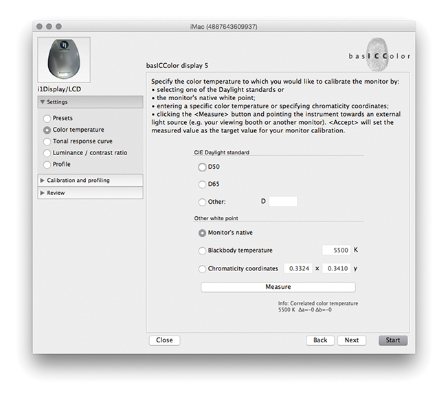
1. To start with, I set the color temperature. Because you cannot physically adjust the white point of an LCD, it is usually best to select the Native White Point option. But with a good-quality LCD you can set this to a standard setting, such as D65.
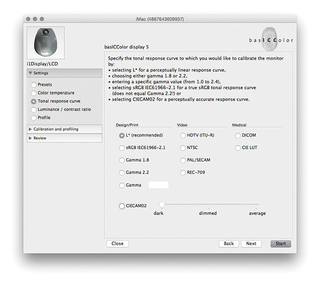
2. Next, I went to the Tonal Response Curve section and selected the recommended L* option. When using other calibration software packages, I recommend selecting Gamma 2.2.
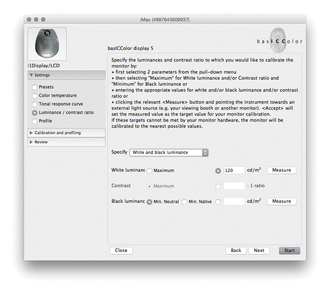
3. I then set the “Luminance/contrast ratio.” A maximum luminance of 110–140 candelas m2 is ideal when calibrating and building profiles for a desktop LCD, but this is not an absolute figure and is dependent on the brightness of the ambient light where the display is located. You cannot always adjust the contrast on an LCD, but you can sometimes adjust the computer operating system brightness controls to adjust the luminance brightness of the display so that the measured brightness matches the desired target setting. Next, I was ready to place the calibrator on the screen and start the calibration process.
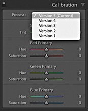
Process Versions
Since Lightroom was first released, there have been several updates to the core Camera Raw processing that have been distinguished as new process versions. Previously referred to as Process 2003, Process 2010, and Process 2012, these are now known as Version 1, Version 2, Version 3, and Version 4, with the most current being Version 5. All new imported images use Version 5, which is essentially not much different from Versions 3 and 4, except Version 5 includes improved Negative Dehaze and better Blacks subtraction to improve the appearance of high ISO images, especially those from smartphone captures. This latest process version does a good job of removing the purple shadow cast that can sometimes be seen in such images (Figure 4.2).
The biggest changes will be seen when converting a Version 1 or 2 image to Version 3, 4, or 5 whereby the Exposure slider in Version 3 or later is both a midtone brightness and highlight clipping control and is essentially a hybrid of the old Exposure and Brightness sliders. The Contrast control is placed just below Exposure and is used to adjust the tonal compression. The Highlights and Shadows sliders are symmetrical in their behavior. They can be used to lighten or darken the highlights or shadows independently, but they don’t affect the midtones quite so much; the midtones should mainly be controlled using the Exposure slider. The Blacks and Whites sliders allow you to fine-tune the blacks and whites at the extreme ends of the tonal range. Another benefit of using the most recent process version is that all images now have the same default settings. Raw and non-raw files both have 0 defaults. This makes it possible to share and synchronize settings between raw and non-raw images more effectively. The tone controls are good at handling contrasty images of high-dynamic-range scenes and can be processed more effectively. As camera manufacturers focus on better ways to capture high-dynamic-range scenes, it is important that the raw image-processing tools offer the flexibility to keep up with such developments.

Upgrading to Version 5
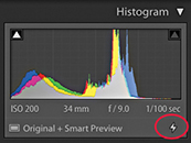
I will be going into more detail about working with the Version 5 controls shortly, but for now, let’s look at the version update process. Whenever you are editing a photo in the Develop module that has previously been edited in an earlier Version 1, 2, 3, or 4 of Lightroom, a thunderbolt icon will appear in the bottom-right corner of the Histogram panel (Figure 4.3). This indicates that it is using an older process version image, and clicking the icon updates the image to Version 5. A warning dialog will appear asking you to confirm the update (you can  -click the thunderbolt icon to bypass this dialog). Alternatively, you can go to the Settings menu and choose Update to Current Process. This lets you update single or multiple photos to Version 5. Or, you can go to the Settings
 ![]() Process submenu and select the process version you want to work with.
Process submenu and select the process version you want to work with.
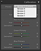
Finally, if you go to the Calibration panel (Figure 4.4), you can select the desired process version from there. This menu also can be used to revert to a previous Version mode, should you wish to do so.
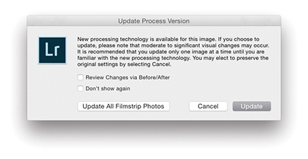
Whenever you choose to update to the latest process version from Version 1 or Version 2, Lightroom will try to achieve as close a match as possible, although it won’t always do so successfully. For example, images in which the Blacks slider has been run up the scale using Version 1 or Version 2 will most likely appear somewhat different after a conversion, because the current Version Blacks sliders tend to back off quite a bit. You will also see the dialog shown in Figure 4.5, which warns you about the consequences of updating and allows you to select a Before/After view if desired. I think you will be fine choosing the “Don’t show again” option and clicking Update. If you go to the Library module Library menu, you can choose Find Previous Process Photos to create a temporary collection of Version 1, 2, 3, and 4 photos in the Catalog panel.
I do not advise you to upgrade all your images to Version 5 in one go. For example, I upgrade my older, legacy images to the latest process version on an image-by-image basis only. The way I see it, I was probably happy with the results I achieved previously using earlier versions, so why be in a hurry to update? If I am going to upgrade to Version 5, I would rather do so gradually. And, of course, all newly imported images use Version 5 by default.
Process Version Mismatches
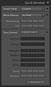
If you are synchronizing photos and there is a process version mismatch, the Quick Develop panel will look like the example shown in Figure 4.6, where the Tone control buttons appear dimmed.
Camera Raw Compatibility
While the Lightroom Develop adjustments are compatible with Camera Raw, it is possible to maintain absolute compatibility between Lightroom and Camera Raw and Bridge only if you are using the latest versions of both programs. As new cameras are released, or new features are added to Lightroom, Adobe provides updates for Lightroom and Camera Raw. You can usually count on an update being released roughly every three months. If you had previously purchased Lightroom 6, you would have been entitled to upgrades up until Lightroom 6.14 and no more. Only Lightroom Classic CC subscribers will have access to updates that appear after this. And, it should be pointed out here, the default Lightroom settings are set so that these updates happen automatically. At the same time, Photoshop customers subscribed to Photoshop CC currently have access to Camera Raw updates from 11.0 onwards and will continue to get updates. When Lightroom Classic CC comes out with new features, only those subscribers will get to see these features.
Maintaining compatibility between Lightroom and Photoshop used to be quite tricky, but now that Lightroom is available as a Creative Cloud subscription only, all you need to do is make sure you update your Photoshop CC Camera Raw subscription at the same time an upgrade takes place for Lightroom Classic CC. Therefore, when you choose the Edit in Photoshop command ( [Mac] or
  [PC]), the Photoshop Camera Raw engine will render a pixel image that opens in Photoshop CC as an unsaved Photoshop file. The only time this won’t work is if you have yet to upgrade Camera Raw to match your most recent Lightroom Classic CC update. However, when choosing the Edit in External Editor command (
 [Mac] or
  [PC]), Lightroom Classic CC always uses its own internal Camera Raw processing engine to render a TIFF, PSD, PNG, HEIF, or JPEG image, so in this respect Camera Raw compatibility won’t be an issue.
Editing CMYK Images in Develop
Lightroom does let you import CMYK images and edit them in the Develop module, although understand that these edit adjustments are taking place in RGB, and any export you make from Lightroom (except for Export Original) will result in an RGB output. It is not really ideal to use a program like Lightroom to edit your CMYK files in this way. The best route would be to go back to the raw or RGB original, make your adjustments there, and create a new CMYK output from that. You can do this in Lightroom by using the Export dialog to create, say, a TIFF output and incorporate a CMYK conversion Photoshop droplet action as part of the Export process routine (see page 462).
The Develop Module Interface
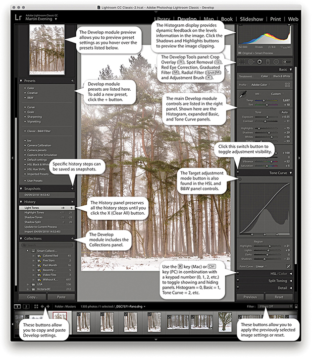
The Develop module has everything photographers need to make adjustments and corrections to their images (Figure 4.7). The main controls are located in the right panel section, where the panels can be expanded by clicking the panel headers. If you -click an individual panel header, you put the panels into “solo” mode, which means that as you click to select and expand a panel, this action simultaneously closes all the other panels. You can reset the individual Develop settings at any time by double-clicking the slider names. At the top are the Histogram panel and Develop Tools panel, and below that the Basic panel, which is where you can make an initial profile selection and carry out all the main tone and color adjustments. This is followed by a Tone Curve panel, which provides you with a more advanced level of control over the image tones, letting you further fine-tune the tone settings after they have been adjusted in the Basic panel. The Tone Curve features a Target Adjustment tool, which when you click to activate it, allows you to click and drag on an area in the image itself to lighten or darken, instead of dragging the sliders. Similar Target mode controls are available when making HSL and B&W panel adjustments. The Tone Curve panel also features a Point Curve editing mode and the ability to edit individual RGB channels.
Below that is the HSL/Color panel. The HSL tab section provides similar controls to the Hue/Saturation adjustment in Photoshop, where you can separately adjust the hue, saturation, and luminance components of an image. The Color tab section is similar to HSL but with simpler controls (and no Target mode option). Converting an image to black and white changes this to a B&W panel and lets you make custom monochrome conversions, creatively blending the RGB color channels to produce different types of black-and-white outputs.
Note
You can learn about Lightroom shortcuts by going to the module help options via the Help menu (or using  ). The following shortcuts enable you to switch between individual modules. (These are Mac shortcuts. PC users should use
  plus the number).
 to select Library
 to select Develop
 to select Map
 to select Book
 to select Slideshow
 to select Print
 to select Web
 to go back to the previous module
Also,  selects the Library module in Grid mode,
  selects the Library module in Loupe mode,
  selects the Crop Overlay mode,
  selects the Spot Removal tool,
  selects the Graduated Filter,
  selects the Radial filter,
  selects the Adjustment Brush, and
  selects the main Develop module again.
The Split Toning controls can be used to colorize the shadows and highlights separately (the Split Toning controls work quite nicely on color images, as well as on black-and-white photos). The Detail panel lets you adjust the sharpness for imported images and has controls for suppressing the color and luminance noise.
The Lens Corrections panel allows you to correct for global lens vignetting, as well as the chromatic aberrations responsible for color fringing. It also offers auto lens corrections, plus automatic perspective and manual transforms. The Effects panel includes post-crop vignette sliders for applying vignette effects to cropped images and Grain sliders for adding film grain effects.
The Calibration panel retains legacy manual calibration sliders and also is used to access a Process Version menu. Develop settings can be saved as custom presets. The left panel contains a selection of default presets to get you started, but it is easy to create your own presets using all, or partial combinations, of the Develop module settings. As you roll over the list in the Presets panel, you will see an instant preview in the Navigator panel, without having to click to apply the effect to an image.
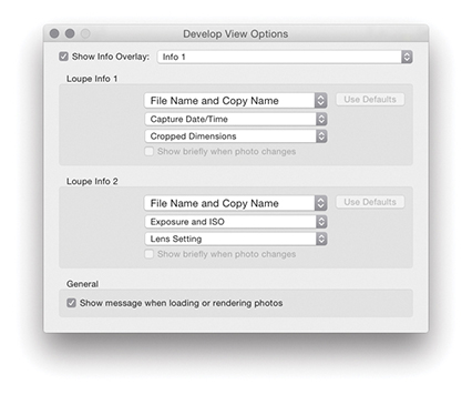
View Options in Develop
If you go to the view menu and choose View Options (  [Mac] or
  [PC]), you can access the dialog shown in Figure 4.8. This includes a “Show message when loading or rendering photos” option at the bottom; check it if you want a message to appear whenever the Develop module is processing a photo.
Develop Module Cropping
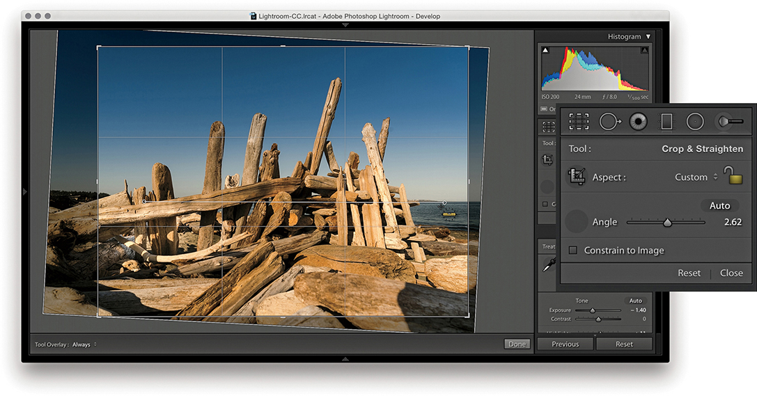
From any of the modules in Lightroom, you can use the keyboard shortcut to switch directly to the Crop Overlay mode in the Develop module. Or, if you are already in the Develop module, you can also click the Crop Overlay mode button in the Tools panel. Figure 4.9 shows a close-up view of the Crop Overlay tool panel controls. Once you are in the Crop Overlay mode, a crop bounding box appears, initially selecting all of the image. As you drag the crop handles, the image and crop edges move relative to the center of the crop and the areas outside the crop bounding box appear shaded. In the Figure 4.10 example, as I dragged the top-right handle inward, the image shifted out of the way to accommodate the change made to the crop area, and the center crop handles (aligned to the green line) always remained in the center of the content area.
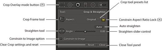
Dragging inside the crop bounding box lets you easily reposition the photograph relative to the crop bounding box. If you hold down the key, you can resize the crop bounding box relative to the crop box center. You can also click the Crop Frame tool in the Tools panel (Figure 4.9) to activate it: Place the Crop Frame tool over the photograph, and then click and drag to make a free-form crop (as you would using the Crop tool in Photoshop). When you have finished defining a crop, the Crop Frame tool returns to its docked position in the Tools panel. Click the Close button to apply a crop and exit the Tools panel (or just press ). To reset the Crop Overlay, click the Reset button or use  (Mac) or
  (PC). Whenever you drag one of the crop handles to make a non-rotational crop, you will see a dividing-thirds grid overlay the image (as in Figure 4.10). The dividing-thirds overlay lines can be useful as an aid to composition, though you can also choose from other custom overlay options. In the Toolbar, you can choose for the Tool overlay to always be on, off, or in Auto mode, when it will be visible only when you drag one of the crop handles.
Rotating a Crop
To rotate and crop an image at the same time, move outside the crop bounding box, click, and drag. Alternatively, you can use the Straighten tool to do this, or use the Angle slider in the Crop Overlay panel to straighten a photograph. In either case, the image rotates relative to the crop bounding box (which always remains level).
1. I clicked to select the Crop Frame tool, then simply dragged to apply a free-form crop to the photograph. When I released the click, the Crop Frame tool returned to its usual location in the Crop Overlay panel.
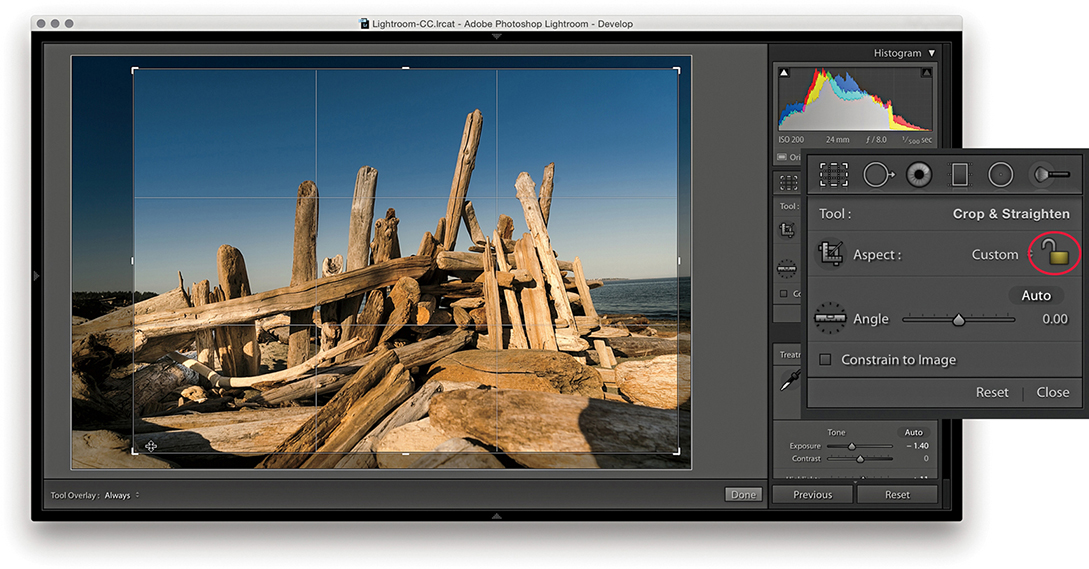
2. First, I clicked the Constrain Aspect Ratio Lock button (circled) to unlock. This allowed me to then click a corner or side handle of the crop bounding box and drag to reposition the crop without restriction.
3. I then clicked to select the Straighten tool and dragged it across the image to define a straighten angle (you can also adjust the straighten angle by using the Angle slider in the Tools panel).
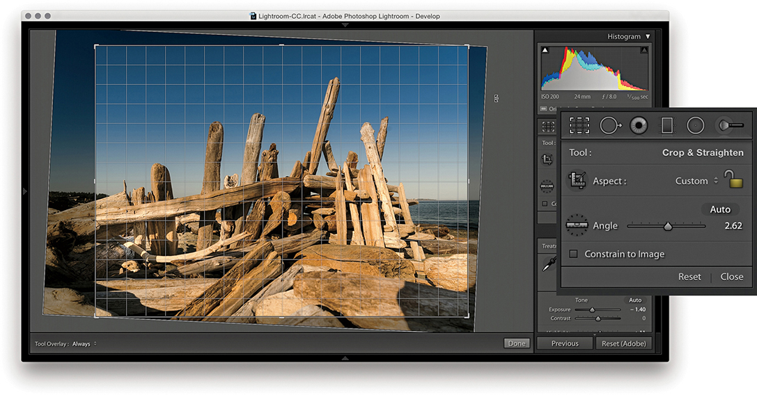
4. You can also straighten a photograph by clicking anywhere outside the crop bounding box and dragging. As you can see here, when I did so, a fine grid appeared. You can use the grid lines to help align the rotation to elements within the photograph.
Constrain to Image Cropping
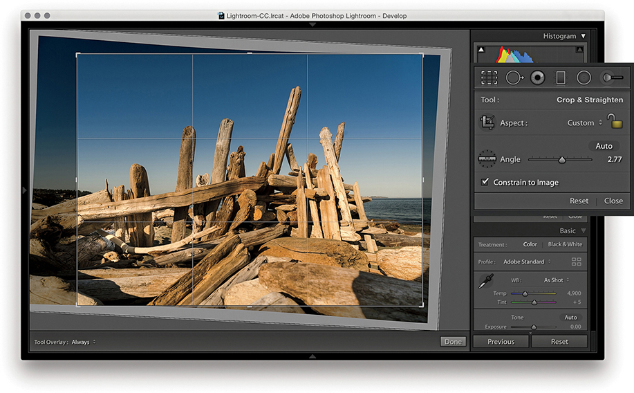
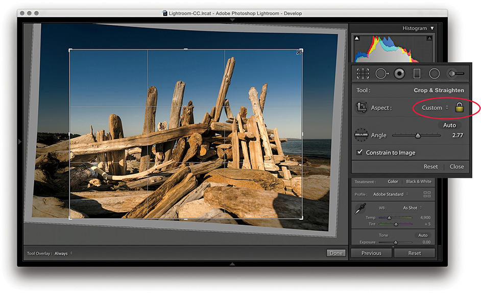
Because Lightroom can apply lens profile corrections and transform adjustments, profile-corrected or transformed images can end up being distorted to some degree. For example, when you apply a lens profile correction, the crop is normally constrained to the warped image bounds. However, extreme Upright adjustments or manual transforms can result in white padded areas showing around the outer bounds of the image. Checking the Constrain to Image option ensures the crop bounds never exceed the image bounds (Figure 4.11).
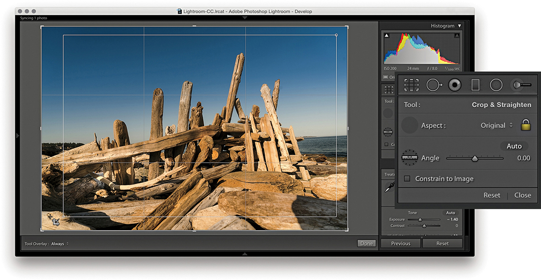
Auto Straightening
The Crop Overlay tool panel options include an Auto button. This essentially provides the same function as a Level Upright adjustment applied via the Transform panel (which is discussed later in this chapter). The following steps demonstrate applying the Auto option being applied.
1. I began by selecting the Crop Overlay tool.
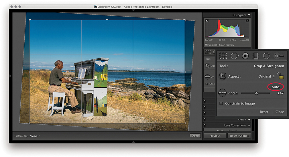
2. I then clicked the Auto button (circled) to auto straighten the photograph. This applied the same type of adjustment as a Level Upright adjustment in the Lens Corrections panel.
Crop Aspect Ratios
When the Constrain Aspect Ratio Lock is on ( toggles the lock closed/on and open/off), the current crop aspect ratio will be preserved as you apply a crop (Figure 4.12). If no crop has been applied yet, the aspect ratio will be locked to the current image proportions. So, if you click the crop bounding box and drag any of the handles, such as a corner handle, the crop area will match the exact proportions of the current image. In Crop Overlay mode, you can use the
  key to rotate the aspect ratio (i.e., you can change a current landscape aspect ratio crop to a portrait crop). You can quite easily flip the aspect ratio from landscape to portrait (or vice versa) by dragging the corner handle in such a way as to force the aspect ratio to switch.
Note
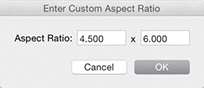
Whenever you enter large numbers for a custom crop aspect ratio (anything greater than 20), you will notice that as these are entered, the decimal place will shift over to the left. So, for example, if you type in a screen display ratio of, say, 1675 x 1150, this will actually set a ratio of 16.75 x 11.5. When you enter crop ratio units, Lightroom always tries to reduce these to the simplest ratio expression possible.
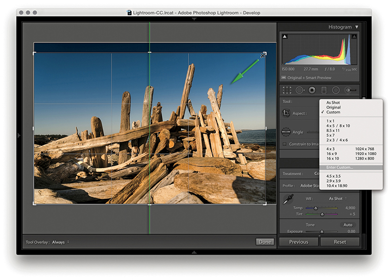
You can select an aspect ratio preset, such as 1x1 or 2x3, from the Aspect Ratio list. Hold down the key when changing the aspect ratio to have the Crop Overlay fill the current image bounds. Or, you can choose Enter Custom, which opens the dialog shown in Figure 4.13. Here, you can enter settings for a new custom aspect ratio setting and click OK to add this setting to the Crop presets list.
Repositioning a Crop
The Crop Overlay tool in Lightroom always restricts the cropping to within the boundary of the document. Unlike in Photoshop, you cannot drag the Crop tool outside the image document area to increase the canvas area. You can crop an image only within the confines of the photograph (plus padded areas). So, however you drag or rotate the crop, you will always be applying the crop to the inside of the picture. When you click inside the crop bounding box, the pointer changes to show the Hand tool, which lets you scroll the image relative to the crop. As you drag, the crop box remains static and the image moves behind the crop.
Crop Guide Overlays
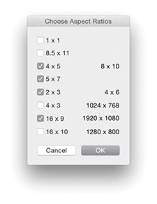
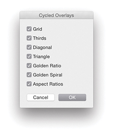
When the Crop Overlay tool is active, you can choose from seven crop guide overlays in the Tools ![]() Crop Guide Overlay menu. These range from the simple grid crop guide overlay shown earlier, to other more exotic overlay designs, such as a Diagonal crop and an Aspect Ratios crop guide overlay. The Thirds overlay provides a standard reference that you may already be used to seeing in, say, a camera viewfinder screen, while the Golden Ratio and Golden Spiral crop overlays offer new ways to preview a photo as you compose a crop. With regards to the Aspect Ratios overlay appearance, you can go to the Tools
Crop Guide Overlay menu. These range from the simple grid crop guide overlay shown earlier, to other more exotic overlay designs, such as a Diagonal crop and an Aspect Ratios crop guide overlay. The Thirds overlay provides a standard reference that you may already be used to seeing in, say, a camera viewfinder screen, while the Golden Ratio and Golden Spiral crop overlays offer new ways to preview a photo as you compose a crop. With regards to the Aspect Ratios overlay appearance, you can go to the Tools ![]() Crop Guide Overlay menu and select Choose Aspect Ratios to open the dialog shown in Figure 4.14. This lets you select which aspect ratio options you want made visible. Regardless of which crop guide overlay you choose, the Grid overlay design shown in Step 4 on page 171 always appears whenever you rotate a crop by dragging outside the crop bounding box. The Grid overlay is useful in these instances because it can help you align the horizontal or vertical lines when straightening an image.
Crop Guide Overlay menu and select Choose Aspect Ratios to open the dialog shown in Figure 4.14. This lets you select which aspect ratio options you want made visible. Regardless of which crop guide overlay you choose, the Grid overlay design shown in Step 4 on page 171 always appears whenever you rotate a crop by dragging outside the crop bounding box. The Grid overlay is useful in these instances because it can help you align the horizontal or vertical lines when straightening an image.
When working in Crop Overlay mode, you can use the  keyboard shortcut to cycle through the crop guide overlays and the
  shortcut to cycle through the crop guide orientation for the individual Triangle and Golden Spiral crop overlay modes. Triangle includes two modes and Golden Spiral has eight. The cycled overlay options can be accessed via the Tools
 ![]() Crop Guide Overlay menu (Figure 4.15). You can use this to choose which options are available as you cycle through them using the keyboard shortcut.
Crop Guide Overlay menu (Figure 4.15). You can use this to choose which options are available as you cycle through them using the keyboard shortcut.
So, why should you want to use these different crop overlays? Cropping is partly about trimming away parts of the picture that are distracting and aligning straight edges, but it is also about creating a nice-looking, well-balanced visual composition of the picture content. These alternative crop overlays can, therefore, help you compose better when applying a crop.
Canceling a Crop
You can use the  key to revert to a previously applied setting made during a crop session. Let’s say you have a photo that has been cropped and rotated slightly. If you were to alter the crop by adjusting the crop ratio or crop angle and then press the key, you would be taken back to the original crop setting. If, on the other hand, you adjusted the crop, exited the crop mode for this photo, started editing photos in another folder, and returned later to this picture, the new crop setting would be the one Lightroom reverts back to if you readjusted the crop and pressed the key. Essentially, canceling a crop is not the same as resetting the Crop Overlay. Canceling takes you back to how the image was before you edited it, which might include a previously applied crop adjustment.
Tool Overlay Menu
The Tool Overlay options can be accessed via the Toolbar ( ) at the bottom of the content area (see Figure 4.12) or the Tools menu (Figure 4.16). The Tool Overlay menu can be used to control the behavior of on-screen overlays. Different options appear when the Spot Removal, Red Eye, Graduated Filter, Radial Filter, or Adjustment Brush are made active. I will be covering these in more detail toward the end of the chapter. But for now let’s just look at the Tool Overlay menu options in the context of the Crop Overlay tool.

The Tool Overlay Options
The Tool Overlay options in Crop Overlay mode determine the visibility of the crop overlays. If you select the Always Show menu option, the crop overlay remains visible at all times. If you want to hide the crop overlays, select Never Show. The Auto Show mode makes the tool overlays visible only when you hover over the content area. In other words, the Crop Overlay guides will disappear from view whenever you roll the pointer outside the image area, such as to the top panel menu.
Another way to work with the tool overlay show/hide feature is to use the  (Mac) or
  (PC) keyboard shortcut, which acts as a toggle for switching between the Always Show and Never Show options. An easier-to-remember (and more flexible) shortcut is to simply use the
  key. This toggles between the Auto Show and Never Show modes. Or, it toggles between the Always Show and Never Show modes (depending on whether you had Auto Show or Always Show selected first).
Quick Develop Cropping
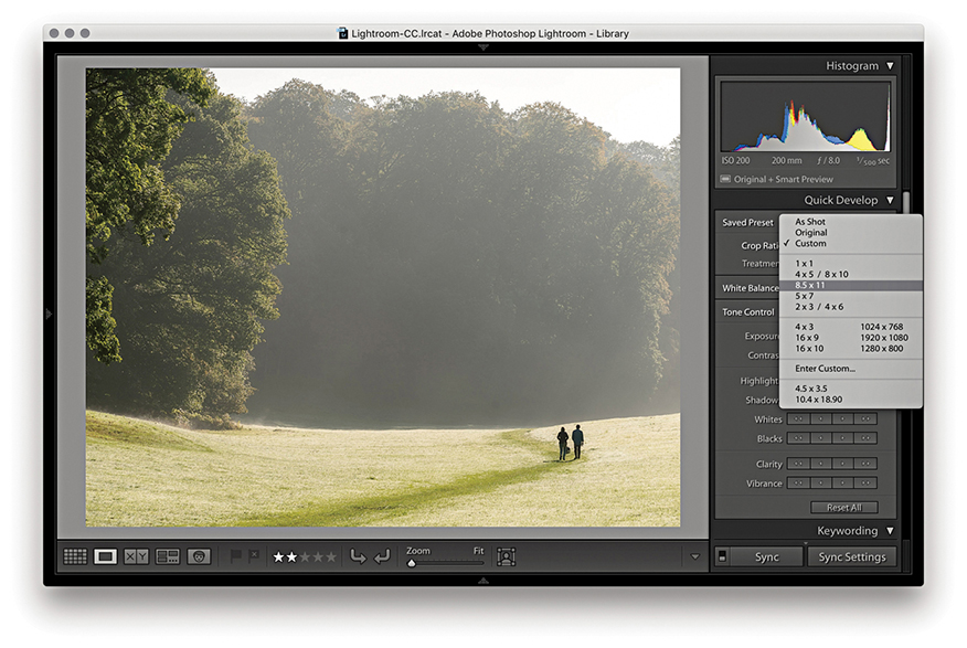
The Crop Ratio menu options in the Library module Quick Develop panel (Figure 4.17) can be used to apply a preset crop ratio that trims the photo evenly on either side. Cropping is something you usually want to apply manually to each photo individually, but having a quick way to change the aspect ratio for a bunch of photos in one go might be quite useful for someone like a school portrait photographer who wants to quickly prepare a set of portraits using a fixed-aspect ratio setting. As with the Develop module Crop Overlay options, you can click the Enter Custom item in the Crop Ratio pop-up menu to create your own Custom Aspect Ratio crop settings for use in the Quick Develop panel (Figure 4.17). In the Figure 4.18 example below, I selected an 8.5 x 11 proportional crop and applied this to the selected photograph. The custom crop settings are also shared between the Develop module and the Quick Develop panel in the Library module.

The Basic Panel
When working with the Basic panel tools, remember that you can click the inside panel edge and drag to adjust the width of the side panels. Figure 4.19 shows the Basic panel in normal and expanded form. A wider panel offers you more precision when dragging the sliders. If you also hold down the key as you drag, you can drag the panel as wide as you like. (Incidentally, this width resizing is possible with all side panels.)
Tip
When setting the white balance, as you zoom out, the magnified pixel view shows more and more of the image (this is good for averaging large areas for high-ISO images). As you zoom in, the magnified pixel view shows less and less of the image (which is good for picking out small, specific areas). In other words, the white balance sample area is zoom-level dependent.
White Balance Tool
The Temp and Tint sliders in the White Balance (WB) section can be used to precisely adjust the white balance of a photograph. With these, you can color-correct most images or apply alternative white balances to your photos. There is also a White Balance tool ( ). You can activate this by clicking it or by using the
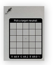
  shortcut. This unlocks the tool from its docked location and lets you click anywhere in the image to set a new white balance (Figure 4.20). The floating loupe magnifier provides an extreme close-up of the pixels you are measuring, which can really help you select the correct pixel reading. As you hover over an image, you will also see the RGB readout values for the point immediately beneath the pointer (Figure 4.21), as well as at the bottom of the Histogram panel. These RGB readings are shown as percentage values and can help you locate and check the color readings (if the RGB values are all close enough to the same value, the color can be regarded as neutral). You can also use the
  (Mac) or
  (PC) keyboard shortcut to apply Auto White Balance. If the Auto Dismiss option is disabled in the Toolbar (see Step 1), all you have to do is click to activate the White Balance tool and continue clicking with the tool until you find the right setting. You can then use the key or the key again to cancel working with the White Balance tool and return it to its normal docked position in the Basic panel.

Note
Do we still need the 0 to 255 scale in the readout section? I know some people say that they would like to see this as an option, but there are no real valid reasons for doing so. The 0 to 255 scale came into existence only because of the way the number of levels are calculated for pixel-rendered 8-bit images. The percentage scale (in my view) makes it easier to interpret what the Eyedropper readout numbers mean. Having said that, when you view a photo with Soft Proofing turned on, the RGB numbers in the Histogram display use the 0 to 255 scale (see pages 503 to 505).
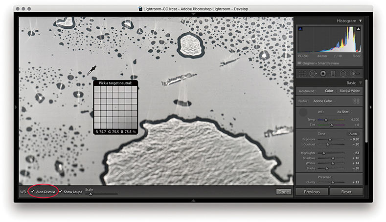
1. To make a white balance adjustment, I selected an area of the picture that was neutral in color (but not a bright white area). If the Auto Dismiss box (circled) in the Toolbar is checked, the White Balance tool automatically returns to its docked position in the Basic panel after a single click. If the Auto Dismiss box is unchecked, you can click and keep clicking with the White Balance tool until you are satisfied with the white balance adjustment that you have made.
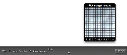
2. The Show Loupe check box allows you to toggle displaying the loupe that appears below the White Balance tool. You can adjust the loupe scale setting by dragging the slider next to the Show Loupe item in the Toolbar. This slider adjusts the sample grid pixel size, and dragging the slider to the right increases the number of pixels used when sampling a white balance point measurement. Increasing the pixel sample size can be beneficial if you want to aggregate the pixel readings more, such as when you are sampling a really noisy image and you do not want the white balance measurement to be unduly affected by the pixels that contain color noise or other artifacts.
White Balance Corrections
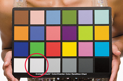
In most shooting environments, once you have found the right white balance, all the other colors will tend to fit into place. You can help get the white balance right in-camera by choosing a fixed or Auto setting. Or, you can use a white balance or color checker chart (like the X-Rite ColorChecker Classic chart shown in Figure 4.22) as a preparatory step that will help you make a more accurate, measured reading later in Lightroom. A camera Auto White Balance setting may do a good job, but it really depends on the camera you are using, because even the best cameras will not know how to handle every lighting situation. Figure 4.23 shows a scene with mixed lighting conditions. This photograph could be processed for either the exterior daylight or the tungsten lighting indoors, and each could be said to be correct. In situations like this, you cannot always rely on the camera’s Auto White Balance setting; you have to decide for yourself which setting works best. This is where the White Balance tool can come in handy. The trick is to analyze the picture and look for an area in the scene that should be a neutral, nonspecular, textural highlight. Aim to select something that should be a neutral light gray. If you click on an area that is too bright, there may be some clipping in one or more of the color channels, which can result in a false white balance measurement and consequently make an inaccurate adjustment.

Creative white Balance Adjustments
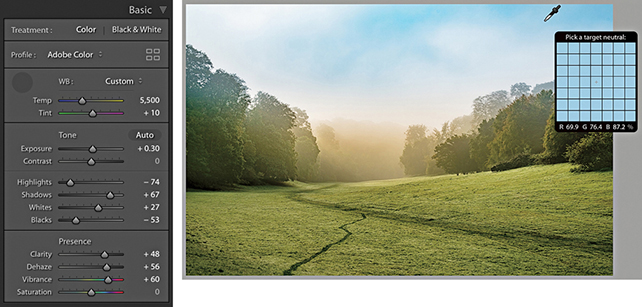
Who is to say if a correct white balance is any better than an incorrect one? Before digital capture and the ability to set accurate white balances, photographers could only choose between shooting with daylight-balanced or tungsten-balanced film emulsions. Most would simply accept whatever colors the film produced. With digital cameras, it is easy to set the white balance precisely. There may be times, such as when shooting catalog work, when it is critical to get the color exactly right from camera to screen to print. But you do not always have to obsess over the color temperature at the capture stage on every type of image. You have the freedom to interpret a master raw file any way you like, and can change the mood in a photograph completely by setting the white balance to an alternative, incorrect setting (Figure 4.24). The key point to emphasize here is that the White Balance controls are used to assign the white point as opposed to creating a white balance. Dragging the Temp slider to the right makes an image warmer and dragging to the left makes it cooler.

Tip
Warning! If you shoot using a studio flash system (not with the built-in flash) and have the camera set to Auto White Balance, the white balance reading will be influenced by the ambient light, such as the tungsten modeling lights instead of the strobe flash.
White Balance and Localized Adjustments
The Basic panel White Balance tool takes into account locally applied white balance adjustments. For example, if you use the Graduated Filter tool to apply a cooling white balance, when you then click with the White Balance tool, it ignores localized Temp or Tint adjustments to ensure the pixels where you click are neutralized.

1. Here, I applied a cooling Temp setting Graduated Filter to the sky in this image.
2. When I selected the White Balance tool and clicked the top half of the image, the new, calculated white balance adjustment ignored the locally applied Temp adjustment and applied a cooler white balance as if there were no filter effect.
Independent auto white Balance Adjustments
As well as selecting Auto from the White Balance menu, you can use the  key plus a double-click on the Temp and Tint sliders to set these independently.

1. I opened this image in Lightroom, which currently shows the As Shot white balance.

2. I held down the key and double-clicked the Tint slider. This auto-set the Tint slider only to apply an auto-calculated “Tint only” White Balance setting.
Profiles
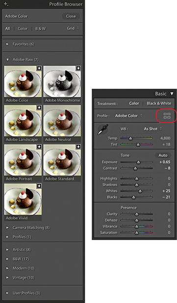
Camera Profiles have long been hidden away in the Calibration panel, but you’ll now find the Profiles menu repositioned up front at the top of the Basic panel (Figure 4.25). This makes profiles more obvious and encourages you to explore the available profile options first before you start adjusting the tone and color settings. In the past, Camera Raw profiles were designed for adjusting raw photos only. But the new Creative profiles can now be applied to any image. To access the Profile Browser, click Browse from the Basic panel Profile menu, or click the Browser icon circled below in red.
About Profiles
DNG Camera Profiles (DCPs) have traditionally powered camera profiles in Lightroom and Camera Raw. DCPs correctly interpret the white balance and translate the device-specific, scene-referred color data contained in the raw files to a standard color space. Look tables can be added to DCPs to apply additional stylistic color transformations. The translations and look tables in DCPs allow Lightroom to produce similar output from any of the 550 or so cameras that Lightroom supports (these are the Adobe Raw profiles).
Adobe Raw Profiles
The top section of the Profile Browser contains all the profiles you would want to apply prior to making any adjustments. Starting with the Adobe Raw profiles, these aim to apply a standardized profile look regardless of the raw camera file type. Therefore, if you were to photograph an event using say, both Canon and Fuji cameras, whenever you apply an Adobe Raw profile such as Adobe Color, Adobe Landscape or Adobe Neutral, these should result in similar looks, despite being shot on different cameras. At the same time, these Adobe profile looks have all been updated to provide improved tone and color rendering. To explain in more detail how such consistency is achieved, behind the scenes Camera Raw applies first the Adobe Standard DCP profile and then adds a look table on top to produce an Adobe raw profile such as Adobe Color or Adobe Vivid.
Note
The new profiles are XMP based, which means the profile settings are applied to the image’s Develop settings. Even if you don’t happen to have a particular XMP profile on another computer running Lightroom, shared files will render the same regardless. However, if the person receiving the file changes the profile and overwrites the develop settings, the original profile setting will be wiped out.
A big change here is the fact that the new Adobe Color profile is now applied by default in place of Adobe Standard. The difference between the two is fairly subtle, but Adobe Color applies a slightly stronger tone contrast and adds more warmth to the reds. Crucially, applying any of the new profiles to newly opened raw images now sets the default sharpening Amount setting to 40 rather than 25.
The previous Camera Portrait profile tended to make skin tones appear too warm in color. The new Adobe Portrait profile has been designed to improve the appearance of portrait images (Figure 4.26). This new version of the Adobe Portrait profile expands the color resolution for skin tones and helps ensure better color and tonality in portraits of people with all types of skin tones.

Camera Matching Profiles
Camera Matching DCP profiles emulate specific in-camera styles, such as Portrait or Landscape on Canon cameras; Clear, Deep, and Vivid on Sony cameras; or Astia/Soft and Velvia/Vivid on Fujifilm cameras. This is achieved by first applying the Adobe Standard DCP profile (as above) and then adding a Look table that specifies these different “camera look” color interpretations.
Note
For each camera that is supported by Camera Raw, two sets of profile measurements are used to record the camera sensor’s color response under controlled daylight-balanced and tungsten-balanced lighting conditions. From this data, Lightroom can extrapolate the color response for all white balance lighting conditions.
More than 550 cameras are supported by Adobe Camera Raw and Lightroom, and in some instances, several camera samples have been tested to obtain a representative average set of measurements. Therefore, the measurements made by Adobe can only ever be as good as the camera or cameras sampled. The sensors in some cameras can vary a lot in color response, and this variance means there is no guarantee it will have exactly the same color response as the cameras Adobe evaluated.
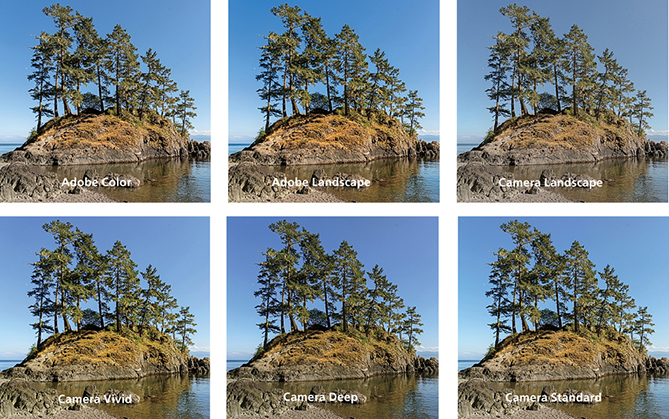
The Camera Matching profiles apply a profile that aims to match the color look settings in your camera, and this profile will vary depending on the type of raw file you have opened in Camera Raw. For example, if you select the Standard profile, Lightroom applies a profile correction that matches the standard camera look (as opposed to what Adobe believes the best standard look should be). This can also be referred to as the “JPEG look.” For example, if you capture both raw and JPEG and review the raw and JPEG photos alongside each other in Bridge, the initial (camera-embedded) raw preview will appear identical to the JPEG, but after a few seconds, it will change appearance as the Camera Raw rendering kicks in behind the scenes and applies the default Camera Raw profile, i.e. Adobe Color. If you choose to apply the Camera Matching Standard profile, however, the raw look should near enough match the JPEG. For example, Figure 4.27 compares a Camera JPEG and on the right a raw capture using the Camera Standard profile. Notice how the image-processed raw image appears near enough the same as the JPEG when the Camera Standard profile is applied.

Advanced users may happen to have custom profiles they created using the free Adobe DNG Profile Editor program. These will appear listed in a separate Profiles category, and below that you’ll see a Legacy profiles group to maintain backward compatibility with older versions of the Adobe Raw profiles.
As you can see in Figure 4.28, the profile selection can affect the color and tone appearance of an image.
Legacy and Custom Profiles
Older Adobe profiles that may have been applied to an image, such as the ACR 2.4 and ACR 4.4 profiles, are respected and preserved when you select a photo and will appear as the applied profile in the Profile Browser (circled in Figure 4.29). If you select another profile from the list, Lightroom replaces the older, legacy profile with the newer one. If you feel you need to continue accessing the legacy profiles, you can do so via the Manage Profiles dialog, which is discussed later on page 192.

You can also use the Adobe DNG Profile Editor program (tinyurl.com/y7szywdo) to create your own custom camera calibrated profiles. These, and any older custom profiles you created will appear listed in the Profiles section, which is also shown in Figure 4.29.
Enhanced Profiles
The DCP profiles discussed so far all work exclusively for the raw file formats supported by Camera Raw and can’t be applied to non-raw files, such as TIFFs or JPEGs. The next section contains the enhanced, or creative, profiles. These specify color and tone imaging instructions for both raw and non-raw files, where the image data has already been translated to a standard color space. In the case of raw files, the enhanced profiles contain the instructions to initially convert the raw data to a specific DCP as the baseline starting point. In most cases, this will be Adobe Standard (this is used for all the supplied enhanced profiles). In the case of non-raw files, the baseline will be the usual standard Lightroom color space. To that, color and tone adjustment instructions are applied using either a Look table or Color Lookup Table, or both. These can be used to accomplish more interesting color transformations than DCP profiles alone can produce. A thing to note here is that for raw files the underlying DCP is applied early on in the processing pipeline, while the Color Lookup Table component is applied last. Enhanced profiles can be used to apply nearly any of the effects that are possible within Lightroom, as well as go beyond to achieve uniquely different color and tone results.
Essentially, enhanced profiles can be used to add special effects. They are organized into the following groups: Artistic (Figure 4.30), Modern, and Vintage, plus there is a B&W collection of profiles offering different black-and-white conversions. In a way, selecting a creative profile is a bit like selecting a preset: You select an option and the image changes. But unlike presets, profiles apply relative rather than absolute adjustments. You see, the problem when using some Lightroom presets is that the preset settings always apply fixed settings. These may work well with some images, but can’t be guaranteed to work for all. The creative profiles, on the other hand, effectively apply a filter adjustment on top of the settings you have already applied rather than substituting the existing settings with new values, which might ruin the image. Selecting a creative profile does not affect any slider values and the adjustments are applied relative to the current image’s Develop settings.

Downloadable Content:

It is quite easy to create your own custom profiles in which you can save specific Develop settings as a profile rather than as a preset. The benefit of doing this is you can create your own custom “color grading” profiles, where the profile effect is applied relative to whatever adjustments have already been applied to the image. This makes the use of profiles more universal compared to creating presets that apply fixed settings, which overwrite any existing settings. To create a custom profile, you open a sample raw image via Camera Raw, apply the desired adjustments, and, in the Presets tab, -click the New Preset button to save the settings as a new profile (see the book website for more details on creating profiles).
You can create Develop module presets that include a specific profile so that selecting a preset applies a profile rather than altering the Develop settings. Or, you can have a preset do both and apply a profile plus apply specific Develop settings.
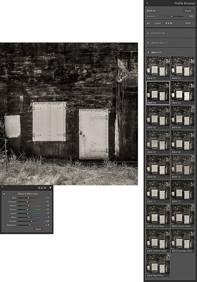
Black-and-White Profiles
The black-and-white profiles can be a useful place to start when converting a photo to black and white. You can roll the mouse over the B&W profile options to see which you like best (Figure 4.31). After you have done that, you’ll find the B&W panel sliders can be accessed still, which means you can continue to adjust these sliders to refine the adjustment and achieve the desired black-and-white look.
Adjusting the Profile Intensity
Whenever you have one of the creative profiles selected, the Amount slider at the top of the Profile Browser becomes active (Figure 4.32). You can drag this to adjust the intensity of a particular profile effect. For example, if you have a black-and-white profile selected, you can use this to subdue or intensify the strength of the black-and-white profile adjustment.

Profile Browser Management
With the Profile Browser open, you can simply hover the cursor over a profile to preview the effect (Figure 4.33). Then you can double-click to apply a profile and dismiss the browser. The profiles can be displayed in either a Grid, Large preview, or List view and you can use the radio button filters to reveal the color or black-and-white profiles only.

Note
Lightroom profiles and Develop presets are now stored separately in a Camera Raw folder that is shared with Camera Raw for Photoshop. These are stored in username/Library/Application Support/Adobe/Camera Raw/Settings (Mac), or username/App Data/Roaming/Adobe/Camera Raw/Settings (PC).
Marking Favorites
With so many profiles to choose from, it can be hard to know which to pick. To make things easier, you can click in the top-right corner of a Profile Browser thumbnail to toggle it on or off as a favorite (see Figure 4.33). Profiles that have been marked as favorites will then appear listed in the Favorites section.
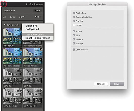
Manage Profiles
To manage Profile sets, open the Profile Browser, right-click any Profile set name (such as Favorites), and select the Manage Profiles option. Or, click on the plus icon circled below in Figure 4.34. A list of all the Profile sets will then appear in the Manage Profiles dialog. Uncheck the ones you wish to hide. This means you can customize the user interface so you see only the Profile sets that are relevant to you, although it is not possible to hide the Favorites profiles. You can also choose to Expand All or Collapse All Profile sets from the Profile Browser context menu.
Tip
As you hover over the Profile list to preview a Profile effect, you can hold down the key to quickly compare the original and after applying the profile.
Calibration Panel
In the Calibration panel (Figure 4.35), you will notice that the Profile menu has now been removed, but you can use the Process menu to choose which Process Version to apply to an image, such as when you might wish to revert to an older process version. Below that are the manual primary color Hue and Saturation sliders. These are mainly kept for legacy reasons.
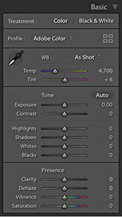
The Basic Panel Tone-Editing Controls
The Tone adjustment controls are designed to be applied in the order they appear listed in the Basic panel (Figure 4.36). This is a good recommendation for most photographers to follow, although there is no reason why you can’t adjust them out of order, should you prefer. In the following section, I refer to the Version 5 slider controls (although these are exactly the same as Versions 3 and 4). Here, then, is a summary of what each of the Basic Panel sliders do.
Exposure
The Exposure slider is both a midtone brightness and highlight clipping adjustment. This means that when evaluating an image, you use the Exposure slider to adjust the image to make it the right brightness. You drag to the left to darken. If you set the Exposure too dark, however, you will not be exploiting the full tonal range of the highlight areas. As you drag to the right to lighten, the image becomes progressively lighter. As you approach the point where the highlights might potentially become clipped, the brightening adjustment smoothly ramps off toward the highlight end, which helps preserve detail in the highlight areas. As you push the Exposure slider further, only then will you start to clip the brightest highlights. Mainly, you want to use the Exposure to get the image brightness looking right. From there on, no matter what you do with the other tone sliders, the midpoint brightness value will not shift too much until you further adjust the Exposure slider.
The Exposure slider’s response correlates quite well to the way film behaves, but is also dependent on the image content. With Version 5, as you increase Exposure, there is more of a “soft clipping” of the highlights as the highlight clipping threshold point is reached. Additional increases in Exposure will see the highlights roll off smoothly instead of being clipped. As you further increase Exposure, you will, of course, see more and more pixels mapping to pure white, but overall, lightening Exposure adjustments should result in smoother highlights and reduced color shifts. You should also find that it provides you with about an extra stop of exposure latitude compared to editing with the older Version 1/Version 2 Exposure slider.
If you hold down the key as you drag the Exposure slider, you will see a threshold mode view, which indicates the highlight clipping. This may be seen as a useful guide to where clipping may be taking place, but I do not recommend you get too hung up about the highlight clipping when adjusting the Exposure. When using the Version 5 Exposure slider, you just need to judge the image brightness visually and reserve using the key threshold view for when you adjust the Whites slider.
Contrast
The Contrast slider can be used to control the global contrast. As you drag the slider to the right, an increased contrast adjustment will make the shadows darker and the highlights lighter. Dragging the slider to the left reduces the contrast adjustment, making the shadows lighter and the highlights darker. The Contrast slider does adapt slightly according to each image so that it better differentiates the tone information in the tone areas that predominate. For low-key images, the midpoint is offset slightly toward the shadows, and with high-key images, the midpoint is offset toward the highlights. Figure 4.37 shows how the contrast adjustment range adapts for a low-key and a high-key image, where the midpoint will sometimes be offset, depending on the image content. Note that increasing the contrast in Lightroom does not produce the same kind of unusual color shifts that you sometimes see in Photoshop when you use Curves. This is because the Lightroom/Camera Raw processing prevents such hue shifts as you increase the contrast.

Essentially, you want to first use the Exposure slider to set the Exposure brightness, and then adjust the Contrast slider according to how much the tones in the image you are adjusting need compressing or expanding. The remaining sliders can then be used to make further tweaks after these two initial image adjustments have been made.
One of the things that tends to confuse some people is the fact that, in addition to there being a Contrast slider in the Basic panel, there is a separate Tone Curve panel that can be used to adjust the contrast. The adjustments you make using the Contrast slider in the Basic panel are a basic, preliminary kind of tone curve adjustment. The thing to appreciate here is that when you go to the Tone Curve panel (where the default curve is a linear curve shape), the adjustments you apply in this panel are applied on top of the contrast adjustment that was previously applied in the Basic panel. The Tone Curve, therefore, provides a secondary fine-tuning control.
Highlights and Shadows
The Highlights and Shadows sliders are symmetrical in the way they behave, allowing you to lighten or darken the highlight or shadow areas. For example, you can use a negative Highlights adjustment to restore more highlight detail, or a positive adjustment to deliberately blow out the highlights. These sliders affect only the tone regions on either side of the midtone point. To be precise, the range of these sliders does extend beyond the midtone value, but the greatest effect is concentrated in the highlight tones for the Highlights slider and the shadow tones for the Shadows slider. Adjustments in the +/– 50% range will have a normal-type effect when lightening or darkening, but as you apply adjustments that are greater than this, the lightening or darkening adjustments are applied via a halo mask (this is similar to the method used in HDR tone mapping). The thing to watch out for here is that as you apply a strong effect, the underlying halos can become noticeable. The goal has been to make the halo mask as unobtrusive as possible. For the most part, it is quite well disguised, but when pushed to extremes, it is possible to see the halo effects.
Typically, after setting the Exposure and Contrast, you will then use the Highlights and Shadows sliders to enhance the highlight and shadow areas as necessary. Here again, it is possible to hold down the key to reveal a threshold view as you adjust the Highlights and Shadows sliders. There may be some potential value in doing so at this stage, but I would urge you to mainly judge the appearance of the preview image for the nuances that can be achieved in the shadow and highlight regions rather than what a threshold analysis is telling you. The Highlights and Shadows controls also inform the whites and blacks how much tonal compression or expansion has been applied and the Whites and Blacks controls will adjust their ranges automatically taking this into account.
Whites and Blacks
In many cases, the Exposure, Contrast, Highlights, and Shadows adjustments may be all that are needed to make a good tone correction. Meanwhile, the Whites and Blacks sliders should be regarded as fine-tuning adjustments that are usually adjusted last. Here, it can definitely be useful to hold down the key to reveal a threshold view, as this will allow you to set the white and black clipping points more precisely. To darken the blacks, drag the Blacks slider to the left and drag to the right when you wish to lighten. Blacks adjustments are auto-calculated based on the contrast range of each individual image. The Blacks range is adaptive and auto-calculated based on the image content. For a low-contrast image, the Blacks adjustment will become increasingly aggressive as you drag the Blacks slider toward a –100 value. This means that you end up with more range, but at the expense of some precision as you attempt to crush the darkest tones.
Auto Whites and Blacks Adjustments
The Whites and Blacks sliders support auto-levels-like functionality. You can + double-click on either of these sliders to independently auto-set the Whites and Blacks adjustments. More specifically, when using this method, Lightroom analyzes the image and computes the Whites or Blacks value needed to just begin to clip. This is not quite the same as applying a standard Auto Settings adjustment, as the auto adjustment is recalculated based on all other adjustment settings that have been applied and also takes into account things like cropping and Lens Corrections and excludes pixels that are not currently visible from the auto calculation. Therefore, if there are some dark shadows in your image, but these become cropped, when you double-click the Whites and Blacks sliders, these settings will be re-evaluated when making a new auto calculation, as the following example shows.
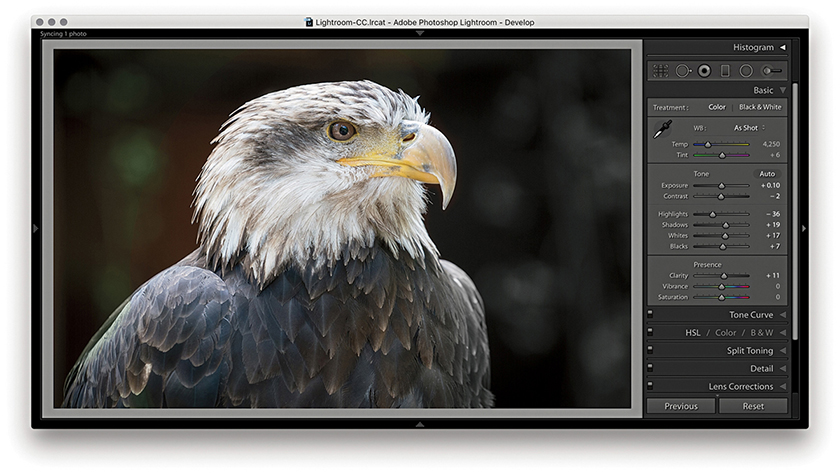
1. I started with a full-frame view of a photograph and then + double-clicked the Whites and Blacks sliders to auto-set the Whites and Blacks sliders.

2. I then cropped the image to focus more on the eagle’s head. When I + double-clicked the Whites and Blacks sliders again, different values were computed based on the tighter image crop.
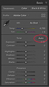
Auto Settings Adjustments
The Auto Settings adjustment can work well on a great many images as a quick-fix tone adjustment and is available via the Develop module Basic panel as well as the Library module Quick Develop panel (see below). To apply an Auto Settings adjustment in Develop, click the Auto button circled in Figure 4.38 or use  (Mac) or
  (PC). This automatically sets the Exposure, Contrast, Highlights, Shadows, Whites, Blacks, Vibrance, and Saturation settings. An Auto Settings adjustment can be undone by double-clicking the Tone button next to Auto. However, this resets the Tone sliders only and not the Vibrance and Saturation sliders. To reset those as well, -click the Presence tab so that it says Reset Presence. You can, of course, use
  (Mac)
(Mac)  (PC) to reset everything. And, as just mentioned, you can also use
  plus a double-click to auto set each of these sliders independently.
The new Auto Settings was created by making use of an advanced neural network. Lightroom can apply better auto settings by analyzing each photo and comparing it to tens of thousands of previously edited photos to choose a suitable auto adjustment. Essentially, the new Auto Settings is smarter than previous incarnations of Auto Tone because it was developed by referencing edit decisions made by professional photographers. Although the development of Auto Settings was powered by machine learning, all the calculations happen off-line, which means you don’t have to have a live Internet connection for it to work.
An Auto Settings adjustment can also be included as part of a Develop preset. This means you can create a Develop preset that can be applied as you import images and have an Auto Settings adjustment automatically applied right from the start. Or, you can make a photo selection in the Library module and click on the Quick Develop panel Auto button to batch apply. However, the auto settings calculation using these methods is not quite as precise as when using the Auto button in the Develop module. This is because Develop module auto settings are based on the full-image data, whereas Library module auto settings are based on the cached preview data.
Working with the new Auto Settings via Lightroom CC and Lightroom Classic CC, I have been impressed with the results. Previously, I would sometimes use Auto Tone as a starting point to see what kind of result this gave, knowing I would almost certainly have to tweak the settings one way or another. With the new Auto Settings, the results are very often spot-on (see Figure 4.39). The additional adjustments I make are generally only required to fine-tune the initial result. I have noticed that Auto Settings tends to make good use of the Contrast slider rather than rely too heavily on Highlights and Shadows adjustments to modify the global tone contrast. It also nearly always applies a positive Vibrance and a (lesser) positive Saturation adjustment.

Auto Settings doesn’t always get it right though. With my studio-lit portraits I have found the outcomes to be mixed, especially as I may prefer a more subdued color rendering. When editing some recent snow-scene photographs, I found the new-style Auto tended to produce darker-than-desired results. However, having applied Auto first, all I needed to do was to select all the photos and apply a positive Exposure adjustment via the Library module Quick Develop panel.
Auto Settings adjustments are crop-aware. Therefore, if you crop an image and click Auto, the result will most likely be different compared to applying Auto to the full-frame image. This is useful to know if you are editing, say, a series of stage-lit photographs where the large areas of black could adversely affect the outcome. To work around this, you could temporarily crop the image, apply Auto and then cancel the crop to revert to the full-frame image.
Basic panel adjustments workflow
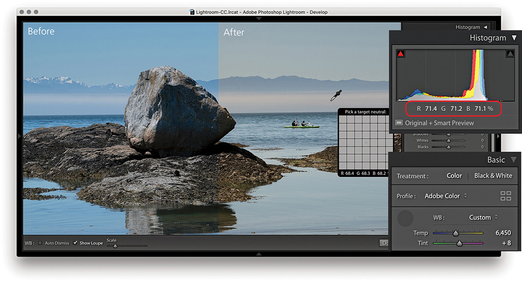
1. To start with, I selected the White Balance tool () and clicked a nonreflective neutral color to set the white balance. The RGB percentage readouts where I clicked with the White Balance tool now show a more neutral color balance.

2. I dragged the Exposure slider to the right to lighten the image slightly.

3. I then dragged the Contrast slider to the left to decrease the tone contrast.
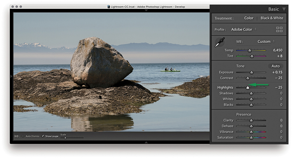
4. After the Exposure and Contrast were set, I dragged the Highlights slider to the left to bring out more detail in the midtone to highlight regions of the photo.
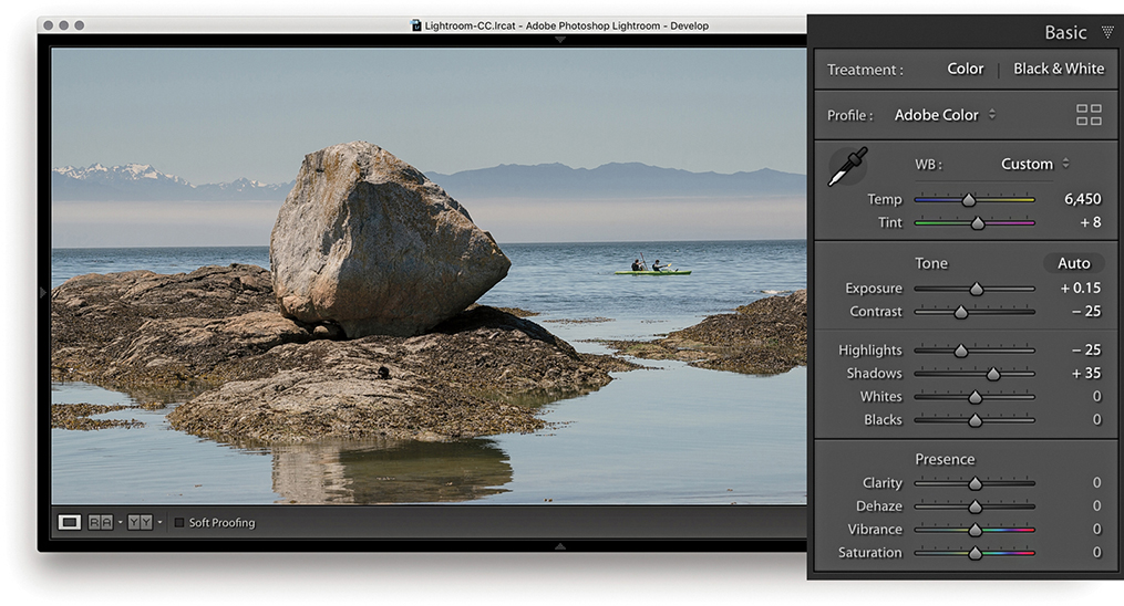
5. Here, I dragged the Shadows slider to the right to lighten the shadow tones.
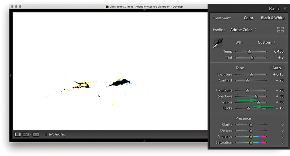
6. I now needed to fine-tune the highlight and shadow clipping points. To do this, I adjusted the Whites and Blacks sliders as shown. At this stage, it can be useful to hold down the key to see a threshold clipping preview for the whites and blacks. It is usually best to allow the shadows to just start to clip. In this example, you can see the threshold preview as I adjusted the Blacks slider.

7. In this final version, you can see the result of the Whites and Blacks adjustment. I also added +15 Clarity to boost the midtone contrast and added +12 Vibrance.
Histogram Panel
When you are in the Develop module, the Histogram panel is displayed in the top-right corner. (The Library Module also contains a Histogram panel, but the histogram in the Develop module has more direct relevance when you’re making Develop adjustments.) Basically, the Histogram panel provides you with information about the distribution of the levels in an image and the means to turn the clipping previews for the shadows and highlights on or off. These previews indicate where there might be any shadow or highlight clipping in the image. You can either roll over or click the buttons circled in Figure 4.40 or press  to toggle displaying the clipping preview. A solid blue color overlay in the preview image indicates where there is shadow clipping, such as on the chimneys in Figure 4.40, and the solid red overlay color indicates any highlight clipping, such as on the lighthouse and building fronts in the example. The clipping warning triangles themselves also indicate which colors in the red, green, or blue channels (or combination of channels) are initially being clipped most; the triangle colors eventually change to white as all three channels become clipped. If you want to hide the Histogram panel, you can use the
  (Mac) or
  (PC) shortcut to toggle collapsing and expanding this panel. In the case of the Figure 4.40 image, the clipping preview showed blue channel clipping in the shadows and yellow (red and green color channel) clipping in the highlight regions.
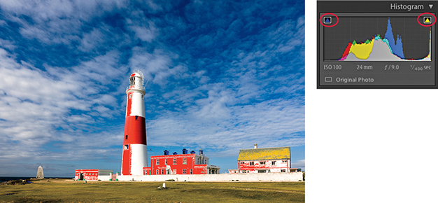
If you are editing an imported JPEG, PNG, HEIF, PSD, or TIFF image, the Lightroom histogram represents the tone range based on the file’s native color space. If, however, you are editing a raw capture, there are no gamut constraints until you export the image as a JPEG, TIFF, or PSD file, at which point the gamut space limit is determined by the choice of RGB output space. The sRGB space has a small gamut, and some of the colors may be clipped when you export. Display P3 matches the color gamut of the latest Mac screens and is somewhat bigger than sRGB. Adobe RGB is a popular, commonly used color space. ProPhoto RGB has the widest gamut of all. Incidentally, Lightroom uses a wide-gamut RGB space similar to ProPhoto RGB to do all the image calculations, and the histogram and RGB percentage readouts are based on this native Lightroom RGB space. To find out more about the Lightroom RGB space, please refer to the “Lightroom RGB space” PDF on the book’s website.
As you roll the pointer over an image, the Histogram display changes from displaying the camera data information to showing the RGB values (Figure 4.41). The Histogram information is useful, although only if you know how to interpret it correctly. For example, if you shoot using raw mode, the histogram display on a digital camera is misleading because it is based on what a JPEG capture would record, and the dynamic range of a JPEG capture will always be less than that available from a raw file. If you are shooting raw, the only way to tell if there is any clipping is to inspect the raw image in Lightroom or via Camera Raw in Photoshop. In other words, do not let the camera histogram unduly sway your judgment if you have good reason to believe the camera exposure you are shooting with is correct.

Downloadable Content:
The Histogram panel and image adjustments
As you adjust an image, you can observe how this affects the image levels in the Histogram panel. In Figure 4.42, notice how as the Exposure was increased, the levels expanded to the right. Also, as it was increased, the highlights did not clip any further and the midtones were brightened. But, if you push the Exposure adjustment to extremes, the highlights will eventually be forced to clip. You may also find it useful to reference the Histogram panel when adjusting images that appear to be overexposed. As you decrease the Exposure slider, more information should appear in the highlights, and this will be reflected in the histogram display (Figure 4.43). However, the ability to recover highlight detail in this way mostly only applies when processing raw images.
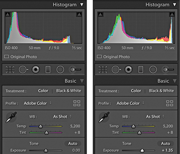
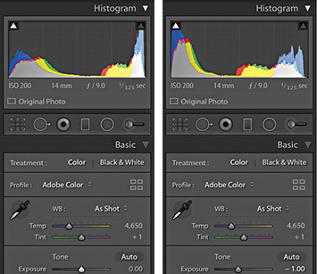
Lightroom also provides optional Lab color readouts. To enable this, right-click in the Histogram panel to access the context menu shown in Figure 4.44 and select the Show Lab Color Values option. As you hover over the image, you will now see Lab values in place of an RGB readout. With this enabled, you might, for example, want to aim for even a* and b* values when evaluating skintones. However, when soft proofing is switched on, the readout display will always default to RGB values.

The histogram is more than just an information display. You can also use it to actively adjust the following Basic panel tone slider controls: Exposure, Highlights, Shadows, Whites, and Blacks. As you roll the pointer over the histogram, you will see each of these sections highlighted (Figure 4.45). And if you click and drag left or right inside the Histogram panel, you can use this as an alternative way to adjust the Basic panel sliders. You can also double-click these areas of the histogram to reset the values.

Navigating the Basic Panel Via the Keyboard
You can use the  and
and  keys (or you could refer to these as the
  and
and  keys) to cycle backward or forward through the Basic panel settings, making each active in turn. When a setting is selected, you can use the
  and
and  keys to increase or decrease the unit settings. Holding down the
  key when tapping the
  keys uses larger increments, while holding down the key uses smaller increments. As you do this, you will also see an overlay appear in the content area indicating the adjustments being made (Figure 4.46).

Correcting Overexposed Images
Lightroom has the ability to reveal highlight detail that might otherwise be hidden. You can often recover seemingly lost highlight information by combining a negative Exposure adjustment with a negative Highlights slider adjustment. Although Lightroom can recover the highlight detail on most images, it has a limited effect on pixel-based images such as JPEGs, PNGs, HEIFs, or TIFFs. This technique produces the best results on raw images, because Lightroom is able to use all of the luminosity information contained in a raw file that is simply waiting for you to access it. In the accompanying example, I was able to recover just over one stop of overexposure, but in some instances it may be possible to recover as much as two stops.
How this works is that Lightroom features an internal technology called highlight recovery, which is designed to help recover luminance and color data in the highlight regions whenever the highlight pixels are partially clipped—in other words, when one or more of the red, green, and blue channels are partially clipped, but not all three channels are affected. The highlight recovery process initially looks for luminance detail in the non-missing channel or channels and uses this to build luminance detail in the clipped channel or channels. After that, Lightroom applies a darkening curve to the highlight region only and, in doing so, brings out more detail in the highlight areas with good highlight color rendering that preserves the partial color relationships, as well as the luminance texture in the highlights. There is also less tendency for color detail to quickly fade to neutral gray. This technology is designed to work best with raw files, although JPEG images can sometimes benefit too (but not so much).
The ability to recover overexposed highlight detail is also dependent on the capture abilities of the sensor. Not all sensors are the same, and with some cameras you do have to be very careful not to overexpose. If the highlights are completely blown out in the original image, you will never be able to recover all the detail completely, but using Version 5 (or Version 3 or Version 4), I think you will be pleasantly surprised at the difference when reprocessing some of your older Version 1/Version 2 shots. Figure 4.47 shows a direct comparison between working in Version 2 and working in Version 5 on an image where the highlights were burned out (and you cannot get much more burned out than shooting directly into the sun).

It is often better to optimize the camera exposure to capture as much of the shadow detail as possible, but without overexposing to the point where you are unable to process important highlight information. I will often ignore the camera or light-meter readings and deliberately overexpose at the time of capture in order to record the maximum amount of levels information and use the combination of negative Exposure and Highlights adjustments when processing the image in Lightroom.